 hover to scroll
Personal Creator
CURATED COLLECTION · 8 REFERENCES
Newsletter, product, and project routes that connect a personal point of view to a useful action. Selected for design and observable paths; conversion rates are not verified.
Copy the reference notes below and paste them into Claude, ChatGPT, or your coding assistant. Add what you want to build.
Includes design notes, original sources, and preview links. An assistant that supports browsing can also read the public board link.
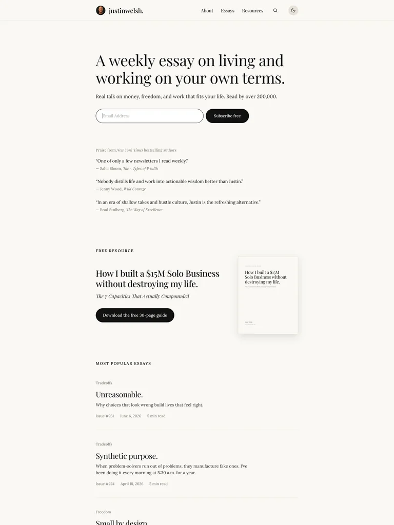
hover to scrollA calm, type-led personal publication makes one recurring email the primary offer.
Useful for: Explaining the newsletter’s topic and cadence before a simple subscription form, then adding endorsements, a free guide, and sample essays. Selection is based on observable design and conversion paths; conversion rates have not been independently verified.
# Design reference: Justin Welsh
Source: https://justinwelsh.me/
Swipefile reference: https://swipefile.design/ref/personal-justin-welsh/
Captured: 2026-09-05. This is a dated reference, not a claim about the current live product.


## Objective
Adapt the visual principles below to my project. Use my own content and identity. Do not reproduce logos, proprietary copy, or brand assets.

## Reference notes
- mood: Editorial Newsletter Brand. A calm, type-led personal publication makes one recurring email the primary offer.
- colors: Warm off-white, charcoal, and muted gray.
- typography: Editorial serif headlines paired with quiet sans-serif interface text.
- layout: Narrow centered hero, inline form, short proof statements, then a guide and essay index.
- motion: Keep navigation and reading immediate; motion should support the work rather than delay access.
- texture: Fine rules and generous whitespace create a publication feel.
- dont: Do not add visual noise around the form or substitute vague inspiration for a specific email promise.

Useful for: Explaining the newsletter’s topic and cadence before a simple subscription form, then adding endorsements, a free guide, and sample essays. Selection is based on observable design and conversion paths; conversion rates have not been independently verified.

## Acceptance criteria
- Existing project conventions, design tokens, working functionality, and unrelated changes are preserved.
- Two or three reference principles clearly support the user's task; conflicts are resolved in favor of usability and the existing product.
- Reusable components and semantic HTML express the interface. Available licensed assets are used; important UI text is never rendered as a bitmap.
- Every visible control has a defined behavior. Loading, empty, error, success, disabled, and long-content states are specified where relevant. Demo data is clearly labeled.
- Navigation and content adapt at 375px, 768px, and 1440px without horizontal page overflow. Keyboard use, visible focus, labeled inputs, at least 44px touch targets, readable contrast, and reduced motion are supported.
- Verification distinguishes rendered behavior from proposals and identifies anything still requiring a backend or external service.

## Quality bar
Clear hierarchy, consistent spacing, restrained surfaces, and purposeful motion. Avoid decorative gradients, excessive cards, placeholder buttons, and invented metrics unless the project calls for them. Do not claim a feature is connected or tested without evidence.
 hover to scroll
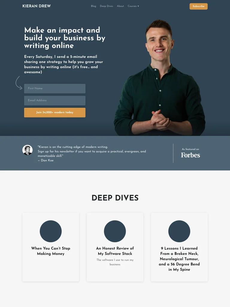
A personal portrait and direct writing-business promise lead into a prominent newsletter form.
Useful for: Making the topic, delivery schedule, and audience clear before asking for an email. Testimonials and sample articles support the subscription decision. Selection is based on observable design and conversion paths; conversion rates have not been independently verified.
# Design reference: Kieran Drew
Source: https://www.kierandrew.com/
Swipefile reference: https://swipefile.design/ref/personal-kieran-drew/
Captured: 2026-09-05. This is a dated reference, not a claim about the current live product.


## Objective
Adapt the visual principles below to my project. Use my own content and identity. Do not reproduce logos, proprietary copy, or brand assets.

## Reference notes
- mood: Writer Newsletter Funnel. A personal portrait and direct writing-business promise lead into a prominent newsletter form.
- colors: Slate blue, warm orange buttons, white, and dark text.
- typography: Bold sans-serif headings with compact supporting copy.
- layout: Two-column portrait-and-form hero, a proof strip, featured deep dives, and article lists.
- motion: Keep navigation and reading immediate; motion should support the work rather than delay access.
- texture: A cutout portrait and simple geometric article illustrations.
- dont: Do not overstate reader outcomes; preserve a concrete promise about what the email actually contains.

Useful for: Making the topic, delivery schedule, and audience clear before asking for an email. Testimonials and sample articles support the subscription decision. Selection is based on observable design and conversion paths; conversion rates have not been independently verified.

## Acceptance criteria
- Existing project conventions, design tokens, working functionality, and unrelated changes are preserved.
- Two or three reference principles clearly support the user's task; conflicts are resolved in favor of usability and the existing product.
- Reusable components and semantic HTML express the interface. Available licensed assets are used; important UI text is never rendered as a bitmap.
- Every visible control has a defined behavior. Loading, empty, error, success, disabled, and long-content states are specified where relevant. Demo data is clearly labeled.
- Navigation and content adapt at 375px, 768px, and 1440px without horizontal page overflow. Keyboard use, visible focus, labeled inputs, at least 44px touch targets, readable contrast, and reduced motion are supported.
- Verification distinguishes rendered behavior from proposals and identifies anything still requiring a backend or external service.

## Quality bar
Clear hierarchy, consistent spacing, restrained surfaces, and purposeful motion. Avoid decorative gradients, excessive cards, placeholder buttons, and invented metrics unless the project calls for them. Do not claim a feature is connected or tested without evidence.
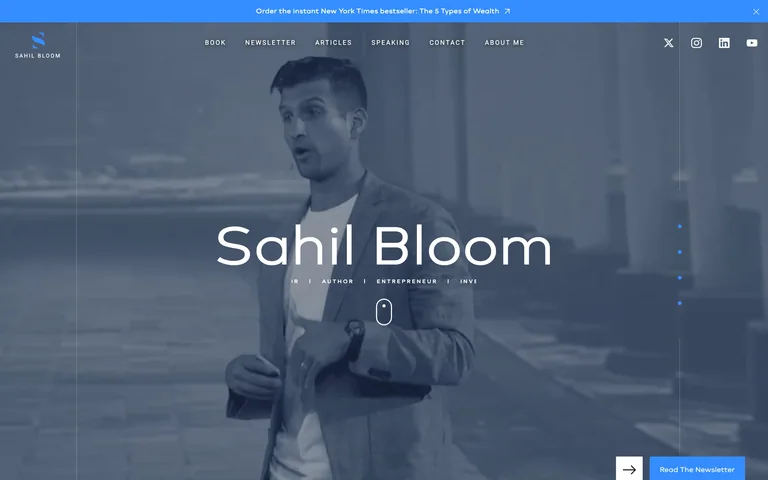
A cinematic portrait and blue accents connect a recognizable creator to a prominent newsletter action.
Useful for: Connecting a recognizable individual to newsletter, book, article, and speaking routes. A persistent newsletter action gives the cinematic opening a practical next step. Selection is based on observable design and conversion paths; conversion rates have not been independently verified.
# Design reference: Sahil Bloom
Source: https://www.sahilbloom.com/#Hero
Swipefile reference: https://swipefile.design/ref/personal-sahil-bloom/
Captured: 2026-09-05. This is a dated reference, not a claim about the current live product.
Capture scope: one viewport. Do not infer unseen page sections or a complete user flow.

## Objective
Adapt the visual principles below to my project. Use my own content and identity. Do not reproduce logos, proprietary copy, or brand assets.

## Reference notes
- mood: Cinematic Creator Brand. A cinematic portrait and blue accents connect a recognizable creator to a prominent newsletter action.
- colors: Bright blue surrounding a dark navy portrait composition with white type.
- typography: Large clean identity text with small uppercase navigation.
- layout: Full-viewport portrait hero with navigation above and a newsletter action at the lower edge.
- motion: The live page uses animated sections; retain a clear static hero and reduced-motion support.
- texture: Dark photographic atmosphere, subtle rules, and concentrated blue accents.
- dont: Do not rely on animation to reveal the subscription route or infer unseen sections from a viewport capture.

Useful for: Connecting a recognizable individual to newsletter, book, article, and speaking routes. A persistent newsletter action gives the cinematic opening a practical next step. Selection is based on observable design and conversion paths; conversion rates have not been independently verified.

## Acceptance criteria
- Existing project conventions, design tokens, working functionality, and unrelated changes are preserved.
- Two or three reference principles clearly support the user's task; conflicts are resolved in favor of usability and the existing product.
- Reusable components and semantic HTML express the interface. Available licensed assets are used; important UI text is never rendered as a bitmap.
- Every visible control has a defined behavior. Loading, empty, error, success, disabled, and long-content states are specified where relevant. Demo data is clearly labeled.
- Navigation and content adapt at 375px, 768px, and 1440px without horizontal page overflow. Keyboard use, visible focus, labeled inputs, at least 44px touch targets, readable contrast, and reduced motion are supported.
- Verification distinguishes rendered behavior from proposals and identifies anything still requiring a backend or external service.

## Quality bar
Clear hierarchy, consistent spacing, restrained surfaces, and purposeful motion. Avoid decorative gradients, excessive cards, placeholder buttons, and invented metrics unless the project calls for them. Do not claim a feature is connected or tested without evidence.
 hover to scroll
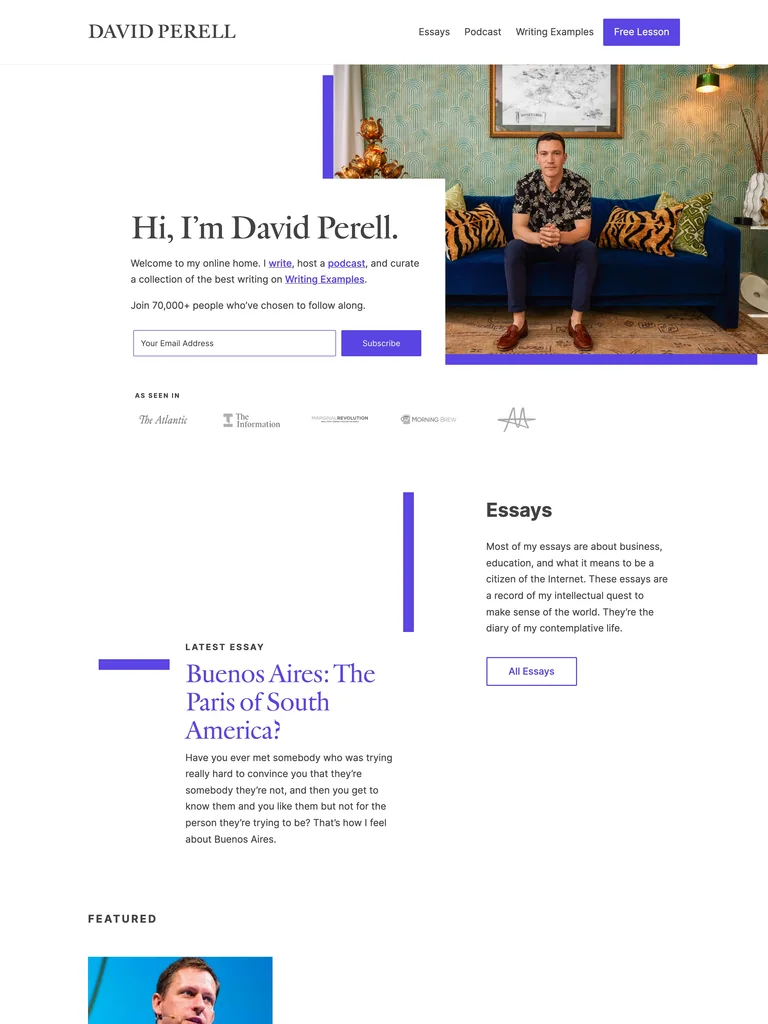
A serif-led personal introduction connects a newsletter to essays and a writing podcast.
Useful for: Giving new readers an immediate subscription route while helping them sample longer work. The free-lesson navigation action offers a second clear entry point. Selection is based on observable design and conversion paths; conversion rates have not been independently verified.
# Design reference: David Perell
Source: https://perell.com/
Swipefile reference: https://swipefile.design/ref/personal-david-perell/
Captured: 2026-09-05. This is a dated reference, not a claim about the current live product.
Capture scope: a page excerpt. Do not infer unseen sections or interactions.

## Objective
Adapt the visual principles below to my project. Use my own content and identity. Do not reproduce logos, proprietary copy, or brand assets.

## Reference notes
- mood: Writer and Podcast Hub. A serif-led personal introduction connects a newsletter to essays and a writing podcast.
- colors: White, dark text, and a vivid purple accent.
- typography: Editorial serif headings with compact sans-serif navigation and form labels.
- layout: Split introduction-and-portrait hero followed by press marks and clearly separated content sections.
- motion: Keep navigation and reading immediate; motion should support the work rather than delay access.
- texture: Purple rules, restrained framing, and natural portrait photography.
- dont: Avoid mixing every content channel into an undifferentiated feed.

Useful for: Giving new readers an immediate subscription route while helping them sample longer work. The free-lesson navigation action offers a second clear entry point. Selection is based on observable design and conversion paths; conversion rates have not been independently verified.

## Acceptance criteria
- Existing project conventions, design tokens, working functionality, and unrelated changes are preserved.
- Two or three reference principles clearly support the user's task; conflicts are resolved in favor of usability and the existing product.
- Reusable components and semantic HTML express the interface. Available licensed assets are used; important UI text is never rendered as a bitmap.
- Every visible control has a defined behavior. Loading, empty, error, success, disabled, and long-content states are specified where relevant. Demo data is clearly labeled.
- Navigation and content adapt at 375px, 768px, and 1440px without horizontal page overflow. Keyboard use, visible focus, labeled inputs, at least 44px touch targets, readable contrast, and reduced motion are supported.
- Verification distinguishes rendered behavior from proposals and identifies anything still requiring a backend or external service.

## Quality bar
Clear hierarchy, consistent spacing, restrained surfaces, and purposeful motion. Avoid decorative gradients, excessive cards, placeholder buttons, and invented metrics unless the project calls for them. Do not claim a feature is connected or tested without evidence.
 hover to scroll
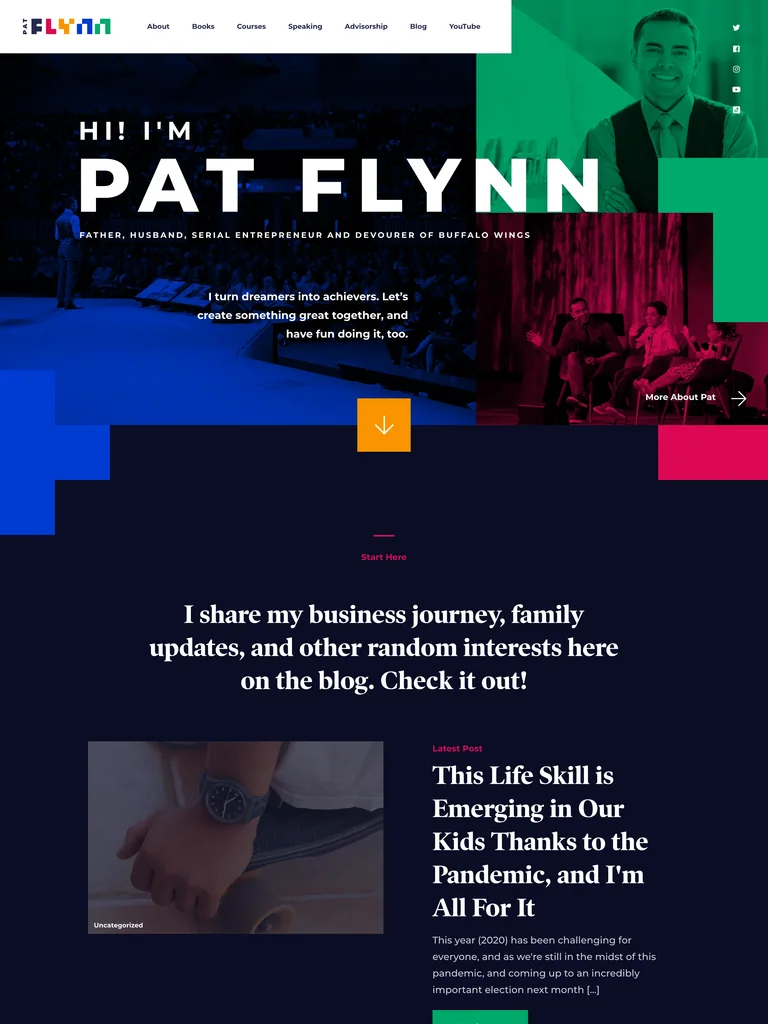
A colorful photographic collage introduces an entrepreneur through both professional work and personal interests.
Useful for: Creating a memorable personal connection while keeping Books, Courses, Speaking, and Advisorship visible in navigation. Content categories offer softer entry points. Selection is based on observable design and conversion paths; conversion rates have not been independently verified.
# Design reference: Pat Flynn
Source: https://patflynn.com/
Swipefile reference: https://swipefile.design/ref/personal-pat-flynn/
Captured: 2026-09-05. This is a dated reference, not a claim about the current live product.
Capture scope: a page excerpt. Do not infer unseen sections or interactions.

## Objective
Adapt the visual principles below to my project. Use my own content and identity. Do not reproduce logos, proprietary copy, or brand assets.

## Reference notes
- mood: Entrepreneur Personal Brand. A colorful photographic collage introduces an entrepreneur through both professional work and personal interests.
- colors: Deep navy with bright green, blue, pink, and yellow accents.
- typography: Widely spaced uppercase identity type paired with editorial section headings.
- layout: Collage hero, personal blog introduction, interest categories, and book promotion.
- motion: Keep navigation and reading immediate; motion should support the work rather than delay access.
- texture: Tinted photography and geometric color blocks.
- dont: Do not let personal interests make the professional routes difficult to find; keep older posts clearly dated.

Useful for: Creating a memorable personal connection while keeping Books, Courses, Speaking, and Advisorship visible in navigation. Content categories offer softer entry points. Selection is based on observable design and conversion paths; conversion rates have not been independently verified.

## Acceptance criteria
- Existing project conventions, design tokens, working functionality, and unrelated changes are preserved.
- Two or three reference principles clearly support the user's task; conflicts are resolved in favor of usability and the existing product.
- Reusable components and semantic HTML express the interface. Available licensed assets are used; important UI text is never rendered as a bitmap.
- Every visible control has a defined behavior. Loading, empty, error, success, disabled, and long-content states are specified where relevant. Demo data is clearly labeled.
- Navigation and content adapt at 375px, 768px, and 1440px without horizontal page overflow. Keyboard use, visible focus, labeled inputs, at least 44px touch targets, readable contrast, and reduced motion are supported.
- Verification distinguishes rendered behavior from proposals and identifies anything still requiring a backend or external service.

## Quality bar
Clear hierarchy, consistent spacing, restrained surfaces, and purposeful motion. Avoid decorative gradients, excessive cards, placeholder buttons, and invented metrics unless the project calls for them. Do not claim a feature is connected or tested without evidence.
 hover to scroll
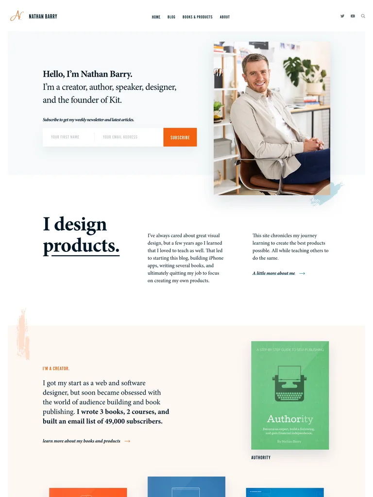
A warm founder introduction connects a newsletter to a visible history of products and teaching.
Useful for: Using shipped books, products, and a company story as evidence behind a personal newsletter. The opening form gives interested readers a direct way to follow along. Selection is based on observable design and conversion paths; conversion rates have not been independently verified.
# Design reference: Nathan Barry
Source: https://nathanbarry.com/
Swipefile reference: https://swipefile.design/ref/personal-nathan-barry/
Captured: 2026-09-05. This is a dated reference, not a claim about the current live product.
Capture scope: a page excerpt. Do not infer unseen sections or interactions.

## Objective
Adapt the visual principles below to my project. Use my own content and identity. Do not reproduce logos, proprietary copy, or brand assets.

## Reference notes
- mood: Founder and Creator Website. A warm founder introduction connects a newsletter to a visible history of products and teaching.
- colors: White, pale blue, warm peach, and orange actions.
- typography: Editorial serif headings with straightforward sans-serif supporting labels.
- layout: Split portrait-and-signup hero followed by product history, books, company context, and media.
- motion: Keep navigation and reading immediate; motion should support the work rather than delay access.
- texture: Book covers, founder photography, and lightly colored editorial sections.
- dont: Do not let a company’s identity overwhelm the personal story or newsletter promise.

Useful for: Using shipped books, products, and a company story as evidence behind a personal newsletter. The opening form gives interested readers a direct way to follow along. Selection is based on observable design and conversion paths; conversion rates have not been independently verified.

## Acceptance criteria
- Existing project conventions, design tokens, working functionality, and unrelated changes are preserved.
- Two or three reference principles clearly support the user's task; conflicts are resolved in favor of usability and the existing product.
- Reusable components and semantic HTML express the interface. Available licensed assets are used; important UI text is never rendered as a bitmap.
- Every visible control has a defined behavior. Loading, empty, error, success, disabled, and long-content states are specified where relevant. Demo data is clearly labeled.
- Navigation and content adapt at 375px, 768px, and 1440px without horizontal page overflow. Keyboard use, visible focus, labeled inputs, at least 44px touch targets, readable contrast, and reduced motion are supported.
- Verification distinguishes rendered behavior from proposals and identifies anything still requiring a backend or external service.

## Quality bar
Clear hierarchy, consistent spacing, restrained surfaces, and purposeful motion. Avoid decorative gradients, excessive cards, placeholder buttons, and invented metrics unless the project calls for them. Do not claim a feature is connected or tested without evidence.
 hover to scroll
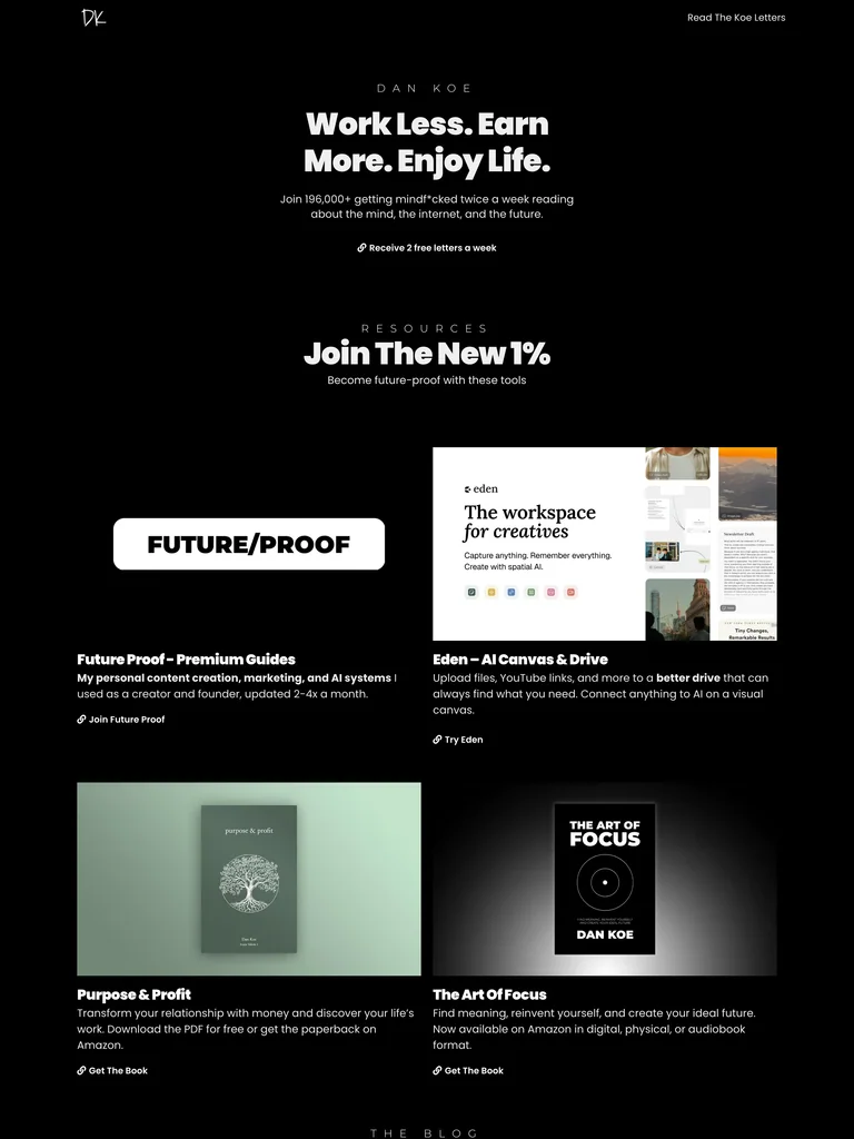
A stark black personal brand organizes a newsletter, books, tools, and essays around one worldview.
Useful for: Making the newsletter the first entry point, then presenting named resources with concrete destinations. The grid helps returning readers find a product without reading the full page. Selection is based on observable design and conversion paths; conversion rates have not been independently verified.
# Design reference: Dan Koe
Source: https://thedankoe.com/
Swipefile reference: https://swipefile.design/ref/personal-dan-koe/
Captured: 2026-09-05. This is a dated reference, not a claim about the current live product.
Capture scope: a page excerpt. Do not infer unseen sections or interactions.

## Objective
Adapt the visual principles below to my project. Use my own content and identity. Do not reproduce logos, proprietary copy, or brand assets.

## Reference notes
- mood: Creator Resource Hub. A stark black personal brand organizes a newsletter, books, tools, and essays around one worldview.
- colors: Black and white with muted book-cover colors.
- typography: Bold centered sans-serif headings with smaller spaced section labels.
- layout: Short centered introduction, a two-column resource grid, article grid, and biography.
- motion: Keep navigation and reading immediate; motion should support the work rather than delay access.
- texture: Monochrome editorial illustrations and restrained product covers.
- dont: Do not substitute aspirational slogans for clear descriptions of each resource.

Useful for: Making the newsletter the first entry point, then presenting named resources with concrete destinations. The grid helps returning readers find a product without reading the full page. Selection is based on observable design and conversion paths; conversion rates have not been independently verified.

## Acceptance criteria
- Existing project conventions, design tokens, working functionality, and unrelated changes are preserved.
- Two or three reference principles clearly support the user's task; conflicts are resolved in favor of usability and the existing product.
- Reusable components and semantic HTML express the interface. Available licensed assets are used; important UI text is never rendered as a bitmap.
- Every visible control has a defined behavior. Loading, empty, error, success, disabled, and long-content states are specified where relevant. Demo data is clearly labeled.
- Navigation and content adapt at 375px, 768px, and 1440px without horizontal page overflow. Keyboard use, visible focus, labeled inputs, at least 44px touch targets, readable contrast, and reduced motion are supported.
- Verification distinguishes rendered behavior from proposals and identifies anything still requiring a backend or external service.

## Quality bar
Clear hierarchy, consistent spacing, restrained surfaces, and purposeful motion. Avoid decorative gradients, excessive cards, placeholder buttons, and invented metrics unless the project calls for them. Do not claim a feature is connected or tested without evidence.
 hover to scroll
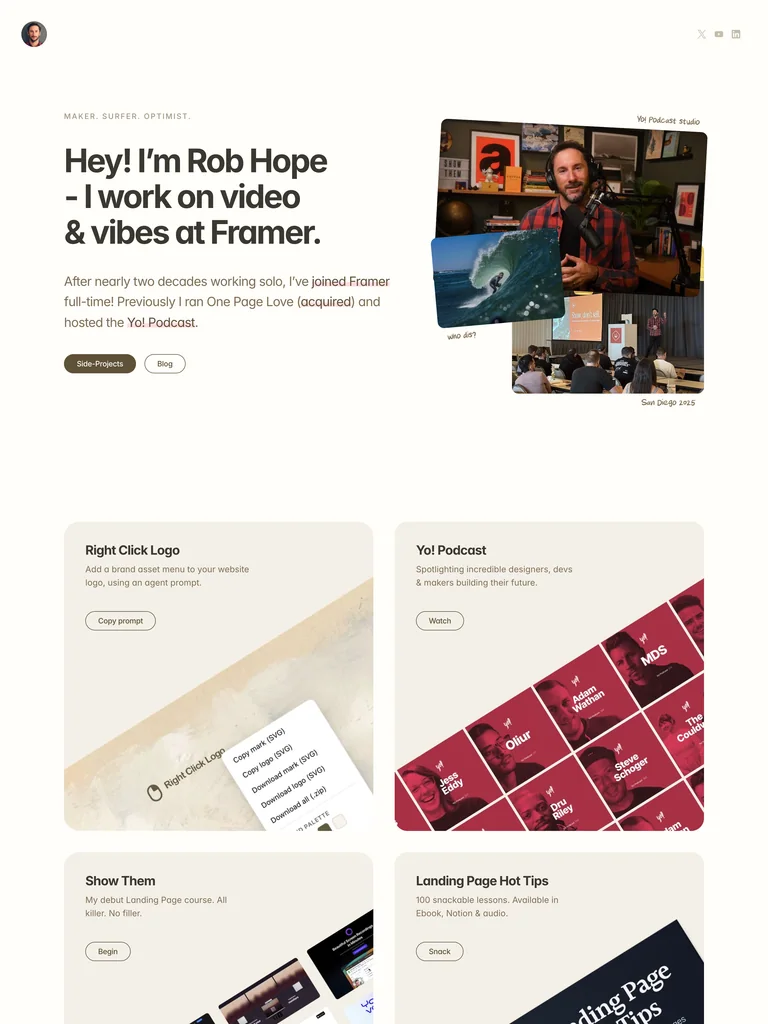
A warm personal homepage pairs a clear current role with projects that visitors can immediately try or buy.
Useful for: Connecting personal credibility to specific destinations: a podcast, a landing-page course, a book, and useful tools. Project cards explain the offer before the action. Selection is based on observable design and conversion paths; conversion rates have not been independently verified.
# Design reference: Rob Hope
Source: https://robhope.com/
Swipefile reference: https://swipefile.design/ref/personal-rob-hope/
Captured: 2026-09-05. This is a dated reference, not a claim about the current live product.


## Objective
Adapt the visual principles below to my project. Use my own content and identity. Do not reproduce logos, proprietary copy, or brand assets.

## Reference notes
- mood: Warm Maker Portfolio. A warm personal homepage pairs a clear current role with projects that visitors can immediately try or buy.
- colors: Warm white, muted olive-brown, cream panels, and color from photography and project art.
- typography: Friendly bold sans-serif headings with relaxed supporting copy.
- layout: Split introduction-and-photo-collage hero, a two-by-two project grid, recent writing, and a personal biography.
- motion: Keep navigation and reading immediate; motion should support the work rather than delay access.
- texture: Slightly rotated photos, handwritten captions, and softly rounded cards.
- dont: Avoid vague project buttons; name what visitors will watch, learn, or use.

Useful for: Connecting personal credibility to specific destinations: a podcast, a landing-page course, a book, and useful tools. Project cards explain the offer before the action. Selection is based on observable design and conversion paths; conversion rates have not been independently verified.

## Acceptance criteria
- Existing project conventions, design tokens, working functionality, and unrelated changes are preserved.
- Two or three reference principles clearly support the user's task; conflicts are resolved in favor of usability and the existing product.
- Reusable components and semantic HTML express the interface. Available licensed assets are used; important UI text is never rendered as a bitmap.
- Every visible control has a defined behavior. Loading, empty, error, success, disabled, and long-content states are specified where relevant. Demo data is clearly labeled.
- Navigation and content adapt at 375px, 768px, and 1440px without horizontal page overflow. Keyboard use, visible focus, labeled inputs, at least 44px touch targets, readable contrast, and reduced motion are supported.
- Verification distinguishes rendered behavior from proposals and identifies anything still requiring a backend or external service.

## Quality bar
Clear hierarchy, consistent spacing, restrained surfaces, and purposeful motion. Avoid decorative gradients, excessive cards, placeholder buttons, and invented metrics unless the project calls for them. Do not claim a feature is connected or tested without evidence.
Allow basic usage counts to help us understand what is useful. Your board contents stay out of analytics. Details
Your browser’s privacy preference keeps analytics off.