Product Showcase
CURATED COLLECTION · 16 REFERENCES
Sixteen live website references across personal brands, architecture, commerce, reports, and creative studios. Selected for observable design choices.
Copy the reference notes below and paste them into Claude, ChatGPT, or your coding assistant. Add what you want to build.
Includes design notes, original sources, and preview links. An assistant that supports browsing can also read the public board link.
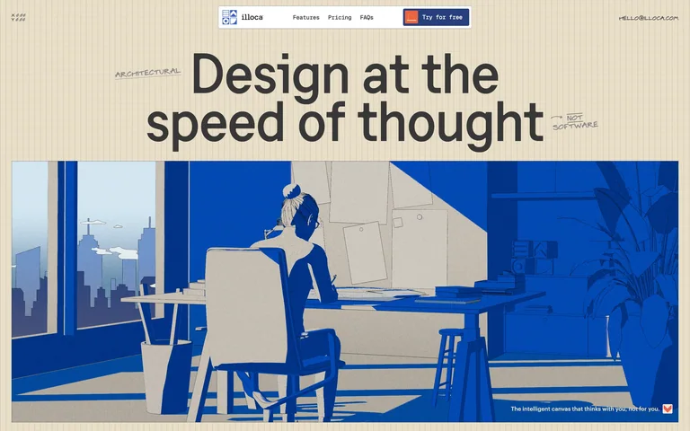
Architectural illustration turns a complex AI design product into an approachable workspace. A compact floating navigation leads directly to features, pricing, and a free trial.
Useful for: Architectural software launches that need to explain both the workflow and the first step.
# Design reference: Illoca
Source: https://illoca.unseen.co/
Swipefile reference: https://swipefile.design/ref/awwwards-illoca/
Captured: 2026-09-05. This is a dated reference, not a claim about the current live product.
Capture scope: one viewport. Do not infer unseen page sections or a complete user flow.

## Objective
Adapt the visual principles below to my project. Use my own content and identity. Do not reproduce logos, proprietary copy, or brand assets.

## Reference notes
- mood: Warm and precise
- colors: Cream, cobalt blue, black
- typography: Large restrained sans headlines and small technical labels
- layout: Centered headline above a wide architectural illustration; compact floating navigation
- motion: Static capture of a live site. Open the source to study its interactive behavior.
- texture: Fine vertical rules and flat architectural drawing
- dont: Adapt the hierarchy and visual principles to your own content; avoid copying the identity, imagery, or exact layout.

Useful for: Architectural software launches that need to explain both the workflow and the first step.

## Acceptance criteria
- Existing project conventions, design tokens, working functionality, and unrelated changes are preserved.
- Two or three reference principles clearly support the user's task; conflicts are resolved in favor of usability and the existing product.
- Reusable components and semantic HTML express the interface. Available licensed assets are used; important UI text is never rendered as a bitmap.
- Every visible control has a defined behavior. Loading, empty, error, success, disabled, and long-content states are specified where relevant. Demo data is clearly labeled.
- Navigation and content adapt at 375px, 768px, and 1440px without horizontal page overflow. Keyboard use, visible focus, labeled inputs, at least 44px touch targets, readable contrast, and reduced motion are supported.
- Verification distinguishes rendered behavior from proposals and identifies anything still requiring a backend or external service.

## Quality bar
Clear hierarchy, consistent spacing, restrained surfaces, and purposeful motion. Avoid decorative gradients, excessive cards, placeholder buttons, and invented metrics unless the project calls for them. Do not claim a feature is connected or tested without evidence.
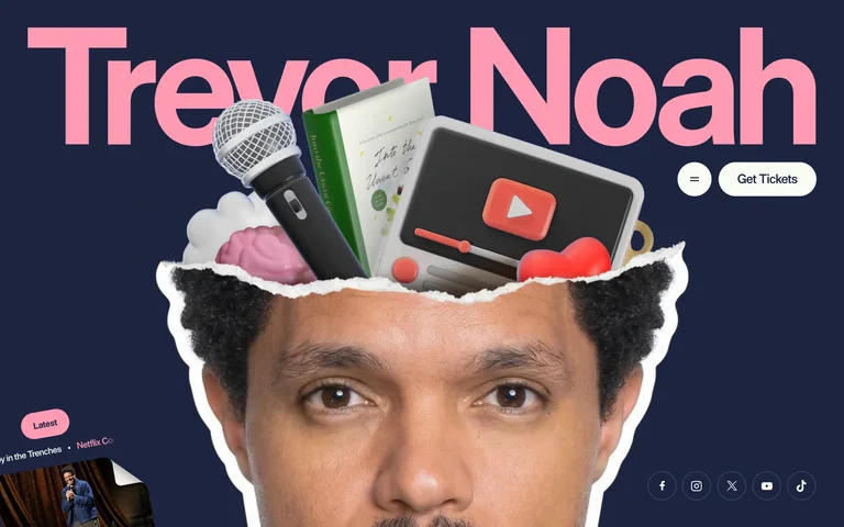
A cut-paper portrait, objects, and an oversized pink name create a memorable personal identity, with a small Get Tickets action that stays easy to spot.
Useful for: Creators and performers who need one recognizable identity across several kinds of media.
# Design reference: Trevor Noah
Source: https://www.trevornoah.com/
Swipefile reference: https://swipefile.design/ref/awwwards-trevor-noah/
Captured: 2026-09-05. This is a dated reference, not a claim about the current live product.
Capture scope: one viewport. Do not infer unseen page sections or a complete user flow.

## Objective
Adapt the visual principles below to my project. Use my own content and identity. Do not reproduce logos, proprietary copy, or brand assets.

## Reference notes
- mood: Playful and recognizably personal
- colors: Deep navy, pink, white
- typography: Oversized sans name with compact navigation labels
- layout: Full-width name above a portrait collage; ticket action in the upper-right
- motion: Static capture of a live site. Open the source to study its interactive behavior.
- texture: Photographic cutouts and layered objects
- dont: Adapt the hierarchy and visual principles to your own content; avoid copying the identity, imagery, or exact layout.

Useful for: Creators and performers who need one recognizable identity across several kinds of media.

## Acceptance criteria
- Existing project conventions, design tokens, working functionality, and unrelated changes are preserved.
- Two or three reference principles clearly support the user's task; conflicts are resolved in favor of usability and the existing product.
- Reusable components and semantic HTML express the interface. Available licensed assets are used; important UI text is never rendered as a bitmap.
- Every visible control has a defined behavior. Loading, empty, error, success, disabled, and long-content states are specified where relevant. Demo data is clearly labeled.
- Navigation and content adapt at 375px, 768px, and 1440px without horizontal page overflow. Keyboard use, visible focus, labeled inputs, at least 44px touch targets, readable contrast, and reduced motion are supported.
- Verification distinguishes rendered behavior from proposals and identifies anything still requiring a backend or external service.

## Quality bar
Clear hierarchy, consistent spacing, restrained surfaces, and purposeful motion. Avoid decorative gradients, excessive cards, placeholder buttons, and invented metrics unless the project calls for them. Do not claim a feature is connected or tested without evidence.
 hover to scroll
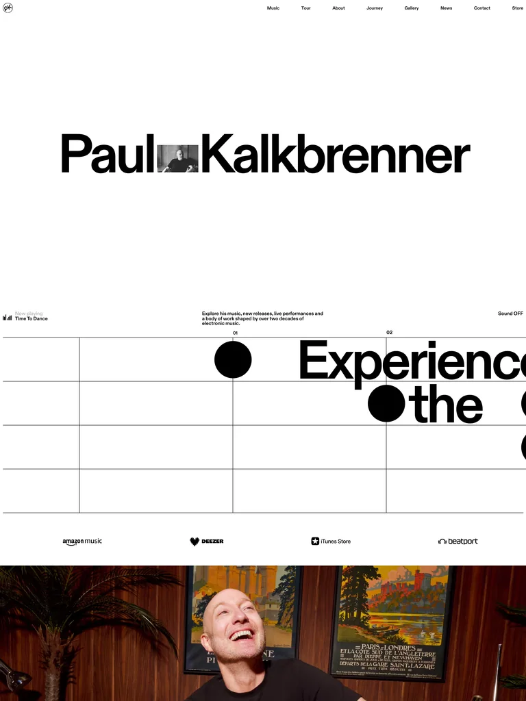
An enormous wordmark shares the opening with a tiny performance image; music, releases, and tour dates organize the rest of the artist identity.
Useful for: Musicians and creators whose work, releases, and events need separate paths.
# Design reference: Paul Kalkbrenner
Source: https://www.paulkalkbrenner.net/
Swipefile reference: https://swipefile.design/ref/awwwards-paul-kalkbrenner/
Captured: 2026-09-05. This is a dated reference, not a claim about the current live product.
Capture scope: a page excerpt. Do not infer unseen sections or interactions.

## Objective
Adapt the visual principles below to my project. Use my own content and identity. Do not reproduce logos, proprietary copy, or brand assets.

## Reference notes
- mood: Confident and spare
- colors: White, black, lime accents
- typography: Heavy sans display type paired with small utility text
- layout: Sparse opening, broad type-led transitions, then recordings and performance imagery
- motion: Static capture of a live site. Open the source to study its interactive behavior.
- texture: Fine grid rules and photographic media
- dont: Adapt the hierarchy and visual principles to your own content; avoid copying the identity, imagery, or exact layout.

Useful for: Musicians and creators whose work, releases, and events need separate paths.

## Acceptance criteria
- Existing project conventions, design tokens, working functionality, and unrelated changes are preserved.
- Two or three reference principles clearly support the user's task; conflicts are resolved in favor of usability and the existing product.
- Reusable components and semantic HTML express the interface. Available licensed assets are used; important UI text is never rendered as a bitmap.
- Every visible control has a defined behavior. Loading, empty, error, success, disabled, and long-content states are specified where relevant. Demo data is clearly labeled.
- Navigation and content adapt at 375px, 768px, and 1440px without horizontal page overflow. Keyboard use, visible focus, labeled inputs, at least 44px touch targets, readable contrast, and reduced motion are supported.
- Verification distinguishes rendered behavior from proposals and identifies anything still requiring a backend or external service.

## Quality bar
Clear hierarchy, consistent spacing, restrained surfaces, and purposeful motion. Avoid decorative gradients, excessive cards, placeholder buttons, and invented metrics unless the project calls for them. Do not claim a feature is connected or tested without evidence.
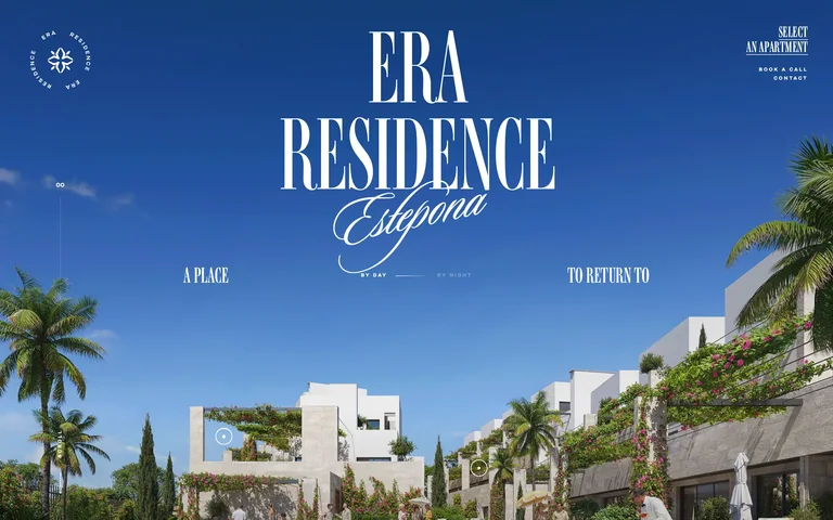
A residential development feels like a destination through a full-bleed architectural image, tall serif lettering, and a handwritten place name.
Useful for: Property and hospitality pages where the setting supplies most of the first impression.
# Design reference: ERA Residence
Source: https://www.era-residence.com/
Swipefile reference: https://swipefile.design/ref/awwwards-era-residence/
Captured: 2026-09-05. This is a dated reference, not a claim about the current live product.
Capture scope: one viewport. Do not infer unseen page sections or a complete user flow.

## Objective
Adapt the visual principles below to my project. Use my own content and identity. Do not reproduce logos, proprietary copy, or brand assets.

## Reference notes
- mood: Sunny and aspirational
- colors: Mediterranean blue, ivory, dark wine
- typography: Tall condensed serif display and a script accent
- layout: A centered identity overlays the architectural hero; small navigation occupies the corners
- motion: Static capture of a live site. Open the source to study its interactive behavior.
- texture: Architectural rendering with photographic landscape detail
- dont: Adapt the hierarchy and visual principles to your own content; avoid copying the identity, imagery, or exact layout.

Useful for: Property and hospitality pages where the setting supplies most of the first impression.

## Acceptance criteria
- Existing project conventions, design tokens, working functionality, and unrelated changes are preserved.
- Two or three reference principles clearly support the user's task; conflicts are resolved in favor of usability and the existing product.
- Reusable components and semantic HTML express the interface. Available licensed assets are used; important UI text is never rendered as a bitmap.
- Every visible control has a defined behavior. Loading, empty, error, success, disabled, and long-content states are specified where relevant. Demo data is clearly labeled.
- Navigation and content adapt at 375px, 768px, and 1440px without horizontal page overflow. Keyboard use, visible focus, labeled inputs, at least 44px touch targets, readable contrast, and reduced motion are supported.
- Verification distinguishes rendered behavior from proposals and identifies anything still requiring a backend or external service.

## Quality bar
Clear hierarchy, consistent spacing, restrained surfaces, and purposeful motion. Avoid decorative gradients, excessive cards, placeholder buttons, and invented metrics unless the project calls for them. Do not claim a feature is connected or tested without evidence.
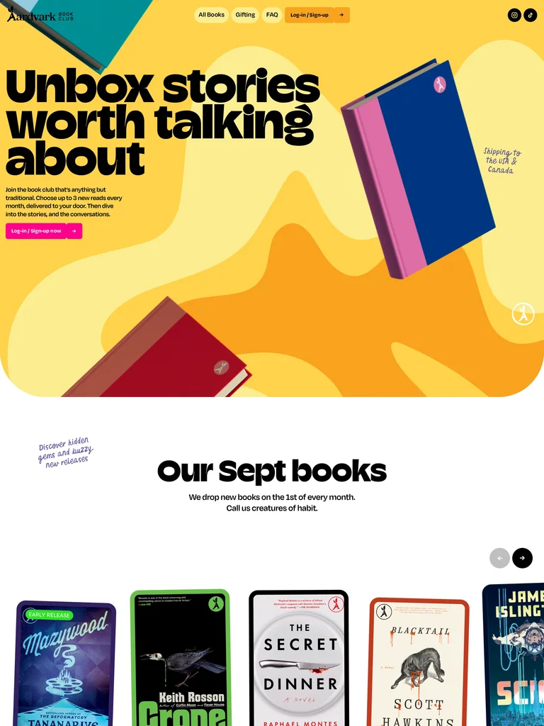 hover to scroll
Oversized black headlines and vivid book covers make the subscription tangible. A current book shelf leads into four illustrated steps explaining how membership works.
Useful for: Subscriptions and clubs that need to show the product before explaining membership.
# Design reference: Aardvark Book Club
Source: https://www.aardvarkbookclub.com/
Swipefile reference: https://swipefile.design/ref/awwwards-aardvark-book-club/
Captured: 2026-09-05. This is a dated reference, not a claim about the current live product.
Capture scope: a page excerpt. Do not infer unseen sections or interactions.

## Objective
Adapt the visual principles below to my project. Use my own content and identity. Do not reproduce logos, proprietary copy, or brand assets.

## Reference notes
- mood: Bright and welcoming
- colors: Yellow, orange, pink, aqua, black
- typography: Heavy rounded sans headlines with short compact descriptions
- layout: Product-led hero, horizontal book shelf, then an illustrated how-it-works panel
- motion: Static capture of a live site. Open the source to study its interactive behavior.
- texture: Flat color fields, book covers, simple illustrations
- dont: Adapt the hierarchy and visual principles to your own content; avoid copying the identity, imagery, or exact layout.

Useful for: Subscriptions and clubs that need to show the product before explaining membership.

## Acceptance criteria
- Existing project conventions, design tokens, working functionality, and unrelated changes are preserved.
- Two or three reference principles clearly support the user's task; conflicts are resolved in favor of usability and the existing product.
- Reusable components and semantic HTML express the interface. Available licensed assets are used; important UI text is never rendered as a bitmap.
- Every visible control has a defined behavior. Loading, empty, error, success, disabled, and long-content states are specified where relevant. Demo data is clearly labeled.
- Navigation and content adapt at 375px, 768px, and 1440px without horizontal page overflow. Keyboard use, visible focus, labeled inputs, at least 44px touch targets, readable contrast, and reduced motion are supported.
- Verification distinguishes rendered behavior from proposals and identifies anything still requiring a backend or external service.

## Quality bar
Clear hierarchy, consistent spacing, restrained surfaces, and purposeful motion. Avoid decorative gradients, excessive cards, placeholder buttons, and invented metrics unless the project calls for them. Do not claim a feature is connected or tested without evidence.
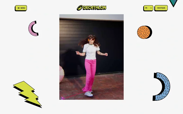
Retro stickers frame a vertical sports clip, giving a heritage campaign the visual language of a scrapbook rather than a standard product grid.
Useful for: Sports, nostalgia, and cultural campaigns with a strong archive of visual material.
# Design reference: Decathlon Yestalgia
Source: https://decathlonyestalgia.com/fr/
Swipefile reference: https://swipefile.design/ref/awwwards-decathlon-yestalgia/
Captured: 2026-09-05. This is a dated reference, not a claim about the current live product.
Capture scope: one viewport. Do not infer unseen page sections or a complete user flow.

## Objective
Adapt the visual principles below to my project. Use my own content and identity. Do not reproduce logos, proprietary copy, or brand assets.

## Reference notes
- mood: Nostalgic and energetic
- colors: Off-white, acid yellow, pink, black
- typography: Compact utility labels around the campaign identity
- layout: Centered portrait media surrounded by stickers, with compact corner controls
- motion: Static capture of a live site. Open the source to study its interactive behavior.
- texture: Sticker graphics and archival-looking video imagery
- dont: Adapt the hierarchy and visual principles to your own content; avoid copying the identity, imagery, or exact layout.

Useful for: Sports, nostalgia, and cultural campaigns with a strong archive of visual material.

## Acceptance criteria
- Existing project conventions, design tokens, working functionality, and unrelated changes are preserved.
- Two or three reference principles clearly support the user's task; conflicts are resolved in favor of usability and the existing product.
- Reusable components and semantic HTML express the interface. Available licensed assets are used; important UI text is never rendered as a bitmap.
- Every visible control has a defined behavior. Loading, empty, error, success, disabled, and long-content states are specified where relevant. Demo data is clearly labeled.
- Navigation and content adapt at 375px, 768px, and 1440px without horizontal page overflow. Keyboard use, visible focus, labeled inputs, at least 44px touch targets, readable contrast, and reduced motion are supported.
- Verification distinguishes rendered behavior from proposals and identifies anything still requiring a backend or external service.

## Quality bar
Clear hierarchy, consistent spacing, restrained surfaces, and purposeful motion. Avoid decorative gradients, excessive cards, placeholder buttons, and invented metrics unless the project calls for them. Do not claim a feature is connected or tested without evidence.
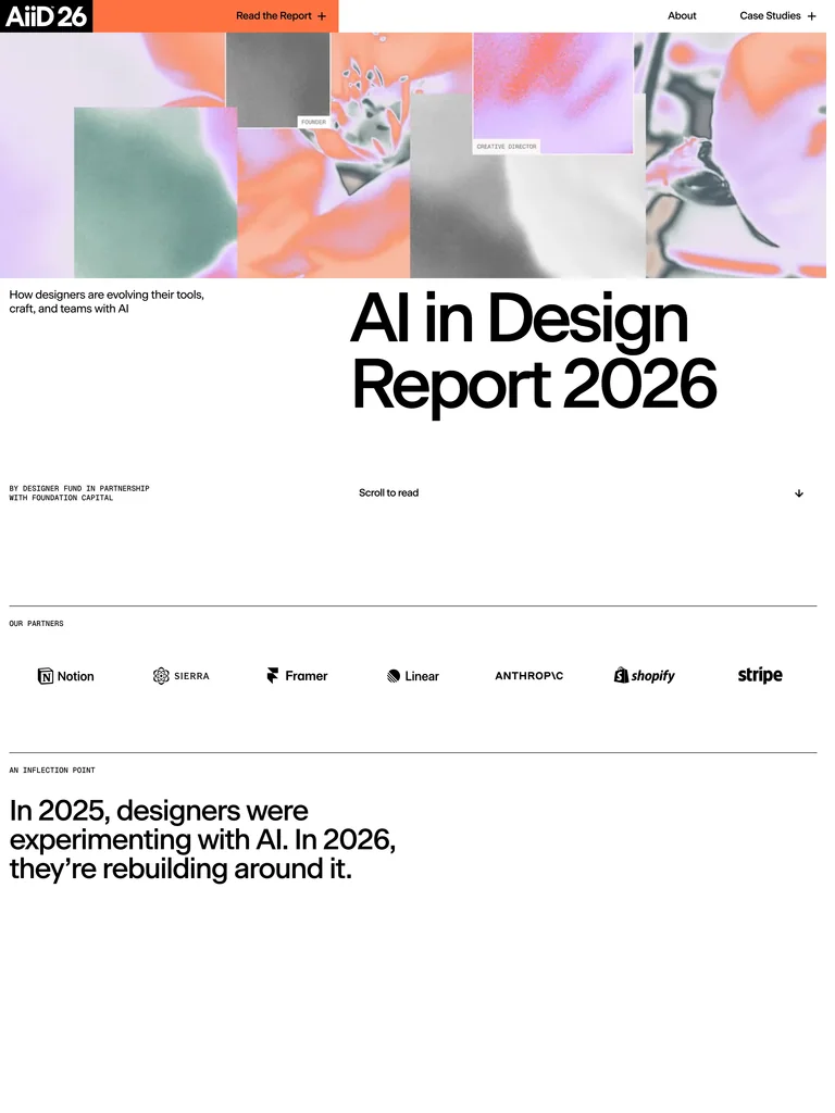 hover to scroll
A colorful image strip introduces an otherwise disciplined report layout: a large title, contributor row, and generous spacing make the research feel editorial.
Useful for: Reports and research publications that need a strong cover and a readable hierarchy.
# Design reference: Ai in Design Report 2026
Source: https://stateofaidesign.com/
Swipefile reference: https://swipefile.design/ref/awwwards-ai-in-design-report-2026/
Captured: 2026-09-05. This is a dated reference, not a claim about the current live product.
Capture scope: a page excerpt. Do not infer unseen sections or interactions.

## Objective
Adapt the visual principles below to my project. Use my own content and identity. Do not reproduce logos, proprietary copy, or brand assets.

## Reference notes
- mood: Clear and inquisitive
- colors: White, black, coral, pastel image colors
- typography: Large sans report title, small labels, readable body copy
- layout: Image strip and offset title lead into contributor logos and long-form sections
- motion: Static capture of a live site. Open the source to study its interactive behavior.
- texture: Image collage balanced by thin horizontal rules
- dont: Adapt the hierarchy and visual principles to your own content; avoid copying the identity, imagery, or exact layout.

Useful for: Reports and research publications that need a strong cover and a readable hierarchy.

## Acceptance criteria
- Existing project conventions, design tokens, working functionality, and unrelated changes are preserved.
- Two or three reference principles clearly support the user's task; conflicts are resolved in favor of usability and the existing product.
- Reusable components and semantic HTML express the interface. Available licensed assets are used; important UI text is never rendered as a bitmap.
- Every visible control has a defined behavior. Loading, empty, error, success, disabled, and long-content states are specified where relevant. Demo data is clearly labeled.
- Navigation and content adapt at 375px, 768px, and 1440px without horizontal page overflow. Keyboard use, visible focus, labeled inputs, at least 44px touch targets, readable contrast, and reduced motion are supported.
- Verification distinguishes rendered behavior from proposals and identifies anything still requiring a backend or external service.

## Quality bar
Clear hierarchy, consistent spacing, restrained surfaces, and purposeful motion. Avoid decorative gradients, excessive cards, placeholder buttons, and invented metrics unless the project calls for them. Do not claim a feature is connected or tested without evidence.
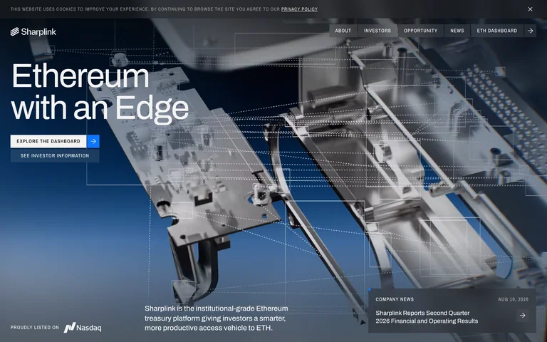
An industrial-looking 3D assembly fills the hero behind a short headline, two action routes, and a compact news panel.
Useful for: Technical product pages that need a concrete visual metaphor and distinct dashboard and information paths.
# Design reference: Sharplink
Source: https://www.sharplink.com/
Swipefile reference: https://swipefile.design/ref/awwwards-sharplink/
Captured: 2026-09-05. This is a dated reference, not a claim about the current live product.
Capture scope: one viewport. Do not infer unseen page sections or a complete user flow.

## Objective
Adapt the visual principles below to my project. Use my own content and identity. Do not reproduce logos, proprietary copy, or brand assets.

## Reference notes
- mood: Technical and institutional
- colors: Steel blue, white, charcoal
- typography: Large light sans headline with small uppercase navigation
- layout: Full-bleed machinery visual with left-aligned actions and supporting information along the bottom
- motion: Static capture of a live site. Open the source to study its interactive behavior.
- texture: Metallic 3D surfaces and translucent interface framing
- dont: Adapt the hierarchy and visual principles to your own content; avoid copying the identity, imagery, or exact layout.

Useful for: Technical product pages that need a concrete visual metaphor and distinct dashboard and information paths.

## Acceptance criteria
- Existing project conventions, design tokens, working functionality, and unrelated changes are preserved.
- Two or three reference principles clearly support the user's task; conflicts are resolved in favor of usability and the existing product.
- Reusable components and semantic HTML express the interface. Available licensed assets are used; important UI text is never rendered as a bitmap.
- Every visible control has a defined behavior. Loading, empty, error, success, disabled, and long-content states are specified where relevant. Demo data is clearly labeled.
- Navigation and content adapt at 375px, 768px, and 1440px without horizontal page overflow. Keyboard use, visible focus, labeled inputs, at least 44px touch targets, readable contrast, and reduced motion are supported.
- Verification distinguishes rendered behavior from proposals and identifies anything still requiring a backend or external service.

## Quality bar
Clear hierarchy, consistent spacing, restrained surfaces, and purposeful motion. Avoid decorative gradients, excessive cards, placeholder buttons, and invented metrics unless the project calls for them. Do not claim a feature is connected or tested without evidence.
 hover to scroll
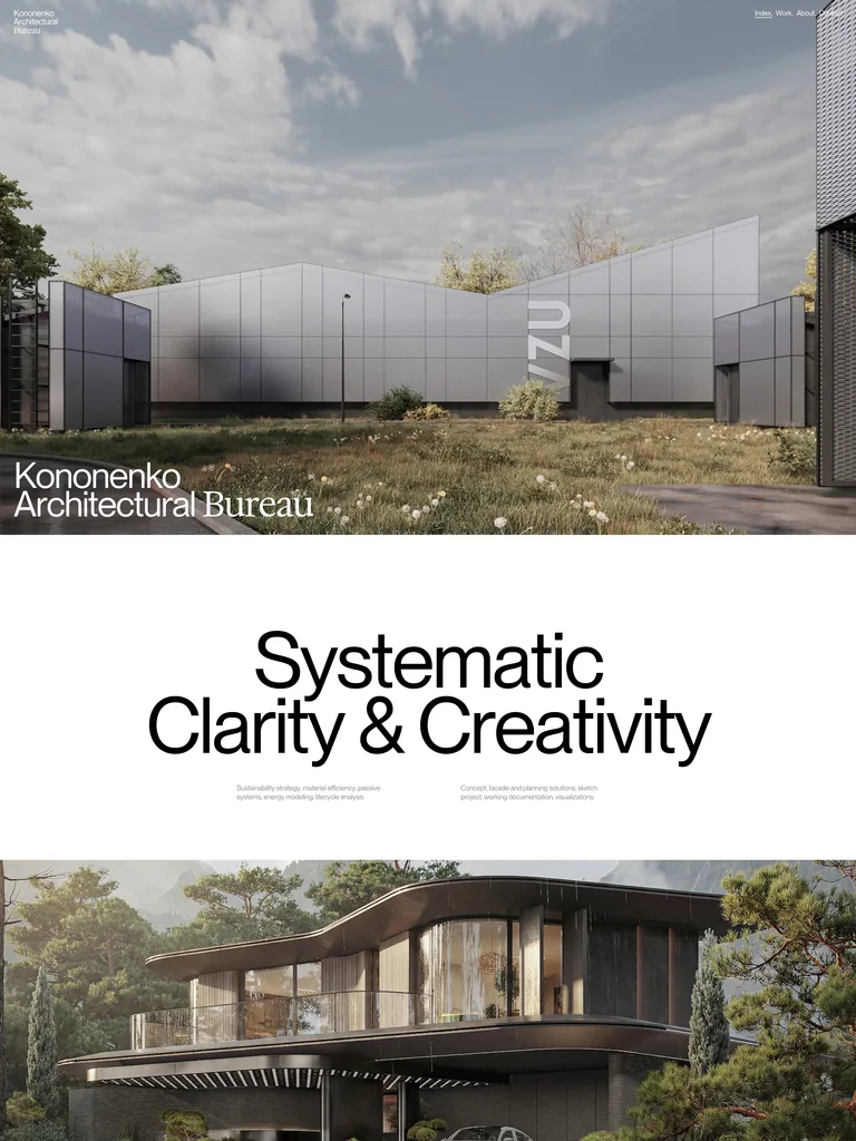
Architecture leads the page, followed by a large statement and a sparse studio profile. Mixing sans and serif display type gives the project work an editorial rhythm.
Useful for: Architecture and design practices whose project photography should carry the presentation.
# Design reference: Kononenko Architectural Bureau
Source: https://kononenkogroup.com/
Swipefile reference: https://swipefile.design/ref/awwwards-kononenko-architectural-bureau/
Captured: 2026-09-05. This is a dated reference, not a claim about the current live product.
Capture scope: a page excerpt. Do not infer unseen sections or interactions.

## Objective
Adapt the visual principles below to my project. Use my own content and identity. Do not reproduce logos, proprietary copy, or brand assets.

## Reference notes
- mood: Quiet and deliberate
- colors: White, black, neutral architecture photography
- typography: Large sans statements alternating with expressive serif service text
- layout: Full-bleed project image, centered statement, second project image, then a split studio profile
- motion: Static capture of a live site. Open the source to study its interactive behavior.
- texture: Natural materials in imagery with a flat paper-like page
- dont: Adapt the hierarchy and visual principles to your own content; avoid copying the identity, imagery, or exact layout.

Useful for: Architecture and design practices whose project photography should carry the presentation.

## Acceptance criteria
- Existing project conventions, design tokens, working functionality, and unrelated changes are preserved.
- Two or three reference principles clearly support the user's task; conflicts are resolved in favor of usability and the existing product.
- Reusable components and semantic HTML express the interface. Available licensed assets are used; important UI text is never rendered as a bitmap.
- Every visible control has a defined behavior. Loading, empty, error, success, disabled, and long-content states are specified where relevant. Demo data is clearly labeled.
- Navigation and content adapt at 375px, 768px, and 1440px without horizontal page overflow. Keyboard use, visible focus, labeled inputs, at least 44px touch targets, readable contrast, and reduced motion are supported.
- Verification distinguishes rendered behavior from proposals and identifies anything still requiring a backend or external service.

## Quality bar
Clear hierarchy, consistent spacing, restrained surfaces, and purposeful motion. Avoid decorative gradients, excessive cards, placeholder buttons, and invented metrics unless the project calls for them. Do not claim a feature is connected or tested without evidence.
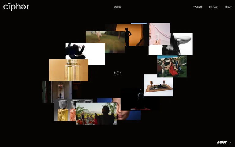
A floating cluster of project thumbnails occupies the center of a near-black canvas. The quiet wordmark and perimeter navigation keep the work as the main event.
Useful for: Film and motion portfolios that can communicate through a diverse body of visual work.
# Design reference: Cipher
Source: https://cipher.tv/
Swipefile reference: https://swipefile.design/ref/awwwards-cipher/
Captured: 2026-09-05. This is a dated reference, not a claim about the current live product.
Capture scope: one viewport. Do not infer unseen page sections or a complete user flow.

## Objective
Adapt the visual principles below to my project. Use my own content and identity. Do not reproduce logos, proprietary copy, or brand assets.

## Reference notes
- mood: Cinematic and exploratory
- colors: Near-black, white, varied media thumbnails
- typography: Small neutral sans navigation and a distinctive lowercase wordmark
- layout: Central spatial cluster of work, surrounded by generous negative space
- motion: Static capture of a live site. Open the source to study its interactive behavior.
- texture: Overlapping photographic and video stills
- dont: Adapt the hierarchy and visual principles to your own content; avoid copying the identity, imagery, or exact layout.

Useful for: Film and motion portfolios that can communicate through a diverse body of visual work.

## Acceptance criteria
- Existing project conventions, design tokens, working functionality, and unrelated changes are preserved.
- Two or three reference principles clearly support the user's task; conflicts are resolved in favor of usability and the existing product.
- Reusable components and semantic HTML express the interface. Available licensed assets are used; important UI text is never rendered as a bitmap.
- Every visible control has a defined behavior. Loading, empty, error, success, disabled, and long-content states are specified where relevant. Demo data is clearly labeled.
- Navigation and content adapt at 375px, 768px, and 1440px without horizontal page overflow. Keyboard use, visible focus, labeled inputs, at least 44px touch targets, readable contrast, and reduced motion are supported.
- Verification distinguishes rendered behavior from proposals and identifies anything still requiring a backend or external service.

## Quality bar
Clear hierarchy, consistent spacing, restrained surfaces, and purposeful motion. Avoid decorative gradients, excessive cards, placeholder buttons, and invented metrics unless the project calls for them. Do not claim a feature is connected or tested without evidence.
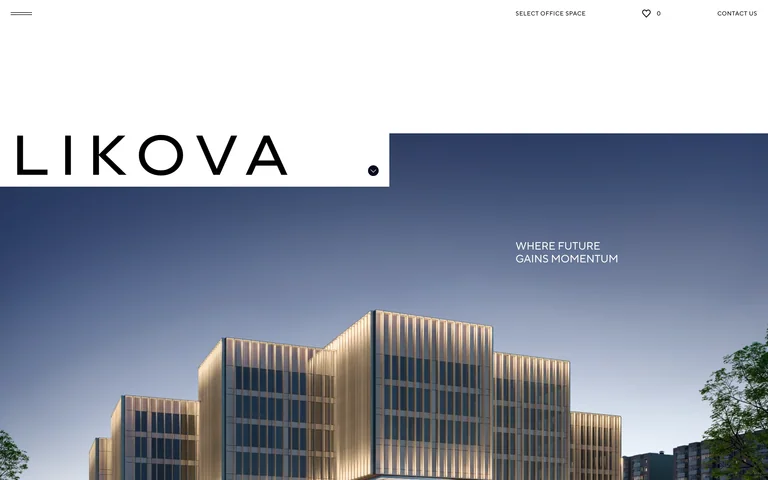
A widely spaced wordmark sits on a white architectural header above a dramatic building image, with direct routes to office selection and contact.
Useful for: Commercial property sites balancing a strong architectural identity with practical leasing actions.
# Design reference: LIKOVA
Source: https://likova.space/
Swipefile reference: https://swipefile.design/ref/awwwards-likova/
Captured: 2026-09-05. This is a dated reference, not a claim about the current live product.
Capture scope: one viewport. Do not infer unseen page sections or a complete user flow.

## Objective
Adapt the visual principles below to my project. Use my own content and identity. Do not reproduce logos, proprietary copy, or brand assets.

## Reference notes
- mood: Architectural and composed
- colors: White, black, midnight blue, warm architectural lighting
- typography: Widely spaced capital wordmark and tiny utility labels
- layout: Generous white header with an offset edge leading into the building image
- motion: Static capture of a live site. Open the source to study its interactive behavior.
- texture: Building visualization, evening sky, crisp flat header
- dont: Adapt the hierarchy and visual principles to your own content; avoid copying the identity, imagery, or exact layout.

Useful for: Commercial property sites balancing a strong architectural identity with practical leasing actions.

## Acceptance criteria
- Existing project conventions, design tokens, working functionality, and unrelated changes are preserved.
- Two or three reference principles clearly support the user's task; conflicts are resolved in favor of usability and the existing product.
- Reusable components and semantic HTML express the interface. Available licensed assets are used; important UI text is never rendered as a bitmap.
- Every visible control has a defined behavior. Loading, empty, error, success, disabled, and long-content states are specified where relevant. Demo data is clearly labeled.
- Navigation and content adapt at 375px, 768px, and 1440px without horizontal page overflow. Keyboard use, visible focus, labeled inputs, at least 44px touch targets, readable contrast, and reduced motion are supported.
- Verification distinguishes rendered behavior from proposals and identifies anything still requiring a backend or external service.

## Quality bar
Clear hierarchy, consistent spacing, restrained surfaces, and purposeful motion. Avoid decorative gradients, excessive cards, placeholder buttons, and invented metrics unless the project calls for them. Do not claim a feature is connected or tested without evidence.
 hover to scroll
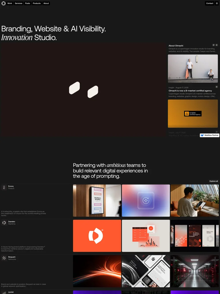
A compact services statement and a quiet brand mark introduce a dark studio page. Dense project thumbnails and short supporting sections quickly add evidence.
Useful for: Small studios that need to connect a clear offer to a substantial body of work.
# Design reference: Oimachi
Source: https://www.oimachi.co/
Swipefile reference: https://swipefile.design/ref/awwwards-oimachi/
Captured: 2026-09-05. This is a dated reference, not a claim about the current live product.
Capture scope: a page excerpt. Do not infer unseen sections or interactions.

## Objective
Adapt the visual principles below to my project. Use my own content and identity. Do not reproduce logos, proprietary copy, or brand assets.

## Reference notes
- mood: Direct and work-focused
- colors: Charcoal, warm white, colors from project imagery
- typography: Compact sans headings with a selective italic accent
- layout: Small top navigation, open hero, then a project grid beside concise supporting copy
- motion: Static capture of a live site. Open the source to study its interactive behavior.
- texture: Flat dark background with varied project imagery
- dont: Adapt the hierarchy and visual principles to your own content; avoid copying the identity, imagery, or exact layout.

Useful for: Small studios that need to connect a clear offer to a substantial body of work.

## Acceptance criteria
- Existing project conventions, design tokens, working functionality, and unrelated changes are preserved.
- Two or three reference principles clearly support the user's task; conflicts are resolved in favor of usability and the existing product.
- Reusable components and semantic HTML express the interface. Available licensed assets are used; important UI text is never rendered as a bitmap.
- Every visible control has a defined behavior. Loading, empty, error, success, disabled, and long-content states are specified where relevant. Demo data is clearly labeled.
- Navigation and content adapt at 375px, 768px, and 1440px without horizontal page overflow. Keyboard use, visible focus, labeled inputs, at least 44px touch targets, readable contrast, and reduced motion are supported.
- Verification distinguishes rendered behavior from proposals and identifies anything still requiring a backend or external service.

## Quality bar
Clear hierarchy, consistent spacing, restrained surfaces, and purposeful motion. Avoid decorative gradients, excessive cards, placeholder buttons, and invented metrics unless the project calls for them. Do not claim a feature is connected or tested without evidence.
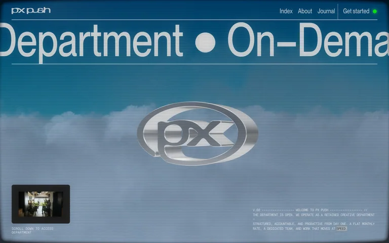
A chrome emblem floats over a cloudy blue background beneath a huge horizontally cropped service line. The quiet navigation includes a visible Get started action.
Useful for: Creative service brands using a distinctive visual identity to make a simple offer memorable.
# Design reference: PX PUSH
Source: https://pxpush.com/
Swipefile reference: https://swipefile.design/ref/awwwards-px-push/
Captured: 2026-09-05. This is a dated reference, not a claim about the current live product.
Capture scope: one viewport. Do not infer unseen page sections or a complete user flow.

## Objective
Adapt the visual principles below to my project. Use my own content and identity. Do not reproduce logos, proprietary copy, or brand assets.

## Reference notes
- mood: Futuristic and assertive
- colors: Steel blue, silver, pale gray
- typography: Oversized narrow sans display with small technical-looking labels
- layout: Full-screen atmospheric hero, large service text across the top, centered metallic mark
- motion: Static capture of a live site. Open the source to study its interactive behavior.
- texture: Reflective metal and hazy sky imagery
- dont: Adapt the hierarchy and visual principles to your own content; avoid copying the identity, imagery, or exact layout.

Useful for: Creative service brands using a distinctive visual identity to make a simple offer memorable.

## Acceptance criteria
- Existing project conventions, design tokens, working functionality, and unrelated changes are preserved.
- Two or three reference principles clearly support the user's task; conflicts are resolved in favor of usability and the existing product.
- Reusable components and semantic HTML express the interface. Available licensed assets are used; important UI text is never rendered as a bitmap.
- Every visible control has a defined behavior. Loading, empty, error, success, disabled, and long-content states are specified where relevant. Demo data is clearly labeled.
- Navigation and content adapt at 375px, 768px, and 1440px without horizontal page overflow. Keyboard use, visible focus, labeled inputs, at least 44px touch targets, readable contrast, and reduced motion are supported.
- Verification distinguishes rendered behavior from proposals and identifies anything still requiring a backend or external service.

## Quality bar
Clear hierarchy, consistent spacing, restrained surfaces, and purposeful motion. Avoid decorative gradients, excessive cards, placeholder buttons, and invented metrics unless the project calls for them. Do not claim a feature is connected or tested without evidence.
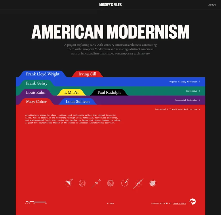 hover to scroll
Colored file tabs turn an architectural history collection into a browsable archive, with a strong headline setting the subject before the index.
Useful for: Editorial archives that benefit from visible grouping and a physical filing metaphor.
# Design reference: Mosby's Files
Source: https://www.mosbyfiles.com/
Swipefile reference: https://swipefile.design/ref/awwwards-mosbys-files/
Captured: 2026-09-05. This is a dated reference, not a claim about the current live product.


## Objective
Adapt the visual principles below to my project. Use my own content and identity. Do not reproduce logos, proprietary copy, or brand assets.

## Reference notes
- mood: Scholarly with a playful filing system
- colors: Near-black, white, cobalt, red, green, yellow
- typography: Heavy condensed headline, serif tab labels, compact archive descriptions
- layout: Centered introduction above stacked colored tabs and an expanded file-like panel
- motion: Static capture of a live site. Open the source to study its interactive behavior.
- texture: Flat paper-like tabs and saturated color panels
- dont: Adapt the hierarchy and visual principles to your own content; avoid copying the identity, imagery, or exact layout.

Useful for: Editorial archives that benefit from visible grouping and a physical filing metaphor.

## Acceptance criteria
- Existing project conventions, design tokens, working functionality, and unrelated changes are preserved.
- Two or three reference principles clearly support the user's task; conflicts are resolved in favor of usability and the existing product.
- Reusable components and semantic HTML express the interface. Available licensed assets are used; important UI text is never rendered as a bitmap.
- Every visible control has a defined behavior. Loading, empty, error, success, disabled, and long-content states are specified where relevant. Demo data is clearly labeled.
- Navigation and content adapt at 375px, 768px, and 1440px without horizontal page overflow. Keyboard use, visible focus, labeled inputs, at least 44px touch targets, readable contrast, and reduced motion are supported.
- Verification distinguishes rendered behavior from proposals and identifies anything still requiring a backend or external service.

## Quality bar
Clear hierarchy, consistent spacing, restrained surfaces, and purposeful motion. Avoid decorative gradients, excessive cards, placeholder buttons, and invented metrics unless the project calls for them. Do not claim a feature is connected or tested without evidence.
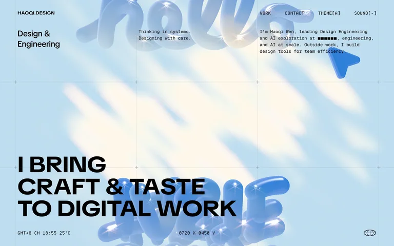
Glossy pale-blue forms frame a forceful statement about design and engineering. Small metadata and navigation keep the portfolio identity specific.
Useful for: Design engineer portfolios that need to show both technical precision and visual craft.
# Design reference: HAOQI.DESIGN
Source: https://haoqi.design/
Swipefile reference: https://swipefile.design/ref/awwwards-haoqi-design/
Captured: 2026-09-05. This is a dated reference, not a claim about the current live product.
Capture scope: one viewport. Do not infer unseen page sections or a complete user flow.

## Objective
Adapt the visual principles below to my project. Use my own content and identity. Do not reproduce logos, proprietary copy, or brand assets.

## Reference notes
- mood: Precise and experimental
- colors: Sky blue, black, ivory
- typography: Heavy sans statement with small technical labels
- layout: Full-screen graphic field, large bottom-left statement, small identity and navigation across the top
- motion: Static capture of a live site. Open the source to study its interactive behavior.
- texture: Glossy inflated-looking forms and soft blue light
- dont: Adapt the hierarchy and visual principles to your own content; avoid copying the identity, imagery, or exact layout.

Useful for: Design engineer portfolios that need to show both technical precision and visual craft.

## Acceptance criteria
- Existing project conventions, design tokens, working functionality, and unrelated changes are preserved.
- Two or three reference principles clearly support the user's task; conflicts are resolved in favor of usability and the existing product.
- Reusable components and semantic HTML express the interface. Available licensed assets are used; important UI text is never rendered as a bitmap.
- Every visible control has a defined behavior. Loading, empty, error, success, disabled, and long-content states are specified where relevant. Demo data is clearly labeled.
- Navigation and content adapt at 375px, 768px, and 1440px without horizontal page overflow. Keyboard use, visible focus, labeled inputs, at least 44px touch targets, readable contrast, and reduced motion are supported.
- Verification distinguishes rendered behavior from proposals and identifies anything still requiring a backend or external service.

## Quality bar
Clear hierarchy, consistent spacing, restrained surfaces, and purposeful motion. Avoid decorative gradients, excessive cards, placeholder buttons, and invented metrics unless the project calls for them. Do not claim a feature is connected or tested without evidence.
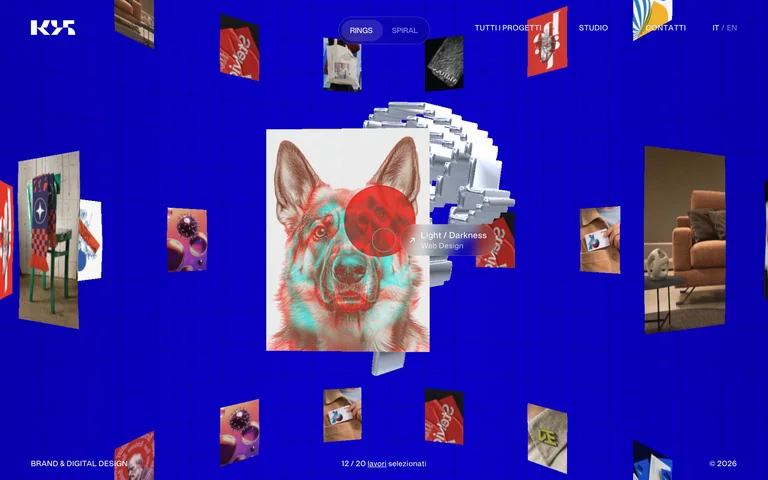
A cobalt canvas displays a central stack of project images surrounded by floating work. Compact project and studio navigation leaves the image field open.
Useful for: Brand studios exploring a spatial alternative to a conventional portfolio grid.
# Design reference: Studio K95
Source: https://k95.it/
Swipefile reference: https://swipefile.design/ref/awwwards-studio-k95-3/
Captured: 2026-09-05. This is a dated reference, not a claim about the current live product.
Capture scope: one viewport. Do not infer unseen page sections or a complete user flow.

## Objective
Adapt the visual principles below to my project. Use my own content and identity. Do not reproduce logos, proprietary copy, or brand assets.

## Reference notes
- mood: Playful and immersive
- colors: Cobalt blue, white, colors from project imagery
- typography: Small uppercase navigation and a compact logo
- layout: Spatial project gallery with a central stack and peripheral project thumbnails
- motion: Static capture of a live site. Open the source to study its interactive behavior.
- texture: Layered project cards against a flat saturated field
- dont: Adapt the hierarchy and visual principles to your own content; avoid copying the identity, imagery, or exact layout.

Useful for: Brand studios exploring a spatial alternative to a conventional portfolio grid.

## Acceptance criteria
- Existing project conventions, design tokens, working functionality, and unrelated changes are preserved.
- Two or three reference principles clearly support the user's task; conflicts are resolved in favor of usability and the existing product.
- Reusable components and semantic HTML express the interface. Available licensed assets are used; important UI text is never rendered as a bitmap.
- Every visible control has a defined behavior. Loading, empty, error, success, disabled, and long-content states are specified where relevant. Demo data is clearly labeled.
- Navigation and content adapt at 375px, 768px, and 1440px without horizontal page overflow. Keyboard use, visible focus, labeled inputs, at least 44px touch targets, readable contrast, and reduced motion are supported.
- Verification distinguishes rendered behavior from proposals and identifies anything still requiring a backend or external service.

## Quality bar
Clear hierarchy, consistent spacing, restrained surfaces, and purposeful motion. Avoid decorative gradients, excessive cards, placeholder buttons, and invented metrics unless the project calls for them. Do not claim a feature is connected or tested without evidence.
Allow basic usage counts to help us understand what is useful. Your board contents stay out of analytics. Details
Your browser’s privacy preference keeps analytics off.