Forms & Onboarding
CURATED COLLECTION · 4 REFERENCES
Profile details, account preferences, notifications, and appearance in a consistent settings shell.
Copy the reference notes below and paste them into Claude, ChatGPT, or your coding assistant. Add what you want to build.
Includes design notes, original sources, and preview links. An assistant that supports browsing can also read the public board link.
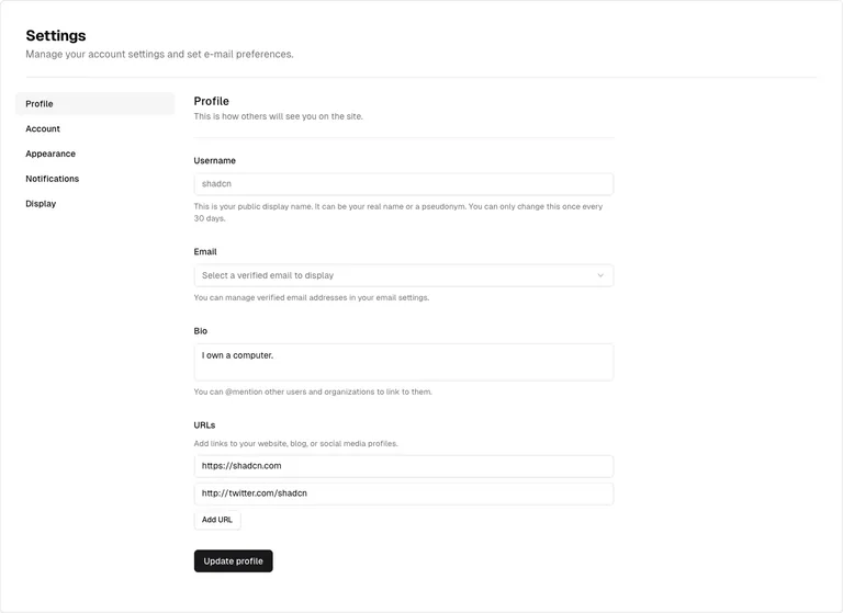
A profile form keeps field explanations close to the controls they clarify.
Useful for: Constrain form width and use inline explanations instead of a separate help panel.
# Design reference: shadcn/ui v3 — Profile form
Source: https://v3.shadcn.com/examples/forms
Swipefile reference: https://swipefile.design/ref/shadcn-profile/
Captured: 2026-09-04. This is a dated reference, not a claim about the current live product.
Capture scope: a page excerpt. Do not infer unseen sections or interactions.

## Objective
Adapt the interaction and layout patterns below to my project. Use my own content and identity. Do not reproduce logos, proprietary copy, or brand assets.

## Reference notes
- surface: Profile form
- nav: A local settings list separates profile, account, appearance, notifications, and display.
- layout: Settings navigation sits beside a constrained single-column form for username, email, bio, and links.
- density: A constrained form column leaves room between groups while keeping labels and controls together.
- color: White surfaces, light input borders, and a dark update button.
- typography: Use clear vertical rhythm between fields while keeping labels and helper text together.
- pattern: Constrain form width and use inline explanations instead of a separate help panel.
- states: Public v3 settings demo with sample values; no profile was submitted.
- dont: Adapt the interaction pattern to your own product. Do not copy brand assets, sample identities, proprietary text, or assume unseen states. Specify keyboard behavior, loading, empty, error, and narrow-screen layouts for your implementation.

Useful for: Constrain form width and use inline explanations instead of a separate help panel.

## Acceptance criteria
- Existing project conventions, design tokens, working functionality, and unrelated changes are preserved.
- Two or three reference principles clearly support the user's task; conflicts are resolved in favor of usability and the existing product.
- Reusable components and semantic HTML express the interface. Available licensed assets are used; important UI text is never rendered as a bitmap.
- Every visible control has a defined behavior. Loading, empty, error, success, disabled, and long-content states are specified where relevant. Demo data is clearly labeled.
- Navigation and content adapt at 375px, 768px, and 1440px without horizontal page overflow. Keyboard use, visible focus, labeled inputs, at least 44px touch targets, readable contrast, and reduced motion are supported.
- Verification distinguishes rendered behavior from proposals and identifies anything still requiring a backend or external service.

## Quality bar
Clear hierarchy, consistent spacing, restrained surfaces, and purposeful motion. Avoid decorative gradients, excessive cards, placeholder buttons, and invented metrics unless the project calls for them. Do not claim a feature is connected or tested without evidence.
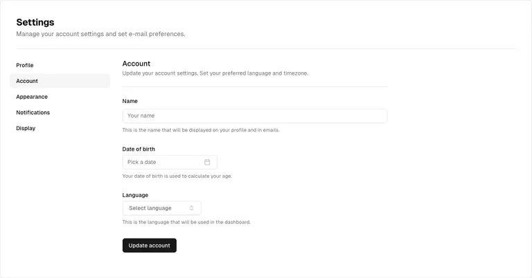
Account preferences pair personal details with date and language controls in a short settings form.
Useful for: Keep personal details and locale preferences together while explaining how each value is used.
# Design reference: shadcn/ui v3 — Account preferences
Source: https://v3.shadcn.com/examples/forms/account
Swipefile reference: https://swipefile.design/ref/shadcn-account/
Captured: 2026-09-04. This is a dated reference, not a claim about the current live product.
Capture scope: a page excerpt. Do not infer unseen sections or interactions.

## Objective
Adapt the interaction and layout patterns below to my project. Use my own content and identity. Do not reproduce logos, proprietary copy, or brand assets.

## Reference notes
- surface: Account preferences
- nav: Account is selected in the persistent settings list alongside profile and appearance.
- layout: A local navigation rail sits beside a constrained form for name, date of birth, and preferred language.
- density: A constrained form column leaves room between groups while keeping labels and controls together.
- color: White surfaces, subtle borders, and a dark update action.
- typography: Keep short fields aligned and place helper text directly below its control.
- pattern: Keep personal details and locale preferences together while explaining how each value is used.
- states: Public v3 account-settings demo with sample fields; no personal data was submitted.
- dont: Adapt the interaction pattern to your own product. Do not copy brand assets, sample identities, proprietary text, or assume unseen states. Specify keyboard behavior, loading, empty, error, and narrow-screen layouts for your implementation.

Useful for: Keep personal details and locale preferences together while explaining how each value is used.

## Acceptance criteria
- Existing project conventions, design tokens, working functionality, and unrelated changes are preserved.
- Two or three reference principles clearly support the user's task; conflicts are resolved in favor of usability and the existing product.
- Reusable components and semantic HTML express the interface. Available licensed assets are used; important UI text is never rendered as a bitmap.
- Every visible control has a defined behavior. Loading, empty, error, success, disabled, and long-content states are specified where relevant. Demo data is clearly labeled.
- Navigation and content adapt at 375px, 768px, and 1440px without horizontal page overflow. Keyboard use, visible focus, labeled inputs, at least 44px touch targets, readable contrast, and reduced motion are supported.
- Verification distinguishes rendered behavior from proposals and identifies anything still requiring a backend or external service.

## Quality bar
Clear hierarchy, consistent spacing, restrained surfaces, and purposeful motion. Avoid decorative gradients, excessive cards, placeholder buttons, and invented metrics unless the project calls for them. Do not claim a feature is connected or tested without evidence.
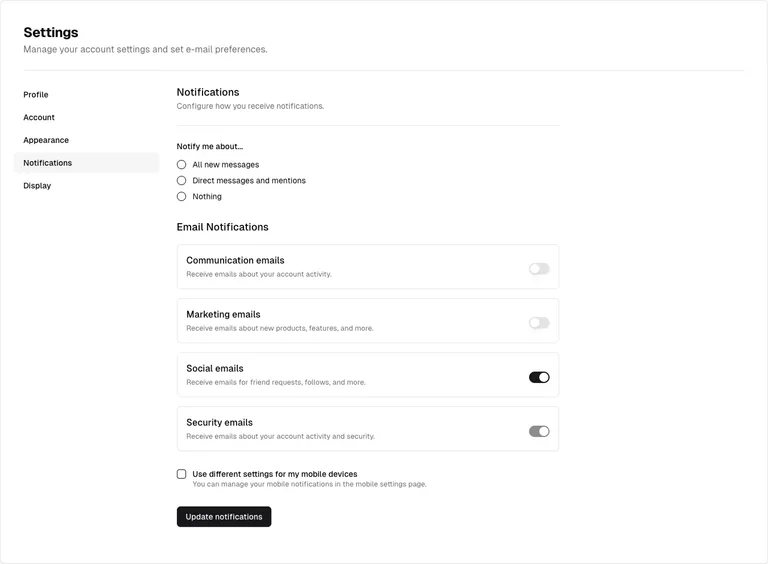
Notification preferences distinguish a primary delivery choice from individual email categories.
Useful for: Separate mutually exclusive notification modes from independent subscription choices.
# Design reference: shadcn/ui v3 — Notification settings
Source: https://v3.shadcn.com/examples/forms/notifications
Swipefile reference: https://swipefile.design/ref/shadcn-notifications/
Captured: 2026-09-04. This is a dated reference, not a claim about the current live product.
Capture scope: a page excerpt. Do not infer unseen sections or interactions.

## Objective
Adapt the interaction and layout patterns below to my project. Use my own content and identity. Do not reproduce logos, proprietary copy, or brand assets.

## Reference notes
- surface: Notification settings
- nav: The active Notifications section remains visible alongside the other settings destinations.
- layout: A narrow settings rail sits beside radio choices and separate rows of email switches with explanations.
- density: A constrained form column leaves room between groups while keeping labels and controls together.
- color: Monochrome controls and light bordered rows keep the focus on preference labels.
- typography: Pair each toggle with a concise heading and a lower-contrast explanation.
- pattern: Separate mutually exclusive notification modes from independent subscription choices.
- states: Public v3 settings demo; no notification preferences were submitted.
- dont: Adapt the interaction pattern to your own product. Do not copy brand assets, sample identities, proprietary text, or assume unseen states. Specify keyboard behavior, loading, empty, error, and narrow-screen layouts for your implementation.

Useful for: Separate mutually exclusive notification modes from independent subscription choices.

## Acceptance criteria
- Existing project conventions, design tokens, working functionality, and unrelated changes are preserved.
- Two or three reference principles clearly support the user's task; conflicts are resolved in favor of usability and the existing product.
- Reusable components and semantic HTML express the interface. Available licensed assets are used; important UI text is never rendered as a bitmap.
- Every visible control has a defined behavior. Loading, empty, error, success, disabled, and long-content states are specified where relevant. Demo data is clearly labeled.
- Navigation and content adapt at 375px, 768px, and 1440px without horizontal page overflow. Keyboard use, visible focus, labeled inputs, at least 44px touch targets, readable contrast, and reduced motion are supported.
- Verification distinguishes rendered behavior from proposals and identifies anything still requiring a backend or external service.

## Quality bar
Clear hierarchy, consistent spacing, restrained surfaces, and purposeful motion. Avoid decorative gradients, excessive cards, placeholder buttons, and invented metrics unless the project calls for them. Do not claim a feature is connected or tested without evidence.
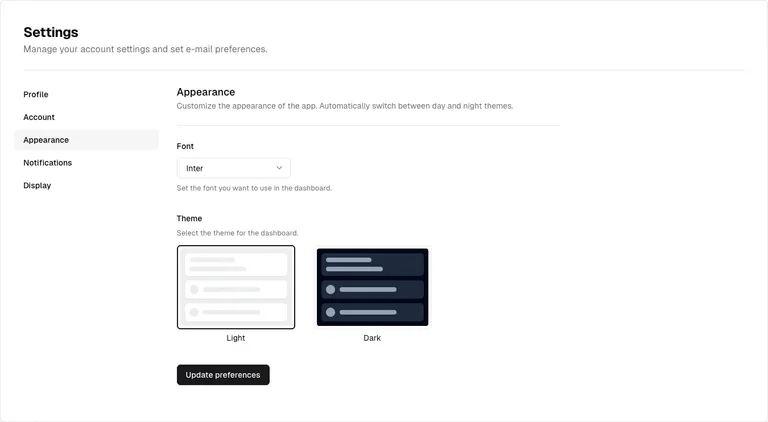
Appearance settings use illustrated light and dark choices beside font preferences.
Useful for: Show the effect of appearance choices visually rather than relying on labels alone.
# Design reference: shadcn/ui v3 — Appearance settings
Source: https://v3.shadcn.com/examples/forms/appearance
Swipefile reference: https://swipefile.design/ref/shadcn-appearance/
Captured: 2026-09-04. This is a dated reference, not a claim about the current live product.
Capture scope: a page excerpt. Do not infer unseen sections or interactions.

## Objective
Adapt the interaction and layout patterns below to my project. Use my own content and identity. Do not reproduce logos, proprietary copy, or brand assets.

## Reference notes
- surface: Appearance settings
- nav: Appearance remains selected in the same navigation used by other settings screens.
- layout: A settings rail sits next to a narrow form with a font picker and side-by-side theme previews.
- density: A constrained form column leaves room between groups while keeping labels and controls together.
- color: Neutral settings chrome with miniature light and dark interface previews.
- typography: Give visual theme choices enough space to compare while keeping their labels close.
- pattern: Show the effect of appearance choices visually rather than relying on labels alone.
- states: Public v3 appearance-settings demo; no preference was submitted.
- dont: Adapt the interaction pattern to your own product. Do not copy brand assets, sample identities, proprietary text, or assume unseen states. Specify keyboard behavior, loading, empty, error, and narrow-screen layouts for your implementation.

Useful for: Show the effect of appearance choices visually rather than relying on labels alone.

## Acceptance criteria
- Existing project conventions, design tokens, working functionality, and unrelated changes are preserved.
- Two or three reference principles clearly support the user's task; conflicts are resolved in favor of usability and the existing product.
- Reusable components and semantic HTML express the interface. Available licensed assets are used; important UI text is never rendered as a bitmap.
- Every visible control has a defined behavior. Loading, empty, error, success, disabled, and long-content states are specified where relevant. Demo data is clearly labeled.
- Navigation and content adapt at 375px, 768px, and 1440px without horizontal page overflow. Keyboard use, visible focus, labeled inputs, at least 44px touch targets, readable contrast, and reduced motion are supported.
- Verification distinguishes rendered behavior from proposals and identifies anything still requiring a backend or external service.

## Quality bar
Clear hierarchy, consistent spacing, restrained surfaces, and purposeful motion. Avoid decorative gradients, excessive cards, placeholder buttons, and invented metrics unless the project calls for them. Do not claim a feature is connected or tested without evidence.
Allow basic usage counts to help us understand what is useful. Your board contents stay out of analytics. Details
Your browser’s privacy preference keeps analytics off.