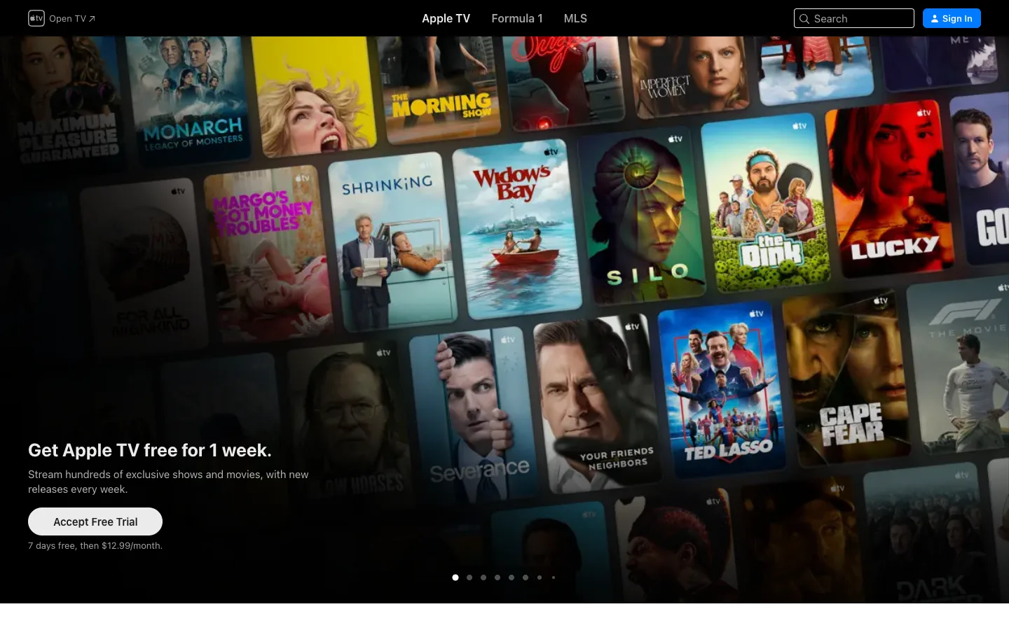
There is no hero container — the entire viewport is a wall of overlapping, slightly rotated show posters, and the UI is a transparent nav bar and one localized scrim, nothing else.
The full-bleed poster-wall-as-wallpaper technique, where dozens of tiles overlap and tilt into one continuous texture instead of a clickable grid, with a dark scrim applied only to the quadrant holding the CTA copy — not across the whole frame. Pair it with the completely transparent, background-less top nav that reads as printed on the image rather than floating above it.
Design notes
Surface
Apple TV marketing homepage, logged out, first slide of the hero carousel
Navigation
One tier, fully transparent — no fill, no border, sitting directly on the image. Logomark plus 'Open TV ↗' far left, three plain text links centered (Apple TV / Formula 1 / MLS, active one white and bold), a search pill plus a solid blue Sign In button far right.
Layout
No sidebar, no columns. One full-bleed image fills the entire viewport edge to edge; all copy and nav float on top of it. Carousel dots pinned bottom-center are the only indication this is a slide, not a static page.
Density
Nav links sit at ~16px in a single row; the CTA block below occupies only the bottom-left quadrant, leaving the rest of the frame as pure imagery.
Color
The canvas is technically black but almost none of it shows — it's covered in show-poster art in every colour (reds, yellows, blues) fighting for attention on purpose. The one deliberate UI colour is the blue Sign In button.
Type
Plain white/grey sans nav links at ~15-16px, a bold white ~30px CTA heading, a grey ~15px body line, and a small grey fine-print line beneath the button.
Pattern
A collage of overlapping, slightly rotated poster tiles stands in for a hero image, reading as texture rather than a grid of clickable items; a gradient scrim is applied only over the bottom-left quadrant where the CTA text sits, leaving the rest of the wall at full saturation.
States
Logged out: Sign In sits in the nav and a 7-day free trial CTA is baked straight into the hero. Carousel dots (about eight) show this is slide one of several — no other loading or empty state is visible.
Don't
Don't scrim the whole frame for legibility. That flattens the density and colour that make the wall work — scrim only the local text region and let everything else stay vivid.
Make it your own
Turn this reference into a useful brief for your project. Copy it into the AI tool you already use.
Add constraintsPreview & edit promptAssembled in your browser. No API key or AI request needed. Changing the fields refreshes the preview.