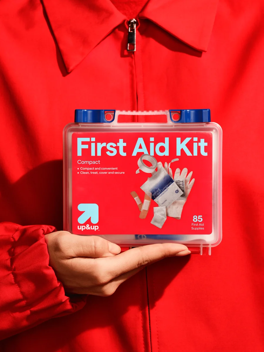
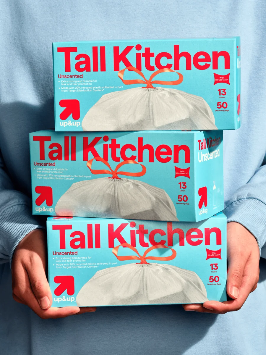
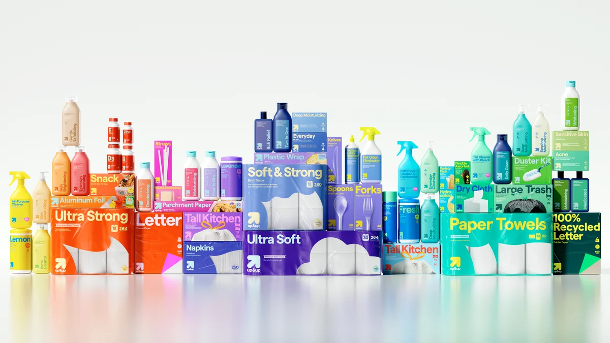
A small upward arrow provides a recurring identifier across products. Shared label hierarchy keeps many package formats visibly related.
Identity work by COLLINS. Selected images from the linked case study, reviewed 2026-09-09. Study the published design; consult the brand’s current guidelines for authorized usage.
First aid packagingHousehold packagingProduct family
Compare two packaging categories and the wider product range.
Design notes
Logo
A small upward arrow provides a recurring identifier across products.
Color
Strong color combinations distinguish everyday product categories.
Type
Large product names take priority over the smaller brand symbol.
System
Shared label hierarchy keeps many package formats visibly related.
In use
Compare two packaging categories and the wider product range.
Don't
Study the principles and develop an original identity. Do not copy these logos, proprietary typefaces, illustrations, or claims. These are selected images from a published case study; current brand guidelines, asset licenses, and real-world performance have not been verified.
Make it your own
Turn this reference into a useful brief for your project. Copy it into the AI tool you already use.
Add constraintsPreview & edit promptAssembled in your browser. No API key or AI request needed. Changing the fields refreshes the preview.