Flightradar24 — Live map
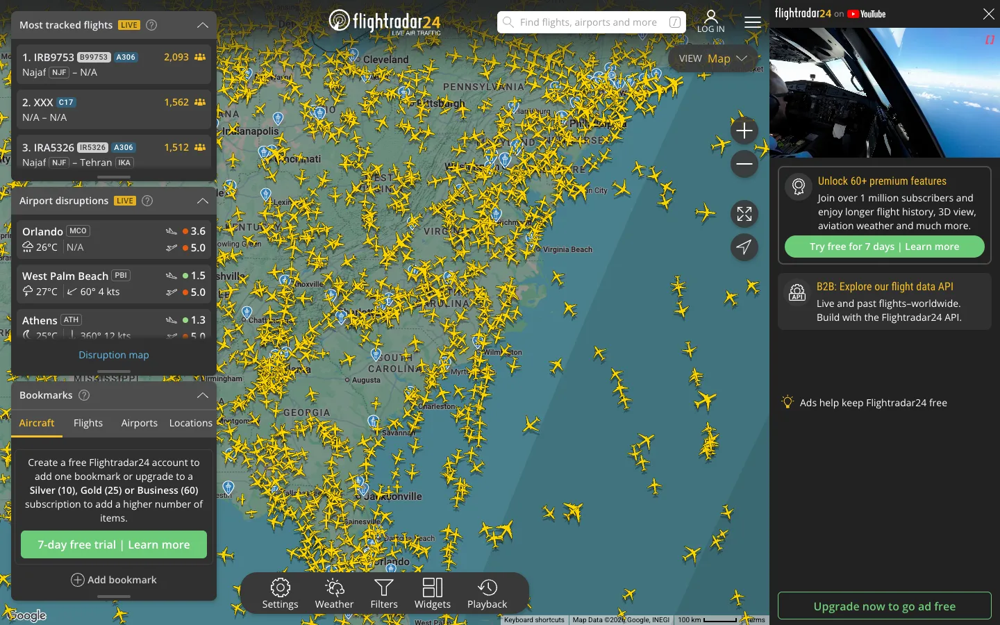
Thousands of yellow aircraft glyphs render straight onto the map as the data layer itself — there's no separate chart, the map IS the visualization. Every panel floats translucent over the edges instead of living in a boxed sidebar.
Why this pattern works
The floating-panel pattern: three independently collapsible translucent panels stacked over the left edge of a full-bleed map, each its own island rather than one sidebar container. Pair it with the floating bottom-center toolbar pill (Settings / Weather / Filters / Widgets / Playback) instead of a fixed header bar — it keeps the map as the entire canvas and treats every control as an overlay, never a layout region.
Design notes
- Surface
- Live global map view, logged out, centered on the US East Coast
- Navigation
- Two tiers, both overlays. A transparent top bar (logo, search pill, log in, hamburger) sits ON the map, not beside it, and a floating bottom-center toolbar pill (Settings, Weather, Filters, Widgets, Playback) handles map tools. There is no sidebar nav — the map is the entire app surface.
- Layout
- Full-bleed map, no fixed columns pushing it. Three translucent panels float independently over the left edge (stacked with gaps, not one container), a fixed ~330px ad column sits at the right edge, and small circular controls (zoom, fullscreen, locate) float over the map above the ad column. Everything overlays; nothing resizes the map.
- Density
- The map carries the density: hundreds of glyphs visible at once, thousands at full zoom-out. The overlay panels stay compact — ~40px list rows — so they read as thin strips of data, not competing surfaces.
- Color
- Near-black dark theme. Saturated color is spent on exactly two things: yellow aircraft glyphs (the live data) and green CTA buttons (trial/upgrade). Panels, toolbar and ad rail are all translucent charcoal — nothing else on screen is colored.
- Type
- Small sans throughout, 11-13px inside panels. No large type anywhere except the wordmark; hierarchy comes from panel header weight and LIVE badges, never from size jumps.
- Pattern
- Live position glyphs rendered directly on the base map as the primary UI element, with every control (nav, tools, info panels) treated as a translucent floating overlay rather than a docked layout region.
- States
- Logged out: LOG IN pill top right, a 'Create a free account' upsell embedded inside the Bookmarks panel with tier levels (Silver/Gold/Business), a video ad autoplaying at the top of the ad rail with its own close X, and green upgrade CTAs bookending the ad column top and bottom.
- Don't
- Don't dock these panels into a fixed sidebar container. The moment they stop floating independently and become one boxed column, the map stops feeling like the whole app and starts feeling like a map embedded in a dashboard — which is the opposite of what makes this pattern work.
Make it your own
Turn this reference into a useful brief for your project. Copy it into the AI tool you already use.