Windy — Weather Map
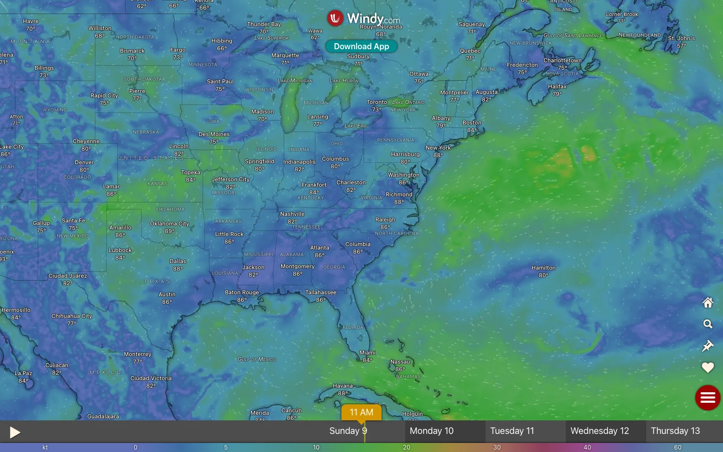
A weather app with almost no chrome: the entire viewport is the wind-speed colour field, and every control — brand, tools, timeline, legend — floats over the data or fuses into one bottom strip.
Why this pattern works
The timeline-plus-legend bottom strip. Windy's only real chrome is one dark translucent band along the bottom edge that does three jobs at once: a play button and orange 'current time' marker for scrubbing, day tabs (Sunday 9 … Thursday 13) for jumping, and — directly beneath — the colour legend as a thin gradient strip with kt values (0/5/10/20/30/40/60), so the scale that decodes the entire map is fused to the control you touch most. No floating legend card, no settings panel. Steal this for any time-scrubbable visualization: make the scrubber the chrome, and print the legend on it. Also worth taking: labels as data — hundreds of city+temperature labels rendered straight onto the field in white with soft shadows, no pins, no cards.
Design notes
- Surface
- Full-bleed forecast map: wind colour field with particle streaks, city labels, floating brand and tools, bottom timeline
- Navigation
- Effectively none. A white brand pill (logo + Windy.com) floats top-centre with a teal 'Download App' pill beneath it; a vertical stack of white glyph icons (home, search, pin, heart) hugs the right edge with a round red hamburger button at its base. That is the entire app frame.
- Layout
- One layer: the map fills 100% of the viewport. Overlays are point-placed — brand top-centre, tool stack right edge, timeline strip pinned along the bottom with the legend gradient as its final row. Nothing owns a column; everything floats.
- Density
- The data is maximally dense — a continuous colour field, animated wind streaks, dozens of city labels, region and water-body names — while the chrome amounts to perhaps six controls total.
- Color
- The palette IS the data: deep blues and purples for calm wind through greens to yellow-orange for strong, covering the whole canvas. Chrome sits on top in white (labels, icon glyphs, brand pill), one teal pill, one red round button, and an orange time-marker — each floating colour chosen to survive on every part of the field.
- Type
- A single sans, all small: city labels ~12px white with temperatures beneath, state/country names in wide-tracked caps at low opacity, water bodies in italic, day tabs ~15px. Text is cartography, not UI copy — hierarchy comes from opacity and tracking.
- Pattern
- Chrome-as-overlay at the extreme: every element floats directly on the data with a shadow or translucent backing, and the one persistent bar (the timeline) moonlights as the legend. The map never shrinks to make room for interface.
- States
- The current scrub position is an orange flag ('11 AM') planted on the active day tab; the active day reads darker than its siblings. Everything else — wind animation, labels — is live data, so the screen has no empty state at all.
- Don't
- Don't give this a header bar, a sidebar, or a floating legend card — every pixel of frame you add is data you deleted. And don't use saturated chrome colours that collide with the field's scale; controls must stay white/neutral with at most two accent pops.
Make it your own
Turn this reference into a useful brief for your project. Copy it into the AI tool you already use.