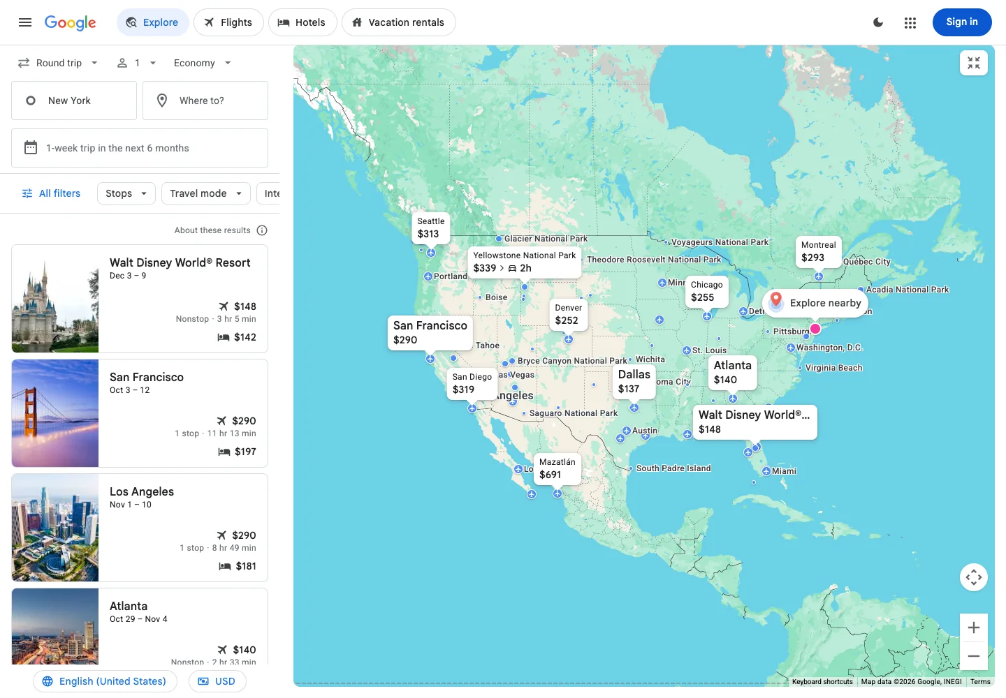
Coordinate a result list with a map so users can compare details and location in one view.
Design notes
Surface
Explore map
Navigation
Travel categories occupy the top bar; dates, origin, and filters belong to the results panel.
Layout
A narrow list of destinations sits to the left of a large interactive map under trip filters.
Density
Primary content has the most space; repeated rows and secondary navigation use a compact, consistent rhythm.
Color
Pale maps, white result cards, blue selection accents, and small photographic thumbnails.
Type
Keep result cards compact and make map labels readable without overpowering the geography.
Pattern
Coordinate a result list with a map so users can compare details and location in one view.
States
Public Explore results in a fresh browser; dates and prices are capture-time examples, not current offers.
Don't
Adapt the interaction pattern to your own product. Do not copy brand assets, sample identities, proprietary text, or assume unseen states. Specify keyboard behavior, loading, empty, error, and narrow-screen layouts for your implementation.
Make it your own
Turn this reference into a useful brief for your project. Copy it into the AI tool you already use.
Add constraintsPreview & edit promptAssembled in your browser. No API key or AI request needed. Changing the fields refreshes the preview.