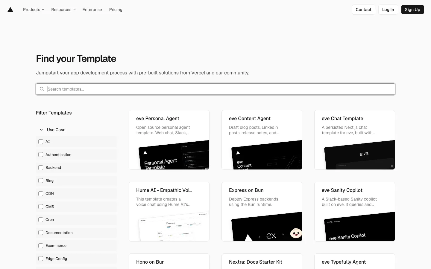
A facet-filtered directory where the sidebar is plain checkboxes and the entire visual identity of the grid comes from one rule: every template's screenshot is forced dark, no matter what the product itself looks like.
Forcing every card's preview thumbnail into the same dark-mode frame — regardless of the linked template's actual UI or branding — is what makes a directory of unrelated, community-submitted projects look like one coherent product. Pair it with a plain checkbox-list filter sidebar under a collapsible category header (no icons, no counts, just text) to keep browsing fast rather than decorative.
Design notes
Surface
Vercel Templates directory, 'Find your Template' landing view
Navigation
Two tiers. A slim global top bar (logo, Products/Resources dropdowns, Enterprise, Pricing, then Contact/Log In/Sign Up on the right) and a page-level filter sidebar (Filter Templates heading, a collapsible 'Use Case' section with a plain checkbox list) running the full height of the content area beside the grid.
Layout
Fixed-width left sidebar (~220px), fluid 3-column card grid filling the rest. The search bar sits full-width above the grid only, not spanning the sidebar.
Density
Roomy. Cards are tall (title, 2-line description, then a large thumbnail); sidebar rows are compact single-line checkboxes with tight vertical rhythm so a long facet list doesn't dominate the page.
Color
Almost entirely monochrome — white page, black text, grey secondary text, black-only primary buttons. The one deliberate colour move is forcing every card's screenshot into a near-black frame, so the grid reads as light chrome around dark windows rather than a busy multicolour mess.
Type
One sans throughout. The page title 'Find your Template' is the largest, boldest text on the page; card titles are bold black at body size; descriptions drop to grey regular weight and truncate at two lines — hierarchy is entirely title-bold versus body-grey, no size ladder beyond that.
Pattern
The forced-dark thumbnail: whatever the template actually looks like, its preview is cropped or framed into a dark card-within-a-card, so unrelated community submissions (a chat UI, a voice waveform, a docs site, a logo mashup) all read as one consistent product family.
States
Checkboxes sit unchecked by default with a plain black outline; no counts, no disabled states, no empty-result state visible in this view — the directory shows the full unfiltered set until a facet is applied.
Don't
Don't let each template's own brand colours leak into the card chrome. If the thumbnail frame stays light or matches the product's real background, the grid loses its uniformity and starts looking like a random link dump instead of a curated directory.
Make it your own
Turn this reference into a useful brief for your project. Copy it into the AI tool you already use.
Add constraintsPreview & edit promptAssembled in your browser. No API key or AI request needed. Changing the fields refreshes the preview.