Gumroad — Discover
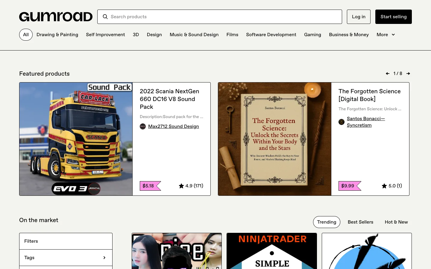
Every card is drawn with a hard 1px black border and zero border-radius, and the price sits inside a pink flag with a notch cut into its right edge instead of a rounded chip — a marketplace that refuses every soft convention of a modern ecommerce card.
Why this pattern works
Steal the split feature card — image locked to the left half, all meta (title, description, seller link, price flag, rating) stacked in the right half, both halves inside one hard-bordered rectangle — for any listing that needs to read as a single object rather than a photo with a caption. Also take the price flag itself: a solid ribbon shape with a triangular notch on its trailing edge, sitting inline with the star rating instead of overlaid on the image, so it reads as a tag pinned to a physical listing rather than a UI badge.
Design notes
- Surface
- Discover home — Featured products carousel plus On the market grid, logged out
- Navigation
- One tier: wordmark, a centred search bar, and two auth buttons (bordered 'Log in', filled black 'Start selling') on the right. Below it, a category row with a circular 'All' icon-toggle followed by flat text links — categories are filters here, not a separate nav tier.
- Layout
- Full-width sections stacked vertically: a featured carousel with two large cards plus a pager, an 'On the market' heading with a sort-pill toggle, then a two-column region — a narrow left filter accordion and a fluid product grid beside it.
- Density
- Generous in the featured cards (large image, full meta stack) tightening to a plain thumbnail grid below with no caption visible yet in frame.
- Color
- Warm off-white page, not pure white; black borders and text throughout. Colour is rationed to two spots — the pink price flag and whatever the product thumbnail itself contains. No blue links, no accent colour on any control.
- Type
- One sans throughout. Card titles are bold at roughly 18-20px, descriptions are grey regular and truncated with an ellipsis, seller name is an underlined link, price is bold white on the flag. Hierarchy comes from weight and the hard border grouping, never from a type scale.
- Pattern
- The split feature card: photo fixed to the left half of a hard-bordered box, all text meta stacked in the right half, price flag and rating anchored to the bottom of that same box. It turns a listing into one deliberate rectangle instead of an image with a caption underneath.
- States
- Logged out — 'Log in' and 'Start selling' both present, no account menu, no cart. The sort toggle shows 'Trending' filled and active against two bordered inactive pills ('Best Sellers,' 'Hot & New'), so the default sort is visible without any hover.
- Don't
- Don't round any of it 'to soften the look' — the zero-radius corners and true-black borders are load-bearing to the marketplace-not-storefront feel. Round the card or the price flag even slightly and it reads as a generic SaaS card again.
Make it your own
Turn this reference into a useful brief for your project. Copy it into the AI tool you already use.