Next.js Commerce — Storefront
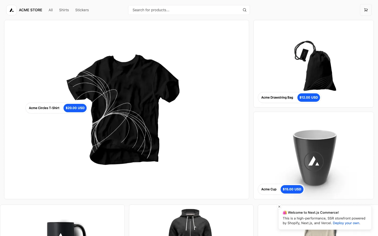
One tile is deliberately doubled in width and height while its neighbours stay unit-size, and every tile carries its name and price as a pill floating on top of the photo — not a caption stacked below it.
Why this pattern works
Steal the floating price pill: a white rounded pill holding the product name, fused edge-to-edge to a blue rounded price chip, anchored over the open space in the photo rather than living in a caption row underneath. It reads as a tag pinned to the object, not an ecommerce label, and it lets the photo run uninterrupted to the tile's edge. Also take the asymmetric bento move itself — give exactly one hero product a 2x-size tile in an otherwise uniform grid so there's a single obvious entry point before the eye starts scanning.
Design notes
- Surface
- Storefront home/product grid of a Next.js Commerce demo store, logged out, promo toast still open
- Navigation
- One flat tier: a logo mark plus wordmark left, three text links (All, Shirts, Stickers), a centred search input, and a bordered square cart-icon button right. No secondary or tertiary nav — this is a single storefront page, not a console.
- Layout
- Fluid bento grid. One tile spans roughly double the width and double the height of a standard tile; two unit tiles stack beside it at equal combined height, and a uniform row of unit tiles continues below. Gutters stay the same width regardless of tile size.
- Density
- Loose. Product photography fills nearly the whole tile at every size; there's no caption row competing for space, so the only text on any tile is the one floating pill.
- Color
- Near-white page, white tiles, black photography and type. Blue is spent on exactly one element — the price chip — and nowhere else: not the nav, not the buttons, not the cart icon.
- Type
- One sans throughout. Product name in the pill is medium-weight black; price is bold white on the blue chip, the only bold white-on-colour text on the page. There's no separate heading scale in view — hierarchy is tile size, not type size.
- Pattern
- The floating price pill placed in whatever negative space the product photo leaves open — low and left when the object sits high in frame, more central when it doesn't — instead of a fixed corner or a caption underneath. It's built to look laid on the object, not applied as UI chrome.
- States
- Logged out, and it shows: a dismissable promo toast sits over the grid bottom-right ('Welcome to Next.js Commerce... Deploy your own'), meaning the first-visit unauthenticated state is rendered by default here, not hidden behind an edge case.
- Don't
- Don't pin the pill to one fixed corner regardless of composition — on the hero tile it sits mid-left specifically to dodge the product's graphic, not because 'hero tiles get a different corner.' Hard-coding pill position independent of what's actually in the photo is what breaks this the moment art direction changes.
Make it your own
Turn this reference into a useful brief for your project. Copy it into the AI tool you already use.