SSENSE — Product listing
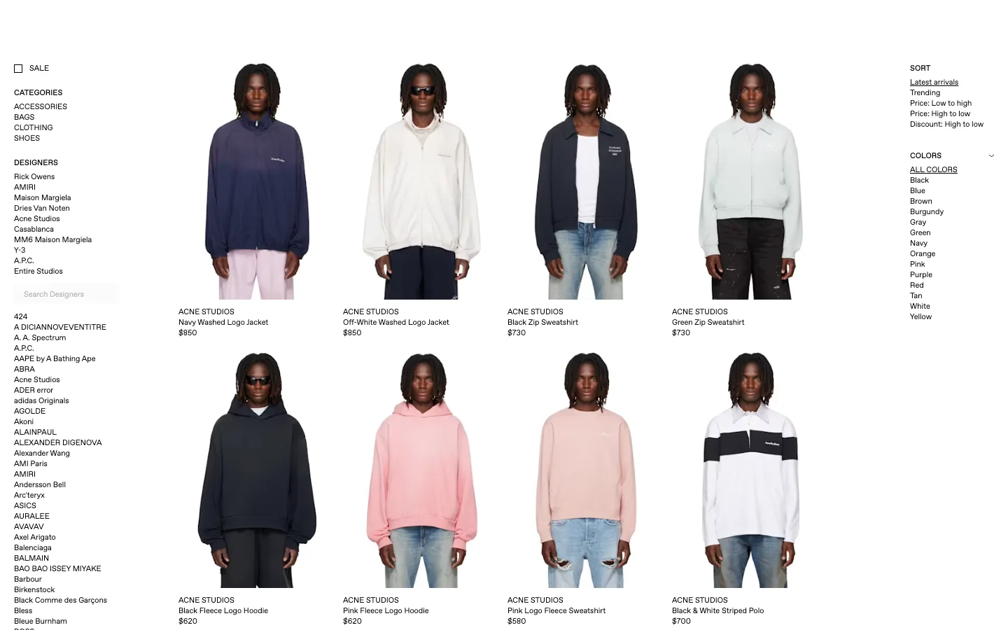
There is no card, no border, no shadow, no hover state anywhere on this grid — the only thing separating one product from the next is whitespace and an 11px caption. The left rail's designer list runs alphabetically past the fold on purpose: this isn't trying to look approachable, it's trying to look like an object catalogue.
Why this pattern works
Steal the chromeless product grid — kill the card entirely, let the photo run to the edge of its column with only a tiny text caption below it — and the split filter architecture: taxonomy (categories, designers) on the left, transient state (sort, active colour) on the right, with the grid sandwiched between. The exhaustive A-to-Z designer list is also worth taking as a filter mechanism once a catalog is big enough to need it.
Design notes
- Surface
- Men's ready-to-wear listing grid, no header in frame
- Navigation
- No app chrome visible — the left rail IS the navigation: a SALE checkbox, four flat CATEGORIES links, then DESIGNERS, which opens into a ten-name curated list, a live designer search box, and a full A-to-Z list of every designer in the catalog running hundreds of rows past the fold.
- Layout
- Three fixed-ish regions with no visible scaffolding between them: a ~190px filter rail left, a fluid 4-column product grid centre, and a ~150px sort/colour rail right. The designer list is the only thing on the page long enough to matter for scroll length; everything else fits in one viewport of height per row.
- Density
- Extremely tight for text — 11-12px captions, single-line list rows with no extra padding — but loose for imagery, with wide gutters between product photos. Built for someone scanning names and prices, not being sold to.
- Color
- Pure white canvas, pure white product backdrop, black text. No brand colour anywhere on screen — the only colour in frame is whatever the garment is wearing. Even the active states (an underlined sort option, underlined 'ALL COLORS') are black-on-white, marked by an underline, never a hue.
- Type
- One small grotesque sans throughout: all caps for taxonomy labels (CATEGORIES, DESIGNERS, SORT, COLORS) and brand names, sentence case for product names. Nothing on screen exceeds ~12px — hierarchy comes from case and position, never from size.
- Pattern
- The chromeless product tile: photo, brand name, product name, price, stacked with zero border, zero background fill, zero shadow, and no visible hover affordance. It works only because the photography carries all the visual weight and the type is small enough to disappear into caption.
- States
- Static, logged-out browse — no cart badge, no personalization banner, no promo toast. The only 'active' states rendered are text-based: an underline on the selected sort option and on 'ALL COLORS.'
- Don't
- Don't add a card background, a border, or a hover shadow 'to polish it up' — that's exactly the chrome this layout exists to eliminate, and it'll make the tiny type read as unfinished instead of intentional.
Make it your own
Turn this reference into a useful brief for your project. Copy it into the AI tool you already use.