Kickstarter — Discover
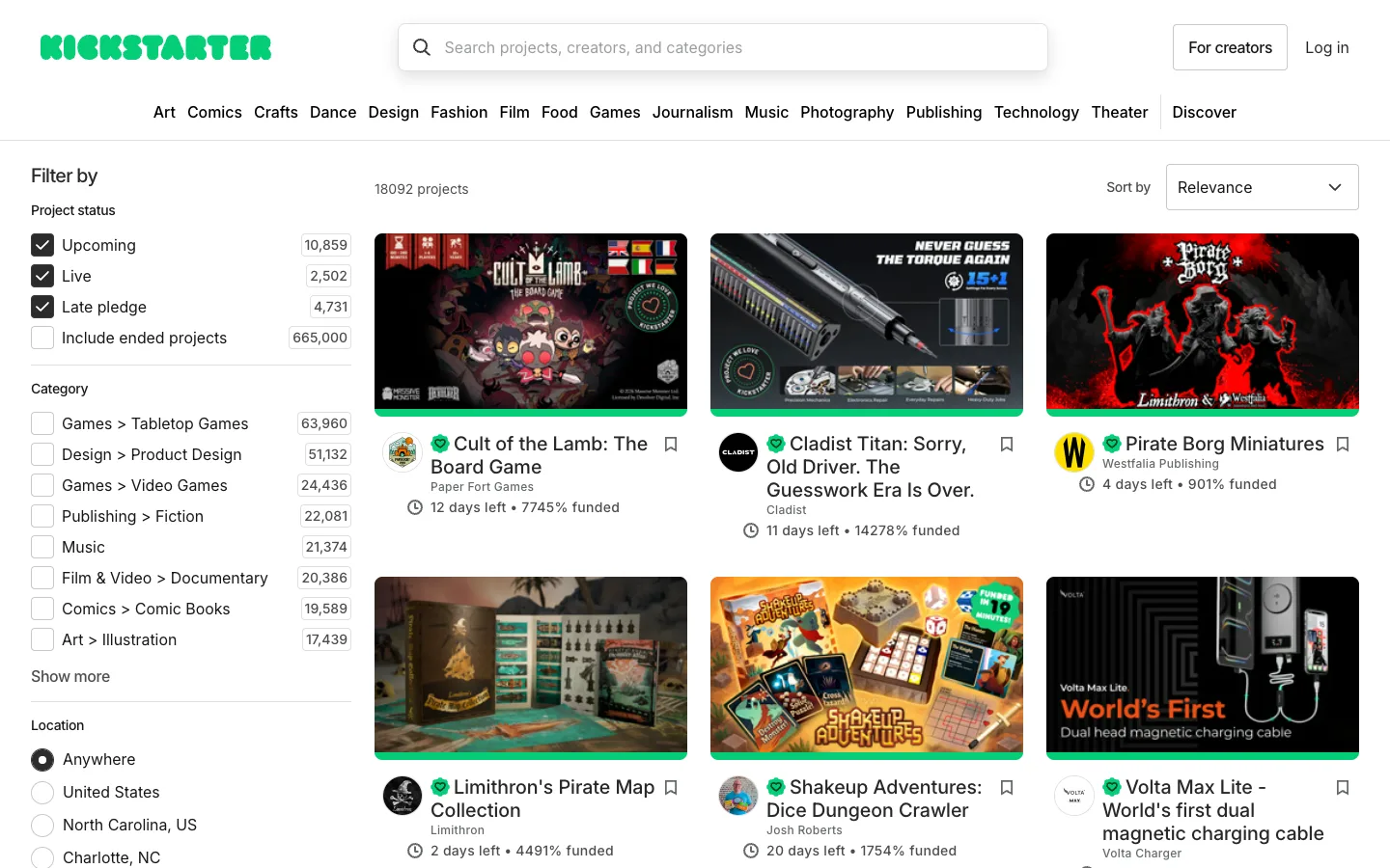
Every facet in the left filter rail carries a live result count in its own bordered box, so 'Games > Tabletop Games' tells you it's 63,960 projects before you ever click it. Each card's meta line then collapses the entire pitch to two numbers: 'N days left • N% funded.'
Why this pattern works
Steal the counted-facet row — label, checkbox, and a right-aligned count sitting in its own small bordered box — for any filter list with enough inventory to make the count meaningful; it turns browsing filters into previewing the dataset. Also take the two-number card meta line as a model for reducing a listing's pitch to the smallest set of numbers that actually sell it, instead of a description sentence.
Design notes
- Surface
- Discover browse grid with default filters applied (Upcoming, Live, Late pledge checked), logged out
- Navigation
- Two tiers: a utility row (wordmark, search bar, 'For creators' and 'Log in') and a full category tab strip beneath it (Art through Theater), with 'Discover' set apart in bold as the active section. Nothing past this is navigation — everything below is filtering.
- Layout
- A fixed left filter rail (~330px) beside a fluid 3-column card grid, with a plain result count and a sort dropdown sitting directly above the grid rather than inside the rail.
- Density
- The rail is dense and list-like — a checkbox row roughly every 40px — while the grid is loose, with large cover images and generous card spacing. The two densities sit side by side without clashing because one is doing lookup and the other is doing browsing.
- Color
- White canvas, black text, and Kickstarter green shows up in exactly three places: the wordmark, a thin bar under every card's cover image, and the verified-creator badge. Nothing else in the chrome carries colour.
- Type
- One sans throughout. Facet counts sit small and regular inside their own bordered box; card titles are bold and can wrap two lines; the meta line is small grey text except the numbers themselves, which are the entire point of the line.
- Pattern
- The counted checkbox: every facet — status, category, location — renders its own result count in a bordered box before it's touched, so applying a filter is an informed choice rather than a guess. It scales from four statuses to dozens of categories without changing shape.
- States
- Logged out — 'Log in' and 'For creators' both visible, no account menu. The default filter state ships with three of four status boxes already checked and 'Include ended projects' off, so even the unfiltered view is a curated default, not a blank slate.
- Don't
- Don't put the count on the section header only (e.g. 'Category (8)') — it has to sit on each individual row. Rolling it up loses the entire point of the pattern: knowing before you click whether a facet narrows you to 60,000 results or 60.
Make it your own
Turn this reference into a useful brief for your project. Copy it into the AI tool you already use.