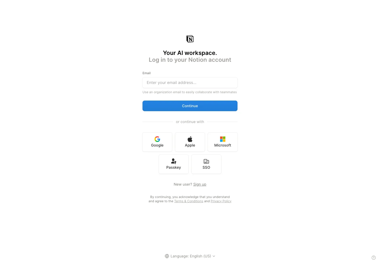
Offer several authentication methods while keeping the email path visually first.
Design notes
Surface
Sign in
Navigation
Language selection is separated at the bottom of the page.
Layout
A centered email form is followed by a divider, provider grid, and account-creation link.
Density
A constrained form column leaves room between groups while keeping labels and controls together.
Color
White background, dark text, a blue continue action, and colored provider icons.
Type
Compact labels, a short bold heading, and muted legal text establish a clear reading order.
Pattern
Offer several authentication methods while keeping the email path visually first.
States
Empty email field and visible alternate sign-in methods.
Don't
Adapt the interaction pattern to your own product. Do not copy brand assets, sample identities, proprietary text, or assume unseen states. Specify keyboard behavior, loading, empty, error, and narrow-screen layouts for your implementation.
Make it your own
Turn this reference into a useful brief for your project. Copy it into the AI tool you already use.
Add constraintsPreview & edit promptAssembled in your browser. No API key or AI request needed. Changing the fields refreshes the preview.