3 Login and Sign-Up Page Examples With Clear Entry Paths
An account screen should help someone choose the right entry path and understand the next step. The interesting design decision is often the order of methods, not the illustration around the form. These three captures show different ways to organize an email path, provider choices, and registration context.
Key takeaways
- Distinguish signing in from creating an account.
- Order the methods around the product’s actual audience and supported paths.
- Plan recovery and failure states alongside the first form.
Editorial observations of dated captures, not measured performance rankings. Original sites may have changed. Our approach.
1. Notion: put email ahead of a compact method grid
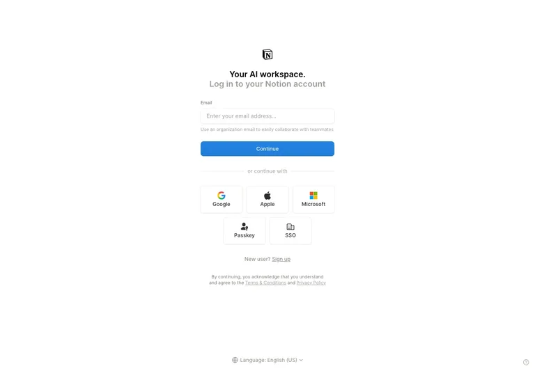
The captured screen gives the email field and continue action a clear first position. Alternative methods sit below in a compact group, with icons and labels separating the choices.
Adapt it: If email is the most understandable first step, give it a clear lane before presenting alternatives. Keep each provider’s name readable and make the next step consistent with the chosen method.
Watch for: A familiar icon is not a complete label for everyone. Keep the method’s meaning understandable without relying on brand recognition alone.
2. Resend: group provider choices above a fallback
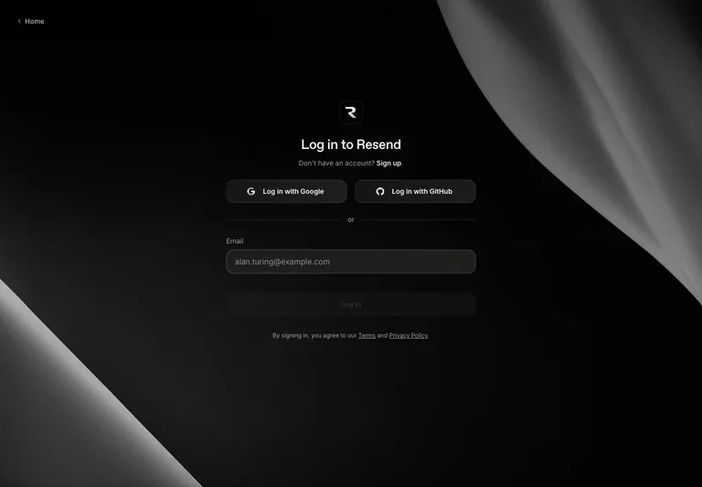
The dark sign-in surface places provider buttons together above an email path. A small amount of structure makes the alternative methods distinguishable without turning the form into a large dashboard.
Adapt it: Use grouping to show which choices are equivalent ways to enter the same account experience. Keep the fallback visible, especially when a preferred provider is unavailable.
Watch for: A dark theme needs readable control boundaries and text. Decorative background imagery should not make fields or feedback harder to distinguish.
3. Stripe: preserve product context behind registration
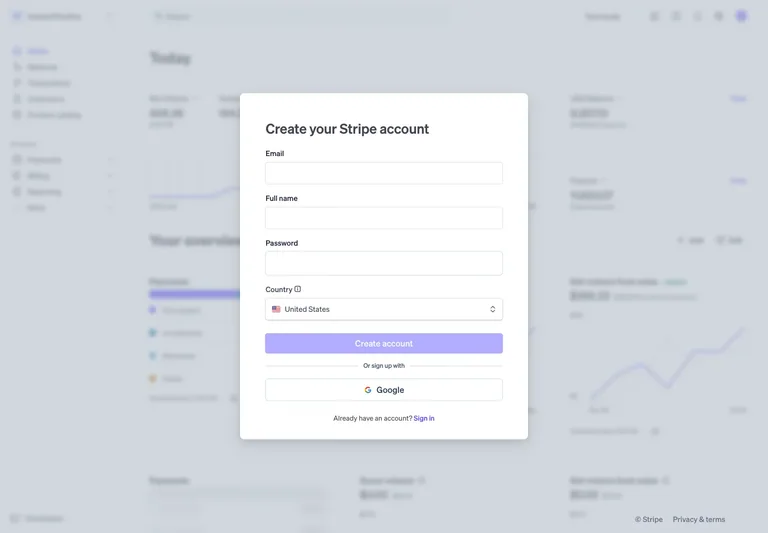
The registration panel appears over a softened dashboard image. Required information and the account action remain in the foreground, while the background suggests the environment the visitor is entering.
Adapt it: Use surrounding product context when it helps explain the destination. Keep the actual form self-contained so the background can simplify or disappear on smaller screens.
Watch for: Do not imply that a background dashboard contains the new user’s data. A product illustration is context, not evidence that an account has already been created.
Name the account task precisely
Signing in returns someone to an existing account. Registering creates one. Joining an invitation may connect a person to a particular team. These tasks can share visual components while requiring different instructions and outcomes.
Write the next-state copy before styling the page. If an email address leads to a link, a password screen, or an organization check, explain that transition where it matters. Avoid a generic “Continue” flow whose meaning changes without any supporting context.
Support the methods your product actually has
Do not add provider buttons because they make a template look complete. Each visible method needs a working route, a failure response, and a clear relationship to existing accounts. Decide what the interface should do when a person previously used a different method.
An authentication screenshot does not establish the security or accessibility of the underlying system. The references here document visible organization, not a tested account implementation. Keep security decisions connected to your product’s actual authentication provider and requirements.
Make assistance compatible with the flow
Password managers and paste can reduce the effort of entering credentials. The W3C accessible authentication guidance discusses authentication tasks that require remembering or transcribing information and ways to provide assistance. Do not disable helpful input mechanisms merely to imitate a visual reference.
Review the interface with realistic long email addresses, browser autofill, and a narrow viewport. A polished empty field can behave differently once the browser fills it or a validation message appears.
Design a route back to progress
Consider an expired link, a cancelled provider sign-in, and a temporarily unavailable service as different states. Give each a relevant next step. Avoid exposing unnecessary account details in feedback; the exact messages should fit the authentication system’s design.
Keep a recovery route discoverable, and show whether a requested action is still in progress. The state-design guide offers a way to specify those branches. Once a user is signed in, the settings guide helps organize the account controls that follow.
Common questions
Is a good-looking login screen enough to evaluate an authentication flow?
No. A capture can show layout and method hierarchy, but it does not verify account recovery, provider errors, security behavior, accessibility, or the handling of existing accounts.