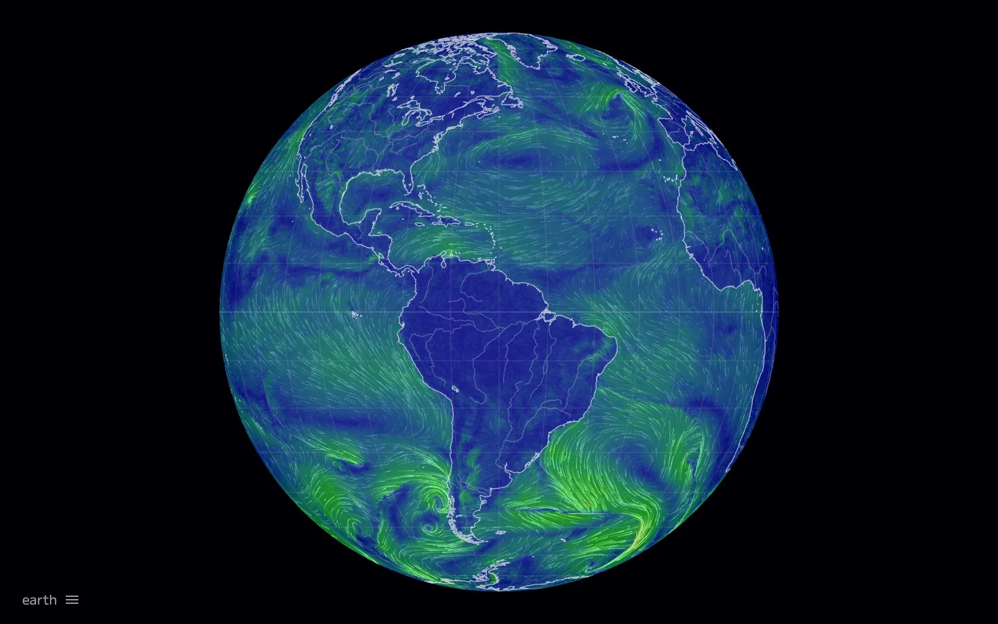
The entire interface is nine characters of grey text and a hamburger glyph in one corner. A rendered globe of animated wind particles on pure black IS the app.
About earning the right to hide all your chrome. When the underlying visualisation is strong enough to be the whole product, delete every piece of UI except the one entry point back into it — here, a single label plus a menu glyph, ~14px, bottom-left. This only works if the render already reads as compelling with zero labels, zero legend and zero header — steal the confidence to remove, not the specific glyph.
Design notes
Surface
earth.nullschool.net default view, animated globe of global wind
Navigation
Effectively zero tiers. One text label ('earth') and one hamburger glyph, bottom-left corner, ~14px, both in muted grey-white on black — that is the entire navigational surface. Presumably opens a settings/layer panel on click; nothing about that panel is visible or hinted at otherwise.
Layout
Single fixed canvas, pure black, edge to edge. The globe sits centered with generous, even black margin on all four sides — no sidebar, no header bar, no footer, no legend panel taking any of that space.
Density
As sparse as an interface can be and still be interactive. Built for someone who already knows the tool and wants nothing standing between them and the data.
Color
Black canvas, nothing spent on chrome. The only colour on screen lives inside the visualisation itself — a wind-speed gradient (deep blue for slow air, green for fast) rendered on the globe, plus faint white coastline strokes and a barely-there lat/long grid.
Type
One label. Lowercase 'earth', thin/light weight, ~14px, grey — deliberately quiet, not a title.
Pattern
Chrome-as-afterthought: every control that would normally live in a header, sidebar or overlay is folded into a single hamburger glyph, so the visualisation owns 100% of the screen until the user explicitly asks for controls.
States
No empty, loading or logged-out state visible in this shot — implies the globe renders directly on load with no auth wall and no configuration step required before first paint.
Don't
Don't add a legend, a title bar, a search box or a data readout 'for context' — the whole point is that none of that earns its pixels next to a visualisation this legible on its own. Adding chrome back is the single easiest way to ruin this screen.
Make it your own
Turn this reference into a useful brief for your project. Copy it into the AI tool you already use.
Add constraintsPreview & edit promptAssembled in your browser. No API key or AI request needed. Changing the fields refreshes the preview.