← Back to library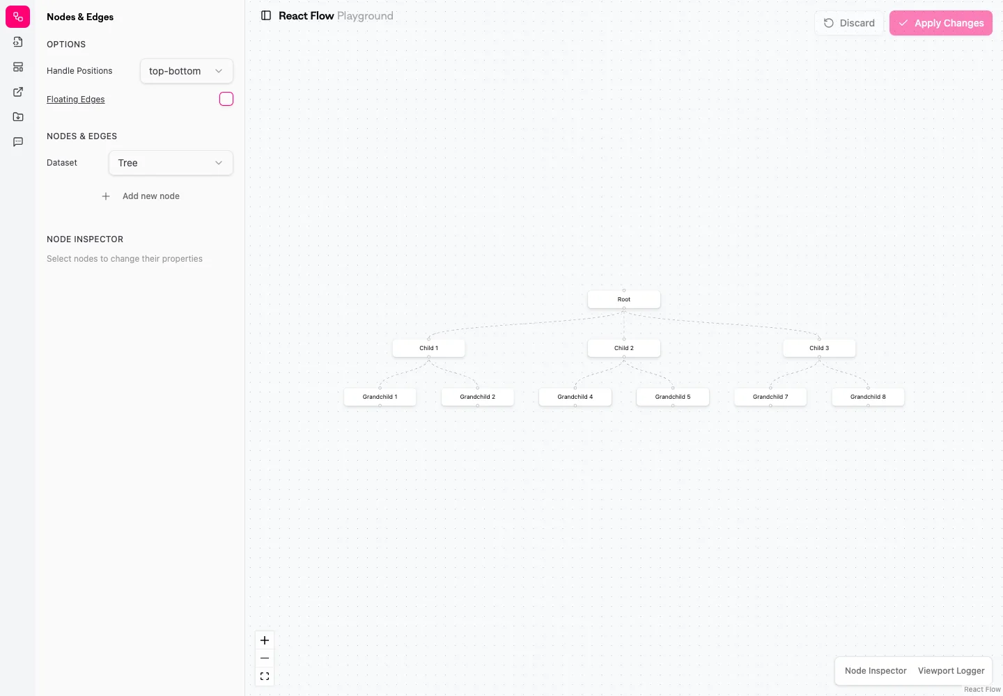
Page excerpt · scroll inside to explore Assembled in your browser. No API key or AI request needed. Changing the fields refreshes the preview.
React Flow — Playground
Creative ToolsSee it liveplay.reactflow.dev
A node-editor playground shows a connected canvas with controls and examples.
Why this pattern works
Keep canvas navigation separate from node-specific editing controls.
Design notes
- Surface
- Playground
- Navigation
- Layout options occupy the left panel; canvas controls stay near its edge.
- Layout
- A narrow options panel sits beside a spacious node canvas.
- Density
- Keep the working area large; use compact labels for controls without shrinking the editing text.
- Color
- Pale workspace with subtle node borders and a pink apply action.
- Type
- Use a clear type hierarchy for the page title, primary content, and supporting labels.
- Pattern
- Keep canvas navigation separate from node-specific editing controls.
- States
- A public playground showing its default connected-node example.
- Don't
- Do not copy brand assets or sample records. Preserve keyboard access and design empty, loading, and error states for the actual task.
Make it your own
Turn this reference into a useful brief for your project. Copy it into the AI tool you already use.