VS Code — Web Empty Workspace
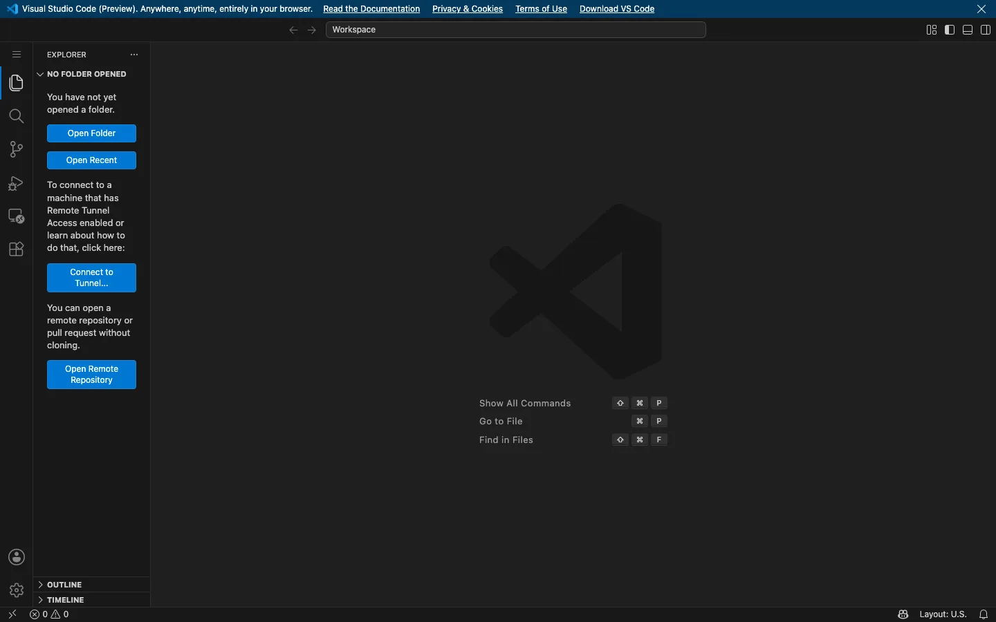
The IDE empty state done right: a ghosted watermark and a keyboard-shortcut cheat sheet fill the editor void, while the sidebar turns 'nothing open' into a stack of blue buttons that each lead somewhere.
Why this pattern works
The teaching empty state. The editor region has no content, so VS Code fills it with two things: a giant near-invisible logo watermark (brand presence at ~5% contrast, never competing with text) and a centred list of the three commands that matter — 'Show All Commands', 'Go to File', 'Find in Files' — each with its shortcut rendered as real keycap chips. Meanwhile the Explorer sidebar refuses to show a dead 'no files' message: it explains the state in one grey sentence, then stacks full-width solid-blue buttons (Open Folder, Open Recent, Connect to Tunnel, Open Remote Repository), each preceded by a short paragraph of context — every path out of emptiness is a button, not a link buried in prose. Steal this pair for any workspace app: watermark + shortcut list in the void, action-stack in the panel.
Design notes
- Surface
- Empty browser IDE: banner, title bar, activity rail, Explorer sidebar in its no-folder state, editor void, status bar
- Navigation
- Layered chrome, all dark. A one-line banner strip up top (product notice + inline links + close ×), then a title bar with back/forward arrows and a centred 'Workspace' command box, then a ~48px activity rail of icon-only buttons down the far left (menu, explorer, search, source control, run, remote, extensions; account and settings pinned at the bottom). The active rail icon gets a left accent edge and full-white fill.
- Layout
- Classic IDE frame: banner and title bar full-width, then rail + ~200px sidebar + fluid editor, with a ~22px status bar closing the bottom. The sidebar is a titled panel ('EXPLORER') with collapsible sections — NO FOLDER OPENED expanded, OUTLINE and TIMELINE collapsed at the bottom.
- Density
- Chrome is compact (22px status bar, tight 13px sidebar text) but the editor void is entirely open — one watermark and three shortcut rows floating slightly right of centre. Empty on purpose, dense at the edges.
- Color
- Charcoal greys layered by depth: near-black rail, dark sidebar, slightly lighter editor field. Text is soft white-grey. The single accent is VS Code blue, spent twice — the stacked sidebar action buttons and link text. Keycap chips are lighter grey squares. The watermark logo is a barely-darker grey on grey.
- Type
- One UI sans at small sizes throughout: 13px sidebar copy, 11px caps section headers (EXPLORER, NO FOLDER OPENED), 13px shortcut labels. Nothing is large — hierarchy comes from placement and the blue fills, not type scale.
- Pattern
- Shortcut rows as furniture: each void row is a right-aligned label ('Show All Commands') paired with keycap chips (⇧ ⌘ P) rendered as individual rounded squares — teaching the keyboard-first model before the user opens a single file.
- States
- This IS the empty state, and nothing collapses: the sidebar keeps its full section structure, explains itself ('You have not yet opened a folder.'), and offers four blue buttons; the editor void brands and teaches; the status bar still reports 0 errors 0 warnings. Every region shows what it will become.
- Don't
- Don't let the watermark rise above ~5% contrast or it fights the shortcut list, and don't replace the sidebar's button stack with prose links — the empty state works because every escape route is a full-width button you cannot miss.
Make it your own
Turn this reference into a useful brief for your project. Copy it into the AI tool you already use.