SoundCloud — Discover
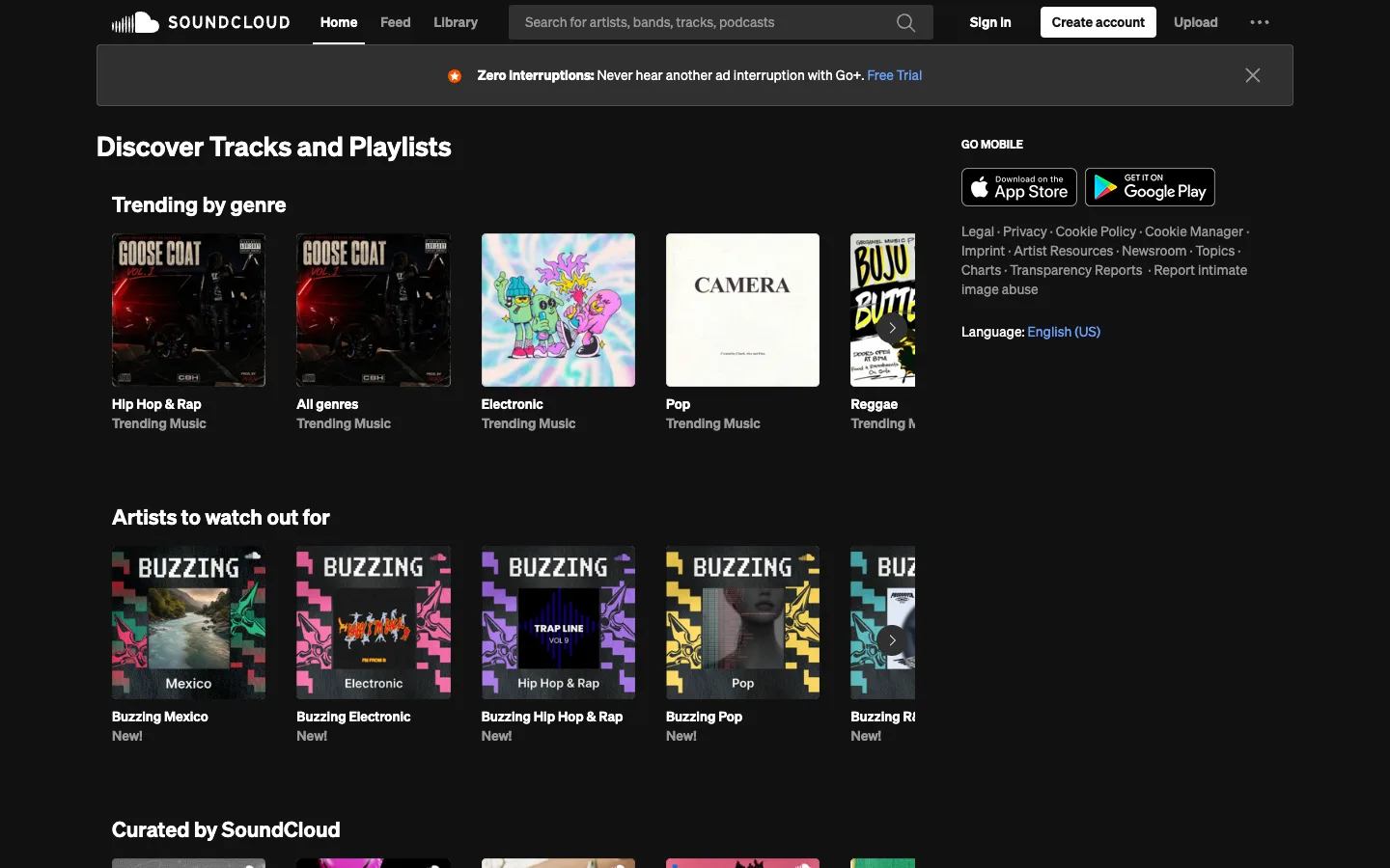
The canvas is pure black and stays that way; every scrap of colour on the page is content — cover art, never chrome — and the same horizontal-shelf-of-square-cards format gets reused for three completely different content types without changing shape.
Why this pattern works
Steal the shelf format wholesale: a bold white section title, then a single-row horizontal scroll of uniform square cards, each captioned with exactly two lines (bold title, gray meta) underneath — no text overlaid on the art itself — and a chevron-in-a-circle affordance that appears over the last, deliberately-clipped card to signal 'more this way' without a visible scrollbar. It scales to any content because the card is just image plus two text lines. Also take the sidebar footer: legal links and app-store badges live in a right-hand column beside the FIRST section of content, not stacked at the bottom of the page after everything else.
Design notes
- Surface
- SoundCloud logged-out Discover/Home feed, top of page
- Navigation
- One tier. A single black top bar: logo, three flat text links (Home active/underlined, Feed, Library), a large dark rounded search field with placeholder copy, then Sign In / Create account (filled white) / Upload / an overflow menu — no secondary nav, no breadcrumb, no tabs below it.
- Layout
- A left content column that runs full width under the nav, and a right rail that only spans the height of the first section or two before the content column continues alone below it. A dismissible promo strip sits between the nav and the first heading.
- Density
- Loose and image-led. Cards are large (roughly 165px square) with only two short text lines beneath, wide gutters between cards, generous section spacing. Built for browsing, not scanning.
- Color
- Flat black canvas and white/gray text is the entire UI palette. All colour on the page is the cover-art thumbnails plus one blue link colour ('Free Trial', 'English (US)') and a single orange star icon in the promo strip. Nothing else competes with the artwork.
- Type
- Bold white sans for page and section headings and card titles, regular gray for card subtitles and the search placeholder — a two-weight system with no size variation inside a card, so every shelf reads identically regardless of what's on it.
- Pattern
- The repeating shelf: heading, then one horizontal row of square cards, each a cover image plus a bold title line and a gray meta line, with a circular chevron button floating over the trailing edge of the last, partially clipped card. The same shelf shape carries 'Trending by genre', 'Artists to watch out for', and 'Curated by SoundCloud' without any structural change between them.
- States
- Logged-out state: 'Sign In' and 'Create account' both present in the nav, and a dismissible subscription promo strip sits above all content. No empty or loading states visible — every shelf is fully populated.
- Don't
- Don't caption the cards by overlaying text on the artwork. Every title and subtitle here lives in a dedicated two-line block below the image, which is why cards from three unrelated sources (genre tiles, artist badges, plain playlist covers) can share one card component without any of them fighting for legibility against their own art.
Make it your own
Turn this reference into a useful brief for your project. Copy it into the AI tool you already use.