Replicate — Explore
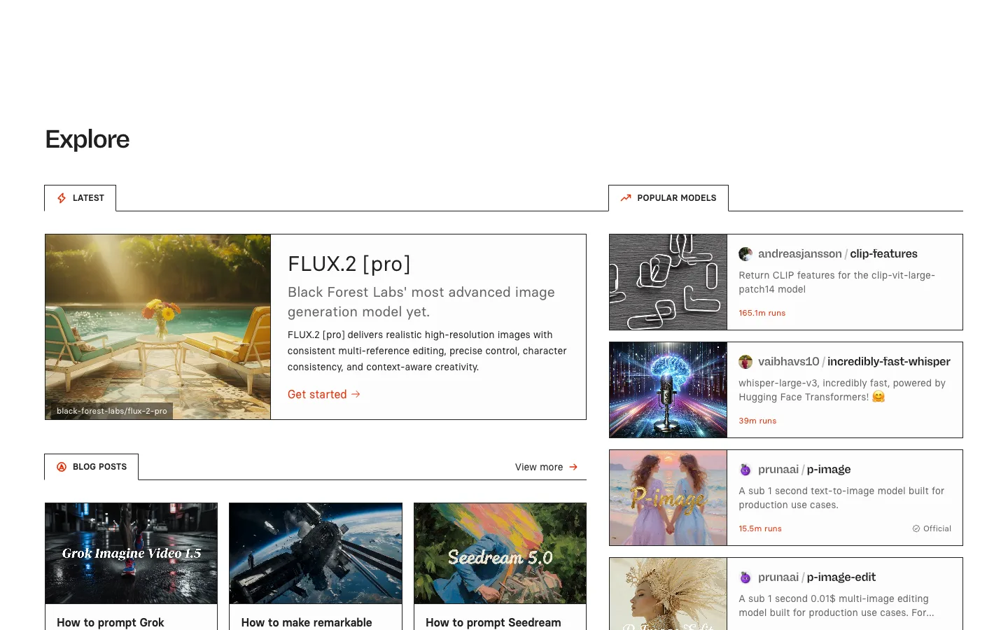
Two unrelated feeds run side by side, each owning its own tab strip, and the active tab in both is drawn as a bordered box with no bottom edge — so it visually fuses into the panel it controls instead of sitting above it.
Why this pattern works
The open-bottomed active tab: a 1px-bordered box around the tab label with the border removed on the bottom edge, so the tab and the content panel below it read as one continuous shape, like a folder tab. Steal this for any module where the active-state indicator should feel structurally attached to its content rather than just a color change. Also take the twin-panel layout — two independently-tabbed regions side by side (Latest/Blog Posts on the left, Popular Models on the right) — so one page can serve two unrelated content types without a shared filter bar trying to do both jobs.
Design notes
- Surface
- Replicate /explore page, logged out, default view
- Navigation
- No global nav visible in this crop — the page opens directly on a bold 'Explore' heading with heavy top whitespace, then splits into two independent content panels, each with its own local tab strip and no shared top-level tabs.
- Layout
- Two-column layout below the heading: a wider left panel (~775px) and a narrower right panel (~500px) with a gutter between them. Each panel scrolls its own content vertically; there's no fixed sidebar in the crop.
- Density
- Comfortable list rows (~90-100px) with generous line-height on descriptions; thumbnails are small and secondary (~90px square or a ~320px banner) so each row reads primarily as text, with the image as an anchor rather than the focus.
- Color
- White canvas, near-black headings, mid-grey body text. One accent — a red-orange (~#f15f31) — is reserved entirely for run counts, 'Get started'/'View more' links, and the tab icons. Nothing else on the page uses color.
- Type
- The page heading is bold at ~40px; tab labels are small (~13px), uppercase, bold, letter-spaced so they read as section labels rather than buttons; model and post titles are ~16-24px bold; run counts are bold and colored — the only colored numerals on the page.
- Pattern
- The fused tab-to-panel border: the active tab is drawn with a top and side border but no bottom border, sitting flush against a full-width rule that continues from where its missing edge would be — so the tab reads as a flap opening directly into its content.
- States
- No loading or empty state visible — both panels are fully populated on load. Officially-verified model rows carry a small checkmark 'Official' badge next to the run count, a trust signal shown inline rather than as a separate filter.
- Don't
- Don't give both panels a shared tab row at the top of the page — the whole value is that Latest/Blog Posts and Popular Models are unrelated feeds with independent state, and merging their tabs into one strip would force them to share a selection they don't share content for.
Make it your own
Turn this reference into a useful brief for your project. Copy it into the AI tool you already use.