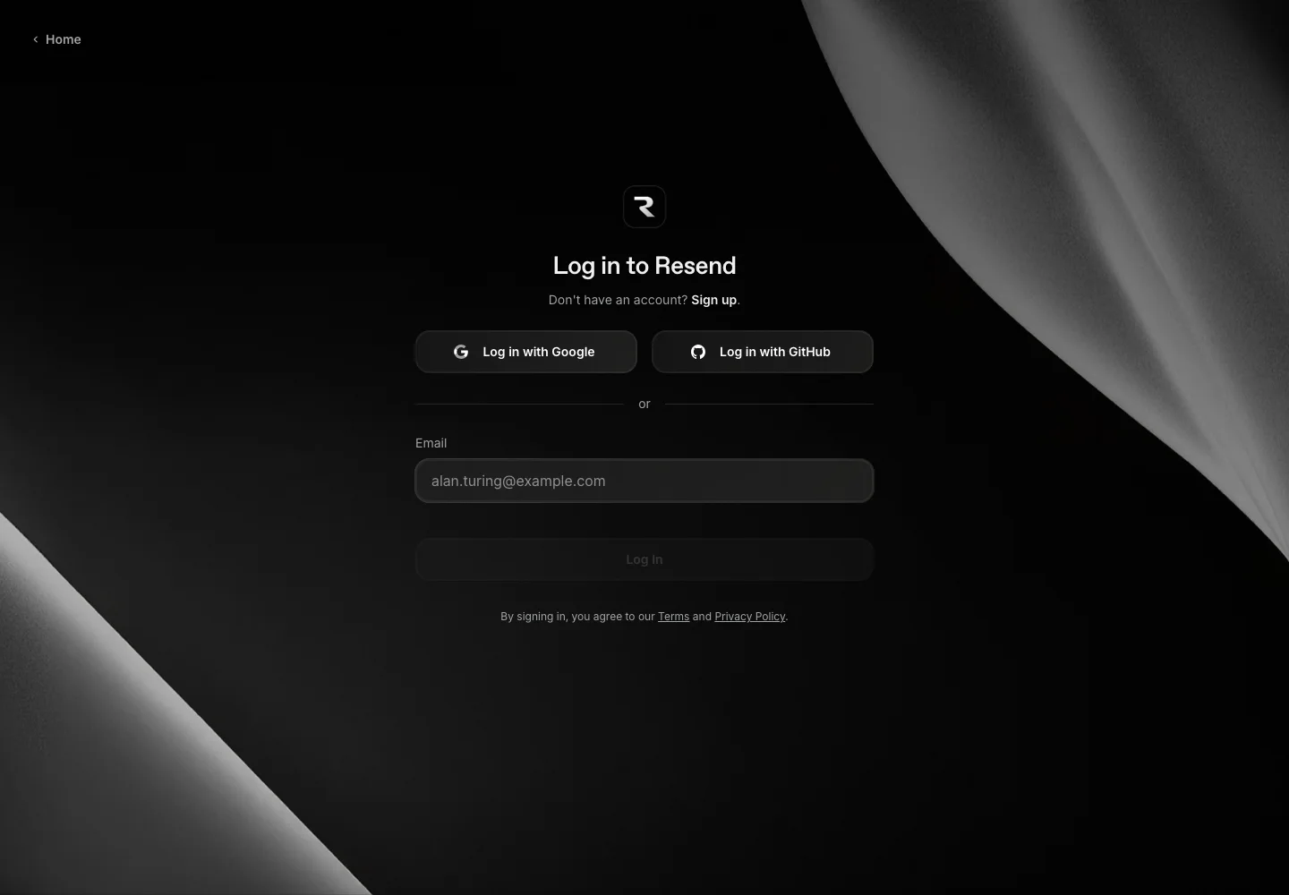
Explore a dark authentication surface with distinct control boundaries and a compact fallback path.
Design notes
Surface
Sign in
Navigation
A home link sits in the top-left, with account creation near the heading.
Layout
Two provider buttons share a row; a divider separates the email field and continuation action.
Density
A constrained form column leaves room between groups while keeping labels and controls together.
Color
Black and charcoal layers, subtle gray control boundaries, and sculptural monochrome background artwork.
Type
Bright headings and muted supporting labels create hierarchy on the dark background.
Pattern
Explore a dark authentication surface with distinct control boundaries and a compact fallback path.
States
Empty email form and visible provider choices; no authenticated state.
Don't
Adapt the interaction pattern to your own product. Do not copy brand assets, sample identities, proprietary text, or assume unseen states. Specify keyboard behavior, loading, empty, error, and narrow-screen layouts for your implementation.
Make it your own
Turn this reference into a useful brief for your project. Copy it into the AI tool you already use.
Add constraintsPreview & edit promptAssembled in your browser. No API key or AI request needed. Changing the fields refreshes the preview.