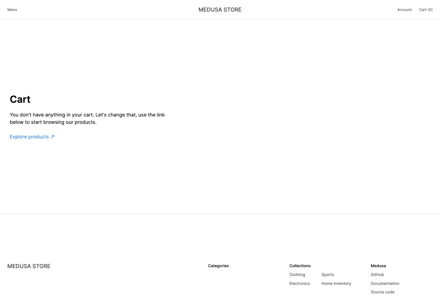
Make an empty cart useful with a clear route back to shopping.
Design notes
Surface
Empty cart
Navigation
The store header retains account and a zero-count cart.
Layout
A brief message and browse link sit in a generous open content area above the store footer.
Density
Primary content has the most space; repeated rows and secondary navigation use a compact, consistent rhythm.
Color
White page, dark heading, gray helper text, and a blue browse link.
Type
A strong cart heading and short explanatory sentence avoid overloading the empty state.
Pattern
Make an empty cart useful with a clear route back to shopping.
States
Empty cart with no products or checkout action.
Don't
Adapt the interaction pattern to your own product. Do not copy brand assets, sample identities, proprietary text, or assume unseen states. Specify keyboard behavior, loading, empty, error, and narrow-screen layouts for your implementation.
Make it your own
Turn this reference into a useful brief for your project. Copy it into the AI tool you already use.
Add constraintsPreview & edit promptAssembled in your browser. No API key or AI request needed. Changing the fields refreshes the preview.