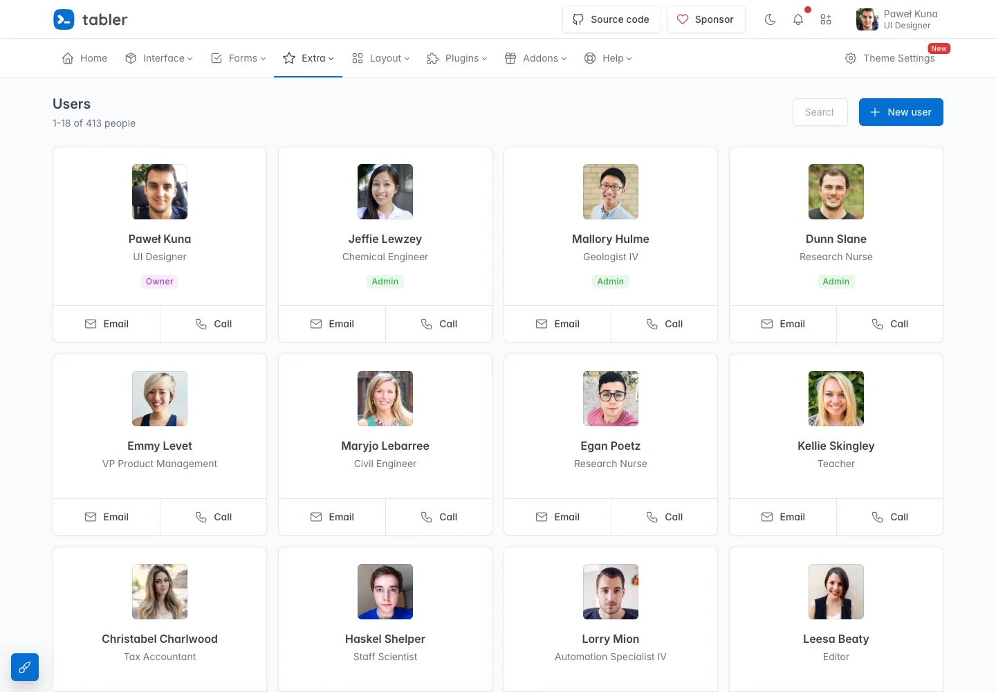
Make people comparable at a glance and put common contact actions in the same position.
Design notes
Surface
People directory
Navigation
Global navigation stays above the directory; local search and paging belong to the list.
Layout
Search and a creation action lead into repeated avatar cards with two contact choices.
Density
Primary content has the most space; repeated rows and secondary navigation use a compact, consistent rhythm.
Color
White cards, a pale page, and restrained blue action accents.
Type
Use identical card anatomy so scanning never depends on where a field happens to appear.
Pattern
Make people comparable at a glance and put common contact actions in the same position.
States
Public directory demo with fictional names, portraits, and roles.
Don't
Adapt the interaction pattern to your own product. Do not copy brand assets, sample identities, proprietary text, or assume unseen states. Specify keyboard behavior, loading, empty, error, and narrow-screen layouts for your implementation.
Make it your own
Turn this reference into a useful brief for your project. Copy it into the AI tool you already use.
Add constraintsPreview & edit promptAssembled in your browser. No API key or AI request needed. Changing the fields refreshes the preview.