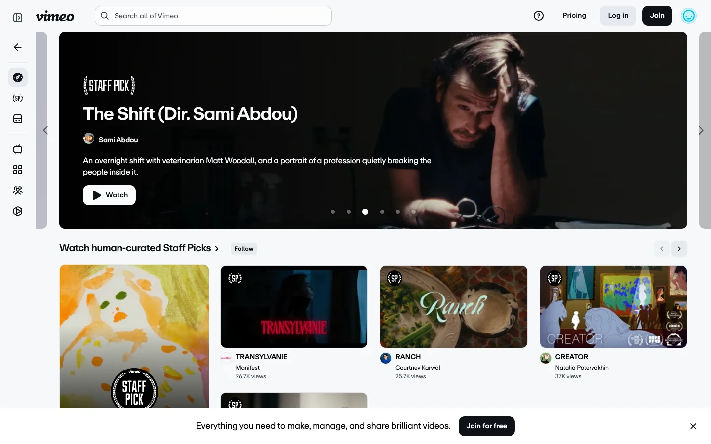
The hero carousel is inset in a grey gutter with slivers of the next and previous slide peeking at both edges — the peek, not the dot row underneath it, is what actually tells you it scrolls.
The inset carousel with peeking neighbour slides as a stronger scroll affordance than dots alone — keep the hero off the viewport edge on purpose. Also take the bracketed '{ STAFF PICK }' curation badge, reused at two scales: the full label on the hero and the abbreviated '{SP}' mark on grid thumbnails, so the same curation signal reads whether the card is huge or 300px wide.
Design notes
Surface
Vimeo homepage hero and the Staff Picks rail beneath it, logged out
Navigation
Two tiers. A fixed ~68px near-black icon rail on the far left (explore, staff-pick bracket glyph, archive, tv, grid, people, camera — explore active on a dark rounded highlight) and a white top bar above the content with the script wordmark, a centered search pill, and Pricing / Log in / Join / avatar on the right.
Layout
Icon rail fixed left, content fluid. The hero video is inset with visible grey gutter and peeking neighbour slides on both sides, not full-bleed. Below it, a 4-up thumbnail grid carries the same curation badges down to a smaller scale.
Density
Hero title runs ~28px bold; grid thumbnails sit around 300px wide with a tight avatar-plus-title-plus-metadata stack underneath, no dividers between cards.
Color
White and light-grey chrome, black text, a near-black icon rail. The only saturated colour that isn't a video still is a teal placeholder avatar circle — every other colour on the page comes from thumbnail or hero imagery.
Type
The Vimeo script logotype is the one decorative mark on the page. Everything else is a single grotesque sans run through a four-step ladder — bold white hero title, regular white creator name, grey description text, and the smallest, greyest text reserved for view counts.
Pattern
A hero carousel inset in a grey gutter, with slivers of neighbouring slides bleeding in from off-canvas and floating chevrons sitting in that gutter rather than on the video itself.
States
Logged out: the top bar shows Log in and Join instead of an account menu, a sticky dark bottom bar pushes 'Join for free' with a dismiss X, and the 'Follow' button on the Staff Picks row sits ungated but presumably prompts login on click.
Don't
Don't run the hero carousel full-bleed to the viewport edge. The grey gutter and the sliver of neighbouring slides are the entire scroll affordance — dots alone are a weaker signal and should only ever back it up, never replace it.
Make it your own
Turn this reference into a useful brief for your project. Copy it into the AI tool you already use.
Add constraintsPreview & edit promptAssembled in your browser. No API key or AI request needed. Changing the fields refreshes the preview.