How to Design Account Settings That People Can Understand
A settings page should make three things clear: what the control changes, whose account it affects, and when the change takes effect. Grouping fields is only the beginning. A useful settings design also explains scope, saving, permissions, and recovery when an update fails.
Key takeaways
- Group settings by the user’s object or task, not your database structure.
- Make personal, workspace, and billing scope explicit.
- Choose a consistent save model and explain whether a change succeeded.
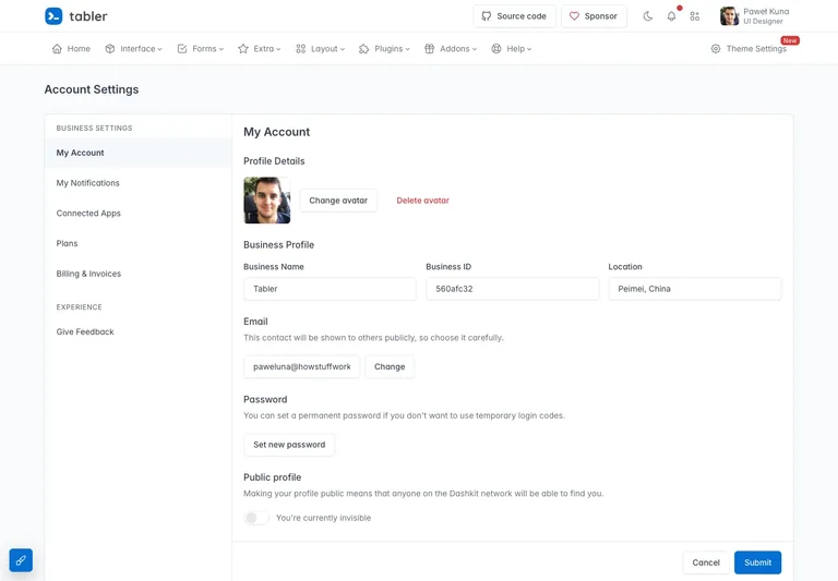
Start with the thing being changed
List the objects that users can configure: their profile, notifications, a workspace, connected tools, and perhaps a subscription. These are different responsibilities. A personal display name and a company billing address should not feel like two unrelated fields in the same miscellaneous form.
In the Tabler account settings capture, local navigation sits beside grouped account controls. The useful principle is the relationship between a stable section list and a focused editing area. It gives the current form a place within the larger account.
Distinguish personal and shared scope
Label controls according to who is affected. A personal notification preference may belong to one user, while a workspace default may influence the whole team. Put that distinction near the setting rather than relying on the user to infer it from a distant page title.
If the product supports several workspaces, preserve the current workspace context while editing. Before a significant change, the user should be able to identify the target without navigating away. Use realistic organization names in the design review, including long ones that wrap.
Choose a save model deliberately
A page can save each control immediately or collect edits behind a save action. Either model needs clear feedback. With explicit saving, explain when changes are unsaved and what happens if someone leaves. With immediate saving, show a pending state and make failures visible where the change occurred.
Avoid mixing models without explanation. A user who has learned that one toggle saves instantly may reasonably expect the next toggle to behave the same way. If a sensitive action uses a separate confirmation flow, explain the consequence in that flow rather than adding confirmation to every harmless edit.
Put plan management in account context
The Tabler plan and billing capture keeps plan choices within the same settings shell. Its side-by-side options are useful to study as a comparison structure; the displayed demo prices and limits are not advice for your product.
For your own plan screen, distinguish the current plan from a proposed change. State the relevant scope, such as an individual account or a workspace, and make the next action describe what will be reviewed or changed. The actual billing provider must determine the final amount and timing; the design should display those real details rather than infer them.
Keep editing available when something fails
A failed update should not silently reset the form or appear to have succeeded. Preserve safe user input, explain what remains unsaved, and offer an appropriate retry. If permission has changed, explain that condition separately from a connection problem.
Include loading, empty, validation, and success states in the brief. For a connected integration, also consider the difference between never connected, connected, and disconnected. A single green “Connected” badge is not a complete state model.
Review the smallest realistic account
Try the design with a new account that has no portrait, no integrations, and no billing history. Then try a long display name, several workspaces, and a read-only user. These cases reveal whether the layout depends on ideal sample data.
Use the navigation guide to distinguish settings navigation from global navigation. For clear feedback after a change, continue with empty, loading, and error states. Your settings page should help people make a change confidently and then return to their actual work.
References to explore
Common questions
Should settings save automatically or use a Save button?
Choose based on the control and consequence, then make the model consistent and visible. Immediate saving needs pending and failure feedback; explicit saving needs a clear unsaved state and a predictable action.