4 App UI Patterns Worth Studying: Dashboards, Boards, Timelines, and Canvases
The right app layout depends on the job someone is doing. Use an analytics overview to monitor change, a board to move work between states, a timeline to compare schedules, and a canvas to understand relationships. These four captured interfaces make that distinction visible.
Key takeaways
- Choose the information model before decorating the screen.
- Keep navigation, controls, and task content at clearly different levels.
- Design empty, loading, error, and long-content states alongside the populated example.
Editorial observations of dated captures, not measured performance rankings. Original sites may have changed. Our approach.
1. OpenPanel: monitor change, then inspect the breakdown
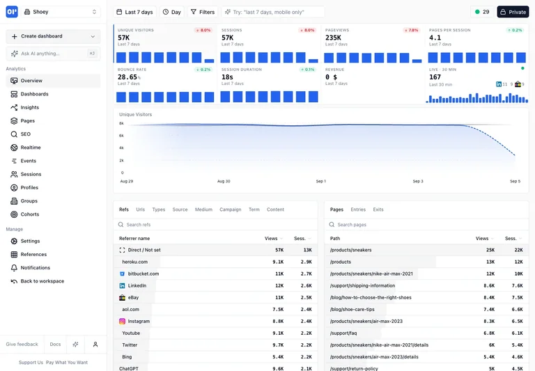
The analytics overview uses a persistent left rail, compact KPI trends, a broad time-series chart, and ranked breakdowns. Overview and supporting detail occupy visibly different levels.
Adapt it: Identify the few signals a person checks first. Place their supporting breakdowns nearby, and define the time range and data source clearly.
Watch for: Do not add metrics because a dashboard template has room for them. Every displayed number needs a meaning, source, and useful next action.
2. Tabler: organize work by state
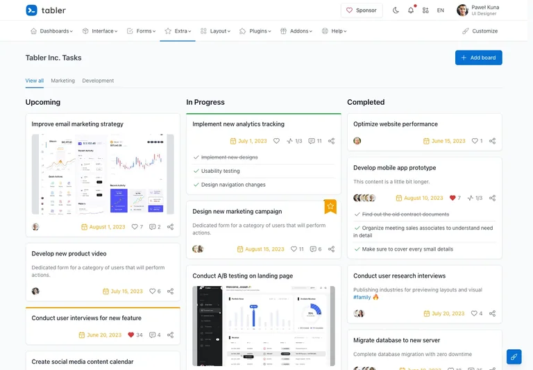
The captured board groups cards into work-in-progress columns. Owners, dates, checklists, and optional previews stay attached to the relevant task.
Adapt it: Use a board when moving an item between states is central to the work. Keep the card’s title and current responsibility scannable, and put secondary details in a predictable place.
Watch for: Drag-and-drop needs an alternative for people who cannot use that gesture. Plan a keyboard-accessible way to change state and a way to recover from a mistaken move.
3. FullCalendar: align resources against time
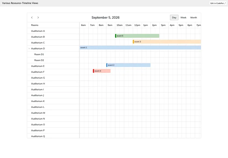
Named room rows align with hourly columns, with bookings represented as horizontal bars. The shared time axis makes overlaps and availability visible within the same frame.
Adapt it: Use consistent time units and keep resource labels associated with their rows. Define how the interface communicates unavailable periods and conflicting bookings.
Watch for: The reference shows a populated scheduling layout. Your implementation still needs to define time zones, validation, error messages, and the booking interaction.
4. ChartDB: make relationships navigable
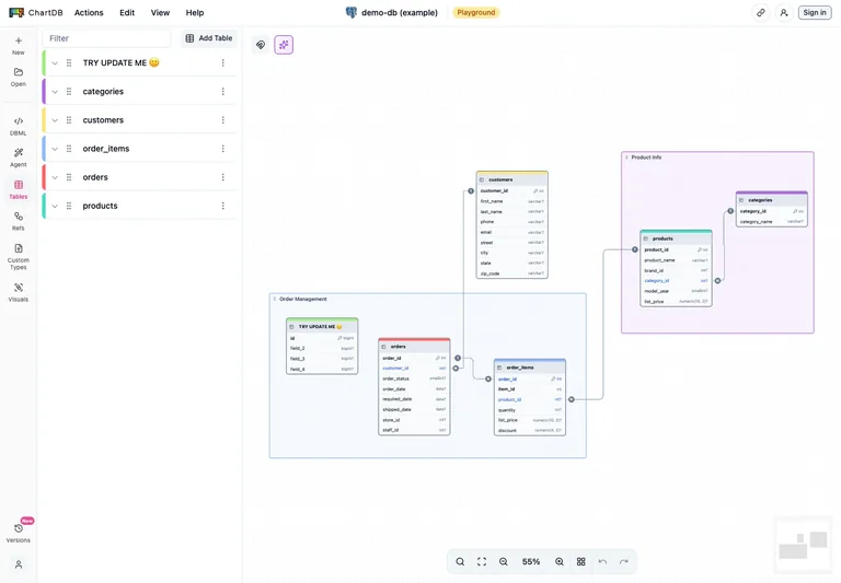
A narrow table inventory sits beside linked schema cards on a large canvas, with a small overview map. The list and diagram offer two ways to locate the same information.
Adapt it: Pair a spatial view with a searchable inventory when the model can become larger than the viewport. Keep the selected item recognizable in both views.
Watch for: A canvas can become difficult to use with only pointer gestures. Provide usable zoom, navigation, selection, and a textual way to inspect important relationships.
Choose a task before choosing a dashboard
“Build me a dashboard” leaves most of the important design decisions unresolved. Is the user checking whether a system is healthy, assigning work, booking a resource, or exploring a model? Each task asks for a different relationship between overview and detail.
These references were chosen for their different information structures. Several are public demonstrations rather than screenshots of private production accounts. The visible example shows how a populated layout can be arranged; it does not prove the behavior of every control or the completeness of the application.
Write the information model in plain language
Before giving a screenshot to an AI builder, list the main object, its important attributes, and the action someone takes on it. A task has an owner and a status. A booking occupies a resource for a period of time. A database relationship connects fields in two tables. Those differences should shape the interface.
Next, decide which information must remain visible while the user works. A calendar may need resource names to stay associated with time slots. A canvas may need a table inventory available while someone navigates a larger diagram. A marketing-style hero does not solve either problem.
Make the states part of the brief
A populated reference is a starting point. Ask your builder to account for:
- An empty account before the first item is created.
- A loading state that does not unexpectedly move the controls.
- A failed request with a useful recovery action.
- A filter that returns no results.
- Very long names, many rows, and missing optional fields.
- Keyboard access to the task’s main actions.
Specify which data is real and label any sample data. A beautiful screen with invented operational metrics should not look like a connected system. The Slop Monster is perfectly happy to put “Revenue +240%” in a box; your users deserve an actual data contract.
Check density at the working size
Review the interface at the size people will actually use. Smaller text can make a screenshot look efficient while making repeated work uncomfortable. Keep frequently used actions reachable, preserve clear labels, and offer an intentional way to inspect overflow rather than shrinking every column.
For a phone, choose what task remains practical. A complex relationship canvas may need zoom and navigation controls; a large table may need horizontal scrolling or a focused detail view. Do not claim mobile support solely because the desktop screen has been compressed.
Give each reference a role
Save a few app screens to a board. Write “navigation,” “information density,” or “task structure” beside each in your brief. Then describe the product-specific differences. The mood-board workflow provides a reusable format, and the typography checklist helps you assess the result.
Common questions
Can I use a landing-page reference for an app dashboard?
You can borrow a visual principle such as type hierarchy, but use an app reference for navigation, density, task structure, and states. A promotional page and a working interface solve different problems.