4 Landing Page Examples: What to Borrow From Long Sales Pages
A long landing page earns its length by answering the questions a buyer needs resolved. These four course pages show different ways to sequence an offer, explain what is included, present examples, and return to an enrollment action. Study that sequence before borrowing the styling.
Key takeaways
- Map each section to a reader question before choosing a page length.
- Use real curriculum, product previews, and accurately attributed proof.
- A sales-page capture does not verify the rest of a funnel or its conversion rate.
Editorial observations of dated captures, not measured performance rankings. Original sites may have changed. Our approach.
1. Davey & Krista: organize the teaching framework
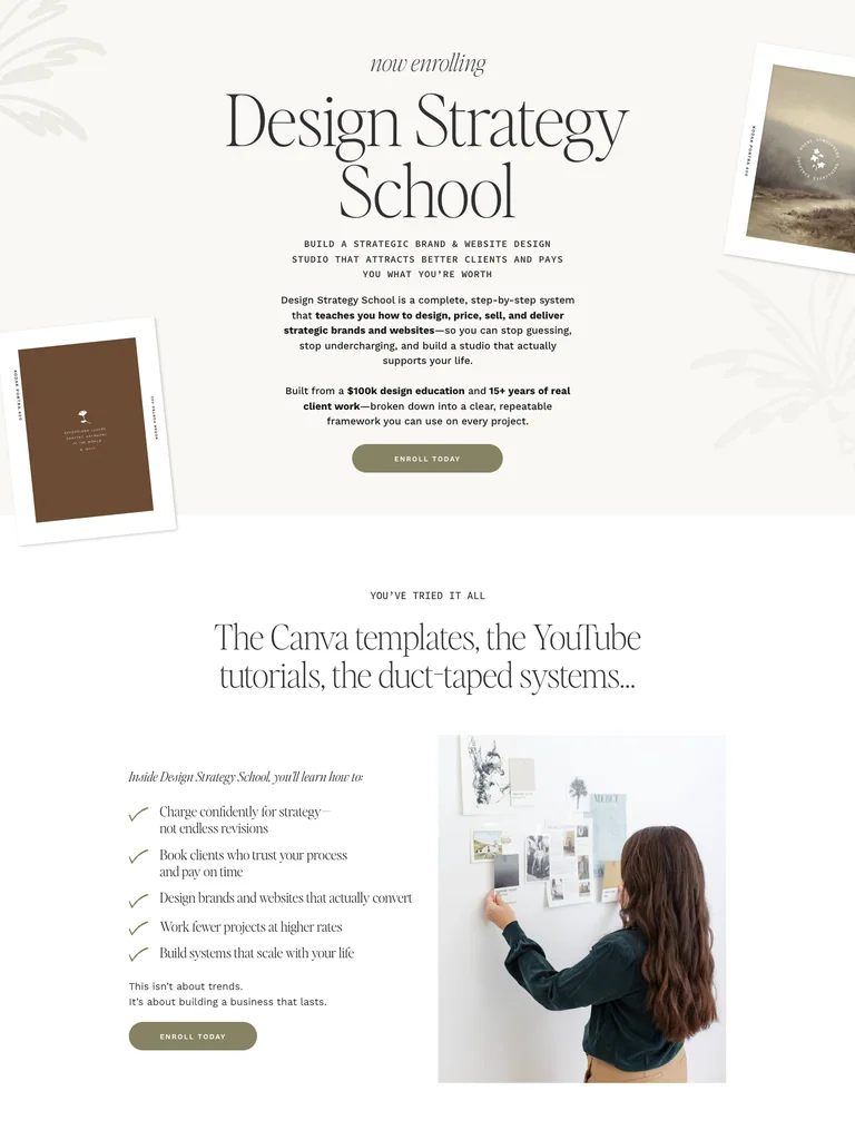
This editorial course page moves from a design-business promise into a teaching framework, curriculum, resources, and instructor or student context. Large photography and typographic changes separate the chapters.
Adapt it: Give your offer a clear internal model. Name the stages, show what belongs in each, and connect the curriculum back to the problem introduced at the top.
Watch for: Borrow the structure, not the source’s claims or testimonials. Serif headlines are a stylistic choice; the framework should remain clear in your own type system.
2. Flux Academy: show the work alongside the offer
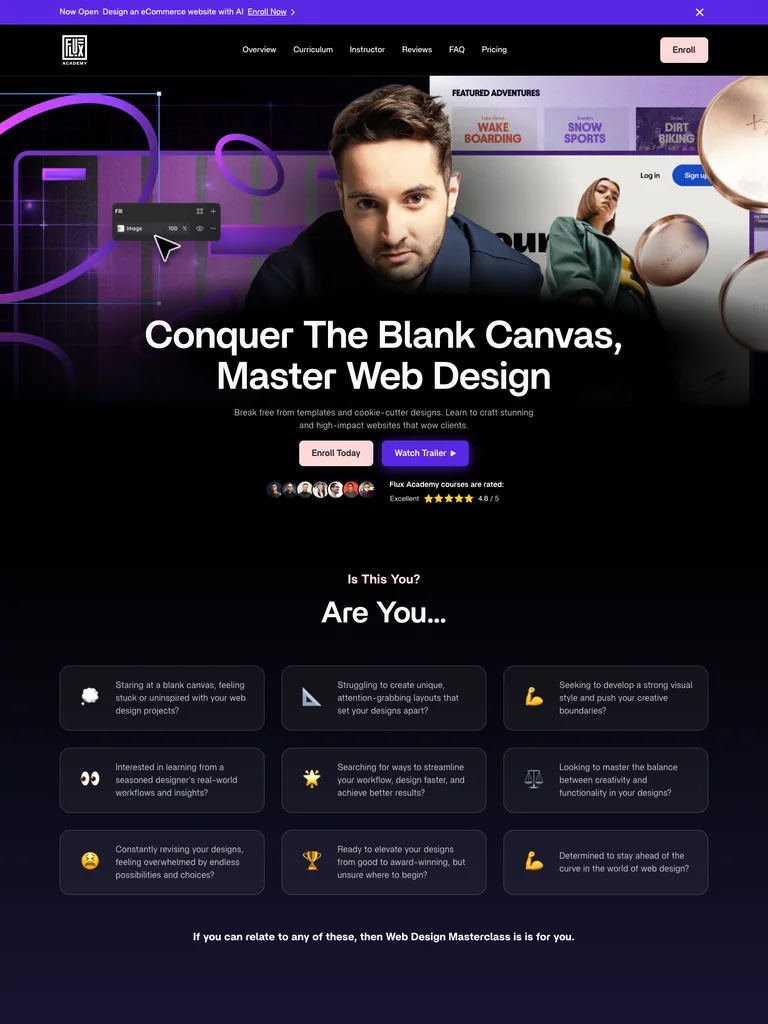
The capture combines an instructor and project-led opening with course features, three example projects, curriculum, mentor support, and enrollment information. Project previews give the learning offer something visual to inspect.
Adapt it: Place representative work near the explanation of what people will practice. Describe the relationship between a project, a skill, and the support available.
Watch for: A finished project image does not establish a typical student outcome. Label examples accurately and avoid implying that everyone will achieve the same result.
3. Ryan Hayward: make the learning experience concrete

A clear opening leads into student proof, course features, project and lesson previews, instructor context, and plans. The structure offers several ways to understand what is inside before reaching the final questions.
Adapt it: Show the actual format: a lesson preview, an exercise, or a representative project. Make the enrollment section explain what access includes and any relevant limitations.
Watch for: Do not copy the source’s pricing, availability, or support promises. Verify your own offer details before publishing.
4. Ashlyn Writes: sustain a long editorial narrative
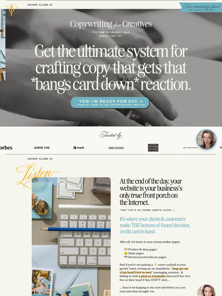
The page layers audience fit, instructor context, student stories, modules, template previews, and a closing offer. Cream, brown, blue, and yellow establish a distinct editorial mood around the detailed content.
Adapt it: Use concrete artifacts to break up a long explanation: a template excerpt, a lesson outline, or a product sample. Let the reader inspect the thing you are describing.
Watch for: Decorative type and extra sections can obscure an offer. Keep body copy readable and include only sections that answer a real question.
What makes a useful long-page reference?
A useful sales-page reference exposes the logic of an offer. A visitor should be able to work out who the product is for, what they will receive, why the format fits their situation, and what happens after taking action. Different offers need different amounts of explanation.
We selected these examples from Swipefile’s landing-page library because their captured pages include more than an opening hero. They show section sequences worth studying. They are not presented as the highest-converting funnels, and the capture does not verify checkout steps, current enrollment availability, or any result claimed on the source page.
Outline the questions before the sections
Start with the visitor’s questions rather than a template’s component names:
- Is this meant for someone in my situation?
- What will I receive or be able to do?
- What does the product or learning experience actually look like?
- What support, requirements, and limitations should I understand?
- What are the price and terms, and what happens when I continue?
Turn those questions into headings. A section called “Everything you need” may sound complete while explaining very little. A section naming the deliverables or showing a sample lesson is easier to evaluate.
Repeat the action when the reader has new context
A long page can offer the same primary action after the overview, after the product details, and near the closing terms. The point is to avoid forcing someone to hunt for the next step after they have enough information. Each action should lead to the destination its label promises.
Avoid asking an AI builder to invent scarcity, guarantees, testimonials, or payment plans to fill a template. If a proof section is waiting for real evidence, omit it or show an honest product demonstration. A convincing layout cannot turn fabricated proof into something useful.
Adapt the page to phones
Review the section order in a single column. Wide comparison tables may need a carefully designed alternative. Keep headings attached to their explanations, and make enrollment links easy to distinguish from secondary links. Test long plan names and actual pricing copy instead of short placeholders.
A mobile preview is also where repeated background changes and decorative separators can become tiring. Keep the contrasts that explain a change of subject; remove the ones that only add length.
Build a focused reference board
Explore landing pages and funnels, save a few references, and label the principle you want from each. You might choose one for its opening, another for curriculum detail, and another for its closing offer. Use the design-brief guide to turn that selection into instructions your builder can follow.
Common questions
How long should a landing page be?
Long enough to explain the offer and resolve the important questions, with each section earning its place. Use the complexity of the decision and your available evidence to guide length, rather than copying a word count.
Are these complete funnel examples?
These references capture public sales pages. They do not verify the full sequence of checkout, payment, onboarding, email follow-up, or conversion results.