3 Newsletter Landing Page Examples With a Clear Reason to Subscribe
A newsletter landing page asks someone to make room for another recurring email. The useful question is not how to make the form louder, but how to make the reading experience understandable. These examples connect a subscription to an author, a subject, and visible work the reader can inspect.
Key takeaways
- Explain the topic and realistic publishing rhythm before asking for an email.
- Let visitors sample the kind of work they will receive.
- Keep the subscription action distinct from courses, services, and other offers.
Editorial observations of dated captures, not measured performance rankings. Original sites may have changed. Our approach.
1. Justin Welsh: give one recurring publication the lead
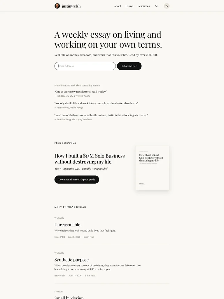
The warm, type-led capture puts a short publication promise and compact inline form at the center of the opening. Supporting statements, a guide, and article links follow in a restrained reading layout.
Adapt it: Describe a specific recurring publication, then keep its form close to that explanation. Let the surrounding page feel like a preview of the writing’s pace and tone.
Watch for: A calm design still needs a concrete topic. Quiet typography cannot explain what an unspecified “weekly dose of inspiration” contains.
2. Kieran Drew: connect the author to the offer
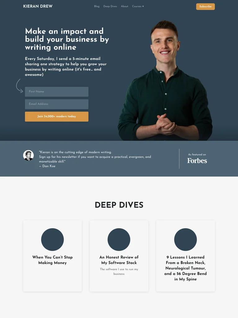
A portrait shares the opening with a direct writing-focused introduction and newsletter form. The dark blue field and warm action color separate the subscription area from the lighter content sections below.
Adapt it: Use a relevant portrait when the relationship with the author is part of the offer. Follow the form with real examples that help someone judge the subject and level of detail.
Watch for: Do not borrow the author’s audience claims or testimonials. A new publication can offer a representative issue instead of manufacturing social proof.
3. David Perell: organize a wider publishing world
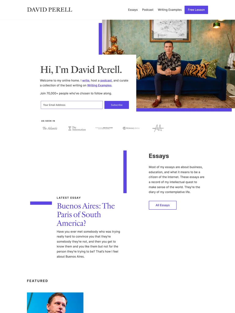
The captured page introduces a writer alongside a portrait and subscription route, then separates essays and other publishing channels into recognizable sections. The editorial typography ties those different formats together.
Adapt it: If a newsletter sits beside essays or a podcast, give each format a name and a clear destination. Help visitors sample the work without losing the subscription path.
Watch for: Avoid dropping every format into one undifferentiated feed. Someone choosing an email subscription needs to understand which experience they are signing up for.
Write the promise before the form
State the subject, the intended reader, and the format you can realistically sustain. A short practical lesson, a curated reading list, and a personal essay are different commitments. Explain which one the newsletter provides instead of describing all of them as valuable insights.
Be precise about frequency when you can maintain it. If the schedule is variable, describe it honestly rather than filling a template with a weekly promise. The form should reinforce the publication you are actually prepared to send.
Give the reader a useful sample
Link to a representative issue or excerpt. Choose a sample that resembles the ongoing publication, not an unusually elaborate launch piece that creates the wrong expectation. Label the sample’s topic and format so readers can decide whether to open it.
Place testimonials or subscriber counts only when you can substantiate them. A visible archive, a clear author introduction, and a good sample can provide useful context without implying a scale the publication has not reached.
Specify what happens after submission
The success state should explain whether the reader is subscribed, needs to confirm an email, or should expect a first issue later. Avoid a generic success toast that disappears before the next step can be read. A resend option, when supported, should state what it resends.
Keep the email field understandable after typing begins. The W3C guidance on labeling controls explains how labels identify fields and connect their names to the controls. A placeholder alone should not carry all the instructions in your design brief.
Keep other offers in proportion
A course, consultation, or community can have a separate section, but it should not unexpectedly replace the action the opening promised. If the main purpose is newsletter growth, review whether competing buttons are taking attention away from understanding the email itself.
Use the navigation guide to organize multiple content channels. For the larger sequence of an educational offer, compare the long landing-page examples. The newsletter page should remain a clear invitation to read, even when it belongs to a larger business.
Common questions
Does a newsletter landing page need a long sales pitch?
Only if the explanation is useful to the subscription decision. A clear topic, representative sample, author context, and understandable next step may do more work than a long sequence of generic benefits.