3 SaaS Hero Examples That Make the Product Easier to Understand
A SaaS hero needs to make an unfamiliar product understandable. A finished output, a recognizable workflow, and a close view of the interface each answer a different question. These three references show how the visual can explain the offer instead of merely filling the space beside a headline.
Key takeaways
- Choose a preview that answers the visitor’s first product question.
- Give the preview enough space to communicate one recognizable idea.
- Connect the image to the headline and the next action.
Editorial observations of dated captures, not measured performance rankings. Original sites may have changed. Our approach.
1. Webflow: show the range of the output
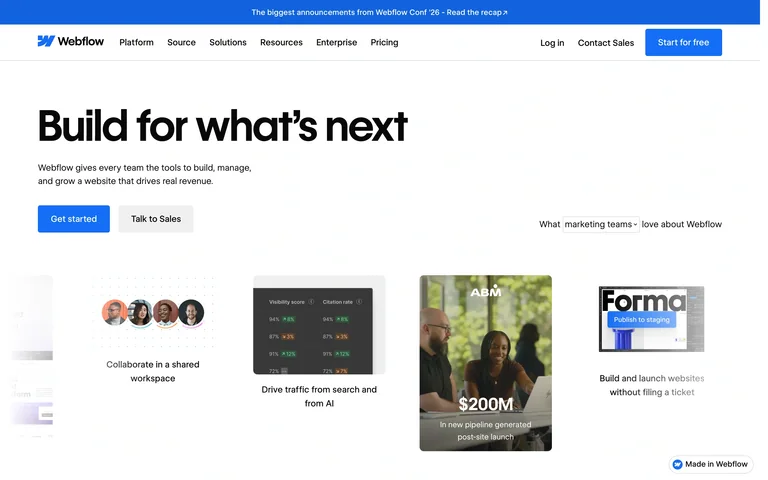
The captured opening places a strong left-aligned introduction above a row of varied website examples. The examples make the platform’s output visible before a visitor has inspected the builder itself.
Adapt it: Use a small gallery when customers care about the range of things they can make. Pick examples with meaningful differences in purpose or structure, rather than five recolored versions of the same template.
Watch for: A busy strip can become decorative confetti. Keep the examples recognizable at the size people will actually see, especially on a phone.
2. Airtable: put a broad promise in a workflow
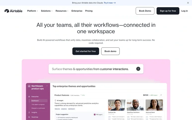
The centered opening leads into a wide, pink-framed product preview. The interface supplies concrete context for a platform that could otherwise sound very broad. The introduction and preview feel like two parts of the same explanation.
Adapt it: Choose one familiar task and show the relevant portion of the workflow. Add a short caption if the important relationship is not obvious from the screen alone.
Watch for: Shrinking an entire dashboard into a tiny frame makes its labels unreadable. A focused crop can explain more than a complete application window.
3. RightFont: make the working interface the opening image
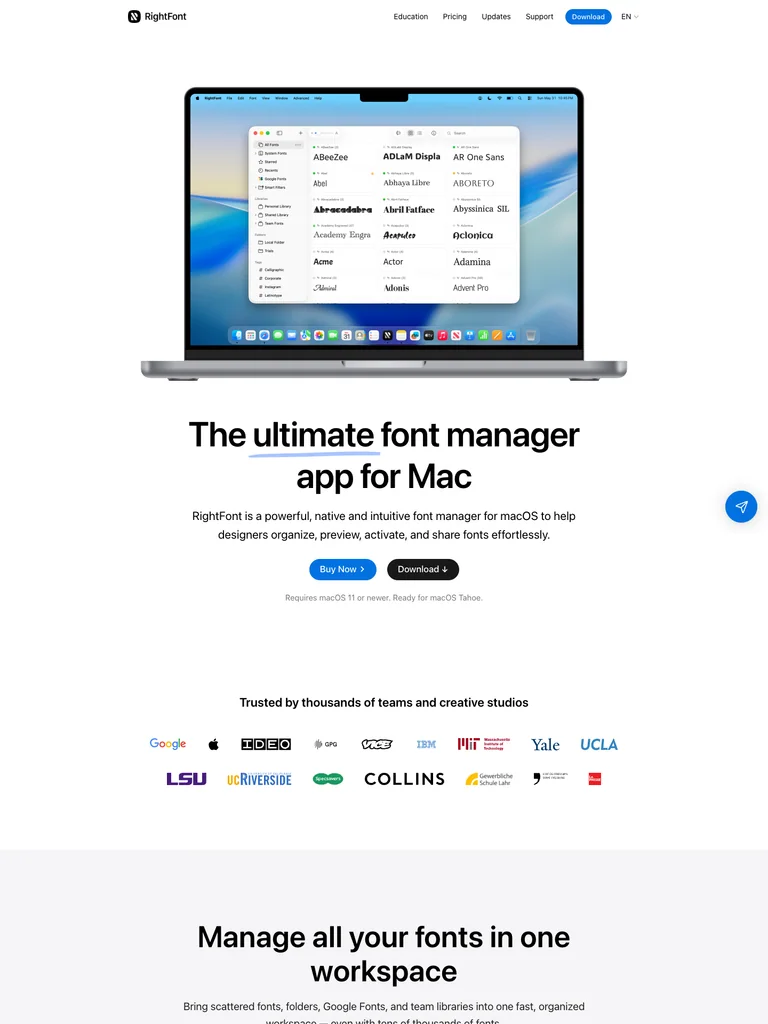
A large laptop preview sits above the main product statement in the capture. The font-management interface supplies the visual interest, while the surrounding page stays relatively quiet.
Adapt it: Lead with the interface when its content clearly reveals the product category. Use a real working state and a device frame only when that frame helps explain the environment.
Watch for: Do not let the laptop become the subject. If the hardware frame occupies more attention than the useful product detail, simplify or remove it.
Choose the question your hero should answer
Before selecting a screenshot, write the question a first-time visitor needs answered. “What can I create?” points toward output examples. “How does this fit my work?” points toward a workflow. “What will I actually use?” points toward the interface. A single hero rarely needs to answer all three at equal volume.
Try describing the proposed visual without naming the product. If the description is only “a dashboard with some colorful charts,” it probably does not explain the offer yet. Choose a state with recognizable objects, meaningful labels, and a clear relationship to the headline.
Make an image brief before making an image
Specify the subject, the useful detail, the surrounding context, and the crop. For a scheduling tool, that might be one real appointment moving from a request into a calendar. For a creative tool, it might be three finished outputs with different formats. These are planning examples, not claims about the references above.
The visual should use your own product evidence. If the interface is a concept, label it as a concept. Avoid inserting customer logos, revenue figures, or success messages simply because another homepage uses them. Visual specificity comes from the product, not from a collection of borrowed proof badges.
Check the relationship with the action
An output gallery can lead to exploring examples or beginning a project. A workflow preview can support a demo request. The label should explain what will happen after the click. A trial and a sales conversation are different commitments, so they need visibly different treatment when both are present.
At the narrow layout, check the order of headline, explanation, action, and image. The screenshot may sit below the action without becoming less valuable. Do not make a visitor scroll through a huge device mockup before finding out what the product does.
Use a focused reference set
Save one reference for the image strategy and another only if it solves a separate problem. Compare this article with the hero imagery guide when you are deciding between product evidence and a more atmospheric opening. Then use the AI design brief workflow to name the exact principle you want to adapt.
Common questions
Should every SaaS homepage show a dashboard?
No. Show the evidence that explains the product best: finished work, a specific workflow, or the interface itself. A dashboard is useful only when its contents help the visitor understand the offer.