3 Website Hero Image Strategies: Product World, Human Context, and Atmosphere
A hero image can explain an idea, show a person doing the work, or establish a memorable setting. Those jobs call for different assets. These three captures help separate the purpose of an image from its style, so the opening can feel distinctive without becoming unrelated decoration.
Key takeaways
- Choose the job of the hero image before choosing its style.
- Keep the message and action readable within the composition.
- Use your own relevant assets and review the narrow-screen crop.
Editorial observations of dated captures, not measured performance rankings. Original sites may have changed. Our approach.
1. Clay: build a visual world around an abstract product

The capture places a colorful miniature landscape above a dark green introduction. Objects, paths, and forms create a memorable scene around a product whose underlying workflows would be harder to communicate with one generic photograph.
Adapt it: Use an illustrated world when a visual metaphor can support the product story. Decide what the key objects represent, then keep the composition focused enough to describe in one sentence.
Watch for: An attractive metaphor can become detached from the offer. Pair it with concrete language or product evidence so visitors do not have to solve a visual riddle.
2. Shopify: connect the offer to a person doing the work
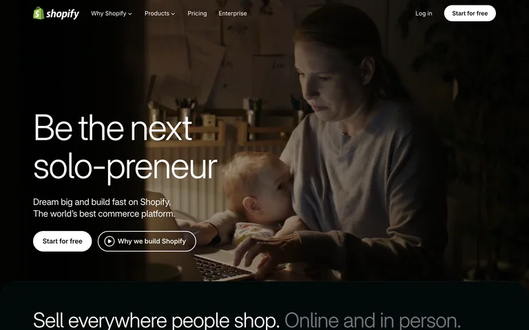
A merchant scene fills the background while the message and actions remain in the foreground. The photograph supplies a recognizable human context rather than presenting the interface as the only way to understand the product.
Adapt it: Choose a real activity that reflects your audience’s work. Compose the scene with room for text, and check that the person and action remain meaningful after a mobile crop.
Watch for: Stock photography can imply a story your product does not support. Avoid presenting a model or invented scene as a customer testimonial or verified result.
3. Skala: give a concise introduction an expansive setting
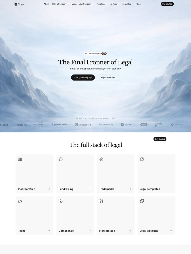
The capture places a small centered serif introduction inside a broad mountain landscape. The large amount of environmental space makes the opening feel calm and deliberate around a limited set of actions.
Adapt it: Use atmosphere when the surrounding setting reinforces the tone of the service. Let restrained copy and a clear action keep the page useful while the image establishes its mood.
Watch for: A landscape can be memorable while saying little about the offer. Do not ask the image to replace a clear explanation of what the organization does.
Choose an image with an editorial reason
Write the reason the image belongs on the page. It might reveal the material quality of a product, show the working environment of a customer, or make a complex idea easier to discuss. If the reason is only that the colors match, keep looking or simplify the opening.
Consider what the image will add beyond the headline. Repeating the same message visually can be useful, but unrelated ornament can introduce a second story the page never resolves. The opening should feel like one composition rather than a headline placed beside a random impressive asset.
Plan the crop as part of the layout
Identify the subject and the space the text needs. A desktop image with a person on one edge may lose that person when cropped into a narrow portrait shape. Prepare an alternate crop or reposition the layout deliberately rather than relying on a default center crop.
Check the image behind the actual words and button labels. A quiet area in one version of the asset may become busy after a crop. If readability depends on a dark overlay, inspect the final combination rather than assuming the original photograph’s contrast is sufficient.
Use evidence when the product needs explanation
Atmosphere and metaphor are not substitutes for showing how a complicated product works. A page can open with a visual world and then introduce a clear product example nearby. Decide where the visitor will get that practical explanation.
If the interface or output already makes the product obvious, it may be the stronger opening asset. Compare the SaaS hero examples before commissioning an illustration that the page does not need.
Brief an original asset
Describe the subject, purpose, composition, tone, and crop requirements in your own words. Use reference images to explain principles, not as assets to reproduce. Confirm that the selected photography, illustration, or generated material is appropriate to use in your project.
Avoid rendering important headlines or button labels into the image. Keep those elements as real interface text so they can adapt with the layout. The typography guide can help establish the relationship between a strong image and readable supporting content.
Common questions
Is a custom illustration always better than a product screenshot?
No. Choose the asset that does a useful job for the visitor. A focused screenshot may explain a tool more directly, while an illustration or photograph may support a broader story or context.