Personal Creator
CURATED COLLECTION · 100 REFERENCES
Explore how famous performers and athletes present themselves beyond a social feed. These 100 English-language sites include expressive album campaigns, focused tour pages, personal portfolios, official stores, and clearly labeled celebrity brands.
Copy the reference notes below and paste them into Claude, ChatGPT, or your coding assistant. Add what you want to build.
Includes design notes, original sources, and preview links. An assistant that supports browsing can also read the public board link.
Selected for visible design choices and a verifiable connection to the celebrity. The pages were reviewed on September 8, 2026. This is an editorial selection, not a popularity ranking. Each capture documents an opening viewport; it does not cover every page or interaction. Some original sites display small consent notices.
Compare the centered portrait, pale map-like lines, and bright store action. Useful for balancing a recognizable identity with a clear next step.
Study the narrow navigation rail and image archive. Useful when photographs and projects need to remain easy to browse.
Study how the dance pose, flowing fabric, and tall name lettering work together. Useful when a person’s craft can shape the whole composition.
Save a small group with complementary strengths: one for identity, one for content organization, and one for the main visitor action. Write down what each contributes. Use your own artwork, names, copy, and evidence, then check the result with a keyboard and on a phone. Famous names bring existing recognition; a new brand may need a clearer introduction.
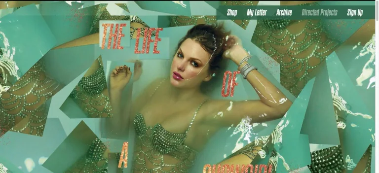
A jewel-green photographic collage fills the opening, with scattered album lettering and compact navigation aligned across the top.
Useful for: A music celebrity website reference; study how its opening presents identity and routes into work, releases, or public appearances.
# Design reference: Taylor Swift
Source: https://www.taylorswift.com/
Swipefile reference: https://swipefile.design/ref/celebrity-taylor-swift/
Captured: 2026-09-08. This is a dated reference, not a claim about the current live product.
Capture scope: one viewport. Do not infer unseen page sections or a complete user flow.

## Objective
Adapt the visual principles below to my project. Use my own content and identity. Do not reproduce logos, proprietary copy, or brand assets.

## Reference notes
- mood: Ornate and theatrical.
- colors: Emerald green, pale aqua, warm gold, and cream.
- typography: Adapt the visible contrast between display lettering and smaller navigation. Choose type that supports your own identity and remains readable on small screens.
- layout: A jewel-green photographic collage fills the opening, with scattered album lettering and compact navigation aligned across the top.
- motion: Static opening-viewport capture. Follow the original source to inspect animation, video, menus, and reduced-motion behavior.
- texture: Let original photography or film provide the visual detail. Keep supporting controls clear.
- dont: Do not copy the celebrity’s identity, claims, photographs, artwork, or trademarks into a new brand.

Useful for: A music celebrity website reference; study how its opening presents identity and routes into work, releases, or public appearances.

## Acceptance criteria
- Existing project conventions, design tokens, working functionality, and unrelated changes are preserved.
- Two or three reference principles clearly support the user's task; conflicts are resolved in favor of usability and the existing product.
- Reusable components and semantic HTML express the interface. Available licensed assets are used; important UI text is never rendered as a bitmap.
- Every visible control has a defined behavior. Loading, empty, error, success, disabled, and long-content states are specified where relevant. Demo data is clearly labeled.
- Navigation and content adapt at 375px, 768px, and 1440px without horizontal page overflow. Keyboard use, visible focus, labeled inputs, at least 44px touch targets, readable contrast, and reduced motion are supported.
- Verification distinguishes rendered behavior from proposals and identifies anything still requiring a backend or external service.

## Quality bar
Clear hierarchy, consistent spacing, restrained surfaces, and purposeful motion. Avoid decorative gradients, excessive cards, placeholder buttons, and invented metrics unless the project calls for them. Do not claim a feature is connected or tested without evidence.
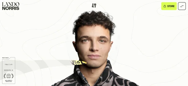
A close centered portrait sits on a pale topographic-line background, balanced by elegant name typography and a fluorescent store control.
Useful for: A sports celebrity website reference; study how its opening presents identity and routes into work, releases, or public appearances.
# Design reference: Lando Norris
Source: https://landonorris.com/
Swipefile reference: https://swipefile.design/ref/celebrity-lando-norris/
Captured: 2026-09-08. This is a dated reference, not a claim about the current live product.
Capture scope: one viewport. Do not infer unseen page sections or a complete user flow.

## Objective
Adapt the visual principles below to my project. Use my own content and identity. Do not reproduce logos, proprietary copy, or brand assets.

## Reference notes
- mood: Precise and modern.
- colors: Off-white, black, lime yellow, and soft gray.
- typography: Adapt the visible contrast between display lettering and smaller navigation. Choose type that supports your own identity and remains readable on small screens.
- layout: A close centered portrait sits on a pale topographic-line background, balanced by elegant name typography and a fluorescent store control.
- motion: Static opening-viewport capture. Follow the original source to inspect animation, video, menus, and reduced-motion behavior.
- texture: Let original photography or film provide the visual detail. Keep supporting controls clear.
- dont: Do not copy the celebrity’s identity, claims, photographs, artwork, or trademarks into a new brand.

Useful for: A sports celebrity website reference; study how its opening presents identity and routes into work, releases, or public appearances.

## Acceptance criteria
- Existing project conventions, design tokens, working functionality, and unrelated changes are preserved.
- Two or three reference principles clearly support the user's task; conflicts are resolved in favor of usability and the existing product.
- Reusable components and semantic HTML express the interface. Available licensed assets are used; important UI text is never rendered as a bitmap.
- Every visible control has a defined behavior. Loading, empty, error, success, disabled, and long-content states are specified where relevant. Demo data is clearly labeled.
- Navigation and content adapt at 375px, 768px, and 1440px without horizontal page overflow. Keyboard use, visible focus, labeled inputs, at least 44px touch targets, readable contrast, and reduced motion are supported.
- Verification distinguishes rendered behavior from proposals and identifies anything still requiring a backend or external service.

## Quality bar
Clear hierarchy, consistent spacing, restrained surfaces, and purposeful motion. Avoid decorative gradients, excessive cards, placeholder buttons, and invented metrics unless the project calls for them. Do not claim a feature is connected or tested without evidence.
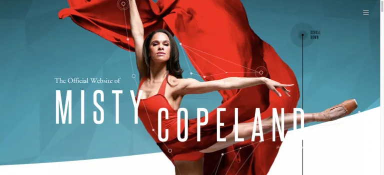
An extended dance pose and flowing red fabric cross a teal geometric background behind tall white identity lettering.
Useful for: A dance celebrity website reference; study how its opening presents identity and routes into work, releases, or public appearances.
# Design reference: Misty Copeland
Source: https://mistycopeland.com/
Swipefile reference: https://swipefile.design/ref/celebrity-misty-copeland/
Captured: 2026-09-08. This is a dated reference, not a claim about the current live product.
Capture scope: one viewport. Do not infer unseen page sections or a complete user flow.

## Objective
Adapt the visual principles below to my project. Use my own content and identity. Do not reproduce logos, proprietary copy, or brand assets.

## Reference notes
- mood: Expressive and movement-led.
- colors: Teal, scarlet, white, and warm skin tones.
- typography: Adapt the visible contrast between display lettering and smaller navigation. Choose type that supports your own identity and remains readable on small screens.
- layout: An extended dance pose and flowing red fabric cross a teal geometric background behind tall white identity lettering.
- motion: Static opening-viewport capture. Follow the original source to inspect animation, video, menus, and reduced-motion behavior.
- texture: Use original graphics and a restrained supporting interface to establish the page’s visual character.
- dont: Do not copy the celebrity’s identity, claims, photographs, artwork, or trademarks into a new brand.

Useful for: A dance celebrity website reference; study how its opening presents identity and routes into work, releases, or public appearances.

## Acceptance criteria
- Existing project conventions, design tokens, working functionality, and unrelated changes are preserved.
- Two or three reference principles clearly support the user's task; conflicts are resolved in favor of usability and the existing product.
- Reusable components and semantic HTML express the interface. Available licensed assets are used; important UI text is never rendered as a bitmap.
- Every visible control has a defined behavior. Loading, empty, error, success, disabled, and long-content states are specified where relevant. Demo data is clearly labeled.
- Navigation and content adapt at 375px, 768px, and 1440px without horizontal page overflow. Keyboard use, visible focus, labeled inputs, at least 44px touch targets, readable contrast, and reduced motion are supported.
- Verification distinguishes rendered behavior from proposals and identifies anything still requiring a backend or external service.

## Quality bar
Clear hierarchy, consistent spacing, restrained surfaces, and purposeful motion. Avoid decorative gradients, excessive cards, placeholder buttons, and invented metrics unless the project calls for them. Do not claim a feature is connected or tested without evidence.
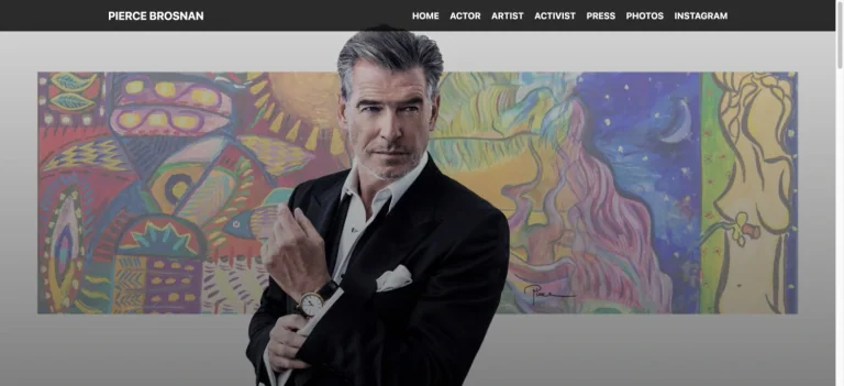
A formal portrait overlaps a colorful painting, connecting the actor’s image with his art beneath an orderly black navigation bar.
Useful for: A film celebrity website reference; study how its opening presents identity and routes into work, releases, or public appearances.
# Design reference: Pierce Brosnan
Source: https://www.piercebrosnan.com/
Swipefile reference: https://swipefile.design/ref/celebrity-pierce-brosnan/
Captured: 2026-09-08. This is a dated reference, not a claim about the current live product.
Capture scope: one viewport. Do not infer unseen page sections or a complete user flow.

## Objective
Adapt the visual principles below to my project. Use my own content and identity. Do not reproduce logos, proprietary copy, or brand assets.

## Reference notes
- mood: Artful and composed.
- colors: Charcoal, white, muted gold, violet, and green.
- typography: Adapt the visible contrast between display lettering and smaller navigation. Choose type that supports your own identity and remains readable on small screens.
- layout: A formal portrait overlaps a colorful painting, connecting the actor’s image with his art beneath an orderly black navigation bar.
- motion: Static opening-viewport capture. Follow the original source to inspect animation, video, menus, and reduced-motion behavior.
- texture: Let original photography or film provide the visual detail. Keep supporting controls clear.
- dont: Do not copy the celebrity’s identity, claims, photographs, artwork, or trademarks into a new brand.

Useful for: A film celebrity website reference; study how its opening presents identity and routes into work, releases, or public appearances.

## Acceptance criteria
- Existing project conventions, design tokens, working functionality, and unrelated changes are preserved.
- Two or three reference principles clearly support the user's task; conflicts are resolved in favor of usability and the existing product.
- Reusable components and semantic HTML express the interface. Available licensed assets are used; important UI text is never rendered as a bitmap.
- Every visible control has a defined behavior. Loading, empty, error, success, disabled, and long-content states are specified where relevant. Demo data is clearly labeled.
- Navigation and content adapt at 375px, 768px, and 1440px without horizontal page overflow. Keyboard use, visible focus, labeled inputs, at least 44px touch targets, readable contrast, and reduced motion are supported.
- Verification distinguishes rendered behavior from proposals and identifies anything still requiring a backend or external service.

## Quality bar
Clear hierarchy, consistent spacing, restrained surfaces, and purposeful motion. Avoid decorative gradients, excessive cards, placeholder buttons, and invented metrics unless the project calls for them. Do not claim a feature is connected or tested without evidence.
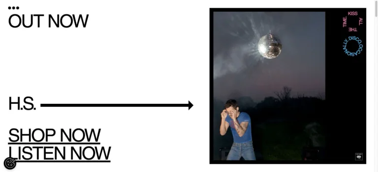
Oversized black links and a long horizontal arrow sit beside album artwork in a stark white composition with deliberately spare branding.
Useful for: A music celebrity website reference; study how its opening presents identity and routes into work, releases, or public appearances.
# Design reference: Harry Styles
Source: https://www.hstyles.co.uk/
Swipefile reference: https://swipefile.design/ref/celebrity-harry-styles/
Captured: 2026-09-08. This is a dated reference, not a claim about the current live product.
Capture scope: one viewport. Do not infer unseen page sections or a complete user flow.

## Objective
Adapt the visual principles below to my project. Use my own content and identity. Do not reproduce logos, proprietary copy, or brand assets.

## Reference notes
- mood: Minimal and type-led.
- colors: White, black, and restrained album color.
- typography: Adapt the visible contrast between display lettering and smaller navigation. Choose type that supports your own identity and remains readable on small screens.
- layout: Oversized black links and a long horizontal arrow sit beside album artwork in a stark white composition with deliberately spare branding.
- motion: Static opening-viewport capture. Follow the original source to inspect animation, video, menus, and reduced-motion behavior.
- texture: Use original graphics and a restrained supporting interface to establish the page’s visual character.
- dont: Do not copy the celebrity’s identity, claims, photographs, artwork, or trademarks into a new brand.

Useful for: A music celebrity website reference; study how its opening presents identity and routes into work, releases, or public appearances.

## Acceptance criteria
- Existing project conventions, design tokens, working functionality, and unrelated changes are preserved.
- Two or three reference principles clearly support the user's task; conflicts are resolved in favor of usability and the existing product.
- Reusable components and semantic HTML express the interface. Available licensed assets are used; important UI text is never rendered as a bitmap.
- Every visible control has a defined behavior. Loading, empty, error, success, disabled, and long-content states are specified where relevant. Demo data is clearly labeled.
- Navigation and content adapt at 375px, 768px, and 1440px without horizontal page overflow. Keyboard use, visible focus, labeled inputs, at least 44px touch targets, readable contrast, and reduced motion are supported.
- Verification distinguishes rendered behavior from proposals and identifies anything still requiring a backend or external service.

## Quality bar
Clear hierarchy, consistent spacing, restrained surfaces, and purposeful motion. Avoid decorative gradients, excessive cards, placeholder buttons, and invented metrics unless the project calls for them. Do not claim a feature is connected or tested without evidence.
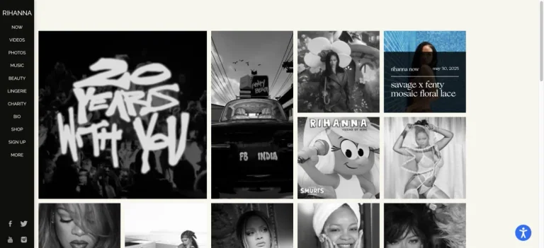
A narrow black navigation rail anchors an off-white archive of square photographs and campaign tiles.
Useful for: A music celebrity website reference; study how its opening presents identity and routes into work, releases, or public appearances.
# Design reference: Rihanna
Source: https://www.rihannanow.com/
Swipefile reference: https://swipefile.design/ref/celebrity-rihanna/
Captured: 2026-09-08. This is a dated reference, not a claim about the current live product.
Capture scope: one viewport. Do not infer unseen page sections or a complete user flow.

## Objective
Adapt the visual principles below to my project. Use my own content and identity. Do not reproduce logos, proprietary copy, or brand assets.

## Reference notes
- mood: Editorial and archival.
- colors: Black, ivory, grayscale photography, and occasional color.
- typography: Adapt the visible contrast between display lettering and smaller navigation. Choose type that supports your own identity and remains readable on small screens.
- layout: A narrow black navigation rail anchors an off-white archive of square photographs and campaign tiles.
- motion: Static opening-viewport capture. Follow the original source to inspect animation, video, menus, and reduced-motion behavior.
- texture: Let original photography or film provide the visual detail. Keep supporting controls clear.
- dont: Do not copy the celebrity’s identity, claims, photographs, artwork, or trademarks into a new brand.

Useful for: A music celebrity website reference; study how its opening presents identity and routes into work, releases, or public appearances.

## Acceptance criteria
- Existing project conventions, design tokens, working functionality, and unrelated changes are preserved.
- Two or three reference principles clearly support the user's task; conflicts are resolved in favor of usability and the existing product.
- Reusable components and semantic HTML express the interface. Available licensed assets are used; important UI text is never rendered as a bitmap.
- Every visible control has a defined behavior. Loading, empty, error, success, disabled, and long-content states are specified where relevant. Demo data is clearly labeled.
- Navigation and content adapt at 375px, 768px, and 1440px without horizontal page overflow. Keyboard use, visible focus, labeled inputs, at least 44px touch targets, readable contrast, and reduced motion are supported.
- Verification distinguishes rendered behavior from proposals and identifies anything still requiring a backend or external service.

## Quality bar
Clear hierarchy, consistent spacing, restrained surfaces, and purposeful motion. Avoid decorative gradients, excessive cards, placeholder buttons, and invented metrics unless the project calls for them. Do not claim a feature is connected or tested without evidence.
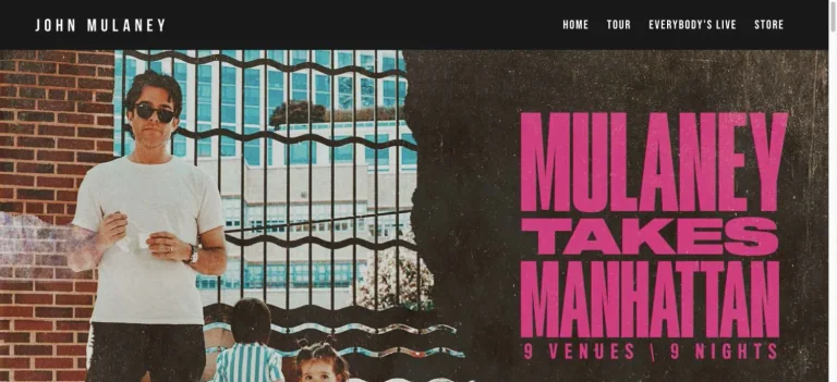
A portrait on a city street meets a grainy dark panel of oversized pink tour lettering, beneath a compact black navigation bar.
Useful for: A comedy celebrity website reference; study how its opening presents identity and routes into work, releases, or public appearances.
# Design reference: John Mulaney
Source: https://www.johnmulaney.com/
Swipefile reference: https://swipefile.design/ref/celebrity-john-mulaney/
Captured: 2026-09-08. This is a dated reference, not a claim about the current live product.
Capture scope: one viewport. Do not infer unseen page sections or a complete user flow.

## Objective
Adapt the visual principles below to my project. Use my own content and identity. Do not reproduce logos, proprietary copy, or brand assets.

## Reference notes
- mood: Urban and poster-like.
- colors: Hot pink, black, warm brown, and white.
- typography: Adapt the visible contrast between display lettering and smaller navigation. Choose type that supports your own identity and remains readable on small screens.
- layout: A portrait on a city street meets a grainy dark panel of oversized pink tour lettering, beneath a compact black navigation bar.
- motion: Static opening-viewport capture. Follow the original source to inspect animation, video, menus, and reduced-motion behavior.
- texture: Let original photography or film provide the visual detail. Keep supporting controls clear.
- dont: Do not copy the celebrity’s identity, claims, photographs, artwork, or trademarks into a new brand.

Useful for: A comedy celebrity website reference; study how its opening presents identity and routes into work, releases, or public appearances.

## Acceptance criteria
- Existing project conventions, design tokens, working functionality, and unrelated changes are preserved.
- Two or three reference principles clearly support the user's task; conflicts are resolved in favor of usability and the existing product.
- Reusable components and semantic HTML express the interface. Available licensed assets are used; important UI text is never rendered as a bitmap.
- Every visible control has a defined behavior. Loading, empty, error, success, disabled, and long-content states are specified where relevant. Demo data is clearly labeled.
- Navigation and content adapt at 375px, 768px, and 1440px without horizontal page overflow. Keyboard use, visible focus, labeled inputs, at least 44px touch targets, readable contrast, and reduced motion are supported.
- Verification distinguishes rendered behavior from proposals and identifies anything still requiring a backend or external service.

## Quality bar
Clear hierarchy, consistent spacing, restrained surfaces, and purposeful motion. Avoid decorative gradients, excessive cards, placeholder buttons, and invented metrics unless the project calls for them. Do not claim a feature is connected or tested without evidence.
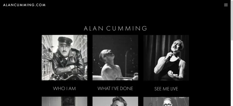
A centered, widely spaced name introduces a grid of monochrome image links on black, separating biography, work, and live appearances.
Useful for: A film celebrity website reference; study how its opening presents identity and routes into work, releases, or public appearances.
# Design reference: Alan Cumming
Source: https://www.alancumming.com/
Swipefile reference: https://swipefile.design/ref/celebrity-alan-cumming/
Captured: 2026-09-08. This is a dated reference, not a claim about the current live product.
Capture scope: one viewport. Do not infer unseen page sections or a complete user flow.

## Objective
Adapt the visual principles below to my project. Use my own content and identity. Do not reproduce logos, proprietary copy, or brand assets.

## Reference notes
- mood: Spare and archival.
- colors: Black, white, and gray.
- typography: Adapt the visible contrast between display lettering and smaller navigation. Choose type that supports your own identity and remains readable on small screens.
- layout: A centered, widely spaced name introduces a grid of monochrome image links on black, separating biography, work, and live appearances.
- motion: Static opening-viewport capture. Follow the original source to inspect animation, video, menus, and reduced-motion behavior.
- texture: Let original photography or film provide the visual detail. Keep supporting controls clear.
- dont: Do not copy the celebrity’s identity, claims, photographs, artwork, or trademarks into a new brand.

Useful for: A film celebrity website reference; study how its opening presents identity and routes into work, releases, or public appearances.

## Acceptance criteria
- Existing project conventions, design tokens, working functionality, and unrelated changes are preserved.
- Two or three reference principles clearly support the user's task; conflicts are resolved in favor of usability and the existing product.
- Reusable components and semantic HTML express the interface. Available licensed assets are used; important UI text is never rendered as a bitmap.
- Every visible control has a defined behavior. Loading, empty, error, success, disabled, and long-content states are specified where relevant. Demo data is clearly labeled.
- Navigation and content adapt at 375px, 768px, and 1440px without horizontal page overflow. Keyboard use, visible focus, labeled inputs, at least 44px touch targets, readable contrast, and reduced motion are supported.
- Verification distinguishes rendered behavior from proposals and identifies anything still requiring a backend or external service.

## Quality bar
Clear hierarchy, consistent spacing, restrained surfaces, and purposeful motion. Avoid decorative gradients, excessive cards, placeholder buttons, and invented metrics unless the project calls for them. Do not claim a feature is connected or tested without evidence.
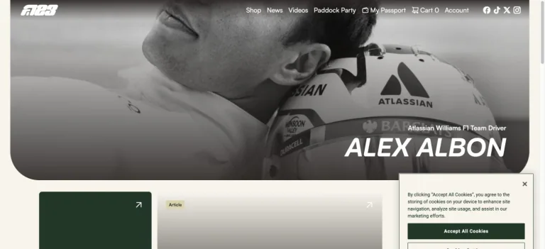
A rounded monochrome portrait hero gives way to modular news cards, with an italic identity and compact commerce and fan navigation.
Useful for: A sports celebrity website reference; study how its opening presents identity and routes into work, releases, or public appearances.
# Design reference: Alex Albon
Source: https://www.alexalbon.com/
Swipefile reference: https://swipefile.design/ref/celebrity-alex-albon/
Captured: 2026-09-08. This is a dated reference, not a claim about the current live product.
Capture scope: one viewport. Do not infer unseen page sections or a complete user flow.

## Objective
Adapt the visual principles below to my project. Use my own content and identity. Do not reproduce logos, proprietary copy, or brand assets.

## Reference notes
- mood: Sporting and approachable.
- colors: White, dark green, black, and gray.
- typography: Adapt the visible contrast between display lettering and smaller navigation. Choose type that supports your own identity and remains readable on small screens.
- layout: A rounded monochrome portrait hero gives way to modular news cards, with an italic identity and compact commerce and fan navigation.
- motion: Static opening-viewport capture. Follow the original source to inspect animation, video, menus, and reduced-motion behavior.
- texture: Let original photography or film provide the visual detail. Keep supporting controls clear.
- dont: Do not copy the celebrity’s identity, claims, photographs, artwork, or trademarks into a new brand.

Useful for: A sports celebrity website reference; study how its opening presents identity and routes into work, releases, or public appearances.

## Acceptance criteria
- Existing project conventions, design tokens, working functionality, and unrelated changes are preserved.
- Two or three reference principles clearly support the user's task; conflicts are resolved in favor of usability and the existing product.
- Reusable components and semantic HTML express the interface. Available licensed assets are used; important UI text is never rendered as a bitmap.
- Every visible control has a defined behavior. Loading, empty, error, success, disabled, and long-content states are specified where relevant. Demo data is clearly labeled.
- Navigation and content adapt at 375px, 768px, and 1440px without horizontal page overflow. Keyboard use, visible focus, labeled inputs, at least 44px touch targets, readable contrast, and reduced motion are supported.
- Verification distinguishes rendered behavior from proposals and identifies anything still requiring a backend or external service.

## Quality bar
Clear hierarchy, consistent spacing, restrained surfaces, and purposeful motion. Avoid decorative gradients, excessive cards, placeholder buttons, and invented metrics unless the project calls for them. Do not claim a feature is connected or tested without evidence.
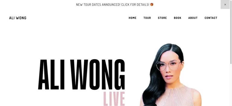
A bright white page pairs a large condensed name with a portrait and pale pink tour lettering, using a restrained top navigation.
Useful for: A comedy celebrity website reference; study how its opening presents identity and routes into work, releases, or public appearances.
# Design reference: Ali Wong
Source: https://www.aliwong.com/
Swipefile reference: https://swipefile.design/ref/celebrity-ali-wong/
Captured: 2026-09-08. This is a dated reference, not a claim about the current live product.
Capture scope: one viewport. Do not infer unseen page sections or a complete user flow.

## Objective
Adapt the visual principles below to my project. Use my own content and identity. Do not reproduce logos, proprietary copy, or brand assets.

## Reference notes
- mood: Clean and personality-led.
- colors: White, black, blush pink, and cream.
- typography: Adapt the visible contrast between display lettering and smaller navigation. Choose type that supports your own identity and remains readable on small screens.
- layout: A bright white page pairs a large condensed name with a portrait and pale pink tour lettering, using a restrained top navigation.
- motion: Static opening-viewport capture. Follow the original source to inspect animation, video, menus, and reduced-motion behavior.
- texture: Let original photography or film provide the visual detail. Keep supporting controls clear.
- dont: Do not copy the celebrity’s identity, claims, photographs, artwork, or trademarks into a new brand.

Useful for: A comedy celebrity website reference; study how its opening presents identity and routes into work, releases, or public appearances.

## Acceptance criteria
- Existing project conventions, design tokens, working functionality, and unrelated changes are preserved.
- Two or three reference principles clearly support the user's task; conflicts are resolved in favor of usability and the existing product.
- Reusable components and semantic HTML express the interface. Available licensed assets are used; important UI text is never rendered as a bitmap.
- Every visible control has a defined behavior. Loading, empty, error, success, disabled, and long-content states are specified where relevant. Demo data is clearly labeled.
- Navigation and content adapt at 375px, 768px, and 1440px without horizontal page overflow. Keyboard use, visible focus, labeled inputs, at least 44px touch targets, readable contrast, and reduced motion are supported.
- Verification distinguishes rendered behavior from proposals and identifies anything still requiring a backend or external service.

## Quality bar
Clear hierarchy, consistent spacing, restrained surfaces, and purposeful motion. Avoid decorative gradients, excessive cards, placeholder buttons, and invented metrics unless the project calls for them. Do not claim a feature is connected or tested without evidence.
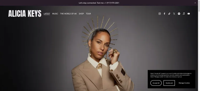
A centered portrait and gold headpiece sit against a charcoal gradient, framed by a bold white wordmark and compact navigation.
Useful for: A music celebrity website reference; study how its opening presents identity and routes into work, releases, or public appearances.
# Design reference: Alicia Keys
Source: https://www.aliciakeys.com/
Swipefile reference: https://swipefile.design/ref/celebrity-alicia-keys/
Captured: 2026-09-08. This is a dated reference, not a claim about the current live product.
Capture scope: one viewport. Do not infer unseen page sections or a complete user flow.

## Objective
Adapt the visual principles below to my project. Use my own content and identity. Do not reproduce logos, proprietary copy, or brand assets.

## Reference notes
- mood: Regal and restrained.
- colors: Charcoal, warm gold, black, and white.
- typography: Adapt the visible contrast between display lettering and smaller navigation. Choose type that supports your own identity and remains readable on small screens.
- layout: A centered portrait and gold headpiece sit against a charcoal gradient, framed by a bold white wordmark and compact navigation.
- motion: Static opening-viewport capture. Follow the original source to inspect animation, video, menus, and reduced-motion behavior.
- texture: Let original photography or film provide the visual detail. Keep supporting controls clear.
- dont: Do not copy the celebrity’s identity, claims, photographs, artwork, or trademarks into a new brand.

Useful for: A music celebrity website reference; study how its opening presents identity and routes into work, releases, or public appearances.

## Acceptance criteria
- Existing project conventions, design tokens, working functionality, and unrelated changes are preserved.
- Two or three reference principles clearly support the user's task; conflicts are resolved in favor of usability and the existing product.
- Reusable components and semantic HTML express the interface. Available licensed assets are used; important UI text is never rendered as a bitmap.
- Every visible control has a defined behavior. Loading, empty, error, success, disabled, and long-content states are specified where relevant. Demo data is clearly labeled.
- Navigation and content adapt at 375px, 768px, and 1440px without horizontal page overflow. Keyboard use, visible focus, labeled inputs, at least 44px touch targets, readable contrast, and reduced motion are supported.
- Verification distinguishes rendered behavior from proposals and identifies anything still requiring a backend or external service.

## Quality bar
Clear hierarchy, consistent spacing, restrained surfaces, and purposeful motion. Avoid decorative gradients, excessive cards, placeholder buttons, and invented metrics unless the project calls for them. Do not claim a feature is connected or tested without evidence.
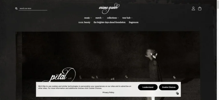
A dark store header gives way to a grainy monochrome album campaign with delicate script lettering and a restrained product navigation.
Useful for: A music celebrity website reference; study how its opening presents identity and routes into products.
# Design reference: Ariana Grande — Official store
Source: https://shop.arianagrande.com/
Swipefile reference: https://swipefile.design/ref/celebrity-ariana-grande/
Captured: 2026-09-08. This is a dated reference, not a claim about the current live product.
Capture scope: one viewport. Do not infer unseen page sections or a complete user flow.

## Objective
Adapt the visual principles below to my project. Use my own content and identity. Do not reproduce logos, proprietary copy, or brand assets.

## Reference notes
- mood: Intimate and cinematic.
- colors: Charcoal, black, warm gray, and white.
- typography: Adapt the visible contrast between display lettering and smaller navigation. Choose type that supports your own identity and remains readable on small screens.
- layout: A dark store header gives way to a grainy monochrome album campaign with delicate script lettering and a restrained product navigation.
- motion: Static opening-viewport capture. Follow the original source to inspect animation, video, menus, and reduced-motion behavior.
- texture: Use original graphics and a restrained supporting interface to establish the page’s visual character.
- dont: Do not copy the celebrity’s identity, claims, photographs, artwork, or trademarks into a new brand.

Useful for: A music celebrity website reference; study how its opening presents identity and routes into products.

## Acceptance criteria
- Existing project conventions, design tokens, working functionality, and unrelated changes are preserved.
- Two or three reference principles clearly support the user's task; conflicts are resolved in favor of usability and the existing product.
- Reusable components and semantic HTML express the interface. Available licensed assets are used; important UI text is never rendered as a bitmap.
- Every visible control has a defined behavior. Loading, empty, error, success, disabled, and long-content states are specified where relevant. Demo data is clearly labeled.
- Navigation and content adapt at 375px, 768px, and 1440px without horizontal page overflow. Keyboard use, visible focus, labeled inputs, at least 44px touch targets, readable contrast, and reduced motion are supported.
- Verification distinguishes rendered behavior from proposals and identifies anything still requiring a backend or external service.

## Quality bar
Clear hierarchy, consistent spacing, restrained surfaces, and purposeful motion. Avoid decorative gradients, excessive cards, placeholder buttons, and invented metrics unless the project calls for them. Do not claim a feature is connected or tested without evidence.
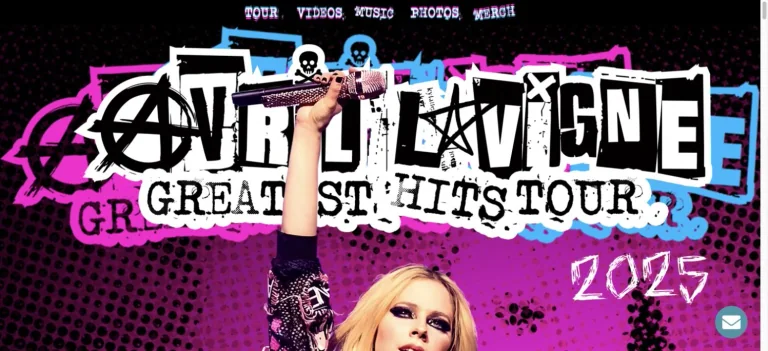
Graffiti-like tour lettering, stars, and a performance portrait create a layered punk poster against black and vivid pink.
Useful for: A music celebrity website reference; study how its opening presents identity and routes into work, releases, or public appearances.
# Design reference: Avril Lavigne
Source: https://avrillavigne.com/
Swipefile reference: https://swipefile.design/ref/celebrity-avril-lavigne/
Captured: 2026-09-08. This is a dated reference, not a claim about the current live product.
Capture scope: one viewport. Do not infer unseen page sections or a complete user flow.

## Objective
Adapt the visual principles below to my project. Use my own content and identity. Do not reproduce logos, proprietary copy, or brand assets.

## Reference notes
- mood: Rebellious and graphic.
- colors: Hot pink, black, white, and electric blue.
- typography: Adapt the visible contrast between display lettering and smaller navigation. Choose type that supports your own identity and remains readable on small screens.
- layout: Graffiti-like tour lettering, stars, and a performance portrait create a layered punk poster against black and vivid pink.
- motion: Static opening-viewport capture. Follow the original source to inspect animation, video, menus, and reduced-motion behavior.
- texture: Let original photography or film provide the visual detail. Keep supporting controls clear.
- dont: Do not copy the celebrity’s identity, claims, photographs, artwork, or trademarks into a new brand.

Useful for: A music celebrity website reference; study how its opening presents identity and routes into work, releases, or public appearances.

## Acceptance criteria
- Existing project conventions, design tokens, working functionality, and unrelated changes are preserved.
- Two or three reference principles clearly support the user's task; conflicts are resolved in favor of usability and the existing product.
- Reusable components and semantic HTML express the interface. Available licensed assets are used; important UI text is never rendered as a bitmap.
- Every visible control has a defined behavior. Loading, empty, error, success, disabled, and long-content states are specified where relevant. Demo data is clearly labeled.
- Navigation and content adapt at 375px, 768px, and 1440px without horizontal page overflow. Keyboard use, visible focus, labeled inputs, at least 44px touch targets, readable contrast, and reduced motion are supported.
- Verification distinguishes rendered behavior from proposals and identifies anything still requiring a backend or external service.

## Quality bar
Clear hierarchy, consistent spacing, restrained surfaces, and purposeful motion. Avoid decorative gradients, excessive cards, placeholder buttons, and invented metrics unless the project calls for them. Do not claim a feature is connected or tested without evidence.
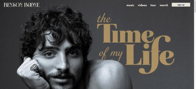
A monochrome portrait occupies the left of the hero while large gold serif release lettering fills the right, beneath a compact navigation.
Useful for: A music celebrity website reference; study how its opening presents identity and routes into work, releases, or public appearances.
# Design reference: Benson Boone
Source: https://www.bensonboone.com/
Swipefile reference: https://swipefile.design/ref/celebrity-benson-boone/
Captured: 2026-09-08. This is a dated reference, not a claim about the current live product.
Capture scope: one viewport. Do not infer unseen page sections or a complete user flow.

## Objective
Adapt the visual principles below to my project. Use my own content and identity. Do not reproduce logos, proprietary copy, or brand assets.

## Reference notes
- mood: Classic and cinematic.
- colors: Charcoal, silver gray, warm gold, and white.
- typography: Adapt the visible contrast between display lettering and smaller navigation. Choose type that supports your own identity and remains readable on small screens.
- layout: A monochrome portrait occupies the left of the hero while large gold serif release lettering fills the right, beneath a compact navigation.
- motion: Static opening-viewport capture. Follow the original source to inspect animation, video, menus, and reduced-motion behavior.
- texture: Let original photography or film provide the visual detail. Keep supporting controls clear.
- dont: Do not copy the celebrity’s identity, claims, photographs, artwork, or trademarks into a new brand.

Useful for: A music celebrity website reference; study how its opening presents identity and routes into work, releases, or public appearances.

## Acceptance criteria
- Existing project conventions, design tokens, working functionality, and unrelated changes are preserved.
- Two or three reference principles clearly support the user's task; conflicts are resolved in favor of usability and the existing product.
- Reusable components and semantic HTML express the interface. Available licensed assets are used; important UI text is never rendered as a bitmap.
- Every visible control has a defined behavior. Loading, empty, error, success, disabled, and long-content states are specified where relevant. Demo data is clearly labeled.
- Navigation and content adapt at 375px, 768px, and 1440px without horizontal page overflow. Keyboard use, visible focus, labeled inputs, at least 44px touch targets, readable contrast, and reduced motion are supported.
- Verification distinguishes rendered behavior from proposals and identifies anything still requiring a backend or external service.

## Quality bar
Clear hierarchy, consistent spacing, restrained surfaces, and purposeful motion. Avoid decorative gradients, excessive cards, placeholder buttons, and invented metrics unless the project calls for them. Do not claim a feature is connected or tested without evidence.
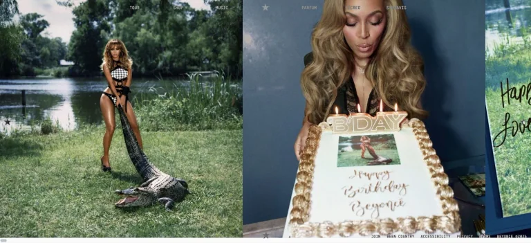
Large side-by-side photographs dominate a birthday-themed opening while tiny navigation keeps the focus on the imagery.
Useful for: A music celebrity website reference; study how its opening presents identity and routes into work, releases, or public appearances.
# Design reference: Beyoncé
Source: https://beyonce.com/
Swipefile reference: https://swipefile.design/ref/celebrity-beyonce/
Captured: 2026-09-08. This is a dated reference, not a claim about the current live product.
Capture scope: one viewport. Do not infer unseen page sections or a complete user flow.

## Objective
Adapt the visual principles below to my project. Use my own content and identity. Do not reproduce logos, proprietary copy, or brand assets.

## Reference notes
- mood: Editorial and image-led.
- colors: Natural green, pale blue, cream, and photographic color.
- typography: Adapt the visible contrast between display lettering and smaller navigation. Choose type that supports your own identity and remains readable on small screens.
- layout: Large side-by-side photographs dominate a birthday-themed opening while tiny navigation keeps the focus on the imagery.
- motion: Static opening-viewport capture. Follow the original source to inspect animation, video, menus, and reduced-motion behavior.
- texture: Let original photography or film provide the visual detail. Keep supporting controls clear.
- dont: Do not copy the celebrity’s identity, claims, photographs, artwork, or trademarks into a new brand.

Useful for: A music celebrity website reference; study how its opening presents identity and routes into work, releases, or public appearances.

## Acceptance criteria
- Existing project conventions, design tokens, working functionality, and unrelated changes are preserved.
- Two or three reference principles clearly support the user's task; conflicts are resolved in favor of usability and the existing product.
- Reusable components and semantic HTML express the interface. Available licensed assets are used; important UI text is never rendered as a bitmap.
- Every visible control has a defined behavior. Loading, empty, error, success, disabled, and long-content states are specified where relevant. Demo data is clearly labeled.
- Navigation and content adapt at 375px, 768px, and 1440px without horizontal page overflow. Keyboard use, visible focus, labeled inputs, at least 44px touch targets, readable contrast, and reduced motion are supported.
- Verification distinguishes rendered behavior from proposals and identifies anything still requiring a backend or external service.

## Quality bar
Clear hierarchy, consistent spacing, restrained surfaces, and purposeful motion. Avoid decorative gradients, excessive cards, placeholder buttons, and invented metrics unless the project calls for them. Do not claim a feature is connected or tested without evidence.
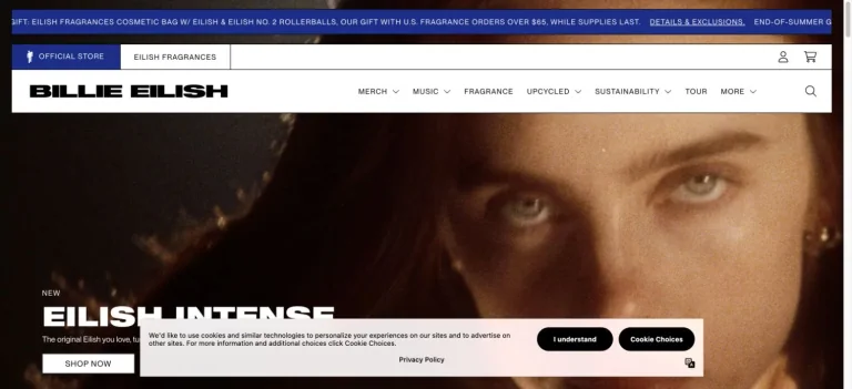
A white commerce header and heavy wordmark frame a large fragrance campaign, with a concise product label and shop action over the image.
Useful for: A music celebrity website reference; study how its opening presents identity and routes into products.
# Design reference: Billie Eilish — Official store
Source: https://store.billieeilish.com/
Swipefile reference: https://swipefile.design/ref/celebrity-billie-eilish/
Captured: 2026-09-08. This is a dated reference, not a claim about the current live product.
Capture scope: one viewport. Do not infer unseen page sections or a complete user flow.

## Objective
Adapt the visual principles below to my project. Use my own content and identity. Do not reproduce logos, proprietary copy, or brand assets.

## Reference notes
- mood: Bold and product-focused.
- colors: White, black, deep blue, and warm photographic tones.
- typography: Adapt the visible contrast between display lettering and smaller navigation. Choose type that supports your own identity and remains readable on small screens.
- layout: A white commerce header and heavy wordmark frame a large fragrance campaign, with a concise product label and shop action over the image.
- motion: Static opening-viewport capture. Follow the original source to inspect animation, video, menus, and reduced-motion behavior.
- texture: Let original photography or film provide the visual detail. Keep supporting controls clear.
- dont: Do not copy the celebrity’s identity, claims, photographs, artwork, or trademarks into a new brand.

Useful for: A music celebrity website reference; study how its opening presents identity and routes into products.

## Acceptance criteria
- Existing project conventions, design tokens, working functionality, and unrelated changes are preserved.
- Two or three reference principles clearly support the user's task; conflicts are resolved in favor of usability and the existing product.
- Reusable components and semantic HTML express the interface. Available licensed assets are used; important UI text is never rendered as a bitmap.
- Every visible control has a defined behavior. Loading, empty, error, success, disabled, and long-content states are specified where relevant. Demo data is clearly labeled.
- Navigation and content adapt at 375px, 768px, and 1440px without horizontal page overflow. Keyboard use, visible focus, labeled inputs, at least 44px touch targets, readable contrast, and reduced motion are supported.
- Verification distinguishes rendered behavior from proposals and identifies anything still requiring a backend or external service.

## Quality bar
Clear hierarchy, consistent spacing, restrained surfaces, and purposeful motion. Avoid decorative gradients, excessive cards, placeholder buttons, and invented metrics unless the project calls for them. Do not claim a feature is connected or tested without evidence.
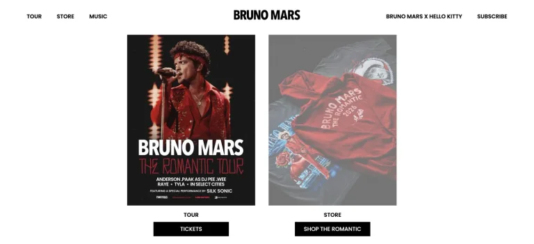
Two upright campaign panels divide tour tickets and merchandise on a white page, with a bold centered wordmark and simple black action bars.
Useful for: A music celebrity website reference; study how its opening presents identity and routes into work, releases, or public appearances.
# Design reference: Bruno Mars
Source: https://www.brunomars.com/
Swipefile reference: https://swipefile.design/ref/celebrity-bruno-mars/
Captured: 2026-09-08. This is a dated reference, not a claim about the current live product.
Capture scope: one viewport. Do not infer unseen page sections or a complete user flow.

## Objective
Adapt the visual principles below to my project. Use my own content and identity. Do not reproduce logos, proprietary copy, or brand assets.

## Reference notes
- mood: Clear and compact.
- colors: White, black, and deep red.
- typography: Adapt the visible contrast between display lettering and smaller navigation. Choose type that supports your own identity and remains readable on small screens.
- layout: Two upright campaign panels divide tour tickets and merchandise on a white page, with a bold centered wordmark and simple black action bars.
- motion: Static opening-viewport capture. Follow the original source to inspect animation, video, menus, and reduced-motion behavior.
- texture: Use original graphics and a restrained supporting interface to establish the page’s visual character.
- dont: Do not copy the celebrity’s identity, claims, photographs, artwork, or trademarks into a new brand.

Useful for: A music celebrity website reference; study how its opening presents identity and routes into work, releases, or public appearances.

## Acceptance criteria
- Existing project conventions, design tokens, working functionality, and unrelated changes are preserved.
- Two or three reference principles clearly support the user's task; conflicts are resolved in favor of usability and the existing product.
- Reusable components and semantic HTML express the interface. Available licensed assets are used; important UI text is never rendered as a bitmap.
- Every visible control has a defined behavior. Loading, empty, error, success, disabled, and long-content states are specified where relevant. Demo data is clearly labeled.
- Navigation and content adapt at 375px, 768px, and 1440px without horizontal page overflow. Keyboard use, visible focus, labeled inputs, at least 44px touch targets, readable contrast, and reduced motion are supported.
- Verification distinguishes rendered behavior from proposals and identifies anything still requiring a backend or external service.

## Quality bar
Clear hierarchy, consistent spacing, restrained surfaces, and purposeful motion. Avoid decorative gradients, excessive cards, placeholder buttons, and invented metrics unless the project calls for them. Do not claim a feature is connected or tested without evidence.
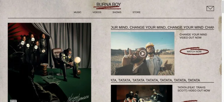
A restrained gray publication-like grid pairs album artwork with video features, repeated headlines, and compact music navigation.
Useful for: A music celebrity website reference; study how its opening presents identity and routes into work, releases, or public appearances.
# Design reference: Burna Boy
Source: https://www.onaspaceship.com/
Swipefile reference: https://swipefile.design/ref/celebrity-burna-boy/
Captured: 2026-09-08. This is a dated reference, not a claim about the current live product.
Capture scope: one viewport. Do not infer unseen page sections or a complete user flow.

## Objective
Adapt the visual principles below to my project. Use my own content and identity. Do not reproduce logos, proprietary copy, or brand assets.

## Reference notes
- mood: Editorial and content-rich.
- colors: Warm gray, black, muted green, and cream.
- typography: Adapt the visible contrast between display lettering and smaller navigation. Choose type that supports your own identity and remains readable on small screens.
- layout: A restrained gray publication-like grid pairs album artwork with video features, repeated headlines, and compact music navigation.
- motion: Static opening-viewport capture. Follow the original source to inspect animation, video, menus, and reduced-motion behavior.
- texture: Use original graphics and a restrained supporting interface to establish the page’s visual character.
- dont: Do not copy the celebrity’s identity, claims, photographs, artwork, or trademarks into a new brand.

Useful for: A music celebrity website reference; study how its opening presents identity and routes into work, releases, or public appearances.

## Acceptance criteria
- Existing project conventions, design tokens, working functionality, and unrelated changes are preserved.
- Two or three reference principles clearly support the user's task; conflicts are resolved in favor of usability and the existing product.
- Reusable components and semantic HTML express the interface. Available licensed assets are used; important UI text is never rendered as a bitmap.
- Every visible control has a defined behavior. Loading, empty, error, success, disabled, and long-content states are specified where relevant. Demo data is clearly labeled.
- Navigation and content adapt at 375px, 768px, and 1440px without horizontal page overflow. Keyboard use, visible focus, labeled inputs, at least 44px touch targets, readable contrast, and reduced motion are supported.
- Verification distinguishes rendered behavior from proposals and identifies anything still requiring a backend or external service.

## Quality bar
Clear hierarchy, consistent spacing, restrained surfaces, and purposeful motion. Avoid decorative gradients, excessive cards, placeholder buttons, and invented metrics unless the project calls for them. Do not claim a feature is connected or tested without evidence.
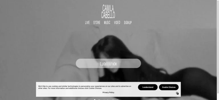
Soft monochrome footage fills the screen behind a small stacked wordmark, compact navigation, and a translucent rounded title element.
Useful for: A music celebrity website reference; study how its opening presents identity and routes into work, releases, or public appearances.
# Design reference: Camila Cabello
Source: https://www.camilacabello.com/
Swipefile reference: https://swipefile.design/ref/celebrity-camila-cabello/
Captured: 2026-09-08. This is a dated reference, not a claim about the current live product.
Capture scope: one viewport. Do not infer unseen page sections or a complete user flow.

## Objective
Adapt the visual principles below to my project. Use my own content and identity. Do not reproduce logos, proprietary copy, or brand assets.

## Reference notes
- mood: Dreamlike and restrained.
- colors: Black, white, and soft gray.
- typography: Adapt the visible contrast between display lettering and smaller navigation. Choose type that supports your own identity and remains readable on small screens.
- layout: Soft monochrome footage fills the screen behind a small stacked wordmark, compact navigation, and a translucent rounded title element.
- motion: Static opening-viewport capture. Follow the original source to inspect animation, video, menus, and reduced-motion behavior.
- texture: Let original photography or film provide the visual detail. Keep supporting controls clear.
- dont: Do not copy the celebrity’s identity, claims, photographs, artwork, or trademarks into a new brand.

Useful for: A music celebrity website reference; study how its opening presents identity and routes into work, releases, or public appearances.

## Acceptance criteria
- Existing project conventions, design tokens, working functionality, and unrelated changes are preserved.
- Two or three reference principles clearly support the user's task; conflicts are resolved in favor of usability and the existing product.
- Reusable components and semantic HTML express the interface. Available licensed assets are used; important UI text is never rendered as a bitmap.
- Every visible control has a defined behavior. Loading, empty, error, success, disabled, and long-content states are specified where relevant. Demo data is clearly labeled.
- Navigation and content adapt at 375px, 768px, and 1440px without horizontal page overflow. Keyboard use, visible focus, labeled inputs, at least 44px touch targets, readable contrast, and reduced motion are supported.
- Verification distinguishes rendered behavior from proposals and identifies anything still requiring a backend or external service.

## Quality bar
Clear hierarchy, consistent spacing, restrained surfaces, and purposeful motion. Avoid decorative gradients, excessive cards, placeholder buttons, and invented metrics unless the project calls for them. Do not claim a feature is connected or tested without evidence.
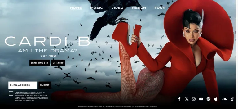
A dramatic red sculptural outfit dominates one side of a cloudy blue hero, while album lettering, listening actions, and an email invitation sit opposite.
Useful for: A music celebrity website reference; study how its opening presents identity and routes into work, releases, or public appearances.
# Design reference: Cardi B
Source: https://www.cardib.com/
Swipefile reference: https://swipefile.design/ref/celebrity-cardi-b/
Captured: 2026-09-08. This is a dated reference, not a claim about the current live product.
Capture scope: one viewport. Do not infer unseen page sections or a complete user flow.

## Objective
Adapt the visual principles below to my project. Use my own content and identity. Do not reproduce logos, proprietary copy, or brand assets.

## Reference notes
- mood: Dramatic and fashion-led.
- colors: Scarlet, sky blue, black, and white.
- typography: Adapt the visible contrast between display lettering and smaller navigation. Choose type that supports your own identity and remains readable on small screens.
- layout: A dramatic red sculptural outfit dominates one side of a cloudy blue hero, while album lettering, listening actions, and an email invitation sit opposite.
- motion: Static opening-viewport capture. Follow the original source to inspect animation, video, menus, and reduced-motion behavior.
- texture: Use original graphics and a restrained supporting interface to establish the page’s visual character.
- dont: Do not copy the celebrity’s identity, claims, photographs, artwork, or trademarks into a new brand.

Useful for: A music celebrity website reference; study how its opening presents identity and routes into work, releases, or public appearances.

## Acceptance criteria
- Existing project conventions, design tokens, working functionality, and unrelated changes are preserved.
- Two or three reference principles clearly support the user's task; conflicts are resolved in favor of usability and the existing product.
- Reusable components and semantic HTML express the interface. Available licensed assets are used; important UI text is never rendered as a bitmap.
- Every visible control has a defined behavior. Loading, empty, error, success, disabled, and long-content states are specified where relevant. Demo data is clearly labeled.
- Navigation and content adapt at 375px, 768px, and 1440px without horizontal page overflow. Keyboard use, visible focus, labeled inputs, at least 44px touch targets, readable contrast, and reduced motion are supported.
- Verification distinguishes rendered behavior from proposals and identifies anything still requiring a backend or external service.

## Quality bar
Clear hierarchy, consistent spacing, restrained surfaces, and purposeful motion. Avoid decorative gradients, excessive cards, placeholder buttons, and invented metrics unless the project calls for them. Do not claim a feature is connected or tested without evidence.
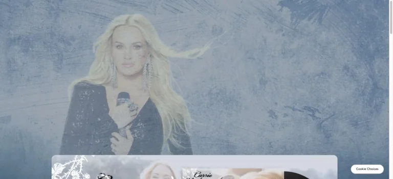
A cool, pale performance photograph fills the hero behind a delicate script identity and a softly rounded content panel below.
Useful for: A music celebrity website reference; study how its opening presents identity and routes into work, releases, or public appearances.
# Design reference: Carrie Underwood
Source: https://www.carrieunderwoodofficial.com/
Swipefile reference: https://swipefile.design/ref/celebrity-carrie-underwood/
Captured: 2026-09-08. This is a dated reference, not a claim about the current live product.
Capture scope: one viewport. Do not infer unseen page sections or a complete user flow.

## Objective
Adapt the visual principles below to my project. Use my own content and identity. Do not reproduce logos, proprietary copy, or brand assets.

## Reference notes
- mood: Soft and stage-led.
- colors: Icy blue, pale gray, white, and black.
- typography: Adapt the visible contrast between display lettering and smaller navigation. Choose type that supports your own identity and remains readable on small screens.
- layout: A cool, pale performance photograph fills the hero behind a delicate script identity and a softly rounded content panel below.
- motion: Static opening-viewport capture. Follow the original source to inspect animation, video, menus, and reduced-motion behavior.
- texture: Let original photography or film provide the visual detail. Keep supporting controls clear.
- dont: Do not copy the celebrity’s identity, claims, photographs, artwork, or trademarks into a new brand.

Useful for: A music celebrity website reference; study how its opening presents identity and routes into work, releases, or public appearances.

## Acceptance criteria
- Existing project conventions, design tokens, working functionality, and unrelated changes are preserved.
- Two or three reference principles clearly support the user's task; conflicts are resolved in favor of usability and the existing product.
- Reusable components and semantic HTML express the interface. Available licensed assets are used; important UI text is never rendered as a bitmap.
- Every visible control has a defined behavior. Loading, empty, error, success, disabled, and long-content states are specified where relevant. Demo data is clearly labeled.
- Navigation and content adapt at 375px, 768px, and 1440px without horizontal page overflow. Keyboard use, visible focus, labeled inputs, at least 44px touch targets, readable contrast, and reduced motion are supported.
- Verification distinguishes rendered behavior from proposals and identifies anything still requiring a backend or external service.

## Quality bar
Clear hierarchy, consistent spacing, restrained surfaces, and purposeful motion. Avoid decorative gradients, excessive cards, placeholder buttons, and invented metrics unless the project calls for them. Do not claim a feature is connected or tested without evidence.
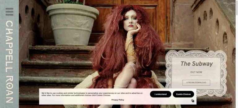
A narrow vertical identity strip frames a warm portrait on stone steps, with a lace-like announcement panel over the photograph.
Useful for: A music celebrity website reference; study how its opening presents identity and routes into work, releases, or public appearances.
# Design reference: Chappell Roan
Source: https://www.iamchappellroan.com/
Swipefile reference: https://swipefile.design/ref/celebrity-chappell-roan/
Captured: 2026-09-08. This is a dated reference, not a claim about the current live product.
Capture scope: one viewport. Do not infer unseen page sections or a complete user flow.

## Objective
Adapt the visual principles below to my project. Use my own content and identity. Do not reproduce logos, proprietary copy, or brand assets.

## Reference notes
- mood: Romantic and theatrical.
- colors: Warm brown, dusty green, cream, and muted red.
- typography: Adapt the visible contrast between display lettering and smaller navigation. Choose type that supports your own identity and remains readable on small screens.
- layout: A narrow vertical identity strip frames a warm portrait on stone steps, with a lace-like announcement panel over the photograph.
- motion: Static opening-viewport capture. Follow the original source to inspect animation, video, menus, and reduced-motion behavior.
- texture: Let original photography or film provide the visual detail. Keep supporting controls clear.
- dont: Do not copy the celebrity’s identity, claims, photographs, artwork, or trademarks into a new brand.

Useful for: A music celebrity website reference; study how its opening presents identity and routes into work, releases, or public appearances.

## Acceptance criteria
- Existing project conventions, design tokens, working functionality, and unrelated changes are preserved.
- Two or three reference principles clearly support the user's task; conflicts are resolved in favor of usability and the existing product.
- Reusable components and semantic HTML express the interface. Available licensed assets are used; important UI text is never rendered as a bitmap.
- Every visible control has a defined behavior. Loading, empty, error, success, disabled, and long-content states are specified where relevant. Demo data is clearly labeled.
- Navigation and content adapt at 375px, 768px, and 1440px without horizontal page overflow. Keyboard use, visible focus, labeled inputs, at least 44px touch targets, readable contrast, and reduced motion are supported.
- Verification distinguishes rendered behavior from proposals and identifies anything still requiring a backend or external service.

## Quality bar
Clear hierarchy, consistent spacing, restrained surfaces, and purposeful motion. Avoid decorative gradients, excessive cards, placeholder buttons, and invented metrics unless the project calls for them. Do not claim a feature is connected or tested without evidence.
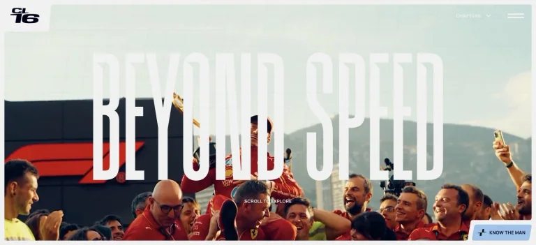
Extremely tall white lettering overlays a wide race-day photograph, with small corner identity marks and restrained navigation.
Useful for: A sports celebrity website reference; study how its opening presents identity and routes into work, releases, or public appearances.
# Design reference: Charles Leclerc
Source: https://charlesleclerc.com/en/
Swipefile reference: https://swipefile.design/ref/celebrity-charles-leclerc/
Captured: 2026-09-08. This is a dated reference, not a claim about the current live product.
Capture scope: one viewport. Do not infer unseen page sections or a complete user flow.

## Objective
Adapt the visual principles below to my project. Use my own content and identity. Do not reproduce logos, proprietary copy, or brand assets.

## Reference notes
- mood: Expansive and athletic.
- colors: White, deep blue, red, and pale aqua.
- typography: Adapt the visible contrast between display lettering and smaller navigation. Choose type that supports your own identity and remains readable on small screens.
- layout: Extremely tall white lettering overlays a wide race-day photograph, with small corner identity marks and restrained navigation.
- motion: Static opening-viewport capture. Follow the original source to inspect animation, video, menus, and reduced-motion behavior.
- texture: Let original photography or film provide the visual detail. Keep supporting controls clear.
- dont: Do not copy the celebrity’s identity, claims, photographs, artwork, or trademarks into a new brand.

Useful for: A sports celebrity website reference; study how its opening presents identity and routes into work, releases, or public appearances.

## Acceptance criteria
- Existing project conventions, design tokens, working functionality, and unrelated changes are preserved.
- Two or three reference principles clearly support the user's task; conflicts are resolved in favor of usability and the existing product.
- Reusable components and semantic HTML express the interface. Available licensed assets are used; important UI text is never rendered as a bitmap.
- Every visible control has a defined behavior. Loading, empty, error, success, disabled, and long-content states are specified where relevant. Demo data is clearly labeled.
- Navigation and content adapt at 375px, 768px, and 1440px without horizontal page overflow. Keyboard use, visible focus, labeled inputs, at least 44px touch targets, readable contrast, and reduced motion are supported.
- Verification distinguishes rendered behavior from proposals and identifies anything still requiring a backend or external service.

## Quality bar
Clear hierarchy, consistent spacing, restrained surfaces, and purposeful motion. Avoid decorative gradients, excessive cards, placeholder buttons, and invented metrics unless the project calls for them. Do not claim a feature is connected or tested without evidence.
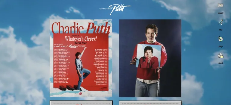
A blue cloud background surrounds album artwork and retro beveled buttons, with small icon-like links arranged at the side.
Useful for: A music celebrity website reference; study how its opening presents identity and routes into work, releases, or public appearances.
# Design reference: Charlie Puth
Source: https://www.charlieputh.com/
Swipefile reference: https://swipefile.design/ref/celebrity-charlie-puth/
Captured: 2026-09-08. This is a dated reference, not a claim about the current live product.
Capture scope: one viewport. Do not infer unseen page sections or a complete user flow.

## Objective
Adapt the visual principles below to my project. Use my own content and identity. Do not reproduce logos, proprietary copy, or brand assets.

## Reference notes
- mood: Retro and playful.
- colors: Sky blue, white, bright red, and gray.
- typography: Adapt the visible contrast between display lettering and smaller navigation. Choose type that supports your own identity and remains readable on small screens.
- layout: A blue cloud background surrounds album artwork and retro beveled buttons, with small icon-like links arranged at the side.
- motion: Static opening-viewport capture. Follow the original source to inspect animation, video, menus, and reduced-motion behavior.
- texture: Use original graphics and a restrained supporting interface to establish the page’s visual character.
- dont: Do not copy the celebrity’s identity, claims, photographs, artwork, or trademarks into a new brand.

Useful for: A music celebrity website reference; study how its opening presents identity and routes into work, releases, or public appearances.

## Acceptance criteria
- Existing project conventions, design tokens, working functionality, and unrelated changes are preserved.
- Two or three reference principles clearly support the user's task; conflicts are resolved in favor of usability and the existing product.
- Reusable components and semantic HTML express the interface. Available licensed assets are used; important UI text is never rendered as a bitmap.
- Every visible control has a defined behavior. Loading, empty, error, success, disabled, and long-content states are specified where relevant. Demo data is clearly labeled.
- Navigation and content adapt at 375px, 768px, and 1440px without horizontal page overflow. Keyboard use, visible focus, labeled inputs, at least 44px touch targets, readable contrast, and reduced motion are supported.
- Verification distinguishes rendered behavior from proposals and identifies anything still requiring a backend or external service.

## Quality bar
Clear hierarchy, consistent spacing, restrained surfaces, and purposeful motion. Avoid decorative gradients, excessive cards, placeholder buttons, and invented metrics unless the project calls for them. Do not claim a feature is connected or tested without evidence.
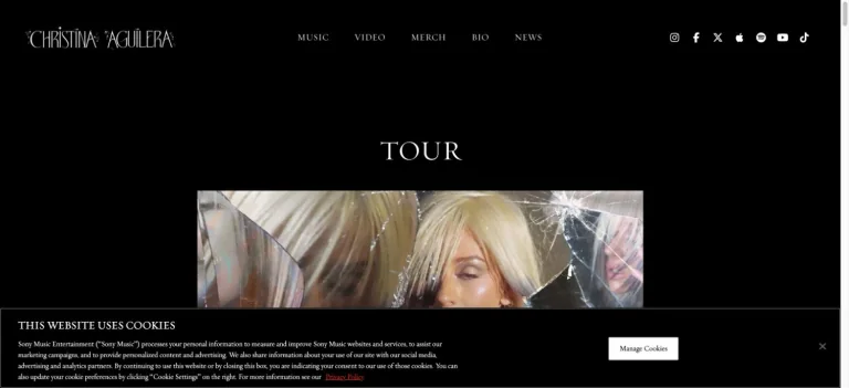
A narrow decorative wordmark and small navigation sit above centered tour content in a nearly black layout.
Useful for: A music celebrity website reference; study how its opening presents identity and routes into work, releases, or public appearances.
# Design reference: Christina Aguilera
Source: https://www.christinaaguilera.com/
Swipefile reference: https://swipefile.design/ref/celebrity-christina-aguilera/
Captured: 2026-09-08. This is a dated reference, not a claim about the current live product.
Capture scope: one viewport. Do not infer unseen page sections or a complete user flow.

## Objective
Adapt the visual principles below to my project. Use my own content and identity. Do not reproduce logos, proprietary copy, or brand assets.

## Reference notes
- mood: Dark and restrained.
- colors: Black, white, and muted photographic color.
- typography: Adapt the visible contrast between display lettering and smaller navigation. Choose type that supports your own identity and remains readable on small screens.
- layout: A narrow decorative wordmark and small navigation sit above centered tour content in a nearly black layout.
- motion: Static opening-viewport capture. Follow the original source to inspect animation, video, menus, and reduced-motion behavior.
- texture: Use original graphics and a restrained supporting interface to establish the page’s visual character.
- dont: Do not copy the celebrity’s identity, claims, photographs, artwork, or trademarks into a new brand.

Useful for: A music celebrity website reference; study how its opening presents identity and routes into work, releases, or public appearances.

## Acceptance criteria
- Existing project conventions, design tokens, working functionality, and unrelated changes are preserved.
- Two or three reference principles clearly support the user's task; conflicts are resolved in favor of usability and the existing product.
- Reusable components and semantic HTML express the interface. Available licensed assets are used; important UI text is never rendered as a bitmap.
- Every visible control has a defined behavior. Loading, empty, error, success, disabled, and long-content states are specified where relevant. Demo data is clearly labeled.
- Navigation and content adapt at 375px, 768px, and 1440px without horizontal page overflow. Keyboard use, visible focus, labeled inputs, at least 44px touch targets, readable contrast, and reduced motion are supported.
- Verification distinguishes rendered behavior from proposals and identifies anything still requiring a backend or external service.

## Quality bar
Clear hierarchy, consistent spacing, restrained surfaces, and purposeful motion. Avoid decorative gradients, excessive cards, placeholder buttons, and invented metrics unless the project calls for them. Do not claim a feature is connected or tested without evidence.
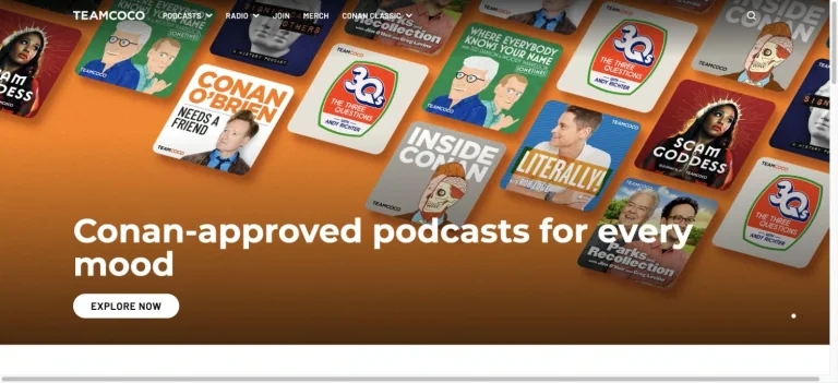
An orange hero scatters podcast cover artwork above a large white discovery headline and a rounded explore action.
Useful for: A comedy celebrity website reference; study how its opening presents identity and routes into work, releases, or public appearances.
# Design reference: Conan O’Brien
Source: https://teamcoco.com/
Swipefile reference: https://swipefile.design/ref/celebrity-conan-o-brien/
Captured: 2026-09-08. This is a dated reference, not a claim about the current live product.
Capture scope: one viewport. Do not infer unseen page sections or a complete user flow.

## Objective
Adapt the visual principles below to my project. Use my own content and identity. Do not reproduce logos, proprietary copy, or brand assets.

## Reference notes
- mood: Playful and discovery-led.
- colors: Orange, white, black, and colorful cover art.
- typography: Adapt the visible contrast between display lettering and smaller navigation. Choose type that supports your own identity and remains readable on small screens.
- layout: An orange hero scatters podcast cover artwork above a large white discovery headline and a rounded explore action.
- motion: Static opening-viewport capture. Follow the original source to inspect animation, video, menus, and reduced-motion behavior.
- texture: Use original graphics and a restrained supporting interface to establish the page’s visual character.
- dont: Do not copy the celebrity’s identity, claims, photographs, artwork, or trademarks into a new brand.

Useful for: A comedy celebrity website reference; study how its opening presents identity and routes into work, releases, or public appearances.

## Acceptance criteria
- Existing project conventions, design tokens, working functionality, and unrelated changes are preserved.
- Two or three reference principles clearly support the user's task; conflicts are resolved in favor of usability and the existing product.
- Reusable components and semantic HTML express the interface. Available licensed assets are used; important UI text is never rendered as a bitmap.
- Every visible control has a defined behavior. Loading, empty, error, success, disabled, and long-content states are specified where relevant. Demo data is clearly labeled.
- Navigation and content adapt at 375px, 768px, and 1440px without horizontal page overflow. Keyboard use, visible focus, labeled inputs, at least 44px touch targets, readable contrast, and reduced motion are supported.
- Verification distinguishes rendered behavior from proposals and identifies anything still requiring a backend or external service.

## Quality bar
Clear hierarchy, consistent spacing, restrained surfaces, and purposeful motion. Avoid decorative gradients, excessive cards, placeholder buttons, and invented metrics unless the project calls for them. Do not claim a feature is connected or tested without evidence.
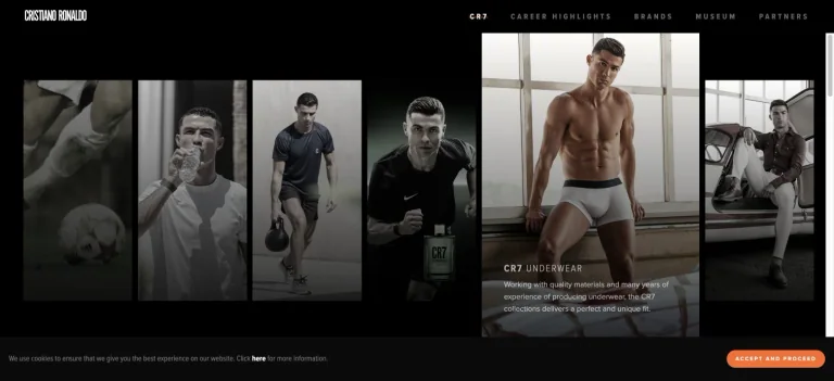
A black frame contains tall image panels for career and brand destinations, with narrow uppercase navigation along the top.
Useful for: A sports celebrity website reference; study how its opening presents identity and routes into work, releases, or public appearances.
# Design reference: Cristiano Ronaldo
Source: https://www.cristianoronaldo.com/
Swipefile reference: https://swipefile.design/ref/celebrity-cristiano-ronaldo/
Captured: 2026-09-08. This is a dated reference, not a claim about the current live product.
Capture scope: one viewport. Do not infer unseen page sections or a complete user flow.

## Objective
Adapt the visual principles below to my project. Use my own content and identity. Do not reproduce logos, proprietary copy, or brand assets.

## Reference notes
- mood: Dramatic and gallery-led.
- colors: Black, white, charcoal, and bronze photographic tones.
- typography: Adapt the visible contrast between display lettering and smaller navigation. Choose type that supports your own identity and remains readable on small screens.
- layout: A black frame contains tall image panels for career and brand destinations, with narrow uppercase navigation along the top.
- motion: Static opening-viewport capture. Follow the original source to inspect animation, video, menus, and reduced-motion behavior.
- texture: Let original photography or film provide the visual detail. Keep supporting controls clear.
- dont: Do not copy the celebrity’s identity, claims, photographs, artwork, or trademarks into a new brand.

Useful for: A sports celebrity website reference; study how its opening presents identity and routes into work, releases, or public appearances.

## Acceptance criteria
- Existing project conventions, design tokens, working functionality, and unrelated changes are preserved.
- Two or three reference principles clearly support the user's task; conflicts are resolved in favor of usability and the existing product.
- Reusable components and semantic HTML express the interface. Available licensed assets are used; important UI text is never rendered as a bitmap.
- Every visible control has a defined behavior. Loading, empty, error, success, disabled, and long-content states are specified where relevant. Demo data is clearly labeled.
- Navigation and content adapt at 375px, 768px, and 1440px without horizontal page overflow. Keyboard use, visible focus, labeled inputs, at least 44px touch targets, readable contrast, and reduced motion are supported.
- Verification distinguishes rendered behavior from proposals and identifies anything still requiring a backend or external service.

## Quality bar
Clear hierarchy, consistent spacing, restrained surfaces, and purposeful motion. Avoid decorative gradients, excessive cards, placeholder buttons, and invented metrics unless the project calls for them. Do not claim a feature is connected or tested without evidence.
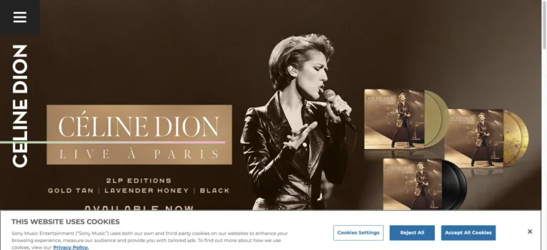
A vertical name rail sits beside a warm concert portrait and a carefully aligned arrangement of live-album record formats.
Useful for: A music celebrity website reference; study how its opening presents identity and routes into work, releases, or public appearances.
# Design reference: Céline Dion
Source: https://www.celinedion.com/
Swipefile reference: https://swipefile.design/ref/celebrity-celine-dion/
Captured: 2026-09-08. This is a dated reference, not a claim about the current live product.
Capture scope: one viewport. Do not infer unseen page sections or a complete user flow.

## Objective
Adapt the visual principles below to my project. Use my own content and identity. Do not reproduce logos, proprietary copy, or brand assets.

## Reference notes
- mood: Elegant and product-led.
- colors: Warm brown, gold, cream, and black.
- typography: Adapt the visible contrast between display lettering and smaller navigation. Choose type that supports your own identity and remains readable on small screens.
- layout: A vertical name rail sits beside a warm concert portrait and a carefully aligned arrangement of live-album record formats.
- motion: Static opening-viewport capture. Follow the original source to inspect animation, video, menus, and reduced-motion behavior.
- texture: Let original photography or film provide the visual detail. Keep supporting controls clear.
- dont: Do not copy the celebrity’s identity, claims, photographs, artwork, or trademarks into a new brand.

Useful for: A music celebrity website reference; study how its opening presents identity and routes into work, releases, or public appearances.

## Acceptance criteria
- Existing project conventions, design tokens, working functionality, and unrelated changes are preserved.
- Two or three reference principles clearly support the user's task; conflicts are resolved in favor of usability and the existing product.
- Reusable components and semantic HTML express the interface. Available licensed assets are used; important UI text is never rendered as a bitmap.
- Every visible control has a defined behavior. Loading, empty, error, success, disabled, and long-content states are specified where relevant. Demo data is clearly labeled.
- Navigation and content adapt at 375px, 768px, and 1440px without horizontal page overflow. Keyboard use, visible focus, labeled inputs, at least 44px touch targets, readable contrast, and reduced motion are supported.
- Verification distinguishes rendered behavior from proposals and identifies anything still requiring a backend or external service.

## Quality bar
Clear hierarchy, consistent spacing, restrained surfaces, and purposeful motion. Avoid decorative gradients, excessive cards, placeholder buttons, and invented metrics unless the project calls for them. Do not claim a feature is connected or tested without evidence.
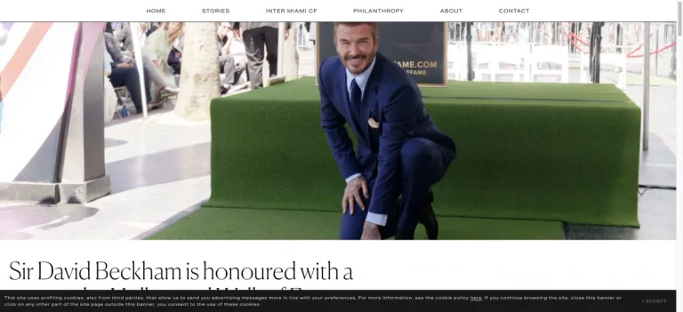
An airy white header and editorial portrait lead into a large serif story headline, giving the homepage the structure of a personal publication.
Useful for: A sports celebrity website reference; study how its opening presents identity and routes into work, releases, or public appearances.
# Design reference: David Beckham
Source: https://www.davidbeckham.com/
Swipefile reference: https://swipefile.design/ref/celebrity-david-beckham/
Captured: 2026-09-08. This is a dated reference, not a claim about the current live product.
Capture scope: one viewport. Do not infer unseen page sections or a complete user flow.

## Objective
Adapt the visual principles below to my project. Use my own content and identity. Do not reproduce logos, proprietary copy, or brand assets.

## Reference notes
- mood: Polished and editorial.
- colors: White, charcoal, muted green, and photographic color.
- typography: Adapt the visible contrast between display lettering and smaller navigation. Choose type that supports your own identity and remains readable on small screens.
- layout: An airy white header and editorial portrait lead into a large serif story headline, giving the homepage the structure of a personal publication.
- motion: Static opening-viewport capture. Follow the original source to inspect animation, video, menus, and reduced-motion behavior.
- texture: Let original photography or film provide the visual detail. Keep supporting controls clear.
- dont: Do not copy the celebrity’s identity, claims, photographs, artwork, or trademarks into a new brand.

Useful for: A sports celebrity website reference; study how its opening presents identity and routes into work, releases, or public appearances.

## Acceptance criteria
- Existing project conventions, design tokens, working functionality, and unrelated changes are preserved.
- Two or three reference principles clearly support the user's task; conflicts are resolved in favor of usability and the existing product.
- Reusable components and semantic HTML express the interface. Available licensed assets are used; important UI text is never rendered as a bitmap.
- Every visible control has a defined behavior. Loading, empty, error, success, disabled, and long-content states are specified where relevant. Demo data is clearly labeled.
- Navigation and content adapt at 375px, 768px, and 1440px without horizontal page overflow. Keyboard use, visible focus, labeled inputs, at least 44px touch targets, readable contrast, and reduced motion are supported.
- Verification distinguishes rendered behavior from proposals and identifies anything still requiring a backend or external service.

## Quality bar
Clear hierarchy, consistent spacing, restrained surfaces, and purposeful motion. Avoid decorative gradients, excessive cards, placeholder buttons, and invented metrics unless the project calls for them. Do not claim a feature is connected or tested without evidence.
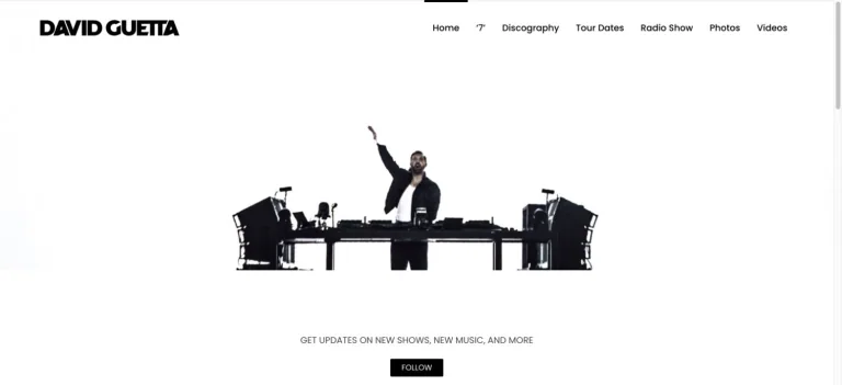
A performance cutout floats in a large white field under a bold black identity and orderly navigation, with a centered follow action below.
Useful for: A music celebrity website reference; study how its opening presents identity and routes into work, releases, or public appearances.
# Design reference: David Guetta
Source: https://davidguetta.com/
Swipefile reference: https://swipefile.design/ref/celebrity-david-guetta/
Captured: 2026-09-08. This is a dated reference, not a claim about the current live product.
Capture scope: one viewport. Do not infer unseen page sections or a complete user flow.

## Objective
Adapt the visual principles below to my project. Use my own content and identity. Do not reproduce logos, proprietary copy, or brand assets.

## Reference notes
- mood: Spare and performance-led.
- colors: White, black, and restrained photographic color.
- typography: Adapt the visible contrast between display lettering and smaller navigation. Choose type that supports your own identity and remains readable on small screens.
- layout: A performance cutout floats in a large white field under a bold black identity and orderly navigation, with a centered follow action below.
- motion: Static opening-viewport capture. Follow the original source to inspect animation, video, menus, and reduced-motion behavior.
- texture: Let original photography or film provide the visual detail. Keep supporting controls clear.
- dont: Do not copy the celebrity’s identity, claims, photographs, artwork, or trademarks into a new brand.

Useful for: A music celebrity website reference; study how its opening presents identity and routes into work, releases, or public appearances.

## Acceptance criteria
- Existing project conventions, design tokens, working functionality, and unrelated changes are preserved.
- Two or three reference principles clearly support the user's task; conflicts are resolved in favor of usability and the existing product.
- Reusable components and semantic HTML express the interface. Available licensed assets are used; important UI text is never rendered as a bitmap.
- Every visible control has a defined behavior. Loading, empty, error, success, disabled, and long-content states are specified where relevant. Demo data is clearly labeled.
- Navigation and content adapt at 375px, 768px, and 1440px without horizontal page overflow. Keyboard use, visible focus, labeled inputs, at least 44px touch targets, readable contrast, and reduced motion are supported.
- Verification distinguishes rendered behavior from proposals and identifies anything still requiring a backend or external service.

## Quality bar
Clear hierarchy, consistent spacing, restrained surfaces, and purposeful motion. Avoid decorative gradients, excessive cards, placeholder buttons, and invented metrics unless the project calls for them. Do not claim a feature is connected or tested without evidence.
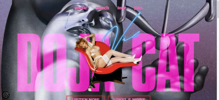
Huge pink artist lettering overlays a metallic portrait collage, with a small floating figure and compact pink navigation above.
Useful for: A music celebrity website reference; study how its opening presents identity and routes into work, releases, or public appearances.
# Design reference: Doja Cat
Source: https://www.dojacat.com/
Swipefile reference: https://swipefile.design/ref/celebrity-doja-cat/
Captured: 2026-09-08. This is a dated reference, not a claim about the current live product.
Capture scope: one viewport. Do not infer unseen page sections or a complete user flow.

## Objective
Adapt the visual principles below to my project. Use my own content and identity. Do not reproduce logos, proprietary copy, or brand assets.

## Reference notes
- mood: Surreal and expressive.
- colors: Hot pink, silver, purple, and charcoal.
- typography: Adapt the visible contrast between display lettering and smaller navigation. Choose type that supports your own identity and remains readable on small screens.
- layout: Huge pink artist lettering overlays a metallic portrait collage, with a small floating figure and compact pink navigation above.
- motion: Static opening-viewport capture. Follow the original source to inspect animation, video, menus, and reduced-motion behavior.
- texture: Let original photography or film provide the visual detail. Keep supporting controls clear.
- dont: Do not copy the celebrity’s identity, claims, photographs, artwork, or trademarks into a new brand.

Useful for: A music celebrity website reference; study how its opening presents identity and routes into work, releases, or public appearances.

## Acceptance criteria
- Existing project conventions, design tokens, working functionality, and unrelated changes are preserved.
- Two or three reference principles clearly support the user's task; conflicts are resolved in favor of usability and the existing product.
- Reusable components and semantic HTML express the interface. Available licensed assets are used; important UI text is never rendered as a bitmap.
- Every visible control has a defined behavior. Loading, empty, error, success, disabled, and long-content states are specified where relevant. Demo data is clearly labeled.
- Navigation and content adapt at 375px, 768px, and 1440px without horizontal page overflow. Keyboard use, visible focus, labeled inputs, at least 44px touch targets, readable contrast, and reduced motion are supported.
- Verification distinguishes rendered behavior from proposals and identifies anything still requiring a backend or external service.

## Quality bar
Clear hierarchy, consistent spacing, restrained surfaces, and purposeful motion. Avoid decorative gradients, excessive cards, placeholder buttons, and invented metrics unless the project calls for them. Do not claim a feature is connected or tested without evidence.
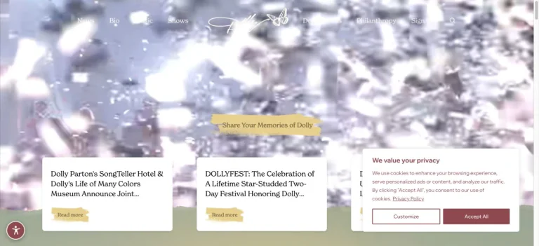
A bright photographic hero uses floating light-like detail behind a script identity, a small fan action, and white editorial cards.
Useful for: A music celebrity website reference; study how its opening presents identity and routes into work, releases, or public appearances.
# Design reference: Dolly Parton
Source: https://www.dollyparton.com/
Swipefile reference: https://swipefile.design/ref/celebrity-dolly-parton/
Captured: 2026-09-08. This is a dated reference, not a claim about the current live product.
Capture scope: one viewport. Do not infer unseen page sections or a complete user flow.

## Objective
Adapt the visual principles below to my project. Use my own content and identity. Do not reproduce logos, proprietary copy, or brand assets.

## Reference notes
- mood: Warm and celebratory.
- colors: White, pale silver, warm gold, and soft photographic color.
- typography: Adapt the visible contrast between display lettering and smaller navigation. Choose type that supports your own identity and remains readable on small screens.
- layout: A bright photographic hero uses floating light-like detail behind a script identity, a small fan action, and white editorial cards.
- motion: Static opening-viewport capture. Follow the original source to inspect animation, video, menus, and reduced-motion behavior.
- texture: Let original photography or film provide the visual detail. Keep supporting controls clear.
- dont: Do not copy the celebrity’s identity, claims, photographs, artwork, or trademarks into a new brand.

Useful for: A music celebrity website reference; study how its opening presents identity and routes into work, releases, or public appearances.

## Acceptance criteria
- Existing project conventions, design tokens, working functionality, and unrelated changes are preserved.
- Two or three reference principles clearly support the user's task; conflicts are resolved in favor of usability and the existing product.
- Reusable components and semantic HTML express the interface. Available licensed assets are used; important UI text is never rendered as a bitmap.
- Every visible control has a defined behavior. Loading, empty, error, success, disabled, and long-content states are specified where relevant. Demo data is clearly labeled.
- Navigation and content adapt at 375px, 768px, and 1440px without horizontal page overflow. Keyboard use, visible focus, labeled inputs, at least 44px touch targets, readable contrast, and reduced motion are supported.
- Verification distinguishes rendered behavior from proposals and identifies anything still requiring a backend or external service.

## Quality bar
Clear hierarchy, consistent spacing, restrained surfaces, and purposeful motion. Avoid decorative gradients, excessive cards, placeholder buttons, and invented metrics unless the project calls for them. Do not claim a feature is connected or tested without evidence.
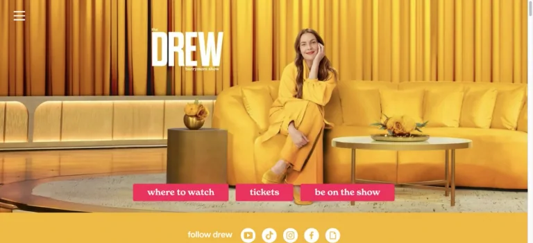
A bright yellow studio portrait puts the host on a sofa behind the show wordmark, with three pink destination buttons along the bottom.
Useful for: A television celebrity website reference; study how its opening presents identity and routes into the associated brand.
# Design reference: Drew Barrymore — The Drew Barrymore Show
Source: https://www.thedrewbarrymoreshow.com/
Swipefile reference: https://swipefile.design/ref/celebrity-drew-barrymore/
Captured: 2026-09-08. This is a dated reference, not a claim about the current live product.
Capture scope: one viewport. Do not infer unseen page sections or a complete user flow.

## Objective
Adapt the visual principles below to my project. Use my own content and identity. Do not reproduce logos, proprietary copy, or brand assets.

## Reference notes
- mood: Warm and welcoming.
- colors: Golden yellow, pink, white, and warm brown.
- typography: Adapt the visible contrast between display lettering and smaller navigation. Choose type that supports your own identity and remains readable on small screens.
- layout: A bright yellow studio portrait puts the host on a sofa behind the show wordmark, with three pink destination buttons along the bottom.
- motion: Static opening-viewport capture. Follow the original source to inspect animation, video, menus, and reduced-motion behavior.
- texture: Let original photography or film provide the visual detail. Keep supporting controls clear.
- dont: Do not copy the celebrity’s identity, claims, photographs, artwork, or trademarks into a new brand.

Useful for: A television celebrity website reference; study how its opening presents identity and routes into the associated brand.

## Acceptance criteria
- Existing project conventions, design tokens, working functionality, and unrelated changes are preserved.
- Two or three reference principles clearly support the user's task; conflicts are resolved in favor of usability and the existing product.
- Reusable components and semantic HTML express the interface. Available licensed assets are used; important UI text is never rendered as a bitmap.
- Every visible control has a defined behavior. Loading, empty, error, success, disabled, and long-content states are specified where relevant. Demo data is clearly labeled.
- Navigation and content adapt at 375px, 768px, and 1440px without horizontal page overflow. Keyboard use, visible focus, labeled inputs, at least 44px touch targets, readable contrast, and reduced motion are supported.
- Verification distinguishes rendered behavior from proposals and identifies anything still requiring a backend or external service.

## Quality bar
Clear hierarchy, consistent spacing, restrained surfaces, and purposeful motion. Avoid decorative gradients, excessive cards, placeholder buttons, and invented metrics unless the project calls for them. Do not claim a feature is connected or tested without evidence.
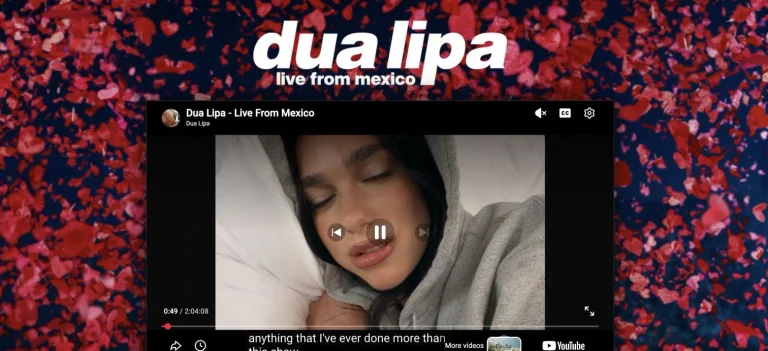
An embedded performance video sits within a bright red-and-blue confetti frame, under a large italic artist wordmark.
Useful for: A music celebrity website reference; study how its opening presents identity and routes into work, releases, or public appearances.
# Design reference: Dua Lipa
Source: https://www.dualipa.com/
Swipefile reference: https://swipefile.design/ref/celebrity-dua-lipa/
Captured: 2026-09-08. This is a dated reference, not a claim about the current live product.
Capture scope: one viewport. Do not infer unseen page sections or a complete user flow.

## Objective
Adapt the visual principles below to my project. Use my own content and identity. Do not reproduce logos, proprietary copy, or brand assets.

## Reference notes
- mood: Celebratory and energetic.
- colors: Red, blue, black, and white.
- typography: Adapt the visible contrast between display lettering and smaller navigation. Choose type that supports your own identity and remains readable on small screens.
- layout: An embedded performance video sits within a bright red-and-blue confetti frame, under a large italic artist wordmark.
- motion: Static opening-viewport capture. Follow the original source to inspect animation, video, menus, and reduced-motion behavior.
- texture: Let original photography or film provide the visual detail. Keep supporting controls clear.
- dont: Do not copy the celebrity’s identity, claims, photographs, artwork, or trademarks into a new brand.

Useful for: A music celebrity website reference; study how its opening presents identity and routes into work, releases, or public appearances.

## Acceptance criteria
- Existing project conventions, design tokens, working functionality, and unrelated changes are preserved.
- Two or three reference principles clearly support the user's task; conflicts are resolved in favor of usability and the existing product.
- Reusable components and semantic HTML express the interface. Available licensed assets are used; important UI text is never rendered as a bitmap.
- Every visible control has a defined behavior. Loading, empty, error, success, disabled, and long-content states are specified where relevant. Demo data is clearly labeled.
- Navigation and content adapt at 375px, 768px, and 1440px without horizontal page overflow. Keyboard use, visible focus, labeled inputs, at least 44px touch targets, readable contrast, and reduced motion are supported.
- Verification distinguishes rendered behavior from proposals and identifies anything still requiring a backend or external service.

## Quality bar
Clear hierarchy, consistent spacing, restrained surfaces, and purposeful motion. Avoid decorative gradients, excessive cards, placeholder buttons, and invented metrics unless the project calls for them. Do not claim a feature is connected or tested without evidence.
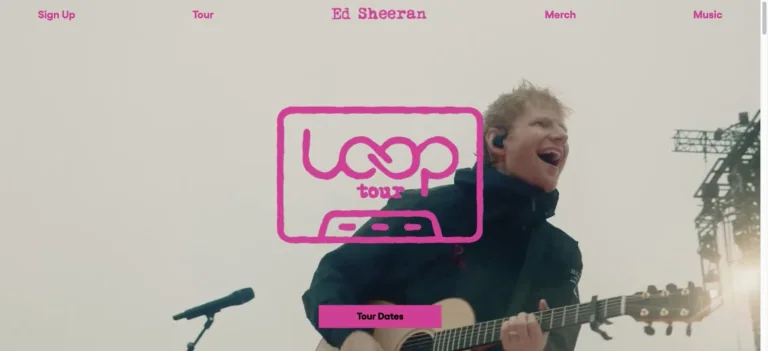
Pink navigation and a cassette-shaped tour mark sit over performance footage, with a matching tour-date action near the bottom.
Useful for: A music celebrity website reference; study how its opening presents identity and routes into work, releases, or public appearances.
# Design reference: Ed Sheeran
Source: https://www.edsheeran.com/
Swipefile reference: https://swipefile.design/ref/celebrity-ed-sheeran/
Captured: 2026-09-08. This is a dated reference, not a claim about the current live product.
Capture scope: one viewport. Do not infer unseen page sections or a complete user flow.

## Objective
Adapt the visual principles below to my project. Use my own content and identity. Do not reproduce logos, proprietary copy, or brand assets.

## Reference notes
- mood: Direct and lively.
- colors: Hot pink, pale gray, black, and photographic color.
- typography: Adapt the visible contrast between display lettering and smaller navigation. Choose type that supports your own identity and remains readable on small screens.
- layout: Pink navigation and a cassette-shaped tour mark sit over performance footage, with a matching tour-date action near the bottom.
- motion: Static opening-viewport capture. Follow the original source to inspect animation, video, menus, and reduced-motion behavior.
- texture: Let original photography or film provide the visual detail. Keep supporting controls clear.
- dont: Do not copy the celebrity’s identity, claims, photographs, artwork, or trademarks into a new brand.

Useful for: A music celebrity website reference; study how its opening presents identity and routes into work, releases, or public appearances.

## Acceptance criteria
- Existing project conventions, design tokens, working functionality, and unrelated changes are preserved.
- Two or three reference principles clearly support the user's task; conflicts are resolved in favor of usability and the existing product.
- Reusable components and semantic HTML express the interface. Available licensed assets are used; important UI text is never rendered as a bitmap.
- Every visible control has a defined behavior. Loading, empty, error, success, disabled, and long-content states are specified where relevant. Demo data is clearly labeled.
- Navigation and content adapt at 375px, 768px, and 1440px without horizontal page overflow. Keyboard use, visible focus, labeled inputs, at least 44px touch targets, readable contrast, and reduced motion are supported.
- Verification distinguishes rendered behavior from proposals and identifies anything still requiring a backend or external service.

## Quality bar
Clear hierarchy, consistent spacing, restrained surfaces, and purposeful motion. Avoid decorative gradients, excessive cards, placeholder buttons, and invented metrics unless the project calls for them. Do not claim a feature is connected or tested without evidence.
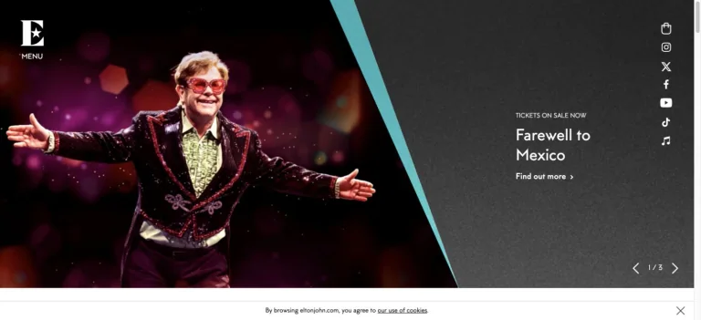
A large performance photograph meets a slanted charcoal information panel, with a compact logo rail and small social links along the edge.
Useful for: A music celebrity website reference; study how its opening presents identity and routes into work, releases, or public appearances.
# Design reference: Elton John
Source: https://www.eltonjohn.com/
Swipefile reference: https://swipefile.design/ref/celebrity-elton-john/
Captured: 2026-09-08. This is a dated reference, not a claim about the current live product.
Capture scope: one viewport. Do not infer unseen page sections or a complete user flow.

## Objective
Adapt the visual principles below to my project. Use my own content and identity. Do not reproduce logos, proprietary copy, or brand assets.

## Reference notes
- mood: Theatrical and structured.
- colors: Black, turquoise, burgundy, and white.
- typography: Adapt the visible contrast between display lettering and smaller navigation. Choose type that supports your own identity and remains readable on small screens.
- layout: A large performance photograph meets a slanted charcoal information panel, with a compact logo rail and small social links along the edge.
- motion: Static opening-viewport capture. Follow the original source to inspect animation, video, menus, and reduced-motion behavior.
- texture: Let original photography or film provide the visual detail. Keep supporting controls clear.
- dont: Do not copy the celebrity’s identity, claims, photographs, artwork, or trademarks into a new brand.

Useful for: A music celebrity website reference; study how its opening presents identity and routes into work, releases, or public appearances.

## Acceptance criteria
- Existing project conventions, design tokens, working functionality, and unrelated changes are preserved.
- Two or three reference principles clearly support the user's task; conflicts are resolved in favor of usability and the existing product.
- Reusable components and semantic HTML express the interface. Available licensed assets are used; important UI text is never rendered as a bitmap.
- Every visible control has a defined behavior. Loading, empty, error, success, disabled, and long-content states are specified where relevant. Demo data is clearly labeled.
- Navigation and content adapt at 375px, 768px, and 1440px without horizontal page overflow. Keyboard use, visible focus, labeled inputs, at least 44px touch targets, readable contrast, and reduced motion are supported.
- Verification distinguishes rendered behavior from proposals and identifies anything still requiring a backend or external service.

## Quality bar
Clear hierarchy, consistent spacing, restrained surfaces, and purposeful motion. Avoid decorative gradients, excessive cards, placeholder buttons, and invented metrics unless the project calls for them. Do not claim a feature is connected or tested without evidence.
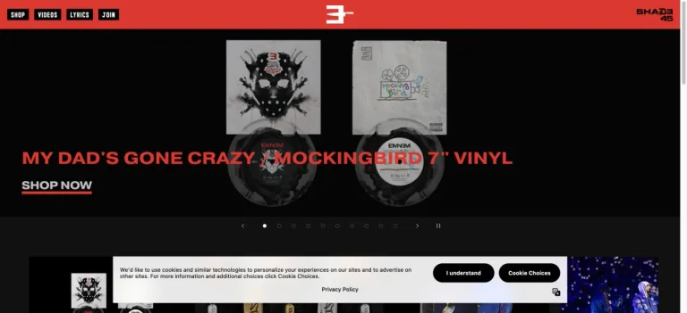
A red identity bar anchors a black storefront, with a product-led campaign, bold red release text, and a direct shop link.
Useful for: A music celebrity website reference; study how its opening presents identity and routes into work, releases, or public appearances.
# Design reference: Eminem
Source: https://www.eminem.com/
Swipefile reference: https://swipefile.design/ref/celebrity-eminem/
Captured: 2026-09-08. This is a dated reference, not a claim about the current live product.
Capture scope: one viewport. Do not infer unseen page sections or a complete user flow.

## Objective
Adapt the visual principles below to my project. Use my own content and identity. Do not reproduce logos, proprietary copy, or brand assets.

## Reference notes
- mood: Forceful and graphic.
- colors: Red, black, white, and gray.
- typography: Adapt the visible contrast between display lettering and smaller navigation. Choose type that supports your own identity and remains readable on small screens.
- layout: A red identity bar anchors a black storefront, with a product-led campaign, bold red release text, and a direct shop link.
- motion: Static opening-viewport capture. Follow the original source to inspect animation, video, menus, and reduced-motion behavior.
- texture: Use original graphics and a restrained supporting interface to establish the page’s visual character.
- dont: Do not copy the celebrity’s identity, claims, photographs, artwork, or trademarks into a new brand.

Useful for: A music celebrity website reference; study how its opening presents identity and routes into work, releases, or public appearances.

## Acceptance criteria
- Existing project conventions, design tokens, working functionality, and unrelated changes are preserved.
- Two or three reference principles clearly support the user's task; conflicts are resolved in favor of usability and the existing product.
- Reusable components and semantic HTML express the interface. Available licensed assets are used; important UI text is never rendered as a bitmap.
- Every visible control has a defined behavior. Loading, empty, error, success, disabled, and long-content states are specified where relevant. Demo data is clearly labeled.
- Navigation and content adapt at 375px, 768px, and 1440px without horizontal page overflow. Keyboard use, visible focus, labeled inputs, at least 44px touch targets, readable contrast, and reduced motion are supported.
- Verification distinguishes rendered behavior from proposals and identifies anything still requiring a backend or external service.

## Quality bar
Clear hierarchy, consistent spacing, restrained surfaces, and purposeful motion. Avoid decorative gradients, excessive cards, placeholder buttons, and invented metrics unless the project calls for them. Do not claim a feature is connected or tested without evidence.
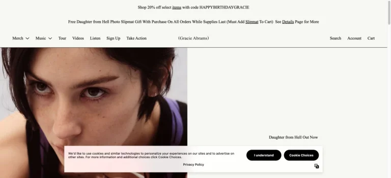
A narrow promotional strip and restrained store header lead into a close portrait, letting the campaign image carry most of the page’s character.
Useful for: A music celebrity website reference; study how its opening presents identity and routes into products.
# Design reference: Gracie Abrams — Official store
Source: https://shop.gracieabrams.com/
Swipefile reference: https://swipefile.design/ref/celebrity-gracie-abrams/
Captured: 2026-09-08. This is a dated reference, not a claim about the current live product.
Capture scope: one viewport. Do not infer unseen page sections or a complete user flow.

## Objective
Adapt the visual principles below to my project. Use my own content and identity. Do not reproduce logos, proprietary copy, or brand assets.

## Reference notes
- mood: Intimate and product-led.
- colors: Warm ivory, dark brown, black, and red accents.
- typography: Adapt the visible contrast between display lettering and smaller navigation. Choose type that supports your own identity and remains readable on small screens.
- layout: A narrow promotional strip and restrained store header lead into a close portrait, letting the campaign image carry most of the page’s character.
- motion: Static opening-viewport capture. Follow the original source to inspect animation, video, menus, and reduced-motion behavior.
- texture: Let original photography or film provide the visual detail. Keep supporting controls clear.
- dont: Do not copy the celebrity’s identity, claims, photographs, artwork, or trademarks into a new brand.

Useful for: A music celebrity website reference; study how its opening presents identity and routes into products.

## Acceptance criteria
- Existing project conventions, design tokens, working functionality, and unrelated changes are preserved.
- Two or three reference principles clearly support the user's task; conflicts are resolved in favor of usability and the existing product.
- Reusable components and semantic HTML express the interface. Available licensed assets are used; important UI text is never rendered as a bitmap.
- Every visible control has a defined behavior. Loading, empty, error, success, disabled, and long-content states are specified where relevant. Demo data is clearly labeled.
- Navigation and content adapt at 375px, 768px, and 1440px without horizontal page overflow. Keyboard use, visible focus, labeled inputs, at least 44px touch targets, readable contrast, and reduced motion are supported.
- Verification distinguishes rendered behavior from proposals and identifies anything still requiring a backend or external service.

## Quality bar
Clear hierarchy, consistent spacing, restrained surfaces, and purposeful motion. Avoid decorative gradients, excessive cards, placeholder buttons, and invented metrics unless the project calls for them. Do not claim a feature is connected or tested without evidence.
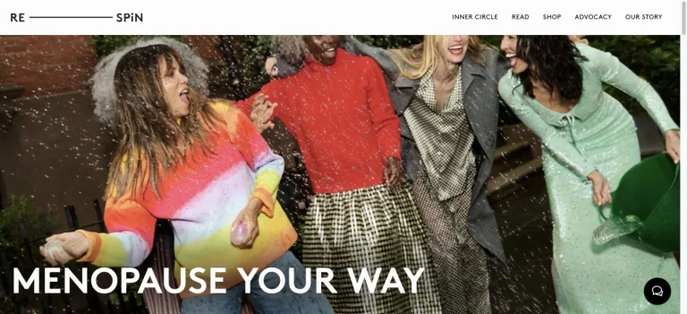
Respin combines a wide candid group photograph with a bold white statement and a restrained editorial navigation.
Useful for: A film celebrity website reference; study how its opening presents identity and routes into the associated brand.
# Design reference: Halle Berry — Respin
Source: https://www.re-spin.com/
Swipefile reference: https://swipefile.design/ref/celebrity-halle-berry/
Captured: 2026-09-08. This is a dated reference, not a claim about the current live product.
Capture scope: one viewport. Do not infer unseen page sections or a complete user flow.

## Objective
Adapt the visual principles below to my project. Use my own content and identity. Do not reproduce logos, proprietary copy, or brand assets.

## Reference notes
- mood: Warm and community-led.
- colors: White, black, red, green, and photographic neutrals.
- typography: Adapt the visible contrast between display lettering and smaller navigation. Choose type that supports your own identity and remains readable on small screens.
- layout: Respin combines a wide candid group photograph with a bold white statement and a restrained editorial navigation.
- motion: Static opening-viewport capture. Follow the original source to inspect animation, video, menus, and reduced-motion behavior.
- texture: Let original photography or film provide the visual detail. Keep supporting controls clear.
- dont: Do not copy the celebrity’s identity, claims, photographs, artwork, or trademarks into a new brand.

Useful for: A film celebrity website reference; study how its opening presents identity and routes into the associated brand.

## Acceptance criteria
- Existing project conventions, design tokens, working functionality, and unrelated changes are preserved.
- Two or three reference principles clearly support the user's task; conflicts are resolved in favor of usability and the existing product.
- Reusable components and semantic HTML express the interface. Available licensed assets are used; important UI text is never rendered as a bitmap.
- Every visible control has a defined behavior. Loading, empty, error, success, disabled, and long-content states are specified where relevant. Demo data is clearly labeled.
- Navigation and content adapt at 375px, 768px, and 1440px without horizontal page overflow. Keyboard use, visible focus, labeled inputs, at least 44px touch targets, readable contrast, and reduced motion are supported.
- Verification distinguishes rendered behavior from proposals and identifies anything still requiring a backend or external service.

## Quality bar
Clear hierarchy, consistent spacing, restrained surfaces, and purposeful motion. Avoid decorative gradients, excessive cards, placeholder buttons, and invented metrics unless the project calls for them. Do not claim a feature is connected or tested without evidence.
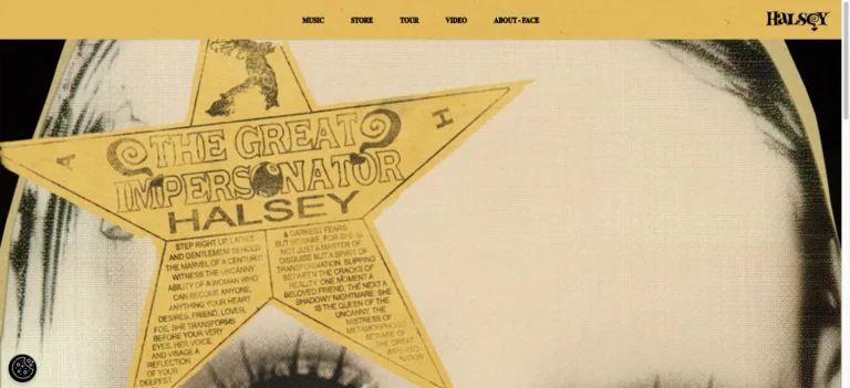
A mustard navigation bar frames an enlarged vintage-style album artwork, with hand-drawn rays and decorative lettering doing the visual work.
Useful for: A music celebrity website reference; study how its opening presents identity and routes into work, releases, or public appearances.
# Design reference: Halsey
Source: https://www.iamhalsey.com/
Swipefile reference: https://swipefile.design/ref/celebrity-halsey/
Captured: 2026-09-08. This is a dated reference, not a claim about the current live product.
Capture scope: one viewport. Do not infer unseen page sections or a complete user flow.

## Objective
Adapt the visual principles below to my project. Use my own content and identity. Do not reproduce logos, proprietary copy, or brand assets.

## Reference notes
- mood: Vintage and expressive.
- colors: Mustard yellow, cream, black, and muted brown.
- typography: Adapt the visible contrast between display lettering and smaller navigation. Choose type that supports your own identity and remains readable on small screens.
- layout: A mustard navigation bar frames an enlarged vintage-style album artwork, with hand-drawn rays and decorative lettering doing the visual work.
- motion: Static opening-viewport capture. Follow the original source to inspect animation, video, menus, and reduced-motion behavior.
- texture: Use original graphics and a restrained supporting interface to establish the page’s visual character.
- dont: Do not copy the celebrity’s identity, claims, photographs, artwork, or trademarks into a new brand.

Useful for: A music celebrity website reference; study how its opening presents identity and routes into work, releases, or public appearances.

## Acceptance criteria
- Existing project conventions, design tokens, working functionality, and unrelated changes are preserved.
- Two or three reference principles clearly support the user's task; conflicts are resolved in favor of usability and the existing product.
- Reusable components and semantic HTML express the interface. Available licensed assets are used; important UI text is never rendered as a bitmap.
- Every visible control has a defined behavior. Loading, empty, error, success, disabled, and long-content states are specified where relevant. Demo data is clearly labeled.
- Navigation and content adapt at 375px, 768px, and 1440px without horizontal page overflow. Keyboard use, visible focus, labeled inputs, at least 44px touch targets, readable contrast, and reduced motion are supported.
- Verification distinguishes rendered behavior from proposals and identifies anything still requiring a backend or external service.

## Quality bar
Clear hierarchy, consistent spacing, restrained surfaces, and purposeful motion. Avoid decorative gradients, excessive cards, placeholder buttons, and invented metrics unless the project calls for them. Do not claim a feature is connected or tested without evidence.
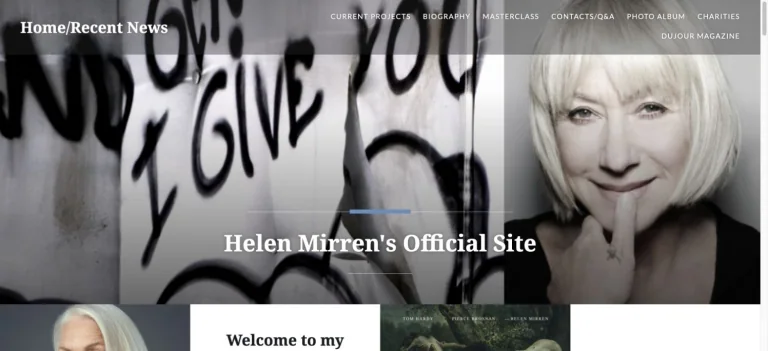
A monochrome portrait and bold handwritten backdrop introduce the actor, with a white serif name and a compact gray navigation strip.
Useful for: A film celebrity website reference; study how its opening presents identity and routes into work, releases, or public appearances.
# Design reference: Helen Mirren
Source: https://www.helenmirren.com/
Swipefile reference: https://swipefile.design/ref/celebrity-helen-mirren/
Captured: 2026-09-08. This is a dated reference, not a claim about the current live product.
Capture scope: one viewport. Do not infer unseen page sections or a complete user flow.

## Objective
Adapt the visual principles below to my project. Use my own content and identity. Do not reproduce logos, proprietary copy, or brand assets.

## Reference notes
- mood: Classic and personal.
- colors: Black, white, gray, and subtle photographic color.
- typography: Adapt the visible contrast between display lettering and smaller navigation. Choose type that supports your own identity and remains readable on small screens.
- layout: A monochrome portrait and bold handwritten backdrop introduce the actor, with a white serif name and a compact gray navigation strip.
- motion: Static opening-viewport capture. Follow the original source to inspect animation, video, menus, and reduced-motion behavior.
- texture: Let original photography or film provide the visual detail. Keep supporting controls clear.
- dont: Do not copy the celebrity’s identity, claims, photographs, artwork, or trademarks into a new brand.

Useful for: A film celebrity website reference; study how its opening presents identity and routes into work, releases, or public appearances.

## Acceptance criteria
- Existing project conventions, design tokens, working functionality, and unrelated changes are preserved.
- Two or three reference principles clearly support the user's task; conflicts are resolved in favor of usability and the existing product.
- Reusable components and semantic HTML express the interface. Available licensed assets are used; important UI text is never rendered as a bitmap.
- Every visible control has a defined behavior. Loading, empty, error, success, disabled, and long-content states are specified where relevant. Demo data is clearly labeled.
- Navigation and content adapt at 375px, 768px, and 1440px without horizontal page overflow. Keyboard use, visible focus, labeled inputs, at least 44px touch targets, readable contrast, and reduced motion are supported.
- Verification distinguishes rendered behavior from proposals and identifies anything still requiring a backend or external service.

## Quality bar
Clear hierarchy, consistent spacing, restrained surfaces, and purposeful motion. Avoid decorative gradients, excessive cards, placeholder buttons, and invented metrics unless the project calls for them. Do not claim a feature is connected or tested without evidence.
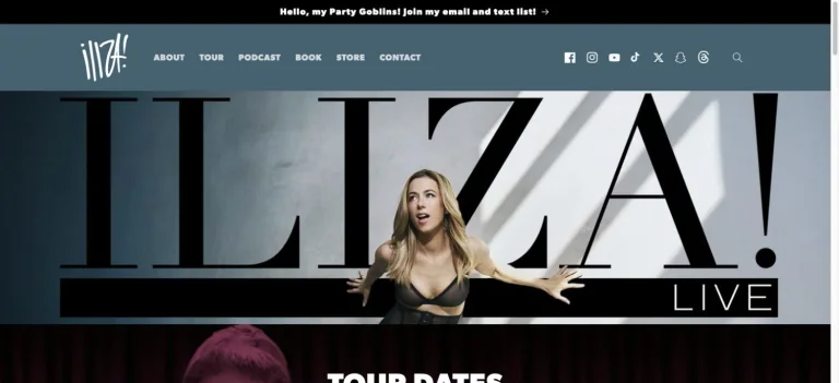
An enormous black identity sits behind a performance portrait, framed by a muted blue navigation bar and a direct transition into tour dates.
Useful for: A comedy celebrity website reference; study how its opening presents identity and routes into work, releases, or public appearances.
# Design reference: Iliza Shlesinger
Source: https://iliza.com/
Swipefile reference: https://swipefile.design/ref/celebrity-iliza-shlesinger/
Captured: 2026-09-08. This is a dated reference, not a claim about the current live product.
Capture scope: one viewport. Do not infer unseen page sections or a complete user flow.

## Objective
Adapt the visual principles below to my project. Use my own content and identity. Do not reproduce logos, proprietary copy, or brand assets.

## Reference notes
- mood: Bold and tour-focused.
- colors: Muted blue, white, black, and gray.
- typography: Adapt the visible contrast between display lettering and smaller navigation. Choose type that supports your own identity and remains readable on small screens.
- layout: An enormous black identity sits behind a performance portrait, framed by a muted blue navigation bar and a direct transition into tour dates.
- motion: Static opening-viewport capture. Follow the original source to inspect animation, video, menus, and reduced-motion behavior.
- texture: Let original photography or film provide the visual detail. Keep supporting controls clear.
- dont: Do not copy the celebrity’s identity, claims, photographs, artwork, or trademarks into a new brand.

Useful for: A comedy celebrity website reference; study how its opening presents identity and routes into work, releases, or public appearances.

## Acceptance criteria
- Existing project conventions, design tokens, working functionality, and unrelated changes are preserved.
- Two or three reference principles clearly support the user's task; conflicts are resolved in favor of usability and the existing product.
- Reusable components and semantic HTML express the interface. Available licensed assets are used; important UI text is never rendered as a bitmap.
- Every visible control has a defined behavior. Loading, empty, error, success, disabled, and long-content states are specified where relevant. Demo data is clearly labeled.
- Navigation and content adapt at 375px, 768px, and 1440px without horizontal page overflow. Keyboard use, visible focus, labeled inputs, at least 44px touch targets, readable contrast, and reduced motion are supported.
- Verification distinguishes rendered behavior from proposals and identifies anything still requiring a backend or external service.

## Quality bar
Clear hierarchy, consistent spacing, restrained surfaces, and purposeful motion. Avoid decorative gradients, excessive cards, placeholder buttons, and invented metrics unless the project calls for them. Do not claim a feature is connected or tested without evidence.
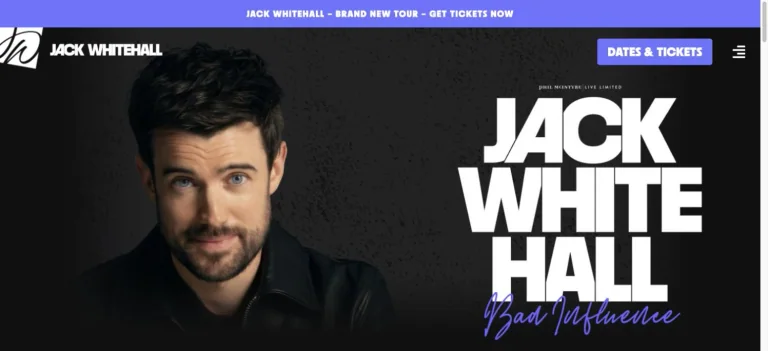
A black textured hero pairs a close portrait with stacked angular white lettering, framed by purple ticket controls.
Useful for: A comedy celebrity website reference; study how its opening presents identity and routes into work, releases, or public appearances.
# Design reference: Jack Whitehall
Source: https://www.jackwhitehall.com/
Swipefile reference: https://swipefile.design/ref/celebrity-jack-whitehall/
Captured: 2026-09-08. This is a dated reference, not a claim about the current live product.
Capture scope: one viewport. Do not infer unseen page sections or a complete user flow.

## Objective
Adapt the visual principles below to my project. Use my own content and identity. Do not reproduce logos, proprietary copy, or brand assets.

## Reference notes
- mood: Direct and graphic.
- colors: Black, white, violet, and muted skin tones.
- typography: Adapt the visible contrast between display lettering and smaller navigation. Choose type that supports your own identity and remains readable on small screens.
- layout: A black textured hero pairs a close portrait with stacked angular white lettering, framed by purple ticket controls.
- motion: Static opening-viewport capture. Follow the original source to inspect animation, video, menus, and reduced-motion behavior.
- texture: Let original photography or film provide the visual detail. Keep supporting controls clear.
- dont: Do not copy the celebrity’s identity, claims, photographs, artwork, or trademarks into a new brand.

Useful for: A comedy celebrity website reference; study how its opening presents identity and routes into work, releases, or public appearances.

## Acceptance criteria
- Existing project conventions, design tokens, working functionality, and unrelated changes are preserved.
- Two or three reference principles clearly support the user's task; conflicts are resolved in favor of usability and the existing product.
- Reusable components and semantic HTML express the interface. Available licensed assets are used; important UI text is never rendered as a bitmap.
- Every visible control has a defined behavior. Loading, empty, error, success, disabled, and long-content states are specified where relevant. Demo data is clearly labeled.
- Navigation and content adapt at 375px, 768px, and 1440px without horizontal page overflow. Keyboard use, visible focus, labeled inputs, at least 44px touch targets, readable contrast, and reduced motion are supported.
- Verification distinguishes rendered behavior from proposals and identifies anything still requiring a backend or external service.

## Quality bar
Clear hierarchy, consistent spacing, restrained surfaces, and purposeful motion. Avoid decorative gradients, excessive cards, placeholder buttons, and invented metrics unless the project calls for them. Do not claim a feature is connected or tested without evidence.
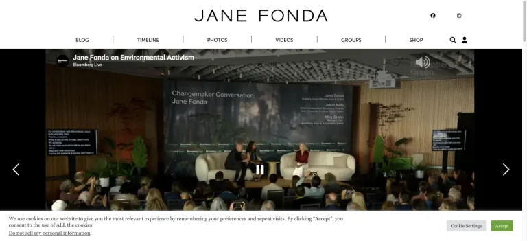
A widely spaced black identity sits in a white editorial header above a large activism video and a compact archive navigation.
Useful for: A film celebrity website reference; study how its opening presents identity and routes into work, releases, or public appearances.
# Design reference: Jane Fonda
Source: https://janefonda.com/
Swipefile reference: https://swipefile.design/ref/celebrity-jane-fonda/
Captured: 2026-09-08. This is a dated reference, not a claim about the current live product.
Capture scope: one viewport. Do not infer unseen page sections or a complete user flow.

## Objective
Adapt the visual principles below to my project. Use my own content and identity. Do not reproduce logos, proprietary copy, or brand assets.

## Reference notes
- mood: Editorial and purposeful.
- colors: White, black, warm brown, and muted photographic color.
- typography: Adapt the visible contrast between display lettering and smaller navigation. Choose type that supports your own identity and remains readable on small screens.
- layout: A widely spaced black identity sits in a white editorial header above a large activism video and a compact archive navigation.
- motion: Static opening-viewport capture. Follow the original source to inspect animation, video, menus, and reduced-motion behavior.
- texture: Use original graphics and a restrained supporting interface to establish the page’s visual character.
- dont: Do not copy the celebrity’s identity, claims, photographs, artwork, or trademarks into a new brand.

Useful for: A film celebrity website reference; study how its opening presents identity and routes into work, releases, or public appearances.

## Acceptance criteria
- Existing project conventions, design tokens, working functionality, and unrelated changes are preserved.
- Two or three reference principles clearly support the user's task; conflicts are resolved in favor of usability and the existing product.
- Reusable components and semantic HTML express the interface. Available licensed assets are used; important UI text is never rendered as a bitmap.
- Every visible control has a defined behavior. Loading, empty, error, success, disabled, and long-content states are specified where relevant. Demo data is clearly labeled.
- Navigation and content adapt at 375px, 768px, and 1440px without horizontal page overflow. Keyboard use, visible focus, labeled inputs, at least 44px touch targets, readable contrast, and reduced motion are supported.
- Verification distinguishes rendered behavior from proposals and identifies anything still requiring a backend or external service.

## Quality bar
Clear hierarchy, consistent spacing, restrained surfaces, and purposeful motion. Avoid decorative gradients, excessive cards, placeholder buttons, and invented metrics unless the project calls for them. Do not claim a feature is connected or tested without evidence.
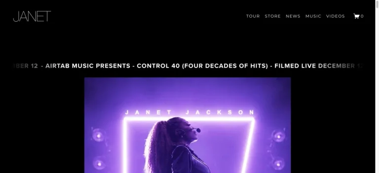
A fine-line identity and small navigation sit on a black page above a scrolling announcement and a purple performance image.
Useful for: A music celebrity website reference; study how its opening presents identity and routes into work, releases, or public appearances.
# Design reference: Janet Jackson
Source: https://www.janetjackson.com/
Swipefile reference: https://swipefile.design/ref/celebrity-janet-jackson/
Captured: 2026-09-08. This is a dated reference, not a claim about the current live product.
Capture scope: one viewport. Do not infer unseen page sections or a complete user flow.

## Objective
Adapt the visual principles below to my project. Use my own content and identity. Do not reproduce logos, proprietary copy, or brand assets.

## Reference notes
- mood: Spare and stage-led.
- colors: Black, white, violet, and gray.
- typography: Adapt the visible contrast between display lettering and smaller navigation. Choose type that supports your own identity and remains readable on small screens.
- layout: A fine-line identity and small navigation sit on a black page above a scrolling announcement and a purple performance image.
- motion: Static opening-viewport capture. Follow the original source to inspect animation, video, menus, and reduced-motion behavior.
- texture: Let original photography or film provide the visual detail. Keep supporting controls clear.
- dont: Do not copy the celebrity’s identity, claims, photographs, artwork, or trademarks into a new brand.

Useful for: A music celebrity website reference; study how its opening presents identity and routes into work, releases, or public appearances.

## Acceptance criteria
- Existing project conventions, design tokens, working functionality, and unrelated changes are preserved.
- Two or three reference principles clearly support the user's task; conflicts are resolved in favor of usability and the existing product.
- Reusable components and semantic HTML express the interface. Available licensed assets are used; important UI text is never rendered as a bitmap.
- Every visible control has a defined behavior. Loading, empty, error, success, disabled, and long-content states are specified where relevant. Demo data is clearly labeled.
- Navigation and content adapt at 375px, 768px, and 1440px without horizontal page overflow. Keyboard use, visible focus, labeled inputs, at least 44px touch targets, readable contrast, and reduced motion are supported.
- Verification distinguishes rendered behavior from proposals and identifies anything still requiring a backend or external service.

## Quality bar
Clear hierarchy, consistent spacing, restrained surfaces, and purposeful motion. Avoid decorative gradients, excessive cards, placeholder buttons, and invented metrics unless the project calls for them. Do not claim a feature is connected or tested without evidence.
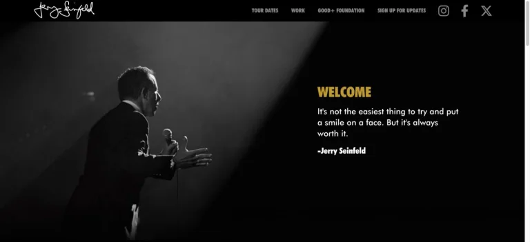
A dark stage photograph balances a short welcome message with one yellow heading, beneath a handwritten identity and small navigation.
Useful for: A comedy celebrity website reference; study how its opening presents identity and routes into work, releases, or public appearances.
# Design reference: Jerry Seinfeld
Source: https://www.jerryseinfeld.com/
Swipefile reference: https://swipefile.design/ref/celebrity-jerry-seinfeld/
Captured: 2026-09-08. This is a dated reference, not a claim about the current live product.
Capture scope: one viewport. Do not infer unseen page sections or a complete user flow.

## Objective
Adapt the visual principles below to my project. Use my own content and identity. Do not reproduce logos, proprietary copy, or brand assets.

## Reference notes
- mood: Quiet and stage-led.
- colors: Black, white, gray, and muted yellow.
- typography: Adapt the visible contrast between display lettering and smaller navigation. Choose type that supports your own identity and remains readable on small screens.
- layout: A dark stage photograph balances a short welcome message with one yellow heading, beneath a handwritten identity and small navigation.
- motion: Static opening-viewport capture. Follow the original source to inspect animation, video, menus, and reduced-motion behavior.
- texture: Let original photography or film provide the visual detail. Keep supporting controls clear.
- dont: Do not copy the celebrity’s identity, claims, photographs, artwork, or trademarks into a new brand.

Useful for: A comedy celebrity website reference; study how its opening presents identity and routes into work, releases, or public appearances.

## Acceptance criteria
- Existing project conventions, design tokens, working functionality, and unrelated changes are preserved.
- Two or three reference principles clearly support the user's task; conflicts are resolved in favor of usability and the existing product.
- Reusable components and semantic HTML express the interface. Available licensed assets are used; important UI text is never rendered as a bitmap.
- Every visible control has a defined behavior. Loading, empty, error, success, disabled, and long-content states are specified where relevant. Demo data is clearly labeled.
- Navigation and content adapt at 375px, 768px, and 1440px without horizontal page overflow. Keyboard use, visible focus, labeled inputs, at least 44px touch targets, readable contrast, and reduced motion are supported.
- Verification distinguishes rendered behavior from proposals and identifies anything still requiring a backend or external service.

## Quality bar
Clear hierarchy, consistent spacing, restrained surfaces, and purposeful motion. Avoid decorative gradients, excessive cards, placeholder buttons, and invented metrics unless the project calls for them. Do not claim a feature is connected or tested without evidence.
The Honest Company pairs soft product footage with a white brand mark, small commerce navigation, and an understated product promise.
Useful for: A film celebrity website reference; study how its opening presents identity and routes into the associated brand.
# Design reference: Jessica Alba — The Honest Company
Source: https://honest.com/
Swipefile reference: https://swipefile.design/ref/celebrity-jessica-alba/
Captured: 2026-09-08. This is a dated reference, not a claim about the current live product.
Capture scope: one viewport. Do not infer unseen page sections or a complete user flow.

## Objective
Adapt the visual principles below to my project. Use my own content and identity. Do not reproduce logos, proprietary copy, or brand assets.

## Reference notes
- mood: Soft and product-focused.
- colors: Warm white, beige, soft gray, and muted green.
- typography: Adapt the visible contrast between display lettering and smaller navigation. Choose type that supports your own identity and remains readable on small screens.
- layout: The Honest Company pairs soft product footage with a white brand mark, small commerce navigation, and an understated product promise.
- motion: Static opening-viewport capture. Follow the original source to inspect animation, video, menus, and reduced-motion behavior.
- texture: Let original photography or film provide the visual detail. Keep supporting controls clear.
- dont: Do not copy the celebrity’s identity, claims, photographs, artwork, or trademarks into a new brand.

Useful for: A film celebrity website reference; study how its opening presents identity and routes into the associated brand.

## Acceptance criteria
- Existing project conventions, design tokens, working functionality, and unrelated changes are preserved.
- Two or three reference principles clearly support the user's task; conflicts are resolved in favor of usability and the existing product.
- Reusable components and semantic HTML express the interface. Available licensed assets are used; important UI text is never rendered as a bitmap.
- Every visible control has a defined behavior. Loading, empty, error, success, disabled, and long-content states are specified where relevant. Demo data is clearly labeled.
- Navigation and content adapt at 375px, 768px, and 1440px without horizontal page overflow. Keyboard use, visible focus, labeled inputs, at least 44px touch targets, readable contrast, and reduced motion are supported.
- Verification distinguishes rendered behavior from proposals and identifies anything still requiring a backend or external service.

## Quality bar
Clear hierarchy, consistent spacing, restrained surfaces, and purposeful motion. Avoid decorative gradients, excessive cards, placeholder buttons, and invented metrics unless the project calls for them. Do not claim a feature is connected or tested without evidence.
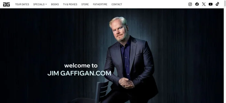
A seated portrait against dark curtains carries a small white welcome message below a tidy white navigation strip.
Useful for: A comedy celebrity website reference; study how its opening presents identity and routes into work, releases, or public appearances.
# Design reference: Jim Gaffigan
Source: https://www.jimgaffigan.com/
Swipefile reference: https://swipefile.design/ref/celebrity-jim-gaffigan/
Captured: 2026-09-08. This is a dated reference, not a claim about the current live product.
Capture scope: one viewport. Do not infer unseen page sections or a complete user flow.

## Objective
Adapt the visual principles below to my project. Use my own content and identity. Do not reproduce logos, proprietary copy, or brand assets.

## Reference notes
- mood: Simple and personable.
- colors: Black, midnight blue, white, and gray.
- typography: Adapt the visible contrast between display lettering and smaller navigation. Choose type that supports your own identity and remains readable on small screens.
- layout: A seated portrait against dark curtains carries a small white welcome message below a tidy white navigation strip.
- motion: Static opening-viewport capture. Follow the original source to inspect animation, video, menus, and reduced-motion behavior.
- texture: Let original photography or film provide the visual detail. Keep supporting controls clear.
- dont: Do not copy the celebrity’s identity, claims, photographs, artwork, or trademarks into a new brand.

Useful for: A comedy celebrity website reference; study how its opening presents identity and routes into work, releases, or public appearances.

## Acceptance criteria
- Existing project conventions, design tokens, working functionality, and unrelated changes are preserved.
- Two or three reference principles clearly support the user's task; conflicts are resolved in favor of usability and the existing product.
- Reusable components and semantic HTML express the interface. Available licensed assets are used; important UI text is never rendered as a bitmap.
- Every visible control has a defined behavior. Loading, empty, error, success, disabled, and long-content states are specified where relevant. Demo data is clearly labeled.
- Navigation and content adapt at 375px, 768px, and 1440px without horizontal page overflow. Keyboard use, visible focus, labeled inputs, at least 44px touch targets, readable contrast, and reduced motion are supported.
- Verification distinguishes rendered behavior from proposals and identifies anything still requiring a backend or external service.

## Quality bar
Clear hierarchy, consistent spacing, restrained surfaces, and purposeful motion. Avoid decorative gradients, excessive cards, placeholder buttons, and invented metrics unless the project calls for them. Do not claim a feature is connected or tested without evidence.

An orange tour hero balances a laughing portrait with heavy black lettering, under a compact dark navigation bar.
Useful for: A comedy celebrity website reference; study how its opening presents identity and routes into work, releases, or public appearances.
# Design reference: Jimmy Carr
Source: https://www.jimmycarr.com/
Swipefile reference: https://swipefile.design/ref/celebrity-jimmy-carr/
Captured: 2026-09-08. This is a dated reference, not a claim about the current live product.
Capture scope: one viewport. Do not infer unseen page sections or a complete user flow.

## Objective
Adapt the visual principles below to my project. Use my own content and identity. Do not reproduce logos, proprietary copy, or brand assets.

## Reference notes
- mood: Punchy and poster-like.
- colors: Orange, black, white, and warm brown.
- typography: Adapt the visible contrast between display lettering and smaller navigation. Choose type that supports your own identity and remains readable on small screens.
- layout: An orange tour hero balances a laughing portrait with heavy black lettering, under a compact dark navigation bar.
- motion: Static opening-viewport capture. Follow the original source to inspect animation, video, menus, and reduced-motion behavior.
- texture: Let original photography or film provide the visual detail. Keep supporting controls clear.
- dont: Do not copy the celebrity’s identity, claims, photographs, artwork, or trademarks into a new brand.

Useful for: A comedy celebrity website reference; study how its opening presents identity and routes into work, releases, or public appearances.

## Acceptance criteria
- Existing project conventions, design tokens, working functionality, and unrelated changes are preserved.
- Two or three reference principles clearly support the user's task; conflicts are resolved in favor of usability and the existing product.
- Reusable components and semantic HTML express the interface. Available licensed assets are used; important UI text is never rendered as a bitmap.
- Every visible control has a defined behavior. Loading, empty, error, success, disabled, and long-content states are specified where relevant. Demo data is clearly labeled.
- Navigation and content adapt at 375px, 768px, and 1440px without horizontal page overflow. Keyboard use, visible focus, labeled inputs, at least 44px touch targets, readable contrast, and reduced motion are supported.
- Verification distinguishes rendered behavior from proposals and identifies anything still requiring a backend or external service.

## Quality bar
Clear hierarchy, consistent spacing, restrained surfaces, and purposeful motion. Avoid decorative gradients, excessive cards, placeholder buttons, and invented metrics unless the project calls for them. Do not claim a feature is connected or tested without evidence.
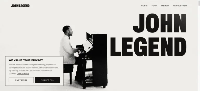
A monochrome photograph of the artist at a piano balances an oversized stacked black name on a warm off-white background.
Useful for: A music celebrity website reference; study how its opening presents identity and routes into work, releases, or public appearances.
# Design reference: John Legend
Source: https://johnlegend.com/
Swipefile reference: https://swipefile.design/ref/celebrity-john-legend/
Captured: 2026-09-08. This is a dated reference, not a claim about the current live product.
Capture scope: one viewport. Do not infer unseen page sections or a complete user flow.

## Objective
Adapt the visual principles below to my project. Use my own content and identity. Do not reproduce logos, proprietary copy, or brand assets.

## Reference notes
- mood: Confident and minimal.
- colors: Off-white, black, and gray.
- typography: Adapt the visible contrast between display lettering and smaller navigation. Choose type that supports your own identity and remains readable on small screens.
- layout: A monochrome photograph of the artist at a piano balances an oversized stacked black name on a warm off-white background.
- motion: Static opening-viewport capture. Follow the original source to inspect animation, video, menus, and reduced-motion behavior.
- texture: Let original photography or film provide the visual detail. Keep supporting controls clear.
- dont: Do not copy the celebrity’s identity, claims, photographs, artwork, or trademarks into a new brand.

Useful for: A music celebrity website reference; study how its opening presents identity and routes into work, releases, or public appearances.

## Acceptance criteria
- Existing project conventions, design tokens, working functionality, and unrelated changes are preserved.
- Two or three reference principles clearly support the user's task; conflicts are resolved in favor of usability and the existing product.
- Reusable components and semantic HTML express the interface. Available licensed assets are used; important UI text is never rendered as a bitmap.
- Every visible control has a defined behavior. Loading, empty, error, success, disabled, and long-content states are specified where relevant. Demo data is clearly labeled.
- Navigation and content adapt at 375px, 768px, and 1440px without horizontal page overflow. Keyboard use, visible focus, labeled inputs, at least 44px touch targets, readable contrast, and reduced motion are supported.
- Verification distinguishes rendered behavior from proposals and identifies anything still requiring a backend or external service.

## Quality bar
Clear hierarchy, consistent spacing, restrained surfaces, and purposeful motion. Avoid decorative gradients, excessive cards, placeholder buttons, and invented metrics unless the project calls for them. Do not claim a feature is connected or tested without evidence.
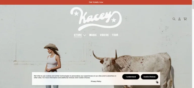
A warm Western photograph of the artist and a longhorn sits under an oversized script mark and a compact store navigation.
Useful for: A music celebrity website reference; study how its opening presents identity and routes into products.
# Design reference: Kacey Musgraves — Official store
Source: https://kaceymusgraves.com/
Swipefile reference: https://swipefile.design/ref/celebrity-kacey-musgraves/
Captured: 2026-09-08. This is a dated reference, not a claim about the current live product.
Capture scope: one viewport. Do not infer unseen page sections or a complete user flow.

## Objective
Adapt the visual principles below to my project. Use my own content and identity. Do not reproduce logos, proprietary copy, or brand assets.

## Reference notes
- mood: Rustic and understated.
- colors: Cream, dusty gray, brown, and rust red.
- typography: Adapt the visible contrast between display lettering and smaller navigation. Choose type that supports your own identity and remains readable on small screens.
- layout: A warm Western photograph of the artist and a longhorn sits under an oversized script mark and a compact store navigation.
- motion: Static opening-viewport capture. Follow the original source to inspect animation, video, menus, and reduced-motion behavior.
- texture: Let original photography or film provide the visual detail. Keep supporting controls clear.
- dont: Do not copy the celebrity’s identity, claims, photographs, artwork, or trademarks into a new brand.

Useful for: A music celebrity website reference; study how its opening presents identity and routes into products.

## Acceptance criteria
- Existing project conventions, design tokens, working functionality, and unrelated changes are preserved.
- Two or three reference principles clearly support the user's task; conflicts are resolved in favor of usability and the existing product.
- Reusable components and semantic HTML express the interface. Available licensed assets are used; important UI text is never rendered as a bitmap.
- Every visible control has a defined behavior. Loading, empty, error, success, disabled, and long-content states are specified where relevant. Demo data is clearly labeled.
- Navigation and content adapt at 375px, 768px, and 1440px without horizontal page overflow. Keyboard use, visible focus, labeled inputs, at least 44px touch targets, readable contrast, and reduced motion are supported.
- Verification distinguishes rendered behavior from proposals and identifies anything still requiring a backend or external service.

## Quality bar
Clear hierarchy, consistent spacing, restrained surfaces, and purposeful motion. Avoid decorative gradients, excessive cards, placeholder buttons, and invented metrics unless the project calls for them. Do not claim a feature is connected or tested without evidence.
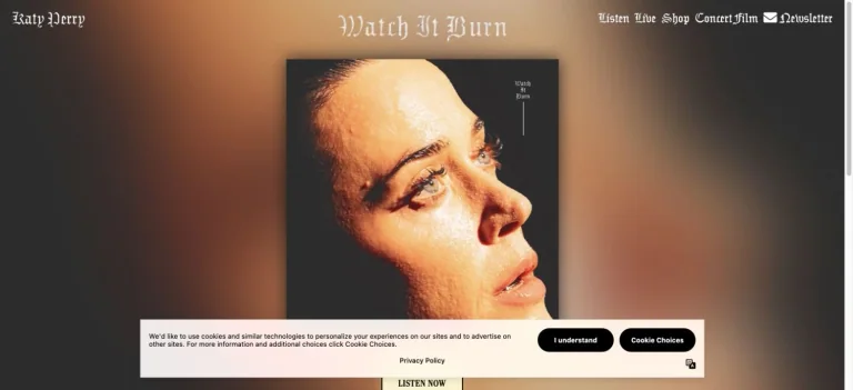
Centered portrait artwork sits against an enlarged warm blurred background, with ornate display text and a small listening action.
Useful for: A music celebrity website reference; study how its opening presents identity and routes into work, releases, or public appearances.
# Design reference: Katy Perry
Source: https://www.katyperry.com/
Swipefile reference: https://swipefile.design/ref/celebrity-katy-perry/
Captured: 2026-09-08. This is a dated reference, not a claim about the current live product.
Capture scope: one viewport. Do not infer unseen page sections or a complete user flow.

## Objective
Adapt the visual principles below to my project. Use my own content and identity. Do not reproduce logos, proprietary copy, or brand assets.

## Reference notes
- mood: Dramatic and intimate.
- colors: Amber, warm brown, black, and cream.
- typography: Adapt the visible contrast between display lettering and smaller navigation. Choose type that supports your own identity and remains readable on small screens.
- layout: Centered portrait artwork sits against an enlarged warm blurred background, with ornate display text and a small listening action.
- motion: Static opening-viewport capture. Follow the original source to inspect animation, video, menus, and reduced-motion behavior.
- texture: Let original photography or film provide the visual detail. Keep supporting controls clear.
- dont: Do not copy the celebrity’s identity, claims, photographs, artwork, or trademarks into a new brand.

Useful for: A music celebrity website reference; study how its opening presents identity and routes into work, releases, or public appearances.

## Acceptance criteria
- Existing project conventions, design tokens, working functionality, and unrelated changes are preserved.
- Two or three reference principles clearly support the user's task; conflicts are resolved in favor of usability and the existing product.
- Reusable components and semantic HTML express the interface. Available licensed assets are used; important UI text is never rendered as a bitmap.
- Every visible control has a defined behavior. Loading, empty, error, success, disabled, and long-content states are specified where relevant. Demo data is clearly labeled.
- Navigation and content adapt at 375px, 768px, and 1440px without horizontal page overflow. Keyboard use, visible focus, labeled inputs, at least 44px touch targets, readable contrast, and reduced motion are supported.
- Verification distinguishes rendered behavior from proposals and identifies anything still requiring a backend or external service.

## Quality bar
Clear hierarchy, consistent spacing, restrained surfaces, and purposeful motion. Avoid decorative gradients, excessive cards, placeholder buttons, and invented metrics unless the project calls for them. Do not claim a feature is connected or tested without evidence.
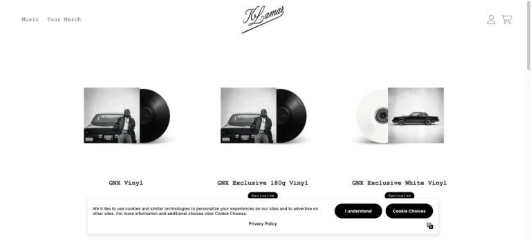
A small script identity and sparse navigation sit above widely spaced vinyl products on a white storefront.
Useful for: A music celebrity website reference; study how its opening presents identity and routes into products.
# Design reference: Kendrick Lamar — Official store
Source: https://shop.my-gnx.com/
Swipefile reference: https://swipefile.design/ref/celebrity-kendrick-lamar/
Captured: 2026-09-08. This is a dated reference, not a claim about the current live product.
Capture scope: one viewport. Do not infer unseen page sections or a complete user flow.

## Objective
Adapt the visual principles below to my project. Use my own content and identity. Do not reproduce logos, proprietary copy, or brand assets.

## Reference notes
- mood: Minimal and product-led.
- colors: White, black, and light gray.
- typography: Adapt the visible contrast between display lettering and smaller navigation. Choose type that supports your own identity and remains readable on small screens.
- layout: A small script identity and sparse navigation sit above widely spaced vinyl products on a white storefront.
- motion: Static opening-viewport capture. Follow the original source to inspect animation, video, menus, and reduced-motion behavior.
- texture: Use original graphics and a restrained supporting interface to establish the page’s visual character.
- dont: Do not copy the celebrity’s identity, claims, photographs, artwork, or trademarks into a new brand.

Useful for: A music celebrity website reference; study how its opening presents identity and routes into products.

## Acceptance criteria
- Existing project conventions, design tokens, working functionality, and unrelated changes are preserved.
- Two or three reference principles clearly support the user's task; conflicts are resolved in favor of usability and the existing product.
- Reusable components and semantic HTML express the interface. Available licensed assets are used; important UI text is never rendered as a bitmap.
- Every visible control has a defined behavior. Loading, empty, error, success, disabled, and long-content states are specified where relevant. Demo data is clearly labeled.
- Navigation and content adapt at 375px, 768px, and 1440px without horizontal page overflow. Keyboard use, visible focus, labeled inputs, at least 44px touch targets, readable contrast, and reduced motion are supported.
- Verification distinguishes rendered behavior from proposals and identifies anything still requiring a backend or external service.

## Quality bar
Clear hierarchy, consistent spacing, restrained surfaces, and purposeful motion. Avoid decorative gradients, excessive cards, placeholder buttons, and invented metrics unless the project calls for them. Do not claim a feature is connected or tested without evidence.
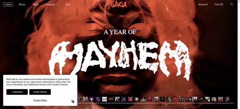
Distressed white album lettering cuts across a red-and-black portrait, with a thin top navigation and a compact image timeline along the bottom.
Useful for: A music celebrity website reference; study how its opening presents identity and routes into work, releases, or public appearances.
# Design reference: Lady Gaga
Source: https://www.ladygaga.com/us-en
Swipefile reference: https://swipefile.design/ref/celebrity-lady-gaga/
Captured: 2026-09-08. This is a dated reference, not a claim about the current live product.
Capture scope: one viewport. Do not infer unseen page sections or a complete user flow.

## Objective
Adapt the visual principles below to my project. Use my own content and identity. Do not reproduce logos, proprietary copy, or brand assets.

## Reference notes
- mood: Raw and theatrical.
- colors: Black, scarlet, and white.
- typography: Adapt the visible contrast between display lettering and smaller navigation. Choose type that supports your own identity and remains readable on small screens.
- layout: Distressed white album lettering cuts across a red-and-black portrait, with a thin top navigation and a compact image timeline along the bottom.
- motion: Static opening-viewport capture. Follow the original source to inspect animation, video, menus, and reduced-motion behavior.
- texture: Let original photography or film provide the visual detail. Keep supporting controls clear.
- dont: Do not copy the celebrity’s identity, claims, photographs, artwork, or trademarks into a new brand.

Useful for: A music celebrity website reference; study how its opening presents identity and routes into work, releases, or public appearances.

## Acceptance criteria
- Existing project conventions, design tokens, working functionality, and unrelated changes are preserved.
- Two or three reference principles clearly support the user's task; conflicts are resolved in favor of usability and the existing product.
- Reusable components and semantic HTML express the interface. Available licensed assets are used; important UI text is never rendered as a bitmap.
- Every visible control has a defined behavior. Loading, empty, error, success, disabled, and long-content states are specified where relevant. Demo data is clearly labeled.
- Navigation and content adapt at 375px, 768px, and 1440px without horizontal page overflow. Keyboard use, visible focus, labeled inputs, at least 44px touch targets, readable contrast, and reduced motion are supported.
- Verification distinguishes rendered behavior from proposals and identifies anything still requiring a backend or external service.

## Quality bar
Clear hierarchy, consistent spacing, restrained surfaces, and purposeful motion. Avoid decorative gradients, excessive cards, placeholder buttons, and invented metrics unless the project calls for them. Do not claim a feature is connected or tested without evidence.
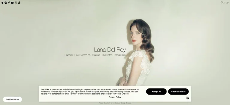
A pale, softly textured portrait composition leaves room for a small centered name and a row of understated music and store links.
Useful for: A music celebrity website reference; study how its opening presents identity and routes into work, releases, or public appearances.
# Design reference: Lana Del Rey
Source: https://www.lanadelrey.com/
Swipefile reference: https://swipefile.design/ref/celebrity-lana-del-rey/
Captured: 2026-09-08. This is a dated reference, not a claim about the current live product.
Capture scope: one viewport. Do not infer unseen page sections or a complete user flow.

## Objective
Adapt the visual principles below to my project. Use my own content and identity. Do not reproduce logos, proprietary copy, or brand assets.

## Reference notes
- mood: Delicate and understated.
- colors: Pale sage, cream, soft gray, and white.
- typography: Adapt the visible contrast between display lettering and smaller navigation. Choose type that supports your own identity and remains readable on small screens.
- layout: A pale, softly textured portrait composition leaves room for a small centered name and a row of understated music and store links.
- motion: Static opening-viewport capture. Follow the original source to inspect animation, video, menus, and reduced-motion behavior.
- texture: Let original photography or film provide the visual detail. Keep supporting controls clear.
- dont: Do not copy the celebrity’s identity, claims, photographs, artwork, or trademarks into a new brand.

Useful for: A music celebrity website reference; study how its opening presents identity and routes into work, releases, or public appearances.

## Acceptance criteria
- Existing project conventions, design tokens, working functionality, and unrelated changes are preserved.
- Two or three reference principles clearly support the user's task; conflicts are resolved in favor of usability and the existing product.
- Reusable components and semantic HTML express the interface. Available licensed assets are used; important UI text is never rendered as a bitmap.
- Every visible control has a defined behavior. Loading, empty, error, success, disabled, and long-content states are specified where relevant. Demo data is clearly labeled.
- Navigation and content adapt at 375px, 768px, and 1440px without horizontal page overflow. Keyboard use, visible focus, labeled inputs, at least 44px touch targets, readable contrast, and reduced motion are supported.
- Verification distinguishes rendered behavior from proposals and identifies anything still requiring a backend or external service.

## Quality bar
Clear hierarchy, consistent spacing, restrained surfaces, and purposeful motion. Avoid decorative gradients, excessive cards, placeholder buttons, and invented metrics unless the project calls for them. Do not claim a feature is connected or tested without evidence.
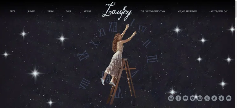
A star-filled night scene frames the artist on a ladder among oversized clock numerals, with a script wordmark and small links around the edges.
Useful for: A music celebrity website reference; study how its opening presents identity and routes into work, releases, or public appearances.
# Design reference: Laufey
Source: https://www.laufeymusic.com/
Swipefile reference: https://swipefile.design/ref/celebrity-laufey/
Captured: 2026-09-08. This is a dated reference, not a claim about the current live product.
Capture scope: one viewport. Do not infer unseen page sections or a complete user flow.

## Objective
Adapt the visual principles below to my project. Use my own content and identity. Do not reproduce logos, proprietary copy, or brand assets.

## Reference notes
- mood: Whimsical and cinematic.
- colors: Midnight blue, silver, black, and warm ivory.
- typography: Adapt the visible contrast between display lettering and smaller navigation. Choose type that supports your own identity and remains readable on small screens.
- layout: A star-filled night scene frames the artist on a ladder among oversized clock numerals, with a script wordmark and small links around the edges.
- motion: Static opening-viewport capture. Follow the original source to inspect animation, video, menus, and reduced-motion behavior.
- texture: Use original graphics and a restrained supporting interface to establish the page’s visual character.
- dont: Do not copy the celebrity’s identity, claims, photographs, artwork, or trademarks into a new brand.

Useful for: A music celebrity website reference; study how its opening presents identity and routes into work, releases, or public appearances.

## Acceptance criteria
- Existing project conventions, design tokens, working functionality, and unrelated changes are preserved.
- Two or three reference principles clearly support the user's task; conflicts are resolved in favor of usability and the existing product.
- Reusable components and semantic HTML express the interface. Available licensed assets are used; important UI text is never rendered as a bitmap.
- Every visible control has a defined behavior. Loading, empty, error, success, disabled, and long-content states are specified where relevant. Demo data is clearly labeled.
- Navigation and content adapt at 375px, 768px, and 1440px without horizontal page overflow. Keyboard use, visible focus, labeled inputs, at least 44px touch targets, readable contrast, and reduced motion are supported.
- Verification distinguishes rendered behavior from proposals and identifies anything still requiring a backend or external service.

## Quality bar
Clear hierarchy, consistent spacing, restrained surfaces, and purposeful motion. Avoid decorative gradients, excessive cards, placeholder buttons, and invented metrics unless the project calls for them. Do not claim a feature is connected or tested without evidence.
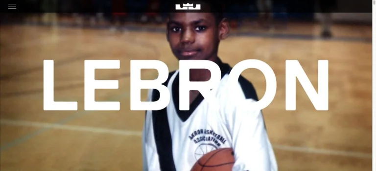
An archival basketball photograph fills the opening beneath an enormous white first name, with a minimal black identity bar above.
Useful for: A sports celebrity website reference; study how its opening presents identity and routes into work, releases, or public appearances.
# Design reference: LeBron James
Source: https://www.lebronjames.com/
Swipefile reference: https://swipefile.design/ref/celebrity-lebron-james/
Captured: 2026-09-08. This is a dated reference, not a claim about the current live product.
Capture scope: one viewport. Do not infer unseen page sections or a complete user flow.

## Objective
Adapt the visual principles below to my project. Use my own content and identity. Do not reproduce logos, proprietary copy, or brand assets.

## Reference notes
- mood: Bold and biographical.
- colors: Warm brown, black, and white.
- typography: Adapt the visible contrast between display lettering and smaller navigation. Choose type that supports your own identity and remains readable on small screens.
- layout: An archival basketball photograph fills the opening beneath an enormous white first name, with a minimal black identity bar above.
- motion: Static opening-viewport capture. Follow the original source to inspect animation, video, menus, and reduced-motion behavior.
- texture: Let original photography or film provide the visual detail. Keep supporting controls clear.
- dont: Do not copy the celebrity’s identity, claims, photographs, artwork, or trademarks into a new brand.

Useful for: A sports celebrity website reference; study how its opening presents identity and routes into work, releases, or public appearances.

## Acceptance criteria
- Existing project conventions, design tokens, working functionality, and unrelated changes are preserved.
- Two or three reference principles clearly support the user's task; conflicts are resolved in favor of usability and the existing product.
- Reusable components and semantic HTML express the interface. Available licensed assets are used; important UI text is never rendered as a bitmap.
- Every visible control has a defined behavior. Loading, empty, error, success, disabled, and long-content states are specified where relevant. Demo data is clearly labeled.
- Navigation and content adapt at 375px, 768px, and 1440px without horizontal page overflow. Keyboard use, visible focus, labeled inputs, at least 44px touch targets, readable contrast, and reduced motion are supported.
- Verification distinguishes rendered behavior from proposals and identifies anything still requiring a backend or external service.

## Quality bar
Clear hierarchy, consistent spacing, restrained surfaces, and purposeful motion. Avoid decorative gradients, excessive cards, placeholder buttons, and invented metrics unless the project calls for them. Do not claim a feature is connected or tested without evidence.
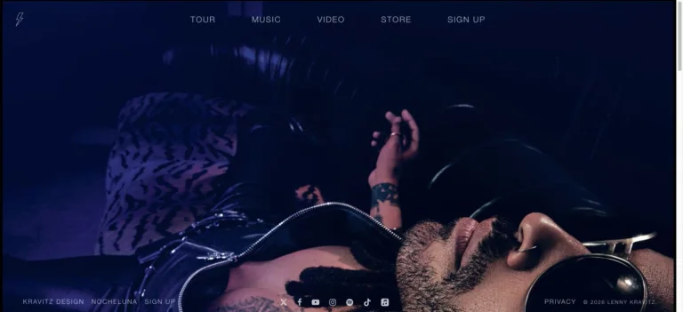
Deep blue photographic footage fills the opening, with a small lightning identity, spaced navigation, and understated social links.
Useful for: A music celebrity website reference; study how its opening presents identity and routes into work, releases, or public appearances.
# Design reference: Lenny Kravitz
Source: https://lennykravitz.com/
Swipefile reference: https://swipefile.design/ref/celebrity-lenny-kravitz/
Captured: 2026-09-08. This is a dated reference, not a claim about the current live product.
Capture scope: one viewport. Do not infer unseen page sections or a complete user flow.

## Objective
Adapt the visual principles below to my project. Use my own content and identity. Do not reproduce logos, proprietary copy, or brand assets.

## Reference notes
- mood: Moody and cinematic.
- colors: Midnight blue, black, white, and violet.
- typography: Adapt the visible contrast between display lettering and smaller navigation. Choose type that supports your own identity and remains readable on small screens.
- layout: Deep blue photographic footage fills the opening, with a small lightning identity, spaced navigation, and understated social links.
- motion: Static opening-viewport capture. Follow the original source to inspect animation, video, menus, and reduced-motion behavior.
- texture: Let original photography or film provide the visual detail. Keep supporting controls clear.
- dont: Do not copy the celebrity’s identity, claims, photographs, artwork, or trademarks into a new brand.

Useful for: A music celebrity website reference; study how its opening presents identity and routes into work, releases, or public appearances.

## Acceptance criteria
- Existing project conventions, design tokens, working functionality, and unrelated changes are preserved.
- Two or three reference principles clearly support the user's task; conflicts are resolved in favor of usability and the existing product.
- Reusable components and semantic HTML express the interface. Available licensed assets are used; important UI text is never rendered as a bitmap.
- Every visible control has a defined behavior. Loading, empty, error, success, disabled, and long-content states are specified where relevant. Demo data is clearly labeled.
- Navigation and content adapt at 375px, 768px, and 1440px without horizontal page overflow. Keyboard use, visible focus, labeled inputs, at least 44px touch targets, readable contrast, and reduced motion are supported.
- Verification distinguishes rendered behavior from proposals and identifies anything still requiring a backend or external service.

## Quality bar
Clear hierarchy, consistent spacing, restrained surfaces, and purposeful motion. Avoid decorative gradients, excessive cards, placeholder buttons, and invented metrics unless the project calls for them. Do not claim a feature is connected or tested without evidence.
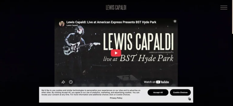
A centered live-performance video thumbnail sits in a black page, beneath a small narrow wordmark and a minimal menu control.
Useful for: A music celebrity website reference; study how its opening presents identity and routes into work, releases, or public appearances.
# Design reference: Lewis Capaldi
Source: https://www.lewiscapaldi.com/
Swipefile reference: https://swipefile.design/ref/celebrity-lewis-capaldi/
Captured: 2026-09-08. This is a dated reference, not a claim about the current live product.
Capture scope: one viewport. Do not infer unseen page sections or a complete user flow.

## Objective
Adapt the visual principles below to my project. Use my own content and identity. Do not reproduce logos, proprietary copy, or brand assets.

## Reference notes
- mood: Focused and performance-led.
- colors: Black, white, charcoal, and subdued gold.
- typography: Adapt the visible contrast between display lettering and smaller navigation. Choose type that supports your own identity and remains readable on small screens.
- layout: A centered live-performance video thumbnail sits in a black page, beneath a small narrow wordmark and a minimal menu control.
- motion: Static opening-viewport capture. Follow the original source to inspect animation, video, menus, and reduced-motion behavior.
- texture: Let original photography or film provide the visual detail. Keep supporting controls clear.
- dont: Do not copy the celebrity’s identity, claims, photographs, artwork, or trademarks into a new brand.

Useful for: A music celebrity website reference; study how its opening presents identity and routes into work, releases, or public appearances.

## Acceptance criteria
- Existing project conventions, design tokens, working functionality, and unrelated changes are preserved.
- Two or three reference principles clearly support the user's task; conflicts are resolved in favor of usability and the existing product.
- Reusable components and semantic HTML express the interface. Available licensed assets are used; important UI text is never rendered as a bitmap.
- Every visible control has a defined behavior. Loading, empty, error, success, disabled, and long-content states are specified where relevant. Demo data is clearly labeled.
- Navigation and content adapt at 375px, 768px, and 1440px without horizontal page overflow. Keyboard use, visible focus, labeled inputs, at least 44px touch targets, readable contrast, and reduced motion are supported.
- Verification distinguishes rendered behavior from proposals and identifies anything still requiring a backend or external service.

## Quality bar
Clear hierarchy, consistent spacing, restrained surfaces, and purposeful motion. Avoid decorative gradients, excessive cards, placeholder buttons, and invented metrics unless the project calls for them. Do not claim a feature is connected or tested without evidence.
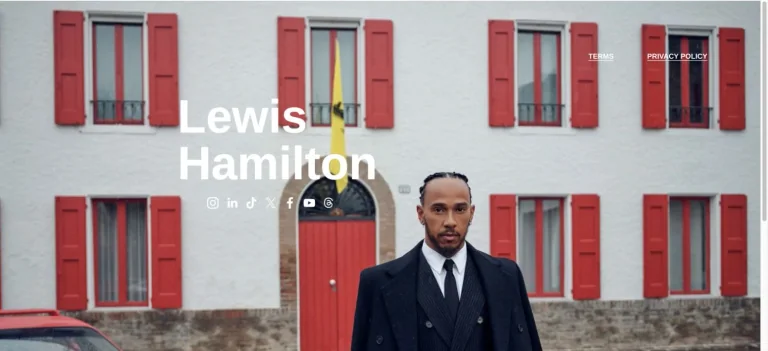
A full-width architectural portrait uses red shutters as a backdrop for a simple white name and a compact group of social links.
Useful for: A sports celebrity website reference; study how its opening presents identity and routes into work, releases, or public appearances.
# Design reference: Lewis Hamilton
Source: https://www.lewishamilton.com/
Swipefile reference: https://swipefile.design/ref/celebrity-lewis-hamilton/
Captured: 2026-09-08. This is a dated reference, not a claim about the current live product.
Capture scope: one viewport. Do not infer unseen page sections or a complete user flow.

## Objective
Adapt the visual principles below to my project. Use my own content and identity. Do not reproduce logos, proprietary copy, or brand assets.

## Reference notes
- mood: Personal and understated.
- colors: Pale gray, red, white, and charcoal.
- typography: Adapt the visible contrast between display lettering and smaller navigation. Choose type that supports your own identity and remains readable on small screens.
- layout: A full-width architectural portrait uses red shutters as a backdrop for a simple white name and a compact group of social links.
- motion: Static opening-viewport capture. Follow the original source to inspect animation, video, menus, and reduced-motion behavior.
- texture: Let original photography or film provide the visual detail. Keep supporting controls clear.
- dont: Do not copy the celebrity’s identity, claims, photographs, artwork, or trademarks into a new brand.

Useful for: A sports celebrity website reference; study how its opening presents identity and routes into work, releases, or public appearances.

## Acceptance criteria
- Existing project conventions, design tokens, working functionality, and unrelated changes are preserved.
- Two or three reference principles clearly support the user's task; conflicts are resolved in favor of usability and the existing product.
- Reusable components and semantic HTML express the interface. Available licensed assets are used; important UI text is never rendered as a bitmap.
- Every visible control has a defined behavior. Loading, empty, error, success, disabled, and long-content states are specified where relevant. Demo data is clearly labeled.
- Navigation and content adapt at 375px, 768px, and 1440px without horizontal page overflow. Keyboard use, visible focus, labeled inputs, at least 44px touch targets, readable contrast, and reduced motion are supported.
- Verification distinguishes rendered behavior from proposals and identifies anything still requiring a backend or external service.

## Quality bar
Clear hierarchy, consistent spacing, restrained surfaces, and purposeful motion. Avoid decorative gradients, excessive cards, placeholder buttons, and invented metrics unless the project calls for them. Do not claim a feature is connected or tested without evidence.
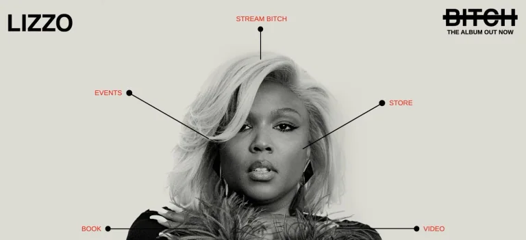
Fine labeled leader lines radiate from a monochrome portrait, making music, events, shopping, and other destinations part of the composition.
Useful for: A music celebrity website reference; study how its opening presents identity and routes into work, releases, or public appearances.
# Design reference: Lizzo
Source: https://www.lizzomusic.com/
Swipefile reference: https://swipefile.design/ref/celebrity-lizzo/
Captured: 2026-09-08. This is a dated reference, not a claim about the current live product.
Capture scope: one viewport. Do not infer unseen page sections or a complete user flow.

## Objective
Adapt the visual principles below to my project. Use my own content and identity. Do not reproduce logos, proprietary copy, or brand assets.

## Reference notes
- mood: Graphic and personality-led.
- colors: Warm off-white, black, gray, and red.
- typography: Adapt the visible contrast between display lettering and smaller navigation. Choose type that supports your own identity and remains readable on small screens.
- layout: Fine labeled leader lines radiate from a monochrome portrait, making music, events, shopping, and other destinations part of the composition.
- motion: Static opening-viewport capture. Follow the original source to inspect animation, video, menus, and reduced-motion behavior.
- texture: Let original photography or film provide the visual detail. Keep supporting controls clear.
- dont: Do not copy the celebrity’s identity, claims, photographs, artwork, or trademarks into a new brand.

Useful for: A music celebrity website reference; study how its opening presents identity and routes into work, releases, or public appearances.

## Acceptance criteria
- Existing project conventions, design tokens, working functionality, and unrelated changes are preserved.
- Two or three reference principles clearly support the user's task; conflicts are resolved in favor of usability and the existing product.
- Reusable components and semantic HTML express the interface. Available licensed assets are used; important UI text is never rendered as a bitmap.
- Every visible control has a defined behavior. Loading, empty, error, success, disabled, and long-content states are specified where relevant. Demo data is clearly labeled.
- Navigation and content adapt at 375px, 768px, and 1440px without horizontal page overflow. Keyboard use, visible focus, labeled inputs, at least 44px touch targets, readable contrast, and reduced motion are supported.
- Verification distinguishes rendered behavior from proposals and identifies anything still requiring a backend or external service.

## Quality bar
Clear hierarchy, consistent spacing, restrained surfaces, and purposeful motion. Avoid decorative gradients, excessive cards, placeholder buttons, and invented metrics unless the project calls for them. Do not claim a feature is connected or tested without evidence.
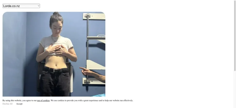
A browser-like select control and rounded video panel create a deliberately simple white page with minimal supporting text.
Useful for: A music celebrity website reference; study how its opening presents identity and routes into work, releases, or public appearances.
# Design reference: Lorde
Source: https://www.lorde.co.nz/
Swipefile reference: https://swipefile.design/ref/celebrity-lorde/
Captured: 2026-09-08. This is a dated reference, not a claim about the current live product.
Capture scope: one viewport. Do not infer unseen page sections or a complete user flow.

## Objective
Adapt the visual principles below to my project. Use my own content and identity. Do not reproduce logos, proprietary copy, or brand assets.

## Reference notes
- mood: Informal and stripped-back.
- colors: White, cool gray, muted blue, and black.
- typography: Adapt the visible contrast between display lettering and smaller navigation. Choose type that supports your own identity and remains readable on small screens.
- layout: A browser-like select control and rounded video panel create a deliberately simple white page with minimal supporting text.
- motion: Static opening-viewport capture. Follow the original source to inspect animation, video, menus, and reduced-motion behavior.
- texture: Use original graphics and a restrained supporting interface to establish the page’s visual character.
- dont: Do not copy the celebrity’s identity, claims, photographs, artwork, or trademarks into a new brand.

Useful for: A music celebrity website reference; study how its opening presents identity and routes into work, releases, or public appearances.

## Acceptance criteria
- Existing project conventions, design tokens, working functionality, and unrelated changes are preserved.
- Two or three reference principles clearly support the user's task; conflicts are resolved in favor of usability and the existing product.
- Reusable components and semantic HTML express the interface. Available licensed assets are used; important UI text is never rendered as a bitmap.
- Every visible control has a defined behavior. Loading, empty, error, success, disabled, and long-content states are specified where relevant. Demo data is clearly labeled.
- Navigation and content adapt at 375px, 768px, and 1440px without horizontal page overflow. Keyboard use, visible focus, labeled inputs, at least 44px touch targets, readable contrast, and reduced motion are supported.
- Verification distinguishes rendered behavior from proposals and identifies anything still requiring a backend or external service.

## Quality bar
Clear hierarchy, consistent spacing, restrained surfaces, and purposeful motion. Avoid decorative gradients, excessive cards, placeholder buttons, and invented metrics unless the project calls for them. Do not claim a feature is connected or tested without evidence.
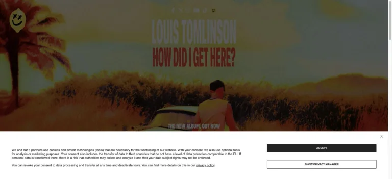
A sunlit album photograph fills the opening under a centered condensed name, with release lettering integrated into the image.
Useful for: A music celebrity website reference; study how its opening presents identity and routes into work, releases, or public appearances.
# Design reference: Louis Tomlinson
Source: https://louis-tomlinson.com/
Swipefile reference: https://swipefile.design/ref/celebrity-louis-tomlinson/
Captured: 2026-09-08. This is a dated reference, not a claim about the current live product.
Capture scope: one viewport. Do not infer unseen page sections or a complete user flow.

## Objective
Adapt the visual principles below to my project. Use my own content and identity. Do not reproduce logos, proprietary copy, or brand assets.

## Reference notes
- mood: Sun-washed and informal.
- colors: Golden yellow, green, muted orange, and black.
- typography: Adapt the visible contrast between display lettering and smaller navigation. Choose type that supports your own identity and remains readable on small screens.
- layout: A sunlit album photograph fills the opening under a centered condensed name, with release lettering integrated into the image.
- motion: Static opening-viewport capture. Follow the original source to inspect animation, video, menus, and reduced-motion behavior.
- texture: Let original photography or film provide the visual detail. Keep supporting controls clear.
- dont: Do not copy the celebrity’s identity, claims, photographs, artwork, or trademarks into a new brand.

Useful for: A music celebrity website reference; study how its opening presents identity and routes into work, releases, or public appearances.

## Acceptance criteria
- Existing project conventions, design tokens, working functionality, and unrelated changes are preserved.
- Two or three reference principles clearly support the user's task; conflicts are resolved in favor of usability and the existing product.
- Reusable components and semantic HTML express the interface. Available licensed assets are used; important UI text is never rendered as a bitmap.
- Every visible control has a defined behavior. Loading, empty, error, success, disabled, and long-content states are specified where relevant. Demo data is clearly labeled.
- Navigation and content adapt at 375px, 768px, and 1440px without horizontal page overflow. Keyboard use, visible focus, labeled inputs, at least 44px touch targets, readable contrast, and reduced motion are supported.
- Verification distinguishes rendered behavior from proposals and identifies anything still requiring a backend or external service.

## Quality bar
Clear hierarchy, consistent spacing, restrained surfaces, and purposeful motion. Avoid decorative gradients, excessive cards, placeholder buttons, and invented metrics unless the project calls for them. Do not claim a feature is connected or tested without evidence.
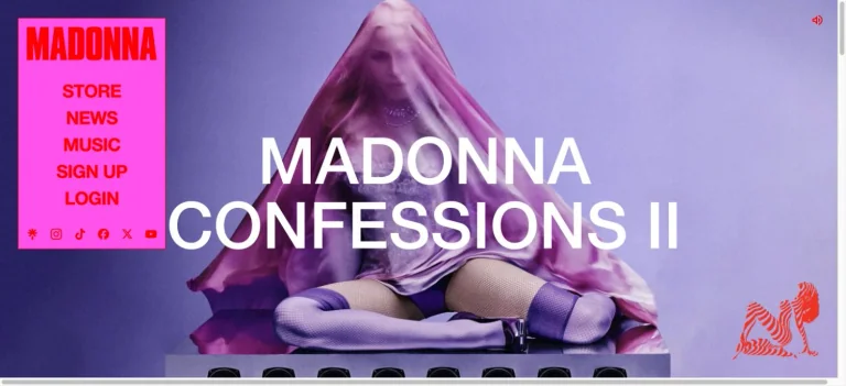
A compact hot-pink navigation block contrasts with a large purple campaign photograph and oversized white release text.
Useful for: A music celebrity website reference; study how its opening presents identity and routes into work, releases, or public appearances.
# Design reference: Madonna
Source: https://www.madonna.com/
Swipefile reference: https://swipefile.design/ref/celebrity-madonna/
Captured: 2026-09-08. This is a dated reference, not a claim about the current live product.
Capture scope: one viewport. Do not infer unseen page sections or a complete user flow.

## Objective
Adapt the visual principles below to my project. Use my own content and identity. Do not reproduce logos, proprietary copy, or brand assets.

## Reference notes
- mood: Expressive and theatrical.
- colors: Hot pink, violet, white, and red.
- typography: Adapt the visible contrast between display lettering and smaller navigation. Choose type that supports your own identity and remains readable on small screens.
- layout: A compact hot-pink navigation block contrasts with a large purple campaign photograph and oversized white release text.
- motion: Static opening-viewport capture. Follow the original source to inspect animation, video, menus, and reduced-motion behavior.
- texture: Let original photography or film provide the visual detail. Keep supporting controls clear.
- dont: Do not copy the celebrity’s identity, claims, photographs, artwork, or trademarks into a new brand.

Useful for: A music celebrity website reference; study how its opening presents identity and routes into work, releases, or public appearances.

## Acceptance criteria
- Existing project conventions, design tokens, working functionality, and unrelated changes are preserved.
- Two or three reference principles clearly support the user's task; conflicts are resolved in favor of usability and the existing product.
- Reusable components and semantic HTML express the interface. Available licensed assets are used; important UI text is never rendered as a bitmap.
- Every visible control has a defined behavior. Loading, empty, error, success, disabled, and long-content states are specified where relevant. Demo data is clearly labeled.
- Navigation and content adapt at 375px, 768px, and 1440px without horizontal page overflow. Keyboard use, visible focus, labeled inputs, at least 44px touch targets, readable contrast, and reduced motion are supported.
- Verification distinguishes rendered behavior from proposals and identifies anything still requiring a backend or external service.

## Quality bar
Clear hierarchy, consistent spacing, restrained surfaces, and purposeful motion. Avoid decorative gradients, excessive cards, placeholder buttons, and invented metrics unless the project calls for them. Do not claim a feature is connected or tested without evidence.
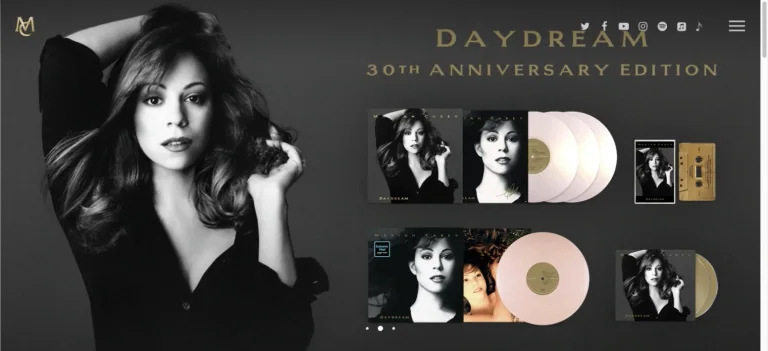
A monochrome portrait balances a neatly arranged set of anniversary records and gold release typography against a charcoal background.
Useful for: A music celebrity website reference; study how its opening presents identity and routes into work, releases, or public appearances.
# Design reference: Mariah Carey
Source: https://mariahcarey.com/
Swipefile reference: https://swipefile.design/ref/celebrity-mariah-carey/
Captured: 2026-09-08. This is a dated reference, not a claim about the current live product.
Capture scope: one viewport. Do not infer unseen page sections or a complete user flow.

## Objective
Adapt the visual principles below to my project. Use my own content and identity. Do not reproduce logos, proprietary copy, or brand assets.

## Reference notes
- mood: Elegant and commemorative.
- colors: Charcoal, silver gray, warm gold, and cream.
- typography: Adapt the visible contrast between display lettering and smaller navigation. Choose type that supports your own identity and remains readable on small screens.
- layout: A monochrome portrait balances a neatly arranged set of anniversary records and gold release typography against a charcoal background.
- motion: Static opening-viewport capture. Follow the original source to inspect animation, video, menus, and reduced-motion behavior.
- texture: Let original photography or film provide the visual detail. Keep supporting controls clear.
- dont: Do not copy the celebrity’s identity, claims, photographs, artwork, or trademarks into a new brand.

Useful for: A music celebrity website reference; study how its opening presents identity and routes into work, releases, or public appearances.

## Acceptance criteria
- Existing project conventions, design tokens, working functionality, and unrelated changes are preserved.
- Two or three reference principles clearly support the user's task; conflicts are resolved in favor of usability and the existing product.
- Reusable components and semantic HTML express the interface. Available licensed assets are used; important UI text is never rendered as a bitmap.
- Every visible control has a defined behavior. Loading, empty, error, success, disabled, and long-content states are specified where relevant. Demo data is clearly labeled.
- Navigation and content adapt at 375px, 768px, and 1440px without horizontal page overflow. Keyboard use, visible focus, labeled inputs, at least 44px touch targets, readable contrast, and reduced motion are supported.
- Verification distinguishes rendered behavior from proposals and identifies anything still requiring a backend or external service.

## Quality bar
Clear hierarchy, consistent spacing, restrained surfaces, and purposeful motion. Avoid decorative gradients, excessive cards, placeholder buttons, and invented metrics unless the project calls for them. Do not claim a feature is connected or tested without evidence.
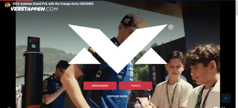
A large white emblem overlays energetic fan and racing footage, with two red primary actions and small supporting navigation.
Useful for: A sports celebrity website reference; study how its opening presents identity and routes into work, releases, or public appearances.
# Design reference: Max Verstappen
Source: https://www.verstappen.com/
Swipefile reference: https://swipefile.design/ref/celebrity-max-verstappen/
Captured: 2026-09-08. This is a dated reference, not a claim about the current live product.
Capture scope: one viewport. Do not infer unseen page sections or a complete user flow.

## Objective
Adapt the visual principles below to my project. Use my own content and identity. Do not reproduce logos, proprietary copy, or brand assets.

## Reference notes
- mood: Energetic and brand-led.
- colors: Black, white, vivid red, and photographic color.
- typography: Adapt the visible contrast between display lettering and smaller navigation. Choose type that supports your own identity and remains readable on small screens.
- layout: A large white emblem overlays energetic fan and racing footage, with two red primary actions and small supporting navigation.
- motion: Static opening-viewport capture. Follow the original source to inspect animation, video, menus, and reduced-motion behavior.
- texture: Let original photography or film provide the visual detail. Keep supporting controls clear.
- dont: Do not copy the celebrity’s identity, claims, photographs, artwork, or trademarks into a new brand.

Useful for: A sports celebrity website reference; study how its opening presents identity and routes into work, releases, or public appearances.

## Acceptance criteria
- Existing project conventions, design tokens, working functionality, and unrelated changes are preserved.
- Two or three reference principles clearly support the user's task; conflicts are resolved in favor of usability and the existing product.
- Reusable components and semantic HTML express the interface. Available licensed assets are used; important UI text is never rendered as a bitmap.
- Every visible control has a defined behavior. Loading, empty, error, success, disabled, and long-content states are specified where relevant. Demo data is clearly labeled.
- Navigation and content adapt at 375px, 768px, and 1440px without horizontal page overflow. Keyboard use, visible focus, labeled inputs, at least 44px touch targets, readable contrast, and reduced motion are supported.
- Verification distinguishes rendered behavior from proposals and identifies anything still requiring a backend or external service.

## Quality bar
Clear hierarchy, consistent spacing, restrained surfaces, and purposeful motion. Avoid decorative gradients, excessive cards, placeholder buttons, and invented metrics unless the project calls for them. Do not claim a feature is connected or tested without evidence.
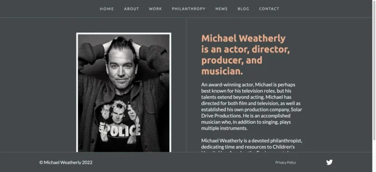
A framed monochrome portrait sits beside a concise orange introduction in a narrow charcoal layout, with small navigation and a simple footer.
Useful for: A film celebrity website reference; study how its opening presents identity and routes into work, releases, or public appearances.
# Design reference: Michael Weatherly
Source: https://www.michaelweatherly.com/
Swipefile reference: https://swipefile.design/ref/celebrity-michael-weatherly/
Captured: 2026-09-08. This is a dated reference, not a claim about the current live product.
Capture scope: one viewport. Do not infer unseen page sections or a complete user flow.

## Objective
Adapt the visual principles below to my project. Use my own content and identity. Do not reproduce logos, proprietary copy, or brand assets.

## Reference notes
- mood: Personal and straightforward.
- colors: Charcoal, muted orange, white, and gray.
- typography: Adapt the visible contrast between display lettering and smaller navigation. Choose type that supports your own identity and remains readable on small screens.
- layout: A framed monochrome portrait sits beside a concise orange introduction in a narrow charcoal layout, with small navigation and a simple footer.
- motion: Static opening-viewport capture. Follow the original source to inspect animation, video, menus, and reduced-motion behavior.
- texture: Let original photography or film provide the visual detail. Keep supporting controls clear.
- dont: Do not copy the celebrity’s identity, claims, photographs, artwork, or trademarks into a new brand.

Useful for: A film celebrity website reference; study how its opening presents identity and routes into work, releases, or public appearances.

## Acceptance criteria
- Existing project conventions, design tokens, working functionality, and unrelated changes are preserved.
- Two or three reference principles clearly support the user's task; conflicts are resolved in favor of usability and the existing product.
- Reusable components and semantic HTML express the interface. Available licensed assets are used; important UI text is never rendered as a bitmap.
- Every visible control has a defined behavior. Loading, empty, error, success, disabled, and long-content states are specified where relevant. Demo data is clearly labeled.
- Navigation and content adapt at 375px, 768px, and 1440px without horizontal page overflow. Keyboard use, visible focus, labeled inputs, at least 44px touch targets, readable contrast, and reduced motion are supported.
- Verification distinguishes rendered behavior from proposals and identifies anything still requiring a backend or external service.

## Quality bar
Clear hierarchy, consistent spacing, restrained surfaces, and purposeful motion. Avoid decorative gradients, excessive cards, placeholder buttons, and invented metrics unless the project calls for them. Do not claim a feature is connected or tested without evidence.
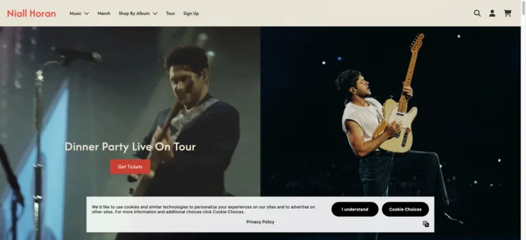
Two adjacent performance photographs create a tour-led store hero, with a small white announcement and a coral ticket action.
Useful for: A music celebrity website reference; study how its opening presents identity and routes into products.
# Design reference: Niall Horan — Official store
Source: https://niallhoran.com/
Swipefile reference: https://swipefile.design/ref/celebrity-niall-horan/
Captured: 2026-09-08. This is a dated reference, not a claim about the current live product.
Capture scope: one viewport. Do not infer unseen page sections or a complete user flow.

## Objective
Adapt the visual principles below to my project. Use my own content and identity. Do not reproduce logos, proprietary copy, or brand assets.

## Reference notes
- mood: Warm and performance-led.
- colors: Cream, black, dark blue, and coral.
- typography: Adapt the visible contrast between display lettering and smaller navigation. Choose type that supports your own identity and remains readable on small screens.
- layout: Two adjacent performance photographs create a tour-led store hero, with a small white announcement and a coral ticket action.
- motion: Static opening-viewport capture. Follow the original source to inspect animation, video, menus, and reduced-motion behavior.
- texture: Let original photography or film provide the visual detail. Keep supporting controls clear.
- dont: Do not copy the celebrity’s identity, claims, photographs, artwork, or trademarks into a new brand.

Useful for: A music celebrity website reference; study how its opening presents identity and routes into products.

## Acceptance criteria
- Existing project conventions, design tokens, working functionality, and unrelated changes are preserved.
- Two or three reference principles clearly support the user's task; conflicts are resolved in favor of usability and the existing product.
- Reusable components and semantic HTML express the interface. Available licensed assets are used; important UI text is never rendered as a bitmap.
- Every visible control has a defined behavior. Loading, empty, error, success, disabled, and long-content states are specified where relevant. Demo data is clearly labeled.
- Navigation and content adapt at 375px, 768px, and 1440px without horizontal page overflow. Keyboard use, visible focus, labeled inputs, at least 44px touch targets, readable contrast, and reduced motion are supported.
- Verification distinguishes rendered behavior from proposals and identifies anything still requiring a backend or external service.

## Quality bar
Clear hierarchy, consistent spacing, restrained surfaces, and purposeful motion. Avoid decorative gradients, excessive cards, placeholder buttons, and invented metrics unless the project calls for them. Do not claim a feature is connected or tested without evidence.
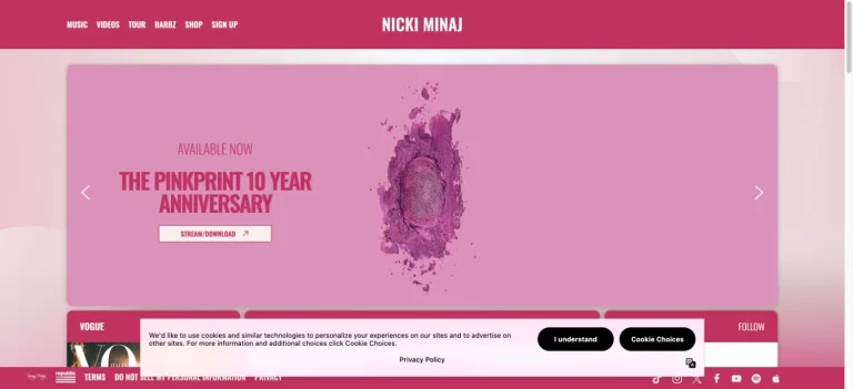
A bright pink header and soft pink campaign frame surround an anniversary album image, with compact white navigation and a small action.
Useful for: A music celebrity website reference; study how its opening presents identity and routes into work, releases, or public appearances.
# Design reference: Nicki Minaj
Source: https://www.nickiminajofficial.com/
Swipefile reference: https://swipefile.design/ref/celebrity-nicki-minaj/
Captured: 2026-09-08. This is a dated reference, not a claim about the current live product.
Capture scope: one viewport. Do not infer unseen page sections or a complete user flow.

## Objective
Adapt the visual principles below to my project. Use my own content and identity. Do not reproduce logos, proprietary copy, or brand assets.

## Reference notes
- mood: Bold and celebratory.
- colors: Magenta, blush pink, cream, and white.
- typography: Adapt the visible contrast between display lettering and smaller navigation. Choose type that supports your own identity and remains readable on small screens.
- layout: A bright pink header and soft pink campaign frame surround an anniversary album image, with compact white navigation and a small action.
- motion: Static opening-viewport capture. Follow the original source to inspect animation, video, menus, and reduced-motion behavior.
- texture: Let original photography or film provide the visual detail. Keep supporting controls clear.
- dont: Do not copy the celebrity’s identity, claims, photographs, artwork, or trademarks into a new brand.

Useful for: A music celebrity website reference; study how its opening presents identity and routes into work, releases, or public appearances.

## Acceptance criteria
- Existing project conventions, design tokens, working functionality, and unrelated changes are preserved.
- Two or three reference principles clearly support the user's task; conflicts are resolved in favor of usability and the existing product.
- Reusable components and semantic HTML express the interface. Available licensed assets are used; important UI text is never rendered as a bitmap.
- Every visible control has a defined behavior. Loading, empty, error, success, disabled, and long-content states are specified where relevant. Demo data is clearly labeled.
- Navigation and content adapt at 375px, 768px, and 1440px without horizontal page overflow. Keyboard use, visible focus, labeled inputs, at least 44px touch targets, readable contrast, and reduced motion are supported.
- Verification distinguishes rendered behavior from proposals and identifies anything still requiring a backend or external service.

## Quality bar
Clear hierarchy, consistent spacing, restrained surfaces, and purposeful motion. Avoid decorative gradients, excessive cards, placeholder buttons, and invented metrics unless the project calls for them. Do not claim a feature is connected or tested without evidence.
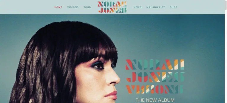
A pale blue header and geometric multicolor wordmark sit above a close portrait and matching album lettering.
Useful for: A music celebrity website reference; study how its opening presents identity and routes into work, releases, or public appearances.
# Design reference: Norah Jones
Source: https://www.norahjones.com/
Swipefile reference: https://swipefile.design/ref/celebrity-norah-jones/
Captured: 2026-09-08. This is a dated reference, not a claim about the current live product.
Capture scope: one viewport. Do not infer unseen page sections or a complete user flow.

## Objective
Adapt the visual principles below to my project. Use my own content and identity. Do not reproduce logos, proprietary copy, or brand assets.

## Reference notes
- mood: Warm and graphic.
- colors: Teal, coral, mustard, pale blue, and black.
- typography: Adapt the visible contrast between display lettering and smaller navigation. Choose type that supports your own identity and remains readable on small screens.
- layout: A pale blue header and geometric multicolor wordmark sit above a close portrait and matching album lettering.
- motion: Static opening-viewport capture. Follow the original source to inspect animation, video, menus, and reduced-motion behavior.
- texture: Let original photography or film provide the visual detail. Keep supporting controls clear.
- dont: Do not copy the celebrity’s identity, claims, photographs, artwork, or trademarks into a new brand.

Useful for: A music celebrity website reference; study how its opening presents identity and routes into work, releases, or public appearances.

## Acceptance criteria
- Existing project conventions, design tokens, working functionality, and unrelated changes are preserved.
- Two or three reference principles clearly support the user's task; conflicts are resolved in favor of usability and the existing product.
- Reusable components and semantic HTML express the interface. Available licensed assets are used; important UI text is never rendered as a bitmap.
- Every visible control has a defined behavior. Loading, empty, error, success, disabled, and long-content states are specified where relevant. Demo data is clearly labeled.
- Navigation and content adapt at 375px, 768px, and 1440px without horizontal page overflow. Keyboard use, visible focus, labeled inputs, at least 44px touch targets, readable contrast, and reduced motion are supported.
- Verification distinguishes rendered behavior from proposals and identifies anything still requiring a backend or external service.

## Quality bar
Clear hierarchy, consistent spacing, restrained surfaces, and purposeful motion. Avoid decorative gradients, excessive cards, placeholder buttons, and invented metrics unless the project calls for them. Do not claim a feature is connected or tested without evidence.
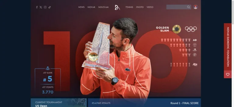
A trophy portrait overlaps enormous translucent numerals, with compact performance information and a narrow red feature rail.
Useful for: A sports celebrity website reference; study how its opening presents identity and routes into work, releases, or public appearances.
# Design reference: Novak Djokovic
Source: https://novakdjokovic.com/en/
Swipefile reference: https://swipefile.design/ref/celebrity-novak-djokovic/
Captured: 2026-09-08. This is a dated reference, not a claim about the current live product.
Capture scope: one viewport. Do not infer unseen page sections or a complete user flow.

## Objective
Adapt the visual principles below to my project. Use my own content and identity. Do not reproduce logos, proprietary copy, or brand assets.

## Reference notes
- mood: Statistical and celebratory.
- colors: Navy, red, white, and metallic gold.
- typography: Adapt the visible contrast between display lettering and smaller navigation. Choose type that supports your own identity and remains readable on small screens.
- layout: A trophy portrait overlaps enormous translucent numerals, with compact performance information and a narrow red feature rail.
- motion: Static opening-viewport capture. Follow the original source to inspect animation, video, menus, and reduced-motion behavior.
- texture: Let original photography or film provide the visual detail. Keep supporting controls clear.
- dont: Do not copy the celebrity’s identity, claims, photographs, artwork, or trademarks into a new brand.

Useful for: A sports celebrity website reference; study how its opening presents identity and routes into work, releases, or public appearances.

## Acceptance criteria
- Existing project conventions, design tokens, working functionality, and unrelated changes are preserved.
- Two or three reference principles clearly support the user's task; conflicts are resolved in favor of usability and the existing product.
- Reusable components and semantic HTML express the interface. Available licensed assets are used; important UI text is never rendered as a bitmap.
- Every visible control has a defined behavior. Loading, empty, error, success, disabled, and long-content states are specified where relevant. Demo data is clearly labeled.
- Navigation and content adapt at 375px, 768px, and 1440px without horizontal page overflow. Keyboard use, visible focus, labeled inputs, at least 44px touch targets, readable contrast, and reduced motion are supported.
- Verification distinguishes rendered behavior from proposals and identifies anything still requiring a backend or external service.

## Quality bar
Clear hierarchy, consistent spacing, restrained surfaces, and purposeful motion. Avoid decorative gradients, excessive cards, placeholder buttons, and invented metrics unless the project calls for them. Do not claim a feature is connected or tested without evidence.
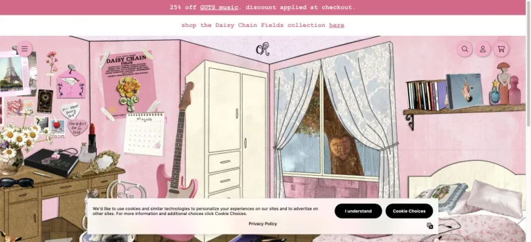
The official store opens into an illustrated pink bedroom, using objects, wall details, and small shop controls to establish a playful setting.
Useful for: A music celebrity website reference; study how its opening presents identity and routes into products.
# Design reference: Olivia Rodrigo — Official store
Source: https://store.oliviarodrigo.com/
Swipefile reference: https://swipefile.design/ref/celebrity-olivia-rodrigo/
Captured: 2026-09-08. This is a dated reference, not a claim about the current live product.
Capture scope: one viewport. Do not infer unseen page sections or a complete user flow.

## Objective
Adapt the visual principles below to my project. Use my own content and identity. Do not reproduce logos, proprietary copy, or brand assets.

## Reference notes
- mood: Illustrated and nostalgic.
- colors: Dusty pink, cream, pale green, and warm brown.
- typography: Adapt the visible contrast between display lettering and smaller navigation. Choose type that supports your own identity and remains readable on small screens.
- layout: The official store opens into an illustrated pink bedroom, using objects, wall details, and small shop controls to establish a playful setting.
- motion: Static opening-viewport capture. Follow the original source to inspect animation, video, menus, and reduced-motion behavior.
- texture: Use original graphics and a restrained supporting interface to establish the page’s visual character.
- dont: Do not copy the celebrity’s identity, claims, photographs, artwork, or trademarks into a new brand.

Useful for: A music celebrity website reference; study how its opening presents identity and routes into products.

## Acceptance criteria
- Existing project conventions, design tokens, working functionality, and unrelated changes are preserved.
- Two or three reference principles clearly support the user's task; conflicts are resolved in favor of usability and the existing product.
- Reusable components and semantic HTML express the interface. Available licensed assets are used; important UI text is never rendered as a bitmap.
- Every visible control has a defined behavior. Loading, empty, error, success, disabled, and long-content states are specified where relevant. Demo data is clearly labeled.
- Navigation and content adapt at 375px, 768px, and 1440px without horizontal page overflow. Keyboard use, visible focus, labeled inputs, at least 44px touch targets, readable contrast, and reduced motion are supported.
- Verification distinguishes rendered behavior from proposals and identifies anything still requiring a backend or external service.

## Quality bar
Clear hierarchy, consistent spacing, restrained surfaces, and purposeful motion. Avoid decorative gradients, excessive cards, placeholder buttons, and invented metrics unless the project calls for them. Do not claim a feature is connected or tested without evidence.
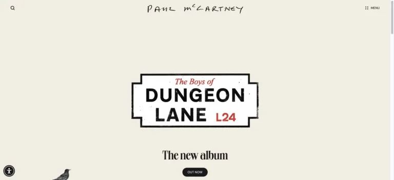
A warm cream canvas surrounds a centered outlined album label, with a handwritten identity at the top and a small release action.
Useful for: A music celebrity website reference; study how its opening presents identity and routes into work, releases, or public appearances.
# Design reference: Paul McCartney
Source: https://www.paulmccartney.com/
Swipefile reference: https://swipefile.design/ref/celebrity-paul-mccartney/
Captured: 2026-09-08. This is a dated reference, not a claim about the current live product.
Capture scope: one viewport. Do not infer unseen page sections or a complete user flow.

## Objective
Adapt the visual principles below to my project. Use my own content and identity. Do not reproduce logos, proprietary copy, or brand assets.

## Reference notes
- mood: Spare and nostalgic.
- colors: Cream, black, and a small red accent.
- typography: Adapt the visible contrast between display lettering and smaller navigation. Choose type that supports your own identity and remains readable on small screens.
- layout: A warm cream canvas surrounds a centered outlined album label, with a handwritten identity at the top and a small release action.
- motion: Static opening-viewport capture. Follow the original source to inspect animation, video, menus, and reduced-motion behavior.
- texture: Use original graphics and a restrained supporting interface to establish the page’s visual character.
- dont: Do not copy the celebrity’s identity, claims, photographs, artwork, or trademarks into a new brand.

Useful for: A music celebrity website reference; study how its opening presents identity and routes into work, releases, or public appearances.

## Acceptance criteria
- Existing project conventions, design tokens, working functionality, and unrelated changes are preserved.
- Two or three reference principles clearly support the user's task; conflicts are resolved in favor of usability and the existing product.
- Reusable components and semantic HTML express the interface. Available licensed assets are used; important UI text is never rendered as a bitmap.
- Every visible control has a defined behavior. Loading, empty, error, success, disabled, and long-content states are specified where relevant. Demo data is clearly labeled.
- Navigation and content adapt at 375px, 768px, and 1440px without horizontal page overflow. Keyboard use, visible focus, labeled inputs, at least 44px touch targets, readable contrast, and reduced motion are supported.
- Verification distinguishes rendered behavior from proposals and identifies anything still requiring a backend or external service.

## Quality bar
Clear hierarchy, consistent spacing, restrained surfaces, and purposeful motion. Avoid decorative gradients, excessive cards, placeholder buttons, and invented metrics unless the project calls for them. Do not claim a feature is connected or tested without evidence.
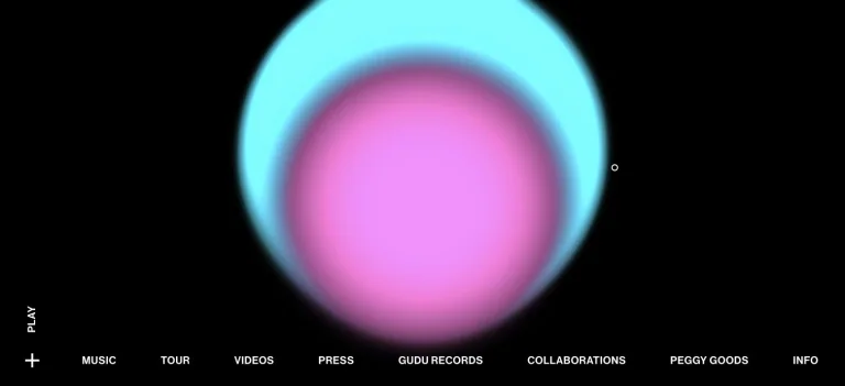
Soft overlapping cyan and magenta circles glow against black, above a thin row of music, tour, label, and collaboration links.
Useful for: A music celebrity website reference; study how its opening presents identity and routes into work, releases, or public appearances.
# Design reference: Peggy Gou
Source: https://www.peggygou.com/
Swipefile reference: https://swipefile.design/ref/celebrity-peggy-gou/
Captured: 2026-09-08. This is a dated reference, not a claim about the current live product.
Capture scope: one viewport. Do not infer unseen page sections or a complete user flow.

## Objective
Adapt the visual principles below to my project. Use my own content and identity. Do not reproduce logos, proprietary copy, or brand assets.

## Reference notes
- mood: Abstract and atmospheric.
- colors: Black, cyan, magenta, and white.
- typography: Adapt the visible contrast between display lettering and smaller navigation. Choose type that supports your own identity and remains readable on small screens.
- layout: Soft overlapping cyan and magenta circles glow against black, above a thin row of music, tour, label, and collaboration links.
- motion: Static opening-viewport capture. Follow the original source to inspect animation, video, menus, and reduced-motion behavior.
- texture: Use original graphics and a restrained supporting interface to establish the page’s visual character.
- dont: Do not copy the celebrity’s identity, claims, photographs, artwork, or trademarks into a new brand.

Useful for: A music celebrity website reference; study how its opening presents identity and routes into work, releases, or public appearances.

## Acceptance criteria
- Existing project conventions, design tokens, working functionality, and unrelated changes are preserved.
- Two or three reference principles clearly support the user's task; conflicts are resolved in favor of usability and the existing product.
- Reusable components and semantic HTML express the interface. Available licensed assets are used; important UI text is never rendered as a bitmap.
- Every visible control has a defined behavior. Loading, empty, error, success, disabled, and long-content states are specified where relevant. Demo data is clearly labeled.
- Navigation and content adapt at 375px, 768px, and 1440px without horizontal page overflow. Keyboard use, visible focus, labeled inputs, at least 44px touch targets, readable contrast, and reduced motion are supported.
- Verification distinguishes rendered behavior from proposals and identifies anything still requiring a backend or external service.

## Quality bar
Clear hierarchy, consistent spacing, restrained surfaces, and purposeful motion. Avoid decorative gradients, excessive cards, placeholder buttons, and invented metrics unless the project calls for them. Do not claim a feature is connected or tested without evidence.
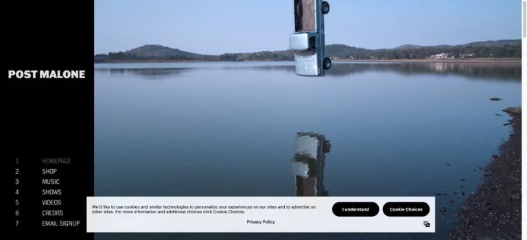
A fixed black identity rail sits beside a wide reflective lake scene, with a numbered list of site destinations down the side.
Useful for: A music celebrity website reference; study how its opening presents identity and routes into work, releases, or public appearances.
# Design reference: Post Malone
Source: https://www.postmalone.com/
Swipefile reference: https://swipefile.design/ref/celebrity-post-malone/
Captured: 2026-09-08. This is a dated reference, not a claim about the current live product.
Capture scope: one viewport. Do not infer unseen page sections or a complete user flow.

## Objective
Adapt the visual principles below to my project. Use my own content and identity. Do not reproduce logos, proprietary copy, or brand assets.

## Reference notes
- mood: Spacious and atmospheric.
- colors: Black, lake blue, pale gray, and muted earth tones.
- typography: Adapt the visible contrast between display lettering and smaller navigation. Choose type that supports your own identity and remains readable on small screens.
- layout: A fixed black identity rail sits beside a wide reflective lake scene, with a numbered list of site destinations down the side.
- motion: Static opening-viewport capture. Follow the original source to inspect animation, video, menus, and reduced-motion behavior.
- texture: Use original graphics and a restrained supporting interface to establish the page’s visual character.
- dont: Do not copy the celebrity’s identity, claims, photographs, artwork, or trademarks into a new brand.

Useful for: A music celebrity website reference; study how its opening presents identity and routes into work, releases, or public appearances.

## Acceptance criteria
- Existing project conventions, design tokens, working functionality, and unrelated changes are preserved.
- Two or three reference principles clearly support the user's task; conflicts are resolved in favor of usability and the existing product.
- Reusable components and semantic HTML express the interface. Available licensed assets are used; important UI text is never rendered as a bitmap.
- Every visible control has a defined behavior. Loading, empty, error, success, disabled, and long-content states are specified where relevant. Demo data is clearly labeled.
- Navigation and content adapt at 375px, 768px, and 1440px without horizontal page overflow. Keyboard use, visible focus, labeled inputs, at least 44px touch targets, readable contrast, and reduced motion are supported.
- Verification distinguishes rendered behavior from proposals and identifies anything still requiring a backend or external service.

## Quality bar
Clear hierarchy, consistent spacing, restrained surfaces, and purposeful motion. Avoid decorative gradients, excessive cards, placeholder buttons, and invented metrics unless the project calls for them. Do not claim a feature is connected or tested without evidence.
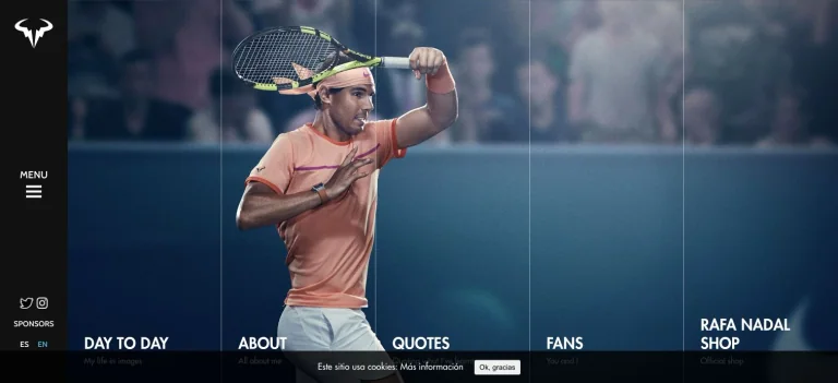
A dark side rail and large tennis photograph are divided by subtle vertical rules into labeled destinations along the bottom.
Useful for: A sports celebrity website reference; study how its opening presents identity and routes into work, releases, or public appearances.
# Design reference: Rafael Nadal
Source: https://rafaelnadal.com/en/
Swipefile reference: https://swipefile.design/ref/celebrity-rafael-nadal/
Captured: 2026-09-08. This is a dated reference, not a claim about the current live product.
Capture scope: one viewport. Do not infer unseen page sections or a complete user flow.

## Objective
Adapt the visual principles below to my project. Use my own content and identity. Do not reproduce logos, proprietary copy, or brand assets.

## Reference notes
- mood: Athletic and structured.
- colors: Deep blue, black, white, and clay orange.
- typography: Adapt the visible contrast between display lettering and smaller navigation. Choose type that supports your own identity and remains readable on small screens.
- layout: A dark side rail and large tennis photograph are divided by subtle vertical rules into labeled destinations along the bottom.
- motion: Static opening-viewport capture. Follow the original source to inspect animation, video, menus, and reduced-motion behavior.
- texture: Let original photography or film provide the visual detail. Keep supporting controls clear.
- dont: Do not copy the celebrity’s identity, claims, photographs, artwork, or trademarks into a new brand.

Useful for: A sports celebrity website reference; study how its opening presents identity and routes into work, releases, or public appearances.

## Acceptance criteria
- Existing project conventions, design tokens, working functionality, and unrelated changes are preserved.
- Two or three reference principles clearly support the user's task; conflicts are resolved in favor of usability and the existing product.
- Reusable components and semantic HTML express the interface. Available licensed assets are used; important UI text is never rendered as a bitmap.
- Every visible control has a defined behavior. Loading, empty, error, success, disabled, and long-content states are specified where relevant. Demo data is clearly labeled.
- Navigation and content adapt at 375px, 768px, and 1440px without horizontal page overflow. Keyboard use, visible focus, labeled inputs, at least 44px touch targets, readable contrast, and reduced motion are supported.
- Verification distinguishes rendered behavior from proposals and identifies anything still requiring a backend or external service.

## Quality bar
Clear hierarchy, consistent spacing, restrained surfaces, and purposeful motion. Avoid decorative gradients, excessive cards, placeholder buttons, and invented metrics unless the project calls for them. Do not claim a feature is connected or tested without evidence.
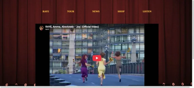
Red stage curtains form the backdrop for gold navigation labels and a large centered music-video panel.
Useful for: A music celebrity website reference; study how its opening presents identity and routes into work, releases, or public appearances.
# Design reference: Raye
Source: https://www.rayeofficial.com/
Swipefile reference: https://swipefile.design/ref/celebrity-raye/
Captured: 2026-09-08. This is a dated reference, not a claim about the current live product.
Capture scope: one viewport. Do not infer unseen page sections or a complete user flow.

## Objective
Adapt the visual principles below to my project. Use my own content and identity. Do not reproduce logos, proprietary copy, or brand assets.

## Reference notes
- mood: Theatrical and simple.
- colors: Burgundy, warm gold, and black.
- typography: Adapt the visible contrast between display lettering and smaller navigation. Choose type that supports your own identity and remains readable on small screens.
- layout: Red stage curtains form the backdrop for gold navigation labels and a large centered music-video panel.
- motion: Static opening-viewport capture. Follow the original source to inspect animation, video, menus, and reduced-motion behavior.
- texture: Use original graphics and a restrained supporting interface to establish the page’s visual character.
- dont: Do not copy the celebrity’s identity, claims, photographs, artwork, or trademarks into a new brand.

Useful for: A music celebrity website reference; study how its opening presents identity and routes into work, releases, or public appearances.

## Acceptance criteria
- Existing project conventions, design tokens, working functionality, and unrelated changes are preserved.
- Two or three reference principles clearly support the user's task; conflicts are resolved in favor of usability and the existing product.
- Reusable components and semantic HTML express the interface. Available licensed assets are used; important UI text is never rendered as a bitmap.
- Every visible control has a defined behavior. Loading, empty, error, success, disabled, and long-content states are specified where relevant. Demo data is clearly labeled.
- Navigation and content adapt at 375px, 768px, and 1440px without horizontal page overflow. Keyboard use, visible focus, labeled inputs, at least 44px touch targets, readable contrast, and reduced motion are supported.
- Verification distinguishes rendered behavior from proposals and identifies anything still requiring a backend or external service.

## Quality bar
Clear hierarchy, consistent spacing, restrained surfaces, and purposeful motion. Avoid decorative gradients, excessive cards, placeholder buttons, and invented metrics unless the project calls for them. Do not claim a feature is connected or tested without evidence.
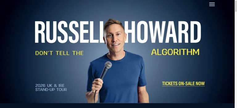
A centered portrait with a microphone overlaps huge white name lettering on a blue background, with yellow tour and ticket accents.
Useful for: A comedy celebrity website reference; study how its opening presents identity and routes into work, releases, or public appearances.
# Design reference: Russell Howard
Source: https://www.russell-howard.co.uk/
Swipefile reference: https://swipefile.design/ref/celebrity-russell-howard/
Captured: 2026-09-08. This is a dated reference, not a claim about the current live product.
Capture scope: one viewport. Do not infer unseen page sections or a complete user flow.

## Objective
Adapt the visual principles below to my project. Use my own content and identity. Do not reproduce logos, proprietary copy, or brand assets.

## Reference notes
- mood: Clear and upbeat.
- colors: Navy blue, white, bright yellow, and light blue.
- typography: Adapt the visible contrast between display lettering and smaller navigation. Choose type that supports your own identity and remains readable on small screens.
- layout: A centered portrait with a microphone overlaps huge white name lettering on a blue background, with yellow tour and ticket accents.
- motion: Static opening-viewport capture. Follow the original source to inspect animation, video, menus, and reduced-motion behavior.
- texture: Let original photography or film provide the visual detail. Keep supporting controls clear.
- dont: Do not copy the celebrity’s identity, claims, photographs, artwork, or trademarks into a new brand.

Useful for: A comedy celebrity website reference; study how its opening presents identity and routes into work, releases, or public appearances.

## Acceptance criteria
- Existing project conventions, design tokens, working functionality, and unrelated changes are preserved.
- Two or three reference principles clearly support the user's task; conflicts are resolved in favor of usability and the existing product.
- Reusable components and semantic HTML express the interface. Available licensed assets are used; important UI text is never rendered as a bitmap.
- Every visible control has a defined behavior. Loading, empty, error, success, disabled, and long-content states are specified where relevant. Demo data is clearly labeled.
- Navigation and content adapt at 375px, 768px, and 1440px without horizontal page overflow. Keyboard use, visible focus, labeled inputs, at least 44px touch targets, readable contrast, and reduced motion are supported.
- Verification distinguishes rendered behavior from proposals and identifies anything still requiring a backend or external service.

## Quality bar
Clear hierarchy, consistent spacing, restrained surfaces, and purposeful motion. Avoid decorative gradients, excessive cards, placeholder buttons, and invented metrics unless the project calls for them. Do not claim a feature is connected or tested without evidence.
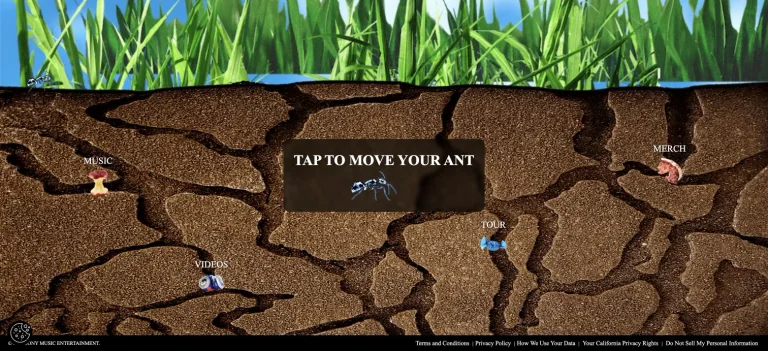
An illustrated cutaway landscape places small ants and labeled destinations below tall grass, turning navigation into part of the scene.
Useful for: A music celebrity website reference; study how its opening presents identity and routes into work, releases, or public appearances.
# Design reference: SZA
Source: https://www.szasos.com/
Swipefile reference: https://swipefile.design/ref/celebrity-sza/
Captured: 2026-09-08. This is a dated reference, not a claim about the current live product.
Capture scope: one viewport. Do not infer unseen page sections or a complete user flow.

## Objective
Adapt the visual principles below to my project. Use my own content and identity. Do not reproduce logos, proprietary copy, or brand assets.

## Reference notes
- mood: Playful and immersive.
- colors: Earth brown, grass green, sky blue, and black.
- typography: Adapt the visible contrast between display lettering and smaller navigation. Choose type that supports your own identity and remains readable on small screens.
- layout: An illustrated cutaway landscape places small ants and labeled destinations below tall grass, turning navigation into part of the scene.
- motion: Static opening-viewport capture. Follow the original source to inspect animation, video, menus, and reduced-motion behavior.
- texture: Use original graphics and a restrained supporting interface to establish the page’s visual character.
- dont: Do not copy the celebrity’s identity, claims, photographs, artwork, or trademarks into a new brand.

Useful for: A music celebrity website reference; study how its opening presents identity and routes into work, releases, or public appearances.

## Acceptance criteria
- Existing project conventions, design tokens, working functionality, and unrelated changes are preserved.
- Two or three reference principles clearly support the user's task; conflicts are resolved in favor of usability and the existing product.
- Reusable components and semantic HTML express the interface. Available licensed assets are used; important UI text is never rendered as a bitmap.
- Every visible control has a defined behavior. Loading, empty, error, success, disabled, and long-content states are specified where relevant. Demo data is clearly labeled.
- Navigation and content adapt at 375px, 768px, and 1440px without horizontal page overflow. Keyboard use, visible focus, labeled inputs, at least 44px touch targets, readable contrast, and reduced motion are supported.
- Verification distinguishes rendered behavior from proposals and identifies anything still requiring a backend or external service.

## Quality bar
Clear hierarchy, consistent spacing, restrained surfaces, and purposeful motion. Avoid decorative gradients, excessive cards, placeholder buttons, and invented metrics unless the project calls for them. Do not claim a feature is connected or tested without evidence.
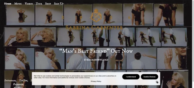
A dense contact sheet of portraits becomes the background for a centered album announcement and a small streaming action.
Useful for: A music celebrity website reference; study how its opening presents identity and routes into work, releases, or public appearances.
# Design reference: Sabrina Carpenter
Source: https://www.sabrinacarpenter.com/
Swipefile reference: https://swipefile.design/ref/celebrity-sabrina-carpenter/
Captured: 2026-09-08. This is a dated reference, not a claim about the current live product.
Capture scope: one viewport. Do not infer unseen page sections or a complete user flow.

## Objective
Adapt the visual principles below to my project. Use my own content and identity. Do not reproduce logos, proprietary copy, or brand assets.

## Reference notes
- mood: Playful and editorial.
- colors: Muted gold, charcoal, cream, and photographic browns.
- typography: Adapt the visible contrast between display lettering and smaller navigation. Choose type that supports your own identity and remains readable on small screens.
- layout: A dense contact sheet of portraits becomes the background for a centered album announcement and a small streaming action.
- motion: Static opening-viewport capture. Follow the original source to inspect animation, video, menus, and reduced-motion behavior.
- texture: Let original photography or film provide the visual detail. Keep supporting controls clear.
- dont: Do not copy the celebrity’s identity, claims, photographs, artwork, or trademarks into a new brand.

Useful for: A music celebrity website reference; study how its opening presents identity and routes into work, releases, or public appearances.

## Acceptance criteria
- Existing project conventions, design tokens, working functionality, and unrelated changes are preserved.
- Two or three reference principles clearly support the user's task; conflicts are resolved in favor of usability and the existing product.
- Reusable components and semantic HTML express the interface. Available licensed assets are used; important UI text is never rendered as a bitmap.
- Every visible control has a defined behavior. Loading, empty, error, success, disabled, and long-content states are specified where relevant. Demo data is clearly labeled.
- Navigation and content adapt at 375px, 768px, and 1440px without horizontal page overflow. Keyboard use, visible focus, labeled inputs, at least 44px touch targets, readable contrast, and reduced motion are supported.
- Verification distinguishes rendered behavior from proposals and identifies anything still requiring a backend or external service.

## Quality bar
Clear hierarchy, consistent spacing, restrained surfaces, and purposeful motion. Avoid decorative gradients, excessive cards, placeholder buttons, and invented metrics unless the project calls for them. Do not claim a feature is connected or tested without evidence.
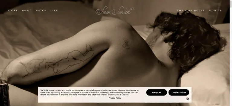
A warm sepia portrait stretches across the opening behind a delicate script identity and widely spaced small navigation.
Useful for: A music celebrity website reference; study how its opening presents identity and routes into work, releases, or public appearances.
# Design reference: Sam Smith
Source: https://www.samsmithworld.com/
Swipefile reference: https://swipefile.design/ref/celebrity-sam-smith/
Captured: 2026-09-08. This is a dated reference, not a claim about the current live product.
Capture scope: one viewport. Do not infer unseen page sections or a complete user flow.

## Objective
Adapt the visual principles below to my project. Use my own content and identity. Do not reproduce logos, proprietary copy, or brand assets.

## Reference notes
- mood: Sensual and understated.
- colors: Sepia, brown, black, and cream.
- typography: Adapt the visible contrast between display lettering and smaller navigation. Choose type that supports your own identity and remains readable on small screens.
- layout: A warm sepia portrait stretches across the opening behind a delicate script identity and widely spaced small navigation.
- motion: Static opening-viewport capture. Follow the original source to inspect animation, video, menus, and reduced-motion behavior.
- texture: Let original photography or film provide the visual detail. Keep supporting controls clear.
- dont: Do not copy the celebrity’s identity, claims, photographs, artwork, or trademarks into a new brand.

Useful for: A music celebrity website reference; study how its opening presents identity and routes into work, releases, or public appearances.

## Acceptance criteria
- Existing project conventions, design tokens, working functionality, and unrelated changes are preserved.
- Two or three reference principles clearly support the user's task; conflicts are resolved in favor of usability and the existing product.
- Reusable components and semantic HTML express the interface. Available licensed assets are used; important UI text is never rendered as a bitmap.
- Every visible control has a defined behavior. Loading, empty, error, success, disabled, and long-content states are specified where relevant. Demo data is clearly labeled.
- Navigation and content adapt at 375px, 768px, and 1440px without horizontal page overflow. Keyboard use, visible focus, labeled inputs, at least 44px touch targets, readable contrast, and reduced motion are supported.
- Verification distinguishes rendered behavior from proposals and identifies anything still requiring a backend or external service.

## Quality bar
Clear hierarchy, consistent spacing, restrained surfaces, and purposeful motion. Avoid decorative gradients, excessive cards, placeholder buttons, and invented metrics unless the project calls for them. Do not claim a feature is connected or tested without evidence.
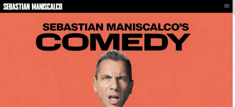
An orange-red campaign background combines an oversized black show title with a close portrait and a small black identity bar.
Useful for: A comedy celebrity website reference; study how its opening presents identity and routes into work, releases, or public appearances.
# Design reference: Sebastian Maniscalco
Source: https://www.sebastianlive.com/
Swipefile reference: https://swipefile.design/ref/celebrity-sebastian-maniscalco/
Captured: 2026-09-08. This is a dated reference, not a claim about the current live product.
Capture scope: one viewport. Do not infer unseen page sections or a complete user flow.

## Objective
Adapt the visual principles below to my project. Use my own content and identity. Do not reproduce logos, proprietary copy, or brand assets.

## Reference notes
- mood: Bold and humorous.
- colors: Coral, orange, black, and white.
- typography: Adapt the visible contrast between display lettering and smaller navigation. Choose type that supports your own identity and remains readable on small screens.
- layout: An orange-red campaign background combines an oversized black show title with a close portrait and a small black identity bar.
- motion: Static opening-viewport capture. Follow the original source to inspect animation, video, menus, and reduced-motion behavior.
- texture: Let original photography or film provide the visual detail. Keep supporting controls clear.
- dont: Do not copy the celebrity’s identity, claims, photographs, artwork, or trademarks into a new brand.

Useful for: A comedy celebrity website reference; study how its opening presents identity and routes into work, releases, or public appearances.

## Acceptance criteria
- Existing project conventions, design tokens, working functionality, and unrelated changes are preserved.
- Two or three reference principles clearly support the user's task; conflicts are resolved in favor of usability and the existing product.
- Reusable components and semantic HTML express the interface. Available licensed assets are used; important UI text is never rendered as a bitmap.
- Every visible control has a defined behavior. Loading, empty, error, success, disabled, and long-content states are specified where relevant. Demo data is clearly labeled.
- Navigation and content adapt at 375px, 768px, and 1440px without horizontal page overflow. Keyboard use, visible focus, labeled inputs, at least 44px touch targets, readable contrast, and reduced motion are supported.
- Verification distinguishes rendered behavior from proposals and identifies anything still requiring a backend or external service.

## Quality bar
Clear hierarchy, consistent spacing, restrained surfaces, and purposeful motion. Avoid decorative gradients, excessive cards, placeholder buttons, and invented metrics unless the project calls for them. Do not claim a feature is connected or tested without evidence.
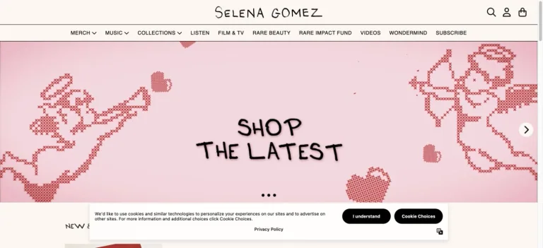
A pink shop announcement uses pixel-style cherubs and hearts around hand-drawn lettering, beneath a compact cream storefront header.
Useful for: A music celebrity website reference; study how its opening presents identity and routes into products.
# Design reference: Selena Gomez — Official store
Source: https://store.selenagomez.com/
Swipefile reference: https://swipefile.design/ref/celebrity-selena-gomez/
Captured: 2026-09-08. This is a dated reference, not a claim about the current live product.
Capture scope: one viewport. Do not infer unseen page sections or a complete user flow.

## Objective
Adapt the visual principles below to my project. Use my own content and identity. Do not reproduce logos, proprietary copy, or brand assets.

## Reference notes
- mood: Sweet and nostalgic.
- colors: Blush pink, muted red, cream, and black.
- typography: Adapt the visible contrast between display lettering and smaller navigation. Choose type that supports your own identity and remains readable on small screens.
- layout: A pink shop announcement uses pixel-style cherubs and hearts around hand-drawn lettering, beneath a compact cream storefront header.
- motion: Static opening-viewport capture. Follow the original source to inspect animation, video, menus, and reduced-motion behavior.
- texture: Use original graphics and a restrained supporting interface to establish the page’s visual character.
- dont: Do not copy the celebrity’s identity, claims, photographs, artwork, or trademarks into a new brand.

Useful for: A music celebrity website reference; study how its opening presents identity and routes into products.

## Acceptance criteria
- Existing project conventions, design tokens, working functionality, and unrelated changes are preserved.
- Two or three reference principles clearly support the user's task; conflicts are resolved in favor of usability and the existing product.
- Reusable components and semantic HTML express the interface. Available licensed assets are used; important UI text is never rendered as a bitmap.
- Every visible control has a defined behavior. Loading, empty, error, success, disabled, and long-content states are specified where relevant. Demo data is clearly labeled.
- Navigation and content adapt at 375px, 768px, and 1440px without horizontal page overflow. Keyboard use, visible focus, labeled inputs, at least 44px touch targets, readable contrast, and reduced motion are supported.
- Verification distinguishes rendered behavior from proposals and identifies anything still requiring a backend or external service.

## Quality bar
Clear hierarchy, consistent spacing, restrained surfaces, and purposeful motion. Avoid decorative gradients, excessive cards, placeholder buttons, and invented metrics unless the project calls for them. Do not claim a feature is connected or tested without evidence.
A single tall fashion portrait on a tennis court is centered within a broad white field, making the image the opening statement.
Useful for: A sports celebrity website reference; study how its opening presents identity and routes into work, releases, or public appearances.
# Design reference: Serena Williams
Source: https://www.serenawilliams.com/
Swipefile reference: https://swipefile.design/ref/celebrity-serena-williams/
Captured: 2026-09-08. This is a dated reference, not a claim about the current live product.
Capture scope: one viewport. Do not infer unseen page sections or a complete user flow.

## Objective
Adapt the visual principles below to my project. Use my own content and identity. Do not reproduce logos, proprietary copy, or brand assets.

## Reference notes
- mood: Sparse and portrait-led.
- colors: White, court blue, warm cream, and photographic green.
- typography: Adapt the visible contrast between display lettering and smaller navigation. Choose type that supports your own identity and remains readable on small screens.
- layout: A single tall fashion portrait on a tennis court is centered within a broad white field, making the image the opening statement.
- motion: Static opening-viewport capture. Follow the original source to inspect animation, video, menus, and reduced-motion behavior.
- texture: Let original photography or film provide the visual detail. Keep supporting controls clear.
- dont: Do not copy the celebrity’s identity, claims, photographs, artwork, or trademarks into a new brand.

Useful for: A sports celebrity website reference; study how its opening presents identity and routes into work, releases, or public appearances.

## Acceptance criteria
- Existing project conventions, design tokens, working functionality, and unrelated changes are preserved.
- Two or three reference principles clearly support the user's task; conflicts are resolved in favor of usability and the existing product.
- Reusable components and semantic HTML express the interface. Available licensed assets are used; important UI text is never rendered as a bitmap.
- Every visible control has a defined behavior. Loading, empty, error, success, disabled, and long-content states are specified where relevant. Demo data is clearly labeled.
- Navigation and content adapt at 375px, 768px, and 1440px without horizontal page overflow. Keyboard use, visible focus, labeled inputs, at least 44px touch targets, readable contrast, and reduced motion are supported.
- Verification distinguishes rendered behavior from proposals and identifies anything still requiring a backend or external service.

## Quality bar
Clear hierarchy, consistent spacing, restrained surfaces, and purposeful motion. Avoid decorative gradients, excessive cards, placeholder buttons, and invented metrics unless the project calls for them. Do not claim a feature is connected or tested without evidence.
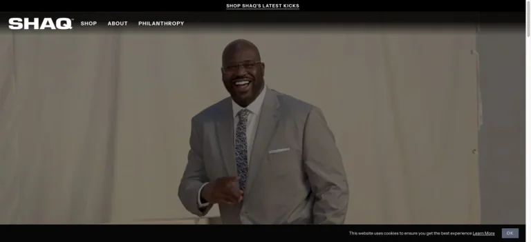
A heavy white wordmark sits in a black commerce header above a large smiling video portrait and a compact category navigation.
Useful for: A sports celebrity website reference; study how its opening presents identity and routes into work, releases, or public appearances.
# Design reference: Shaquille O’Neal
Source: https://shaq.com/
Swipefile reference: https://swipefile.design/ref/celebrity-shaquille-o-neal/
Captured: 2026-09-08. This is a dated reference, not a claim about the current live product.
Capture scope: one viewport. Do not infer unseen page sections or a complete user flow.

## Objective
Adapt the visual principles below to my project. Use my own content and identity. Do not reproduce logos, proprietary copy, or brand assets.

## Reference notes
- mood: Friendly and commerce-led.
- colors: Black, white, warm gray, and cream.
- typography: Adapt the visible contrast between display lettering and smaller navigation. Choose type that supports your own identity and remains readable on small screens.
- layout: A heavy white wordmark sits in a black commerce header above a large smiling video portrait and a compact category navigation.
- motion: Static opening-viewport capture. Follow the original source to inspect animation, video, menus, and reduced-motion behavior.
- texture: Let original photography or film provide the visual detail. Keep supporting controls clear.
- dont: Do not copy the celebrity’s identity, claims, photographs, artwork, or trademarks into a new brand.

Useful for: A sports celebrity website reference; study how its opening presents identity and routes into work, releases, or public appearances.

## Acceptance criteria
- Existing project conventions, design tokens, working functionality, and unrelated changes are preserved.
- Two or three reference principles clearly support the user's task; conflicts are resolved in favor of usability and the existing product.
- Reusable components and semantic HTML express the interface. Available licensed assets are used; important UI text is never rendered as a bitmap.
- Every visible control has a defined behavior. Loading, empty, error, success, disabled, and long-content states are specified where relevant. Demo data is clearly labeled.
- Navigation and content adapt at 375px, 768px, and 1440px without horizontal page overflow. Keyboard use, visible focus, labeled inputs, at least 44px touch targets, readable contrast, and reduced motion are supported.
- Verification distinguishes rendered behavior from proposals and identifies anything still requiring a backend or external service.

## Quality bar
Clear hierarchy, consistent spacing, restrained surfaces, and purposeful motion. Avoid decorative gradients, excessive cards, placeholder buttons, and invented metrics unless the project calls for them. Do not claim a feature is connected or tested without evidence.
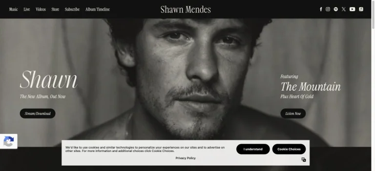
A monochrome close-up portrait spans the hero, with italic album lettering and small pill actions placed in the open image areas.
Useful for: A music celebrity website reference; study how its opening presents identity and routes into work, releases, or public appearances.
# Design reference: Shawn Mendes
Source: https://www.shawnmendesofficial.com/
Swipefile reference: https://swipefile.design/ref/celebrity-shawn-mendes/
Captured: 2026-09-08. This is a dated reference, not a claim about the current live product.
Capture scope: one viewport. Do not infer unseen page sections or a complete user flow.

## Objective
Adapt the visual principles below to my project. Use my own content and identity. Do not reproduce logos, proprietary copy, or brand assets.

## Reference notes
- mood: Quiet and intimate.
- colors: Black, cream, soft gray, and photographic neutrals.
- typography: Adapt the visible contrast between display lettering and smaller navigation. Choose type that supports your own identity and remains readable on small screens.
- layout: A monochrome close-up portrait spans the hero, with italic album lettering and small pill actions placed in the open image areas.
- motion: Static opening-viewport capture. Follow the original source to inspect animation, video, menus, and reduced-motion behavior.
- texture: Let original photography or film provide the visual detail. Keep supporting controls clear.
- dont: Do not copy the celebrity’s identity, claims, photographs, artwork, or trademarks into a new brand.

Useful for: A music celebrity website reference; study how its opening presents identity and routes into work, releases, or public appearances.

## Acceptance criteria
- Existing project conventions, design tokens, working functionality, and unrelated changes are preserved.
- Two or three reference principles clearly support the user's task; conflicts are resolved in favor of usability and the existing product.
- Reusable components and semantic HTML express the interface. Available licensed assets are used; important UI text is never rendered as a bitmap.
- Every visible control has a defined behavior. Loading, empty, error, success, disabled, and long-content states are specified where relevant. Demo data is clearly labeled.
- Navigation and content adapt at 375px, 768px, and 1440px without horizontal page overflow. Keyboard use, visible focus, labeled inputs, at least 44px touch targets, readable contrast, and reduced motion are supported.
- Verification distinguishes rendered behavior from proposals and identifies anything still requiring a backend or external service.

## Quality bar
Clear hierarchy, consistent spacing, restrained surfaces, and purposeful motion. Avoid decorative gradients, excessive cards, placeholder buttons, and invented metrics unless the project calls for them. Do not claim a feature is connected or tested without evidence.
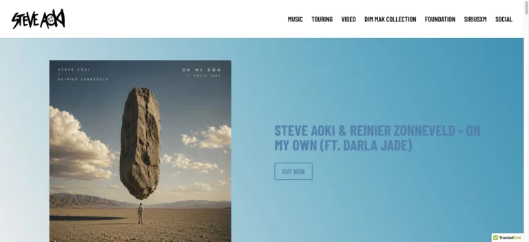
A blue campaign panel places upright album artwork beside a concise release announcement, beneath a white header and hand-drawn identity.
Useful for: A music celebrity website reference; study how its opening presents identity and routes into work, releases, or public appearances.
# Design reference: Steve Aoki
Source: https://steveaoki.com/
Swipefile reference: https://swipefile.design/ref/celebrity-steve-aoki/
Captured: 2026-09-08. This is a dated reference, not a claim about the current live product.
Capture scope: one viewport. Do not infer unseen page sections or a complete user flow.

## Objective
Adapt the visual principles below to my project. Use my own content and identity. Do not reproduce logos, proprietary copy, or brand assets.

## Reference notes
- mood: Clear and release-focused.
- colors: Sky blue, white, charcoal, and warm sand.
- typography: Adapt the visible contrast between display lettering and smaller navigation. Choose type that supports your own identity and remains readable on small screens.
- layout: A blue campaign panel places upright album artwork beside a concise release announcement, beneath a white header and hand-drawn identity.
- motion: Static opening-viewport capture. Follow the original source to inspect animation, video, menus, and reduced-motion behavior.
- texture: Use original graphics and a restrained supporting interface to establish the page’s visual character.
- dont: Do not copy the celebrity’s identity, claims, photographs, artwork, or trademarks into a new brand.

Useful for: A music celebrity website reference; study how its opening presents identity and routes into work, releases, or public appearances.

## Acceptance criteria
- Existing project conventions, design tokens, working functionality, and unrelated changes are preserved.
- Two or three reference principles clearly support the user's task; conflicts are resolved in favor of usability and the existing product.
- Reusable components and semantic HTML express the interface. Available licensed assets are used; important UI text is never rendered as a bitmap.
- Every visible control has a defined behavior. Loading, empty, error, success, disabled, and long-content states are specified where relevant. Demo data is clearly labeled.
- Navigation and content adapt at 375px, 768px, and 1440px without horizontal page overflow. Keyboard use, visible focus, labeled inputs, at least 44px touch targets, readable contrast, and reduced motion are supported.
- Verification distinguishes rendered behavior from proposals and identifies anything still requiring a backend or external service.

## Quality bar
Clear hierarchy, consistent spacing, restrained surfaces, and purposeful motion. Avoid decorative gradients, excessive cards, placeholder buttons, and invented metrics unless the project calls for them. Do not claim a feature is connected or tested without evidence.
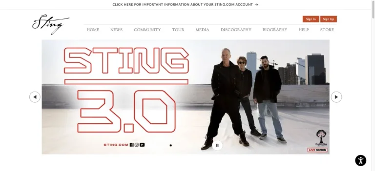
A centered signature header and orderly navigation sit above a wide tour banner that combines outlined red lettering with a group photograph.
Useful for: A music celebrity website reference; study how its opening presents identity and routes into work, releases, or public appearances.
# Design reference: Sting
Source: https://sting.com/
Swipefile reference: https://swipefile.design/ref/celebrity-sting/
Captured: 2026-09-08. This is a dated reference, not a claim about the current live product.
Capture scope: one viewport. Do not infer unseen page sections or a complete user flow.

## Objective
Adapt the visual principles below to my project. Use my own content and identity. Do not reproduce logos, proprietary copy, or brand assets.

## Reference notes
- mood: Classic and organized.
- colors: White, gray, black, and red.
- typography: Adapt the visible contrast between display lettering and smaller navigation. Choose type that supports your own identity and remains readable on small screens.
- layout: A centered signature header and orderly navigation sit above a wide tour banner that combines outlined red lettering with a group photograph.
- motion: Static opening-viewport capture. Follow the original source to inspect animation, video, menus, and reduced-motion behavior.
- texture: Let original photography or film provide the visual detail. Keep supporting controls clear.
- dont: Do not copy the celebrity’s identity, claims, photographs, artwork, or trademarks into a new brand.

Useful for: A music celebrity website reference; study how its opening presents identity and routes into work, releases, or public appearances.

## Acceptance criteria
- Existing project conventions, design tokens, working functionality, and unrelated changes are preserved.
- Two or three reference principles clearly support the user's task; conflicts are resolved in favor of usability and the existing product.
- Reusable components and semantic HTML express the interface. Available licensed assets are used; important UI text is never rendered as a bitmap.
- Every visible control has a defined behavior. Loading, empty, error, success, disabled, and long-content states are specified where relevant. Demo data is clearly labeled.
- Navigation and content adapt at 375px, 768px, and 1440px without horizontal page overflow. Keyboard use, visible focus, labeled inputs, at least 44px touch targets, readable contrast, and reduced motion are supported.
- Verification distinguishes rendered behavior from proposals and identifies anything still requiring a backend or external service.

## Quality bar
Clear hierarchy, consistent spacing, restrained surfaces, and purposeful motion. Avoid decorative gradients, excessive cards, placeholder buttons, and invented metrics unless the project calls for them. Do not claim a feature is connected or tested without evidence.
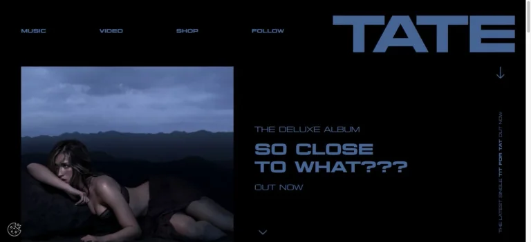
A black canvas pairs oversized blue identity lettering with a dark rectangular campaign image and compact album information.
Useful for: A music celebrity website reference; study how its opening presents identity and routes into work, releases, or public appearances.
# Design reference: Tate McRae
Source: https://www.tatemcrae.com/
Swipefile reference: https://swipefile.design/ref/celebrity-tate-mcrae/
Captured: 2026-09-08. This is a dated reference, not a claim about the current live product.
Capture scope: one viewport. Do not infer unseen page sections or a complete user flow.

## Objective
Adapt the visual principles below to my project. Use my own content and identity. Do not reproduce logos, proprietary copy, or brand assets.

## Reference notes
- mood: Cool and graphic.
- colors: Black, slate blue, and pale blue.
- typography: Adapt the visible contrast between display lettering and smaller navigation. Choose type that supports your own identity and remains readable on small screens.
- layout: A black canvas pairs oversized blue identity lettering with a dark rectangular campaign image and compact album information.
- motion: Static opening-viewport capture. Follow the original source to inspect animation, video, menus, and reduced-motion behavior.
- texture: Let original photography or film provide the visual detail. Keep supporting controls clear.
- dont: Do not copy the celebrity’s identity, claims, photographs, artwork, or trademarks into a new brand.

Useful for: A music celebrity website reference; study how its opening presents identity and routes into work, releases, or public appearances.

## Acceptance criteria
- Existing project conventions, design tokens, working functionality, and unrelated changes are preserved.
- Two or three reference principles clearly support the user's task; conflicts are resolved in favor of usability and the existing product.
- Reusable components and semantic HTML express the interface. Available licensed assets are used; important UI text is never rendered as a bitmap.
- Every visible control has a defined behavior. Loading, empty, error, success, disabled, and long-content states are specified where relevant. Demo data is clearly labeled.
- Navigation and content adapt at 375px, 768px, and 1440px without horizontal page overflow. Keyboard use, visible focus, labeled inputs, at least 44px touch targets, readable contrast, and reduced motion are supported.
- Verification distinguishes rendered behavior from proposals and identifies anything still requiring a backend or external service.

## Quality bar
Clear hierarchy, consistent spacing, restrained surfaces, and purposeful motion. Avoid decorative gradients, excessive cards, placeholder buttons, and invented metrics unless the project calls for them. Do not claim a feature is connected or tested without evidence.
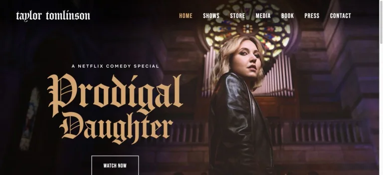
A cinematic portrait and church-like interior frame oversized gold blackletter release typography and a small watch action.
Useful for: A comedy celebrity website reference; study how its opening presents identity and routes into work, releases, or public appearances.
# Design reference: Taylor Tomlinson
Source: https://taylortomlinsoncomedy.com/
Swipefile reference: https://swipefile.design/ref/celebrity-taylor-tomlinson/
Captured: 2026-09-08. This is a dated reference, not a claim about the current live product.
Capture scope: one viewport. Do not infer unseen page sections or a complete user flow.

## Objective
Adapt the visual principles below to my project. Use my own content and identity. Do not reproduce logos, proprietary copy, or brand assets.

## Reference notes
- mood: Theatrical and cinematic.
- colors: Deep brown, gold, black, and cream.
- typography: Adapt the visible contrast between display lettering and smaller navigation. Choose type that supports your own identity and remains readable on small screens.
- layout: A cinematic portrait and church-like interior frame oversized gold blackletter release typography and a small watch action.
- motion: Static opening-viewport capture. Follow the original source to inspect animation, video, menus, and reduced-motion behavior.
- texture: Let original photography or film provide the visual detail. Keep supporting controls clear.
- dont: Do not copy the celebrity’s identity, claims, photographs, artwork, or trademarks into a new brand.

Useful for: A comedy celebrity website reference; study how its opening presents identity and routes into work, releases, or public appearances.

## Acceptance criteria
- Existing project conventions, design tokens, working functionality, and unrelated changes are preserved.
- Two or three reference principles clearly support the user's task; conflicts are resolved in favor of usability and the existing product.
- Reusable components and semantic HTML express the interface. Available licensed assets are used; important UI text is never rendered as a bitmap.
- Every visible control has a defined behavior. Loading, empty, error, success, disabled, and long-content states are specified where relevant. Demo data is clearly labeled.
- Navigation and content adapt at 375px, 768px, and 1440px without horizontal page overflow. Keyboard use, visible focus, labeled inputs, at least 44px touch targets, readable contrast, and reduced motion are supported.
- Verification distinguishes rendered behavior from proposals and identifies anything still requiring a backend or external service.

## Quality bar
Clear hierarchy, consistent spacing, restrained surfaces, and purposeful motion. Avoid decorative gradients, excessive cards, placeholder buttons, and invented metrics unless the project calls for them. Do not claim a feature is connected or tested without evidence.
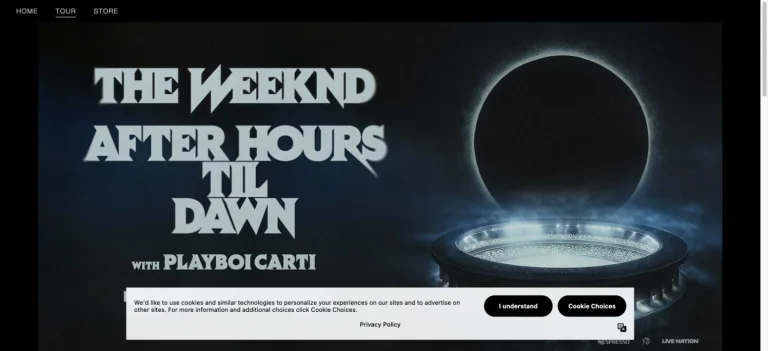
A dark tour campaign pairs oversized angular lettering with a luminous circular stage image and minimal top navigation.
Useful for: A music celebrity website reference; study how its opening presents identity and routes into work, releases, or public appearances.
# Design reference: The Weeknd
Source: https://www.theweeknd.com/tour/
Swipefile reference: https://swipefile.design/ref/celebrity-the-weeknd/
Captured: 2026-09-08. This is a dated reference, not a claim about the current live product.
Capture scope: one viewport. Do not infer unseen page sections or a complete user flow.

## Objective
Adapt the visual principles below to my project. Use my own content and identity. Do not reproduce logos, proprietary copy, or brand assets.

## Reference notes
- mood: Cinematic and monumental.
- colors: Black, midnight blue, icy white, and gray.
- typography: Adapt the visible contrast between display lettering and smaller navigation. Choose type that supports your own identity and remains readable on small screens.
- layout: A dark tour campaign pairs oversized angular lettering with a luminous circular stage image and minimal top navigation.
- motion: Static opening-viewport capture. Follow the original source to inspect animation, video, menus, and reduced-motion behavior.
- texture: Let original photography or film provide the visual detail. Keep supporting controls clear.
- dont: Do not copy the celebrity’s identity, claims, photographs, artwork, or trademarks into a new brand.

Useful for: A music celebrity website reference; study how its opening presents identity and routes into work, releases, or public appearances.

## Acceptance criteria
- Existing project conventions, design tokens, working functionality, and unrelated changes are preserved.
- Two or three reference principles clearly support the user's task; conflicts are resolved in favor of usability and the existing product.
- Reusable components and semantic HTML express the interface. Available licensed assets are used; important UI text is never rendered as a bitmap.
- Every visible control has a defined behavior. Loading, empty, error, success, disabled, and long-content states are specified where relevant. Demo data is clearly labeled.
- Navigation and content adapt at 375px, 768px, and 1440px without horizontal page overflow. Keyboard use, visible focus, labeled inputs, at least 44px touch targets, readable contrast, and reduced motion are supported.
- Verification distinguishes rendered behavior from proposals and identifies anything still requiring a backend or external service.

## Quality bar
Clear hierarchy, consistent spacing, restrained surfaces, and purposeful motion. Avoid decorative gradients, excessive cards, placeholder buttons, and invented metrics unless the project calls for them. Do not claim a feature is connected or tested without evidence.

A seated monochrome portrait occupies one side of a nearly black page, while a narrow white identity and representation details form a small opposite column.
Useful for: A film celebrity website reference; study how its opening presents identity and routes into work, releases, or public appearances.
# Design reference: Tom Felton
Source: https://tomfelton.com/
Swipefile reference: https://swipefile.design/ref/celebrity-tom-felton/
Captured: 2026-09-08. This is a dated reference, not a claim about the current live product.
Capture scope: one viewport. Do not infer unseen page sections or a complete user flow.

## Objective
Adapt the visual principles below to my project. Use my own content and identity. Do not reproduce logos, proprietary copy, or brand assets.

## Reference notes
- mood: Minimal and professional.
- colors: Black, white, and warm gray.
- typography: Adapt the visible contrast between display lettering and smaller navigation. Choose type that supports your own identity and remains readable on small screens.
- layout: A seated monochrome portrait occupies one side of a nearly black page, while a narrow white identity and representation details form a small opposite column.
- motion: Static opening-viewport capture. Follow the original source to inspect animation, video, menus, and reduced-motion behavior.
- texture: Let original photography or film provide the visual detail. Keep supporting controls clear.
- dont: Do not copy the celebrity’s identity, claims, photographs, artwork, or trademarks into a new brand.

Useful for: A film celebrity website reference; study how its opening presents identity and routes into work, releases, or public appearances.

## Acceptance criteria
- Existing project conventions, design tokens, working functionality, and unrelated changes are preserved.
- Two or three reference principles clearly support the user's task; conflicts are resolved in favor of usability and the existing product.
- Reusable components and semantic HTML express the interface. Available licensed assets are used; important UI text is never rendered as a bitmap.
- Every visible control has a defined behavior. Loading, empty, error, success, disabled, and long-content states are specified where relevant. Demo data is clearly labeled.
- Navigation and content adapt at 375px, 768px, and 1440px without horizontal page overflow. Keyboard use, visible focus, labeled inputs, at least 44px touch targets, readable contrast, and reduced motion are supported.
- Verification distinguishes rendered behavior from proposals and identifies anything still requiring a backend or external service.

## Quality bar
Clear hierarchy, consistent spacing, restrained surfaces, and purposeful motion. Avoid decorative gradients, excessive cards, placeholder buttons, and invented metrics unless the project calls for them. Do not claim a feature is connected or tested without evidence.
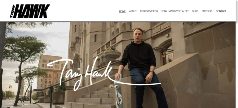
A bold black identity and tidy white navigation frame a large outdoor portrait with a handwritten name across the photograph.
Useful for: A sports celebrity website reference; study how its opening presents identity and routes into work, releases, or public appearances.
# Design reference: Tony Hawk
Source: https://www.tonyhawk.com/
Swipefile reference: https://swipefile.design/ref/celebrity-tony-hawk/
Captured: 2026-09-08. This is a dated reference, not a claim about the current live product.
Capture scope: one viewport. Do not infer unseen page sections or a complete user flow.

## Objective
Adapt the visual principles below to my project. Use my own content and identity. Do not reproduce logos, proprietary copy, or brand assets.

## Reference notes
- mood: Personal and direct.
- colors: White, black, warm stone, and muted green.
- typography: Adapt the visible contrast between display lettering and smaller navigation. Choose type that supports your own identity and remains readable on small screens.
- layout: A bold black identity and tidy white navigation frame a large outdoor portrait with a handwritten name across the photograph.
- motion: Static opening-viewport capture. Follow the original source to inspect animation, video, menus, and reduced-motion behavior.
- texture: Let original photography or film provide the visual detail. Keep supporting controls clear.
- dont: Do not copy the celebrity’s identity, claims, photographs, artwork, or trademarks into a new brand.

Useful for: A sports celebrity website reference; study how its opening presents identity and routes into work, releases, or public appearances.

## Acceptance criteria
- Existing project conventions, design tokens, working functionality, and unrelated changes are preserved.
- Two or three reference principles clearly support the user's task; conflicts are resolved in favor of usability and the existing product.
- Reusable components and semantic HTML express the interface. Available licensed assets are used; important UI text is never rendered as a bitmap.
- Every visible control has a defined behavior. Loading, empty, error, success, disabled, and long-content states are specified where relevant. Demo data is clearly labeled.
- Navigation and content adapt at 375px, 768px, and 1440px without horizontal page overflow. Keyboard use, visible focus, labeled inputs, at least 44px touch targets, readable contrast, and reduced motion are supported.
- Verification distinguishes rendered behavior from proposals and identifies anything still requiring a backend or external service.

## Quality bar
Clear hierarchy, consistent spacing, restrained surfaces, and purposeful motion. Avoid decorative gradients, excessive cards, placeholder buttons, and invented metrics unless the project calls for them. Do not claim a feature is connected or tested without evidence.
An isolated sneaker floats in an almost empty black field, with tiny tour and shop controls and a small emblem below.
Useful for: A music celebrity website reference; study how its opening presents identity and routes into work, releases, or public appearances.
# Design reference: Travis Scott
Source: https://www.travisscott.com/
Swipefile reference: https://swipefile.design/ref/celebrity-travis-scott/
Captured: 2026-09-08. This is a dated reference, not a claim about the current live product.
Capture scope: one viewport. Do not infer unseen page sections or a complete user flow.

## Objective
Adapt the visual principles below to my project. Use my own content and identity. Do not reproduce logos, proprietary copy, or brand assets.

## Reference notes
- mood: Sparse and object-focused.
- colors: Black, cool blue, and gray.
- typography: Adapt the visible contrast between display lettering and smaller navigation. Choose type that supports your own identity and remains readable on small screens.
- layout: An isolated sneaker floats in an almost empty black field, with tiny tour and shop controls and a small emblem below.
- motion: Static opening-viewport capture. Follow the original source to inspect animation, video, menus, and reduced-motion behavior.
- texture: Use original graphics and a restrained supporting interface to establish the page’s visual character.
- dont: Do not copy the celebrity’s identity, claims, photographs, artwork, or trademarks into a new brand.

Useful for: A music celebrity website reference; study how its opening presents identity and routes into work, releases, or public appearances.

## Acceptance criteria
- Existing project conventions, design tokens, working functionality, and unrelated changes are preserved.
- Two or three reference principles clearly support the user's task; conflicts are resolved in favor of usability and the existing product.
- Reusable components and semantic HTML express the interface. Available licensed assets are used; important UI text is never rendered as a bitmap.
- Every visible control has a defined behavior. Loading, empty, error, success, disabled, and long-content states are specified where relevant. Demo data is clearly labeled.
- Navigation and content adapt at 375px, 768px, and 1440px without horizontal page overflow. Keyboard use, visible focus, labeled inputs, at least 44px touch targets, readable contrast, and reduced motion are supported.
- Verification distinguishes rendered behavior from proposals and identifies anything still requiring a backend or external service.

## Quality bar
Clear hierarchy, consistent spacing, restrained surfaces, and purposeful motion. Avoid decorative gradients, excessive cards, placeholder buttons, and invented metrics unless the project calls for them. Do not claim a feature is connected or tested without evidence.
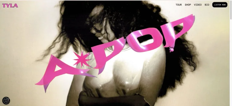
A large diagonal pink album mark crosses a close photographic hero, with a small artist identity and direct navigation along the top.
Useful for: A music celebrity website reference; study how its opening presents identity and routes into work, releases, or public appearances.
# Design reference: Tyla
Source: https://www.tylaworld.com/
Swipefile reference: https://swipefile.design/ref/celebrity-tyla/
Captured: 2026-09-08. This is a dated reference, not a claim about the current live product.
Capture scope: one viewport. Do not infer unseen page sections or a complete user flow.

## Objective
Adapt the visual principles below to my project. Use my own content and identity. Do not reproduce logos, proprietary copy, or brand assets.

## Reference notes
- mood: Confident and pop-focused.
- colors: Hot pink, cream, black, and warm photographic tones.
- typography: Adapt the visible contrast between display lettering and smaller navigation. Choose type that supports your own identity and remains readable on small screens.
- layout: A large diagonal pink album mark crosses a close photographic hero, with a small artist identity and direct navigation along the top.
- motion: Static opening-viewport capture. Follow the original source to inspect animation, video, menus, and reduced-motion behavior.
- texture: Let original photography or film provide the visual detail. Keep supporting controls clear.
- dont: Do not copy the celebrity’s identity, claims, photographs, artwork, or trademarks into a new brand.

Useful for: A music celebrity website reference; study how its opening presents identity and routes into work, releases, or public appearances.

## Acceptance criteria
- Existing project conventions, design tokens, working functionality, and unrelated changes are preserved.
- Two or three reference principles clearly support the user's task; conflicts are resolved in favor of usability and the existing product.
- Reusable components and semantic HTML express the interface. Available licensed assets are used; important UI text is never rendered as a bitmap.
- Every visible control has a defined behavior. Loading, empty, error, success, disabled, and long-content states are specified where relevant. Demo data is clearly labeled.
- Navigation and content adapt at 375px, 768px, and 1440px without horizontal page overflow. Keyboard use, visible focus, labeled inputs, at least 44px touch targets, readable contrast, and reduced motion are supported.
- Verification distinguishes rendered behavior from proposals and identifies anything still requiring a backend or external service.

## Quality bar
Clear hierarchy, consistent spacing, restrained surfaces, and purposeful motion. Avoid decorative gradients, excessive cards, placeholder buttons, and invented metrics unless the project calls for them. Do not claim a feature is connected or tested without evidence.
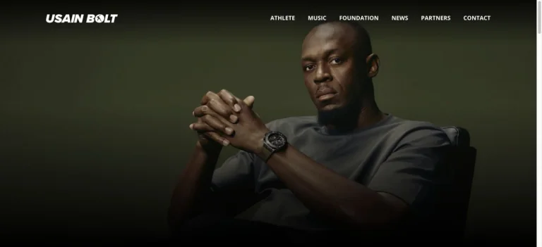
A seated portrait emerges from a dark olive background beneath a bold italic white identity and a simple row of destinations.
Useful for: A sports celebrity website reference; study how its opening presents identity and routes into work, releases, or public appearances.
# Design reference: Usain Bolt
Source: https://usainbolt.com/
Swipefile reference: https://swipefile.design/ref/celebrity-usain-bolt/
Captured: 2026-09-08. This is a dated reference, not a claim about the current live product.
Capture scope: one viewport. Do not infer unseen page sections or a complete user flow.

## Objective
Adapt the visual principles below to my project. Use my own content and identity. Do not reproduce logos, proprietary copy, or brand assets.

## Reference notes
- mood: Composed and confident.
- colors: Olive green, black, warm brown, and white.
- typography: Adapt the visible contrast between display lettering and smaller navigation. Choose type that supports your own identity and remains readable on small screens.
- layout: A seated portrait emerges from a dark olive background beneath a bold italic white identity and a simple row of destinations.
- motion: Static opening-viewport capture. Follow the original source to inspect animation, video, menus, and reduced-motion behavior.
- texture: Let original photography or film provide the visual detail. Keep supporting controls clear.
- dont: Do not copy the celebrity’s identity, claims, photographs, artwork, or trademarks into a new brand.

Useful for: A sports celebrity website reference; study how its opening presents identity and routes into work, releases, or public appearances.

## Acceptance criteria
- Existing project conventions, design tokens, working functionality, and unrelated changes are preserved.
- Two or three reference principles clearly support the user's task; conflicts are resolved in favor of usability and the existing product.
- Reusable components and semantic HTML express the interface. Available licensed assets are used; important UI text is never rendered as a bitmap.
- Every visible control has a defined behavior. Loading, empty, error, success, disabled, and long-content states are specified where relevant. Demo data is clearly labeled.
- Navigation and content adapt at 375px, 768px, and 1440px without horizontal page overflow. Keyboard use, visible focus, labeled inputs, at least 44px touch targets, readable contrast, and reduced motion are supported.
- Verification distinguishes rendered behavior from proposals and identifies anything still requiring a backend or external service.

## Quality bar
Clear hierarchy, consistent spacing, restrained surfaces, and purposeful motion. Avoid decorative gradients, excessive cards, placeholder buttons, and invented metrics unless the project calls for them. Do not claim a feature is connected or tested without evidence.
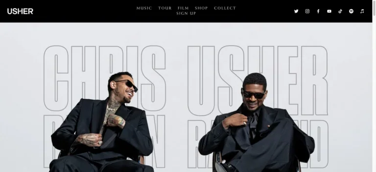
A black navigation strip frames a pale campaign photograph with giant outlined lettering behind the performers.
Useful for: A music celebrity website reference; study how its opening presents identity and routes into work, releases, or public appearances.
# Design reference: Usher
Source: https://www.usherworld.com/
Swipefile reference: https://swipefile.design/ref/celebrity-usher/
Captured: 2026-09-08. This is a dated reference, not a claim about the current live product.
Capture scope: one viewport. Do not infer unseen page sections or a complete user flow.

## Objective
Adapt the visual principles below to my project. Use my own content and identity. Do not reproduce logos, proprietary copy, or brand assets.

## Reference notes
- mood: Bold and performance-led.
- colors: Black, pale gray, white, and photographic neutrals.
- typography: Adapt the visible contrast between display lettering and smaller navigation. Choose type that supports your own identity and remains readable on small screens.
- layout: A black navigation strip frames a pale campaign photograph with giant outlined lettering behind the performers.
- motion: Static opening-viewport capture. Follow the original source to inspect animation, video, menus, and reduced-motion behavior.
- texture: Let original photography or film provide the visual detail. Keep supporting controls clear.
- dont: Do not copy the celebrity’s identity, claims, photographs, artwork, or trademarks into a new brand.

Useful for: A music celebrity website reference; study how its opening presents identity and routes into work, releases, or public appearances.

## Acceptance criteria
- Existing project conventions, design tokens, working functionality, and unrelated changes are preserved.
- Two or three reference principles clearly support the user's task; conflicts are resolved in favor of usability and the existing product.
- Reusable components and semantic HTML express the interface. Available licensed assets are used; important UI text is never rendered as a bitmap.
- Every visible control has a defined behavior. Loading, empty, error, success, disabled, and long-content states are specified where relevant. Demo data is clearly labeled.
- Navigation and content adapt at 375px, 768px, and 1440px without horizontal page overflow. Keyboard use, visible focus, labeled inputs, at least 44px touch targets, readable contrast, and reduced motion are supported.
- Verification distinguishes rendered behavior from proposals and identifies anything still requiring a backend or external service.

## Quality bar
Clear hierarchy, consistent spacing, restrained surfaces, and purposeful motion. Avoid decorative gradients, excessive cards, placeholder buttons, and invented metrics unless the project calls for them. Do not claim a feature is connected or tested without evidence.
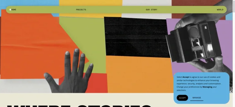
JuVee Productions opens with a collage of colored paper, black-and-white hands, and film equipment beneath a thin rounded navigation bar.
Useful for: A film celebrity website reference; study how its opening presents identity and routes into the associated brand.
# Design reference: Viola Davis — JuVee Productions
Source: https://www.juveeproductions.com/
Swipefile reference: https://swipefile.design/ref/celebrity-viola-davis/
Captured: 2026-09-08. This is a dated reference, not a claim about the current live product.
Capture scope: one viewport. Do not infer unseen page sections or a complete user flow.

## Objective
Adapt the visual principles below to my project. Use my own content and identity. Do not reproduce logos, proprietary copy, or brand assets.

## Reference notes
- mood: Tactile and creative.
- colors: Lime, orange, lavender, cyan, and black.
- typography: Adapt the visible contrast between display lettering and smaller navigation. Choose type that supports your own identity and remains readable on small screens.
- layout: JuVee Productions opens with a collage of colored paper, black-and-white hands, and film equipment beneath a thin rounded navigation bar.
- motion: Static opening-viewport capture. Follow the original source to inspect animation, video, menus, and reduced-motion behavior.
- texture: Use original graphics and a restrained supporting interface to establish the page’s visual character.
- dont: Do not copy the celebrity’s identity, claims, photographs, artwork, or trademarks into a new brand.

Useful for: A film celebrity website reference; study how its opening presents identity and routes into the associated brand.

## Acceptance criteria
- Existing project conventions, design tokens, working functionality, and unrelated changes are preserved.
- Two or three reference principles clearly support the user's task; conflicts are resolved in favor of usability and the existing product.
- Reusable components and semantic HTML express the interface. Available licensed assets are used; important UI text is never rendered as a bitmap.
- Every visible control has a defined behavior. Loading, empty, error, success, disabled, and long-content states are specified where relevant. Demo data is clearly labeled.
- Navigation and content adapt at 375px, 768px, and 1440px without horizontal page overflow. Keyboard use, visible focus, labeled inputs, at least 44px touch targets, readable contrast, and reduced motion are supported.
- Verification distinguishes rendered behavior from proposals and identifies anything still requiring a backend or external service.

## Quality bar
Clear hierarchy, consistent spacing, restrained surfaces, and purposeful motion. Avoid decorative gradients, excessive cards, placeholder buttons, and invented metrics unless the project calls for them. Do not claim a feature is connected or tested without evidence.
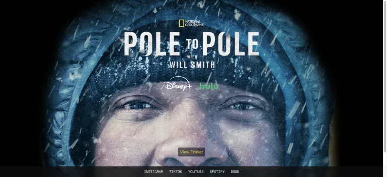
An icy close-up portrait becomes the campaign background for a documentary title, with a small trailer action and compact social links below.
Useful for: A film celebrity website reference; study how its opening presents identity and routes into work, releases, or public appearances.
# Design reference: Will Smith
Source: https://willsmith.com/
Swipefile reference: https://swipefile.design/ref/celebrity-will-smith/
Captured: 2026-09-08. This is a dated reference, not a claim about the current live product.
Capture scope: one viewport. Do not infer unseen page sections or a complete user flow.

## Objective
Adapt the visual principles below to my project. Use my own content and identity. Do not reproduce logos, proprietary copy, or brand assets.

## Reference notes
- mood: Cinematic and immersive.
- colors: Ice blue, black, white, and gray.
- typography: Adapt the visible contrast between display lettering and smaller navigation. Choose type that supports your own identity and remains readable on small screens.
- layout: An icy close-up portrait becomes the campaign background for a documentary title, with a small trailer action and compact social links below.
- motion: Static opening-viewport capture. Follow the original source to inspect animation, video, menus, and reduced-motion behavior.
- texture: Let original photography or film provide the visual detail. Keep supporting controls clear.
- dont: Do not copy the celebrity’s identity, claims, photographs, artwork, or trademarks into a new brand.

Useful for: A film celebrity website reference; study how its opening presents identity and routes into work, releases, or public appearances.

## Acceptance criteria
- Existing project conventions, design tokens, working functionality, and unrelated changes are preserved.
- Two or three reference principles clearly support the user's task; conflicts are resolved in favor of usability and the existing product.
- Reusable components and semantic HTML express the interface. Available licensed assets are used; important UI text is never rendered as a bitmap.
- Every visible control has a defined behavior. Loading, empty, error, success, disabled, and long-content states are specified where relevant. Demo data is clearly labeled.
- Navigation and content adapt at 375px, 768px, and 1440px without horizontal page overflow. Keyboard use, visible focus, labeled inputs, at least 44px touch targets, readable contrast, and reduced motion are supported.
- Verification distinguishes rendered behavior from proposals and identifies anything still requiring a backend or external service.

## Quality bar
Clear hierarchy, consistent spacing, restrained surfaces, and purposeful motion. Avoid decorative gradients, excessive cards, placeholder buttons, and invented metrics unless the project calls for them. Do not claim a feature is connected or tested without evidence.
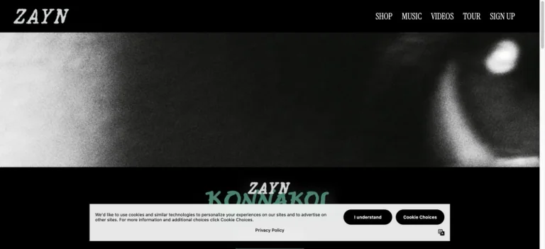
A black header and sharp white artist wordmark frame an extreme monochrome close-up, with green album lettering at the transition below.
Useful for: A music celebrity website reference; study how its opening presents identity and routes into work, releases, or public appearances.
# Design reference: Zayn
Source: https://www.inzayn.com/
Swipefile reference: https://swipefile.design/ref/celebrity-zayn/
Captured: 2026-09-08. This is a dated reference, not a claim about the current live product.
Capture scope: one viewport. Do not infer unseen page sections or a complete user flow.

## Objective
Adapt the visual principles below to my project. Use my own content and identity. Do not reproduce logos, proprietary copy, or brand assets.

## Reference notes
- mood: Moody and cinematic.
- colors: Black, white, gray, and muted green.
- typography: Adapt the visible contrast between display lettering and smaller navigation. Choose type that supports your own identity and remains readable on small screens.
- layout: A black header and sharp white artist wordmark frame an extreme monochrome close-up, with green album lettering at the transition below.
- motion: Static opening-viewport capture. Follow the original source to inspect animation, video, menus, and reduced-motion behavior.
- texture: Use original graphics and a restrained supporting interface to establish the page’s visual character.
- dont: Do not copy the celebrity’s identity, claims, photographs, artwork, or trademarks into a new brand.

Useful for: A music celebrity website reference; study how its opening presents identity and routes into work, releases, or public appearances.

## Acceptance criteria
- Existing project conventions, design tokens, working functionality, and unrelated changes are preserved.
- Two or three reference principles clearly support the user's task; conflicts are resolved in favor of usability and the existing product.
- Reusable components and semantic HTML express the interface. Available licensed assets are used; important UI text is never rendered as a bitmap.
- Every visible control has a defined behavior. Loading, empty, error, success, disabled, and long-content states are specified where relevant. Demo data is clearly labeled.
- Navigation and content adapt at 375px, 768px, and 1440px without horizontal page overflow. Keyboard use, visible focus, labeled inputs, at least 44px touch targets, readable contrast, and reduced motion are supported.
- Verification distinguishes rendered behavior from proposals and identifies anything still requiring a backend or external service.

## Quality bar
Clear hierarchy, consistent spacing, restrained surfaces, and purposeful motion. Avoid decorative gradients, excessive cards, placeholder buttons, and invented metrics unless the project calls for them. Do not claim a feature is connected or tested without evidence.
Allow basic usage counts to help us understand what is useful. Your board contents stay out of analytics. Details
Your browser’s privacy preference keeps analytics off.