Personal Creator
CURATED COLLECTION · 97 REFERENCES
Explore 100 English-language websites from prominent YouTube creators and their brands. Compare how a photographer presents a body of work, a teacher introduces a resource, or a creator turns a familiar identity into a shop.
Copy the reference notes below and paste them into Claude, ChatGPT, or your coding assistant. Add what you want to build.
Includes design notes, original sources, and preview links. An assistant that supports browsing can also read the public board link.
3 references are no longer public and are omitted.
Curated for design reference value, with English-language pages checked on September 8, 2026. This selection includes personal sites, creator-led publications and businesses, and official stores. It is not a subscriber ranking. Each screenshot shows the opening viewport; follow the original website to explore the rest.
Compare a clear introduction and portrait with paths into learning and templates. Start here for an educational creator site.
Study the quiet identity and dense photography grid. Start here when the work itself should introduce you.
Compare the MKBHD store’s product-led hero and compact shop action. Start here for an official creator storefront.
Choose a reference for the job your website needs to do: introduce, teach, publish, or sell. Save a small set to a board and name the specific decision you want to adapt from each. Use your own words and imagery, then check the layout with real content on a phone. These captures support visual comparison, not claims about conversion rates or interaction quality.
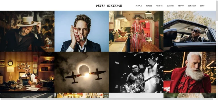
A minimal centered photographer identity and category navigation sit above a dense edge-to-edge grid of portraits, objects, and lifestyle photography.
Useful for: A photography creator website; study its opening composition, identity, and paths into the creator’s work.
# Design reference: Peter McKinnon
Source: https://www.petermckinnon.com/
Swipefile reference: https://swipefile.design/ref/youtube-peter-mckinnon/
Captured: 2026-09-08. This is a dated reference, not a claim about the current live product.
Capture scope: one viewport. Do not infer unseen page sections or a complete user flow.

## Objective
Adapt the visual principles below to my project. Use my own content and identity. Do not reproduce logos, proprietary copy, or brand assets.

## Reference notes
- mood: Immersive and photographic.
- colors: White, black, and varied photographic colors.
- typography: Use the hierarchy visible in the capture: one main statement and a restrained secondary navigation.
- layout: A minimal centered photographer identity and category navigation sit above a dense edge-to-edge grid of portraits, objects, and lifestyle photography.
- motion: Static viewport capture. Inspect the source website to assess animation, video, and reduced-motion behavior.
- texture: Let the original photographic or video imagery carry the visual detail.
- dont: Do not reproduce the creator’s identity, claims, copy, or artwork in a new brand.

Useful for: A photography creator website; study its opening composition, identity, and paths into the creator’s work.

## Acceptance criteria
- Existing project conventions, design tokens, working functionality, and unrelated changes are preserved.
- Two or three reference principles clearly support the user's task; conflicts are resolved in favor of usability and the existing product.
- Reusable components and semantic HTML express the interface. Available licensed assets are used; important UI text is never rendered as a bitmap.
- Every visible control has a defined behavior. Loading, empty, error, success, disabled, and long-content states are specified where relevant. Demo data is clearly labeled.
- Navigation and content adapt at 375px, 768px, and 1440px without horizontal page overflow. Keyboard use, visible focus, labeled inputs, at least 44px touch targets, readable contrast, and reduced motion are supported.
- Verification distinguishes rendered behavior from proposals and identifies anything still requiring a backend or external service.

## Quality bar
Clear hierarchy, consistent spacing, restrained surfaces, and purposeful motion. Avoid decorative gradients, excessive cards, placeholder buttons, and invented metrics unless the project calls for them. Do not claim a feature is connected or tested without evidence.
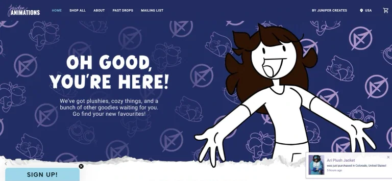
A purple illustrated character hero pairs welcoming oversized text with line-art motifs and a compact store navigation.
Useful for: A animation creator website; study its opening composition, identity, and paths into the creator’s work.
# Design reference: Jaiden Animations
Source: https://jaidenanimations.com/
Swipefile reference: https://swipefile.design/ref/youtube-jaiden-animations/
Captured: 2026-09-08. This is a dated reference, not a claim about the current live product.
Capture scope: one viewport. Do not infer unseen page sections or a complete user flow.

## Objective
Adapt the visual principles below to my project. Use my own content and identity. Do not reproduce logos, proprietary copy, or brand assets.

## Reference notes
- mood: Playful and character-led.
- colors: Deep purple, periwinkle, white, and light blue.
- typography: The captured page uses cc-thismanthismonster-var. Keep a clear contrast between the main statement and the smaller navigation.
- layout: A purple illustrated character hero pairs welcoming oversized text with line-art motifs and a compact store navigation.
- motion: Static viewport capture. Inspect the source website to assess animation, video, and reduced-motion behavior.
- texture: Graphic illustration and shape provide the visual detail.
- dont: Do not reproduce the creator’s identity, claims, copy, or artwork in a new brand.

Useful for: A animation creator website; study its opening composition, identity, and paths into the creator’s work.

## Acceptance criteria
- Existing project conventions, design tokens, working functionality, and unrelated changes are preserved.
- Two or three reference principles clearly support the user's task; conflicts are resolved in favor of usability and the existing product.
- Reusable components and semantic HTML express the interface. Available licensed assets are used; important UI text is never rendered as a bitmap.
- Every visible control has a defined behavior. Loading, empty, error, success, disabled, and long-content states are specified where relevant. Demo data is clearly labeled.
- Navigation and content adapt at 375px, 768px, and 1440px without horizontal page overflow. Keyboard use, visible focus, labeled inputs, at least 44px touch targets, readable contrast, and reduced motion are supported.
- Verification distinguishes rendered behavior from proposals and identifies anything still requiring a backend or external service.

## Quality bar
Clear hierarchy, consistent spacing, restrained surfaces, and purposeful motion. Avoid decorative gradients, excessive cards, placeholder buttons, and invented metrics unless the project calls for them. Do not claim a feature is connected or tested without evidence.
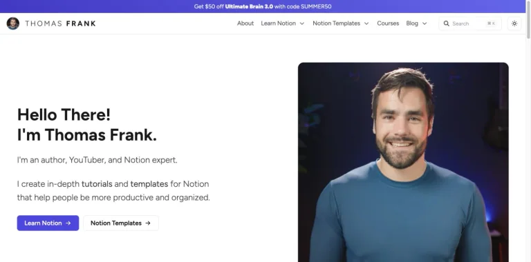
A bright split homepage introduces the creator beside a large rounded portrait, with clear learning and template actions.
Useful for: A productivity creator website; study its opening composition, identity, and paths into the creator’s work.
# Design reference: Thomas Frank
Source: https://thomasjfrank.com/
Swipefile reference: https://swipefile.design/ref/youtube-thomas-frank/
Captured: 2026-09-08. This is a dated reference, not a claim about the current live product.
Capture scope: one viewport. Do not infer unseen page sections or a complete user flow.

## Objective
Adapt the visual principles below to my project. Use my own content and identity. Do not reproduce logos, proprietary copy, or brand assets.

## Reference notes
- mood: Clear and helpful.
- colors: White, dark gray, violet, and blue.
- typography: The captured page uses Figtree. Keep a clear contrast between the main statement and the smaller navigation.
- layout: A bright split homepage introduces the creator beside a large rounded portrait, with clear learning and template actions.
- motion: Static viewport capture. Inspect the source website to assess animation, video, and reduced-motion behavior.
- texture: Let the original photographic or video imagery carry the visual detail.
- dont: Do not reproduce the creator’s identity, claims, copy, or artwork in a new brand.

Useful for: A productivity creator website; study its opening composition, identity, and paths into the creator’s work.

## Acceptance criteria
- Existing project conventions, design tokens, working functionality, and unrelated changes are preserved.
- Two or three reference principles clearly support the user's task; conflicts are resolved in favor of usability and the existing product.
- Reusable components and semantic HTML express the interface. Available licensed assets are used; important UI text is never rendered as a bitmap.
- Every visible control has a defined behavior. Loading, empty, error, success, disabled, and long-content states are specified where relevant. Demo data is clearly labeled.
- Navigation and content adapt at 375px, 768px, and 1440px without horizontal page overflow. Keyboard use, visible focus, labeled inputs, at least 44px touch targets, readable contrast, and reduced motion are supported.
- Verification distinguishes rendered behavior from proposals and identifies anything still requiring a backend or external service.

## Quality bar
Clear hierarchy, consistent spacing, restrained surfaces, and purposeful motion. Avoid decorative gradients, excessive cards, placeholder buttons, and invented metrics unless the project calls for them. Do not claim a feature is connected or tested without evidence.
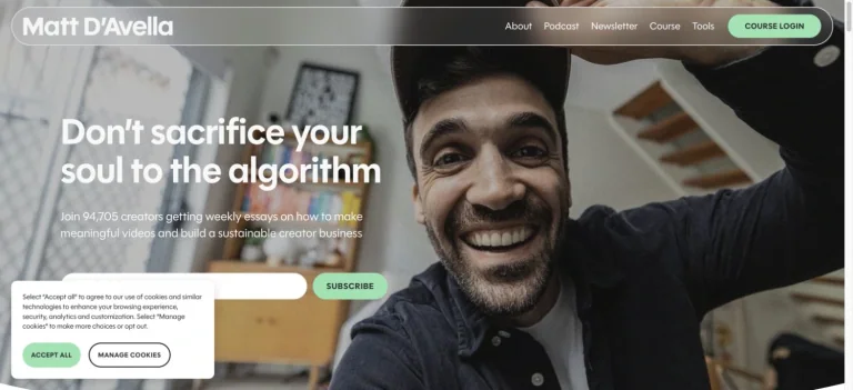
A close creator portrait fills the hero behind a large white statement, compact navigation, and an embedded newsletter form.
Useful for: A filmmaking creator website; study its opening composition, identity, and paths into the creator’s work.
# Design reference: Matt D’Avella
Source: https://www.mattdavella.com/
Swipefile reference: https://swipefile.design/ref/youtube-matt-d-avella/
Captured: 2026-09-08. This is a dated reference, not a claim about the current live product.
Capture scope: one viewport. Do not infer unseen page sections or a complete user flow.

## Objective
Adapt the visual principles below to my project. Use my own content and identity. Do not reproduce logos, proprietary copy, or brand assets.

## Reference notes
- mood: Personal and cinematic.
- colors: Muted photographic gray, white, and mint.
- typography: The captured page uses polymath. Keep a clear contrast between the main statement and the smaller navigation.
- layout: A close creator portrait fills the hero behind a large white statement, compact navigation, and an embedded newsletter form.
- motion: Static viewport capture. Inspect the source website to assess animation, video, and reduced-motion behavior.
- texture: Let the original photographic or video imagery carry the visual detail.
- dont: Do not reproduce the creator’s identity, claims, copy, or artwork in a new brand.

Useful for: A filmmaking creator website; study its opening composition, identity, and paths into the creator’s work.

## Acceptance criteria
- Existing project conventions, design tokens, working functionality, and unrelated changes are preserved.
- Two or three reference principles clearly support the user's task; conflicts are resolved in favor of usability and the existing product.
- Reusable components and semantic HTML express the interface. Available licensed assets are used; important UI text is never rendered as a bitmap.
- Every visible control has a defined behavior. Loading, empty, error, success, disabled, and long-content states are specified where relevant. Demo data is clearly labeled.
- Navigation and content adapt at 375px, 768px, and 1440px without horizontal page overflow. Keyboard use, visible focus, labeled inputs, at least 44px touch targets, readable contrast, and reduced motion are supported.
- Verification distinguishes rendered behavior from proposals and identifies anything still requiring a backend or external service.

## Quality bar
Clear hierarchy, consistent spacing, restrained surfaces, and purposeful motion. Avoid decorative gradients, excessive cards, placeholder buttons, and invented metrics unless the project calls for them. Do not claim a feature is connected or tested without evidence.
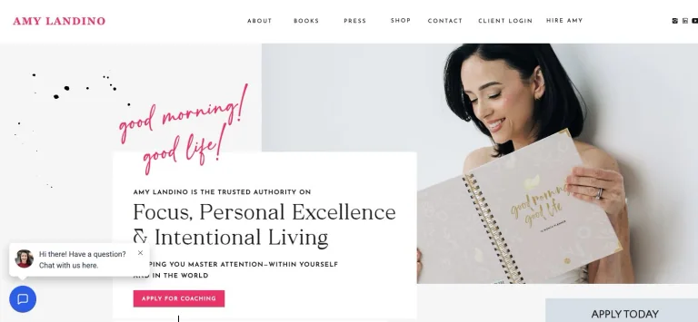
A large lifestyle portrait sits behind an overlapping white editorial panel, with pink handwriting and a compact navigation row adding personality.
Useful for: A productivity creator website; study its opening composition, identity, and paths into the creator’s work.
# Design reference: Amy Landino
Source: https://amylandino.com/
Swipefile reference: https://swipefile.design/ref/youtube-amy-landino/
Captured: 2026-09-08. This is a dated reference, not a claim about the current live product.
Capture scope: one viewport. Do not infer unseen page sections or a complete user flow.

## Objective
Adapt the visual principles below to my project. Use my own content and identity. Do not reproduce logos, proprietary copy, or brand assets.

## Reference notes
- mood: Personal and editorial.
- colors: White, light gray, black, and vivid pink.
- typography: The captured page uses Georgia and Quartage and Josefin Sans. Keep a clear contrast between the main statement and the smaller navigation.
- layout: A large lifestyle portrait sits behind an overlapping white editorial panel, with pink handwriting and a compact navigation row adding personality.
- motion: Static viewport capture. Inspect the source website to assess animation, video, and reduced-motion behavior.
- texture: Let the original photographic or video imagery carry the visual detail.
- dont: Do not reproduce the creator’s identity, claims, copy, or artwork in a new brand.

Useful for: A productivity creator website; study its opening composition, identity, and paths into the creator’s work.

## Acceptance criteria
- Existing project conventions, design tokens, working functionality, and unrelated changes are preserved.
- Two or three reference principles clearly support the user's task; conflicts are resolved in favor of usability and the existing product.
- Reusable components and semantic HTML express the interface. Available licensed assets are used; important UI text is never rendered as a bitmap.
- Every visible control has a defined behavior. Loading, empty, error, success, disabled, and long-content states are specified where relevant. Demo data is clearly labeled.
- Navigation and content adapt at 375px, 768px, and 1440px without horizontal page overflow. Keyboard use, visible focus, labeled inputs, at least 44px touch targets, readable contrast, and reduced motion are supported.
- Verification distinguishes rendered behavior from proposals and identifies anything still requiring a backend or external service.

## Quality bar
Clear hierarchy, consistent spacing, restrained surfaces, and purposeful motion. Avoid decorative gradients, excessive cards, placeholder buttons, and invented metrics unless the project calls for them. Do not claim a feature is connected or tested without evidence.
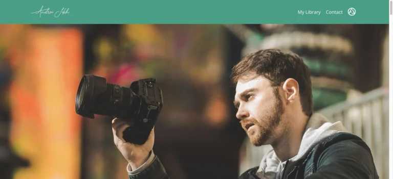
A handwritten identity and green navigation strip introduce a wide creator photograph, with a restrained set of links into the learning site.
Useful for: A finance creator website; study its opening composition, identity, and paths into the creator’s work.
# Design reference: Andrei Jikh
Source: https://www.zerotoamillion.com/
Swipefile reference: https://swipefile.design/ref/youtube-andrei-jikh/
Captured: 2026-09-08. This is a dated reference, not a claim about the current live product.
Capture scope: one viewport. Do not infer unseen page sections or a complete user flow.

## Objective
Adapt the visual principles below to my project. Use my own content and identity. Do not reproduce logos, proprietary copy, or brand assets.

## Reference notes
- mood: Approachable and focused.
- colors: Muted green, white, and warm photographic tones.
- typography: The captured page uses Josefin Sans. Keep a clear contrast between the main statement and the smaller navigation.
- layout: A handwritten identity and green navigation strip introduce a wide creator photograph, with a restrained set of links into the learning site.
- motion: Static viewport capture. Inspect the source website to assess animation, video, and reduced-motion behavior.
- texture: Let the original photographic or video imagery carry the visual detail.
- dont: Do not reproduce the creator’s identity, claims, copy, or artwork in a new brand.

Useful for: A finance creator website; study its opening composition, identity, and paths into the creator’s work.

## Acceptance criteria
- Existing project conventions, design tokens, working functionality, and unrelated changes are preserved.
- Two or three reference principles clearly support the user's task; conflicts are resolved in favor of usability and the existing product.
- Reusable components and semantic HTML express the interface. Available licensed assets are used; important UI text is never rendered as a bitmap.
- Every visible control has a defined behavior. Loading, empty, error, success, disabled, and long-content states are specified where relevant. Demo data is clearly labeled.
- Navigation and content adapt at 375px, 768px, and 1440px without horizontal page overflow. Keyboard use, visible focus, labeled inputs, at least 44px touch targets, readable contrast, and reduced motion are supported.
- Verification distinguishes rendered behavior from proposals and identifies anything still requiring a backend or external service.

## Quality bar
Clear hierarchy, consistent spacing, restrained surfaces, and purposeful motion. Avoid decorative gradients, excessive cards, placeholder buttons, and invented metrics unless the project calls for them. Do not claim a feature is connected or tested without evidence.
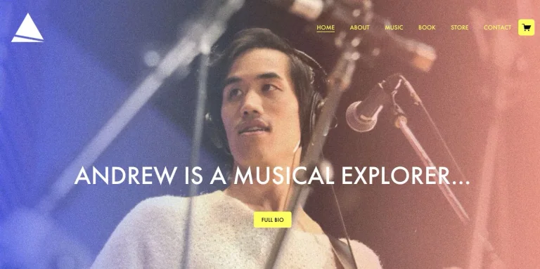
A full-width music studio portrait uses a colorful lighting wash, centered positioning, and a small yellow biography button.
Useful for: A music creator website; study its opening composition, identity, and paths into the creator’s work.
# Design reference: Andrew Huang
Source: https://andrewhuang.com/
Swipefile reference: https://swipefile.design/ref/youtube-andrew-huang/
Captured: 2026-09-08. This is a dated reference, not a claim about the current live product.
Capture scope: one viewport. Do not infer unseen page sections or a complete user flow.

## Objective
Adapt the visual principles below to my project. Use my own content and identity. Do not reproduce logos, proprietary copy, or brand assets.

## Reference notes
- mood: Expressive and musical.
- colors: Violet, rose, and yellow over photography.
- typography: The captured page uses futura-pt. Keep a clear contrast between the main statement and the smaller navigation.
- layout: A full-width music studio portrait uses a colorful lighting wash, centered positioning, and a small yellow biography button.
- motion: Static viewport capture. Inspect the source website to assess animation, video, and reduced-motion behavior.
- texture: Let the original photographic or video imagery carry the visual detail.
- dont: Do not reproduce the creator’s identity, claims, copy, or artwork in a new brand.

Useful for: A music creator website; study its opening composition, identity, and paths into the creator’s work.

## Acceptance criteria
- Existing project conventions, design tokens, working functionality, and unrelated changes are preserved.
- Two or three reference principles clearly support the user's task; conflicts are resolved in favor of usability and the existing product.
- Reusable components and semantic HTML express the interface. Available licensed assets are used; important UI text is never rendered as a bitmap.
- Every visible control has a defined behavior. Loading, empty, error, success, disabled, and long-content states are specified where relevant. Demo data is clearly labeled.
- Navigation and content adapt at 375px, 768px, and 1440px without horizontal page overflow. Keyboard use, visible focus, labeled inputs, at least 44px touch targets, readable contrast, and reduced motion are supported.
- Verification distinguishes rendered behavior from proposals and identifies anything still requiring a backend or external service.

## Quality bar
Clear hierarchy, consistent spacing, restrained surfaces, and purposeful motion. Avoid decorative gradients, excessive cards, placeholder buttons, and invented metrics unless the project calls for them. Do not claim a feature is connected or tested without evidence.
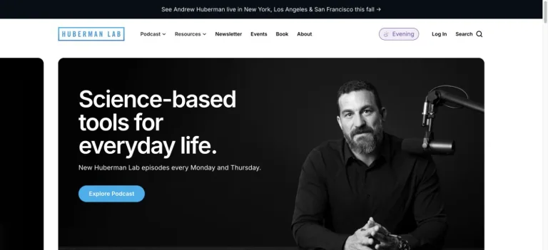
A black portrait-led podcast panel places a large white statement beside the host and microphone, within a clean white navigation shell.
Useful for: A science creator website; study its opening composition, identity, and paths into the creator’s work.
# Design reference: Andrew Huberman
Source: https://www.hubermanlab.com/
Swipefile reference: https://swipefile.design/ref/youtube-andrew-huberman/
Captured: 2026-09-08. This is a dated reference, not a claim about the current live product.
Capture scope: one viewport. Do not infer unseen page sections or a complete user flow.

## Objective
Adapt the visual principles below to my project. Use my own content and identity. Do not reproduce logos, proprietary copy, or brand assets.

## Reference notes
- mood: Direct and studio-like.
- colors: Black, white, and pale blue.
- typography: The captured page uses Inter. Keep a clear contrast between the main statement and the smaller navigation.
- layout: A black portrait-led podcast panel places a large white statement beside the host and microphone, within a clean white navigation shell.
- motion: Static viewport capture. Inspect the source website to assess animation, video, and reduced-motion behavior.
- texture: Let the original photographic or video imagery carry the visual detail.
- dont: Do not reproduce the creator’s identity, claims, copy, or artwork in a new brand.

Useful for: A science creator website; study its opening composition, identity, and paths into the creator’s work.

## Acceptance criteria
- Existing project conventions, design tokens, working functionality, and unrelated changes are preserved.
- Two or three reference principles clearly support the user's task; conflicts are resolved in favor of usability and the existing product.
- Reusable components and semantic HTML express the interface. Available licensed assets are used; important UI text is never rendered as a bitmap.
- Every visible control has a defined behavior. Loading, empty, error, success, disabled, and long-content states are specified where relevant. Demo data is clearly labeled.
- Navigation and content adapt at 375px, 768px, and 1440px without horizontal page overflow. Keyboard use, visible focus, labeled inputs, at least 44px touch targets, readable contrast, and reduced motion are supported.
- Verification distinguishes rendered behavior from proposals and identifies anything still requiring a backend or external service.

## Quality bar
Clear hierarchy, consistent spacing, restrained surfaces, and purposeful motion. Avoid decorative gradients, excessive cards, placeholder buttons, and invented metrics unless the project calls for them. Do not claim a feature is connected or tested without evidence.
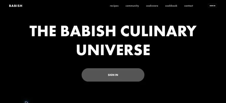
A dark culinary homepage uses a large centered uppercase title and a restrained account action beneath a small navigation row.
Useful for: A food creator website; study its opening composition, identity, and paths into the creator’s work.
# Design reference: Andrew Rea — Babish
Source: https://www.babi.sh/
Swipefile reference: https://swipefile.design/ref/youtube-andrew-rea/
Captured: 2026-09-08. This is a dated reference, not a claim about the current live product.
Capture scope: one viewport. Do not infer unseen page sections or a complete user flow.

## Objective
Adapt the visual principles below to my project. Use my own content and identity. Do not reproduce logos, proprietary copy, or brand assets.

## Reference notes
- mood: Bold and cinematic.
- colors: Black, white, and neutral gray.
- typography: The captured page uses futura-pt. Keep a clear contrast between the main statement and the smaller navigation.
- layout: A dark culinary homepage uses a large centered uppercase title and a restrained account action beneath a small navigation row.
- motion: Static viewport capture. Inspect the source website to assess animation, video, and reduced-motion behavior.
- texture: Keep surfaces restrained so the typography and content stay prominent.
- dont: Do not reproduce the creator’s identity, claims, copy, or artwork in a new brand.

Useful for: A food creator website; study its opening composition, identity, and paths into the creator’s work.

## Acceptance criteria
- Existing project conventions, design tokens, working functionality, and unrelated changes are preserved.
- Two or three reference principles clearly support the user's task; conflicts are resolved in favor of usability and the existing product.
- Reusable components and semantic HTML express the interface. Available licensed assets are used; important UI text is never rendered as a bitmap.
- Every visible control has a defined behavior. Loading, empty, error, success, disabled, and long-content states are specified where relevant. Demo data is clearly labeled.
- Navigation and content adapt at 375px, 768px, and 1440px without horizontal page overflow. Keyboard use, visible focus, labeled inputs, at least 44px touch targets, readable contrast, and reduced motion are supported.
- Verification distinguishes rendered behavior from proposals and identifies anything still requiring a backend or external service.

## Quality bar
Clear hierarchy, consistent spacing, restrained surfaces, and purposeful motion. Avoid decorative gradients, excessive cards, placeholder buttons, and invented metrics unless the project calls for them. Do not claim a feature is connected or tested without evidence.
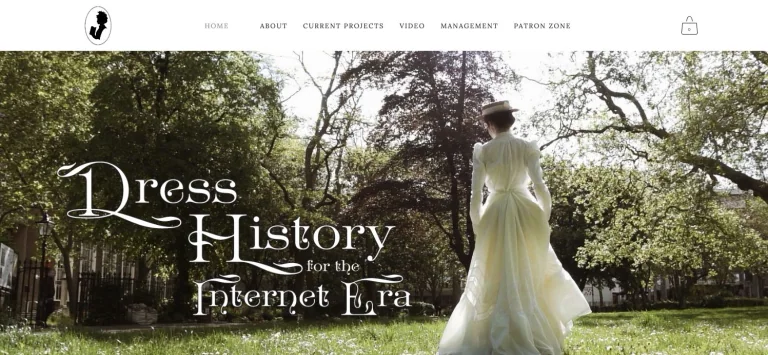
A forest photograph and historical dress establish the subject immediately, with decorative serif lettering and a light, compact header.
Useful for: A fashion creator website; study its opening composition, identity, and paths into the creator’s work.
# Design reference: Bernadette Banner
Source: https://bernadettebanner.co.uk/
Swipefile reference: https://swipefile.design/ref/youtube-bernadette-banner/
Captured: 2026-09-08. This is a dated reference, not a claim about the current live product.
Capture scope: one viewport. Do not infer unseen page sections or a complete user flow.

## Objective
Adapt the visual principles below to my project. Use my own content and identity. Do not reproduce logos, proprietary copy, or brand assets.

## Reference notes
- mood: Romantic and historical.
- colors: Woodland green, cream, and white.
- typography: Use the hierarchy visible in the capture: one main statement and a restrained secondary navigation.
- layout: A forest photograph and historical dress establish the subject immediately, with decorative serif lettering and a light, compact header.
- motion: Static viewport capture. Inspect the source website to assess animation, video, and reduced-motion behavior.
- texture: Let the original photographic or video imagery carry the visual detail.
- dont: Do not reproduce the creator’s identity, claims, copy, or artwork in a new brand.

Useful for: A fashion creator website; study its opening composition, identity, and paths into the creator’s work.

## Acceptance criteria
- Existing project conventions, design tokens, working functionality, and unrelated changes are preserved.
- Two or three reference principles clearly support the user's task; conflicts are resolved in favor of usability and the existing product.
- Reusable components and semantic HTML express the interface. Available licensed assets are used; important UI text is never rendered as a bitmap.
- Every visible control has a defined behavior. Loading, empty, error, success, disabled, and long-content states are specified where relevant. Demo data is clearly labeled.
- Navigation and content adapt at 375px, 768px, and 1440px without horizontal page overflow. Keyboard use, visible focus, labeled inputs, at least 44px touch targets, readable contrast, and reduced motion are supported.
- Verification distinguishes rendered behavior from proposals and identifies anything still requiring a backend or external service.

## Quality bar
Clear hierarchy, consistent spacing, restrained surfaces, and purposeful motion. Avoid decorative gradients, excessive cards, placeholder buttons, and invented metrics unless the project calls for them. Do not claim a feature is connected or tested without evidence.
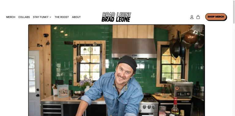
A white merchandise header gives way to a broad kitchen portrait, with an outlined wordmark and a small orange shop action.
Useful for: A food creator website; study its opening composition, identity, and paths into the creator’s work.
# Design reference: Brad Leone
Source: https://bradleone.com/
Swipefile reference: https://swipefile.design/ref/youtube-brad-leone/
Captured: 2026-09-08. This is a dated reference, not a claim about the current live product.
Capture scope: one viewport. Do not infer unseen page sections or a complete user flow.

## Objective
Adapt the visual principles below to my project. Use my own content and identity. Do not reproduce logos, proprietary copy, or brand assets.

## Reference notes
- mood: Casual and tactile.
- colors: White, black, orange, and warm green photography.
- typography: The captured page uses Prompt and Inter. Keep a clear contrast between the main statement and the smaller navigation.
- layout: A white merchandise header gives way to a broad kitchen portrait, with an outlined wordmark and a small orange shop action.
- motion: Static viewport capture. Inspect the source website to assess animation, video, and reduced-motion behavior.
- texture: Let the original photographic or video imagery carry the visual detail.
- dont: Do not reproduce the creator’s identity, claims, copy, or artwork in a new brand.

Useful for: A food creator website; study its opening composition, identity, and paths into the creator’s work.

## Acceptance criteria
- Existing project conventions, design tokens, working functionality, and unrelated changes are preserved.
- Two or three reference principles clearly support the user's task; conflicts are resolved in favor of usability and the existing product.
- Reusable components and semantic HTML express the interface. Available licensed assets are used; important UI text is never rendered as a bitmap.
- Every visible control has a defined behavior. Loading, empty, error, success, disabled, and long-content states are specified where relevant. Demo data is clearly labeled.
- Navigation and content adapt at 375px, 768px, and 1440px without horizontal page overflow. Keyboard use, visible focus, labeled inputs, at least 44px touch targets, readable contrast, and reduced motion are supported.
- Verification distinguishes rendered behavior from proposals and identifies anything still requiring a backend or external service.

## Quality bar
Clear hierarchy, consistent spacing, restrained surfaces, and purposeful motion. Avoid decorative gradients, excessive cards, placeholder buttons, and invented metrics unless the project calls for them. Do not claim a feature is connected or tested without evidence.
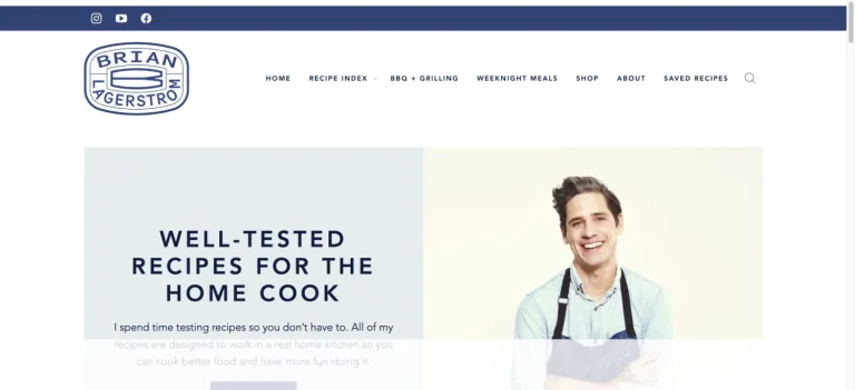
A pale split hero places a cooking promise beside a creator portrait, under a blue social strip and recipe-focused navigation.
Useful for: A food creator website; study its opening composition, identity, and paths into the creator’s work.
# Design reference: Brian Lagerstrom
Source: https://brianlagerstrom.com/
Swipefile reference: https://swipefile.design/ref/youtube-brian-lagerstrom/
Captured: 2026-09-08. This is a dated reference, not a claim about the current live product.
Capture scope: one viewport. Do not infer unseen page sections or a complete user flow.

## Objective
Adapt the visual principles below to my project. Use my own content and identity. Do not reproduce logos, proprietary copy, or brand assets.

## Reference notes
- mood: Friendly and organized.
- colors: Pale blue, cream, navy, and white.
- typography: The captured page uses Avenir. Keep a clear contrast between the main statement and the smaller navigation.
- layout: A pale split hero places a cooking promise beside a creator portrait, under a blue social strip and recipe-focused navigation.
- motion: Static viewport capture. Inspect the source website to assess animation, video, and reduced-motion behavior.
- texture: Let the original photographic or video imagery carry the visual detail.
- dont: Do not reproduce the creator’s identity, claims, copy, or artwork in a new brand.

Useful for: A food creator website; study its opening composition, identity, and paths into the creator’s work.

## Acceptance criteria
- Existing project conventions, design tokens, working functionality, and unrelated changes are preserved.
- Two or three reference principles clearly support the user's task; conflicts are resolved in favor of usability and the existing product.
- Reusable components and semantic HTML express the interface. Available licensed assets are used; important UI text is never rendered as a bitmap.
- Every visible control has a defined behavior. Loading, empty, error, success, disabled, and long-content states are specified where relevant. Demo data is clearly labeled.
- Navigation and content adapt at 375px, 768px, and 1440px without horizontal page overflow. Keyboard use, visible focus, labeled inputs, at least 44px touch targets, readable contrast, and reduced motion are supported.
- Verification distinguishes rendered behavior from proposals and identifies anything still requiring a backend or external service.

## Quality bar
Clear hierarchy, consistent spacing, restrained surfaces, and purposeful motion. Avoid decorative gradients, excessive cards, placeholder buttons, and invented metrics unless the project calls for them. Do not claim a feature is connected or tested without evidence.
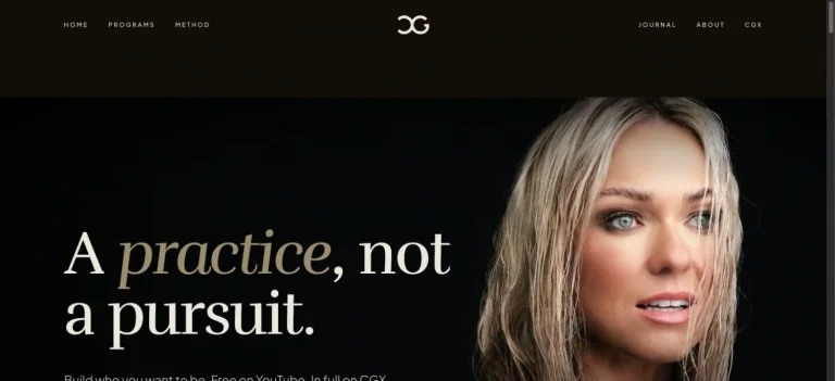
A close portrait dominates a dark fitness homepage, balanced by a large cream serif statement and restrained navigation.
Useful for: A fitness creator website; study its opening composition, identity, and paths into the creator’s work.
# Design reference: Caroline Girvan
Source: https://carolinegirvan.com/
Swipefile reference: https://swipefile.design/ref/youtube-caroline-girvan/
Captured: 2026-09-08. This is a dated reference, not a claim about the current live product.
Capture scope: one viewport. Do not infer unseen page sections or a complete user flow.

## Objective
Adapt the visual principles below to my project. Use my own content and identity. Do not reproduce logos, proprietary copy, or brand assets.

## Reference notes
- mood: Composed and premium.
- colors: Near-black, warm cream, and skin tones.
- typography: The captured page uses rufina. Keep a clear contrast between the main statement and the smaller navigation.
- layout: A close portrait dominates a dark fitness homepage, balanced by a large cream serif statement and restrained navigation.
- motion: Static viewport capture. Inspect the source website to assess animation, video, and reduced-motion behavior.
- texture: Let the original photographic or video imagery carry the visual detail.
- dont: Do not reproduce the creator’s identity, claims, copy, or artwork in a new brand.

Useful for: A fitness creator website; study its opening composition, identity, and paths into the creator’s work.

## Acceptance criteria
- Existing project conventions, design tokens, working functionality, and unrelated changes are preserved.
- Two or three reference principles clearly support the user's task; conflicts are resolved in favor of usability and the existing product.
- Reusable components and semantic HTML express the interface. Available licensed assets are used; important UI text is never rendered as a bitmap.
- Every visible control has a defined behavior. Loading, empty, error, success, disabled, and long-content states are specified where relevant. Demo data is clearly labeled.
- Navigation and content adapt at 375px, 768px, and 1440px without horizontal page overflow. Keyboard use, visible focus, labeled inputs, at least 44px touch targets, readable contrast, and reduced motion are supported.
- Verification distinguishes rendered behavior from proposals and identifies anything still requiring a backend or external service.

## Quality bar
Clear hierarchy, consistent spacing, restrained surfaces, and purposeful motion. Avoid decorative gradients, excessive cards, placeholder buttons, and invented metrics unless the project calls for them. Do not claim a feature is connected or tested without evidence.
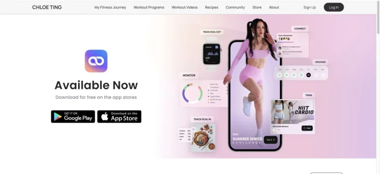
A split app-launch hero places download links on one side and a trainer, phone mockup, and interface details on the other.
Useful for: A fitness creator website; study its opening composition, identity, and paths into the creator’s work.
# Design reference: Chloe Ting
Source: https://chloeting.com/
Swipefile reference: https://swipefile.design/ref/youtube-chloe-ting/
Captured: 2026-09-08. This is a dated reference, not a claim about the current live product.
Capture scope: one viewport. Do not infer unseen page sections or a complete user flow.

## Objective
Adapt the visual principles below to my project. Use my own content and identity. Do not reproduce logos, proprietary copy, or brand assets.

## Reference notes
- mood: Bright and accessible.
- colors: White, soft pink, lavender, and charcoal.
- typography: The captured page uses Poppins and Manrope. Keep a clear contrast between the main statement and the smaller navigation.
- layout: A split app-launch hero places download links on one side and a trainer, phone mockup, and interface details on the other.
- motion: Static viewport capture. Inspect the source website to assess animation, video, and reduced-motion behavior.
- texture: Keep surfaces restrained so the typography and content stay prominent.
- dont: Do not reproduce the creator’s identity, claims, copy, or artwork in a new brand.

Useful for: A fitness creator website; study its opening composition, identity, and paths into the creator’s work.

## Acceptance criteria
- Existing project conventions, design tokens, working functionality, and unrelated changes are preserved.
- Two or three reference principles clearly support the user's task; conflicts are resolved in favor of usability and the existing product.
- Reusable components and semantic HTML express the interface. Available licensed assets are used; important UI text is never rendered as a bitmap.
- Every visible control has a defined behavior. Loading, empty, error, success, disabled, and long-content states are specified where relevant. Demo data is clearly labeled.
- Navigation and content adapt at 375px, 768px, and 1440px without horizontal page overflow. Keyboard use, visible focus, labeled inputs, at least 44px touch targets, readable contrast, and reduced motion are supported.
- Verification distinguishes rendered behavior from proposals and identifies anything still requiring a backend or external service.

## Quality bar
Clear hierarchy, consistent spacing, restrained surfaces, and purposeful motion. Avoid decorative gradients, excessive cards, placeholder buttons, and invented metrics unless the project calls for them. Do not claim a feature is connected or tested without evidence.
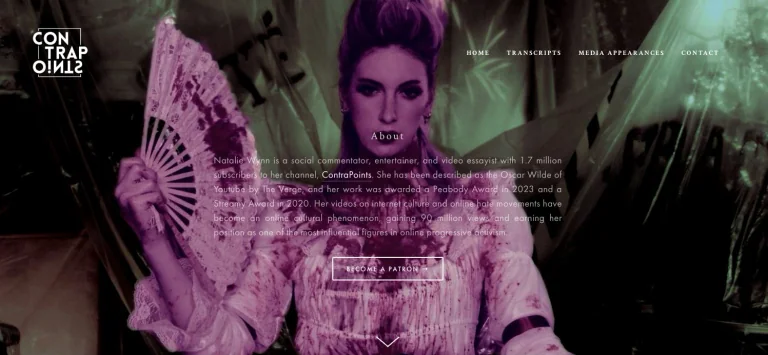
A theatrical portrait becomes the background for centered biographical copy, a compact wordmark, and an outlined support action.
Useful for: A commentary creator website; study its opening composition, identity, and paths into the creator’s work.
# Design reference: ContraPoints — Natalie Wynn
Source: https://www.contrapoints.com/
Swipefile reference: https://swipefile.design/ref/youtube-contrapoints/
Captured: 2026-09-08. This is a dated reference, not a claim about the current live product.
Capture scope: one viewport. Do not infer unseen page sections or a complete user flow.

## Objective
Adapt the visual principles below to my project. Use my own content and identity. Do not reproduce logos, proprietary copy, or brand assets.

## Reference notes
- mood: Theatrical and immersive.
- colors: Deep purple, green, black, and white.
- typography: The captured page uses Crimson Text. Keep a clear contrast between the main statement and the smaller navigation.
- layout: A theatrical portrait becomes the background for centered biographical copy, a compact wordmark, and an outlined support action.
- motion: Static viewport capture. Inspect the source website to assess animation, video, and reduced-motion behavior.
- texture: Let the original photographic or video imagery carry the visual detail.
- dont: Do not reproduce the creator’s identity, claims, copy, or artwork in a new brand.

Useful for: A commentary creator website; study its opening composition, identity, and paths into the creator’s work.

## Acceptance criteria
- Existing project conventions, design tokens, working functionality, and unrelated changes are preserved.
- Two or three reference principles clearly support the user's task; conflicts are resolved in favor of usability and the existing product.
- Reusable components and semantic HTML express the interface. Available licensed assets are used; important UI text is never rendered as a bitmap.
- Every visible control has a defined behavior. Loading, empty, error, success, disabled, and long-content states are specified where relevant. Demo data is clearly labeled.
- Navigation and content adapt at 375px, 768px, and 1440px without horizontal page overflow. Keyboard use, visible focus, labeled inputs, at least 44px touch targets, readable contrast, and reduced motion are supported.
- Verification distinguishes rendered behavior from proposals and identifies anything still requiring a backend or external service.

## Quality bar
Clear hierarchy, consistent spacing, restrained surfaces, and purposeful motion. Avoid decorative gradients, excessive cards, placeholder buttons, and invented metrics unless the project calls for them. Do not claim a feature is connected or tested without evidence.
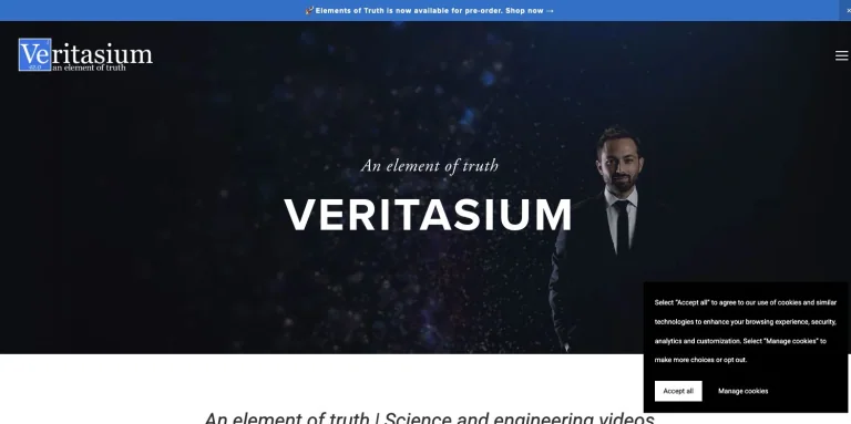
A dark star-like background and presenter portrait support a centered channel name and short italic tagline, with compact edge navigation.
Useful for: A science creator website; study its opening composition, identity, and paths into the creator’s work.
# Design reference: Derek Muller — Veritasium
Source: https://www.veritasium.com/
Swipefile reference: https://swipefile.design/ref/youtube-derek-muller/
Captured: 2026-09-08. This is a dated reference, not a claim about the current live product.
Capture scope: one viewport. Do not infer unseen page sections or a complete user flow.

## Objective
Adapt the visual principles below to my project. Use my own content and identity. Do not reproduce logos, proprietary copy, or brand assets.

## Reference notes
- mood: Scientific and cinematic.
- colors: Midnight blue, black, and white.
- typography: The captured page uses Roboto. Keep a clear contrast between the main statement and the smaller navigation.
- layout: A dark star-like background and presenter portrait support a centered channel name and short italic tagline, with compact edge navigation.
- motion: Static viewport capture. Inspect the source website to assess animation, video, and reduced-motion behavior.
- texture: Let the original photographic or video imagery carry the visual detail.
- dont: Do not reproduce the creator’s identity, claims, copy, or artwork in a new brand.

Useful for: A science creator website; study its opening composition, identity, and paths into the creator’s work.

## Acceptance criteria
- Existing project conventions, design tokens, working functionality, and unrelated changes are preserved.
- Two or three reference principles clearly support the user's task; conflicts are resolved in favor of usability and the existing product.
- Reusable components and semantic HTML express the interface. Available licensed assets are used; important UI text is never rendered as a bitmap.
- Every visible control has a defined behavior. Loading, empty, error, success, disabled, and long-content states are specified where relevant. Demo data is clearly labeled.
- Navigation and content adapt at 375px, 768px, and 1440px without horizontal page overflow. Keyboard use, visible focus, labeled inputs, at least 44px touch targets, readable contrast, and reduced motion are supported.
- Verification distinguishes rendered behavior from proposals and identifies anything still requiring a backend or external service.

## Quality bar
Clear hierarchy, consistent spacing, restrained surfaces, and purposeful motion. Avoid decorative gradients, excessive cards, placeholder buttons, and invented metrics unless the project calls for them. Do not claim a feature is connected or tested without evidence.
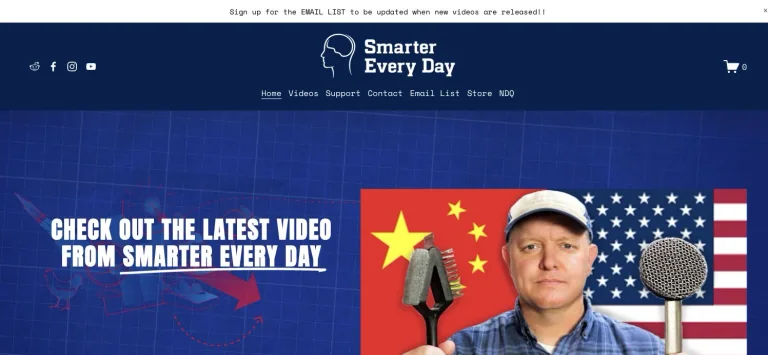
A navy channel header leads into a blue blueprint-style hero with a prominent latest-video message and a large video thumbnail.
Useful for: A science creator website; study its opening composition, identity, and paths into the creator’s work.
# Design reference: Destin Sandlin — Smarter Every Day
Source: https://www.smartereveryday.com/
Swipefile reference: https://swipefile.design/ref/youtube-destin-sandlin/
Captured: 2026-09-08. This is a dated reference, not a claim about the current live product.
Capture scope: one viewport. Do not infer unseen page sections or a complete user flow.

## Objective
Adapt the visual principles below to my project. Use my own content and identity. Do not reproduce logos, proprietary copy, or brand assets.

## Reference notes
- mood: Curious and technical.
- colors: Navy, blueprint blue, white, and thumbnail accents.
- typography: The captured page uses Anton. Keep a clear contrast between the main statement and the smaller navigation.
- layout: A navy channel header leads into a blue blueprint-style hero with a prominent latest-video message and a large video thumbnail.
- motion: Static viewport capture. Inspect the source website to assess animation, video, and reduced-motion behavior.
- texture: Let the original photographic or video imagery carry the visual detail.
- dont: Do not reproduce the creator’s identity, claims, copy, or artwork in a new brand.

Useful for: A science creator website; study its opening composition, identity, and paths into the creator’s work.

## Acceptance criteria
- Existing project conventions, design tokens, working functionality, and unrelated changes are preserved.
- Two or three reference principles clearly support the user's task; conflicts are resolved in favor of usability and the existing product.
- Reusable components and semantic HTML express the interface. Available licensed assets are used; important UI text is never rendered as a bitmap.
- Every visible control has a defined behavior. Loading, empty, error, success, disabled, and long-content states are specified where relevant. Demo data is clearly labeled.
- Navigation and content adapt at 375px, 768px, and 1440px without horizontal page overflow. Keyboard use, visible focus, labeled inputs, at least 44px touch targets, readable contrast, and reduced motion are supported.
- Verification distinguishes rendered behavior from proposals and identifies anything still requiring a backend or external service.

## Quality bar
Clear hierarchy, consistent spacing, restrained surfaces, and purposeful motion. Avoid decorative gradients, excessive cards, placeholder buttons, and invented metrics unless the project calls for them. Do not claim a feature is connected or tested without evidence.
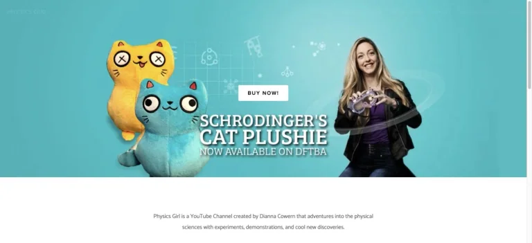
A turquoise campaign hero combines a creator portrait, illustrated science merchandise, and large white promotional lettering.
Useful for: A science creator website; study its opening composition, identity, and paths into the creator’s work.
# Design reference: Dianna Cowern — Physics Girl
Source: https://physicsgirl.org/
Swipefile reference: https://swipefile.design/ref/youtube-dianna-cowern/
Captured: 2026-09-08. This is a dated reference, not a claim about the current live product.
Capture scope: one viewport. Do not infer unseen page sections or a complete user flow.

## Objective
Adapt the visual principles below to my project. Use my own content and identity. Do not reproduce logos, proprietary copy, or brand assets.

## Reference notes
- mood: Playful and educational.
- colors: Turquoise, white, yellow, and lavender.
- typography: The captured page uses Catamaran. Keep a clear contrast between the main statement and the smaller navigation.
- layout: A turquoise campaign hero combines a creator portrait, illustrated science merchandise, and large white promotional lettering.
- motion: Static viewport capture. Inspect the source website to assess animation, video, and reduced-motion behavior.
- texture: Let the original photographic or video imagery carry the visual detail.
- dont: Do not reproduce the creator’s identity, claims, copy, or artwork in a new brand.

Useful for: A science creator website; study its opening composition, identity, and paths into the creator’s work.

## Acceptance criteria
- Existing project conventions, design tokens, working functionality, and unrelated changes are preserved.
- Two or three reference principles clearly support the user's task; conflicts are resolved in favor of usability and the existing product.
- Reusable components and semantic HTML express the interface. Available licensed assets are used; important UI text is never rendered as a bitmap.
- Every visible control has a defined behavior. Loading, empty, error, success, disabled, and long-content states are specified where relevant. Demo data is clearly labeled.
- Navigation and content adapt at 375px, 768px, and 1440px without horizontal page overflow. Keyboard use, visible focus, labeled inputs, at least 44px touch targets, readable contrast, and reduced motion are supported.
- Verification distinguishes rendered behavior from proposals and identifies anything still requiring a backend or external service.

## Quality bar
Clear hierarchy, consistent spacing, restrained surfaces, and purposeful motion. Avoid decorative gradients, excessive cards, placeholder buttons, and invented metrics unless the project calls for them. Do not claim a feature is connected or tested without evidence.

A tiled collage of video appearances sits behind a dark overlay, centered introduction, social links, and an outlined watch action.
Useful for: A science creator website; study its opening composition, identity, and paths into the creator’s work.
# Design reference: Doctor Mike
Source: https://www.doctormikemedia.com/
Swipefile reference: https://swipefile.design/ref/youtube-doctor-mike/
Captured: 2026-09-08. This is a dated reference, not a claim about the current live product.
Capture scope: one viewport. Do not infer unseen page sections or a complete user flow.

## Objective
Adapt the visual principles below to my project. Use my own content and identity. Do not reproduce logos, proprietary copy, or brand assets.

## Reference notes
- mood: Media-focused and confident.
- colors: Navy, charcoal, white, and blue.
- typography: The captured page uses Galano grotesque and Galano grotesque semi. Keep a clear contrast between the main statement and the smaller navigation.
- layout: A tiled collage of video appearances sits behind a dark overlay, centered introduction, social links, and an outlined watch action.
- motion: Static viewport capture. Inspect the source website to assess animation, video, and reduced-motion behavior.
- texture: Let the original photographic or video imagery carry the visual detail.
- dont: Do not reproduce the creator’s identity, claims, copy, or artwork in a new brand.

Useful for: A science creator website; study its opening composition, identity, and paths into the creator’s work.

## Acceptance criteria
- Existing project conventions, design tokens, working functionality, and unrelated changes are preserved.
- Two or three reference principles clearly support the user's task; conflicts are resolved in favor of usability and the existing product.
- Reusable components and semantic HTML express the interface. Available licensed assets are used; important UI text is never rendered as a bitmap.
- Every visible control has a defined behavior. Loading, empty, error, success, disabled, and long-content states are specified where relevant. Demo data is clearly labeled.
- Navigation and content adapt at 375px, 768px, and 1440px without horizontal page overflow. Keyboard use, visible focus, labeled inputs, at least 44px touch targets, readable contrast, and reduced motion are supported.
- Verification distinguishes rendered behavior from proposals and identifies anything still requiring a backend or external service.

## Quality bar
Clear hierarchy, consistent spacing, restrained surfaces, and purposeful motion. Avoid decorative gradients, excessive cards, placeholder buttons, and invented metrics unless the project calls for them. Do not claim a feature is connected or tested without evidence.
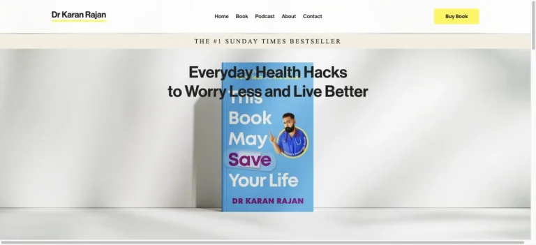
A bright book-led homepage pairs a spare navigation bar with centered bold text and a prominently displayed cover.
Useful for: A science creator website; study its opening composition, identity, and paths into the creator’s work.
# Design reference: Dr Karan Rajan
Source: https://www.drkaranrajan.com/
Swipefile reference: https://swipefile.design/ref/youtube-dr-karan-rajan/
Captured: 2026-09-08. This is a dated reference, not a claim about the current live product.
Capture scope: one viewport. Do not infer unseen page sections or a complete user flow.

## Objective
Adapt the visual principles below to my project. Use my own content and identity. Do not reproduce logos, proprietary copy, or brand assets.

## Reference notes
- mood: Clear and approachable.
- colors: White, light gray, yellow, and cover blue.
- typography: The captured page uses neue-haas-grotesk-display. Keep a clear contrast between the main statement and the smaller navigation.
- layout: A bright book-led homepage pairs a spare navigation bar with centered bold text and a prominently displayed cover.
- motion: Static viewport capture. Inspect the source website to assess animation, video, and reduced-motion behavior.
- texture: Keep surfaces restrained so the typography and content stay prominent.
- dont: Do not reproduce the creator’s identity, claims, copy, or artwork in a new brand.

Useful for: A science creator website; study its opening composition, identity, and paths into the creator’s work.

## Acceptance criteria
- Existing project conventions, design tokens, working functionality, and unrelated changes are preserved.
- Two or three reference principles clearly support the user's task; conflicts are resolved in favor of usability and the existing product.
- Reusable components and semantic HTML express the interface. Available licensed assets are used; important UI text is never rendered as a bitmap.
- Every visible control has a defined behavior. Loading, empty, error, success, disabled, and long-content states are specified where relevant. Demo data is clearly labeled.
- Navigation and content adapt at 375px, 768px, and 1440px without horizontal page overflow. Keyboard use, visible focus, labeled inputs, at least 44px touch targets, readable contrast, and reduced motion are supported.
- Verification distinguishes rendered behavior from proposals and identifies anything still requiring a backend or external service.

## Quality bar
Clear hierarchy, consistent spacing, restrained surfaces, and purposeful motion. Avoid decorative gradients, excessive cards, placeholder buttons, and invented metrics unless the project calls for them. Do not claim a feature is connected or tested without evidence.
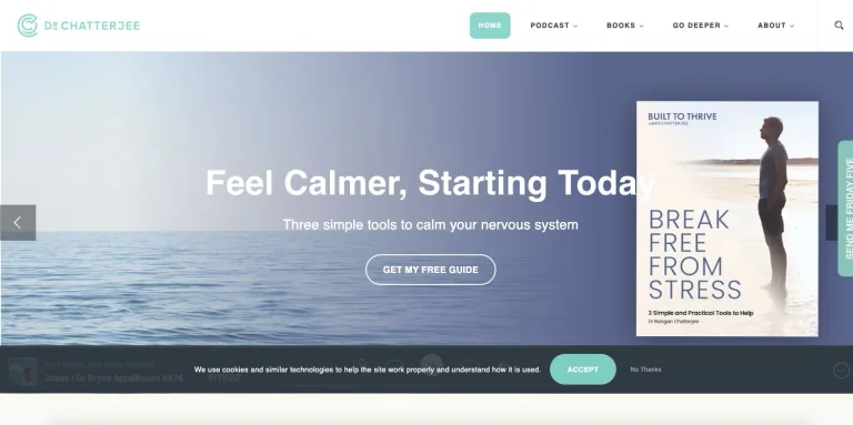
A landscape-backed wellness hero brings together a short promise, a prominent guide cover, and a centered action below compact navigation.
Useful for: A wellness creator website; study its opening composition, identity, and paths into the creator’s work.
# Design reference: Dr Rangan Chatterjee
Source: https://drchatterjee.com/
Swipefile reference: https://swipefile.design/ref/youtube-dr-rangan-chatterjee/
Captured: 2026-09-08. This is a dated reference, not a claim about the current live product.
Capture scope: one viewport. Do not infer unseen page sections or a complete user flow.

## Objective
Adapt the visual principles below to my project. Use my own content and identity. Do not reproduce logos, proprietary copy, or brand assets.

## Reference notes
- mood: Calm and reassuring.
- colors: Ocean blue, muted violet, white, and mint.
- typography: The captured page uses Helvetica. Keep a clear contrast between the main statement and the smaller navigation.
- layout: A landscape-backed wellness hero brings together a short promise, a prominent guide cover, and a centered action below compact navigation.
- motion: Static viewport capture. Inspect the source website to assess animation, video, and reduced-motion behavior.
- texture: Let the original photographic or video imagery carry the visual detail.
- dont: Do not reproduce the creator’s identity, claims, copy, or artwork in a new brand.

Useful for: A wellness creator website; study its opening composition, identity, and paths into the creator’s work.

## Acceptance criteria
- Existing project conventions, design tokens, working functionality, and unrelated changes are preserved.
- Two or three reference principles clearly support the user's task; conflicts are resolved in favor of usability and the existing product.
- Reusable components and semantic HTML express the interface. Available licensed assets are used; important UI text is never rendered as a bitmap.
- Every visible control has a defined behavior. Loading, empty, error, success, disabled, and long-content states are specified where relevant. Demo data is clearly labeled.
- Navigation and content adapt at 375px, 768px, and 1440px without horizontal page overflow. Keyboard use, visible focus, labeled inputs, at least 44px touch targets, readable contrast, and reduced motion are supported.
- Verification distinguishes rendered behavior from proposals and identifies anything still requiring a backend or external service.

## Quality bar
Clear hierarchy, consistent spacing, restrained surfaces, and purposeful motion. Avoid decorative gradients, excessive cards, placeholder buttons, and invented metrics unless the project calls for them. Do not claim a feature is connected or tested without evidence.
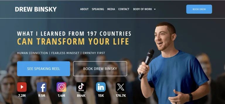
A speaking-site hero pairs a large creator portrait with condensed positioning, contrasting action buttons, and an immediately visible social row.
Useful for: A travel creator website; study its opening composition, identity, and paths into the creator’s work.
# Design reference: Drew Binsky
Source: https://drewbinsky.com/
Swipefile reference: https://swipefile.design/ref/youtube-drew-binsky/
Captured: 2026-09-08. This is a dated reference, not a claim about the current live product.
Capture scope: one viewport. Do not infer unseen page sections or a complete user flow.

## Objective
Adapt the visual principles below to my project. Use my own content and identity. Do not reproduce logos, proprietary copy, or brand assets.

## Reference notes
- mood: Energetic and direct.
- colors: Slate blue, white, yellow, and bright blue.
- typography: The captured page uses Open Sans Hebrew Condensed and Fira Sans. Keep a clear contrast between the main statement and the smaller navigation.
- layout: A speaking-site hero pairs a large creator portrait with condensed positioning, contrasting action buttons, and an immediately visible social row.
- motion: Static viewport capture. Inspect the source website to assess animation, video, and reduced-motion behavior.
- texture: Let the original photographic or video imagery carry the visual detail.
- dont: Do not reproduce the creator’s identity, claims, copy, or artwork in a new brand.

Useful for: A travel creator website; study its opening composition, identity, and paths into the creator’s work.

## Acceptance criteria
- Existing project conventions, design tokens, working functionality, and unrelated changes are preserved.
- Two or three reference principles clearly support the user's task; conflicts are resolved in favor of usability and the existing product.
- Reusable components and semantic HTML express the interface. Available licensed assets are used; important UI text is never rendered as a bitmap.
- Every visible control has a defined behavior. Loading, empty, error, success, disabled, and long-content states are specified where relevant. Demo data is clearly labeled.
- Navigation and content adapt at 375px, 768px, and 1440px without horizontal page overflow. Keyboard use, visible focus, labeled inputs, at least 44px touch targets, readable contrast, and reduced motion are supported.
- Verification distinguishes rendered behavior from proposals and identifies anything still requiring a backend or external service.

## Quality bar
Clear hierarchy, consistent spacing, restrained surfaces, and purposeful motion. Avoid decorative gradients, excessive cards, placeholder buttons, and invented metrics unless the project calls for them. Do not claim a feature is connected or tested without evidence.
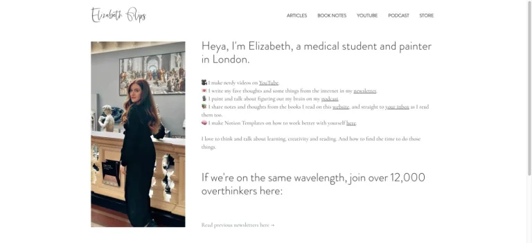
A handwritten wordmark and narrow navigation row lead to a small portrait beside a personal introduction, resource links, and newsletter copy.
Useful for: A productivity creator website; study its opening composition, identity, and paths into the creator’s work.
# Design reference: Elizabeth Filips
Source: https://www.elizabethfilips.com/
Swipefile reference: https://swipefile.design/ref/youtube-elizabeth-filips/
Captured: 2026-09-08. This is a dated reference, not a claim about the current live product.
Capture scope: one viewport. Do not infer unseen page sections or a complete user flow.

## Objective
Adapt the visual principles below to my project. Use my own content and identity. Do not reproduce logos, proprietary copy, or brand assets.

## Reference notes
- mood: Intimate and restrained.
- colors: White, soft gray, and natural photography.
- typography: Use the hierarchy visible in the capture: one main statement and a restrained secondary navigation.
- layout: A handwritten wordmark and narrow navigation row lead to a small portrait beside a personal introduction, resource links, and newsletter copy.
- motion: Static viewport capture. Inspect the source website to assess animation, video, and reduced-motion behavior.
- texture: Let the original photographic or video imagery carry the visual detail.
- dont: Do not reproduce the creator’s identity, claims, copy, or artwork in a new brand.

Useful for: A productivity creator website; study its opening composition, identity, and paths into the creator’s work.

## Acceptance criteria
- Existing project conventions, design tokens, working functionality, and unrelated changes are preserved.
- Two or three reference principles clearly support the user's task; conflicts are resolved in favor of usability and the existing product.
- Reusable components and semantic HTML express the interface. Available licensed assets are used; important UI text is never rendered as a bitmap.
- Every visible control has a defined behavior. Loading, empty, error, success, disabled, and long-content states are specified where relevant. Demo data is clearly labeled.
- Navigation and content adapt at 375px, 768px, and 1440px without horizontal page overflow. Keyboard use, visible focus, labeled inputs, at least 44px touch targets, readable contrast, and reduced motion are supported.
- Verification distinguishes rendered behavior from proposals and identifies anything still requiring a backend or external service.

## Quality bar
Clear hierarchy, consistent spacing, restrained surfaces, and purposeful motion. Avoid decorative gradients, excessive cards, placeholder buttons, and invented metrics unless the project calls for them. Do not claim a feature is connected or tested without evidence.
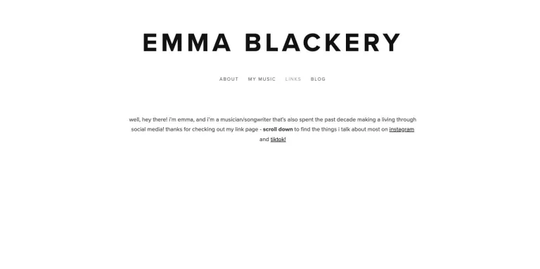
An oversized uppercase name anchors a very sparse white homepage, with small navigation and a short personal introduction.
Useful for: A music creator website; study its opening composition, identity, and paths into the creator’s work.
# Design reference: Emma Blackery
Source: https://www.emmablackery.com/
Swipefile reference: https://swipefile.design/ref/youtube-emma-blackery/
Captured: 2026-09-08. This is a dated reference, not a claim about the current live product.
Capture scope: one viewport. Do not infer unseen page sections or a complete user flow.

## Objective
Adapt the visual principles below to my project. Use my own content and identity. Do not reproduce logos, proprietary copy, or brand assets.

## Reference notes
- mood: Minimal and typographic.
- colors: White and black.
- typography: The captured page uses proxima-nova. Keep a clear contrast between the main statement and the smaller navigation.
- layout: An oversized uppercase name anchors a very sparse white homepage, with small navigation and a short personal introduction.
- motion: Static viewport capture. Inspect the source website to assess animation, video, and reduced-motion behavior.
- texture: Keep surfaces restrained so the typography and content stay prominent.
- dont: Do not reproduce the creator’s identity, claims, copy, or artwork in a new brand.

Useful for: A music creator website; study its opening composition, identity, and paths into the creator’s work.

## Acceptance criteria
- Existing project conventions, design tokens, working functionality, and unrelated changes are preserved.
- Two or three reference principles clearly support the user's task; conflicts are resolved in favor of usability and the existing product.
- Reusable components and semantic HTML express the interface. Available licensed assets are used; important UI text is never rendered as a bitmap.
- Every visible control has a defined behavior. Loading, empty, error, success, disabled, and long-content states are specified where relevant. Demo data is clearly labeled.
- Navigation and content adapt at 375px, 768px, and 1440px without horizontal page overflow. Keyboard use, visible focus, labeled inputs, at least 44px touch targets, readable contrast, and reduced motion are supported.
- Verification distinguishes rendered behavior from proposals and identifies anything still requiring a backend or external service.

## Quality bar
Clear hierarchy, consistent spacing, restrained surfaces, and purposeful motion. Avoid decorative gradients, excessive cards, placeholder buttons, and invented metrics unless the project calls for them. Do not claim a feature is connected or tested without evidence.
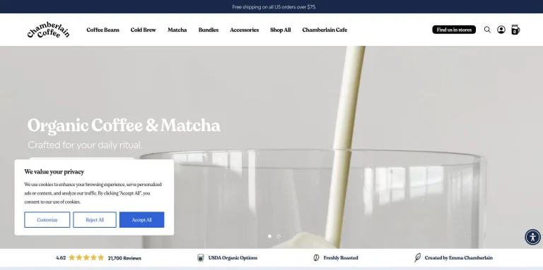
A slim store header and handwritten coffee identity lead to a soft product photograph with a short white headline.
Useful for: A lifestyle creator website; study its opening composition, identity, and paths into the creator’s work.
# Design reference: Emma Chamberlain
Source: https://chamberlaincoffee.com/
Swipefile reference: https://swipefile.design/ref/youtube-emma-chamberlain/
Captured: 2026-09-08. This is a dated reference, not a claim about the current live product.
Capture scope: one viewport. Do not infer unseen page sections or a complete user flow.

## Objective
Adapt the visual principles below to my project. Use my own content and identity. Do not reproduce logos, proprietary copy, or brand assets.

## Reference notes
- mood: Soft and product-focused.
- colors: Cream, muted green, white, and espresso tones.
- typography: Use the hierarchy visible in the capture: one main statement and a restrained secondary navigation.
- layout: A slim store header and handwritten coffee identity lead to a soft product photograph with a short white headline.
- motion: Static viewport capture. Inspect the source website to assess animation, video, and reduced-motion behavior.
- texture: Let the original photographic or video imagery carry the visual detail.
- dont: Do not reproduce the creator’s identity, claims, copy, or artwork in a new brand.

Useful for: A lifestyle creator website; study its opening composition, identity, and paths into the creator’s work.

## Acceptance criteria
- Existing project conventions, design tokens, working functionality, and unrelated changes are preserved.
- Two or three reference principles clearly support the user's task; conflicts are resolved in favor of usability and the existing product.
- Reusable components and semantic HTML express the interface. Available licensed assets are used; important UI text is never rendered as a bitmap.
- Every visible control has a defined behavior. Loading, empty, error, success, disabled, and long-content states are specified where relevant. Demo data is clearly labeled.
- Navigation and content adapt at 375px, 768px, and 1440px without horizontal page overflow. Keyboard use, visible focus, labeled inputs, at least 44px touch targets, readable contrast, and reduced motion are supported.
- Verification distinguishes rendered behavior from proposals and identifies anything still requiring a backend or external service.

## Quality bar
Clear hierarchy, consistent spacing, restrained surfaces, and purposeful motion. Avoid decorative gradients, excessive cards, placeholder buttons, and invented metrics unless the project calls for them. Do not claim a feature is connected or tested without evidence.
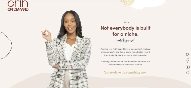
A cream editorial hero pairs a cutout portrait with a short conversational statement, decorative linework, and vertically arranged social links.
Useful for: A business creator website; study its opening composition, identity, and paths into the creator’s work.
# Design reference: Erin On Demand
Source: https://erinondemand.com/
Swipefile reference: https://swipefile.design/ref/youtube-erin-on-demand/
Captured: 2026-09-08. This is a dated reference, not a claim about the current live product.
Capture scope: one viewport. Do not infer unseen page sections or a complete user flow.

## Objective
Adapt the visual principles below to my project. Use my own content and identity. Do not reproduce logos, proprietary copy, or brand assets.

## Reference notes
- mood: Warm and personable.
- colors: Cream, rust, black, and muted gold.
- typography: The captured page uses Sofia Pro Medium and Boulders Beach Script and Oswald. Keep a clear contrast between the main statement and the smaller navigation.
- layout: A cream editorial hero pairs a cutout portrait with a short conversational statement, decorative linework, and vertically arranged social links.
- motion: Static viewport capture. Inspect the source website to assess animation, video, and reduced-motion behavior.
- texture: Let the original photographic or video imagery carry the visual detail.
- dont: Do not reproduce the creator’s identity, claims, copy, or artwork in a new brand.

Useful for: A business creator website; study its opening composition, identity, and paths into the creator’s work.

## Acceptance criteria
- Existing project conventions, design tokens, working functionality, and unrelated changes are preserved.
- Two or three reference principles clearly support the user's task; conflicts are resolved in favor of usability and the existing product.
- Reusable components and semantic HTML express the interface. Available licensed assets are used; important UI text is never rendered as a bitmap.
- Every visible control has a defined behavior. Loading, empty, error, success, disabled, and long-content states are specified where relevant. Demo data is clearly labeled.
- Navigation and content adapt at 375px, 768px, and 1440px without horizontal page overflow. Keyboard use, visible focus, labeled inputs, at least 44px touch targets, readable contrast, and reduced motion are supported.
- Verification distinguishes rendered behavior from proposals and identifies anything still requiring a backend or external service.

## Quality bar
Clear hierarchy, consistent spacing, restrained surfaces, and purposeful motion. Avoid decorative gradients, excessive cards, placeholder buttons, and invented metrics unless the project calls for them. Do not claim a feature is connected or tested without evidence.
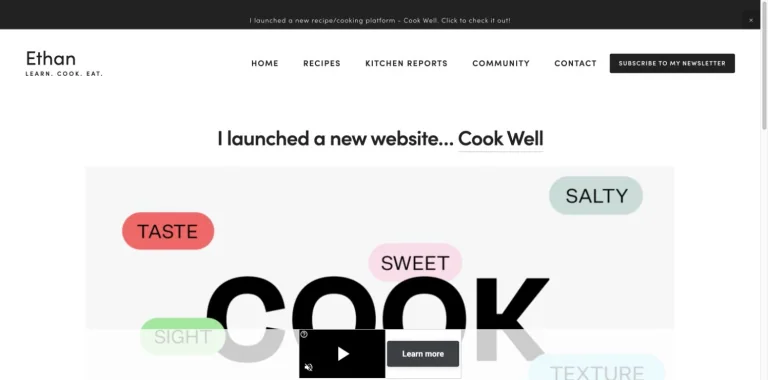
A small editorial header introduces a new cooking platform through a large typographic preview and a concise announcement above it.
Useful for: A food creator website; study its opening composition, identity, and paths into the creator’s work.
# Design reference: Ethan Chlebowski
Source: https://www.ethanchlebowski.com/
Swipefile reference: https://swipefile.design/ref/youtube-ethan-chlebowski/
Captured: 2026-09-08. This is a dated reference, not a claim about the current live product.
Capture scope: one viewport. Do not infer unseen page sections or a complete user flow.

## Objective
Adapt the visual principles below to my project. Use my own content and identity. Do not reproduce logos, proprietary copy, or brand assets.

## Reference notes
- mood: Clear and content-led.
- colors: White, black, and pastel label colors.
- typography: Use the hierarchy visible in the capture: one main statement and a restrained secondary navigation.
- layout: A small editorial header introduces a new cooking platform through a large typographic preview and a concise announcement above it.
- motion: Static viewport capture. Inspect the source website to assess animation, video, and reduced-motion behavior.
- texture: Keep surfaces restrained so the typography and content stay prominent.
- dont: Do not reproduce the creator’s identity, claims, copy, or artwork in a new brand.

Useful for: A food creator website; study its opening composition, identity, and paths into the creator’s work.

## Acceptance criteria
- Existing project conventions, design tokens, working functionality, and unrelated changes are preserved.
- Two or three reference principles clearly support the user's task; conflicts are resolved in favor of usability and the existing product.
- Reusable components and semantic HTML express the interface. Available licensed assets are used; important UI text is never rendered as a bitmap.
- Every visible control has a defined behavior. Loading, empty, error, success, disabled, and long-content states are specified where relevant. Demo data is clearly labeled.
- Navigation and content adapt at 375px, 768px, and 1440px without horizontal page overflow. Keyboard use, visible focus, labeled inputs, at least 44px touch targets, readable contrast, and reduced motion are supported.
- Verification distinguishes rendered behavior from proposals and identifies anything still requiring a backend or external service.

## Quality bar
Clear hierarchy, consistent spacing, restrained surfaces, and purposeful motion. Avoid decorative gradients, excessive cards, placeholder buttons, and invented metrics unless the project calls for them. Do not claim a feature is connected or tested without evidence.
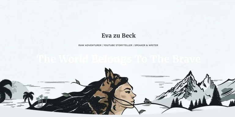
An illustrated mountain journey sets the scene beneath a centered creator name and adventurous positioning.
Useful for: A travel creator website; study its opening composition, identity, and paths into the creator’s work.
# Design reference: Eva zu Beck
Source: https://www.evazubeck.com/
Swipefile reference: https://swipefile.design/ref/youtube-eva-zu-beck/
Captured: 2026-09-08. This is a dated reference, not a claim about the current live product.
Capture scope: one viewport. Do not infer unseen page sections or a complete user flow.

## Objective
Adapt the visual principles below to my project. Use my own content and identity. Do not reproduce logos, proprietary copy, or brand assets.

## Reference notes
- mood: Adventurous and illustrated.
- colors: Icy blue, white, charcoal, and muted earth tones.
- typography: The captured page uses Merriweather. Keep a clear contrast between the main statement and the smaller navigation.
- layout: An illustrated mountain journey sets the scene beneath a centered creator name and adventurous positioning.
- motion: Static viewport capture. Inspect the source website to assess animation, video, and reduced-motion behavior.
- texture: Graphic illustration and shape provide the visual detail.
- dont: Do not reproduce the creator’s identity, claims, copy, or artwork in a new brand.

Useful for: A travel creator website; study its opening composition, identity, and paths into the creator’s work.

## Acceptance criteria
- Existing project conventions, design tokens, working functionality, and unrelated changes are preserved.
- Two or three reference principles clearly support the user's task; conflicts are resolved in favor of usability and the existing product.
- Reusable components and semantic HTML express the interface. Available licensed assets are used; important UI text is never rendered as a bitmap.
- Every visible control has a defined behavior. Loading, empty, error, success, disabled, and long-content states are specified where relevant. Demo data is clearly labeled.
- Navigation and content adapt at 375px, 768px, and 1440px without horizontal page overflow. Keyboard use, visible focus, labeled inputs, at least 44px touch targets, readable contrast, and reduced motion are supported.
- Verification distinguishes rendered behavior from proposals and identifies anything still requiring a backend or external service.

## Quality bar
Clear hierarchy, consistent spacing, restrained surfaces, and purposeful motion. Avoid decorative gradients, excessive cards, placeholder buttons, and invented metrics unless the project calls for them. Do not claim a feature is connected or tested without evidence.
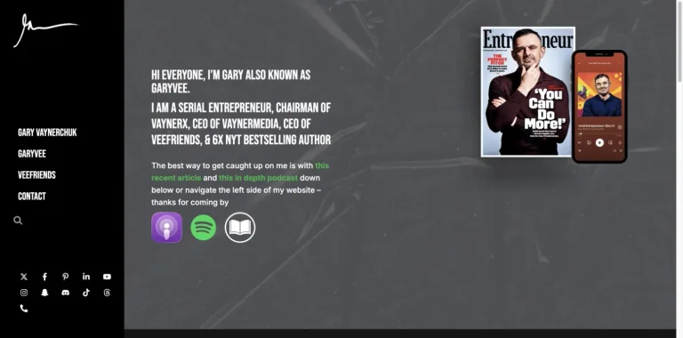
A fixed black side navigation supports a dark introduction with condensed text, a book-and-phone composition, and podcast platform icons.
Useful for: A business creator website; study its opening composition, identity, and paths into the creator’s work.
# Design reference: Gary Vaynerchuk
Source: https://garyvaynerchuk.com/
Swipefile reference: https://swipefile.design/ref/youtube-gary-vaynerchuk/
Captured: 2026-09-08. This is a dated reference, not a claim about the current live product.
Capture scope: one viewport. Do not infer unseen page sections or a complete user flow.

## Objective
Adapt the visual principles below to my project. Use my own content and identity. Do not reproduce logos, proprietary copy, or brand assets.

## Reference notes
- mood: Dense and media-oriented.
- colors: Black, graphite, white, and small green accents.
- typography: The captured page uses Bebas Neue. Keep a clear contrast between the main statement and the smaller navigation.
- layout: A fixed black side navigation supports a dark introduction with condensed text, a book-and-phone composition, and podcast platform icons.
- motion: Static viewport capture. Inspect the source website to assess animation, video, and reduced-motion behavior.
- texture: Keep surfaces restrained so the typography and content stay prominent.
- dont: Do not reproduce the creator’s identity, claims, copy, or artwork in a new brand.

Useful for: A business creator website; study its opening composition, identity, and paths into the creator’s work.

## Acceptance criteria
- Existing project conventions, design tokens, working functionality, and unrelated changes are preserved.
- Two or three reference principles clearly support the user's task; conflicts are resolved in favor of usability and the existing product.
- Reusable components and semantic HTML express the interface. Available licensed assets are used; important UI text is never rendered as a bitmap.
- Every visible control has a defined behavior. Loading, empty, error, success, disabled, and long-content states are specified where relevant. Demo data is clearly labeled.
- Navigation and content adapt at 375px, 768px, and 1440px without horizontal page overflow. Keyboard use, visible focus, labeled inputs, at least 44px touch targets, readable contrast, and reduced motion are supported.
- Verification distinguishes rendered behavior from proposals and identifies anything still requiring a backend or external service.

## Quality bar
Clear hierarchy, consistent spacing, restrained surfaces, and purposeful motion. Avoid decorative gradients, excessive cards, placeholder buttons, and invented metrics unless the project calls for them. Do not claim a feature is connected or tested without evidence.
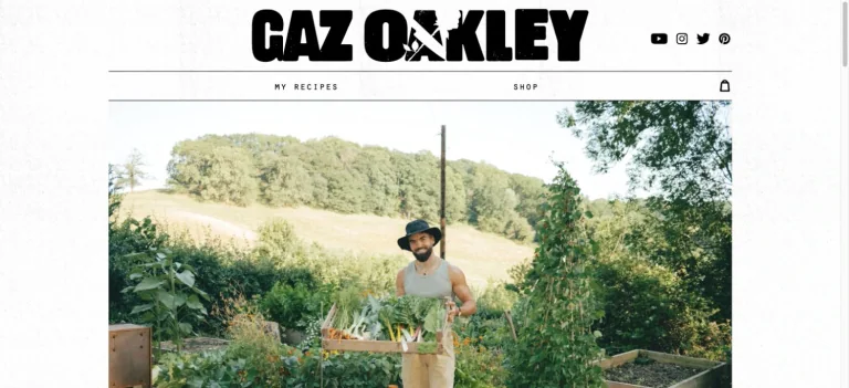
A bold custom wordmark, fine rules, and compact navigation frame natural cooking and garden imagery.
Useful for: A food creator website; study its opening composition, identity, and paths into the creator’s work.
# Design reference: Gaz Oakley
Source: https://www.gazoakleychef.com/
Swipefile reference: https://swipefile.design/ref/youtube-gaz-oakley/
Captured: 2026-09-08. This is a dated reference, not a claim about the current live product.
Capture scope: one viewport. Do not infer unseen page sections or a complete user flow.

## Objective
Adapt the visual principles below to my project. Use my own content and identity. Do not reproduce logos, proprietary copy, or brand assets.

## Reference notes
- mood: Rustic and graphic.
- colors: Black, white, and natural green.
- typography: The captured page uses anton. Keep a clear contrast between the main statement and the smaller navigation.
- layout: A bold custom wordmark, fine rules, and compact navigation frame natural cooking and garden imagery.
- motion: Static viewport capture. Inspect the source website to assess animation, video, and reduced-motion behavior.
- texture: Keep surfaces restrained so the typography and content stay prominent.
- dont: Do not reproduce the creator’s identity, claims, copy, or artwork in a new brand.

Useful for: A food creator website; study its opening composition, identity, and paths into the creator’s work.

## Acceptance criteria
- Existing project conventions, design tokens, working functionality, and unrelated changes are preserved.
- Two or three reference principles clearly support the user's task; conflicts are resolved in favor of usability and the existing product.
- Reusable components and semantic HTML express the interface. Available licensed assets are used; important UI text is never rendered as a bitmap.
- Every visible control has a defined behavior. Loading, empty, error, success, disabled, and long-content states are specified where relevant. Demo data is clearly labeled.
- Navigation and content adapt at 375px, 768px, and 1440px without horizontal page overflow. Keyboard use, visible focus, labeled inputs, at least 44px touch targets, readable contrast, and reduced motion are supported.
- Verification distinguishes rendered behavior from proposals and identifies anything still requiring a backend or external service.

## Quality bar
Clear hierarchy, consistent spacing, restrained surfaces, and purposeful motion. Avoid decorative gradients, excessive cards, placeholder buttons, and invented metrics unless the project calls for them. Do not claim a feature is connected or tested without evidence.
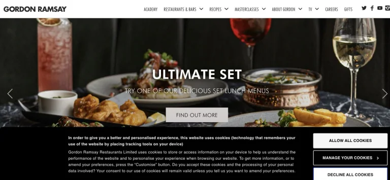
A compact white navigation bar leads to a full-width food photograph with centered promotional text and a single light action.
Useful for: A food creator website; study its opening composition, identity, and paths into the creator’s work.
# Design reference: Gordon Ramsay
Source: https://www.gordonramsay.com/
Swipefile reference: https://swipefile.design/ref/youtube-gordon-ramsay/
Captured: 2026-09-08. This is a dated reference, not a claim about the current live product.
Capture scope: one viewport. Do not infer unseen page sections or a complete user flow.

## Objective
Adapt the visual principles below to my project. Use my own content and identity. Do not reproduce logos, proprietary copy, or brand assets.

## Reference notes
- mood: Polished and commercial.
- colors: Black, white, and rich food photography.
- typography: The captured page uses BT Futura W01. Keep a clear contrast between the main statement and the smaller navigation.
- layout: A compact white navigation bar leads to a full-width food photograph with centered promotional text and a single light action.
- motion: Static viewport capture. Inspect the source website to assess animation, video, and reduced-motion behavior.
- texture: Let the original photographic or video imagery carry the visual detail.
- dont: Do not reproduce the creator’s identity, claims, copy, or artwork in a new brand.

Useful for: A food creator website; study its opening composition, identity, and paths into the creator’s work.

## Acceptance criteria
- Existing project conventions, design tokens, working functionality, and unrelated changes are preserved.
- Two or three reference principles clearly support the user's task; conflicts are resolved in favor of usability and the existing product.
- Reusable components and semantic HTML express the interface. Available licensed assets are used; important UI text is never rendered as a bitmap.
- Every visible control has a defined behavior. Loading, empty, error, success, disabled, and long-content states are specified where relevant. Demo data is clearly labeled.
- Navigation and content adapt at 375px, 768px, and 1440px without horizontal page overflow. Keyboard use, visible focus, labeled inputs, at least 44px touch targets, readable contrast, and reduced motion are supported.
- Verification distinguishes rendered behavior from proposals and identifies anything still requiring a backend or external service.

## Quality bar
Clear hierarchy, consistent spacing, restrained surfaces, and purposeful motion. Avoid decorative gradients, excessive cards, placeholder buttons, and invented metrics unless the project calls for them. Do not claim a feature is connected or tested without evidence.
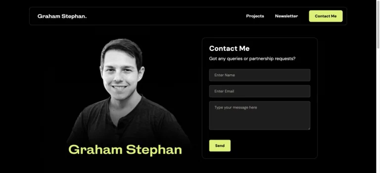
A dark personal homepage combines a monochrome portrait, vivid accent lettering, and a compact contact form in the opening view.
Useful for: A finance creator website; study its opening composition, identity, and paths into the creator’s work.
# Design reference: Graham Stephan
Source: https://www.grahamstephan.com/
Swipefile reference: https://swipefile.design/ref/youtube-graham-stephan/
Captured: 2026-09-08. This is a dated reference, not a claim about the current live product.
Capture scope: one viewport. Do not infer unseen page sections or a complete user flow.

## Objective
Adapt the visual principles below to my project. Use my own content and identity. Do not reproduce logos, proprietary copy, or brand assets.

## Reference notes
- mood: Direct and high-contrast.
- colors: Black, charcoal, white, and lime.
- typography: The captured page uses __hkGothic_4901a2 and __DM_Sans_05e5f9. Keep a clear contrast between the main statement and the smaller navigation.
- layout: A dark personal homepage combines a monochrome portrait, vivid accent lettering, and a compact contact form in the opening view.
- motion: Static viewport capture. Inspect the source website to assess animation, video, and reduced-motion behavior.
- texture: Let the original photographic or video imagery carry the visual detail.
- dont: Do not reproduce the creator’s identity, claims, copy, or artwork in a new brand.

Useful for: A finance creator website; study its opening composition, identity, and paths into the creator’s work.

## Acceptance criteria
- Existing project conventions, design tokens, working functionality, and unrelated changes are preserved.
- Two or three reference principles clearly support the user's task; conflicts are resolved in favor of usability and the existing product.
- Reusable components and semantic HTML express the interface. Available licensed assets are used; important UI text is never rendered as a bitmap.
- Every visible control has a defined behavior. Loading, empty, error, success, disabled, and long-content states are specified where relevant. Demo data is clearly labeled.
- Navigation and content adapt at 375px, 768px, and 1440px without horizontal page overflow. Keyboard use, visible focus, labeled inputs, at least 44px touch targets, readable contrast, and reduced motion are supported.
- Verification distinguishes rendered behavior from proposals and identifies anything still requiring a backend or external service.

## Quality bar
Clear hierarchy, consistent spacing, restrained surfaces, and purposeful motion. Avoid decorative gradients, excessive cards, placeholder buttons, and invented metrics unless the project calls for them. Do not claim a feature is connected or tested without evidence.
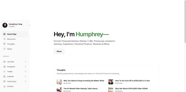
A slim left sidebar organizes a white personal site with a short introduction, a small biography action, and an article preview list.
Useful for: A finance creator website; study its opening composition, identity, and paths into the creator’s work.
# Design reference: Humphrey Yang
Source: https://www.humphreytalks.com/
Swipefile reference: https://swipefile.design/ref/youtube-humphrey-yang/
Captured: 2026-09-08. This is a dated reference, not a claim about the current live product.
Capture scope: one viewport. Do not infer unseen page sections or a complete user flow.

## Objective
Adapt the visual principles below to my project. Use my own content and identity. Do not reproduce logos, proprietary copy, or brand assets.

## Reference notes
- mood: Simple and navigable.
- colors: White, light gray, black, and green.
- typography: The captured page uses Inter and Inter-SemiBold. Keep a clear contrast between the main statement and the smaller navigation.
- layout: A slim left sidebar organizes a white personal site with a short introduction, a small biography action, and an article preview list.
- motion: Static viewport capture. Inspect the source website to assess animation, video, and reduced-motion behavior.
- texture: Keep surfaces restrained so the typography and content stay prominent.
- dont: Do not reproduce the creator’s identity, claims, copy, or artwork in a new brand.

Useful for: A finance creator website; study its opening composition, identity, and paths into the creator’s work.

## Acceptance criteria
- Existing project conventions, design tokens, working functionality, and unrelated changes are preserved.
- Two or three reference principles clearly support the user's task; conflicts are resolved in favor of usability and the existing product.
- Reusable components and semantic HTML express the interface. Available licensed assets are used; important UI text is never rendered as a bitmap.
- Every visible control has a defined behavior. Loading, empty, error, success, disabled, and long-content states are specified where relevant. Demo data is clearly labeled.
- Navigation and content adapt at 375px, 768px, and 1440px without horizontal page overflow. Keyboard use, visible focus, labeled inputs, at least 44px touch targets, readable contrast, and reduced motion are supported.
- Verification distinguishes rendered behavior from proposals and identifies anything still requiring a backend or external service.

## Quality bar
Clear hierarchy, consistent spacing, restrained surfaces, and purposeful motion. Avoid decorative gradients, excessive cards, placeholder buttons, and invented metrics unless the project calls for them. Do not claim a feature is connected or tested without evidence.
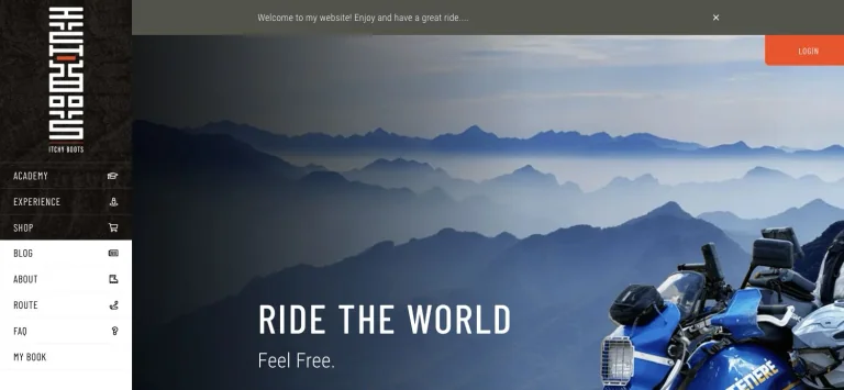
A tall dark sidebar and vertical wordmark frame a mountain-and-motorcycle hero, keeping travel imagery central to the page.
Useful for: A travel creator website; study its opening composition, identity, and paths into the creator’s work.
# Design reference: Itchy Boots — Noraly Schoenmaker
Source: https://www.itchyboots.com/
Swipefile reference: https://swipefile.design/ref/youtube-itchy-boots/
Captured: 2026-09-08. This is a dated reference, not a claim about the current live product.
Capture scope: one viewport. Do not infer unseen page sections or a complete user flow.

## Objective
Adapt the visual principles below to my project. Use my own content and identity. Do not reproduce logos, proprietary copy, or brand assets.

## Reference notes
- mood: Expansive and adventurous.
- colors: Charcoal, misty blue, white, and orange.
- typography: The captured page uses Barlow Condensed and Roboto Condensed. Keep a clear contrast between the main statement and the smaller navigation.
- layout: A tall dark sidebar and vertical wordmark frame a mountain-and-motorcycle hero, keeping travel imagery central to the page.
- motion: Static viewport capture. Inspect the source website to assess animation, video, and reduced-motion behavior.
- texture: Keep surfaces restrained so the typography and content stay prominent.
- dont: Do not reproduce the creator’s identity, claims, copy, or artwork in a new brand.

Useful for: A travel creator website; study its opening composition, identity, and paths into the creator’s work.

## Acceptance criteria
- Existing project conventions, design tokens, working functionality, and unrelated changes are preserved.
- Two or three reference principles clearly support the user's task; conflicts are resolved in favor of usability and the existing product.
- Reusable components and semantic HTML express the interface. Available licensed assets are used; important UI text is never rendered as a bitmap.
- Every visible control has a defined behavior. Loading, empty, error, success, disabled, and long-content states are specified where relevant. Demo data is clearly labeled.
- Navigation and content adapt at 375px, 768px, and 1440px without horizontal page overflow. Keyboard use, visible focus, labeled inputs, at least 44px touch targets, readable contrast, and reduced motion are supported.
- Verification distinguishes rendered behavior from proposals and identifies anything still requiring a backend or external service.

## Quality bar
Clear hierarchy, consistent spacing, restrained surfaces, and purposeful motion. Avoid decorative gradients, excessive cards, placeholder buttons, and invented metrics unless the project calls for them. Do not claim a feature is connected or tested without evidence.
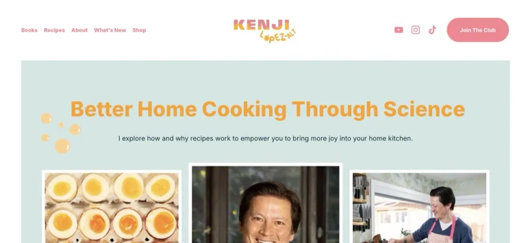
A playful centered wordmark and pastel navigation introduce a pale green cooking headline above a mix of food and creator imagery.
Useful for: A food creator website; study its opening composition, identity, and paths into the creator’s work.
# Design reference: J. Kenji López-Alt
Source: https://www.kenjilopezalt.com/
Swipefile reference: https://swipefile.design/ref/youtube-j-kenji-lopez-alt/
Captured: 2026-09-08. This is a dated reference, not a claim about the current live product.
Capture scope: one viewport. Do not infer unseen page sections or a complete user flow.

## Objective
Adapt the visual principles below to my project. Use my own content and identity. Do not reproduce logos, proprietary copy, or brand assets.

## Reference notes
- mood: Friendly and editorial.
- colors: Pale green, coral pink, orange, and white.
- typography: The captured page uses Inter. Keep a clear contrast between the main statement and the smaller navigation.
- layout: A playful centered wordmark and pastel navigation introduce a pale green cooking headline above a mix of food and creator imagery.
- motion: Static viewport capture. Inspect the source website to assess animation, video, and reduced-motion behavior.
- texture: Let the original photographic or video imagery carry the visual detail.
- dont: Do not reproduce the creator’s identity, claims, copy, or artwork in a new brand.

Useful for: A food creator website; study its opening composition, identity, and paths into the creator’s work.

## Acceptance criteria
- Existing project conventions, design tokens, working functionality, and unrelated changes are preserved.
- Two or three reference principles clearly support the user's task; conflicts are resolved in favor of usability and the existing product.
- Reusable components and semantic HTML express the interface. Available licensed assets are used; important UI text is never rendered as a bitmap.
- Every visible control has a defined behavior. Loading, empty, error, success, disabled, and long-content states are specified where relevant. Demo data is clearly labeled.
- Navigation and content adapt at 375px, 768px, and 1440px without horizontal page overflow. Keyboard use, visible focus, labeled inputs, at least 44px touch targets, readable contrast, and reduced motion are supported.
- Verification distinguishes rendered behavior from proposals and identifies anything still requiring a backend or external service.

## Quality bar
Clear hierarchy, consistent spacing, restrained surfaces, and purposeful motion. Avoid decorative gradients, excessive cards, placeholder buttons, and invented metrics unless the project calls for them. Do not claim a feature is connected or tested without evidence.
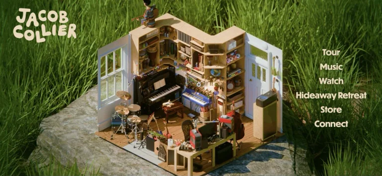
A miniature room set into grass forms the entire visual premise, with a loose organic wordmark and large right-aligned navigation.
Useful for: A music creator website; study its opening composition, identity, and paths into the creator’s work.
# Design reference: Jacob Collier
Source: https://www.jacobcollier.com/
Swipefile reference: https://swipefile.design/ref/youtube-jacob-collier/
Captured: 2026-09-08. This is a dated reference, not a claim about the current live product.
Capture scope: one viewport. Do not infer unseen page sections or a complete user flow.

## Objective
Adapt the visual principles below to my project. Use my own content and identity. Do not reproduce logos, proprietary copy, or brand assets.

## Reference notes
- mood: Whimsical and immersive.
- colors: Leaf green, warm wood, cream, and small colorful details.
- typography: The captured page uses Overpass. Keep a clear contrast between the main statement and the smaller navigation.
- layout: A miniature room set into grass forms the entire visual premise, with a loose organic wordmark and large right-aligned navigation.
- motion: Static viewport capture. Inspect the source website to assess animation, video, and reduced-motion behavior.
- texture: Keep surfaces restrained so the typography and content stay prominent.
- dont: Do not reproduce the creator’s identity, claims, copy, or artwork in a new brand.

Useful for: A music creator website; study its opening composition, identity, and paths into the creator’s work.

## Acceptance criteria
- Existing project conventions, design tokens, working functionality, and unrelated changes are preserved.
- Two or three reference principles clearly support the user's task; conflicts are resolved in favor of usability and the existing product.
- Reusable components and semantic HTML express the interface. Available licensed assets are used; important UI text is never rendered as a bitmap.
- Every visible control has a defined behavior. Loading, empty, error, success, disabled, and long-content states are specified where relevant. Demo data is clearly labeled.
- Navigation and content adapt at 375px, 768px, and 1440px without horizontal page overflow. Keyboard use, visible focus, labeled inputs, at least 44px touch targets, readable contrast, and reduced motion are supported.
- Verification distinguishes rendered behavior from proposals and identifies anything still requiring a backend or external service.

## Quality bar
Clear hierarchy, consistent spacing, restrained surfaces, and purposeful motion. Avoid decorative gradients, excessive cards, placeholder buttons, and invented metrics unless the project calls for them. Do not claim a feature is connected or tested without evidence.
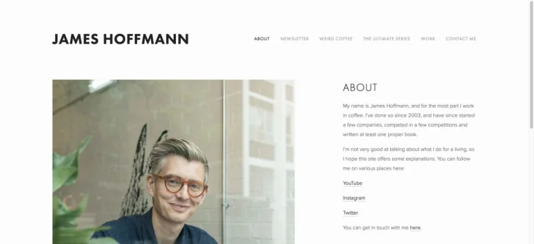
A spacious white layout balances a bold name and small navigation with a portrait and a restrained biographical text column.
Useful for: A food creator website; study its opening composition, identity, and paths into the creator’s work.
# Design reference: James Hoffmann
Source: https://www.jameshoffmann.co.uk/
Swipefile reference: https://swipefile.design/ref/youtube-james-hoffmann/
Captured: 2026-09-08. This is a dated reference, not a claim about the current live product.
Capture scope: one viewport. Do not infer unseen page sections or a complete user flow.

## Objective
Adapt the visual principles below to my project. Use my own content and identity. Do not reproduce logos, proprietary copy, or brand assets.

## Reference notes
- mood: Spare and editorial.
- colors: White, charcoal, and soft photographic green.
- typography: The captured page uses futura-pt. Keep a clear contrast between the main statement and the smaller navigation.
- layout: A spacious white layout balances a bold name and small navigation with a portrait and a restrained biographical text column.
- motion: Static viewport capture. Inspect the source website to assess animation, video, and reduced-motion behavior.
- texture: Let the original photographic or video imagery carry the visual detail.
- dont: Do not reproduce the creator’s identity, claims, copy, or artwork in a new brand.

Useful for: A food creator website; study its opening composition, identity, and paths into the creator’s work.

## Acceptance criteria
- Existing project conventions, design tokens, working functionality, and unrelated changes are preserved.
- Two or three reference principles clearly support the user's task; conflicts are resolved in favor of usability and the existing product.
- Reusable components and semantic HTML express the interface. Available licensed assets are used; important UI text is never rendered as a bitmap.
- Every visible control has a defined behavior. Loading, empty, error, success, disabled, and long-content states are specified where relevant. Demo data is clearly labeled.
- Navigation and content adapt at 375px, 768px, and 1440px without horizontal page overflow. Keyboard use, visible focus, labeled inputs, at least 44px touch targets, readable contrast, and reduced motion are supported.
- Verification distinguishes rendered behavior from proposals and identifies anything still requiring a backend or external service.

## Quality bar
Clear hierarchy, consistent spacing, restrained surfaces, and purposeful motion. Avoid decorative gradients, excessive cards, placeholder buttons, and invented metrics unless the project calls for them. Do not claim a feature is connected or tested without evidence.
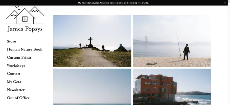
A narrow left rail holds the photographer’s identity and navigation while a tightly aligned image grid occupies most of the screen.
Useful for: A photography creator website; study its opening composition, identity, and paths into the creator’s work.
# Design reference: James Popsys
Source: https://www.jamespopsys.com/
Swipefile reference: https://swipefile.design/ref/youtube-james-popsys/
Captured: 2026-09-08. This is a dated reference, not a claim about the current live product.
Capture scope: one viewport. Do not infer unseen page sections or a complete user flow.

## Objective
Adapt the visual principles below to my project. Use my own content and identity. Do not reproduce logos, proprietary copy, or brand assets.

## Reference notes
- mood: Photographic and orderly.
- colors: White, black, and muted landscape photography.
- typography: Use the hierarchy visible in the capture: one main statement and a restrained secondary navigation.
- layout: A narrow left rail holds the photographer’s identity and navigation while a tightly aligned image grid occupies most of the screen.
- motion: Static viewport capture. Inspect the source website to assess animation, video, and reduced-motion behavior.
- texture: Let the original photographic or video imagery carry the visual detail.
- dont: Do not reproduce the creator’s identity, claims, copy, or artwork in a new brand.

Useful for: A photography creator website; study its opening composition, identity, and paths into the creator’s work.

## Acceptance criteria
- Existing project conventions, design tokens, working functionality, and unrelated changes are preserved.
- Two or three reference principles clearly support the user's task; conflicts are resolved in favor of usability and the existing product.
- Reusable components and semantic HTML express the interface. Available licensed assets are used; important UI text is never rendered as a bitmap.
- Every visible control has a defined behavior. Loading, empty, error, success, disabled, and long-content states are specified where relevant. Demo data is clearly labeled.
- Navigation and content adapt at 375px, 768px, and 1440px without horizontal page overflow. Keyboard use, visible focus, labeled inputs, at least 44px touch targets, readable contrast, and reduced motion are supported.
- Verification distinguishes rendered behavior from proposals and identifies anything still requiring a backend or external service.

## Quality bar
Clear hierarchy, consistent spacing, restrained surfaces, and purposeful motion. Avoid decorative gradients, excessive cards, placeholder buttons, and invented metrics unless the project calls for them. Do not claim a feature is connected or tested without evidence.
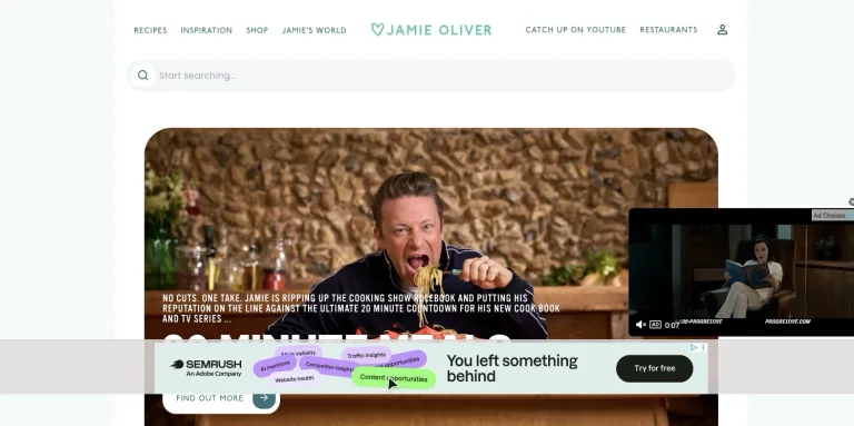
A recipe-focused white header and prominent search bar lead into large food and presenter imagery with clear content categories.
Useful for: A food creator website; study its opening composition, identity, and paths into the creator’s work.
# Design reference: Jamie Oliver
Source: https://www.jamieoliver.com/
Swipefile reference: https://swipefile.design/ref/youtube-jamie-oliver/
Captured: 2026-09-08. This is a dated reference, not a claim about the current live product.
Capture scope: one viewport. Do not infer unseen page sections or a complete user flow.

## Objective
Adapt the visual principles below to my project. Use my own content and identity. Do not reproduce logos, proprietary copy, or brand assets.

## Reference notes
- mood: Accessible and content-rich.
- colors: White, pale blue, teal, and food photography.
- typography: Use the hierarchy visible in the capture: one main statement and a restrained secondary navigation.
- layout: A recipe-focused white header and prominent search bar lead into large food and presenter imagery with clear content categories.
- motion: Static viewport capture. Inspect the source website to assess animation, video, and reduced-motion behavior.
- texture: Let the original photographic or video imagery carry the visual detail.
- dont: Do not reproduce the creator’s identity, claims, copy, or artwork in a new brand.

Useful for: A food creator website; study its opening composition, identity, and paths into the creator’s work.

## Acceptance criteria
- Existing project conventions, design tokens, working functionality, and unrelated changes are preserved.
- Two or three reference principles clearly support the user's task; conflicts are resolved in favor of usability and the existing product.
- Reusable components and semantic HTML express the interface. Available licensed assets are used; important UI text is never rendered as a bitmap.
- Every visible control has a defined behavior. Loading, empty, error, success, disabled, and long-content states are specified where relevant. Demo data is clearly labeled.
- Navigation and content adapt at 375px, 768px, and 1440px without horizontal page overflow. Keyboard use, visible focus, labeled inputs, at least 44px touch targets, readable contrast, and reduced motion are supported.
- Verification distinguishes rendered behavior from proposals and identifies anything still requiring a backend or external service.

## Quality bar
Clear hierarchy, consistent spacing, restrained surfaces, and purposeful motion. Avoid decorative gradients, excessive cards, placeholder buttons, and invented metrics unless the project calls for them. Do not claim a feature is connected or tested without evidence.

A pale geometric background frames a blue-accented introduction and a cutout portrait, with one prominent learning action.
Useful for: A finance creator website; study its opening composition, identity, and paths into the creator’s work.
# Design reference: Jaspreet Singh — Minority Mindset
Source: https://theminoritymindset.com/
Swipefile reference: https://swipefile.design/ref/youtube-jaspreet-singh/
Captured: 2026-09-08. This is a dated reference, not a claim about the current live product.
Capture scope: one viewport. Do not infer unseen page sections or a complete user flow.

## Objective
Adapt the visual principles below to my project. Use my own content and identity. Do not reproduce logos, proprietary copy, or brand assets.

## Reference notes
- mood: Confident and instructional.
- colors: White, pale gray, vivid blue, and portrait accents.
- typography: The captured page uses dashicons. Keep a clear contrast between the main statement and the smaller navigation.
- layout: A pale geometric background frames a blue-accented introduction and a cutout portrait, with one prominent learning action.
- motion: Static viewport capture. Inspect the source website to assess animation, video, and reduced-motion behavior.
- texture: Let the original photographic or video imagery carry the visual detail.
- dont: Do not reproduce the creator’s identity, claims, copy, or artwork in a new brand.

Useful for: A finance creator website; study its opening composition, identity, and paths into the creator’s work.

## Acceptance criteria
- Existing project conventions, design tokens, working functionality, and unrelated changes are preserved.
- Two or three reference principles clearly support the user's task; conflicts are resolved in favor of usability and the existing product.
- Reusable components and semantic HTML express the interface. Available licensed assets are used; important UI text is never rendered as a bitmap.
- Every visible control has a defined behavior. Loading, empty, error, success, disabled, and long-content states are specified where relevant. Demo data is clearly labeled.
- Navigation and content adapt at 375px, 768px, and 1440px without horizontal page overflow. Keyboard use, visible focus, labeled inputs, at least 44px touch targets, readable contrast, and reduced motion are supported.
- Verification distinguishes rendered behavior from proposals and identifies anything still requiring a backend or external service.

## Quality bar
Clear hierarchy, consistent spacing, restrained surfaces, and purposeful motion. Avoid decorative gradients, excessive cards, placeholder buttons, and invented metrics unless the project calls for them. Do not claim a feature is connected or tested without evidence.
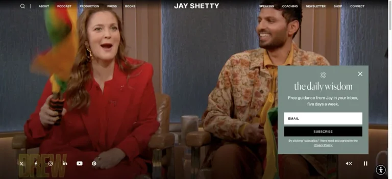
A full-width media hero sits beneath tightly spaced navigation, using a restrained overlay to frame the host’s content and projects.
Useful for: A wellness creator website; study its opening composition, identity, and paths into the creator’s work.
# Design reference: Jay Shetty
Source: https://www.jayshetty.me/
Swipefile reference: https://swipefile.design/ref/youtube-jay-shetty/
Captured: 2026-09-08. This is a dated reference, not a claim about the current live product.
Capture scope: one viewport. Do not infer unseen page sections or a complete user flow.

## Objective
Adapt the visual principles below to my project. Use my own content and identity. Do not reproduce logos, proprietary copy, or brand assets.

## Reference notes
- mood: Cinematic and media-focused.
- colors: Black, white, and muted warm photographic tones.
- typography: Use the hierarchy visible in the capture: one main statement and a restrained secondary navigation.
- layout: A full-width media hero sits beneath tightly spaced navigation, using a restrained overlay to frame the host’s content and projects.
- motion: Static viewport capture. Inspect the source website to assess animation, video, and reduced-motion behavior.
- texture: Keep surfaces restrained so the typography and content stay prominent.
- dont: Do not reproduce the creator’s identity, claims, copy, or artwork in a new brand.

Useful for: A wellness creator website; study its opening composition, identity, and paths into the creator’s work.

## Acceptance criteria
- Existing project conventions, design tokens, working functionality, and unrelated changes are preserved.
- Two or three reference principles clearly support the user's task; conflicts are resolved in favor of usability and the existing product.
- Reusable components and semantic HTML express the interface. Available licensed assets are used; important UI text is never rendered as a bitmap.
- Every visible control has a defined behavior. Loading, empty, error, success, disabled, and long-content states are specified where relevant. Demo data is clearly labeled.
- Navigation and content adapt at 375px, 768px, and 1440px without horizontal page overflow. Keyboard use, visible focus, labeled inputs, at least 44px touch targets, readable contrast, and reduced motion are supported.
- Verification distinguishes rendered behavior from proposals and identifies anything still requiring a backend or external service.

## Quality bar
Clear hierarchy, consistent spacing, restrained surfaces, and purposeful motion. Avoid decorative gradients, excessive cards, placeholder buttons, and invented metrics unless the project calls for them. Do not claim a feature is connected or tested without evidence.
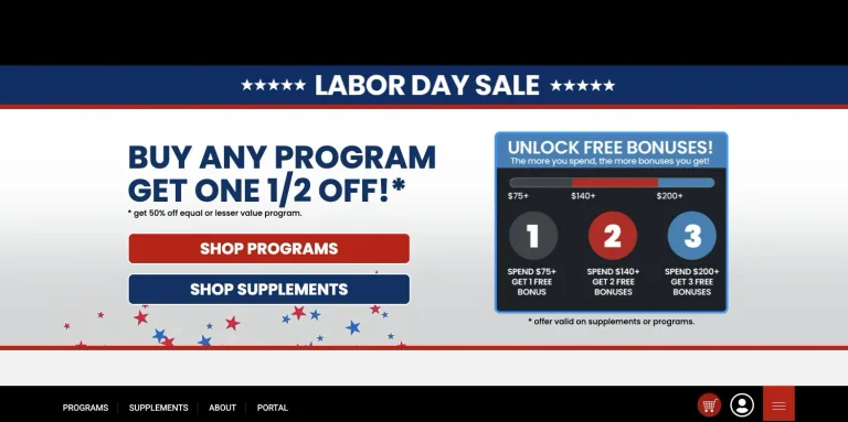
A dark fitness brand header gives way to a bold promotional section with large uppercase lettering and contrasting red actions.
Useful for: A fitness creator website; study its opening composition, identity, and paths into the creator’s work.
# Design reference: Jeff Cavaliere — Athlean-X
Source: https://athleanx.com/
Swipefile reference: https://swipefile.design/ref/youtube-jeff-cavaliere/
Captured: 2026-09-08. This is a dated reference, not a claim about the current live product.
Capture scope: one viewport. Do not infer unseen page sections or a complete user flow.

## Objective
Adapt the visual principles below to my project. Use my own content and identity. Do not reproduce logos, proprietary copy, or brand assets.

## Reference notes
- mood: Strong and promotional.
- colors: Black, white, navy, and red.
- typography: The captured page uses Poppins and Roboto Condensed. Keep a clear contrast between the main statement and the smaller navigation.
- layout: A dark fitness brand header gives way to a bold promotional section with large uppercase lettering and contrasting red actions.
- motion: Static viewport capture. Inspect the source website to assess animation, video, and reduced-motion behavior.
- texture: Keep surfaces restrained so the typography and content stay prominent.
- dont: Do not reproduce the creator’s identity, claims, copy, or artwork in a new brand.

Useful for: A fitness creator website; study its opening composition, identity, and paths into the creator’s work.

## Acceptance criteria
- Existing project conventions, design tokens, working functionality, and unrelated changes are preserved.
- Two or three reference principles clearly support the user's task; conflicts are resolved in favor of usability and the existing product.
- Reusable components and semantic HTML express the interface. Available licensed assets are used; important UI text is never rendered as a bitmap.
- Every visible control has a defined behavior. Loading, empty, error, success, disabled, and long-content states are specified where relevant. Demo data is clearly labeled.
- Navigation and content adapt at 375px, 768px, and 1440px without horizontal page overflow. Keyboard use, visible focus, labeled inputs, at least 44px touch targets, readable contrast, and reduced motion are supported.
- Verification distinguishes rendered behavior from proposals and identifies anything still requiring a backend or external service.

## Quality bar
Clear hierarchy, consistent spacing, restrained surfaces, and purposeful motion. Avoid decorative gradients, excessive cards, placeholder buttons, and invented metrics unless the project calls for them. Do not claim a feature is connected or tested without evidence.
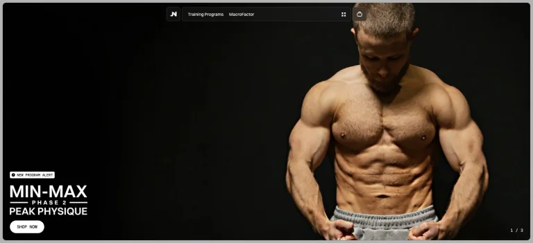
A dark fitness hero uses a large athlete portrait, compact navigation, and condensed promotional lettering around a primary program action.
Useful for: A fitness creator website; study its opening composition, identity, and paths into the creator’s work.
# Design reference: Jeff Nippard
Source: https://jeffnippard.com/
Swipefile reference: https://swipefile.design/ref/youtube-jeff-nippard/
Captured: 2026-09-08. This is a dated reference, not a claim about the current live product.
Capture scope: one viewport. Do not infer unseen page sections or a complete user flow.

## Objective
Adapt the visual principles below to my project. Use my own content and identity. Do not reproduce logos, proprietary copy, or brand assets.

## Reference notes
- mood: Focused and athletic.
- colors: Black, charcoal, and white.
- typography: The captured page uses font-secondary. Keep a clear contrast between the main statement and the smaller navigation.
- layout: A dark fitness hero uses a large athlete portrait, compact navigation, and condensed promotional lettering around a primary program action.
- motion: Static viewport capture. Inspect the source website to assess animation, video, and reduced-motion behavior.
- texture: Let the original photographic or video imagery carry the visual detail.
- dont: Do not reproduce the creator’s identity, claims, copy, or artwork in a new brand.

Useful for: A fitness creator website; study its opening composition, identity, and paths into the creator’s work.

## Acceptance criteria
- Existing project conventions, design tokens, working functionality, and unrelated changes are preserved.
- Two or three reference principles clearly support the user's task; conflicts are resolved in favor of usability and the existing product.
- Reusable components and semantic HTML express the interface. Available licensed assets are used; important UI text is never rendered as a bitmap.
- Every visible control has a defined behavior. Loading, empty, error, success, disabled, and long-content states are specified where relevant. Demo data is clearly labeled.
- Navigation and content adapt at 375px, 768px, and 1440px without horizontal page overflow. Keyboard use, visible focus, labeled inputs, at least 44px touch targets, readable contrast, and reduced motion are supported.
- Verification distinguishes rendered behavior from proposals and identifies anything still requiring a backend or external service.

## Quality bar
Clear hierarchy, consistent spacing, restrained surfaces, and purposeful motion. Avoid decorative gradients, excessive cards, placeholder buttons, and invented metrics unless the project calls for them. Do not claim a feature is connected or tested without evidence.
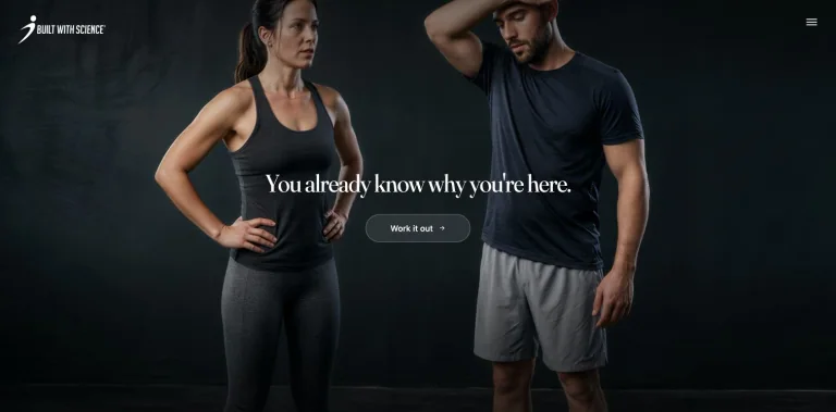
A dramatic trainer photograph fills the opening view, with a small central statement and understated action beneath the brand navigation.
Useful for: A fitness creator website; study its opening composition, identity, and paths into the creator’s work.
# Design reference: Jeremy Ethier
Source: https://builtwithscience.com/
Swipefile reference: https://swipefile.design/ref/youtube-jeremy-ethier/
Captured: 2026-09-08. This is a dated reference, not a claim about the current live product.
Capture scope: one viewport. Do not infer unseen page sections or a complete user flow.

## Objective
Adapt the visual principles below to my project. Use my own content and identity. Do not reproduce logos, proprietary copy, or brand assets.

## Reference notes
- mood: Focused and photographic.
- colors: Deep blue-green, charcoal, and white.
- typography: Use the hierarchy visible in the capture: one main statement and a restrained secondary navigation.
- layout: A dramatic trainer photograph fills the opening view, with a small central statement and understated action beneath the brand navigation.
- motion: Static viewport capture. Inspect the source website to assess animation, video, and reduced-motion behavior.
- texture: Let the original photographic or video imagery carry the visual detail.
- dont: Do not reproduce the creator’s identity, claims, copy, or artwork in a new brand.

Useful for: A fitness creator website; study its opening composition, identity, and paths into the creator’s work.

## Acceptance criteria
- Existing project conventions, design tokens, working functionality, and unrelated changes are preserved.
- Two or three reference principles clearly support the user's task; conflicts are resolved in favor of usability and the existing product.
- Reusable components and semantic HTML express the interface. Available licensed assets are used; important UI text is never rendered as a bitmap.
- Every visible control has a defined behavior. Loading, empty, error, success, disabled, and long-content states are specified where relevant. Demo data is clearly labeled.
- Navigation and content adapt at 375px, 768px, and 1440px without horizontal page overflow. Keyboard use, visible focus, labeled inputs, at least 44px touch targets, readable contrast, and reduced motion are supported.
- Verification distinguishes rendered behavior from proposals and identifies anything still requiring a backend or external service.

## Quality bar
Clear hierarchy, consistent spacing, restrained surfaces, and purposeful motion. Avoid decorative gradients, excessive cards, placeholder buttons, and invented metrics unless the project calls for them. Do not claim a feature is connected or tested without evidence.
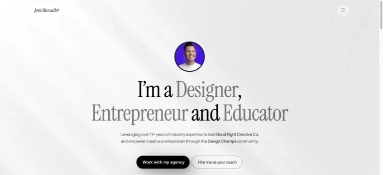
A small circular portrait precedes a large centered serif introduction, with abundant white space and a restrained menu control.
Useful for: A design creator website; study its opening composition, identity, and paths into the creator’s work.
# Design reference: Jesse Showalter
Source: https://www.jesseshowalter.com/
Swipefile reference: https://swipefile.design/ref/youtube-jesse-showalter/
Captured: 2026-09-08. This is a dated reference, not a claim about the current live product.
Capture scope: one viewport. Do not infer unseen page sections or a complete user flow.

## Objective
Adapt the visual principles below to my project. Use my own content and identity. Do not reproduce logos, proprietary copy, or brand assets.

## Reference notes
- mood: Elegant and personal.
- colors: White, warm gray, black, and a violet portrait accent.
- typography: The captured page uses Instrument Serif. Keep a clear contrast between the main statement and the smaller navigation.
- layout: A small circular portrait precedes a large centered serif introduction, with abundant white space and a restrained menu control.
- motion: Static viewport capture. Inspect the source website to assess animation, video, and reduced-motion behavior.
- texture: Let the original photographic or video imagery carry the visual detail.
- dont: Do not reproduce the creator’s identity, claims, copy, or artwork in a new brand.

Useful for: A design creator website; study its opening composition, identity, and paths into the creator’s work.

## Acceptance criteria
- Existing project conventions, design tokens, working functionality, and unrelated changes are preserved.
- Two or three reference principles clearly support the user's task; conflicts are resolved in favor of usability and the existing product.
- Reusable components and semantic HTML express the interface. Available licensed assets are used; important UI text is never rendered as a bitmap.
- Every visible control has a defined behavior. Loading, empty, error, success, disabled, and long-content states are specified where relevant. Demo data is clearly labeled.
- Navigation and content adapt at 375px, 768px, and 1440px without horizontal page overflow. Keyboard use, visible focus, labeled inputs, at least 44px touch targets, readable contrast, and reduced motion are supported.
- Verification distinguishes rendered behavior from proposals and identifies anything still requiring a backend or external service.

## Quality bar
Clear hierarchy, consistent spacing, restrained surfaces, and purposeful motion. Avoid decorative gradients, excessive cards, placeholder buttons, and invented metrics unless the project calls for them. Do not claim a feature is connected or tested without evidence.
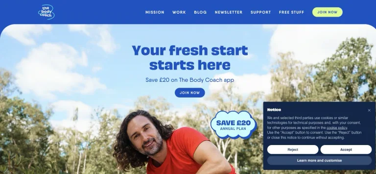
A bright outdoor trainer portrait sits below a blue navigation bar, with a large blue headline and highly visible enrollment actions.
Useful for: A fitness creator website; study its opening composition, identity, and paths into the creator’s work.
# Design reference: Joe Wicks — The Body Coach
Source: https://www.thebodycoach.com/
Swipefile reference: https://swipefile.design/ref/youtube-joe-wicks/
Captured: 2026-09-08. This is a dated reference, not a claim about the current live product.
Capture scope: one viewport. Do not infer unseen page sections or a complete user flow.

## Objective
Adapt the visual principles below to my project. Use my own content and identity. Do not reproduce logos, proprietary copy, or brand assets.

## Reference notes
- mood: Upbeat and active.
- colors: Bright blue, sky blue, white, and lime.
- typography: The captured page uses Obviously and QanelasSoft. Keep a clear contrast between the main statement and the smaller navigation.
- layout: A bright outdoor trainer portrait sits below a blue navigation bar, with a large blue headline and highly visible enrollment actions.
- motion: Static viewport capture. Inspect the source website to assess animation, video, and reduced-motion behavior.
- texture: Let the original photographic or video imagery carry the visual detail.
- dont: Do not reproduce the creator’s identity, claims, copy, or artwork in a new brand.

Useful for: A fitness creator website; study its opening composition, identity, and paths into the creator’s work.

## Acceptance criteria
- Existing project conventions, design tokens, working functionality, and unrelated changes are preserved.
- Two or three reference principles clearly support the user's task; conflicts are resolved in favor of usability and the existing product.
- Reusable components and semantic HTML express the interface. Available licensed assets are used; important UI text is never rendered as a bitmap.
- Every visible control has a defined behavior. Loading, empty, error, success, disabled, and long-content states are specified where relevant. Demo data is clearly labeled.
- Navigation and content adapt at 375px, 768px, and 1440px without horizontal page overflow. Keyboard use, visible focus, labeled inputs, at least 44px touch targets, readable contrast, and reduced motion are supported.
- Verification distinguishes rendered behavior from proposals and identifies anything still requiring a backend or external service.

## Quality bar
Clear hierarchy, consistent spacing, restrained surfaces, and purposeful motion. Avoid decorative gradients, excessive cards, placeholder buttons, and invented metrics unless the project calls for them. Do not claim a feature is connected or tested without evidence.
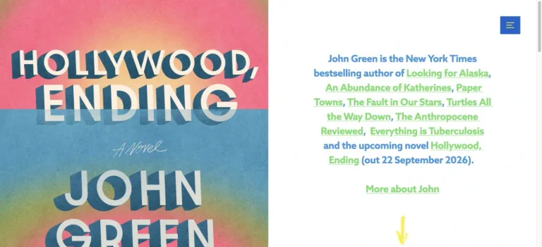
A compact author site brings together book artwork, short biographical text, colorful text links, and video content within a white layout.
Useful for: A books creator website; study its opening composition, identity, and paths into the creator’s work.
# Design reference: John Green
Source: https://www.johngreenbooks.com/
Swipefile reference: https://swipefile.design/ref/youtube-john-green/
Captured: 2026-09-08. This is a dated reference, not a claim about the current live product.
Capture scope: one viewport. Do not infer unseen page sections or a complete user flow.

## Objective
Adapt the visual principles below to my project. Use my own content and identity. Do not reproduce logos, proprietary copy, or brand assets.

## Reference notes
- mood: Bookish and straightforward.
- colors: White, blue, green, and colorful cover artwork.
- typography: The captured page uses azo-sans. Keep a clear contrast between the main statement and the smaller navigation.
- layout: A compact author site brings together book artwork, short biographical text, colorful text links, and video content within a white layout.
- motion: Static viewport capture. Inspect the source website to assess animation, video, and reduced-motion behavior.
- texture: Let the original photographic or video imagery carry the visual detail.
- dont: Do not reproduce the creator’s identity, claims, copy, or artwork in a new brand.

Useful for: A books creator website; study its opening composition, identity, and paths into the creator’s work.

## Acceptance criteria
- Existing project conventions, design tokens, working functionality, and unrelated changes are preserved.
- Two or three reference principles clearly support the user's task; conflicts are resolved in favor of usability and the existing product.
- Reusable components and semantic HTML express the interface. Available licensed assets are used; important UI text is never rendered as a bitmap.
- Every visible control has a defined behavior. Loading, empty, error, success, disabled, and long-content states are specified where relevant. Demo data is clearly labeled.
- Navigation and content adapt at 375px, 768px, and 1440px without horizontal page overflow. Keyboard use, visible focus, labeled inputs, at least 44px touch targets, readable contrast, and reduced motion are supported.
- Verification distinguishes rendered behavior from proposals and identifies anything still requiring a backend or external service.

## Quality bar
Clear hierarchy, consistent spacing, restrained surfaces, and purposeful motion. Avoid decorative gradients, excessive cards, placeholder buttons, and invented metrics unless the project calls for them. Do not claim a feature is connected or tested without evidence.
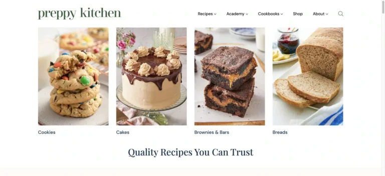
A clean recipe header and a row of large food photographs organize dessert categories before a centered editorial promise.
Useful for: A food creator website; study its opening composition, identity, and paths into the creator’s work.
# Design reference: John Kanell — Preppy Kitchen
Source: https://preppykitchen.com/
Swipefile reference: https://swipefile.design/ref/youtube-john-kanell/
Captured: 2026-09-08. This is a dated reference, not a claim about the current live product.
Capture scope: one viewport. Do not infer unseen page sections or a complete user flow.

## Objective
Adapt the visual principles below to my project. Use my own content and identity. Do not reproduce logos, proprietary copy, or brand assets.

## Reference notes
- mood: Inviting and organized.
- colors: White, pale cream, dark green, and warm food tones.
- typography: Use the hierarchy visible in the capture: one main statement and a restrained secondary navigation.
- layout: A clean recipe header and a row of large food photographs organize dessert categories before a centered editorial promise.
- motion: Static viewport capture. Inspect the source website to assess animation, video, and reduced-motion behavior.
- texture: Let the original photographic or video imagery carry the visual detail.
- dont: Do not reproduce the creator’s identity, claims, copy, or artwork in a new brand.

Useful for: A food creator website; study its opening composition, identity, and paths into the creator’s work.

## Acceptance criteria
- Existing project conventions, design tokens, working functionality, and unrelated changes are preserved.
- Two or three reference principles clearly support the user's task; conflicts are resolved in favor of usability and the existing product.
- Reusable components and semantic HTML express the interface. Available licensed assets are used; important UI text is never rendered as a bitmap.
- Every visible control has a defined behavior. Loading, empty, error, success, disabled, and long-content states are specified where relevant. Demo data is clearly labeled.
- Navigation and content adapt at 375px, 768px, and 1440px without horizontal page overflow. Keyboard use, visible focus, labeled inputs, at least 44px touch targets, readable contrast, and reduced motion are supported.
- Verification distinguishes rendered behavior from proposals and identifies anything still requiring a backend or external service.

## Quality bar
Clear hierarchy, consistent spacing, restrained surfaces, and purposeful motion. Avoid decorative gradients, excessive cards, placeholder buttons, and invented metrics unless the project calls for them. Do not claim a feature is connected or tested without evidence.
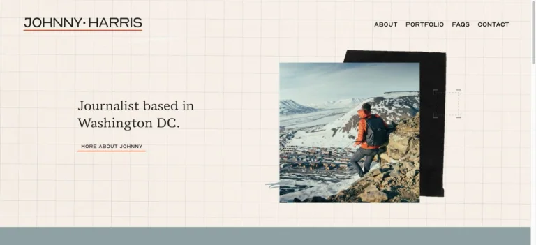
A cream graph-paper background supports a short serif introduction and an offset stack of travel photographs under minimal navigation.
Useful for: A storytelling creator website; study its opening composition, identity, and paths into the creator’s work.
# Design reference: Johnny Harris
Source: https://www.johnnyharris.ch/
Swipefile reference: https://swipefile.design/ref/youtube-johnny-harris/
Captured: 2026-09-08. This is a dated reference, not a claim about the current live product.
Capture scope: one viewport. Do not infer unseen page sections or a complete user flow.

## Objective
Adapt the visual principles below to my project. Use my own content and identity. Do not reproduce logos, proprietary copy, or brand assets.

## Reference notes
- mood: Editorial and exploratory.
- colors: Cream, charcoal, and natural photographic blue.
- typography: The captured page uses Vanio. Keep a clear contrast between the main statement and the smaller navigation.
- layout: A cream graph-paper background supports a short serif introduction and an offset stack of travel photographs under minimal navigation.
- motion: Static viewport capture. Inspect the source website to assess animation, video, and reduced-motion behavior.
- texture: Let the original photographic or video imagery carry the visual detail.
- dont: Do not reproduce the creator’s identity, claims, copy, or artwork in a new brand.

Useful for: A storytelling creator website; study its opening composition, identity, and paths into the creator’s work.

## Acceptance criteria
- Existing project conventions, design tokens, working functionality, and unrelated changes are preserved.
- Two or three reference principles clearly support the user's task; conflicts are resolved in favor of usability and the existing product.
- Reusable components and semantic HTML express the interface. Available licensed assets are used; important UI text is never rendered as a bitmap.
- Every visible control has a defined behavior. Loading, empty, error, success, disabled, and long-content states are specified where relevant. Demo data is clearly labeled.
- Navigation and content adapt at 375px, 768px, and 1440px without horizontal page overflow. Keyboard use, visible focus, labeled inputs, at least 44px touch targets, readable contrast, and reduced motion are supported.
- Verification distinguishes rendered behavior from proposals and identifies anything still requiring a backend or external service.

## Quality bar
Clear hierarchy, consistent spacing, restrained surfaces, and purposeful motion. Avoid decorative gradients, excessive cards, placeholder buttons, and invented metrics unless the project calls for them. Do not claim a feature is connected or tested without evidence.
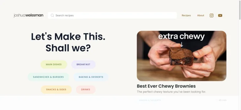
A pale recipe homepage places a bold cooking introduction and pastel category chips beside a large featured dish photograph.
Useful for: A food creator website; study its opening composition, identity, and paths into the creator’s work.
# Design reference: Joshua Weissman
Source: https://www.joshuaweissman.com/
Swipefile reference: https://swipefile.design/ref/youtube-joshua-weissman/
Captured: 2026-09-08. This is a dated reference, not a claim about the current live product.
Capture scope: one viewport. Do not infer unseen page sections or a complete user flow.

## Objective
Adapt the visual principles below to my project. Use my own content and identity. Do not reproduce logos, proprietary copy, or brand assets.

## Reference notes
- mood: Friendly and practical.
- colors: Warm white, black, and soft pastel category colors.
- typography: The captured page uses Poppins. Keep a clear contrast between the main statement and the smaller navigation.
- layout: A pale recipe homepage places a bold cooking introduction and pastel category chips beside a large featured dish photograph.
- motion: Static viewport capture. Inspect the source website to assess animation, video, and reduced-motion behavior.
- texture: Let the original photographic or video imagery carry the visual detail.
- dont: Do not reproduce the creator’s identity, claims, copy, or artwork in a new brand.

Useful for: A food creator website; study its opening composition, identity, and paths into the creator’s work.

## Acceptance criteria
- Existing project conventions, design tokens, working functionality, and unrelated changes are preserved.
- Two or three reference principles clearly support the user's task; conflicts are resolved in favor of usability and the existing product.
- Reusable components and semantic HTML express the interface. Available licensed assets are used; important UI text is never rendered as a bitmap.
- Every visible control has a defined behavior. Loading, empty, error, success, disabled, and long-content states are specified where relevant. Demo data is clearly labeled.
- Navigation and content adapt at 375px, 768px, and 1440px without horizontal page overflow. Keyboard use, visible focus, labeled inputs, at least 44px touch targets, readable contrast, and reduced motion are supported.
- Verification distinguishes rendered behavior from proposals and identifies anything still requiring a backend or external service.

## Quality bar
Clear hierarchy, consistent spacing, restrained surfaces, and purposeful motion. Avoid decorative gradients, excessive cards, placeholder buttons, and invented metrics unless the project calls for them. Do not claim a feature is connected or tested without evidence.

A star-filled illustrated space scene supports an oversized white studio introduction beneath a clean light navigation bar.
Useful for: A science creator website; study its opening composition, identity, and paths into the creator’s work.
# Design reference: Kurzgesagt — Philipp Dettmer
Source: https://kurzgesagt.org/
Swipefile reference: https://swipefile.design/ref/youtube-kurzgesagt/
Captured: 2026-09-08. This is a dated reference, not a claim about the current live product.
Capture scope: one viewport. Do not infer unseen page sections or a complete user flow.

## Objective
Adapt the visual principles below to my project. Use my own content and identity. Do not reproduce logos, proprietary copy, or brand assets.

## Reference notes
- mood: Expansive and playful.
- colors: Midnight blue, violet, white, and bright illustrated accents.
- typography: The captured page uses Montserrat-Medium. Keep a clear contrast between the main statement and the smaller navigation.
- layout: A star-filled illustrated space scene supports an oversized white studio introduction beneath a clean light navigation bar.
- motion: Static viewport capture. Inspect the source website to assess animation, video, and reduced-motion behavior.
- texture: Let the original photographic or video imagery carry the visual detail.
- dont: Do not reproduce the creator’s identity, claims, copy, or artwork in a new brand.

Useful for: A science creator website; study its opening composition, identity, and paths into the creator’s work.

## Acceptance criteria
- Existing project conventions, design tokens, working functionality, and unrelated changes are preserved.
- Two or three reference principles clearly support the user's task; conflicts are resolved in favor of usability and the existing product.
- Reusable components and semantic HTML express the interface. Available licensed assets are used; important UI text is never rendered as a bitmap.
- Every visible control has a defined behavior. Loading, empty, error, success, disabled, and long-content states are specified where relevant. Demo data is clearly labeled.
- Navigation and content adapt at 375px, 768px, and 1440px without horizontal page overflow. Keyboard use, visible focus, labeled inputs, at least 44px touch targets, readable contrast, and reduced motion are supported.
- Verification distinguishes rendered behavior from proposals and identifies anything still requiring a backend or external service.

## Quality bar
Clear hierarchy, consistent spacing, restrained surfaces, and purposeful motion. Avoid decorative gradients, excessive cards, placeholder buttons, and invented metrics unless the project calls for them. Do not claim a feature is connected or tested without evidence.
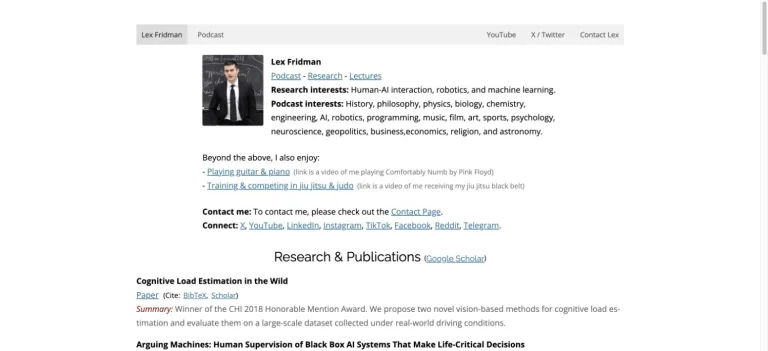
A narrow academic-style layout uses a small portrait, simple text navigation, biography links, and research-oriented content.
Useful for: A technology creator website; study its opening composition, identity, and paths into the creator’s work.
# Design reference: Lex Fridman
Source: https://lexfridman.com/
Swipefile reference: https://swipefile.design/ref/youtube-lex-fridman/
Captured: 2026-09-08. This is a dated reference, not a claim about the current live product.
Capture scope: one viewport. Do not infer unseen page sections or a complete user flow.

## Objective
Adapt the visual principles below to my project. Use my own content and identity. Do not reproduce logos, proprietary copy, or brand assets.

## Reference notes
- mood: Plain and informational.
- colors: White, light gray, black, and conventional blue links.
- typography: The captured page uses Open Sans and Raleway. Keep a clear contrast between the main statement and the smaller navigation.
- layout: A narrow academic-style layout uses a small portrait, simple text navigation, biography links, and research-oriented content.
- motion: Static viewport capture. Inspect the source website to assess animation, video, and reduced-motion behavior.
- texture: Let the original photographic or video imagery carry the visual detail.
- dont: Do not reproduce the creator’s identity, claims, copy, or artwork in a new brand.

Useful for: A technology creator website; study its opening composition, identity, and paths into the creator’s work.

## Acceptance criteria
- Existing project conventions, design tokens, working functionality, and unrelated changes are preserved.
- Two or three reference principles clearly support the user's task; conflicts are resolved in favor of usability and the existing product.
- Reusable components and semantic HTML express the interface. Available licensed assets are used; important UI text is never rendered as a bitmap.
- Every visible control has a defined behavior. Loading, empty, error, success, disabled, and long-content states are specified where relevant. Demo data is clearly labeled.
- Navigation and content adapt at 375px, 768px, and 1440px without horizontal page overflow. Keyboard use, visible focus, labeled inputs, at least 44px touch targets, readable contrast, and reduced motion are supported.
- Verification distinguishes rendered behavior from proposals and identifies anything still requiring a backend or external service.

## Quality bar
Clear hierarchy, consistent spacing, restrained surfaces, and purposeful motion. Avoid decorative gradients, excessive cards, placeholder buttons, and invented metrics unless the project calls for them. Do not claim a feature is connected or tested without evidence.
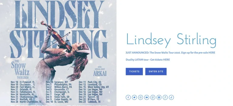
A tour announcement pairs large poster artwork with a light typographic introduction and two clear paths for tickets or the main site.
Useful for: A music creator website; study its opening composition, identity, and paths into the creator’s work.
# Design reference: Lindsey Stirling
Source: https://www.lindseystirling.com/
Swipefile reference: https://swipefile.design/ref/youtube-lindsey-stirling/
Captured: 2026-09-08. This is a dated reference, not a claim about the current live product.
Capture scope: one viewport. Do not infer unseen page sections or a complete user flow.

## Objective
Adapt the visual principles below to my project. Use my own content and identity. Do not reproduce logos, proprietary copy, or brand assets.

## Reference notes
- mood: Airy and event-focused.
- colors: White, icy blue, and poster colors.
- typography: The captured page uses josefin. Keep a clear contrast between the main statement and the smaller navigation.
- layout: A tour announcement pairs large poster artwork with a light typographic introduction and two clear paths for tickets or the main site.
- motion: Static viewport capture. Inspect the source website to assess animation, video, and reduced-motion behavior.
- texture: Keep surfaces restrained so the typography and content stay prominent.
- dont: Do not reproduce the creator’s identity, claims, copy, or artwork in a new brand.

Useful for: A music creator website; study its opening composition, identity, and paths into the creator’s work.

## Acceptance criteria
- Existing project conventions, design tokens, working functionality, and unrelated changes are preserved.
- Two or three reference principles clearly support the user's task; conflicts are resolved in favor of usability and the existing product.
- Reusable components and semantic HTML express the interface. Available licensed assets are used; important UI text is never rendered as a bitmap.
- Every visible control has a defined behavior. Loading, empty, error, success, disabled, and long-content states are specified where relevant. Demo data is clearly labeled.
- Navigation and content adapt at 375px, 768px, and 1440px without horizontal page overflow. Keyboard use, visible focus, labeled inputs, at least 44px touch targets, readable contrast, and reduced motion are supported.
- Verification distinguishes rendered behavior from proposals and identifies anything still requiring a backend or external service.

## Quality bar
Clear hierarchy, consistent spacing, restrained surfaces, and purposeful motion. Avoid decorative gradients, excessive cards, placeholder buttons, and invented metrics unless the project calls for them. Do not claim a feature is connected or tested without evidence.

A dark technology reel fills the opening screen beneath a minimal studio header, with prominent condensed positioning as part of the hero.
Useful for: A technology creator website; study its opening composition, identity, and paths into the creator’s work.
# Design reference: Linus Sebastian
Source: https://linusmediagroup.com/
Swipefile reference: https://swipefile.design/ref/youtube-linus-sebastian/
Captured: 2026-09-08. This is a dated reference, not a claim about the current live product.
Capture scope: one viewport. Do not infer unseen page sections or a complete user flow.

## Objective
Adapt the visual principles below to my project. Use my own content and identity. Do not reproduce logos, proprietary copy, or brand assets.

## Reference notes
- mood: Technical and cinematic.
- colors: Black, charcoal, white, and orange branding.
- typography: The captured page uses rama-gothic-m. Keep a clear contrast between the main statement and the smaller navigation.
- layout: A dark technology reel fills the opening screen beneath a minimal studio header, with prominent condensed positioning as part of the hero.
- motion: Static viewport capture. Inspect the source website to assess animation, video, and reduced-motion behavior.
- texture: Let the original photographic or video imagery carry the visual detail.
- dont: Do not reproduce the creator’s identity, claims, copy, or artwork in a new brand.

Useful for: A technology creator website; study its opening composition, identity, and paths into the creator’s work.

## Acceptance criteria
- Existing project conventions, design tokens, working functionality, and unrelated changes are preserved.
- Two or three reference principles clearly support the user's task; conflicts are resolved in favor of usability and the existing product.
- Reusable components and semantic HTML express the interface. Available licensed assets are used; important UI text is never rendered as a bitmap.
- Every visible control has a defined behavior. Loading, empty, error, success, disabled, and long-content states are specified where relevant. Demo data is clearly labeled.
- Navigation and content adapt at 375px, 768px, and 1440px without horizontal page overflow. Keyboard use, visible focus, labeled inputs, at least 44px touch targets, readable contrast, and reduced motion are supported.
- Verification distinguishes rendered behavior from proposals and identifies anything still requiring a backend or external service.

## Quality bar
Clear hierarchy, consistent spacing, restrained surfaces, and purposeful motion. Avoid decorative gradients, excessive cards, placeholder buttons, and invented metrics unless the project calls for them. Do not claim a feature is connected or tested without evidence.
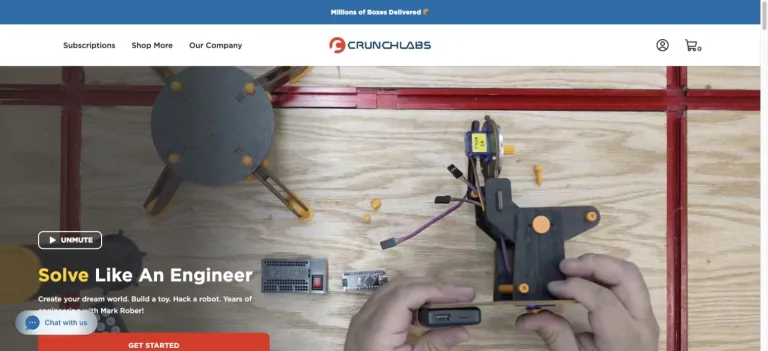
An energetic engineering-kit homepage pairs large playful lettering with hands-on project footage, a centered brand mark, and a clear starting action.
Useful for: A science creator website; study its opening composition, identity, and paths into the creator’s work.
# Design reference: Mark Rober
Source: https://www.crunchlabs.com/
Swipefile reference: https://swipefile.design/ref/youtube-mark-rober/
Captured: 2026-09-08. This is a dated reference, not a claim about the current live product.
Capture scope: one viewport. Do not infer unseen page sections or a complete user flow.

## Objective
Adapt the visual principles below to my project. Use my own content and identity. Do not reproduce logos, proprietary copy, or brand assets.

## Reference notes
- mood: Playful and inventive.
- colors: Deep blue, white, and bright project colors.
- typography: The captured page uses GothamHTF. Keep a clear contrast between the main statement and the smaller navigation.
- layout: An energetic engineering-kit homepage pairs large playful lettering with hands-on project footage, a centered brand mark, and a clear starting action.
- motion: Static viewport capture. Inspect the source website to assess animation, video, and reduced-motion behavior.
- texture: Graphic illustration and shape provide the visual detail.
- dont: Do not reproduce the creator’s identity, claims, copy, or artwork in a new brand.

Useful for: A science creator website; study its opening composition, identity, and paths into the creator’s work.

## Acceptance criteria
- Existing project conventions, design tokens, working functionality, and unrelated changes are preserved.
- Two or three reference principles clearly support the user's task; conflicts are resolved in favor of usability and the existing product.
- Reusable components and semantic HTML express the interface. Available licensed assets are used; important UI text is never rendered as a bitmap.
- Every visible control has a defined behavior. Loading, empty, error, success, disabled, and long-content states are specified where relevant. Demo data is clearly labeled.
- Navigation and content adapt at 375px, 768px, and 1440px without horizontal page overflow. Keyboard use, visible focus, labeled inputs, at least 44px touch targets, readable contrast, and reduced motion are supported.
- Verification distinguishes rendered behavior from proposals and identifies anything still requiring a backend or external service.

## Quality bar
Clear hierarchy, consistent spacing, restrained surfaces, and purposeful motion. Avoid decorative gradients, excessive cards, placeholder buttons, and invented metrics unless the project calls for them. Do not claim a feature is connected or tested without evidence.
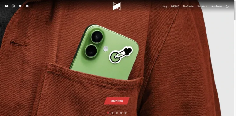
A product photograph fills the homepage behind minimal edge navigation and a small high-contrast shop action.
Useful for: A technology creator website; study its opening composition, identity, and paths into the creator’s work.
# Design reference: Marques Brownlee
Source: https://mkbhd.com/
Swipefile reference: https://swipefile.design/ref/youtube-marques-brownlee/
Captured: 2026-09-08. This is a dated reference, not a claim about the current live product.
Capture scope: one viewport. Do not infer unseen page sections or a complete user flow.

## Objective
Adapt the visual principles below to my project. Use my own content and identity. Do not reproduce logos, proprietary copy, or brand assets.

## Reference notes
- mood: Clean and product-led.
- colors: Photographic rust and green, white, and red.
- typography: The captured page uses DIN Pro. Keep a clear contrast between the main statement and the smaller navigation.
- layout: A product photograph fills the homepage behind minimal edge navigation and a small high-contrast shop action.
- motion: Static viewport capture. Inspect the source website to assess animation, video, and reduced-motion behavior.
- texture: Let the original photographic or video imagery carry the visual detail.
- dont: Do not reproduce the creator’s identity, claims, copy, or artwork in a new brand.

Useful for: A technology creator website; study its opening composition, identity, and paths into the creator’s work.

## Acceptance criteria
- Existing project conventions, design tokens, working functionality, and unrelated changes are preserved.
- Two or three reference principles clearly support the user's task; conflicts are resolved in favor of usability and the existing product.
- Reusable components and semantic HTML express the interface. Available licensed assets are used; important UI text is never rendered as a bitmap.
- Every visible control has a defined behavior. Loading, empty, error, success, disabled, and long-content states are specified where relevant. Demo data is clearly labeled.
- Navigation and content adapt at 375px, 768px, and 1440px without horizontal page overflow. Keyboard use, visible focus, labeled inputs, at least 44px touch targets, readable contrast, and reduced motion are supported.
- Verification distinguishes rendered behavior from proposals and identifies anything still requiring a backend or external service.

## Quality bar
Clear hierarchy, consistent spacing, restrained surfaces, and purposeful motion. Avoid decorative gradients, excessive cards, placeholder buttons, and invented metrics unless the project calls for them. Do not claim a feature is connected or tested without evidence.
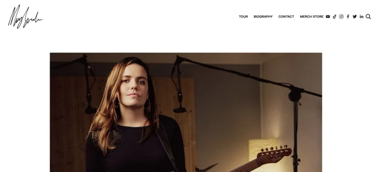
A handwritten identity and compact upper navigation frame a broad portrait of the musician with her instrument.
Useful for: A music creator website; study its opening composition, identity, and paths into the creator’s work.
# Design reference: Mary Spender
Source: https://www.maryspender.com/
Swipefile reference: https://swipefile.design/ref/youtube-mary-spender/
Captured: 2026-09-08. This is a dated reference, not a claim about the current live product.
Capture scope: one viewport. Do not infer unseen page sections or a complete user flow.

## Objective
Adapt the visual principles below to my project. Use my own content and identity. Do not reproduce logos, proprietary copy, or brand assets.

## Reference notes
- mood: Personal and photographic.
- colors: White, black, and warm studio photography.
- typography: The captured page uses futura-pt. Keep a clear contrast between the main statement and the smaller navigation.
- layout: A handwritten identity and compact upper navigation frame a broad portrait of the musician with her instrument.
- motion: Static viewport capture. Inspect the source website to assess animation, video, and reduced-motion behavior.
- texture: Let the original photographic or video imagery carry the visual detail.
- dont: Do not reproduce the creator’s identity, claims, copy, or artwork in a new brand.

Useful for: A music creator website; study its opening composition, identity, and paths into the creator’s work.

## Acceptance criteria
- Existing project conventions, design tokens, working functionality, and unrelated changes are preserved.
- Two or three reference principles clearly support the user's task; conflicts are resolved in favor of usability and the existing product.
- Reusable components and semantic HTML express the interface. Available licensed assets are used; important UI text is never rendered as a bitmap.
- Every visible control has a defined behavior. Loading, empty, error, success, disabled, and long-content states are specified where relevant. Demo data is clearly labeled.
- Navigation and content adapt at 375px, 768px, and 1440px without horizontal page overflow. Keyboard use, visible focus, labeled inputs, at least 44px touch targets, readable contrast, and reduced motion are supported.
- Verification distinguishes rendered behavior from proposals and identifies anything still requiring a backend or external service.

## Quality bar
Clear hierarchy, consistent spacing, restrained surfaces, and purposeful motion. Avoid decorative gradients, excessive cards, placeholder buttons, and invented metrics unless the project calls for them. Do not claim a feature is connected or tested without evidence.
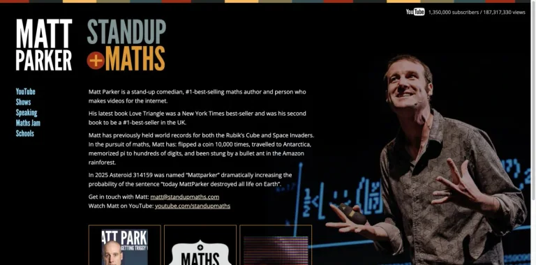
A black mathematics homepage pairs a colorful stacked wordmark and slim left navigation with biography text and a stage portrait.
Useful for: A education creator website; study its opening composition, identity, and paths into the creator’s work.
# Design reference: Matt Parker — Stand-up Maths
Source: https://standupmaths.com/
Swipefile reference: https://swipefile.design/ref/youtube-matt-parker/
Captured: 2026-09-08. This is a dated reference, not a claim about the current live product.
Capture scope: one viewport. Do not infer unseen page sections or a complete user flow.

## Objective
Adapt the visual principles below to my project. Use my own content and identity. Do not reproduce logos, proprietary copy, or brand assets.

## Reference notes
- mood: Eccentric and information-rich.
- colors: Black, white, ochre, teal, and blue.
- typography: Use the hierarchy visible in the capture: one main statement and a restrained secondary navigation.
- layout: A black mathematics homepage pairs a colorful stacked wordmark and slim left navigation with biography text and a stage portrait.
- motion: Static viewport capture. Inspect the source website to assess animation, video, and reduced-motion behavior.
- texture: Let the original photographic or video imagery carry the visual detail.
- dont: Do not reproduce the creator’s identity, claims, copy, or artwork in a new brand.

Useful for: A education creator website; study its opening composition, identity, and paths into the creator’s work.

## Acceptance criteria
- Existing project conventions, design tokens, working functionality, and unrelated changes are preserved.
- Two or three reference principles clearly support the user's task; conflicts are resolved in favor of usability and the existing product.
- Reusable components and semantic HTML express the interface. Available licensed assets are used; important UI text is never rendered as a bitmap.
- Every visible control has a defined behavior. Loading, empty, error, success, disabled, and long-content states are specified where relevant. Demo data is clearly labeled.
- Navigation and content adapt at 375px, 768px, and 1440px without horizontal page overflow. Keyboard use, visible focus, labeled inputs, at least 44px touch targets, readable contrast, and reduced motion are supported.
- Verification distinguishes rendered behavior from proposals and identifies anything still requiring a backend or external service.

## Quality bar
Clear hierarchy, consistent spacing, restrained surfaces, and purposeful motion. Avoid decorative gradients, excessive cards, placeholder buttons, and invented metrics unless the project calls for them. Do not claim a feature is connected or tested without evidence.
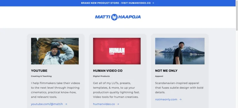
A simple white creator hub groups the channel, digital products, and apparel into three illustrated cards below a blue announcement bar.
Useful for: A filmmaking creator website; study its opening composition, identity, and paths into the creator’s work.
# Design reference: Matti Haapoja
Source: https://mattihaapoja.com/
Swipefile reference: https://swipefile.design/ref/youtube-matti-haapoja/
Captured: 2026-09-08. This is a dated reference, not a claim about the current live product.
Capture scope: one viewport. Do not infer unseen page sections or a complete user flow.

## Objective
Adapt the visual principles below to my project. Use my own content and identity. Do not reproduce logos, proprietary copy, or brand assets.

## Reference notes
- mood: Clear and modular.
- colors: White, light gray, bright blue, and thumbnail colors.
- typography: The captured page uses Archivo. Keep a clear contrast between the main statement and the smaller navigation.
- layout: A simple white creator hub groups the channel, digital products, and apparel into three illustrated cards below a blue announcement bar.
- motion: Static viewport capture. Inspect the source website to assess animation, video, and reduced-motion behavior.
- texture: Graphic illustration and shape provide the visual detail.
- dont: Do not reproduce the creator’s identity, claims, copy, or artwork in a new brand.

Useful for: A filmmaking creator website; study its opening composition, identity, and paths into the creator’s work.

## Acceptance criteria
- Existing project conventions, design tokens, working functionality, and unrelated changes are preserved.
- Two or three reference principles clearly support the user's task; conflicts are resolved in favor of usability and the existing product.
- Reusable components and semantic HTML express the interface. Available licensed assets are used; important UI text is never rendered as a bitmap.
- Every visible control has a defined behavior. Loading, empty, error, success, disabled, and long-content states are specified where relevant. Demo data is clearly labeled.
- Navigation and content adapt at 375px, 768px, and 1440px without horizontal page overflow. Keyboard use, visible focus, labeled inputs, at least 44px touch targets, readable contrast, and reduced motion are supported.
- Verification distinguishes rendered behavior from proposals and identifies anything still requiring a backend or external service.

## Quality bar
Clear hierarchy, consistent spacing, restrained surfaces, and purposeful motion. Avoid decorative gradients, excessive cards, placeholder buttons, and invented metrics unless the project calls for them. Do not claim a feature is connected or tested without evidence.
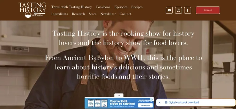
A warm brown navigation bar leads to a kitchen photograph overlaid with centered serif copy describing the cooking-and-history show.
Useful for: A food creator website; study its opening composition, identity, and paths into the creator’s work.
# Design reference: Max Miller — Tasting History
Source: https://www.tastinghistory.com/
Swipefile reference: https://swipefile.design/ref/youtube-max-miller/
Captured: 2026-09-08. This is a dated reference, not a claim about the current live product.
Capture scope: one viewport. Do not infer unseen page sections or a complete user flow.

## Objective
Adapt the visual principles below to my project. Use my own content and identity. Do not reproduce logos, proprietary copy, or brand assets.

## Reference notes
- mood: Historical and welcoming.
- colors: Warm brown, cream, white, and kitchen photography.
- typography: The captured page uses ltc-bodoni-175. Keep a clear contrast between the main statement and the smaller navigation.
- layout: A warm brown navigation bar leads to a kitchen photograph overlaid with centered serif copy describing the cooking-and-history show.
- motion: Static viewport capture. Inspect the source website to assess animation, video, and reduced-motion behavior.
- texture: Let the original photographic or video imagery carry the visual detail.
- dont: Do not reproduce the creator’s identity, claims, copy, or artwork in a new brand.

Useful for: A food creator website; study its opening composition, identity, and paths into the creator’s work.

## Acceptance criteria
- Existing project conventions, design tokens, working functionality, and unrelated changes are preserved.
- Two or three reference principles clearly support the user's task; conflicts are resolved in favor of usability and the existing product.
- Reusable components and semantic HTML express the interface. Available licensed assets are used; important UI text is never rendered as a bitmap.
- Every visible control has a defined behavior. Loading, empty, error, success, disabled, and long-content states are specified where relevant. Demo data is clearly labeled.
- Navigation and content adapt at 375px, 768px, and 1440px without horizontal page overflow. Keyboard use, visible focus, labeled inputs, at least 44px touch targets, readable contrast, and reduced motion are supported.
- Verification distinguishes rendered behavior from proposals and identifies anything still requiring a backend or external service.

## Quality bar
Clear hierarchy, consistent spacing, restrained surfaces, and purposeful motion. Avoid decorative gradients, excessive cards, placeholder buttons, and invented metrics unless the project calls for them. Do not claim a feature is connected or tested without evidence.
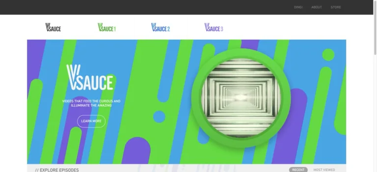
A bright geometric channel hero combines large colored shapes, a circular tunnel illustration, and a compact learning action.
Useful for: A science creator website; study its opening composition, identity, and paths into the creator’s work.
# Design reference: Michael Stevens — Vsauce
Source: https://www.vsauce.com/
Swipefile reference: https://swipefile.design/ref/youtube-michael-stevens/
Captured: 2026-09-08. This is a dated reference, not a claim about the current live product.
Capture scope: one viewport. Do not infer unseen page sections or a complete user flow.

## Objective
Adapt the visual principles below to my project. Use my own content and identity. Do not reproduce logos, proprietary copy, or brand assets.

## Reference notes
- mood: Playful and curious.
- colors: Sky blue, lime, violet, and white.
- typography: The captured page uses DINNextRoundedLTPro-Regular. Keep a clear contrast between the main statement and the smaller navigation.
- layout: A bright geometric channel hero combines large colored shapes, a circular tunnel illustration, and a compact learning action.
- motion: Static viewport capture. Inspect the source website to assess animation, video, and reduced-motion behavior.
- texture: Graphic illustration and shape provide the visual detail.
- dont: Do not reproduce the creator’s identity, claims, copy, or artwork in a new brand.

Useful for: A science creator website; study its opening composition, identity, and paths into the creator’s work.

## Acceptance criteria
- Existing project conventions, design tokens, working functionality, and unrelated changes are preserved.
- Two or three reference principles clearly support the user's task; conflicts are resolved in favor of usability and the existing product.
- Reusable components and semantic HTML express the interface. Available licensed assets are used; important UI text is never rendered as a bitmap.
- Every visible control has a defined behavior. Loading, empty, error, success, disabled, and long-content states are specified where relevant. Demo data is clearly labeled.
- Navigation and content adapt at 375px, 768px, and 1440px without horizontal page overflow. Keyboard use, visible focus, labeled inputs, at least 44px touch targets, readable contrast, and reduced motion are supported.
- Verification distinguishes rendered behavior from proposals and identifies anything still requiring a backend or external service.

## Quality bar
Clear hierarchy, consistent spacing, restrained surfaces, and purposeful motion. Avoid decorative gradients, excessive cards, placeholder buttons, and invented metrics unless the project calls for them. Do not claim a feature is connected or tested without evidence.
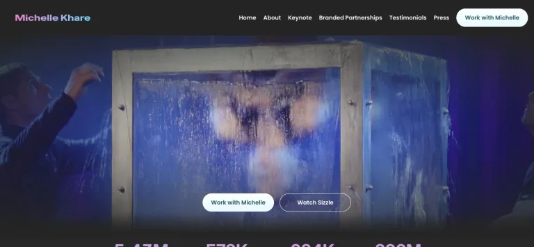
A dark video-led homepage uses a minimal nameplate and navigation, with two light actions directing visitors to partnerships or the showreel.
Useful for: A entertainment creator website; study its opening composition, identity, and paths into the creator’s work.
# Design reference: Michelle Khare
Source: https://michellekhare.com/
Swipefile reference: https://swipefile.design/ref/youtube-michelle-khare/
Captured: 2026-09-08. This is a dated reference, not a claim about the current live product.
Capture scope: one viewport. Do not infer unseen page sections or a complete user flow.

## Objective
Adapt the visual principles below to my project. Use my own content and identity. Do not reproduce logos, proprietary copy, or brand assets.

## Reference notes
- mood: Cinematic and energetic.
- colors: Charcoal, white, pale blue, and video colors.
- typography: The captured page uses Inter and Poppins and Inter Variable. Keep a clear contrast between the main statement and the smaller navigation.
- layout: A dark video-led homepage uses a minimal nameplate and navigation, with two light actions directing visitors to partnerships or the showreel.
- motion: Static viewport capture. Inspect the source website to assess animation, video, and reduced-motion behavior.
- texture: Let the original photographic or video imagery carry the visual detail.
- dont: Do not reproduce the creator’s identity, claims, copy, or artwork in a new brand.

Useful for: A entertainment creator website; study its opening composition, identity, and paths into the creator’s work.

## Acceptance criteria
- Existing project conventions, design tokens, working functionality, and unrelated changes are preserved.
- Two or three reference principles clearly support the user's task; conflicts are resolved in favor of usability and the existing product.
- Reusable components and semantic HTML express the interface. Available licensed assets are used; important UI text is never rendered as a bitmap.
- Every visible control has a defined behavior. Loading, empty, error, success, disabled, and long-content states are specified where relevant. Demo data is clearly labeled.
- Navigation and content adapt at 375px, 768px, and 1440px without horizontal page overflow. Keyboard use, visible focus, labeled inputs, at least 44px touch targets, readable contrast, and reduced motion are supported.
- Verification distinguishes rendered behavior from proposals and identifies anything still requiring a backend or external service.

## Quality bar
Clear hierarchy, consistent spacing, restrained surfaces, and purposeful motion. Avoid decorative gradients, excessive cards, placeholder buttons, and invented metrics unless the project calls for them. Do not claim a feature is connected or tested without evidence.
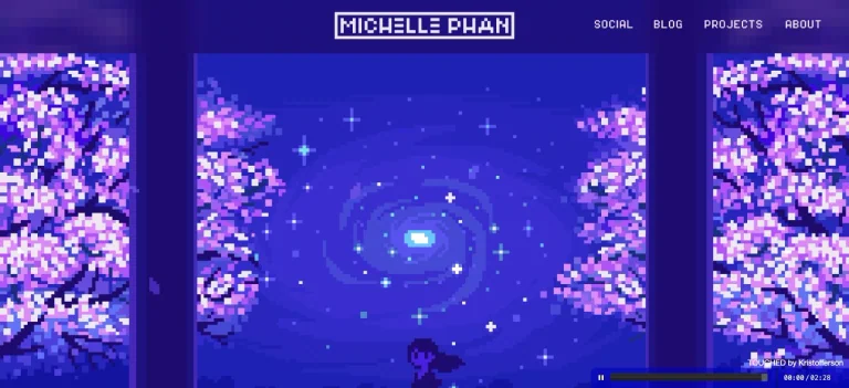
A pixel-art world becomes the opening visual, framed by a game-like wordmark and a compact navigation row.
Useful for: A beauty creator website; study its opening composition, identity, and paths into the creator’s work.
# Design reference: Michelle Phan
Source: https://www.michellephan.com/
Swipefile reference: https://swipefile.design/ref/youtube-michelle-phan/
Captured: 2026-09-08. This is a dated reference, not a claim about the current live product.
Capture scope: one viewport. Do not infer unseen page sections or a complete user flow.

## Objective
Adapt the visual principles below to my project. Use my own content and identity. Do not reproduce logos, proprietary copy, or brand assets.

## Reference notes
- mood: Digital and nostalgic.
- colors: Electric violet, indigo, pink, and white.
- typography: Use the hierarchy visible in the capture: one main statement and a restrained secondary navigation.
- layout: A pixel-art world becomes the opening visual, framed by a game-like wordmark and a compact navigation row.
- motion: Static viewport capture. Inspect the source website to assess animation, video, and reduced-motion behavior.
- texture: Graphic illustration and shape provide the visual detail.
- dont: Do not reproduce the creator’s identity, claims, copy, or artwork in a new brand.

Useful for: A beauty creator website; study its opening composition, identity, and paths into the creator’s work.

## Acceptance criteria
- Existing project conventions, design tokens, working functionality, and unrelated changes are preserved.
- Two or three reference principles clearly support the user's task; conflicts are resolved in favor of usability and the existing product.
- Reusable components and semantic HTML express the interface. Available licensed assets are used; important UI text is never rendered as a bitmap.
- Every visible control has a defined behavior. Loading, empty, error, success, disabled, and long-content states are specified where relevant. Demo data is clearly labeled.
- Navigation and content adapt at 375px, 768px, and 1440px without horizontal page overflow. Keyboard use, visible focus, labeled inputs, at least 44px touch targets, readable contrast, and reduced motion are supported.
- Verification distinguishes rendered behavior from proposals and identifies anything still requiring a backend or external service.

## Quality bar
Clear hierarchy, consistent spacing, restrained surfaces, and purposeful motion. Avoid decorative gradients, excessive cards, placeholder buttons, and invented metrics unless the project calls for them. Do not claim a feature is connected or tested without evidence.
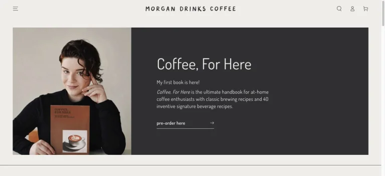
A neutral split hero pairs a book portrait with a dark text panel, using a narrow type style and restrained preorder link.
Useful for: A food creator website; study its opening composition, identity, and paths into the creator’s work.
# Design reference: Morgan Eckroth
Source: https://morgandrinkscoffee.com/
Swipefile reference: https://swipefile.design/ref/youtube-morgan-eckroth/
Captured: 2026-09-08. This is a dated reference, not a claim about the current live product.
Capture scope: one viewport. Do not infer unseen page sections or a complete user flow.

## Objective
Adapt the visual principles below to my project. Use my own content and identity. Do not reproduce logos, proprietary copy, or brand assets.

## Reference notes
- mood: Calm and editorial.
- colors: Warm white, charcoal, and natural portrait tones.
- typography: The captured page uses Dosis. Keep a clear contrast between the main statement and the smaller navigation.
- layout: A neutral split hero pairs a book portrait with a dark text panel, using a narrow type style and restrained preorder link.
- motion: Static viewport capture. Inspect the source website to assess animation, video, and reduced-motion behavior.
- texture: Let the original photographic or video imagery carry the visual detail.
- dont: Do not reproduce the creator’s identity, claims, copy, or artwork in a new brand.

Useful for: A food creator website; study its opening composition, identity, and paths into the creator’s work.

## Acceptance criteria
- Existing project conventions, design tokens, working functionality, and unrelated changes are preserved.
- Two or three reference principles clearly support the user's task; conflicts are resolved in favor of usability and the existing product.
- Reusable components and semantic HTML express the interface. Available licensed assets are used; important UI text is never rendered as a bitmap.
- Every visible control has a defined behavior. Loading, empty, error, success, disabled, and long-content states are specified where relevant. Demo data is clearly labeled.
- Navigation and content adapt at 375px, 768px, and 1440px without horizontal page overflow. Keyboard use, visible focus, labeled inputs, at least 44px touch targets, readable contrast, and reduced motion are supported.
- Verification distinguishes rendered behavior from proposals and identifies anything still requiring a backend or external service.

## Quality bar
Clear hierarchy, consistent spacing, restrained surfaces, and purposeful motion. Avoid decorative gradients, excessive cards, placeholder buttons, and invented metrics unless the project calls for them. Do not claim a feature is connected or tested without evidence.
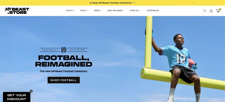
A vivid store hero places oversized promotional lettering over sports photography, below a bright announcement strip and compact product navigation.
Useful for: A entertainment creator website; study its opening composition, identity, and paths into the creator’s work.
# Design reference: MrBeast
Source: https://mrbeast.store/
Swipefile reference: https://swipefile.design/ref/youtube-mrbeast/
Captured: 2026-09-08. This is a dated reference, not a claim about the current live product.
Capture scope: one viewport. Do not infer unseen page sections or a complete user flow.

## Objective
Adapt the visual principles below to my project. Use my own content and identity. Do not reproduce logos, proprietary copy, or brand assets.

## Reference notes
- mood: Energetic and commercial.
- colors: Sky blue, bright yellow, black, and white.
- typography: The captured page uses transducer and Work Sans. Keep a clear contrast between the main statement and the smaller navigation.
- layout: A vivid store hero places oversized promotional lettering over sports photography, below a bright announcement strip and compact product navigation.
- motion: Static viewport capture. Inspect the source website to assess animation, video, and reduced-motion behavior.
- texture: Let the original photographic or video imagery carry the visual detail.
- dont: Do not reproduce the creator’s identity, claims, copy, or artwork in a new brand.

Useful for: A entertainment creator website; study its opening composition, identity, and paths into the creator’s work.

## Acceptance criteria
- Existing project conventions, design tokens, working functionality, and unrelated changes are preserved.
- Two or three reference principles clearly support the user's task; conflicts are resolved in favor of usability and the existing product.
- Reusable components and semantic HTML express the interface. Available licensed assets are used; important UI text is never rendered as a bitmap.
- Every visible control has a defined behavior. Loading, empty, error, success, disabled, and long-content states are specified where relevant. Demo data is clearly labeled.
- Navigation and content adapt at 375px, 768px, and 1440px without horizontal page overflow. Keyboard use, visible focus, labeled inputs, at least 44px touch targets, readable contrast, and reduced motion are supported.
- Verification distinguishes rendered behavior from proposals and identifies anything still requiring a backend or external service.

## Quality bar
Clear hierarchy, consistent spacing, restrained surfaces, and purposeful motion. Avoid decorative gradients, excessive cards, placeholder buttons, and invented metrics unless the project calls for them. Do not claim a feature is connected or tested without evidence.
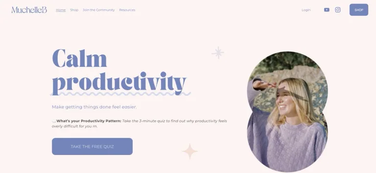
A soft productivity homepage combines a decorative serif headline, an arched portrait, small star details, and a rounded quiz action.
Useful for: A productivity creator website; study its opening composition, identity, and paths into the creator’s work.
# Design reference: MuchelleB
Source: https://www.muchelleb.com.au/
Swipefile reference: https://swipefile.design/ref/youtube-muchelleb/
Captured: 2026-09-08. This is a dated reference, not a claim about the current live product.
Capture scope: one viewport. Do not infer unseen page sections or a complete user flow.

## Objective
Adapt the visual principles below to my project. Use my own content and identity. Do not reproduce logos, proprietary copy, or brand assets.

## Reference notes
- mood: Gentle and personal.
- colors: Pale pink, periwinkle, cream, and lavender.
- typography: The captured page uses Tan-Ashford. Keep a clear contrast between the main statement and the smaller navigation.
- layout: A soft productivity homepage combines a decorative serif headline, an arched portrait, small star details, and a rounded quiz action.
- motion: Static viewport capture. Inspect the source website to assess animation, video, and reduced-motion behavior.
- texture: Let the original photographic or video imagery carry the visual detail.
- dont: Do not reproduce the creator’s identity, claims, copy, or artwork in a new brand.

Useful for: A productivity creator website; study its opening composition, identity, and paths into the creator’s work.

## Acceptance criteria
- Existing project conventions, design tokens, working functionality, and unrelated changes are preserved.
- Two or three reference principles clearly support the user's task; conflicts are resolved in favor of usability and the existing product.
- Reusable components and semantic HTML express the interface. Available licensed assets are used; important UI text is never rendered as a bitmap.
- Every visible control has a defined behavior. Loading, empty, error, success, disabled, and long-content states are specified where relevant. Demo data is clearly labeled.
- Navigation and content adapt at 375px, 768px, and 1440px without horizontal page overflow. Keyboard use, visible focus, labeled inputs, at least 44px touch targets, readable contrast, and reduced motion are supported.
- Verification distinguishes rendered behavior from proposals and identifies anything still requiring a backend or external service.

## Quality bar
Clear hierarchy, consistent spacing, restrained surfaces, and purposeful motion. Avoid decorative gradients, excessive cards, placeholder buttons, and invented metrics unless the project calls for them. Do not claim a feature is connected or tested without evidence.
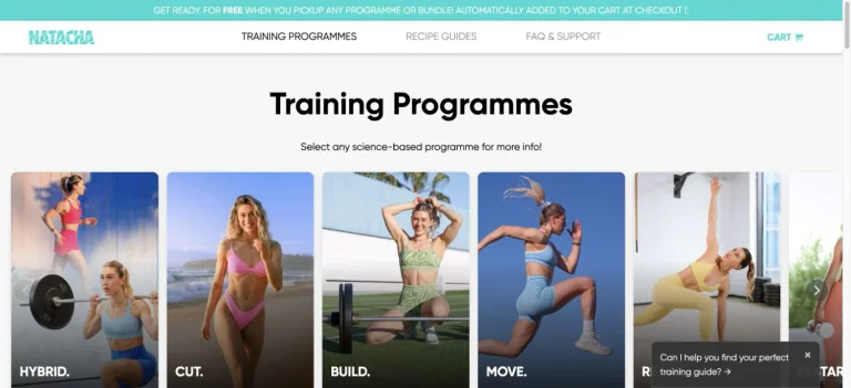
A clean training-program catalog uses bold section typography and a horizontal row of large photographic program cards.
Useful for: A fitness creator website; study its opening composition, identity, and paths into the creator’s work.
# Design reference: Natacha Océane
Source: https://natachaoceane.com/
Swipefile reference: https://swipefile.design/ref/youtube-natacha-oceane/
Captured: 2026-09-08. This is a dated reference, not a claim about the current live product.
Capture scope: one viewport. Do not infer unseen page sections or a complete user flow.

## Objective
Adapt the visual principles below to my project. Use my own content and identity. Do not reproduce logos, proprietary copy, or brand assets.

## Reference notes
- mood: Practical and visual.
- colors: White, black, turquoise, and fitness photography.
- typography: The captured page uses Gilroy Bold. Keep a clear contrast between the main statement and the smaller navigation.
- layout: A clean training-program catalog uses bold section typography and a horizontal row of large photographic program cards.
- motion: Static viewport capture. Inspect the source website to assess animation, video, and reduced-motion behavior.
- texture: Let the original photographic or video imagery carry the visual detail.
- dont: Do not reproduce the creator’s identity, claims, copy, or artwork in a new brand.

Useful for: A fitness creator website; study its opening composition, identity, and paths into the creator’s work.

## Acceptance criteria
- Existing project conventions, design tokens, working functionality, and unrelated changes are preserved.
- Two or three reference principles clearly support the user's task; conflicts are resolved in favor of usability and the existing product.
- Reusable components and semantic HTML express the interface. Available licensed assets are used; important UI text is never rendered as a bitmap.
- Every visible control has a defined behavior. Loading, empty, error, success, disabled, and long-content states are specified where relevant. Demo data is clearly labeled.
- Navigation and content adapt at 375px, 768px, and 1440px without horizontal page overflow. Keyboard use, visible focus, labeled inputs, at least 44px touch targets, readable contrast, and reduced motion are supported.
- Verification distinguishes rendered behavior from proposals and identifies anything still requiring a backend or external service.

## Quality bar
Clear hierarchy, consistent spacing, restrained surfaces, and purposeful motion. Avoid decorative gradients, excessive cards, placeholder buttons, and invented metrics unless the project calls for them. Do not claim a feature is connected or tested without evidence.
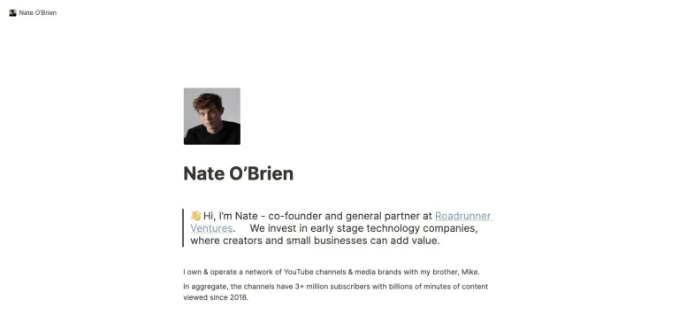
A sparse personal page pairs a small portrait and bold name with a short introduction and a restrained set of text links.
Useful for: A finance creator website; study its opening composition, identity, and paths into the creator’s work.
# Design reference: Nate O’Brien
Source: https://nateobrien.com/
Swipefile reference: https://swipefile.design/ref/youtube-nate-o-brien/
Captured: 2026-09-08. This is a dated reference, not a claim about the current live product.
Capture scope: one viewport. Do not infer unseen page sections or a complete user flow.

## Objective
Adapt the visual principles below to my project. Use my own content and identity. Do not reproduce logos, proprietary copy, or brand assets.

## Reference notes
- mood: Minimal and direct.
- colors: White, charcoal, and pale blue links.
- typography: The captured page uses Inter. Keep a clear contrast between the main statement and the smaller navigation.
- layout: A sparse personal page pairs a small portrait and bold name with a short introduction and a restrained set of text links.
- motion: Static viewport capture. Inspect the source website to assess animation, video, and reduced-motion behavior.
- texture: Let the original photographic or video imagery carry the visual detail.
- dont: Do not reproduce the creator’s identity, claims, copy, or artwork in a new brand.

Useful for: A finance creator website; study its opening composition, identity, and paths into the creator’s work.

## Acceptance criteria
- Existing project conventions, design tokens, working functionality, and unrelated changes are preserved.
- Two or three reference principles clearly support the user's task; conflicts are resolved in favor of usability and the existing product.
- Reusable components and semantic HTML express the interface. Available licensed assets are used; important UI text is never rendered as a bitmap.
- Every visible control has a defined behavior. Loading, empty, error, success, disabled, and long-content states are specified where relevant. Demo data is clearly labeled.
- Navigation and content adapt at 375px, 768px, and 1440px without horizontal page overflow. Keyboard use, visible focus, labeled inputs, at least 44px touch targets, readable contrast, and reduced motion are supported.
- Verification distinguishes rendered behavior from proposals and identifies anything still requiring a backend or external service.

## Quality bar
Clear hierarchy, consistent spacing, restrained surfaces, and purposeful motion. Avoid decorative gradients, excessive cards, placeholder buttons, and invented metrics unless the project calls for them. Do not claim a feature is connected or tested without evidence.
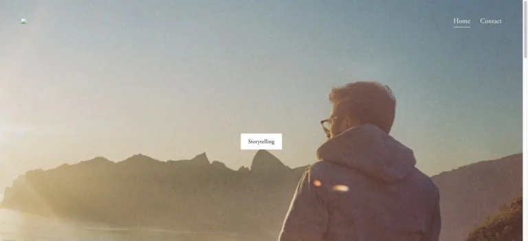
A grainy mountain photograph fills the opening view, with extremely restrained corner navigation and a small central storytelling link.
Useful for: A filmmaking creator website; study its opening composition, identity, and paths into the creator’s work.
# Design reference: Nathaniel Drew
Source: https://www.nathanieldrew.com/
Swipefile reference: https://swipefile.design/ref/youtube-nathaniel-drew/
Captured: 2026-09-08. This is a dated reference, not a claim about the current live product.
Capture scope: one viewport. Do not infer unseen page sections or a complete user flow.

## Objective
Adapt the visual principles below to my project. Use my own content and identity. Do not reproduce logos, proprietary copy, or brand assets.

## Reference notes
- mood: Reflective and cinematic.
- colors: Muted gold, pale blue, charcoal, and white.
- typography: Use the hierarchy visible in the capture: one main statement and a restrained secondary navigation.
- layout: A grainy mountain photograph fills the opening view, with extremely restrained corner navigation and a small central storytelling link.
- motion: Static viewport capture. Inspect the source website to assess animation, video, and reduced-motion behavior.
- texture: Let the original photographic or video imagery carry the visual detail.
- dont: Do not reproduce the creator’s identity, claims, copy, or artwork in a new brand.

Useful for: A filmmaking creator website; study its opening composition, identity, and paths into the creator’s work.

## Acceptance criteria
- Existing project conventions, design tokens, working functionality, and unrelated changes are preserved.
- Two or three reference principles clearly support the user's task; conflicts are resolved in favor of usability and the existing product.
- Reusable components and semantic HTML express the interface. Available licensed assets are used; important UI text is never rendered as a bitmap.
- Every visible control has a defined behavior. Loading, empty, error, success, disabled, and long-content states are specified where relevant. Demo data is clearly labeled.
- Navigation and content adapt at 375px, 768px, and 1440px without horizontal page overflow. Keyboard use, visible focus, labeled inputs, at least 44px touch targets, readable contrast, and reduced motion are supported.
- Verification distinguishes rendered behavior from proposals and identifies anything still requiring a backend or external service.

## Quality bar
Clear hierarchy, consistent spacing, restrained surfaces, and purposeful motion. Avoid decorative gradients, excessive cards, placeholder buttons, and invented metrics unless the project calls for them. Do not claim a feature is connected or tested without evidence.
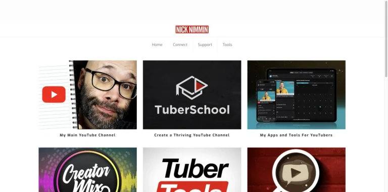
A centered wordmark and simple navigation lead into a grid of channel, training, music, and creator-tool tiles.
Useful for: A business creator website; study its opening composition, identity, and paths into the creator’s work.
# Design reference: Nick Nimmin
Source: https://www.nicknimmin.com/
Swipefile reference: https://swipefile.design/ref/youtube-nick-nimmin/
Captured: 2026-09-08. This is a dated reference, not a claim about the current live product.
Capture scope: one viewport. Do not infer unseen page sections or a complete user flow.

## Objective
Adapt the visual principles below to my project. Use my own content and identity. Do not reproduce logos, proprietary copy, or brand assets.

## Reference notes
- mood: Practical and modular.
- colors: White, black, red, and colorful tile artwork.
- typography: The captured page uses Exo. Keep a clear contrast between the main statement and the smaller navigation.
- layout: A centered wordmark and simple navigation lead into a grid of channel, training, music, and creator-tool tiles.
- motion: Static viewport capture. Inspect the source website to assess animation, video, and reduced-motion behavior.
- texture: Keep surfaces restrained so the typography and content stay prominent.
- dont: Do not reproduce the creator’s identity, claims, copy, or artwork in a new brand.

Useful for: A business creator website; study its opening composition, identity, and paths into the creator’s work.

## Acceptance criteria
- Existing project conventions, design tokens, working functionality, and unrelated changes are preserved.
- Two or three reference principles clearly support the user's task; conflicts are resolved in favor of usability and the existing product.
- Reusable components and semantic HTML express the interface. Available licensed assets are used; important UI text is never rendered as a bitmap.
- Every visible control has a defined behavior. Loading, empty, error, success, disabled, and long-content states are specified where relevant. Demo data is clearly labeled.
- Navigation and content adapt at 375px, 768px, and 1440px without horizontal page overflow. Keyboard use, visible focus, labeled inputs, at least 44px touch targets, readable contrast, and reduced motion are supported.
- Verification distinguishes rendered behavior from proposals and identifies anything still requiring a backend or external service.

## Quality bar
Clear hierarchy, consistent spacing, restrained surfaces, and purposeful motion. Avoid decorative gradients, excessive cards, placeholder buttons, and invented metrics unless the project calls for them. Do not claim a feature is connected or tested without evidence.
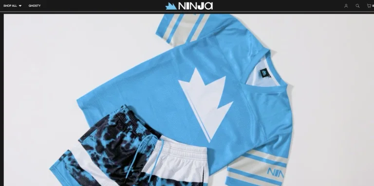
A minimal dark merchandise header leaves most of the screen to a large branded apparel photograph.
Useful for: A gaming creator website; study its opening composition, identity, and paths into the creator’s work.
# Design reference: Ninja
Source: https://teamninja.com/
Swipefile reference: https://swipefile.design/ref/youtube-ninja/
Captured: 2026-09-08. This is a dated reference, not a claim about the current live product.
Capture scope: one viewport. Do not infer unseen page sections or a complete user flow.

## Objective
Adapt the visual principles below to my project. Use my own content and identity. Do not reproduce logos, proprietary copy, or brand assets.

## Reference notes
- mood: Graphic and product-focused.
- colors: Black, white, and icy blue.
- typography: The captured page uses Helvetica. Keep a clear contrast between the main statement and the smaller navigation.
- layout: A minimal dark merchandise header leaves most of the screen to a large branded apparel photograph.
- motion: Static viewport capture. Inspect the source website to assess animation, video, and reduced-motion behavior.
- texture: Let the original photographic or video imagery carry the visual detail.
- dont: Do not reproduce the creator’s identity, claims, copy, or artwork in a new brand.

Useful for: A gaming creator website; study its opening composition, identity, and paths into the creator’s work.

## Acceptance criteria
- Existing project conventions, design tokens, working functionality, and unrelated changes are preserved.
- Two or three reference principles clearly support the user's task; conflicts are resolved in favor of usability and the existing product.
- Reusable components and semantic HTML express the interface. Available licensed assets are used; important UI text is never rendered as a bitmap.
- Every visible control has a defined behavior. Loading, empty, error, success, disabled, and long-content states are specified where relevant. Demo data is clearly labeled.
- Navigation and content adapt at 375px, 768px, and 1440px without horizontal page overflow. Keyboard use, visible focus, labeled inputs, at least 44px touch targets, readable contrast, and reduced motion are supported.
- Verification distinguishes rendered behavior from proposals and identifies anything still requiring a backend or external service.

## Quality bar
Clear hierarchy, consistent spacing, restrained surfaces, and purposeful motion. Avoid decorative gradients, excessive cards, placeholder buttons, and invented metrics unless the project calls for them. Do not claim a feature is connected or tested without evidence.
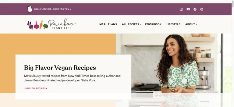
A warm recipe hero combines a large yellow field, an overlapping white introduction panel, and a bright kitchen portrait.
Useful for: A food creator website; study its opening composition, identity, and paths into the creator’s work.
# Design reference: Nisha Vora — Rainbow Plant Life
Source: https://rainbowplantlife.com/
Swipefile reference: https://swipefile.design/ref/youtube-nisha-vora/
Captured: 2026-09-08. This is a dated reference, not a claim about the current live product.
Capture scope: one viewport. Do not infer unseen page sections or a complete user flow.

## Objective
Adapt the visual principles below to my project. Use my own content and identity. Do not reproduce logos, proprietary copy, or brand assets.

## Reference notes
- mood: Welcoming and colorful.
- colors: Cream, mustard yellow, plum, and white.
- typography: The captured page uses Recoleta. Keep a clear contrast between the main statement and the smaller navigation.
- layout: A warm recipe hero combines a large yellow field, an overlapping white introduction panel, and a bright kitchen portrait.
- motion: Static viewport capture. Inspect the source website to assess animation, video, and reduced-motion behavior.
- texture: Let the original photographic or video imagery carry the visual detail.
- dont: Do not reproduce the creator’s identity, claims, copy, or artwork in a new brand.

Useful for: A food creator website; study its opening composition, identity, and paths into the creator’s work.

## Acceptance criteria
- Existing project conventions, design tokens, working functionality, and unrelated changes are preserved.
- Two or three reference principles clearly support the user's task; conflicts are resolved in favor of usability and the existing product.
- Reusable components and semantic HTML express the interface. Available licensed assets are used; important UI text is never rendered as a bitmap.
- Every visible control has a defined behavior. Loading, empty, error, success, disabled, and long-content states are specified where relevant. Demo data is clearly labeled.
- Navigation and content adapt at 375px, 768px, and 1440px without horizontal page overflow. Keyboard use, visible focus, labeled inputs, at least 44px touch targets, readable contrast, and reduced motion are supported.
- Verification distinguishes rendered behavior from proposals and identifies anything still requiring a backend or external service.

## Quality bar
Clear hierarchy, consistent spacing, restrained surfaces, and purposeful motion. Avoid decorative gradients, excessive cards, placeholder buttons, and invented metrics unless the project calls for them. Do not claim a feature is connected or tested without evidence.
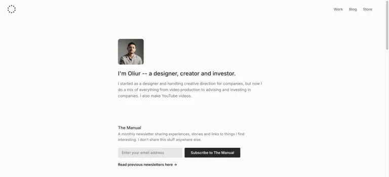
A very restrained personal homepage uses a small portrait, concise introduction, tiny navigation, and a compact newsletter form.
Useful for: A design creator website; study its opening composition, identity, and paths into the creator’s work.
# Design reference: Oliur
Source: https://www.oliur.com/
Swipefile reference: https://swipefile.design/ref/youtube-oliur/
Captured: 2026-09-08. This is a dated reference, not a claim about the current live product.
Capture scope: one viewport. Do not infer unseen page sections or a complete user flow.

## Objective
Adapt the visual principles below to my project. Use my own content and identity. Do not reproduce logos, proprietary copy, or brand assets.

## Reference notes
- mood: Quiet and minimal.
- colors: Off-white, charcoal, and soft gray.
- typography: The captured page uses Inter. Keep a clear contrast between the main statement and the smaller navigation.
- layout: A very restrained personal homepage uses a small portrait, concise introduction, tiny navigation, and a compact newsletter form.
- motion: Static viewport capture. Inspect the source website to assess animation, video, and reduced-motion behavior.
- texture: Let the original photographic or video imagery carry the visual detail.
- dont: Do not reproduce the creator’s identity, claims, copy, or artwork in a new brand.

Useful for: A design creator website; study its opening composition, identity, and paths into the creator’s work.

## Acceptance criteria
- Existing project conventions, design tokens, working functionality, and unrelated changes are preserved.
- Two or three reference principles clearly support the user's task; conflicts are resolved in favor of usability and the existing product.
- Reusable components and semantic HTML express the interface. Available licensed assets are used; important UI text is never rendered as a bitmap.
- Every visible control has a defined behavior. Loading, empty, error, success, disabled, and long-content states are specified where relevant. Demo data is clearly labeled.
- Navigation and content adapt at 375px, 768px, and 1440px without horizontal page overflow. Keyboard use, visible focus, labeled inputs, at least 44px touch targets, readable contrast, and reduced motion are supported.
- Verification distinguishes rendered behavior from proposals and identifies anything still requiring a backend or external service.

## Quality bar
Clear hierarchy, consistent spacing, restrained surfaces, and purposeful motion. Avoid decorative gradients, excessive cards, placeholder buttons, and invented metrics unless the project calls for them. Do not claim a feature is connected or tested without evidence.
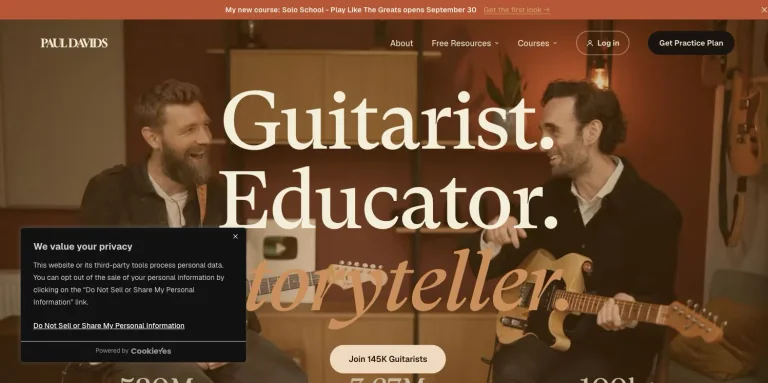
A warm guitar-studio photograph sits behind oversized serif positioning and a clear practice-plan action under compact navigation.
Useful for: A music creator website; study its opening composition, identity, and paths into the creator’s work.
# Design reference: Paul Davids
Source: https://pauldavidsguitar.com/
Swipefile reference: https://swipefile.design/ref/youtube-paul-davids/
Captured: 2026-09-08. This is a dated reference, not a claim about the current live product.
Capture scope: one viewport. Do not infer unseen page sections or a complete user flow.

## Objective
Adapt the visual principles below to my project. Use my own content and identity. Do not reproduce logos, proprietary copy, or brand assets.

## Reference notes
- mood: Craft-focused and inviting.
- colors: Warm brown, cream, orange, and black.
- typography: The captured page uses GT Super Text and Fraunces Variable. Keep a clear contrast between the main statement and the smaller navigation.
- layout: A warm guitar-studio photograph sits behind oversized serif positioning and a clear practice-plan action under compact navigation.
- motion: Static viewport capture. Inspect the source website to assess animation, video, and reduced-motion behavior.
- texture: Let the original photographic or video imagery carry the visual detail.
- dont: Do not reproduce the creator’s identity, claims, copy, or artwork in a new brand.

Useful for: A music creator website; study its opening composition, identity, and paths into the creator’s work.

## Acceptance criteria
- Existing project conventions, design tokens, working functionality, and unrelated changes are preserved.
- Two or three reference principles clearly support the user's task; conflicts are resolved in favor of usability and the existing product.
- Reusable components and semantic HTML express the interface. Available licensed assets are used; important UI text is never rendered as a bitmap.
- Every visible control has a defined behavior. Loading, empty, error, success, disabled, and long-content states are specified where relevant. Demo data is clearly labeled.
- Navigation and content adapt at 375px, 768px, and 1440px without horizontal page overflow. Keyboard use, visible focus, labeled inputs, at least 44px touch targets, readable contrast, and reduced motion are supported.
- Verification distinguishes rendered behavior from proposals and identifies anything still requiring a backend or external service.

## Quality bar
Clear hierarchy, consistent spacing, restrained surfaces, and purposeful motion. Avoid decorative gradients, excessive cards, placeholder buttons, and invented metrics unless the project calls for them. Do not claim a feature is connected or tested without evidence.
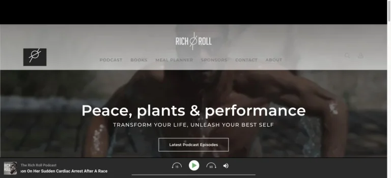
A subdued photographic hero uses a centered statement and one podcast action beneath a monochrome navigation row.
Useful for: A wellness creator website; study its opening composition, identity, and paths into the creator’s work.
# Design reference: Rich Roll
Source: https://richroll.com/
Swipefile reference: https://swipefile.design/ref/youtube-rich-roll/
Captured: 2026-09-08. This is a dated reference, not a claim about the current live product.
Capture scope: one viewport. Do not infer unseen page sections or a complete user flow.

## Objective
Adapt the visual principles below to my project. Use my own content and identity. Do not reproduce logos, proprietary copy, or brand assets.

## Reference notes
- mood: Reflective and grounded.
- colors: Charcoal, white, and muted natural tones.
- typography: The captured page uses Montserrat. Keep a clear contrast between the main statement and the smaller navigation.
- layout: A subdued photographic hero uses a centered statement and one podcast action beneath a monochrome navigation row.
- motion: Static viewport capture. Inspect the source website to assess animation, video, and reduced-motion behavior.
- texture: Let the original photographic or video imagery carry the visual detail.
- dont: Do not reproduce the creator’s identity, claims, copy, or artwork in a new brand.

Useful for: A wellness creator website; study its opening composition, identity, and paths into the creator’s work.

## Acceptance criteria
- Existing project conventions, design tokens, working functionality, and unrelated changes are preserved.
- Two or three reference principles clearly support the user's task; conflicts are resolved in favor of usability and the existing product.
- Reusable components and semantic HTML express the interface. Available licensed assets are used; important UI text is never rendered as a bitmap.
- Every visible control has a defined behavior. Loading, empty, error, success, disabled, and long-content states are specified where relevant. Demo data is clearly labeled.
- Navigation and content adapt at 375px, 768px, and 1440px without horizontal page overflow. Keyboard use, visible focus, labeled inputs, at least 44px touch targets, readable contrast, and reduced motion are supported.
- Verification distinguishes rendered behavior from proposals and identifies anything still requiring a backend or external service.

## Quality bar
Clear hierarchy, consistent spacing, restrained surfaces, and purposeful motion. Avoid decorative gradients, excessive cards, placeholder buttons, and invented metrics unless the project calls for them. Do not claim a feature is connected or tested without evidence.
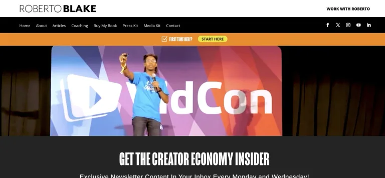
A compact personal-brand header and orange resource strip lead to a large speaking photograph and bold newsletter positioning.
Useful for: A business creator website; study its opening composition, identity, and paths into the creator’s work.
# Design reference: Roberto Blake
Source: https://robertoblake.com/
Swipefile reference: https://swipefile.design/ref/youtube-roberto-blake/
Captured: 2026-09-08. This is a dated reference, not a claim about the current live product.
Capture scope: one viewport. Do not infer unseen page sections or a complete user flow.

## Objective
Adapt the visual principles below to my project. Use my own content and identity. Do not reproduce logos, proprietary copy, or brand assets.

## Reference notes
- mood: Professional and creator-focused.
- colors: White, black, orange, and presentation colors.
- typography: The captured page uses mongoose. Keep a clear contrast between the main statement and the smaller navigation.
- layout: A compact personal-brand header and orange resource strip lead to a large speaking photograph and bold newsletter positioning.
- motion: Static viewport capture. Inspect the source website to assess animation, video, and reduced-motion behavior.
- texture: Let the original photographic or video imagery carry the visual detail.
- dont: Do not reproduce the creator’s identity, claims, copy, or artwork in a new brand.

Useful for: A business creator website; study its opening composition, identity, and paths into the creator’s work.

## Acceptance criteria
- Existing project conventions, design tokens, working functionality, and unrelated changes are preserved.
- Two or three reference principles clearly support the user's task; conflicts are resolved in favor of usability and the existing product.
- Reusable components and semantic HTML express the interface. Available licensed assets are used; important UI text is never rendered as a bitmap.
- Every visible control has a defined behavior. Loading, empty, error, success, disabled, and long-content states are specified where relevant. Demo data is clearly labeled.
- Navigation and content adapt at 375px, 768px, and 1440px without horizontal page overflow. Keyboard use, visible focus, labeled inputs, at least 44px touch targets, readable contrast, and reduced motion are supported.
- Verification distinguishes rendered behavior from proposals and identifies anything still requiring a backend or external service.

## Quality bar
Clear hierarchy, consistent spacing, restrained surfaces, and purposeful motion. Avoid decorative gradients, excessive cards, placeholder buttons, and invented metrics unless the project calls for them. Do not claim a feature is connected or tested without evidence.
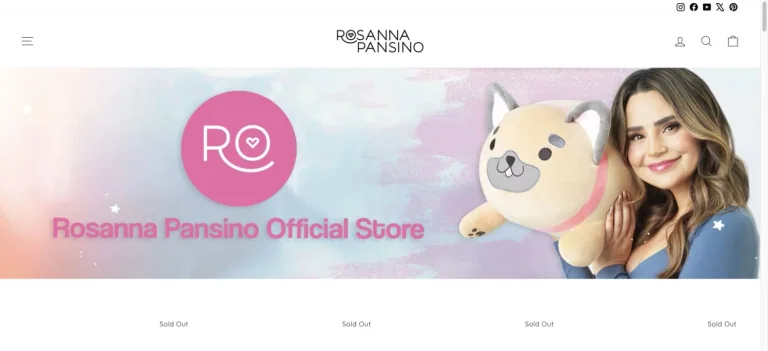
A light merchandise header gives way to pastel campaign artwork featuring the creator and character-based products.
Useful for: A food creator website; study its opening composition, identity, and paths into the creator’s work.
# Design reference: Rosanna Pansino
Source: https://rosannapansino.com/
Swipefile reference: https://swipefile.design/ref/youtube-rosanna-pansino/
Captured: 2026-09-08. This is a dated reference, not a claim about the current live product.
Capture scope: one viewport. Do not infer unseen page sections or a complete user flow.

## Objective
Adapt the visual principles below to my project. Use my own content and identity. Do not reproduce logos, proprietary copy, or brand assets.

## Reference notes
- mood: Cheerful and playful.
- colors: White, blush pink, pale blue, and lavender.
- typography: The captured page uses Montserrat. Keep a clear contrast between the main statement and the smaller navigation.
- layout: A light merchandise header gives way to pastel campaign artwork featuring the creator and character-based products.
- motion: Static viewport capture. Inspect the source website to assess animation, video, and reduced-motion behavior.
- texture: Keep surfaces restrained so the typography and content stay prominent.
- dont: Do not reproduce the creator’s identity, claims, copy, or artwork in a new brand.

Useful for: A food creator website; study its opening composition, identity, and paths into the creator’s work.

## Acceptance criteria
- Existing project conventions, design tokens, working functionality, and unrelated changes are preserved.
- Two or three reference principles clearly support the user's task; conflicts are resolved in favor of usability and the existing product.
- Reusable components and semantic HTML express the interface. Available licensed assets are used; important UI text is never rendered as a bitmap.
- Every visible control has a defined behavior. Loading, empty, error, success, disabled, and long-content states are specified where relevant. Demo data is clearly labeled.
- Navigation and content adapt at 375px, 768px, and 1440px without horizontal page overflow. Keyboard use, visible focus, labeled inputs, at least 44px touch targets, readable contrast, and reduced motion are supported.
- Verification distinguishes rendered behavior from proposals and identifies anything still requiring a backend or external service.

## Quality bar
Clear hierarchy, consistent spacing, restrained surfaces, and purposeful motion. Avoid decorative gradients, excessive cards, placeholder buttons, and invented metrics unless the project calls for them. Do not claim a feature is connected or tested without evidence.
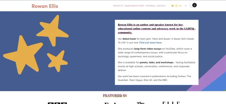
A colorful illustrated panel uses large star shapes and an overlapping white biography card under a compact author navigation.
Useful for: A commentary creator website; study its opening composition, identity, and paths into the creator’s work.
# Design reference: Rowan Ellis
Source: https://www.rowanellis.com/
Swipefile reference: https://swipefile.design/ref/youtube-rowan-ellis/
Captured: 2026-09-08. This is a dated reference, not a claim about the current live product.
Capture scope: one viewport. Do not infer unseen page sections or a complete user flow.

## Objective
Adapt the visual principles below to my project. Use my own content and identity. Do not reproduce logos, proprietary copy, or brand assets.

## Reference notes
- mood: Expressive and editorial.
- colors: Blue, lavender, mustard yellow, white, and coral.
- typography: The captured page uses BohemianSoul. Keep a clear contrast between the main statement and the smaller navigation.
- layout: A colorful illustrated panel uses large star shapes and an overlapping white biography card under a compact author navigation.
- motion: Static viewport capture. Inspect the source website to assess animation, video, and reduced-motion behavior.
- texture: Graphic illustration and shape provide the visual detail.
- dont: Do not reproduce the creator’s identity, claims, copy, or artwork in a new brand.

Useful for: A commentary creator website; study its opening composition, identity, and paths into the creator’s work.

## Acceptance criteria
- Existing project conventions, design tokens, working functionality, and unrelated changes are preserved.
- Two or three reference principles clearly support the user's task; conflicts are resolved in favor of usability and the existing product.
- Reusable components and semantic HTML express the interface. Available licensed assets are used; important UI text is never rendered as a bitmap.
- Every visible control has a defined behavior. Loading, empty, error, success, disabled, and long-content states are specified where relevant. Demo data is clearly labeled.
- Navigation and content adapt at 375px, 768px, and 1440px without horizontal page overflow. Keyboard use, visible focus, labeled inputs, at least 44px touch targets, readable contrast, and reduced motion are supported.
- Verification distinguishes rendered behavior from proposals and identifies anything still requiring a backend or external service.

## Quality bar
Clear hierarchy, consistent spacing, restrained surfaces, and purposeful motion. Avoid decorative gradients, excessive cards, placeholder buttons, and invented metrics unless the project calls for them. Do not claim a feature is connected or tested without evidence.
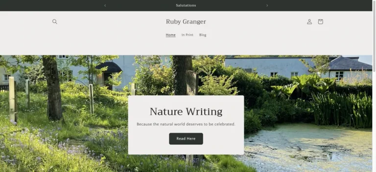
A quiet store header frames a garden photograph with a centered cream panel introducing nature writing.
Useful for: A education creator website; study its opening composition, identity, and paths into the creator’s work.
# Design reference: Ruby Granger
Source: https://rubygranger.com/
Swipefile reference: https://swipefile.design/ref/youtube-ruby-granger/
Captured: 2026-09-08. This is a dated reference, not a claim about the current live product.
Capture scope: one viewport. Do not infer unseen page sections or a complete user flow.

## Objective
Adapt the visual principles below to my project. Use my own content and identity. Do not reproduce logos, proprietary copy, or brand assets.

## Reference notes
- mood: Literary and pastoral.
- colors: Cream, forest green, white, and soft gray.
- typography: The captured page uses Trirong. Keep a clear contrast between the main statement and the smaller navigation.
- layout: A quiet store header frames a garden photograph with a centered cream panel introducing nature writing.
- motion: Static viewport capture. Inspect the source website to assess animation, video, and reduced-motion behavior.
- texture: Let the original photographic or video imagery carry the visual detail.
- dont: Do not reproduce the creator’s identity, claims, copy, or artwork in a new brand.

Useful for: A education creator website; study its opening composition, identity, and paths into the creator’s work.

## Acceptance criteria
- Existing project conventions, design tokens, working functionality, and unrelated changes are preserved.
- Two or three reference principles clearly support the user's task; conflicts are resolved in favor of usability and the existing product.
- Reusable components and semantic HTML express the interface. Available licensed assets are used; important UI text is never rendered as a bitmap.
- Every visible control has a defined behavior. Loading, empty, error, success, disabled, and long-content states are specified where relevant. Demo data is clearly labeled.
- Navigation and content adapt at 375px, 768px, and 1440px without horizontal page overflow. Keyboard use, visible focus, labeled inputs, at least 44px touch targets, readable contrast, and reduced motion are supported.
- Verification distinguishes rendered behavior from proposals and identifies anything still requiring a backend or external service.

## Quality bar
Clear hierarchy, consistent spacing, restrained surfaces, and purposeful motion. Avoid decorative gradients, excessive cards, placeholder buttons, and invented metrics unless the project calls for them. Do not claim a feature is connected or tested without evidence.
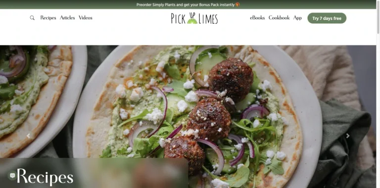
A spare recipe navigation bar places the brand centrally above an immersive close-up food photograph.
Useful for: A food creator website; study its opening composition, identity, and paths into the creator’s work.
# Design reference: Sadia Badiei — Pick Up Limes
Source: https://www.pickuplimes.com/
Swipefile reference: https://swipefile.design/ref/youtube-sadia-badiei/
Captured: 2026-09-08. This is a dated reference, not a claim about the current live product.
Capture scope: one viewport. Do not infer unseen page sections or a complete user flow.

## Objective
Adapt the visual principles below to my project. Use my own content and identity. Do not reproduce logos, proprietary copy, or brand assets.

## Reference notes
- mood: Fresh and photographic.
- colors: White, olive green, and natural food colors.
- typography: Use the hierarchy visible in the capture: one main statement and a restrained secondary navigation.
- layout: A spare recipe navigation bar places the brand centrally above an immersive close-up food photograph.
- motion: Static viewport capture. Inspect the source website to assess animation, video, and reduced-motion behavior.
- texture: Let the original photographic or video imagery carry the visual detail.
- dont: Do not reproduce the creator’s identity, claims, copy, or artwork in a new brand.

Useful for: A food creator website; study its opening composition, identity, and paths into the creator’s work.

## Acceptance criteria
- Existing project conventions, design tokens, working functionality, and unrelated changes are preserved.
- Two or three reference principles clearly support the user's task; conflicts are resolved in favor of usability and the existing product.
- Reusable components and semantic HTML express the interface. Available licensed assets are used; important UI text is never rendered as a bitmap.
- Every visible control has a defined behavior. Loading, empty, error, success, disabled, and long-content states are specified where relevant. Demo data is clearly labeled.
- Navigation and content adapt at 375px, 768px, and 1440px without horizontal page overflow. Keyboard use, visible focus, labeled inputs, at least 44px touch targets, readable contrast, and reduced motion are supported.
- Verification distinguishes rendered behavior from proposals and identifies anything still requiring a backend or external service.

## Quality bar
Clear hierarchy, consistent spacing, restrained surfaces, and purposeful motion. Avoid decorative gradients, excessive cards, placeholder buttons, and invented metrics unless the project calls for them. Do not claim a feature is connected or tested without evidence.
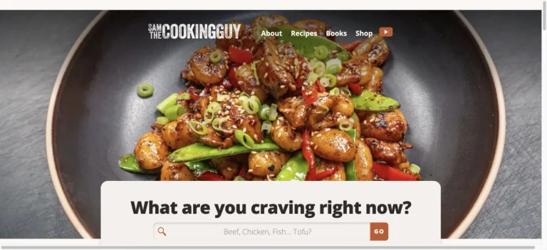
A large overhead food photograph anchors the homepage, with small navigation and a warm light panel introducing recipe discovery.
Useful for: A food creator website; study its opening composition, identity, and paths into the creator’s work.
# Design reference: Sam the Cooking Guy
Source: https://www.thecookingguy.com/
Swipefile reference: https://swipefile.design/ref/youtube-sam-the-cooking-guy/
Captured: 2026-09-08. This is a dated reference, not a claim about the current live product.
Capture scope: one viewport. Do not infer unseen page sections or a complete user flow.

## Objective
Adapt the visual principles below to my project. Use my own content and identity. Do not reproduce logos, proprietary copy, or brand assets.

## Reference notes
- mood: Appetizing and direct.
- colors: Charcoal, cream, white, and vivid food colors.
- typography: The captured page uses Opensans Variablefont Wdth Wght. Keep a clear contrast between the main statement and the smaller navigation.
- layout: A large overhead food photograph anchors the homepage, with small navigation and a warm light panel introducing recipe discovery.
- motion: Static viewport capture. Inspect the source website to assess animation, video, and reduced-motion behavior.
- texture: Let the original photographic or video imagery carry the visual detail.
- dont: Do not reproduce the creator’s identity, claims, copy, or artwork in a new brand.

Useful for: A food creator website; study its opening composition, identity, and paths into the creator’s work.

## Acceptance criteria
- Existing project conventions, design tokens, working functionality, and unrelated changes are preserved.
- Two or three reference principles clearly support the user's task; conflicts are resolved in favor of usability and the existing product.
- Reusable components and semantic HTML express the interface. Available licensed assets are used; important UI text is never rendered as a bitmap.
- Every visible control has a defined behavior. Loading, empty, error, success, disabled, and long-content states are specified where relevant. Demo data is clearly labeled.
- Navigation and content adapt at 375px, 768px, and 1440px without horizontal page overflow. Keyboard use, visible focus, labeled inputs, at least 44px touch targets, readable contrast, and reduced motion are supported.
- Verification distinguishes rendered behavior from proposals and identifies anything still requiring a backend or external service.

## Quality bar
Clear hierarchy, consistent spacing, restrained surfaces, and purposeful motion. Avoid decorative gradients, excessive cards, placeholder buttons, and invented metrics unless the project calls for them. Do not claim a feature is connected or tested without evidence.
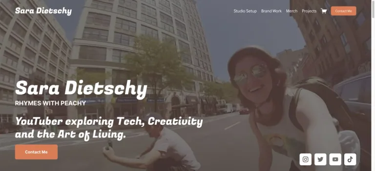
An urban creator photograph carries a large white introduction, small upper navigation, and a warm contrasting contact action.
Useful for: A technology creator website; study its opening composition, identity, and paths into the creator’s work.
# Design reference: Sara Dietschy
Source: https://saradietschy.com/
Swipefile reference: https://swipefile.design/ref/youtube-sara-dietschy/
Captured: 2026-09-08. This is a dated reference, not a claim about the current live product.
Capture scope: one viewport. Do not infer unseen page sections or a complete user flow.

## Objective
Adapt the visual principles below to my project. Use my own content and identity. Do not reproduce logos, proprietary copy, or brand assets.

## Reference notes
- mood: Casual and energetic.
- colors: Muted photographic gray, white, and orange.
- typography: The captured page uses Fugaz One. Keep a clear contrast between the main statement and the smaller navigation.
- layout: An urban creator photograph carries a large white introduction, small upper navigation, and a warm contrasting contact action.
- motion: Static viewport capture. Inspect the source website to assess animation, video, and reduced-motion behavior.
- texture: Let the original photographic or video imagery carry the visual detail.
- dont: Do not reproduce the creator’s identity, claims, copy, or artwork in a new brand.

Useful for: A technology creator website; study its opening composition, identity, and paths into the creator’s work.

## Acceptance criteria
- Existing project conventions, design tokens, working functionality, and unrelated changes are preserved.
- Two or three reference principles clearly support the user's task; conflicts are resolved in favor of usability and the existing product.
- Reusable components and semantic HTML express the interface. Available licensed assets are used; important UI text is never rendered as a bitmap.
- Every visible control has a defined behavior. Loading, empty, error, success, disabled, and long-content states are specified where relevant. Demo data is clearly labeled.
- Navigation and content adapt at 375px, 768px, and 1440px without horizontal page overflow. Keyboard use, visible focus, labeled inputs, at least 44px touch targets, readable contrast, and reduced motion are supported.
- Verification distinguishes rendered behavior from proposals and identifies anything still requiring a backend or external service.

## Quality bar
Clear hierarchy, consistent spacing, restrained surfaces, and purposeful motion. Avoid decorative gradients, excessive cards, placeholder buttons, and invented metrics unless the project calls for them. Do not claim a feature is connected or tested without evidence.
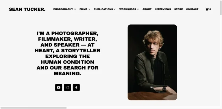
A light gray split composition balances a dense uppercase personal statement with a rounded portrait and small social buttons.
Useful for: A photography creator website; study its opening composition, identity, and paths into the creator’s work.
# Design reference: Sean Tucker
Source: https://www.seantucker.photography/
Swipefile reference: https://swipefile.design/ref/youtube-sean-tucker/
Captured: 2026-09-08. This is a dated reference, not a claim about the current live product.
Capture scope: one viewport. Do not infer unseen page sections or a complete user flow.

## Objective
Adapt the visual principles below to my project. Use my own content and identity. Do not reproduce logos, proprietary copy, or brand assets.

## Reference notes
- mood: Direct and contemplative.
- colors: Light gray, black, white, and portrait tones.
- typography: The captured page uses Archivo Black. Keep a clear contrast between the main statement and the smaller navigation.
- layout: A light gray split composition balances a dense uppercase personal statement with a rounded portrait and small social buttons.
- motion: Static viewport capture. Inspect the source website to assess animation, video, and reduced-motion behavior.
- texture: Let the original photographic or video imagery carry the visual detail.
- dont: Do not reproduce the creator’s identity, claims, copy, or artwork in a new brand.

Useful for: A photography creator website; study its opening composition, identity, and paths into the creator’s work.

## Acceptance criteria
- Existing project conventions, design tokens, working functionality, and unrelated changes are preserved.
- Two or three reference principles clearly support the user's task; conflicts are resolved in favor of usability and the existing product.
- Reusable components and semantic HTML express the interface. Available licensed assets are used; important UI text is never rendered as a bitmap.
- Every visible control has a defined behavior. Loading, empty, error, success, disabled, and long-content states are specified where relevant. Demo data is clearly labeled.
- Navigation and content adapt at 375px, 768px, and 1440px without horizontal page overflow. Keyboard use, visible focus, labeled inputs, at least 44px touch targets, readable contrast, and reduced motion are supported.
- Verification distinguishes rendered behavior from proposals and identifies anything still requiring a backend or external service.

## Quality bar
Clear hierarchy, consistent spacing, restrained surfaces, and purposeful motion. Avoid decorative gradients, excessive cards, placeholder buttons, and invented metrics unless the project calls for them. Do not claim a feature is connected or tested without evidence.
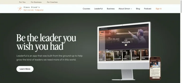
A dark green split hero combines a large white serif statement with desktop and phone product imagery, under a light navigation shell.
Useful for: A business creator website; study its opening composition, identity, and paths into the creator’s work.
# Design reference: Simon Sinek
Source: https://simonsinek.com/
Swipefile reference: https://swipefile.design/ref/youtube-simon-sinek/
Captured: 2026-09-08. This is a dated reference, not a claim about the current live product.
Capture scope: one viewport. Do not infer unseen page sections or a complete user flow.

## Objective
Adapt the visual principles below to my project. Use my own content and identity. Do not reproduce logos, proprietary copy, or brand assets.

## Reference notes
- mood: Calm and professional.
- colors: Deep green, cream, white, and soft gray.
- typography: The captured page uses Advercase. Keep a clear contrast between the main statement and the smaller navigation.
- layout: A dark green split hero combines a large white serif statement with desktop and phone product imagery, under a light navigation shell.
- motion: Static viewport capture. Inspect the source website to assess animation, video, and reduced-motion behavior.
- texture: Keep surfaces restrained so the typography and content stay prominent.
- dont: Do not reproduce the creator’s identity, claims, copy, or artwork in a new brand.

Useful for: A business creator website; study its opening composition, identity, and paths into the creator’s work.

## Acceptance criteria
- Existing project conventions, design tokens, working functionality, and unrelated changes are preserved.
- Two or three reference principles clearly support the user's task; conflicts are resolved in favor of usability and the existing product.
- Reusable components and semantic HTML express the interface. Available licensed assets are used; important UI text is never rendered as a bitmap.
- Every visible control has a defined behavior. Loading, empty, error, success, disabled, and long-content states are specified where relevant. Demo data is clearly labeled.
- Navigation and content adapt at 375px, 768px, and 1440px without horizontal page overflow. Keyboard use, visible focus, labeled inputs, at least 44px touch targets, readable contrast, and reduced motion are supported.
- Verification distinguishes rendered behavior from proposals and identifies anything still requiring a backend or external service.

## Quality bar
Clear hierarchy, consistent spacing, restrained surfaces, and purposeful motion. Avoid decorative gradients, excessive cards, placeholder buttons, and invented metrics unless the project calls for them. Do not claim a feature is connected or tested without evidence.
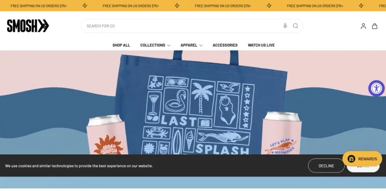
A colorful merchandise campaign pairs playful wave shapes and prominent products with a search-oriented store header.
Useful for: A entertainment creator website; study its opening composition, identity, and paths into the creator’s work.
# Design reference: Smosh — Ian Hecox and Anthony Padilla
Source: https://smosh.com/
Swipefile reference: https://swipefile.design/ref/youtube-smosh/
Captured: 2026-09-08. This is a dated reference, not a claim about the current live product.
Capture scope: one viewport. Do not infer unseen page sections or a complete user flow.

## Objective
Adapt the visual principles below to my project. Use my own content and identity. Do not reproduce logos, proprietary copy, or brand assets.

## Reference notes
- mood: Playful and commercial.
- colors: Cream, soft pink, dusty blue, black, and yellow.
- typography: Use the hierarchy visible in the capture: one main statement and a restrained secondary navigation.
- layout: A colorful merchandise campaign pairs playful wave shapes and prominent products with a search-oriented store header.
- motion: Static viewport capture. Inspect the source website to assess animation, video, and reduced-motion behavior.
- texture: Keep surfaces restrained so the typography and content stay prominent.
- dont: Do not reproduce the creator’s identity, claims, copy, or artwork in a new brand.

Useful for: A entertainment creator website; study its opening composition, identity, and paths into the creator’s work.

## Acceptance criteria
- Existing project conventions, design tokens, working functionality, and unrelated changes are preserved.
- Two or three reference principles clearly support the user's task; conflicts are resolved in favor of usability and the existing product.
- Reusable components and semantic HTML express the interface. Available licensed assets are used; important UI text is never rendered as a bitmap.
- Every visible control has a defined behavior. Loading, empty, error, success, disabled, and long-content states are specified where relevant. Demo data is clearly labeled.
- Navigation and content adapt at 375px, 768px, and 1440px without horizontal page overflow. Keyboard use, visible focus, labeled inputs, at least 44px touch targets, readable contrast, and reduced motion are supported.
- Verification distinguishes rendered behavior from proposals and identifies anything still requiring a backend or external service.

## Quality bar
Clear hierarchy, consistent spacing, restrained surfaces, and purposeful motion. Avoid decorative gradients, excessive cards, placeholder buttons, and invented metrics unless the project calls for them. Do not claim a feature is connected or tested without evidence.
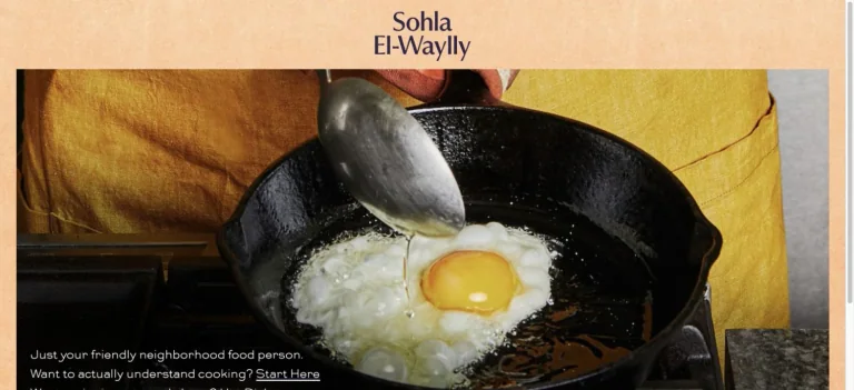
A warm textured page places a compact serif name over close-up cooking photography, creating a simple food-first identity.
Useful for: A food creator website; study its opening composition, identity, and paths into the creator’s work.
# Design reference: Sohla El-Waylly
Source: https://hellosohla.com/
Swipefile reference: https://swipefile.design/ref/youtube-sohla-el-waylly/
Captured: 2026-09-08. This is a dated reference, not a claim about the current live product.
Capture scope: one viewport. Do not infer unseen page sections or a complete user flow.

## Objective
Adapt the visual principles below to my project. Use my own content and identity. Do not reproduce logos, proprietary copy, or brand assets.

## Reference notes
- mood: Tactile and personal.
- colors: Warm cream, parchment orange, black, and food photography.
- typography: Use the hierarchy visible in the capture: one main statement and a restrained secondary navigation.
- layout: A warm textured page places a compact serif name over close-up cooking photography, creating a simple food-first identity.
- motion: Static viewport capture. Inspect the source website to assess animation, video, and reduced-motion behavior.
- texture: Let the original photographic or video imagery carry the visual detail.
- dont: Do not reproduce the creator’s identity, claims, copy, or artwork in a new brand.

Useful for: A food creator website; study its opening composition, identity, and paths into the creator’s work.

## Acceptance criteria
- Existing project conventions, design tokens, working functionality, and unrelated changes are preserved.
- Two or three reference principles clearly support the user's task; conflicts are resolved in favor of usability and the existing product.
- Reusable components and semantic HTML express the interface. Available licensed assets are used; important UI text is never rendered as a bitmap.
- Every visible control has a defined behavior. Loading, empty, error, success, disabled, and long-content states are specified where relevant. Demo data is clearly labeled.
- Navigation and content adapt at 375px, 768px, and 1440px without horizontal page overflow. Keyboard use, visible focus, labeled inputs, at least 44px touch targets, readable contrast, and reduced motion are supported.
- Verification distinguishes rendered behavior from proposals and identifies anything still requiring a backend or external service.

## Quality bar
Clear hierarchy, consistent spacing, restrained surfaces, and purposeful motion. Avoid decorative gradients, excessive cards, placeholder buttons, and invented metrics unless the project calls for them. Do not claim a feature is connected or tested without evidence.
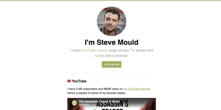
A small circular portrait and centered introduction lead into a video preview, with a restrained green contact button.
Useful for: A science creator website; study its opening composition, identity, and paths into the creator’s work.
# Design reference: Steve Mould
Source: https://stevemould.com/
Swipefile reference: https://swipefile.design/ref/youtube-steve-mould/
Captured: 2026-09-08. This is a dated reference, not a claim about the current live product.
Capture scope: one viewport. Do not infer unseen page sections or a complete user flow.

## Objective
Adapt the visual principles below to my project. Use my own content and identity. Do not reproduce logos, proprietary copy, or brand assets.

## Reference notes
- mood: Simple and approachable.
- colors: White, black, light gray, and muted green.
- typography: The captured page uses sans-serif. Keep a clear contrast between the main statement and the smaller navigation.
- layout: A small circular portrait and centered introduction lead into a video preview, with a restrained green contact button.
- motion: Static viewport capture. Inspect the source website to assess animation, video, and reduced-motion behavior.
- texture: Let the original photographic or video imagery carry the visual detail.
- dont: Do not reproduce the creator’s identity, claims, copy, or artwork in a new brand.

Useful for: A science creator website; study its opening composition, identity, and paths into the creator’s work.

## Acceptance criteria
- Existing project conventions, design tokens, working functionality, and unrelated changes are preserved.
- Two or three reference principles clearly support the user's task; conflicts are resolved in favor of usability and the existing product.
- Reusable components and semantic HTML express the interface. Available licensed assets are used; important UI text is never rendered as a bitmap.
- Every visible control has a defined behavior. Loading, empty, error, success, disabled, and long-content states are specified where relevant. Demo data is clearly labeled.
- Navigation and content adapt at 375px, 768px, and 1440px without horizontal page overflow. Keyboard use, visible focus, labeled inputs, at least 44px touch targets, readable contrast, and reduced motion are supported.
- Verification distinguishes rendered behavior from proposals and identifies anything still requiring a backend or external service.

## Quality bar
Clear hierarchy, consistent spacing, restrained surfaces, and purposeful motion. Avoid decorative gradients, excessive cards, placeholder buttons, and invented metrics unless the project calls for them. Do not claim a feature is connected or tested without evidence.
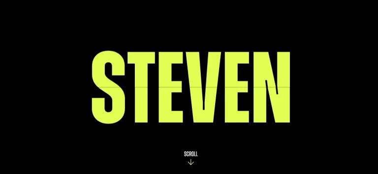
Oversized condensed lime lettering dominates a black opening screen, with a small scroll cue leading into the wider personal site.
Useful for: A business creator website; study its opening composition, identity, and paths into the creator’s work.
# Design reference: Steven Bartlett
Source: https://stevenbartlett.com/
Swipefile reference: https://swipefile.design/ref/youtube-steven-bartlett/
Captured: 2026-09-08. This is a dated reference, not a claim about the current live product.
Capture scope: one viewport. Do not infer unseen page sections or a complete user flow.

## Objective
Adapt the visual principles below to my project. Use my own content and identity. Do not reproduce logos, proprietary copy, or brand assets.

## Reference notes
- mood: Bold and typographic.
- colors: Black and vivid lime.
- typography: The captured page uses zuume. Keep a clear contrast between the main statement and the smaller navigation.
- layout: Oversized condensed lime lettering dominates a black opening screen, with a small scroll cue leading into the wider personal site.
- motion: Static viewport capture. Inspect the source website to assess animation, video, and reduced-motion behavior.
- texture: Keep surfaces restrained so the typography and content stay prominent.
- dont: Do not reproduce the creator’s identity, claims, copy, or artwork in a new brand.

Useful for: A business creator website; study its opening composition, identity, and paths into the creator’s work.

## Acceptance criteria
- Existing project conventions, design tokens, working functionality, and unrelated changes are preserved.
- Two or three reference principles clearly support the user's task; conflicts are resolved in favor of usability and the existing product.
- Reusable components and semantic HTML express the interface. Available licensed assets are used; important UI text is never rendered as a bitmap.
- Every visible control has a defined behavior. Loading, empty, error, success, disabled, and long-content states are specified where relevant. Demo data is clearly labeled.
- Navigation and content adapt at 375px, 768px, and 1440px without horizontal page overflow. Keyboard use, visible focus, labeled inputs, at least 44px touch targets, readable contrast, and reduced motion are supported.
- Verification distinguishes rendered behavior from proposals and identifies anything still requiring a backend or external service.

## Quality bar
Clear hierarchy, consistent spacing, restrained surfaces, and purposeful motion. Avoid decorative gradients, excessive cards, placeholder buttons, and invented metrics unless the project calls for them. Do not claim a feature is connected or tested without evidence.
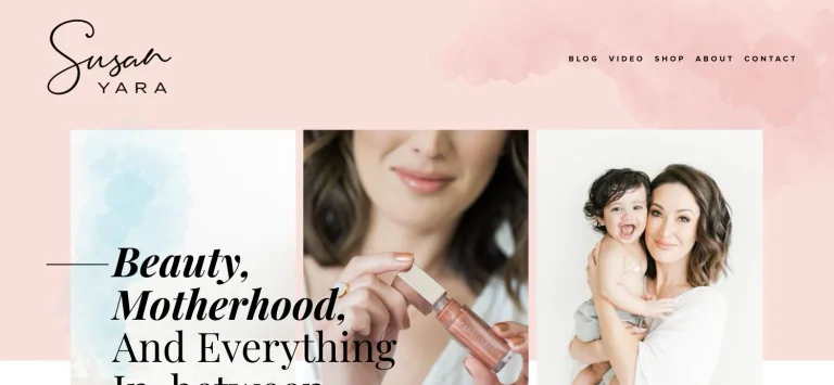
A handwritten wordmark and blush watercolor header lead into a photo collage with a large italic serif topic statement.
Useful for: A beauty creator website; study its opening composition, identity, and paths into the creator’s work.
# Design reference: Susan Yara
Source: https://www.susanyara.com/
Swipefile reference: https://swipefile.design/ref/youtube-susan-yara/
Captured: 2026-09-08. This is a dated reference, not a claim about the current live product.
Capture scope: one viewport. Do not infer unseen page sections or a complete user flow.

## Objective
Adapt the visual principles below to my project. Use my own content and identity. Do not reproduce logos, proprietary copy, or brand assets.

## Reference notes
- mood: Soft and editorial.
- colors: Blush pink, cream, white, and black.
- typography: The captured page uses Playfair Display. Keep a clear contrast between the main statement and the smaller navigation.
- layout: A handwritten wordmark and blush watercolor header lead into a photo collage with a large italic serif topic statement.
- motion: Static viewport capture. Inspect the source website to assess animation, video, and reduced-motion behavior.
- texture: Keep surfaces restrained so the typography and content stay prominent.
- dont: Do not reproduce the creator’s identity, claims, copy, or artwork in a new brand.

Useful for: A beauty creator website; study its opening composition, identity, and paths into the creator’s work.

## Acceptance criteria
- Existing project conventions, design tokens, working functionality, and unrelated changes are preserved.
- Two or three reference principles clearly support the user's task; conflicts are resolved in favor of usability and the existing product.
- Reusable components and semantic HTML express the interface. Available licensed assets are used; important UI text is never rendered as a bitmap.
- Every visible control has a defined behavior. Loading, empty, error, success, disabled, and long-content states are specified where relevant. Demo data is clearly labeled.
- Navigation and content adapt at 375px, 768px, and 1440px without horizontal page overflow. Keyboard use, visible focus, labeled inputs, at least 44px touch targets, readable contrast, and reduced motion are supported.
- Verification distinguishes rendered behavior from proposals and identifies anything still requiring a backend or external service.

## Quality bar
Clear hierarchy, consistent spacing, restrained surfaces, and purposeful motion. Avoid decorative gradients, excessive cards, placeholder buttons, and invented metrics unless the project calls for them. Do not claim a feature is connected or tested without evidence.
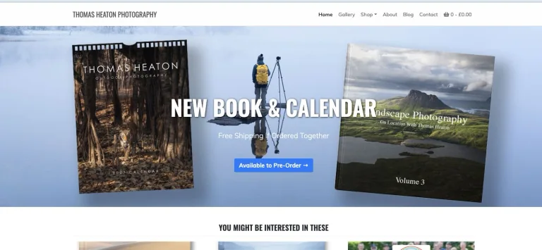
A compact photographer header introduces a wide book-and-calendar campaign with landscape imagery and a blue preorder action.
Useful for: A photography creator website; study its opening composition, identity, and paths into the creator’s work.
# Design reference: Thomas Heaton
Source: https://thomasheaton.co.uk/
Swipefile reference: https://swipefile.design/ref/youtube-thomas-heaton/
Captured: 2026-09-08. This is a dated reference, not a claim about the current live product.
Capture scope: one viewport. Do not infer unseen page sections or a complete user flow.

## Objective
Adapt the visual principles below to my project. Use my own content and identity. Do not reproduce logos, proprietary copy, or brand assets.

## Reference notes
- mood: Photographic and practical.
- colors: White, black, landscape blue, and gray.
- typography: The captured page uses Oswald. Keep a clear contrast between the main statement and the smaller navigation.
- layout: A compact photographer header introduces a wide book-and-calendar campaign with landscape imagery and a blue preorder action.
- motion: Static viewport capture. Inspect the source website to assess animation, video, and reduced-motion behavior.
- texture: Let the original photographic or video imagery carry the visual detail.
- dont: Do not reproduce the creator’s identity, claims, copy, or artwork in a new brand.

Useful for: A photography creator website; study its opening composition, identity, and paths into the creator’s work.

## Acceptance criteria
- Existing project conventions, design tokens, working functionality, and unrelated changes are preserved.
- Two or three reference principles clearly support the user's task; conflicts are resolved in favor of usability and the existing product.
- Reusable components and semantic HTML express the interface. Available licensed assets are used; important UI text is never rendered as a bitmap.
- Every visible control has a defined behavior. Loading, empty, error, success, disabled, and long-content states are specified where relevant. Demo data is clearly labeled.
- Navigation and content adapt at 375px, 768px, and 1440px without horizontal page overflow. Keyboard use, visible focus, labeled inputs, at least 44px touch targets, readable contrast, and reduced motion are supported.
- Verification distinguishes rendered behavior from proposals and identifies anything still requiring a backend or external service.

## Quality bar
Clear hierarchy, consistent spacing, restrained surfaces, and purposeful motion. Avoid decorative gradients, excessive cards, placeholder buttons, and invented metrics unless the project calls for them. Do not claim a feature is connected or tested without evidence.
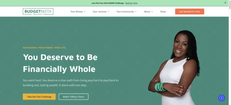
A teal personal-finance hero pairs a bold white promise with a creator portrait, subtle line patterns, and contrasting next-step actions.
Useful for: A finance creator website; study its opening composition, identity, and paths into the creator’s work.
# Design reference: Tiffany Aliche — The Budgetnista
Source: https://thebudgetnista.com/
Swipefile reference: https://swipefile.design/ref/youtube-tiffany-aliche/
Captured: 2026-09-08. This is a dated reference, not a claim about the current live product.
Capture scope: one viewport. Do not infer unseen page sections or a complete user flow.

## Objective
Adapt the visual principles below to my project. Use my own content and identity. Do not reproduce logos, proprietary copy, or brand assets.

## Reference notes
- mood: Warm and encouraging.
- colors: Teal, mint, white, yellow, and coral.
- typography: The captured page uses Maven Pro. Keep a clear contrast between the main statement and the smaller navigation.
- layout: A teal personal-finance hero pairs a bold white promise with a creator portrait, subtle line patterns, and contrasting next-step actions.
- motion: Static viewport capture. Inspect the source website to assess animation, video, and reduced-motion behavior.
- texture: Let the original photographic or video imagery carry the visual detail.
- dont: Do not reproduce the creator’s identity, claims, copy, or artwork in a new brand.

Useful for: A finance creator website; study its opening composition, identity, and paths into the creator’s work.

## Acceptance criteria
- Existing project conventions, design tokens, working functionality, and unrelated changes are preserved.
- Two or three reference principles clearly support the user's task; conflicts are resolved in favor of usability and the existing product.
- Reusable components and semantic HTML express the interface. Available licensed assets are used; important UI text is never rendered as a bitmap.
- Every visible control has a defined behavior. Loading, empty, error, success, disabled, and long-content states are specified where relevant. Demo data is clearly labeled.
- Navigation and content adapt at 375px, 768px, and 1440px without horizontal page overflow. Keyboard use, visible focus, labeled inputs, at least 44px touch targets, readable contrast, and reduced motion are supported.
- Verification distinguishes rendered behavior from proposals and identifies anything still requiring a backend or external service.

## Quality bar
Clear hierarchy, consistent spacing, restrained surfaces, and purposeful motion. Avoid decorative gradients, excessive cards, placeholder buttons, and invented metrics unless the project calls for them. Do not claim a feature is connected or tested without evidence.
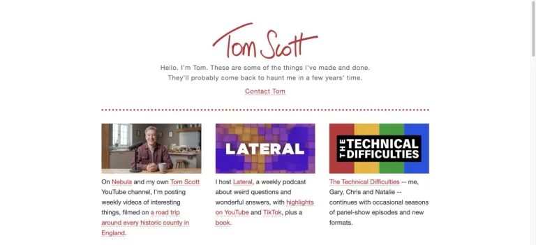
A red handwritten identity sits over a short introduction and a three-column grid of projects, with simple text links and dotted rules.
Useful for: A education creator website; study its opening composition, identity, and paths into the creator’s work.
# Design reference: Tom Scott
Source: https://www.tomscott.com/
Swipefile reference: https://swipefile.design/ref/youtube-tom-scott/
Captured: 2026-09-08. This is a dated reference, not a claim about the current live product.
Capture scope: one viewport. Do not infer unseen page sections or a complete user flow.

## Objective
Adapt the visual principles below to my project. Use my own content and identity. Do not reproduce logos, proprietary copy, or brand assets.

## Reference notes
- mood: Plain and friendly.
- colors: White, red, black, and project thumbnail colors.
- typography: The captured page uses Helvetica Neue. Keep a clear contrast between the main statement and the smaller navigation.
- layout: A red handwritten identity sits over a short introduction and a three-column grid of projects, with simple text links and dotted rules.
- motion: Static viewport capture. Inspect the source website to assess animation, video, and reduced-motion behavior.
- texture: Keep surfaces restrained so the typography and content stay prominent.
- dont: Do not reproduce the creator’s identity, claims, copy, or artwork in a new brand.

Useful for: A education creator website; study its opening composition, identity, and paths into the creator’s work.

## Acceptance criteria
- Existing project conventions, design tokens, working functionality, and unrelated changes are preserved.
- Two or three reference principles clearly support the user's task; conflicts are resolved in favor of usability and the existing product.
- Reusable components and semantic HTML express the interface. Available licensed assets are used; important UI text is never rendered as a bitmap.
- Every visible control has a defined behavior. Loading, empty, error, success, disabled, and long-content states are specified where relevant. Demo data is clearly labeled.
- Navigation and content adapt at 375px, 768px, and 1440px without horizontal page overflow. Keyboard use, visible focus, labeled inputs, at least 44px touch targets, readable contrast, and reduced motion are supported.
- Verification distinguishes rendered behavior from proposals and identifies anything still requiring a backend or external service.

## Quality bar
Clear hierarchy, consistent spacing, restrained surfaces, and purposeful motion. Avoid decorative gradients, excessive cards, placeholder buttons, and invented metrics unless the project calls for them. Do not claim a feature is connected or tested without evidence.
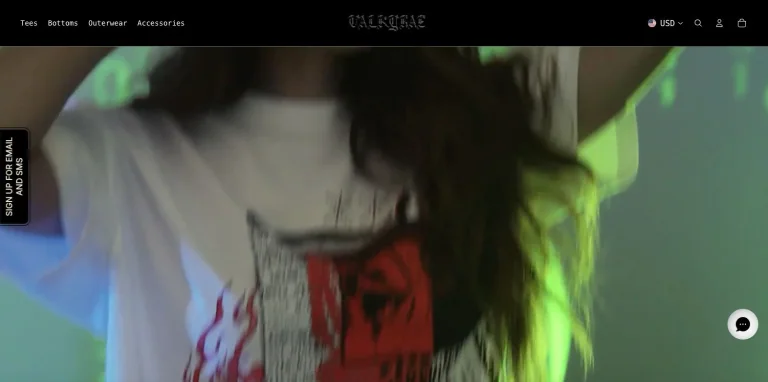
A minimal black merchandise header frames a full-width fashion film, with restrained product-category navigation.
Useful for: A gaming creator website; study its opening composition, identity, and paths into the creator’s work.
# Design reference: Valkyrae
Source: https://valkyrae.com/
Swipefile reference: https://swipefile.design/ref/youtube-valkyrae/
Captured: 2026-09-08. This is a dated reference, not a claim about the current live product.
Capture scope: one viewport. Do not infer unseen page sections or a complete user flow.

## Objective
Adapt the visual principles below to my project. Use my own content and identity. Do not reproduce logos, proprietary copy, or brand assets.

## Reference notes
- mood: Moody and fashion-led.
- colors: Black, white, and green photographic highlights.
- typography: The captured page uses SF Mono. Keep a clear contrast between the main statement and the smaller navigation.
- layout: A minimal black merchandise header frames a full-width fashion film, with restrained product-category navigation.
- motion: Static viewport capture. Inspect the source website to assess animation, video, and reduced-motion behavior.
- texture: Let the original photographic or video imagery carry the visual detail.
- dont: Do not reproduce the creator’s identity, claims, copy, or artwork in a new brand.

Useful for: A gaming creator website; study its opening composition, identity, and paths into the creator’s work.

## Acceptance criteria
- Existing project conventions, design tokens, working functionality, and unrelated changes are preserved.
- Two or three reference principles clearly support the user's task; conflicts are resolved in favor of usability and the existing product.
- Reusable components and semantic HTML express the interface. Available licensed assets are used; important UI text is never rendered as a bitmap.
- Every visible control has a defined behavior. Loading, empty, error, success, disabled, and long-content states are specified where relevant. Demo data is clearly labeled.
- Navigation and content adapt at 375px, 768px, and 1440px without horizontal page overflow. Keyboard use, visible focus, labeled inputs, at least 44px touch targets, readable contrast, and reduced motion are supported.
- Verification distinguishes rendered behavior from proposals and identifies anything still requiring a backend or external service.

## Quality bar
Clear hierarchy, consistent spacing, restrained surfaces, and purposeful motion. Avoid decorative gradients, excessive cards, placeholder buttons, and invented metrics unless the project calls for them. Do not claim a feature is connected or tested without evidence.
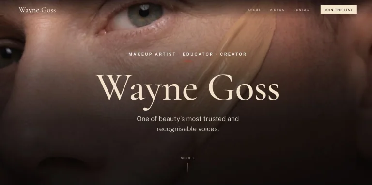
An extreme close-up beauty portrait fills the screen behind a centered serif name, small positioning text, and restrained navigation.
Useful for: A beauty creator website; study its opening composition, identity, and paths into the creator’s work.
# Design reference: Wayne Goss
Source: https://waynegoss.co.uk/
Swipefile reference: https://swipefile.design/ref/youtube-wayne-goss/
Captured: 2026-09-08. This is a dated reference, not a claim about the current live product.
Capture scope: one viewport. Do not infer unseen page sections or a complete user flow.

## Objective
Adapt the visual principles below to my project. Use my own content and identity. Do not reproduce logos, proprietary copy, or brand assets.

## Reference notes
- mood: Intimate and polished.
- colors: Warm skin tones, charcoal, cream, and white.
- typography: The captured page uses Cormorant Garamond. Keep a clear contrast between the main statement and the smaller navigation.
- layout: An extreme close-up beauty portrait fills the screen behind a centered serif name, small positioning text, and restrained navigation.
- motion: Static viewport capture. Inspect the source website to assess animation, video, and reduced-motion behavior.
- texture: Let the original photographic or video imagery carry the visual detail.
- dont: Do not reproduce the creator’s identity, claims, copy, or artwork in a new brand.

Useful for: A beauty creator website; study its opening composition, identity, and paths into the creator’s work.

## Acceptance criteria
- Existing project conventions, design tokens, working functionality, and unrelated changes are preserved.
- Two or three reference principles clearly support the user's task; conflicts are resolved in favor of usability and the existing product.
- Reusable components and semantic HTML express the interface. Available licensed assets are used; important UI text is never rendered as a bitmap.
- Every visible control has a defined behavior. Loading, empty, error, success, disabled, and long-content states are specified where relevant. Demo data is clearly labeled.
- Navigation and content adapt at 375px, 768px, and 1440px without horizontal page overflow. Keyboard use, visible focus, labeled inputs, at least 44px touch targets, readable contrast, and reduced motion are supported.
- Verification distinguishes rendered behavior from proposals and identifies anything still requiring a backend or external service.

## Quality bar
Clear hierarchy, consistent spacing, restrained surfaces, and purposeful motion. Avoid decorative gradients, excessive cards, placeholder buttons, and invented metrics unless the project calls for them. Do not claim a feature is connected or tested without evidence.
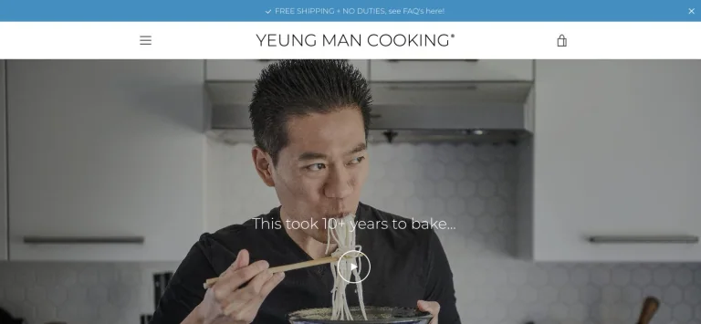
A full-width cooking portrait and understated video action sit below a spare store header and narrow blue announcement strip.
Useful for: A food creator website; study its opening composition, identity, and paths into the creator’s work.
# Design reference: Wil Yeung
Source: https://yeungmancooking.com/
Swipefile reference: https://swipefile.design/ref/youtube-wil-yeung/
Captured: 2026-09-08. This is a dated reference, not a claim about the current live product.
Capture scope: one viewport. Do not infer unseen page sections or a complete user flow.

## Objective
Adapt the visual principles below to my project. Use my own content and identity. Do not reproduce logos, proprietary copy, or brand assets.

## Reference notes
- mood: Calm and focused.
- colors: White, black, pale blue, and kitchen photography.
- typography: The captured page uses Montserrat. Keep a clear contrast between the main statement and the smaller navigation.
- layout: A full-width cooking portrait and understated video action sit below a spare store header and narrow blue announcement strip.
- motion: Static viewport capture. Inspect the source website to assess animation, video, and reduced-motion behavior.
- texture: Let the original photographic or video imagery carry the visual detail.
- dont: Do not reproduce the creator’s identity, claims, copy, or artwork in a new brand.

Useful for: A food creator website; study its opening composition, identity, and paths into the creator’s work.

## Acceptance criteria
- Existing project conventions, design tokens, working functionality, and unrelated changes are preserved.
- Two or three reference principles clearly support the user's task; conflicts are resolved in favor of usability and the existing product.
- Reusable components and semantic HTML express the interface. Available licensed assets are used; important UI text is never rendered as a bitmap.
- Every visible control has a defined behavior. Loading, empty, error, success, disabled, and long-content states are specified where relevant. Demo data is clearly labeled.
- Navigation and content adapt at 375px, 768px, and 1440px without horizontal page overflow. Keyboard use, visible focus, labeled inputs, at least 44px touch targets, readable contrast, and reduced motion are supported.
- Verification distinguishes rendered behavior from proposals and identifies anything still requiring a backend or external service.

## Quality bar
Clear hierarchy, consistent spacing, restrained surfaces, and purposeful motion. Avoid decorative gradients, excessive cards, placeholder buttons, and invented metrics unless the project calls for them. Do not claim a feature is connected or tested without evidence.
An immersive travel film fills the opening screen and uses the creators’ real-world encounters as the primary visual introduction.
Useful for: A travel creator website; study its opening composition, identity, and paths into the creator’s work.
# Design reference: Yes Theory
Source: https://yestheory.com/
Swipefile reference: https://swipefile.design/ref/youtube-yes-theory/
Captured: 2026-09-08. This is a dated reference, not a claim about the current live product.
Capture scope: one viewport. Do not infer unseen page sections or a complete user flow.

## Objective
Adapt the visual principles below to my project. Use my own content and identity. Do not reproduce logos, proprietary copy, or brand assets.

## Reference notes
- mood: Adventurous and cinematic.
- colors: Natural photographic colors and minimal interface accents.
- typography: The captured page uses Truenoblk and Truenobd and Futura extra font. Keep a clear contrast between the main statement and the smaller navigation.
- layout: An immersive travel film fills the opening screen and uses the creators’ real-world encounters as the primary visual introduction.
- motion: Static viewport capture. Inspect the source website to assess animation, video, and reduced-motion behavior.
- texture: Let the original photographic or video imagery carry the visual detail.
- dont: Do not reproduce the creator’s identity, claims, copy, or artwork in a new brand.

Useful for: A travel creator website; study its opening composition, identity, and paths into the creator’s work.

## Acceptance criteria
- Existing project conventions, design tokens, working functionality, and unrelated changes are preserved.
- Two or three reference principles clearly support the user's task; conflicts are resolved in favor of usability and the existing product.
- Reusable components and semantic HTML express the interface. Available licensed assets are used; important UI text is never rendered as a bitmap.
- Every visible control has a defined behavior. Loading, empty, error, success, disabled, and long-content states are specified where relevant. Demo data is clearly labeled.
- Navigation and content adapt at 375px, 768px, and 1440px without horizontal page overflow. Keyboard use, visible focus, labeled inputs, at least 44px touch targets, readable contrast, and reduced motion are supported.
- Verification distinguishes rendered behavior from proposals and identifies anything still requiring a backend or external service.

## Quality bar
Clear hierarchy, consistent spacing, restrained surfaces, and purposeful motion. Avoid decorative gradients, excessive cards, placeholder buttons, and invented metrics unless the project calls for them. Do not claim a feature is connected or tested without evidence.
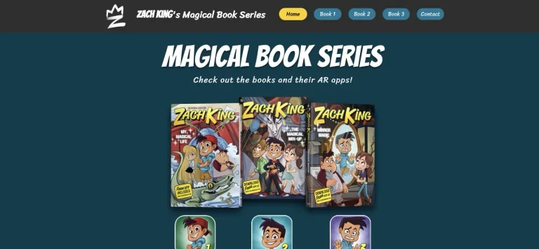
A dark teal book homepage centers bold condensed lettering above a row of illustrated covers, with pill-shaped navigation tabs.
Useful for: A filmmaking creator website; study its opening composition, identity, and paths into the creator’s work.
# Design reference: Zach King
Source: https://www.zachkingmagic.com/
Swipefile reference: https://swipefile.design/ref/youtube-zach-king/
Captured: 2026-09-08. This is a dated reference, not a claim about the current live product.
Capture scope: one viewport. Do not infer unseen page sections or a complete user flow.

## Objective
Adapt the visual principles below to my project. Use my own content and identity. Do not reproduce logos, proprietary copy, or brand assets.

## Reference notes
- mood: Playful and story-led.
- colors: Deep teal, charcoal, yellow, white, and cover colors.
- typography: The captured page uses spinnaker. Keep a clear contrast between the main statement and the smaller navigation.
- layout: A dark teal book homepage centers bold condensed lettering above a row of illustrated covers, with pill-shaped navigation tabs.
- motion: Static viewport capture. Inspect the source website to assess animation, video, and reduced-motion behavior.
- texture: Graphic illustration and shape provide the visual detail.
- dont: Do not reproduce the creator’s identity, claims, copy, or artwork in a new brand.

Useful for: A filmmaking creator website; study its opening composition, identity, and paths into the creator’s work.

## Acceptance criteria
- Existing project conventions, design tokens, working functionality, and unrelated changes are preserved.
- Two or three reference principles clearly support the user's task; conflicts are resolved in favor of usability and the existing product.
- Reusable components and semantic HTML express the interface. Available licensed assets are used; important UI text is never rendered as a bitmap.
- Every visible control has a defined behavior. Loading, empty, error, success, disabled, and long-content states are specified where relevant. Demo data is clearly labeled.
- Navigation and content adapt at 375px, 768px, and 1440px without horizontal page overflow. Keyboard use, visible focus, labeled inputs, at least 44px touch targets, readable contrast, and reduced motion are supported.
- Verification distinguishes rendered behavior from proposals and identifies anything still requiring a backend or external service.

## Quality bar
Clear hierarchy, consistent spacing, restrained surfaces, and purposeful motion. Avoid decorative gradients, excessive cards, placeholder buttons, and invented metrics unless the project calls for them. Do not claim a feature is connected or tested without evidence.
Allow basic usage counts to help us understand what is useful. Your board contents stay out of analytics. Details
Your browser’s privacy preference keeps analytics off.