Calendar & Scheduling
CURATED COLLECTION · 4 REFERENCES
Monthly planning, weekly time slots, shared resources, and booking availability.
Copy the reference notes below and paste them into Claude, ChatGPT, or your coding assistant. Add what you want to build.
Includes design notes, original sources, and preview links. An assistant that supports browsing can also read the public board link.
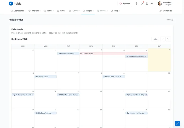
A monthly team calendar displays timed and multi-day events inside the app shell.
Useful for: Keep period navigation close to a spacious calendar while distinguishing event types without heavy decoration.
# Design reference: Tabler — Team calendar
Source: https://preview.tabler.io/fullcalendar.html
Swipefile reference: https://swipefile.design/ref/tabler-calendar/
Captured: 2026-09-05. This is a dated reference, not a claim about the current live product.
Capture scope: one viewport. Do not infer unseen page sections or a complete user flow.

## Objective
Adapt the interaction and layout patterns below to my project. Use my own content and identity. Do not reproduce logos, proprietary copy, or brand assets.

## Reference notes
- surface: Team calendar
- nav: Previous, next, and today controls sit beside the active month above the grid.
- layout: A full-width month grid places date labels above compact event bars.
- density: Primary content has the most space; repeated rows and secondary navigation use a compact, consistent rhythm.
- color: White date cells, subtle current-day tint, and restrained blue and pink events.
- typography: Small date labels and concise event titles preserve usable space within each day.
- pattern: Keep period navigation close to a spacious calendar while distinguishing event types without heavy decoration.
- states: Public month-view demo with sample meetings and an all-day event.
- dont: Adapt the interaction pattern to your own product. Do not copy brand assets, sample identities, proprietary text, or assume unseen states. Specify keyboard behavior, loading, empty, error, and narrow-screen layouts for your implementation.

Useful for: Keep period navigation close to a spacious calendar while distinguishing event types without heavy decoration.

## Acceptance criteria
- Existing project conventions, design tokens, working functionality, and unrelated changes are preserved.
- Two or three reference principles clearly support the user's task; conflicts are resolved in favor of usability and the existing product.
- Reusable components and semantic HTML express the interface. Available licensed assets are used; important UI text is never rendered as a bitmap.
- Every visible control has a defined behavior. Loading, empty, error, success, disabled, and long-content states are specified where relevant. Demo data is clearly labeled.
- Navigation and content adapt at 375px, 768px, and 1440px without horizontal page overflow. Keyboard use, visible focus, labeled inputs, at least 44px touch targets, readable contrast, and reduced motion are supported.
- Verification distinguishes rendered behavior from proposals and identifies anything still requiring a backend or external service.

## Quality bar
Clear hierarchy, consistent spacing, restrained surfaces, and purposeful motion. Avoid decorative gradients, excessive cards, placeholder buttons, and invented metrics unless the project calls for them. Do not claim a feature is connected or tested without evidence.
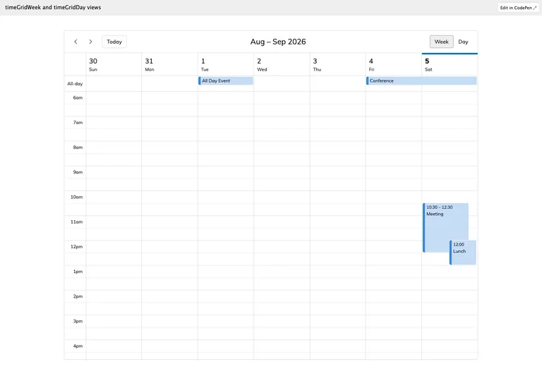
A weekly time grid positions timed events against shared hourly rows and a separate all-day band.
Useful for: Make time conflicts and available space visible using consistent axes and distinct all-day placement.
# Design reference: FullCalendar — Weekly schedule
Source: https://fullcalendar.io/docs/timegrid-standard-view-demo
Swipefile reference: https://swipefile.design/ref/fullcalendar-week/
Captured: 2026-09-05. This is a dated reference, not a claim about the current live product.
Capture scope: one viewport. Do not infer unseen page sections or a complete user flow.

## Objective
Adapt the interaction and layout patterns below to my project. Use my own content and identity. Do not reproduce logos, proprietary copy, or brand assets.

## Reference notes
- surface: Weekly schedule
- nav: Period arrows, today, and week/day selectors stay above the schedule.
- layout: Seven day columns align against one time axis; overlapping events share horizontal space within a day.
- density: Primary content has the most space; repeated rows and secondary navigation use a compact, consistent rhythm.
- color: White grid, fine gray rules, pale current-day tint, and blue event blocks.
- typography: Small hour labels and concise event titles support precise reading of compact event blocks.
- pattern: Make time conflicts and available space visible using consistent axes and distinct all-day placement.
- states: Public weekly calendar demo with sample all-day and overlapping timed events.
- dont: Adapt the interaction pattern to your own product. Do not copy brand assets, sample identities, proprietary text, or assume unseen states. Specify keyboard behavior, loading, empty, error, and narrow-screen layouts for your implementation.

Useful for: Make time conflicts and available space visible using consistent axes and distinct all-day placement.

## Acceptance criteria
- Existing project conventions, design tokens, working functionality, and unrelated changes are preserved.
- Two or three reference principles clearly support the user's task; conflicts are resolved in favor of usability and the existing product.
- Reusable components and semantic HTML express the interface. Available licensed assets are used; important UI text is never rendered as a bitmap.
- Every visible control has a defined behavior. Loading, empty, error, success, disabled, and long-content states are specified where relevant. Demo data is clearly labeled.
- Navigation and content adapt at 375px, 768px, and 1440px without horizontal page overflow. Keyboard use, visible focus, labeled inputs, at least 44px touch targets, readable contrast, and reduced motion are supported.
- Verification distinguishes rendered behavior from proposals and identifies anything still requiring a backend or external service.

## Quality bar
Clear hierarchy, consistent spacing, restrained surfaces, and purposeful motion. Avoid decorative gradients, excessive cards, placeholder buttons, and invented metrics unless the project calls for them. Do not claim a feature is connected or tested without evidence.
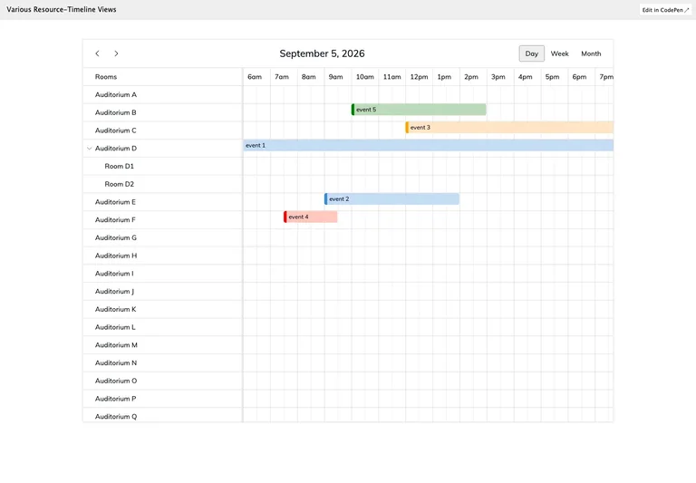
A resource timeline compares room bookings across a shared horizontal time axis.
Useful for: Show resource occupancy and overlapping time spans in one shared scheduling surface.
# Design reference: FullCalendar — Resource timeline
Source: https://fullcalendar.io/docs/timeline-standard-view-demo
Swipefile reference: https://swipefile.design/ref/fullcalendar-resources/
Captured: 2026-09-05. This is a dated reference, not a claim about the current live product.
Capture scope: one viewport. Do not infer unseen page sections or a complete user flow.

## Objective
Adapt the interaction and layout patterns below to my project. Use my own content and identity. Do not reproduce logos, proprietary copy, or brand assets.

## Reference notes
- surface: Resource timeline
- nav: Date navigation and day/week/month choices sit above the resource grid.
- layout: Named room rows sit to the left of hourly columns with bookings drawn as horizontal bars.
- density: Primary content has the most space; repeated rows and secondary navigation use a compact, consistent rhythm.
- color: White grid with fine separators and softly colored booking bars.
- typography: Compact resource names and hour labels leave space for the booking spans.
- pattern: Show resource occupancy and overlapping time spans in one shared scheduling surface.
- states: Public resource-timeline demo with sample rooms and bookings; the source identifies this as a premium calendar feature.
- dont: Adapt the interaction pattern to your own product. Do not copy brand assets, sample identities, proprietary text, or assume unseen states. Specify keyboard behavior, loading, empty, error, and narrow-screen layouts for your implementation.

Useful for: Show resource occupancy and overlapping time spans in one shared scheduling surface.

## Acceptance criteria
- Existing project conventions, design tokens, working functionality, and unrelated changes are preserved.
- Two or three reference principles clearly support the user's task; conflicts are resolved in favor of usability and the existing product.
- Reusable components and semantic HTML express the interface. Available licensed assets are used; important UI text is never rendered as a bitmap.
- Every visible control has a defined behavior. Loading, empty, error, success, disabled, and long-content states are specified where relevant. Demo data is clearly labeled.
- Navigation and content adapt at 375px, 768px, and 1440px without horizontal page overflow. Keyboard use, visible focus, labeled inputs, at least 44px touch targets, readable contrast, and reduced motion are supported.
- Verification distinguishes rendered behavior from proposals and identifies anything still requiring a backend or external service.

## Quality bar
Clear hierarchy, consistent spacing, restrained surfaces, and purposeful motion. Avoid decorative gradients, excessive cards, placeholder buttons, and invented metrics unless the project calls for them. Do not claim a feature is connected or tested without evidence.
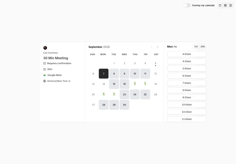
A public booking page keeps meeting context, calendar dates, and available times visible together.
Useful for: Keep date and time selection in context while making timezone and meeting length explicit.
# Design reference: Cal.com — Date and time selection
Source: https://cal.com/cal/30min
Swipefile reference: https://swipefile.design/ref/cal-scheduling/
Captured: 2026-09-05. This is a dated reference, not a claim about the current live product.
Capture scope: one viewport. Do not infer unseen page sections or a complete user flow.

## Objective
Adapt the interaction and layout patterns below to my project. Use my own content and identity. Do not reproduce logos, proprietary copy, or brand assets.

## Reference notes
- surface: Date and time selection
- nav: Calendar arrows, time-format controls, and timezone selection stay beside their relevant content.
- layout: Three adjacent columns show meeting details, month selection, and a vertically stacked time list.
- density: Primary content has the most space; repeated rows and secondary navigation use a compact, consistent rhythm.
- color: Near-white surfaces, fine gray borders, dark selected date, and pale unavailable dates.
- typography: Compact day labels and aligned time buttons support fast scanning across columns.
- pattern: Keep date and time selection in context while making timezone and meeting length explicit.
- states: Public meeting calendar with a selected date and available times; no booking was submitted.
- dont: Adapt the interaction pattern to your own product. Do not copy brand assets, sample identities, proprietary text, or assume unseen states. Specify keyboard behavior, loading, empty, error, and narrow-screen layouts for your implementation.

Useful for: Keep date and time selection in context while making timezone and meeting length explicit.

## Acceptance criteria
- Existing project conventions, design tokens, working functionality, and unrelated changes are preserved.
- Two or three reference principles clearly support the user's task; conflicts are resolved in favor of usability and the existing product.
- Reusable components and semantic HTML express the interface. Available licensed assets are used; important UI text is never rendered as a bitmap.
- Every visible control has a defined behavior. Loading, empty, error, success, disabled, and long-content states are specified where relevant. Demo data is clearly labeled.
- Navigation and content adapt at 375px, 768px, and 1440px without horizontal page overflow. Keyboard use, visible focus, labeled inputs, at least 44px touch targets, readable contrast, and reduced motion are supported.
- Verification distinguishes rendered behavior from proposals and identifies anything still requiring a backend or external service.

## Quality bar
Clear hierarchy, consistent spacing, restrained surfaces, and purposeful motion. Avoid decorative gradients, excessive cards, placeholder buttons, and invented metrics unless the project calls for them. Do not claim a feature is connected or tested without evidence.
Allow basic usage counts to help us understand what is useful. Your board contents stay out of analytics. Details
Your browser’s privacy preference keeps analytics off.