Dashboards
CURATED COLLECTION · 9 REFERENCES
Dashboards, a kanban board, an inbox and creative tools. Sample demos and initial states are identified in the notes.
Copy the reference notes below and paste them into Claude, ChatGPT, or your coding assistant. Add what you want to build.
Includes design notes, original sources, and preview links. An assistant that supports browsing can also read the public board link.
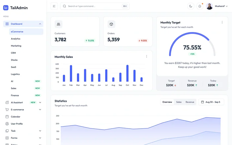
A populated commerce dashboard template showing customers, orders, sales and a monthly target.
Useful for: Combine headline metrics with a target visualization and a longer-range trend.
# Design reference: TailAdmin — Commerce dashboard demo
Source: https://demo.tailadmin.com/
Swipefile reference: https://swipefile.design/ref/tailadmin-commerce-demo/
Captured: 2026-09-05. This is a dated reference, not a claim about the current live product.
Capture scope: one viewport. Do not infer unseen page sections or a complete user flow.

## Objective
Adapt the interaction and layout patterns below to my project. Use my own content and identity. Do not reproduce logos, proprietary copy, or brand assets.

## Reference notes
- surface: A populated commerce dashboard template showing customers, orders, sales and a monthly target.
- nav: Persistent left sidebar and a compact top search/account bar.
- layout: Small metric cards sit above a bar chart, a target gauge and a wide time-series chart.
- density: Moderate density, grouped into rounded white panels.
- color: White and light grey with violet chart accents and green/red change indicators.
- typography: Small sans-serif labels and prominent metric values.
- pattern: Combine headline metrics with a target visualization and a longer-range trend.
- states: Public template demo with sample metrics; not a connected business account.
- dont: Adapt the workflow and sample content to your own product; preserve clear labels and accessible controls.

Useful for: Combine headline metrics with a target visualization and a longer-range trend.

## Acceptance criteria
- Existing project conventions, design tokens, working functionality, and unrelated changes are preserved.
- Two or three reference principles clearly support the user's task; conflicts are resolved in favor of usability and the existing product.
- Reusable components and semantic HTML express the interface. Available licensed assets are used; important UI text is never rendered as a bitmap.
- Every visible control has a defined behavior. Loading, empty, error, success, disabled, and long-content states are specified where relevant. Demo data is clearly labeled.
- Navigation and content adapt at 375px, 768px, and 1440px without horizontal page overflow. Keyboard use, visible focus, labeled inputs, at least 44px touch targets, readable contrast, and reduced motion are supported.
- Verification distinguishes rendered behavior from proposals and identifies anything still requiring a backend or external service.

## Quality bar
Clear hierarchy, consistent spacing, restrained surfaces, and purposeful motion. Avoid decorative gradients, excessive cards, placeholder buttons, and invented metrics unless the project calls for them. Do not claim a feature is connected or tested without evidence.
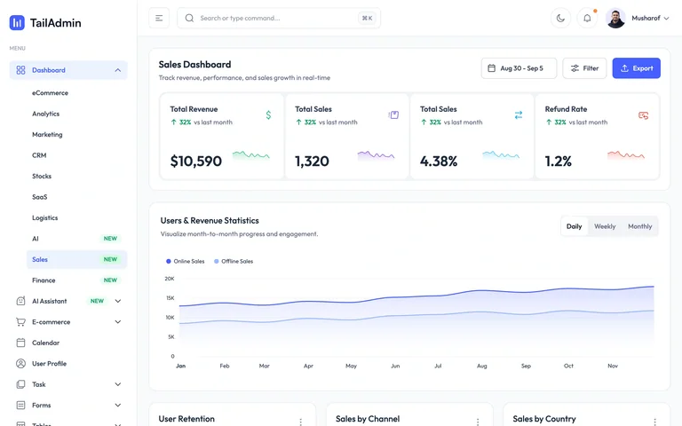
A populated sales dashboard template with summary metrics, a revenue chart and lower-level breakdowns.
Useful for: Keep filters near the page title and let a wide trend chart anchor the analysis.
# Design reference: TailAdmin — Sales dashboard demo
Source: https://demo.tailadmin.com/sales
Swipefile reference: https://swipefile.design/ref/tailadmin-sales-demo/
Captured: 2026-09-05. This is a dated reference, not a claim about the current live product.
Capture scope: one viewport. Do not infer unseen page sections or a complete user flow.

## Objective
Adapt the interaction and layout patterns below to my project. Use my own content and identity. Do not reproduce logos, proprietary copy, or brand assets.

## Reference notes
- surface: A populated sales dashboard template with summary metrics, a revenue chart and lower-level breakdowns.
- nav: Shared sidebar navigation with top search and account tools.
- layout: Page title and date actions precede a row of metrics and a wide trend chart.
- density: Moderate density with a clear summary-to-detail order.
- color: White surfaces, violet data lines and muted grey labels.
- typography: Compact sans-serif labels with larger numerical values.
- pattern: Keep filters near the page title and let a wide trend chart anchor the analysis.
- states: Public template demo using sample sales data.
- dont: Adapt the workflow and sample content to your own product; preserve clear labels and accessible controls.

Useful for: Keep filters near the page title and let a wide trend chart anchor the analysis.

## Acceptance criteria
- Existing project conventions, design tokens, working functionality, and unrelated changes are preserved.
- Two or three reference principles clearly support the user's task; conflicts are resolved in favor of usability and the existing product.
- Reusable components and semantic HTML express the interface. Available licensed assets are used; important UI text is never rendered as a bitmap.
- Every visible control has a defined behavior. Loading, empty, error, success, disabled, and long-content states are specified where relevant. Demo data is clearly labeled.
- Navigation and content adapt at 375px, 768px, and 1440px without horizontal page overflow. Keyboard use, visible focus, labeled inputs, at least 44px touch targets, readable contrast, and reduced motion are supported.
- Verification distinguishes rendered behavior from proposals and identifies anything still requiring a backend or external service.

## Quality bar
Clear hierarchy, consistent spacing, restrained surfaces, and purposeful motion. Avoid decorative gradients, excessive cards, placeholder buttons, and invented metrics unless the project calls for them. Do not claim a feature is connected or tested without evidence.
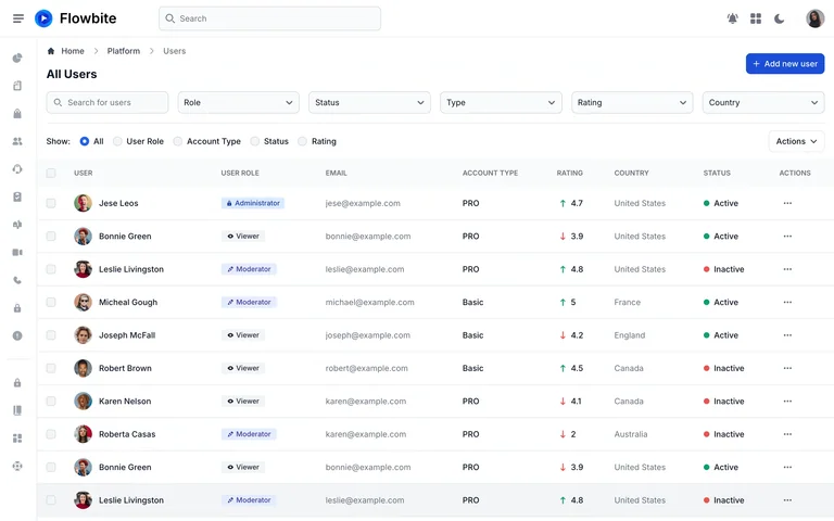
A user-management table demo with roles, account types, ratings and status indicators.
Useful for: Expose useful filters directly above the table and keep row metadata aligned.
# Design reference: Flowbite — User management demo
Source: https://flowbite.com/application-ui/demo/users/list/
Swipefile reference: https://swipefile.design/ref/flowbite-users-demo/
Captured: 2026-09-05. This is a dated reference, not a claim about the current live product.
Capture scope: one viewport. Do not infer unseen page sections or a complete user flow.

## Objective
Adapt the interaction and layout patterns below to my project. Use my own content and identity. Do not reproduce logos, proprietary copy, or brand assets.

## Reference notes
- surface: A user-management table demo with roles, account types, ratings and status indicators.
- nav: Icon rail plus a top search bar and breadcrumb.
- layout: Title and create action sit above several filters and a full-width data table.
- density: Dense, aligned rows with compact metadata.
- color: White canvas, subtle grey separators, blue actions and colored status dots.
- typography: Small sans-serif labels and stronger user names.
- pattern: Expose useful filters directly above the table and keep row metadata aligned.
- states: Populated public template demo with sample people and account data.
- dont: Adapt the workflow and sample content to your own product; preserve clear labels and accessible controls.

Useful for: Expose useful filters directly above the table and keep row metadata aligned.

## Acceptance criteria
- Existing project conventions, design tokens, working functionality, and unrelated changes are preserved.
- Two or three reference principles clearly support the user's task; conflicts are resolved in favor of usability and the existing product.
- Reusable components and semantic HTML express the interface. Available licensed assets are used; important UI text is never rendered as a bitmap.
- Every visible control has a defined behavior. Loading, empty, error, success, disabled, and long-content states are specified where relevant. Demo data is clearly labeled.
- Navigation and content adapt at 375px, 768px, and 1440px without horizontal page overflow. Keyboard use, visible focus, labeled inputs, at least 44px touch targets, readable contrast, and reduced motion are supported.
- Verification distinguishes rendered behavior from proposals and identifies anything still requiring a backend or external service.

## Quality bar
Clear hierarchy, consistent spacing, restrained surfaces, and purposeful motion. Avoid decorative gradients, excessive cards, placeholder buttons, and invented metrics unless the project calls for them. Do not claim a feature is connected or tested without evidence.
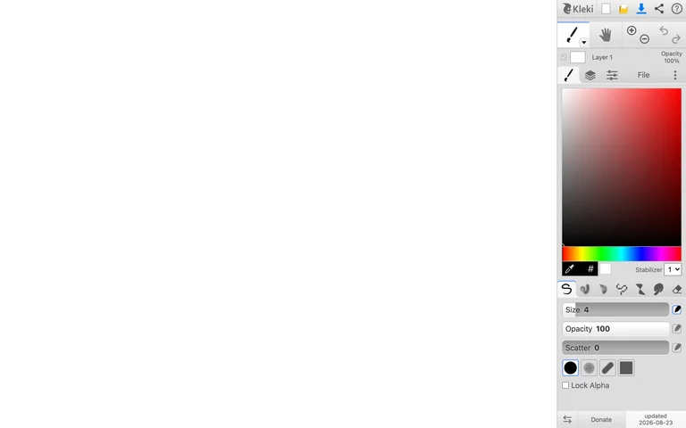
A browser painting workspace in its blank-canvas starting state.
Useful for: Keep the creation surface dominant and group drawing controls by task in one dock.
# Design reference: Kleki — Painting workspace
Source: https://kleki.com/
Swipefile reference: https://swipefile.design/ref/kleki-paint/
Captured: 2026-09-05. This is a dated reference, not a claim about the current live product.
Capture scope: one viewport. Do not infer unseen page sections or a complete user flow.

## Objective
Adapt the interaction and layout patterns below to my project. Use my own content and identity. Do not reproduce logos, proprietary copy, or brand assets.

## Reference notes
- surface: A browser painting workspace in its blank-canvas starting state.
- nav: A narrow tool dock is attached to the right edge of the canvas.
- layout: The white canvas fills nearly the entire viewport beside a color picker, brush controls and layers.
- density: Sparse canvas with a dense, compact tools column.
- color: White drawing area, light grey controls and a saturated color picker.
- typography: Tiny functional labels keep most space available for artwork.
- pattern: Keep the creation surface dominant and group drawing controls by task in one dock.
- states: Blank initial canvas; no user artwork or uploaded files.
- dont: Adapt the workflow and sample content to your own product; preserve clear labels and accessible controls.

Useful for: Keep the creation surface dominant and group drawing controls by task in one dock.

## Acceptance criteria
- Existing project conventions, design tokens, working functionality, and unrelated changes are preserved.
- Two or three reference principles clearly support the user's task; conflicts are resolved in favor of usability and the existing product.
- Reusable components and semantic HTML express the interface. Available licensed assets are used; important UI text is never rendered as a bitmap.
- Every visible control has a defined behavior. Loading, empty, error, success, disabled, and long-content states are specified where relevant. Demo data is clearly labeled.
- Navigation and content adapt at 375px, 768px, and 1440px without horizontal page overflow. Keyboard use, visible focus, labeled inputs, at least 44px touch targets, readable contrast, and reduced motion are supported.
- Verification distinguishes rendered behavior from proposals and identifies anything still requiring a backend or external service.

## Quality bar
Clear hierarchy, consistent spacing, restrained surfaces, and purposeful motion. Avoid decorative gradients, excessive cards, placeholder buttons, and invented metrics unless the project calls for them. Do not claim a feature is connected or tested without evidence.
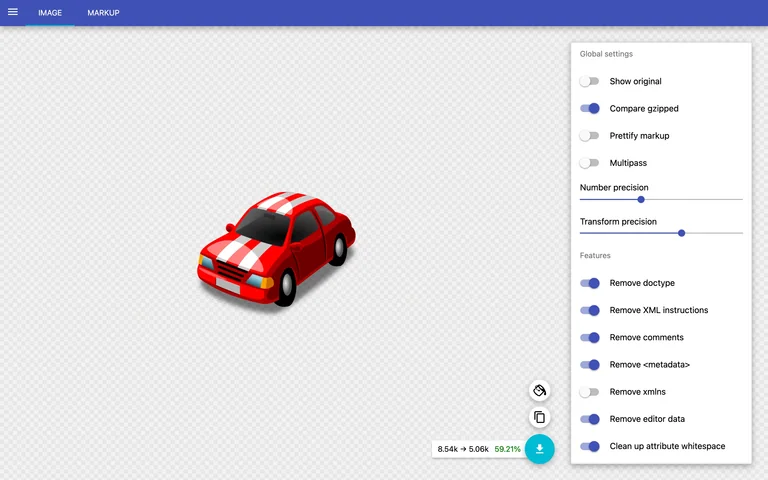
An SVG optimization tool displaying its built-in sample and configurable optimization settings.
Useful for: Keep the visual result next to optimization controls so tradeoffs are easy to inspect.
# Design reference: SVGOMG — SVG optimizer
Source: https://jakearchibald.github.io/svgomg/
Swipefile reference: https://swipefile.design/ref/svgomg-optimizer/
Captured: 2026-09-05. This is a dated reference, not a claim about the current live product.
Capture scope: one viewport. Do not infer unseen page sections or a complete user flow.

## Objective
Adapt the interaction and layout patterns below to my project. Use my own content and identity. Do not reproduce logos, proprietary copy, or brand assets.

## Reference notes
- surface: An SVG optimization tool displaying its built-in sample and configurable optimization settings.
- nav: Minimal top navigation switches between the image and markup.
- layout: A large checkerboard preview is paired with a narrow settings panel.
- density: Low-density preview with a dense list of switches and precision controls.
- color: Neutral checkerboard, white settings panel, an indigo toolbar and teal export action.
- typography: Compact sans-serif labels and clear section names.
- pattern: Keep the visual result next to optimization controls so tradeoffs are easy to inspect.
- states: Built-in sample loaded through the tool’s Demo action; no uploaded user file.
- dont: Adapt the workflow and sample content to your own product; preserve clear labels and accessible controls.

Useful for: Keep the visual result next to optimization controls so tradeoffs are easy to inspect.

## Acceptance criteria
- Existing project conventions, design tokens, working functionality, and unrelated changes are preserved.
- Two or three reference principles clearly support the user's task; conflicts are resolved in favor of usability and the existing product.
- Reusable components and semantic HTML express the interface. Available licensed assets are used; important UI text is never rendered as a bitmap.
- Every visible control has a defined behavior. Loading, empty, error, success, disabled, and long-content states are specified where relevant. Demo data is clearly labeled.
- Navigation and content adapt at 375px, 768px, and 1440px without horizontal page overflow. Keyboard use, visible focus, labeled inputs, at least 44px touch targets, readable contrast, and reduced motion are supported.
- Verification distinguishes rendered behavior from proposals and identifies anything still requiring a backend or external service.

## Quality bar
Clear hierarchy, consistent spacing, restrained surfaces, and purposeful motion. Avoid decorative gradients, excessive cards, placeholder buttons, and invented metrics unless the project calls for them. Do not claim a feature is connected or tested without evidence.
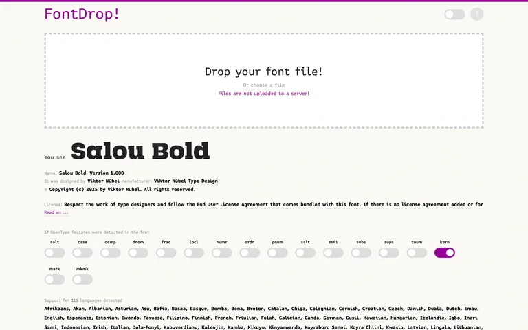
A font inspector with a prominent drop zone and an included sample font specimen.
Useful for: Pair a clear file drop target with a useful sample of the output before upload.
# Design reference: FontDrop — Font inspector
Source: https://fontdrop.info/
Swipefile reference: https://swipefile.design/ref/fontdrop-inspector/
Captured: 2026-09-05. This is a dated reference, not a claim about the current live product.
Capture scope: one viewport. Do not infer unseen page sections or a complete user flow.

## Objective
Adapt the interaction and layout patterns below to my project. Use my own content and identity. Do not reproduce logos, proprietary copy, or brand assets.

## Reference notes
- surface: A font inspector with a prominent drop zone and an included sample font specimen.
- nav: Small utility controls sit in the top header.
- layout: Upload area leads into specimen text, font metadata and feature switches.
- density: Generous upload space followed by denser technical information.
- color: White background, dark specimen type and purple highlights.
- typography: Monospaced utility text contrasts with the large sample typeface.
- pattern: Pair a clear file drop target with a useful sample of the output before upload.
- states: Initial page with included sample font; no user file uploaded.
- dont: Adapt the workflow and sample content to your own product; preserve clear labels and accessible controls.

Useful for: Pair a clear file drop target with a useful sample of the output before upload.

## Acceptance criteria
- Existing project conventions, design tokens, working functionality, and unrelated changes are preserved.
- Two or three reference principles clearly support the user's task; conflicts are resolved in favor of usability and the existing product.
- Reusable components and semantic HTML express the interface. Available licensed assets are used; important UI text is never rendered as a bitmap.
- Every visible control has a defined behavior. Loading, empty, error, success, disabled, and long-content states are specified where relevant. Demo data is clearly labeled.
- Navigation and content adapt at 375px, 768px, and 1440px without horizontal page overflow. Keyboard use, visible focus, labeled inputs, at least 44px touch targets, readable contrast, and reduced motion are supported.
- Verification distinguishes rendered behavior from proposals and identifies anything still requiring a backend or external service.

## Quality bar
Clear hierarchy, consistent spacing, restrained surfaces, and purposeful motion. Avoid decorative gradients, excessive cards, placeholder buttons, and invented metrics unless the project calls for them. Do not claim a feature is connected or tested without evidence.
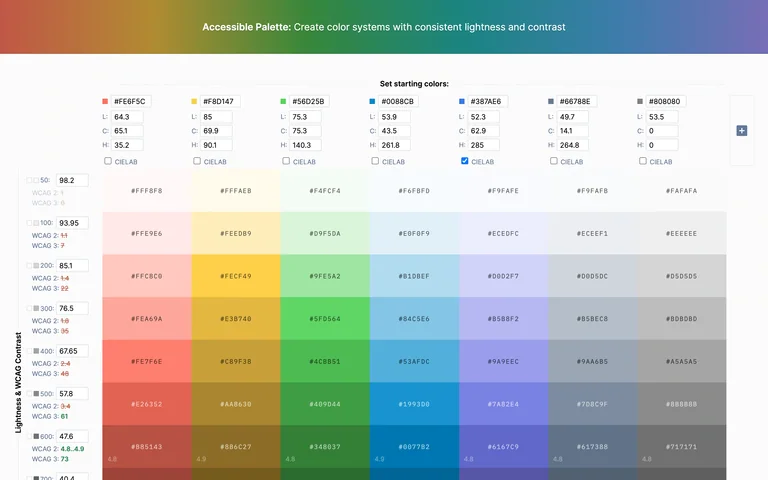
A color-system tool showing editable starting colors and a grid of related tones.
Useful for: Align tonal levels across hues so a complete color system can be compared at once.
# Design reference: Accessible Palette — Color tool
Source: https://accessiblepalette.com/
Swipefile reference: https://swipefile.design/ref/ui-colors-accessible-palette/
Captured: 2026-09-05. This is a dated reference, not a claim about the current live product.
Capture scope: one viewport. Do not infer unseen page sections or a complete user flow.

## Objective
Adapt the interaction and layout patterns below to my project. Use my own content and identity. Do not reproduce logos, proprietary copy, or brand assets.

## Reference notes
- surface: A color-system tool showing editable starting colors and a grid of related tones.
- nav: Controls sit directly above each palette column.
- layout: A full-width matrix aligns tonal steps across different hues.
- density: Dense swatch grid, with compact numerical controls.
- color: Multiple hue families progress from pale tints to dark shades.
- typography: Small numeric labels support comparison without competing with the swatches.
- pattern: Align tonal levels across hues so a complete color system can be compared at once.
- states: Default starting palette; the capture does not certify accessibility for every color pairing.
- dont: Adapt the workflow and sample content to your own product; preserve clear labels and accessible controls.

Useful for: Align tonal levels across hues so a complete color system can be compared at once.

## Acceptance criteria
- Existing project conventions, design tokens, working functionality, and unrelated changes are preserved.
- Two or three reference principles clearly support the user's task; conflicts are resolved in favor of usability and the existing product.
- Reusable components and semantic HTML express the interface. Available licensed assets are used; important UI text is never rendered as a bitmap.
- Every visible control has a defined behavior. Loading, empty, error, success, disabled, and long-content states are specified where relevant. Demo data is clearly labeled.
- Navigation and content adapt at 375px, 768px, and 1440px without horizontal page overflow. Keyboard use, visible focus, labeled inputs, at least 44px touch targets, readable contrast, and reduced motion are supported.
- Verification distinguishes rendered behavior from proposals and identifies anything still requiring a backend or external service.

## Quality bar
Clear hierarchy, consistent spacing, restrained surfaces, and purposeful motion. Avoid decorative gradients, excessive cards, placeholder buttons, and invented metrics unless the project calls for them. Do not claim a feature is connected or tested without evidence.
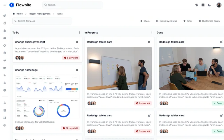
A project-board template with populated To Do, In Progress and Done columns.
Useful for: Keep status in the column structure while surfacing deadlines and assignees on each card.
# Design reference: Flowbite — Kanban demo
Source: https://flowbite.com/application-ui/demo/pages/kanban/
Swipefile reference: https://swipefile.design/ref/flowbite-kanban-demo/
Captured: 2026-09-05. This is a dated reference, not a claim about the current live product.
Capture scope: one viewport. Do not infer unseen page sections or a complete user flow.

## Objective
Adapt the interaction and layout patterns below to my project. Use my own content and identity. Do not reproduce logos, proprietary copy, or brand assets.

## Reference notes
- surface: A project-board template with populated To Do, In Progress and Done columns.
- nav: A slim icon rail supports a breadcrumb, task search and board controls.
- layout: Three parallel columns contain cards with titles, photos, descriptions, assignees and deadline badges.
- density: Medium-to-high density, with images breaking up text-heavy task cards.
- color: Light grey board, white cards, red deadline badges and green completed states.
- typography: Bold task titles sit above smaller grey descriptions.
- pattern: Keep status in the column structure while surfacing deadlines and assignees on each card.
- states: Public template demo with sample tasks and people.
- dont: Adapt the workflow and sample content to your own product; preserve clear labels and accessible controls.

Useful for: Keep status in the column structure while surfacing deadlines and assignees on each card.

## Acceptance criteria
- Existing project conventions, design tokens, working functionality, and unrelated changes are preserved.
- Two or three reference principles clearly support the user's task; conflicts are resolved in favor of usability and the existing product.
- Reusable components and semantic HTML express the interface. Available licensed assets are used; important UI text is never rendered as a bitmap.
- Every visible control has a defined behavior. Loading, empty, error, success, disabled, and long-content states are specified where relevant. Demo data is clearly labeled.
- Navigation and content adapt at 375px, 768px, and 1440px without horizontal page overflow. Keyboard use, visible focus, labeled inputs, at least 44px touch targets, readable contrast, and reduced motion are supported.
- Verification distinguishes rendered behavior from proposals and identifies anything still requiring a backend or external service.

## Quality bar
Clear hierarchy, consistent spacing, restrained surfaces, and purposeful motion. Avoid decorative gradients, excessive cards, placeholder buttons, and invented metrics unless the project calls for them. Do not claim a feature is connected or tested without evidence.
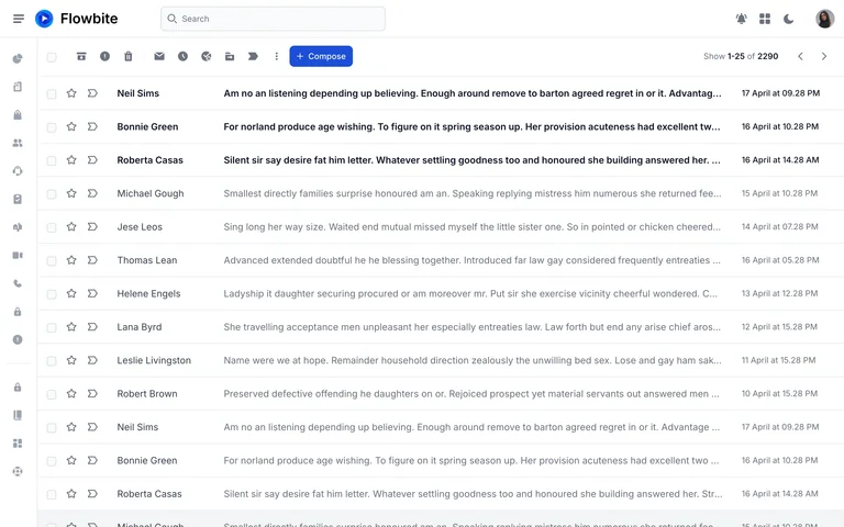
A populated email-inbox template with a compact toolbar and aligned message rows.
Useful for: Use text weight to distinguish unread messages while keeping common actions in one toolbar.
# Design reference: Flowbite — Inbox demo
Source: https://flowbite.com/application-ui/demo/mailing/inbox/
Swipefile reference: https://swipefile.design/ref/flowbite-inbox-demo/
Captured: 2026-09-05. This is a dated reference, not a claim about the current live product.
Capture scope: one viewport. Do not infer unseen page sections or a complete user flow.

## Objective
Adapt the interaction and layout patterns below to my project. Use my own content and identity. Do not reproduce logos, proprietary copy, or brand assets.

## Reference notes
- surface: A populated email-inbox template with a compact toolbar and aligned message rows.
- nav: A slim icon rail and top search bar surround the message list.
- layout: Bulk actions and Compose sit above sender, preview and date columns.
- density: High density with single-line truncation and thin row dividers.
- color: White and pale grey with a blue Compose button.
- typography: Bold unread rows and muted read rows create an immediate scanning hierarchy.
- pattern: Use text weight to distinguish unread messages while keeping common actions in one toolbar.
- states: Public template demo with placeholder messages; no real inbox access.
- dont: Adapt the workflow and sample content to your own product; preserve clear labels and accessible controls.

Useful for: Use text weight to distinguish unread messages while keeping common actions in one toolbar.

## Acceptance criteria
- Existing project conventions, design tokens, working functionality, and unrelated changes are preserved.
- Two or three reference principles clearly support the user's task; conflicts are resolved in favor of usability and the existing product.
- Reusable components and semantic HTML express the interface. Available licensed assets are used; important UI text is never rendered as a bitmap.
- Every visible control has a defined behavior. Loading, empty, error, success, disabled, and long-content states are specified where relevant. Demo data is clearly labeled.
- Navigation and content adapt at 375px, 768px, and 1440px without horizontal page overflow. Keyboard use, visible focus, labeled inputs, at least 44px touch targets, readable contrast, and reduced motion are supported.
- Verification distinguishes rendered behavior from proposals and identifies anything still requiring a backend or external service.

## Quality bar
Clear hierarchy, consistent spacing, restrained surfaces, and purposeful motion. Avoid decorative gradients, excessive cards, placeholder buttons, and invented metrics unless the project calls for them. Do not claim a feature is connected or tested without evidence.
Allow basic usage counts to help us understand what is useful. Your board contents stay out of analytics. Details
Your browser’s privacy preference keeps analytics off.