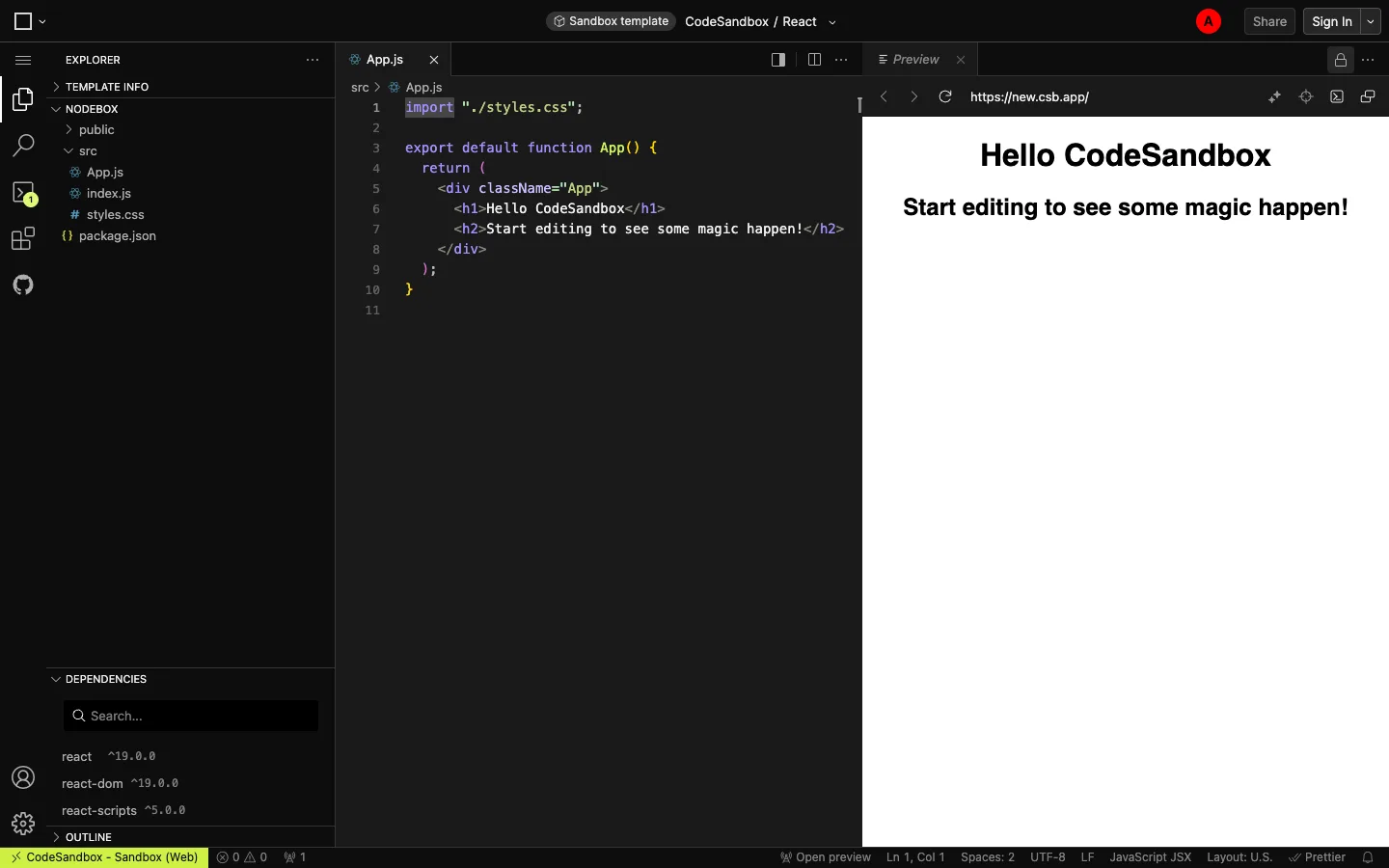
A full VS Code clone squeezed into a browser tab, and the live preview pane wears real browser chrome — URL bar, back/forward, refresh — instead of looking like a sandboxed iframe.
The three-pane split (file tree, editor with tabs, preview) where the preview pane carries actual browser chrome around the rendered output, so it reads as 'a real site' rather than 'a code demo.' Also worth lifting: the extremely dense bottom status bar that crams error/warning counts, cursor position, encoding, line-ending, language mode and formatter into one 22px strip with zero visual weight.
Design notes
Surface
The main editor view of a React sandbox — file explorer, code editor, and live preview open side by side
Navigation
Two tiers. A ~48px icon-only rail on the far left (Explorer, Search, Source Control with a badge count, Extensions, GitHub, Account, Settings) with no text labels at all, then the file explorer panel it toggles. Tabs live inside each pane — App.js in the editor, Preview on the right — rather than a single global tab bar.
Layout
Three fixed-width columns: icon rail (~48px), file explorer (~300px), then the editor and preview panes splitting the remainder roughly 50/50 across a resizable divider. Only the code and preview panes scroll independently; the explorer scrolls its own tree.
Density
Compact. Explorer rows sit around 22px, code runs 13-14px monospace with generous line height, and the bottom status bar packs a dozen items into a single 22px strip.
Color
Near-black editor surface with syntax colour doing all the work — purple keywords, orange/yellow strings, default-white identifiers. Icon rail, panels and status bar stay flat dark grey. The only non-code saturation is the red avatar circle top right.
Type
A small UI sans for chrome (tabs, panel headers, status bar) and a monospace for code. Panel labels (EXPLORER, NODEBOX, DEPENDENCIES) are uppercase, tiny and grey — quiet section dividers, not headings.
Pattern
The preview pane wears real browser chrome — back, forward, refresh, and an actual-looking URL bar — inside a tool panel, not a separate window. It reframes 'preview' as 'this is a live page,' not 'this is a sandboxed iframe.'
States
Fresh-sandbox state: default boilerplate code and its matching rendered output are already in place (Hello CodeSandbox), the status bar shows zero errors and zero warnings, and exactly one file tab is open. A new sandbox never opens empty — it opens pre-populated.
Don't
Don't fake the preview's URL bar as a static label. If you borrow this pattern the address bar has to look editable and the nav buttons have to look live, or the whole 'this is a real site' illusion collapses into a screenshot.
Make it your own
Turn this reference into a useful brief for your project. Copy it into the AI tool you already use.
Add constraintsPreview & edit promptAssembled in your browser. No API key or AI request needed. Changing the fields refreshes the preview.