GitHub — Pull request diff
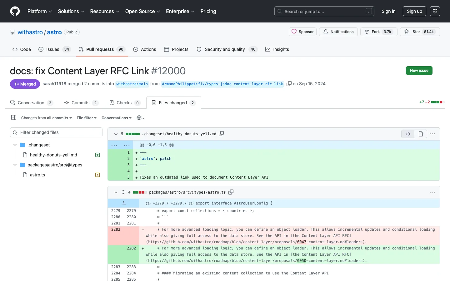
Word-level diff highlighting is the whole trick: changed lines get a full-row red or green tint, but the exact substring that changed inside that line gets a second, darker shade layered on top — so you can spot 'a link changed' without re-reading the sentence.
Why this pattern works
Steal the two-tier diff highlight (row-level color plus a darker word-level color on just the changed span) — it's the single mechanism that makes a diff scannable instead of just colored. Also take the per-file stat chip: a small 'N lines changed' number paired with a 5-segment red/green mini-bar, repeated at both the PR-summary level (next to Files changed) and again on every individual file header, so density-of-change is legible before you read a single line.
Design notes
- Surface
- Files changed tab of a merged pull request (withastro/astro #12000), diff view across 2 files
- Navigation
- Same three-tier chrome as a repo page (global dark nav, org/repo identity row with `Sponsor` / `Notifications` / `Fork` / `Star`, then a tab strip), plus two PR-specific tiers: a sub-tab strip (Conversation, Commits, Checks, Files changed) and a diff toolbar (view-shaping dropdowns on the left, a +/− stat and tree toggle on the right).
- Layout
- A collapsible left file-tree panel (~280px) beside a fluid right diff panel. Each changed file is its own bordered card, stacked vertically down the page.
- Density
- Tight, monospace, code-editor line-height inside the diff body, with a fixed-width grey line-number gutter on both sides. Everything outside the diff (headers, badges, tabs) sits at normal UI density, which makes the diff read as a document rather than a UI.
- Color
- Same black/white/grey shell as the rest of GitHub, plus a purple `Merged` badge and an orange active-tab underline on `Files changed`. Inside the diff: pale green rows for additions, pale red for deletions, and a noticeably darker green or red layered only over the exact characters that changed within those rows.
- Type
- UI chrome stays in the sans; the entire diff body switches to monospace, including line numbers, hunk headers and the code itself. The PR title is the largest text on the page at ~24px bold.
- Pattern
- Word-level diff highlighting layered inside line-level diff highlighting — two intensities of the same hue doing two different jobs, which lines changed versus exactly what changed inside them.
- States
- A merged, fully-resolved PR: a purple `Merged` badge instead of an open/conflict indicator, no pending checks shown. The file tree marks a newly added file with a green status dot and a modified file with an amber one.
- Don't
- Don't stop at line-level tinting. A red or green row with no word-level highlight forces a reviewer to diff the sentence by eye; the darker inline highlight is what makes a one-character change (a link slug, a version number) jump out without reading.
Make it your own
Turn this reference into a useful brief for your project. Copy it into the AI tool you already use.