GitHub — Repository
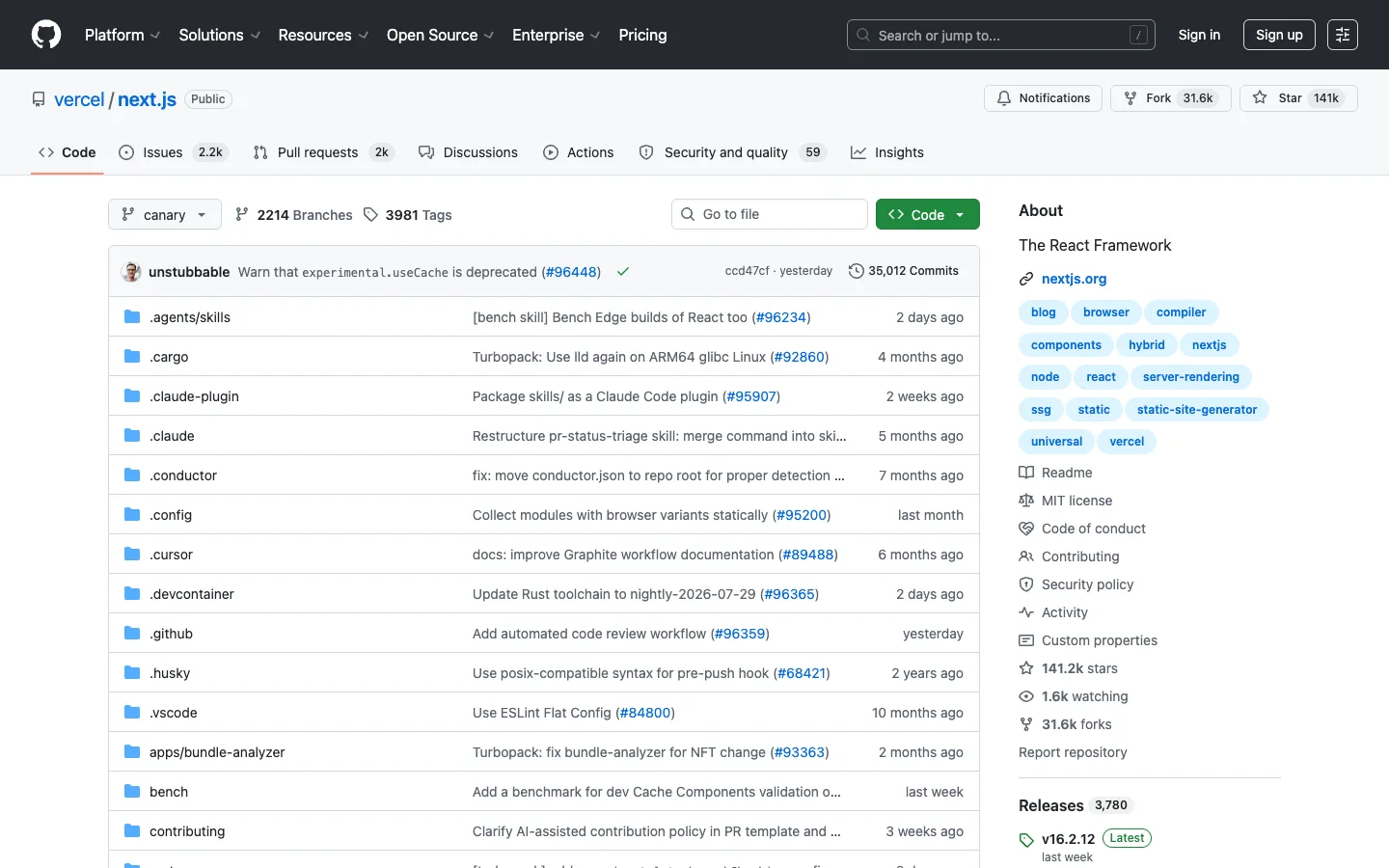
Every file row doubles as a changelog: the commit message and relative time ARE the file browser, so you never need a separate history view to know what changed and when.
Why this pattern works
Steal the file-list-as-changelog pattern: instead of a plain name/size/date table, each row shows the folder or file, the most recent commit message that touched it (truncated, with the PR number linked inline), and a relative timestamp — one table answers 'what is this' and 'what happened to it' at once. Also worth lifting: the metadata rail on the right as a stack of single-purpose modules (About blurb, wrapping topic-tag pill cloud, Readme/license/policy links, Releases) separated by hairlines, no cards.
Design notes
- Surface
- Repository root / Code tab for vercel/next.js, logged out
- Navigation
- Three tiers. A near-black global product nav (dropdowns, search, sign in/up), a repo identity row (org/repo breadcrumb, `Public` badge, `Notifications` / `Fork` / `Star` pill buttons), then a tab strip (Code, Issues, Pull requests, Discussions, Actions, Security and quality, Insights) using icon-plus-label with a plain count instead of a badge.
- Layout
- Fixed-width centered container, two columns below the tabs at roughly 3:1 — a wide file browser on the left, a narrower fixed metadata rail on the right. One continuous scroll, no pinned panes.
- Density
- Compact ~40px rows in the file table, three ellipsis-truncated zones per row (name, commit message, time). The metadata rail is looser — one fact per line.
- Color
- Black-and-white with exactly one saturated accent: the green `Code` clone button. Folders get a blue icon, files a plain grey one. Topic tags in the sidebar are pale-blue pill chips, the only other colour on the page. Top nav is near-black; everything below it is white.
- Type
- One sans throughout. Repo name is bold at ~20px beside a lighter grey org name; file names and commit messages sit at ~14px regular, staying default-colour rather than link-blue until hovered; timestamps are grey, right-aligned, same size as body text.
- Pattern
- The `latest commit` summary strip sitting above the file table — avatar, author, message, linked PR number, checkmark, commit hash, total commit count — a preview row outside the list that reframes the whole table as 'what's under this commit' instead of a flat listing.
- States
- No empty, loading or zero-count states visible — a populated, healthy-repo screenshot. The one dynamic-feeling element is the green CI checkmark beside the latest commit.
- Don't
- Don't render the commit-message column in link-blue by default. GitHub keeps file names and messages in default text colour and saves blue for the PR number and the breadcrumb only, so the eye still lands on the green Code button first.
Make it your own
Turn this reference into a useful brief for your project. Copy it into the AI tool you already use.