npm — Package page
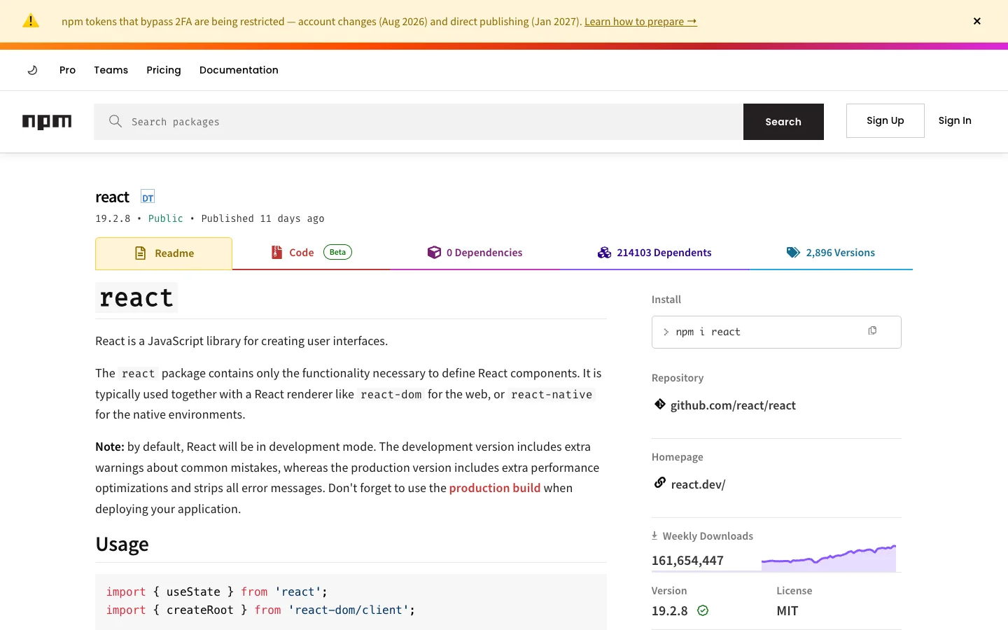
The whole right column is one idea done five times: a label, a value, sometimes a tiny inline chart, separated by hairlines — no cards, no icons doing heavy lifting, just a repeatable meta-fact module reused for install command, repo link, homepage, downloads and version/license.
Why this pattern works
Steal the meta-rail as a reusable primitive: stack single-fact modules (Install / Repository / Homepage / Weekly Downloads / Version+License) in a fixed-width sidebar, each separated only by a hairline, and let one of them carry an inline sparkline instead of a separate chart panel. Also take the color-coded tab strip: every secondary tab (Code, Dependencies, Dependents, Versions) gets its own accent color on its icon, and the tab underline is stitched together from those same colors, so the tab bar reads as a legend before you click anything.
Design notes
- Surface
- Package detail page for react on npmjs.com, Readme tab active
- Navigation
- Two stacked bars above the content: a slim secondary nav (Pro, Teams, Pricing, Documentation) and a primary nav (wordmark, a search-input-plus-button combo, `Sign Up` / `Sign In`). No breadcrumb — the package name itself is the only wayfinding once you're on the page.
- Layout
- Two columns under a full-width header: a wide left reading column (~65%) for rendered Markdown, a narrower fixed right rail (~30%) for metadata, split by a hairline. A dismissible banner and a thin gradient stripe sit above everything.
- Density
- Loose. Readme content runs at normal prose line-height; the sidebar gives each fact its own paragraph of whitespace instead of compressing into a stat grid.
- Color
- White page, near-black text. The loudest element is the banner's rainbow gradient stripe. Each secondary tab carries its own small accent colour on its icon (red, purple, blue, teal) that also tints its segment of the tab-strip underline. A green checkmark marks the current version; a red-orange inline link calls out `production build` inside the prose.
- Type
- The package name renders in a bold slab/monospace-flavoured display face, visually distinct from the humanist sans used everywhere else in the chrome. Readme headings are bold sans; code spans and the code block switch to monospace with syntax colour. Sidebar labels are small grey caps-adjacent text over larger plain values.
- Pattern
- The meta-rail as a stack of single-fact modules — Install, Repository, Homepage, Weekly Downloads, Version/License — each just a label and a value, with one of them (Downloads) carrying an inline sparkline instead of a separate chart card.
- States
- No empty or error states visible — a fully populated, high-traffic package page. The dismissible top banner is the only temporary element, with its own close affordance separate from the rest of the page.
- Don't
- Don't give every sidebar fact its own bordered card. The moment Install, Repository, Homepage and Downloads each get a box, the rail stops reading as one continuous spec sheet and starts looking like an unfinished dashboard — hairline-only separation is what makes it feel authored.
Make it your own
Turn this reference into a useful brief for your project. Copy it into the AI tool you already use.