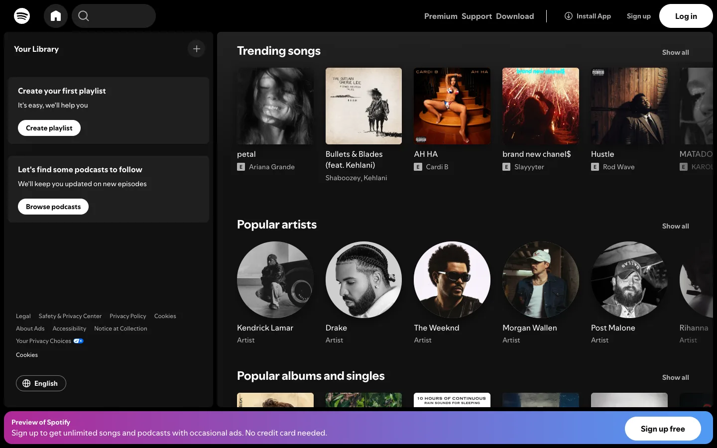
A pure-black canvas where the only signal is content thumbnails — chrome disappears so completely that the persistent gradient bar at the bottom is the loudest thing on the page.
The sticky bottom upsell bar: a gradient banner pinned to the viewport floor that survives every scroll position without ever blocking a click, instead of a dismiss-and-gone modal. Also the content shelf pattern — bold heading, right-aligned 'Show all' link, one clipped horizontal row of equal-size cards — which repeats for songs, artists and albums and composes the entire page from one repeated block.
Design notes
Surface
Home feed, logged out, root of open.spotify.com
Navigation
Two tiers, both minimal. A slim top bar (logo, home icon, search pill, right-aligned text links) and a fixed left library panel beneath it. There's no third tier here — logged out strips the playlist tree entirely, so the sidebar becomes two prompt cards instead of a nav list.
Layout
Fixed top bar (~64px) and fixed left sidebar (~420px), fluid content well to the right that scrolls on its own. A gradient banner is pinned to the bottom of the viewport, floating over the content rather than sitting in document flow.
Density
Roomy. Album art cards run ~150px square with generous gutters, about six to seven per shelf before the row clips. Built for browsing, not managing anything.
Color
Almost entirely black and off-white. Colour never touches the chrome — the only saturated pixels are the artwork itself and the bottom banner's purple-to-blue gradient, which exists purely to sell the upgrade.
Type
One sans throughout. Section headers sit around 24px bold white and are the only large type; card titles are ~14px semibold, artist lines ~13px grey. Hierarchy comes from size and grey-vs-white contrast, not weight.
Pattern
The content shelf: a heading, a 'Show all' link at the right, and a single horizontal row of equal-width cards that clips rather than wraps. Stack that block as many times as needed and the page builds itself.
States
Logged-out empty library: instead of a track list, two dark prompt cards ('Create your first playlist,' 'Let's find some podcasts to follow') each carrying its own white CTA pill — the empty state does the selling instead of apologizing. The bottom banner is the persistent logged-out nag, present at every scroll position.
Don't
Don't make the bottom banner modal or dismiss-and-gone — its entire power is surviving scroll without ever blocking a click. Turn it into a popup and the pattern dies.
Make it your own
Turn this reference into a useful brief for your project. Copy it into the AI tool you already use.
Add constraintsPreview & edit promptAssembled in your browser. No API key or AI request needed. Changing the fields refreshes the preview.