Turning a screenshot collection into a useful design brief
How Swipefile adds selection criteria, focused reference notes, and design questions to an existing collection without replacing its save-to-board workflow.
Key takeaways
- Start with the decision the interface needs to support.
- Give each reference a specific role and retain your own identity.
- Verify the resulting behavior; screenshots are not performance evidence.
The problem: attractive examples do not explain the decision
A collection of screenshots gives a designer somewhere to start. It can still leave a difficult question unanswered: what should I actually take from these references? A long sales page, software trial page, and writing-course offer may share a category while solving different communication problems.
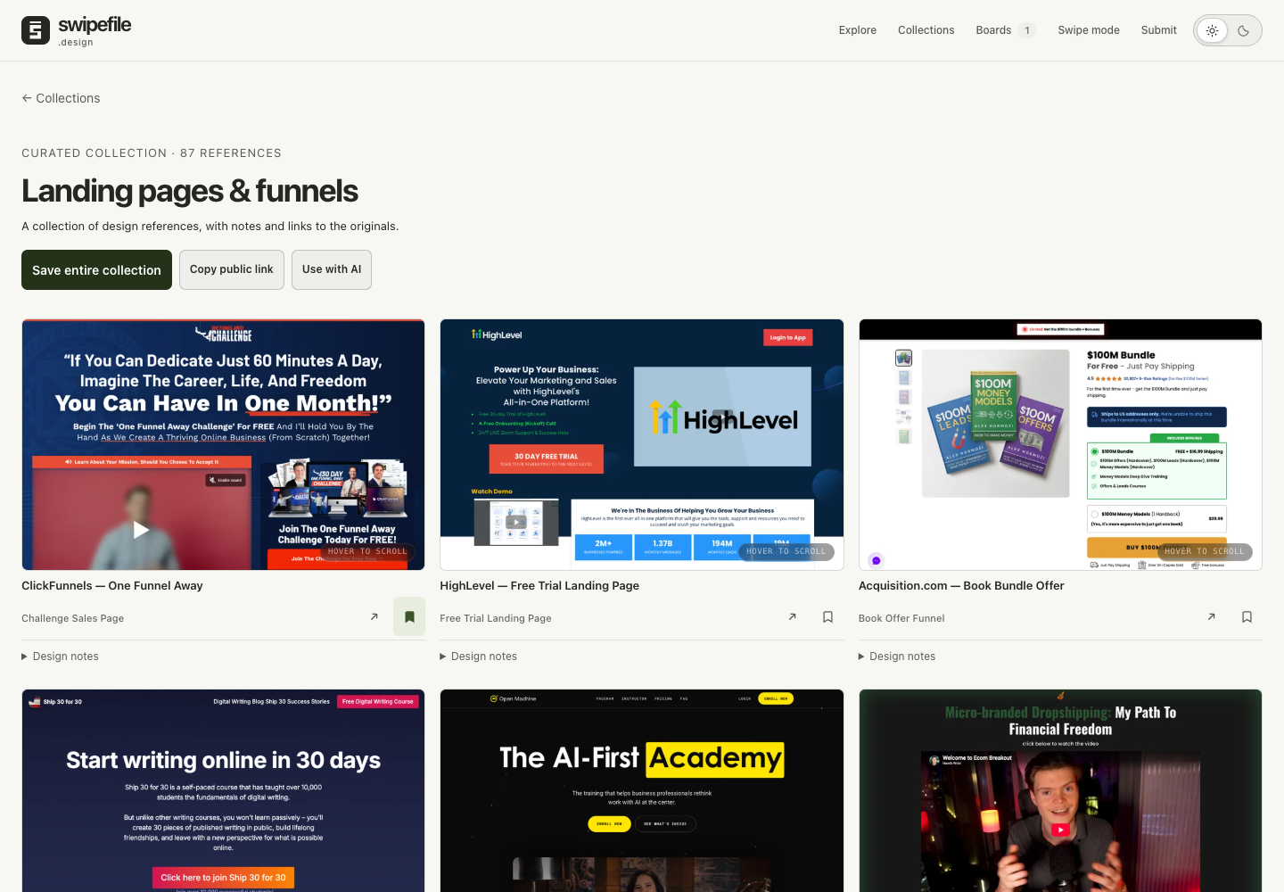
The earlier landing-pages collection put the title, save action, and gallery first. Each reference had notes, but the collection-level introduction did little to help someone choose a starting point.
The references: compare the work each section does
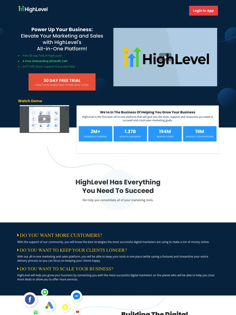
The HighLevel trial-page capture moves from a product promise through capabilities and pricing. One Funnel Away provides a course-oriented structure with training tracks, curriculum, trainers, enrollment, and questions. Ship 30 for 30 explains a writing method and program before its enrollment decision.
These distinctions matter more than treating all three as interchangeable “high-converting funnels.” Swipefile has no verified conversion data for those offers. A screenshot can establish that a section is present; it cannot establish that the section caused a purchase.
The more useful design brief is to identify the job of each section: explain the offer, demonstrate the method, establish fit, disclose commitments, answer an objection, or invite an action.
The result: a collection with a point of view
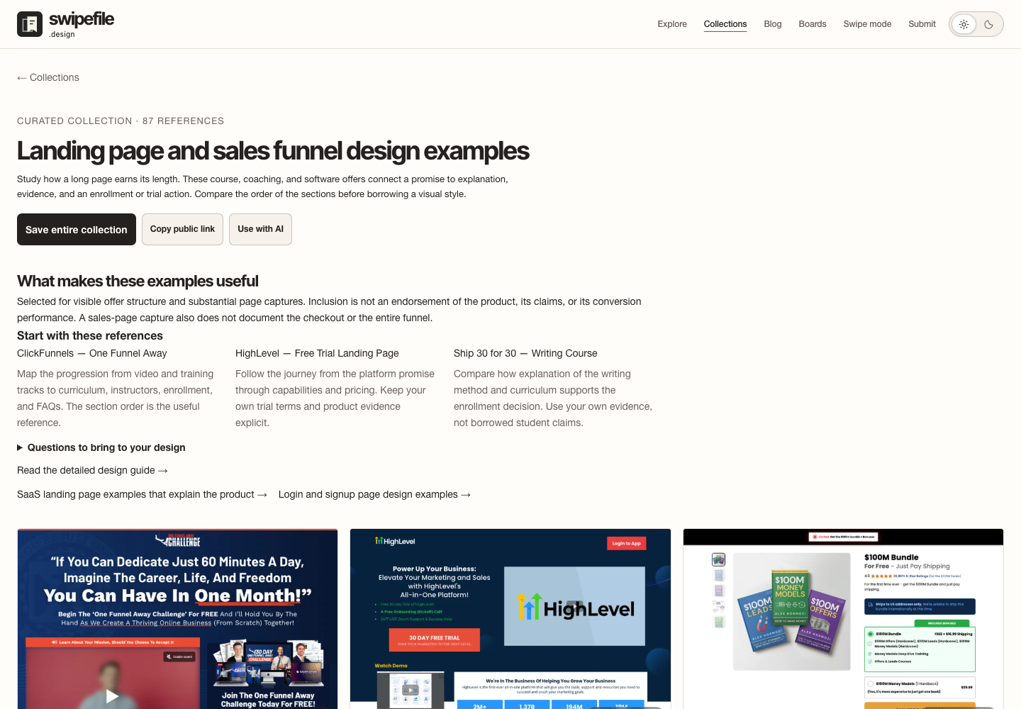
The updated page explains why the examples belong together and the limits of what their captures show. Three suggested references give a visitor a manageable starting set. Each recommendation names a specific aspect to examine instead of declaring the entire website “best.”
Design questions turn the collection into a practical review tool. Can a visitor identify the audience and offer? Does each section answer a new question? Can someone find the price and commitments before taking the final action? The answers depend on the project, so the page provides a method rather than a universal layout recipe.
The board workflow stays intact. A visitor can save the whole collection or choose individual references. The AI handoff remains available for the selected reference data, while a linked article explains the design topic in more depth. Related collections offer a next step when the user’s problem is actually software positioning or account entry.
A brief you can adapt
Use these selected references to outline our offer page. For each proposed section, state the visitor question it answers and the evidence our project can provide. Keep our own brand and content. Do not reuse testimonials, invent conversion results, or assume a screenshot documents checkout behavior. Explain where the reference is relevant and where our audience needs a different approach.
What to verify in your own collection
Open the landing-page collection and choose a small set for a real project. Read the source notes, save the references, and compare the resulting board with the brief. Remove a reference if you cannot explain its role.
The earlier and current captures show different development stages. This case study documents a content and interface change, not an experiment in rankings or sales. The same method also supports the SaaS collection and dashboard examples: make the selection criteria explicit and connect every example to a decision.