SaaS Marketing
CURATED COLLECTION · 22 REFERENCES
Compare software homepages by how quickly they make the product understandable. The most useful reference for your project may be a clear workflow preview or an honest demo route, rather than a dramatic hero.
Copy the reference notes below and paste them into Claude, ChatGPT, or your coding assistant. Add what you want to build.
Includes design notes, original sources, and preview links. An assistant that supports browsing can also read the public board link.
Selected for visible positioning, product evidence, and signup or demo paths in dated public captures. The collection spans different audiences; a developer tool and an enterprise platform do not need the same opening.
Study the connection between a broad platform promise, two actions, and a concrete workflow preview. Start your own preview with a recognizable task.
The compact developer presentation makes implementation feel nearby. Use a real code or interface example when it helps explain your own product.
A desktop-like shell becomes a product metaphor. Borrow this only when the metaphor clarifies navigation rather than adding an extra puzzle.
Choose one reference for hierarchy and another for product evidence. Write down what each contributes before generating a page. Show a real state of your own product, explain who it helps, and keep demo and signup choices distinct. Verify the small-screen layout using realistic copy and screenshots.
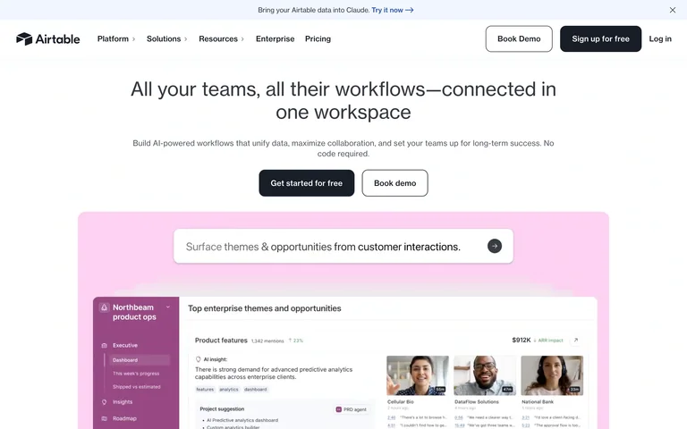
A centered platform promise and two clear actions sit above a pink-tinted product workflow preview, connecting the broad offer to a concrete interface.
Useful for: Flexible work platforms that need to turn a broad category into a visible workflow.
# Design reference: Airtable
Source: https://www.airtable.com/
Swipefile reference: https://swipefile.design/ref/saas-airtable/
Captured: 2026-09-05. This is a dated reference, not a claim about the current live product.
Capture scope: one viewport. Do not infer unseen page sections or a complete user flow.

## Objective
Adapt the visual principles below to my project. Use my own content and identity. Do not reproduce logos, proprietary copy, or brand assets.

## Reference notes
- mood: Clear and flexible
- colors: White, charcoal, pastel pink
- typography: Medium-weight sans headline and compact navigation
- layout: Centered headline and trial/demo pair above a wide product preview
- motion: Static opening-screen capture. Visit the source to study transitions and interactive behavior.
- texture: Soft color fields around interface imagery
- dont: Adapt the hierarchy to your own product and content; use your own identity and imagery.

Useful for: Flexible work platforms that need to turn a broad category into a visible workflow.

## Acceptance criteria
- Existing project conventions, design tokens, working functionality, and unrelated changes are preserved.
- Two or three reference principles clearly support the user's task; conflicts are resolved in favor of usability and the existing product.
- Reusable components and semantic HTML express the interface. Available licensed assets are used; important UI text is never rendered as a bitmap.
- Every visible control has a defined behavior. Loading, empty, error, success, disabled, and long-content states are specified where relevant. Demo data is clearly labeled.
- Navigation and content adapt at 375px, 768px, and 1440px without horizontal page overflow. Keyboard use, visible focus, labeled inputs, at least 44px touch targets, readable contrast, and reduced motion are supported.
- Verification distinguishes rendered behavior from proposals and identifies anything still requiring a backend or external service.

## Quality bar
Clear hierarchy, consistent spacing, restrained surfaces, and purposeful motion. Avoid decorative gradients, excessive cards, placeholder buttons, and invented metrics unless the project calls for them. Do not claim a feature is connected or tested without evidence.
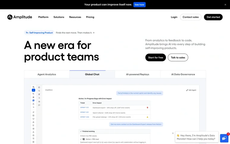
A short product-team message leads into a tabbed interface preview, so visitors can connect the platform story to several capabilities.
Useful for: Analytics platforms explaining several workflows through one organized product preview.
# Design reference: Amplitude
Source: https://amplitude.com/
Swipefile reference: https://swipefile.design/ref/saas-amplitude/
Captured: 2026-09-05. This is a dated reference, not a claim about the current live product.
Capture scope: one viewport. Do not infer unseen page sections or a complete user flow.

## Objective
Adapt the visual principles below to my project. Use my own content and identity. Do not reproduce logos, proprietary copy, or brand assets.

## Reference notes
- mood: Practical and product-led
- colors: White, black, muted blue
- typography: Large sans headline with compact product labels
- layout: Headline and actions above a broad preview with capability tabs
- motion: Static opening-screen capture. Visit the source to study transitions and interactive behavior.
- texture: Restrained interface screenshots and light panel borders
- dont: Adapt the hierarchy to your own product and content; use your own identity and imagery.

Useful for: Analytics platforms explaining several workflows through one organized product preview.

## Acceptance criteria
- Existing project conventions, design tokens, working functionality, and unrelated changes are preserved.
- Two or three reference principles clearly support the user's task; conflicts are resolved in favor of usability and the existing product.
- Reusable components and semantic HTML express the interface. Available licensed assets are used; important UI text is never rendered as a bitmap.
- Every visible control has a defined behavior. Loading, empty, error, success, disabled, and long-content states are specified where relevant. Demo data is clearly labeled.
- Navigation and content adapt at 375px, 768px, and 1440px without horizontal page overflow. Keyboard use, visible focus, labeled inputs, at least 44px touch targets, readable contrast, and reduced motion are supported.
- Verification distinguishes rendered behavior from proposals and identifies anything still requiring a backend or external service.

## Quality bar
Clear hierarchy, consistent spacing, restrained surfaces, and purposeful motion. Avoid decorative gradients, excessive cards, placeholder buttons, and invented metrics unless the project calls for them. Do not claim a feature is connected or tested without evidence.
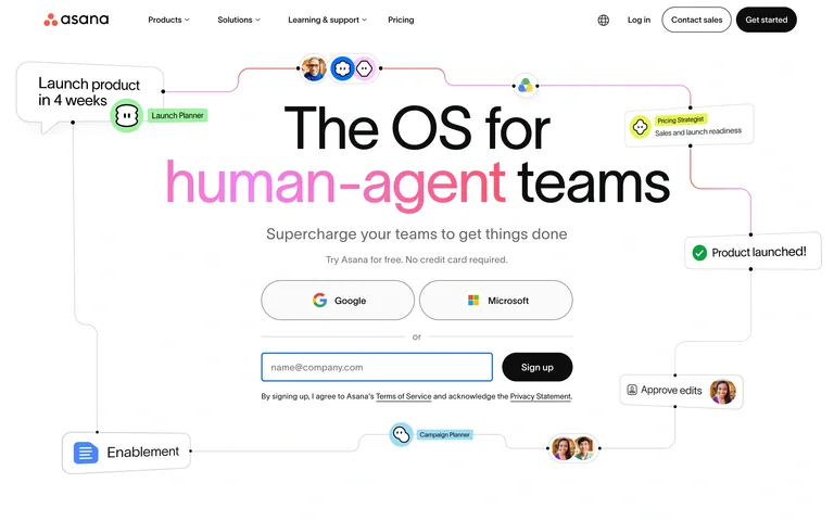
A large headline is surrounded by small connected work labels and avatars, while provider buttons and an email field make the first account step visible.
Useful for: Collaboration software connecting an abstract teamwork promise to a concrete signup path.
# Design reference: Asana
Source: https://asana.com/
Swipefile reference: https://swipefile.design/ref/saas-asana/
Captured: 2026-09-05. This is a dated reference, not a claim about the current live product.
Capture scope: one viewport. Do not infer unseen page sections or a complete user flow.

## Objective
Adapt the visual principles below to my project. Use my own content and identity. Do not reproduce logos, proprietary copy, or brand assets.

## Reference notes
- mood: Collaborative and approachable
- colors: White, black, pink, small multicolor accents
- typography: Large clean sans display with a colored phrase
- layout: Centered message and account choices, framed by a loose network of work labels
- motion: Static opening-screen capture. Visit the source to study transitions and interactive behavior.
- texture: Thin connector lines, small avatars, and rounded UI fragments
- dont: Adapt the hierarchy to your own product and content; use your own identity and imagery.

Useful for: Collaboration software connecting an abstract teamwork promise to a concrete signup path.

## Acceptance criteria
- Existing project conventions, design tokens, working functionality, and unrelated changes are preserved.
- Two or three reference principles clearly support the user's task; conflicts are resolved in favor of usability and the existing product.
- Reusable components and semantic HTML express the interface. Available licensed assets are used; important UI text is never rendered as a bitmap.
- Every visible control has a defined behavior. Loading, empty, error, success, disabled, and long-content states are specified where relevant. Demo data is clearly labeled.
- Navigation and content adapt at 375px, 768px, and 1440px without horizontal page overflow. Keyboard use, visible focus, labeled inputs, at least 44px touch targets, readable contrast, and reduced motion are supported.
- Verification distinguishes rendered behavior from proposals and identifies anything still requiring a backend or external service.

## Quality bar
Clear hierarchy, consistent spacing, restrained surfaces, and purposeful motion. Avoid decorative gradients, excessive cards, placeholder buttons, and invented metrics unless the project calls for them. Do not claim a feature is connected or tested without evidence.
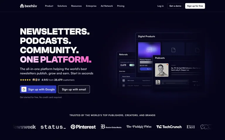
Stacked typography on a dark field introduces a creator platform, with provider and email signup routes alongside a compact product preview.
Useful for: Creator SaaS that needs to show the publishing offer and a low-friction first step.
# Design reference: beehiiv
Source: https://www.beehiiv.com/
Swipefile reference: https://swipefile.design/ref/saas-beehiiv/
Captured: 2026-09-05. This is a dated reference, not a claim about the current live product.
Capture scope: one viewport. Do not infer unseen page sections or a complete user flow.

## Objective
Adapt the visual principles below to my project. Use my own content and identity. Do not reproduce logos, proprietary copy, or brand assets.

## Reference notes
- mood: Bold and creator-focused
- colors: Deep navy, white, pink-purple accents
- typography: Heavy uppercase stacked display
- layout: Left-aligned pitch and signup choices, right-side product panels, customer names below
- motion: Static opening-screen capture. Visit the source to study transitions and interactive behavior.
- texture: Dark flat field with softly glowing interface previews
- dont: Adapt the hierarchy to your own product and content; use your own identity and imagery.

Useful for: Creator SaaS that needs to show the publishing offer and a low-friction first step.

## Acceptance criteria
- Existing project conventions, design tokens, working functionality, and unrelated changes are preserved.
- Two or three reference principles clearly support the user's task; conflicts are resolved in favor of usability and the existing product.
- Reusable components and semantic HTML express the interface. Available licensed assets are used; important UI text is never rendered as a bitmap.
- Every visible control has a defined behavior. Loading, empty, error, success, disabled, and long-content states are specified where relevant. Demo data is clearly labeled.
- Navigation and content adapt at 375px, 768px, and 1440px without horizontal page overflow. Keyboard use, visible focus, labeled inputs, at least 44px touch targets, readable contrast, and reduced motion are supported.
- Verification distinguishes rendered behavior from proposals and identifies anything still requiring a backend or external service.

## Quality bar
Clear hierarchy, consistent spacing, restrained surfaces, and purposeful motion. Avoid decorative gradients, excessive cards, placeholder buttons, and invented metrics unless the project calls for them. Do not claim a feature is connected or tested without evidence.
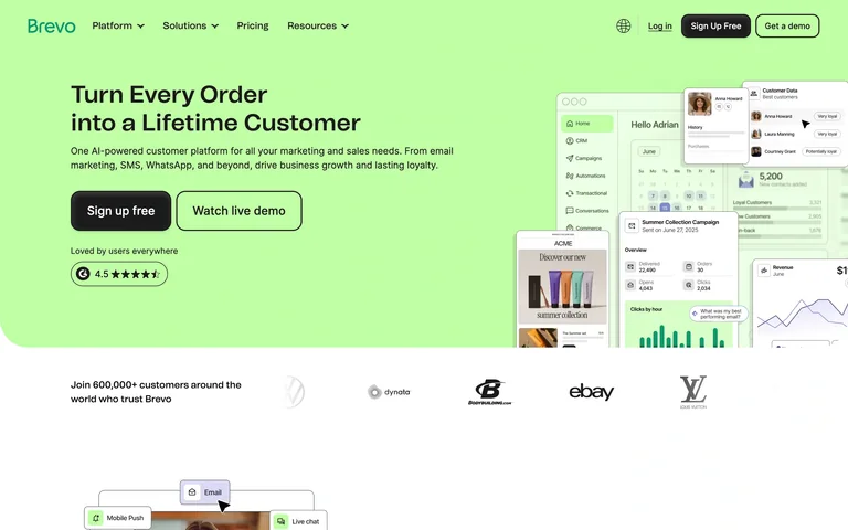
A lime panel pairs a short customer-growth message with layered marketing and reporting screens, then gives way to a row of customer logos.
Useful for: Marketing platforms using recognizable screens and customer context to support a broad offer.
# Design reference: Brevo
Source: https://www.brevo.com/
Swipefile reference: https://swipefile.design/ref/saas-brevo/
Captured: 2026-09-05. This is a dated reference, not a claim about the current live product.
Capture scope: one viewport. Do not infer unseen page sections or a complete user flow.

## Objective
Adapt the visual principles below to my project. Use my own content and identity. Do not reproduce logos, proprietary copy, or brand assets.

## Reference notes
- mood: Fresh and commercially focused
- colors: Pale lime, white, black
- typography: Clean sans headline and compact supporting copy
- layout: Left-aligned introduction and actions, right-side UI collage, customer row underneath
- motion: Static opening-screen capture. Visit the source to study transitions and interactive behavior.
- texture: Flat pastel color with overlapping interface panels
- dont: Adapt the hierarchy to your own product and content; use your own identity and imagery.

Useful for: Marketing platforms using recognizable screens and customer context to support a broad offer.

## Acceptance criteria
- Existing project conventions, design tokens, working functionality, and unrelated changes are preserved.
- Two or three reference principles clearly support the user's task; conflicts are resolved in favor of usability and the existing product.
- Reusable components and semantic HTML express the interface. Available licensed assets are used; important UI text is never rendered as a bitmap.
- Every visible control has a defined behavior. Loading, empty, error, success, disabled, and long-content states are specified where relevant. Demo data is clearly labeled.
- Navigation and content adapt at 375px, 768px, and 1440px without horizontal page overflow. Keyboard use, visible focus, labeled inputs, at least 44px touch targets, readable contrast, and reduced motion are supported.
- Verification distinguishes rendered behavior from proposals and identifies anything still requiring a backend or external service.

## Quality bar
Clear hierarchy, consistent spacing, restrained surfaces, and purposeful motion. Avoid decorative gradients, excessive cards, placeholder buttons, and invented metrics unless the project calls for them. Do not claim a feature is connected or tested without evidence.
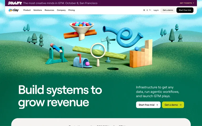
A colorful miniature landscape sits above a dark green section with a large growth-systems message and trial/demo choices.
Useful for: Complex workflow products using a memorable visual metaphor before explaining the system.
# Design reference: Clay
Source: https://www.clay.com/
Swipefile reference: https://swipefile.design/ref/saas-clay/
Captured: 2026-09-05. This is a dated reference, not a claim about the current live product.
Capture scope: one viewport. Do not infer unseen page sections or a complete user flow.

## Objective
Adapt the visual principles below to my project. Use my own content and identity. Do not reproduce logos, proprietary copy, or brand assets.

## Reference notes
- mood: Playful and systematic
- colors: Forest green, sky blue, yellow, pastel colors
- typography: Large white sans statement with smaller supporting text
- layout: Broad illustrated scene above a split introduction and action area
- motion: Static opening-screen capture. Visit the source to study transitions and interactive behavior.
- texture: Tactile 3D objects, grass-like surfaces, and soft clouds
- dont: Adapt the hierarchy to your own product and content; use your own identity and imagery.

Useful for: Complex workflow products using a memorable visual metaphor before explaining the system.

## Acceptance criteria
- Existing project conventions, design tokens, working functionality, and unrelated changes are preserved.
- Two or three reference principles clearly support the user's task; conflicts are resolved in favor of usability and the existing product.
- Reusable components and semantic HTML express the interface. Available licensed assets are used; important UI text is never rendered as a bitmap.
- Every visible control has a defined behavior. Loading, empty, error, success, disabled, and long-content states are specified where relevant. Demo data is clearly labeled.
- Navigation and content adapt at 375px, 768px, and 1440px without horizontal page overflow. Keyboard use, visible focus, labeled inputs, at least 44px touch targets, readable contrast, and reduced motion are supported.
- Verification distinguishes rendered behavior from proposals and identifies anything still requiring a backend or external service.

## Quality bar
Clear hierarchy, consistent spacing, restrained surfaces, and purposeful motion. Avoid decorative gradients, excessive cards, placeholder buttons, and invented metrics unless the project calls for them. Do not claim a feature is connected or tested without evidence.
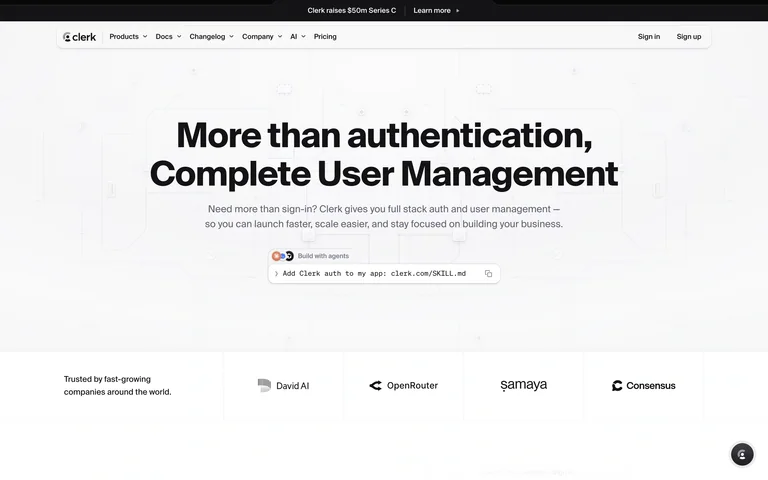
A restrained authentication pitch sits above a compact code-oriented control and customer logos, keeping the developer product presentation focused.
Useful for: Developer tools that need to explain one capability and make implementation feel close.
# Design reference: Clerk
Source: https://clerk.com/
Swipefile reference: https://swipefile.design/ref/saas-clerk/
Captured: 2026-09-05. This is a dated reference, not a claim about the current live product.
Capture scope: one viewport. Do not infer unseen page sections or a complete user flow.

## Objective
Adapt the visual principles below to my project. Use my own content and identity. Do not reproduce logos, proprietary copy, or brand assets.

## Reference notes
- mood: Focused and technical
- colors: White, near-black, muted gray
- typography: Heavy sans headline with compact code-like text
- layout: Centered headline and short description, small implementation control, customer row
- motion: Static opening-screen capture. Visit the source to study transitions and interactive behavior.
- texture: Minimal decoration, light rules, and code-oriented UI
- dont: Adapt the hierarchy to your own product and content; use your own identity and imagery.

Useful for: Developer tools that need to explain one capability and make implementation feel close.

## Acceptance criteria
- Existing project conventions, design tokens, working functionality, and unrelated changes are preserved.
- Two or three reference principles clearly support the user's task; conflicts are resolved in favor of usability and the existing product.
- Reusable components and semantic HTML express the interface. Available licensed assets are used; important UI text is never rendered as a bitmap.
- Every visible control has a defined behavior. Loading, empty, error, success, disabled, and long-content states are specified where relevant. Demo data is clearly labeled.
- Navigation and content adapt at 375px, 768px, and 1440px without horizontal page overflow. Keyboard use, visible focus, labeled inputs, at least 44px touch targets, readable contrast, and reduced motion are supported.
- Verification distinguishes rendered behavior from proposals and identifies anything still requiring a backend or external service.

## Quality bar
Clear hierarchy, consistent spacing, restrained surfaces, and purposeful motion. Avoid decorative gradients, excessive cards, placeholder buttons, and invented metrics unless the project calls for them. Do not claim a feature is connected or tested without evidence.
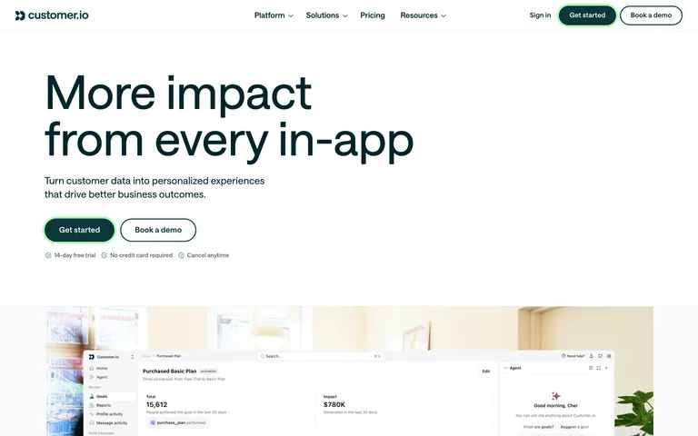
A large dark-green message introduces in-app communication, with a brief explanation and adjacent trial/demo actions before the product imagery begins.
Useful for: Lifecycle messaging tools connecting the communication channel to a clear business use.
# Design reference: Customer.io
Source: https://customer.io/
Swipefile reference: https://swipefile.design/ref/saas-customer-io/
Captured: 2026-09-05. This is a dated reference, not a claim about the current live product.
Capture scope: one viewport. Do not infer unseen page sections or a complete user flow.

## Objective
Adapt the visual principles below to my project. Use my own content and identity. Do not reproduce logos, proprietary copy, or brand assets.

## Reference notes
- mood: Calm and direct
- colors: White, dark green, muted image colors
- typography: Large lightweight sans headline
- layout: Left-aligned statement and paired actions, wide media area below
- motion: Static opening-screen capture. Visit the source to study transitions and interactive behavior.
- texture: Generous white space and restrained product imagery
- dont: Adapt the hierarchy to your own product and content; use your own identity and imagery.

Useful for: Lifecycle messaging tools connecting the communication channel to a clear business use.

## Acceptance criteria
- Existing project conventions, design tokens, working functionality, and unrelated changes are preserved.
- Two or three reference principles clearly support the user's task; conflicts are resolved in favor of usability and the existing product.
- Reusable components and semantic HTML express the interface. Available licensed assets are used; important UI text is never rendered as a bitmap.
- Every visible control has a defined behavior. Loading, empty, error, success, disabled, and long-content states are specified where relevant. Demo data is clearly labeled.
- Navigation and content adapt at 375px, 768px, and 1440px without horizontal page overflow. Keyboard use, visible focus, labeled inputs, at least 44px touch targets, readable contrast, and reduced motion are supported.
- Verification distinguishes rendered behavior from proposals and identifies anything still requiring a backend or external service.

## Quality bar
Clear hierarchy, consistent spacing, restrained surfaces, and purposeful motion. Avoid decorative gradients, excessive cards, placeholder buttons, and invented metrics unless the project calls for them. Do not claim a feature is connected or tested without evidence.
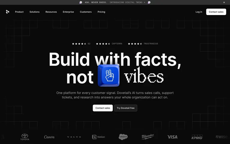
A bold customer-evidence message occupies a dark technical field, with a small blue object interrupting the type and sales/trial paths below.
Useful for: Research and customer-intelligence products that need a strong point of view before showing details.
# Design reference: Dovetail
Source: https://dovetail.com/
Swipefile reference: https://swipefile.design/ref/saas-dovetail/
Captured: 2026-09-05. This is a dated reference, not a claim about the current live product.
Capture scope: one viewport. Do not infer unseen page sections or a complete user flow.

## Objective
Adapt the visual principles below to my project. Use my own content and identity. Do not reproduce logos, proprietary copy, or brand assets.

## Reference notes
- mood: Analytical and assertive
- colors: Black, white, electric blue
- typography: Heavy centered sans display
- layout: Centered headline and short explanation above paired actions and customer logos
- motion: Static opening-screen capture. Visit the source to study transitions and interactive behavior.
- texture: Subtle line grid and a bright product-related graphic
- dont: Adapt the hierarchy to your own product and content; use your own identity and imagery.

Useful for: Research and customer-intelligence products that need a strong point of view before showing details.

## Acceptance criteria
- Existing project conventions, design tokens, working functionality, and unrelated changes are preserved.
- Two or three reference principles clearly support the user's task; conflicts are resolved in favor of usability and the existing product.
- Reusable components and semantic HTML express the interface. Available licensed assets are used; important UI text is never rendered as a bitmap.
- Every visible control has a defined behavior. Loading, empty, error, success, disabled, and long-content states are specified where relevant. Demo data is clearly labeled.
- Navigation and content adapt at 375px, 768px, and 1440px without horizontal page overflow. Keyboard use, visible focus, labeled inputs, at least 44px touch targets, readable contrast, and reduced motion are supported.
- Verification distinguishes rendered behavior from proposals and identifies anything still requiring a backend or external service.

## Quality bar
Clear hierarchy, consistent spacing, restrained surfaces, and purposeful motion. Avoid decorative gradients, excessive cards, placeholder buttons, and invented metrics unless the project calls for them. Do not claim a feature is connected or tested without evidence.
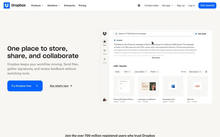
A short storage-and-collaboration message sits beside a large file workspace preview, with a trial action and an enterprise route close together.
Useful for: File and knowledge platforms making the organization of content visible in the hero.
# Design reference: Dropbox
Source: https://www.dropbox.com/
Swipefile reference: https://swipefile.design/ref/saas-dropbox/
Captured: 2026-09-05. This is a dated reference, not a claim about the current live product.
Capture scope: one viewport. Do not infer unseen page sections or a complete user flow.

## Objective
Adapt the visual principles below to my project. Use my own content and identity. Do not reproduce logos, proprietary copy, or brand assets.

## Reference notes
- mood: Practical and familiar
- colors: Warm white, black, saturated blue
- typography: Compact bold sans headline and readable body text
- layout: Two-column introduction: message and actions left, workspace preview right
- motion: Static opening-screen capture. Visit the source to study transitions and interactive behavior.
- texture: Neutral page surface with crisp interface imagery
- dont: Adapt the hierarchy to your own product and content; use your own identity and imagery.

Useful for: File and knowledge platforms making the organization of content visible in the hero.

## Acceptance criteria
- Existing project conventions, design tokens, working functionality, and unrelated changes are preserved.
- Two or three reference principles clearly support the user's task; conflicts are resolved in favor of usability and the existing product.
- Reusable components and semantic HTML express the interface. Available licensed assets are used; important UI text is never rendered as a bitmap.
- Every visible control has a defined behavior. Loading, empty, error, success, disabled, and long-content states are specified where relevant. Demo data is clearly labeled.
- Navigation and content adapt at 375px, 768px, and 1440px without horizontal page overflow. Keyboard use, visible focus, labeled inputs, at least 44px touch targets, readable contrast, and reduced motion are supported.
- Verification distinguishes rendered behavior from proposals and identifies anything still requiring a backend or external service.

## Quality bar
Clear hierarchy, consistent spacing, restrained surfaces, and purposeful motion. Avoid decorative gradients, excessive cards, placeholder buttons, and invented metrics unless the project calls for them. Do not claim a feature is connected or tested without evidence.
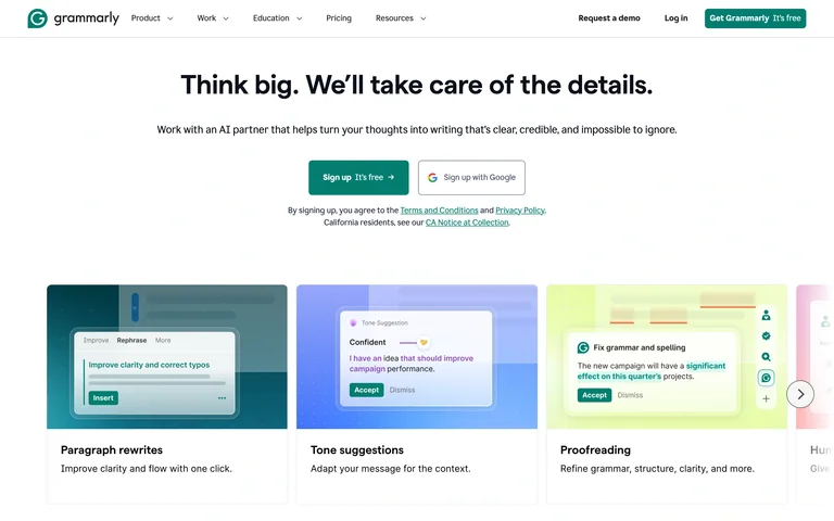
A centered writing promise leads into a row of focused feature examples, each pairing a colored preview with a short task label.
Useful for: Assistive tools that can explain value through recognizable tasks rather than a long feature list.
# Design reference: Grammarly
Source: https://www.grammarly.com/
Swipefile reference: https://swipefile.design/ref/saas-grammarly/
Captured: 2026-09-05. This is a dated reference, not a claim about the current live product.
Capture scope: one viewport. Do not infer unseen page sections or a complete user flow.

## Objective
Adapt the visual principles below to my project. Use my own content and identity. Do not reproduce logos, proprietary copy, or brand assets.

## Reference notes
- mood: Supportive and clear
- colors: White, deep green, pastel blue and lilac
- typography: Bold sans headline with smaller explanatory labels
- layout: Centered introduction and signup choices above a row of task-oriented cards
- motion: Static opening-screen capture. Visit the source to study transitions and interactive behavior.
- texture: Soft colored preview backgrounds and text-editing examples
- dont: Adapt the hierarchy to your own product and content; use your own identity and imagery.

Useful for: Assistive tools that can explain value through recognizable tasks rather than a long feature list.

## Acceptance criteria
- Existing project conventions, design tokens, working functionality, and unrelated changes are preserved.
- Two or three reference principles clearly support the user's task; conflicts are resolved in favor of usability and the existing product.
- Reusable components and semantic HTML express the interface. Available licensed assets are used; important UI text is never rendered as a bitmap.
- Every visible control has a defined behavior. Loading, empty, error, success, disabled, and long-content states are specified where relevant. Demo data is clearly labeled.
- Navigation and content adapt at 375px, 768px, and 1440px without horizontal page overflow. Keyboard use, visible focus, labeled inputs, at least 44px touch targets, readable contrast, and reduced motion are supported.
- Verification distinguishes rendered behavior from proposals and identifies anything still requiring a backend or external service.

## Quality bar
Clear hierarchy, consistent spacing, restrained surfaces, and purposeful motion. Avoid decorative gradients, excessive cards, placeholder buttons, and invented metrics unless the project calls for them. Do not claim a feature is connected or tested without evidence.
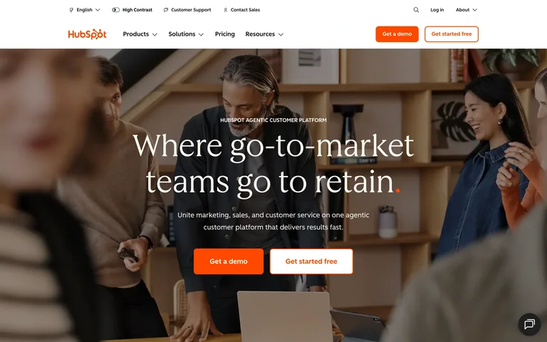
A full-width team photograph supports a centered customer-platform message, with adjacent demo and free-start actions.
Useful for: Business platforms that connect an operational promise to the teams using the product.
# Design reference: HubSpot
Source: https://www.hubspot.com/homepg-b?wfuid=ce45e84a0d.1788650983&wfsid=1788650983-d802-bdd7-3902ff2c79f1
Swipefile reference: https://swipefile.design/ref/saas-hubspot/
Captured: 2026-09-05. This is a dated reference, not a claim about the current live product.
Capture scope: one viewport. Do not infer unseen page sections or a complete user flow.

## Objective
Adapt the visual principles below to my project. Use my own content and identity. Do not reproduce logos, proprietary copy, or brand assets.

## Reference notes
- mood: Human and business-focused
- colors: Warm photography, white text, orange actions
- typography: Large centered serif headline with compact sans supporting text
- layout: Two utility and product-navigation rows above an image-led hero, centered message, and paired actions
- motion: Static opening-screen capture. Visit the source to study transitions and interactive behavior.
- texture: Natural team photography under a readability overlay
- dont: Adapt the hierarchy to your own product and content; use your own identity and imagery.

Useful for: Business platforms that connect an operational promise to the teams using the product.

## Acceptance criteria
- Existing project conventions, design tokens, working functionality, and unrelated changes are preserved.
- Two or three reference principles clearly support the user's task; conflicts are resolved in favor of usability and the existing product.
- Reusable components and semantic HTML express the interface. Available licensed assets are used; important UI text is never rendered as a bitmap.
- Every visible control has a defined behavior. Loading, empty, error, success, disabled, and long-content states are specified where relevant. Demo data is clearly labeled.
- Navigation and content adapt at 375px, 768px, and 1440px without horizontal page overflow. Keyboard use, visible focus, labeled inputs, at least 44px touch targets, readable contrast, and reduced motion are supported.
- Verification distinguishes rendered behavior from proposals and identifies anything still requiring a backend or external service.

## Quality bar
Clear hierarchy, consistent spacing, restrained surfaces, and purposeful motion. Avoid decorative gradients, excessive cards, placeholder buttons, and invented metrics unless the project calls for them. Do not claim a feature is connected or tested without evidence.
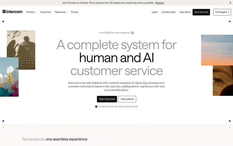
A large mixed-tone headline introduces customer service, flanked by narrow editorial image fragments and followed by trial/demo choices.
Useful for: Support platforms balancing a human service story with a product-led first step.
# Design reference: Intercom
Source: https://www.intercom.com/
Swipefile reference: https://swipefile.design/ref/saas-intercom/
Captured: 2026-09-05. This is a dated reference, not a claim about the current live product.
Capture scope: one viewport. Do not infer unseen page sections or a complete user flow.

## Objective
Adapt the visual principles below to my project. Use my own content and identity. Do not reproduce logos, proprietary copy, or brand assets.

## Reference notes
- mood: Editorial and composed
- colors: Warm white, black, soft gray, muted photography
- typography: Large light sans display with selectively emphasized words
- layout: Centered statement with image strips at the edges and compact actions below
- motion: Static opening-screen capture. Visit the source to study transitions and interactive behavior.
- texture: Sparse photo collage and generous open space
- dont: Adapt the hierarchy to your own product and content; use your own identity and imagery.

Useful for: Support platforms balancing a human service story with a product-led first step.

## Acceptance criteria
- Existing project conventions, design tokens, working functionality, and unrelated changes are preserved.
- Two or three reference principles clearly support the user's task; conflicts are resolved in favor of usability and the existing product.
- Reusable components and semantic HTML express the interface. Available licensed assets are used; important UI text is never rendered as a bitmap.
- Every visible control has a defined behavior. Loading, empty, error, success, disabled, and long-content states are specified where relevant. Demo data is clearly labeled.
- Navigation and content adapt at 375px, 768px, and 1440px without horizontal page overflow. Keyboard use, visible focus, labeled inputs, at least 44px touch targets, readable contrast, and reduced motion are supported.
- Verification distinguishes rendered behavior from proposals and identifies anything still requiring a backend or external service.

## Quality bar
Clear hierarchy, consistent spacing, restrained surfaces, and purposeful motion. Avoid decorative gradients, excessive cards, placeholder buttons, and invented metrics unless the project calls for them. Do not claim a feature is connected or tested without evidence.
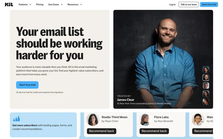
A split layout pairs a heavy benefit headline with a large creator portrait, then introduces content and recommendation cards below.
Useful for: Creator tools that can make their audience and use case tangible through real creator stories.
# Design reference: Kit
Source: https://kit.com/
Swipefile reference: https://swipefile.design/ref/saas-kit/
Captured: 2026-09-05. This is a dated reference, not a claim about the current live product.
Capture scope: one viewport. Do not infer unseen page sections or a complete user flow.

## Objective
Adapt the visual principles below to my project. Use my own content and identity. Do not reproduce logos, proprietary copy, or brand assets.

## Reference notes
- mood: Personal and practical
- colors: Warm white, black, sky-blue accents
- typography: Heavy condensed-feeling sans headline and small labels
- layout: Message and action on the left, portrait on the right, small content cards below
- motion: Static opening-screen capture. Visit the source to study transitions and interactive behavior.
- texture: Portrait photography with a simple editorial frame
- dont: Adapt the hierarchy to your own product and content; use your own identity and imagery.

Useful for: Creator tools that can make their audience and use case tangible through real creator stories.

## Acceptance criteria
- Existing project conventions, design tokens, working functionality, and unrelated changes are preserved.
- Two or three reference principles clearly support the user's task; conflicts are resolved in favor of usability and the existing product.
- Reusable components and semantic HTML express the interface. Available licensed assets are used; important UI text is never rendered as a bitmap.
- Every visible control has a defined behavior. Loading, empty, error, success, disabled, and long-content states are specified where relevant. Demo data is clearly labeled.
- Navigation and content adapt at 375px, 768px, and 1440px without horizontal page overflow. Keyboard use, visible focus, labeled inputs, at least 44px touch targets, readable contrast, and reduced motion are supported.
- Verification distinguishes rendered behavior from proposals and identifies anything still requiring a backend or external service.

## Quality bar
Clear hierarchy, consistent spacing, restrained surfaces, and purposeful motion. Avoid decorative gradients, excessive cards, placeholder buttons, and invented metrics unless the project calls for them. Do not claim a feature is connected or tested without evidence.
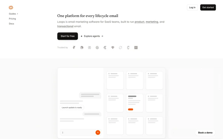
A deliberately small headline and sparse navigation leave room for a quiet workflow illustration, giving the email product a lightweight feel.
Useful for: Focused SaaS tools that benefit from a calm, low-density introduction.
# Design reference: Loops
Source: https://loops.so/
Swipefile reference: https://swipefile.design/ref/saas-loops/
Captured: 2026-09-05. This is a dated reference, not a claim about the current live product.
Capture scope: one viewport. Do not infer unseen page sections or a complete user flow.

## Objective
Adapt the visual principles below to my project. Use my own content and identity. Do not reproduce logos, proprietary copy, or brand assets.

## Reference notes
- mood: Quiet and lightweight
- colors: White, pale gray, small orange accents
- typography: Small restrained sans text throughout
- layout: Small introduction near the upper center, broad workflow diagram below
- motion: Static opening-screen capture. Visit the source to study transitions and interactive behavior.
- texture: Thin outlined email panels and abundant white space
- dont: Adapt the hierarchy to your own product and content; use your own identity and imagery.

Useful for: Focused SaaS tools that benefit from a calm, low-density introduction.

## Acceptance criteria
- Existing project conventions, design tokens, working functionality, and unrelated changes are preserved.
- Two or three reference principles clearly support the user's task; conflicts are resolved in favor of usability and the existing product.
- Reusable components and semantic HTML express the interface. Available licensed assets are used; important UI text is never rendered as a bitmap.
- Every visible control has a defined behavior. Loading, empty, error, success, disabled, and long-content states are specified where relevant. Demo data is clearly labeled.
- Navigation and content adapt at 375px, 768px, and 1440px without horizontal page overflow. Keyboard use, visible focus, labeled inputs, at least 44px touch targets, readable contrast, and reduced motion are supported.
- Verification distinguishes rendered behavior from proposals and identifies anything still requiring a backend or external service.

## Quality bar
Clear hierarchy, consistent spacing, restrained surfaces, and purposeful motion. Avoid decorative gradients, excessive cards, placeholder buttons, and invented metrics unless the project calls for them. Do not claim a feature is connected or tested without evidence.
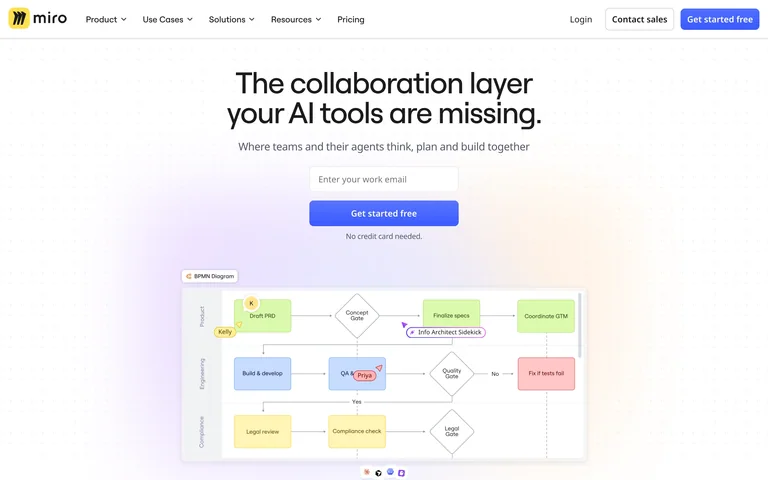
A centered collaboration message floats above a colorful canvas preview, with one blue start action and customer marks supporting the introduction.
Useful for: Canvas and collaboration tools whose visual workspace can explain the product quickly.
# Design reference: Miro
Source: https://miro.com/
Swipefile reference: https://swipefile.design/ref/saas-miro/
Captured: 2026-09-05. This is a dated reference, not a claim about the current live product.
Capture scope: one viewport. Do not infer unseen page sections or a complete user flow.

## Objective
Adapt the visual principles below to my project. Use my own content and identity. Do not reproduce logos, proprietary copy, or brand assets.

## Reference notes
- mood: Open and collaborative
- colors: White, soft lilac, blue, pastel sticky-note colors
- typography: Medium-weight sans headline
- layout: Centered headline and action above a broad collaborative board preview
- motion: Static opening-screen capture. Visit the source to study transitions and interactive behavior.
- texture: Soft glow behind a crisp diagram-like workspace
- dont: Adapt the hierarchy to your own product and content; use your own identity and imagery.

Useful for: Canvas and collaboration tools whose visual workspace can explain the product quickly.

## Acceptance criteria
- Existing project conventions, design tokens, working functionality, and unrelated changes are preserved.
- Two or three reference principles clearly support the user's task; conflicts are resolved in favor of usability and the existing product.
- Reusable components and semantic HTML express the interface. Available licensed assets are used; important UI text is never rendered as a bitmap.
- Every visible control has a defined behavior. Loading, empty, error, success, disabled, and long-content states are specified where relevant. Demo data is clearly labeled.
- Navigation and content adapt at 375px, 768px, and 1440px without horizontal page overflow. Keyboard use, visible focus, labeled inputs, at least 44px touch targets, readable contrast, and reduced motion are supported.
- Verification distinguishes rendered behavior from proposals and identifies anything still requiring a backend or external service.

## Quality bar
Clear hierarchy, consistent spacing, restrained surfaces, and purposeful motion. Avoid decorative gradients, excessive cards, placeholder buttons, and invented metrics unless the project calls for them. Do not claim a feature is connected or tested without evidence.
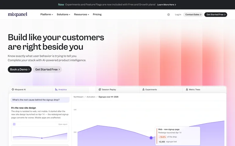
A left-aligned product-intelligence message and trial/demo actions lead into a wide analytics preview over a soft red-to-lilac gradient.
Useful for: Analytics products that need to connect a high-level promise to visible reporting detail.
# Design reference: Mixpanel
Source: https://mixpanel.com/home/
Swipefile reference: https://swipefile.design/ref/saas-mixpanel/
Captured: 2026-09-05. This is a dated reference, not a claim about the current live product.
Capture scope: one viewport. Do not infer unseen page sections or a complete user flow.

## Objective
Adapt the visual principles below to my project. Use my own content and identity. Do not reproduce logos, proprietary copy, or brand assets.

## Reference notes
- mood: Modern and analytical
- colors: White, charcoal, coral, pale purple
- typography: Clear sans headline with compact supporting copy
- layout: Introduction above a wide product screenshot; subtle gradient carries the section
- motion: Static opening-screen capture. Visit the source to study transitions and interactive behavior.
- texture: Soft color bands behind structured analytics UI
- dont: Adapt the hierarchy to your own product and content; use your own identity and imagery.

Useful for: Analytics products that need to connect a high-level promise to visible reporting detail.

## Acceptance criteria
- Existing project conventions, design tokens, working functionality, and unrelated changes are preserved.
- Two or three reference principles clearly support the user's task; conflicts are resolved in favor of usability and the existing product.
- Reusable components and semantic HTML express the interface. Available licensed assets are used; important UI text is never rendered as a bitmap.
- Every visible control has a defined behavior. Loading, empty, error, success, disabled, and long-content states are specified where relevant. Demo data is clearly labeled.
- Navigation and content adapt at 375px, 768px, and 1440px without horizontal page overflow. Keyboard use, visible focus, labeled inputs, at least 44px touch targets, readable contrast, and reduced motion are supported.
- Verification distinguishes rendered behavior from proposals and identifies anything still requiring a backend or external service.

## Quality bar
Clear hierarchy, consistent spacing, restrained surfaces, and purposeful motion. Avoid decorative gradients, excessive cards, placeholder buttons, and invented metrics unless the project calls for them. Do not claim a feature is connected or tested without evidence.
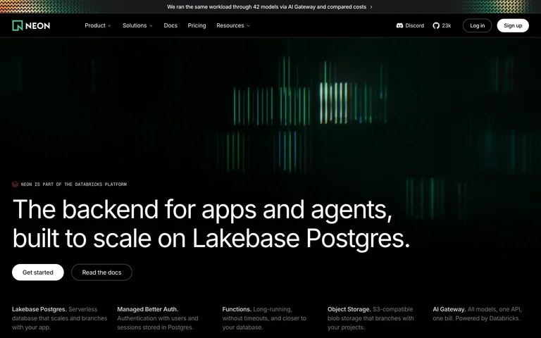
A luminous green data-like graphic sits above a large database-platform statement, with two clear actions and compact capability descriptions below.
Useful for: Developer infrastructure products using a technical visual identity without burying the offer.
# Design reference: Neon
Source: https://neon.com/
Swipefile reference: https://swipefile.design/ref/saas-neon/
Captured: 2026-09-05. This is a dated reference, not a claim about the current live product.
Capture scope: one viewport. Do not infer unseen page sections or a complete user flow.

## Objective
Adapt the visual principles below to my project. Use my own content and identity. Do not reproduce logos, proprietary copy, or brand assets.

## Reference notes
- mood: Technical and concentrated
- colors: Near-black, green, white
- typography: Large clean sans headline with small technical labels
- layout: Wide graphic above a left-aligned introduction, then compact capability columns
- motion: Static opening-screen capture. Visit the source to study transitions and interactive behavior.
- texture: Glowing vertical bars and a flat dark background
- dont: Adapt the hierarchy to your own product and content; use your own identity and imagery.

Useful for: Developer infrastructure products using a technical visual identity without burying the offer.

## Acceptance criteria
- Existing project conventions, design tokens, working functionality, and unrelated changes are preserved.
- Two or three reference principles clearly support the user's task; conflicts are resolved in favor of usability and the existing product.
- Reusable components and semantic HTML express the interface. Available licensed assets are used; important UI text is never rendered as a bitmap.
- Every visible control has a defined behavior. Loading, empty, error, success, disabled, and long-content states are specified where relevant. Demo data is clearly labeled.
- Navigation and content adapt at 375px, 768px, and 1440px without horizontal page overflow. Keyboard use, visible focus, labeled inputs, at least 44px touch targets, readable contrast, and reduced motion are supported.
- Verification distinguishes rendered behavior from proposals and identifies anything still requiring a backend or external service.

## Quality bar
Clear hierarchy, consistent spacing, restrained surfaces, and purposeful motion. Avoid decorative gradients, excessive cards, placeholder buttons, and invented metrics unless the project calls for them. Do not claim a feature is connected or tested without evidence.
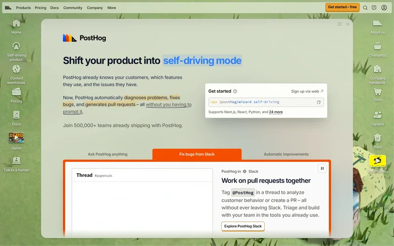
A desktop-like website shell wraps product navigation, a light content window, and a compact signup panel, turning the site itself into a product metaphor.
Useful for: Developer platforms with enough breadth to justify an exploratory, desktop-inspired navigation model.
# Design reference: PostHog
Source: https://posthog.com/
Swipefile reference: https://swipefile.design/ref/saas-posthog/
Captured: 2026-09-05. This is a dated reference, not a claim about the current live product.
Capture scope: one viewport. Do not infer unseen page sections or a complete user flow.

## Objective
Adapt the visual principles below to my project. Use my own content and identity. Do not reproduce logos, proprietary copy, or brand assets.

## Reference notes
- mood: Playful and technical
- colors: Sage green, warm white, orange
- typography: Compact sans interface text with a larger central statement
- layout: Persistent desktop-style side navigation around a central product window and signup choices
- motion: Static opening-screen capture. Visit the source to study transitions and interactive behavior.
- texture: Illustrated icons, window borders, and a retro software-shell treatment
- dont: Adapt the hierarchy to your own product and content; use your own identity and imagery.

Useful for: Developer platforms with enough breadth to justify an exploratory, desktop-inspired navigation model.

## Acceptance criteria
- Existing project conventions, design tokens, working functionality, and unrelated changes are preserved.
- Two or three reference principles clearly support the user's task; conflicts are resolved in favor of usability and the existing product.
- Reusable components and semantic HTML express the interface. Available licensed assets are used; important UI text is never rendered as a bitmap.
- Every visible control has a defined behavior. Loading, empty, error, success, disabled, and long-content states are specified where relevant. Demo data is clearly labeled.
- Navigation and content adapt at 375px, 768px, and 1440px without horizontal page overflow. Keyboard use, visible focus, labeled inputs, at least 44px touch targets, readable contrast, and reduced motion are supported.
- Verification distinguishes rendered behavior from proposals and identifies anything still requiring a backend or external service.

## Quality bar
Clear hierarchy, consistent spacing, restrained surfaces, and purposeful motion. Avoid decorative gradients, excessive cards, placeholder buttons, and invented metrics unless the project calls for them. Do not claim a feature is connected or tested without evidence.
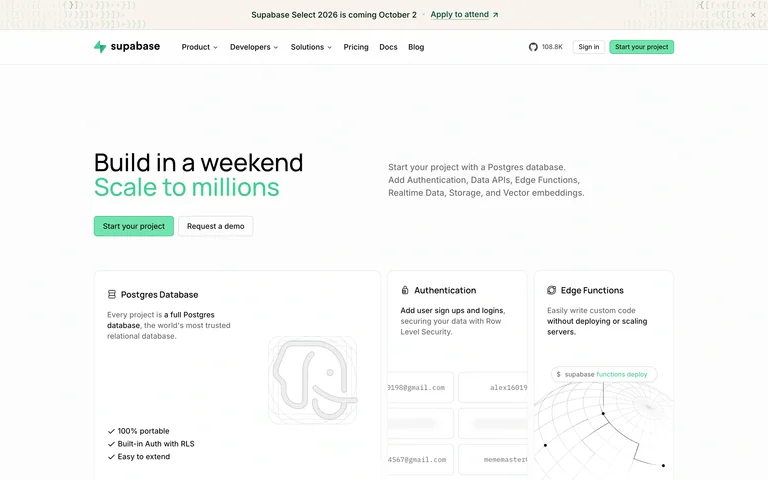
A concise two-line promise uses green emphasis above clear project and demo actions, with product capability panels giving developers immediate context.
Useful for: Infrastructure platforms that need a brief promise and recognizable technical building blocks.
# Design reference: Supabase
Source: https://supabase.com/
Swipefile reference: https://swipefile.design/ref/saas-supabase/
Captured: 2026-09-05. This is a dated reference, not a claim about the current live product.
Capture scope: one viewport. Do not infer unseen page sections or a complete user flow.

## Objective
Adapt the visual principles below to my project. Use my own content and identity. Do not reproduce logos, proprietary copy, or brand assets.

## Reference notes
- mood: Clear and developer-focused
- colors: White, charcoal, mint green
- typography: Clean sans headline and small capability labels
- layout: Split opening message followed by a tidy grid of capability panels
- motion: Static opening-screen capture. Visit the source to study transitions and interactive behavior.
- texture: Fine borders, line illustrations, and restrained green accents
- dont: Adapt the hierarchy to your own product and content; use your own identity and imagery.

Useful for: Infrastructure platforms that need a brief promise and recognizable technical building blocks.

## Acceptance criteria
- Existing project conventions, design tokens, working functionality, and unrelated changes are preserved.
- Two or three reference principles clearly support the user's task; conflicts are resolved in favor of usability and the existing product.
- Reusable components and semantic HTML express the interface. Available licensed assets are used; important UI text is never rendered as a bitmap.
- Every visible control has a defined behavior. Loading, empty, error, success, disabled, and long-content states are specified where relevant. Demo data is clearly labeled.
- Navigation and content adapt at 375px, 768px, and 1440px without horizontal page overflow. Keyboard use, visible focus, labeled inputs, at least 44px touch targets, readable contrast, and reduced motion are supported.
- Verification distinguishes rendered behavior from proposals and identifies anything still requiring a backend or external service.

## Quality bar
Clear hierarchy, consistent spacing, restrained surfaces, and purposeful motion. Avoid decorative gradients, excessive cards, placeholder buttons, and invented metrics unless the project calls for them. Do not claim a feature is connected or tested without evidence.
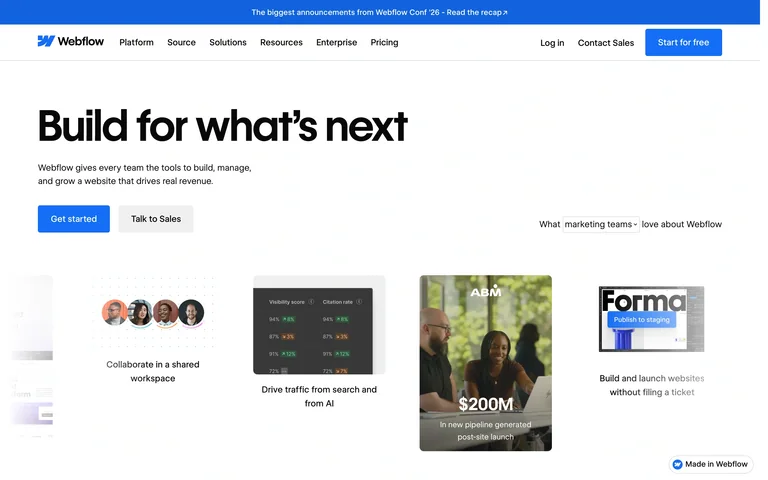
A large left-aligned headline and paired actions introduce a web platform, followed by a strip of varied website examples that makes the output visible.
Useful for: Creation platforms that can demonstrate their range through finished work.
# Design reference: Webflow
Source: https://webflow.com/
Swipefile reference: https://swipefile.design/ref/saas-webflow/
Captured: 2026-09-05. This is a dated reference, not a claim about the current live product.
Capture scope: one viewport. Do not infer unseen page sections or a complete user flow.

## Objective
Adapt the visual principles below to my project. Use my own content and identity. Do not reproduce logos, proprietary copy, or brand assets.

## Reference notes
- mood: Confident and output-focused
- colors: White, black, blue accents
- typography: Large heavy sans headline
- layout: Left-aligned introduction above a horizontal gallery of website examples
- motion: Static opening-screen capture. Visit the source to study transitions and interactive behavior.
- texture: Flat white page with crisp preview cards
- dont: Adapt the hierarchy to your own product and content; use your own identity and imagery.

Useful for: Creation platforms that can demonstrate their range through finished work.

## Acceptance criteria
- Existing project conventions, design tokens, working functionality, and unrelated changes are preserved.
- Two or three reference principles clearly support the user's task; conflicts are resolved in favor of usability and the existing product.
- Reusable components and semantic HTML express the interface. Available licensed assets are used; important UI text is never rendered as a bitmap.
- Every visible control has a defined behavior. Loading, empty, error, success, disabled, and long-content states are specified where relevant. Demo data is clearly labeled.
- Navigation and content adapt at 375px, 768px, and 1440px without horizontal page overflow. Keyboard use, visible focus, labeled inputs, at least 44px touch targets, readable contrast, and reduced motion are supported.
- Verification distinguishes rendered behavior from proposals and identifies anything still requiring a backend or external service.

## Quality bar
Clear hierarchy, consistent spacing, restrained surfaces, and purposeful motion. Avoid decorative gradients, excessive cards, placeholder buttons, and invented metrics unless the project calls for them. Do not claim a feature is connected or tested without evidence.
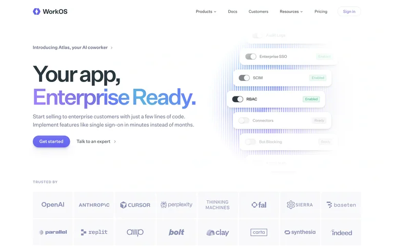
A split headline emphasizes enterprise readiness in purple, while compact interface fragments suggest authentication and user-management capabilities.
Useful for: Developer platforms turning an enterprise capability into a clear product promise.
# Design reference: WorkOS
Source: https://workos.com/
Swipefile reference: https://swipefile.design/ref/saas-workos/
Captured: 2026-09-05. This is a dated reference, not a claim about the current live product.
Capture scope: one viewport. Do not infer unseen page sections or a complete user flow.

## Objective
Adapt the visual principles below to my project. Use my own content and identity. Do not reproduce logos, proprietary copy, or brand assets.

## Reference notes
- mood: Composed and technical
- colors: White, charcoal, lavender
- typography: Large sans headline with a colored second line
- layout: Left-aligned message and actions beside floating UI fragments, with customer logos below
- motion: Static opening-screen capture. Visit the source to study transitions and interactive behavior.
- texture: Soft shadows and pale interface panels
- dont: Adapt the hierarchy to your own product and content; use your own identity and imagery.

Useful for: Developer platforms turning an enterprise capability into a clear product promise.

## Acceptance criteria
- Existing project conventions, design tokens, working functionality, and unrelated changes are preserved.
- Two or three reference principles clearly support the user's task; conflicts are resolved in favor of usability and the existing product.
- Reusable components and semantic HTML express the interface. Available licensed assets are used; important UI text is never rendered as a bitmap.
- Every visible control has a defined behavior. Loading, empty, error, success, disabled, and long-content states are specified where relevant. Demo data is clearly labeled.
- Navigation and content adapt at 375px, 768px, and 1440px without horizontal page overflow. Keyboard use, visible focus, labeled inputs, at least 44px touch targets, readable contrast, and reduced motion are supported.
- Verification distinguishes rendered behavior from proposals and identifies anything still requiring a backend or external service.

## Quality bar
Clear hierarchy, consistent spacing, restrained surfaces, and purposeful motion. Avoid decorative gradients, excessive cards, placeholder buttons, and invented metrics unless the project calls for them. Do not claim a feature is connected or tested without evidence.
Allow basic usage counts to help us understand what is useful. Your board contents stay out of analytics. Details
Your browser’s privacy preference keeps analytics off.