 hover to scroll
Challenge Sales Page
CURATED COLLECTION · 85 REFERENCES
Study how a long page earns its length. These course, coaching, and software offers connect a promise to explanation, evidence, and an enrollment or trial action. Compare the order of the sections before borrowing a visual style.
Copy the reference notes below and paste them into Claude, ChatGPT, or your coding assistant. Add what you want to build.
Includes design notes, original sources, and preview links. An assistant that supports browsing can also read the public board link.
2 references are no longer public and are omitted.
Selected for visible offer structure and substantial page captures. Inclusion is not an endorsement of the product, its claims, or its conversion performance. A sales-page capture also does not document the checkout or the entire funnel.
Map the progression from video and training tracks to curriculum, instructors, enrollment, and FAQs. The section order is the useful reference.
Follow the journey from the platform promise through capabilities and pricing. Keep your own trial terms and product evidence explicit.
Compare how explanation of the writing method and curriculum supports the enrollment decision. Use your own evidence, not borrowed student claims.
Build an outline before choosing fonts: audience, promise, demonstration, fit, evidence, offer, questions, action. Remove any section that cannot answer a real visitor question. A shorter offer may need only a few of these sections. Keep repeated actions consistent and label what happens after the click.
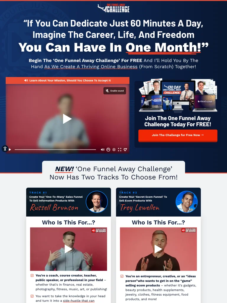
hover to scrollA long challenge sales page with a video-led opening, two training tracks, curriculum, trainer profiles, an enrollment section, guarantee, and FAQs.
Useful for: Study the complete public landing page and its section order. This is one sales page, not a captured multi-step checkout or verified conversion result.
# Design reference: ClickFunnels — One Funnel Away
Source: https://www.onefunnelaway.com/
Swipefile reference: https://swipefile.design/ref/funnel-one-funnel-away/
Captured: 2026-09-07. This is a dated reference, not a claim about the current live product.


## Objective
Adapt the visual principles below to my project. Use my own content and identity. Do not reproduce logos, proprietary copy, or brand assets.

## Reference notes
- mood: Energetic, direct, and instruction-led.
- colors: Navy and white sections with orange-red calls to action and pale blue supporting panels.
- typography: Heavy sans headings with selected phrases enlarged or underlined; readable paragraphs and short checklist-style blocks.
- layout: Video and offer above the fold → two audience tracks → curriculum → training, accountability and tools → proof and trainers → enrollment → guarantee → FAQs. Orange-red join buttons repeat throughout.
- motion: The screenshot records a static state. Preserve readable scrolling and clear CTA feedback; do not infer video playback or hidden form behavior.
- texture: Dark patterned backgrounds, bordered video panels, course imagery, and trainer photography.
- dont: Use your own offer, brand, and assets. Do not invent testimonials, results, scarcity, guarantees, or pricing.

Useful for: Study the complete public landing page and its section order. This is one sales page, not a captured multi-step checkout or verified conversion result.

## Acceptance criteria
- Existing project conventions, design tokens, working functionality, and unrelated changes are preserved.
- Two or three reference principles clearly support the user's task; conflicts are resolved in favor of usability and the existing product.
- Reusable components and semantic HTML express the interface. Available licensed assets are used; important UI text is never rendered as a bitmap.
- Every visible control has a defined behavior. Loading, empty, error, success, disabled, and long-content states are specified where relevant. Demo data is clearly labeled.
- Navigation and content adapt at 375px, 768px, and 1440px without horizontal page overflow. Keyboard use, visible focus, labeled inputs, at least 44px touch targets, readable contrast, and reduced motion are supported.
- Verification distinguishes rendered behavior from proposals and identifies anything still requiring a backend or external service.

## Quality bar
Clear hierarchy, consistent spacing, restrained surfaces, and purposeful motion. Avoid decorative gradients, excessive cards, placeholder buttons, and invented metrics unless the project calls for them. Do not claim a feature is connected or tested without evidence.
 hover to scroll
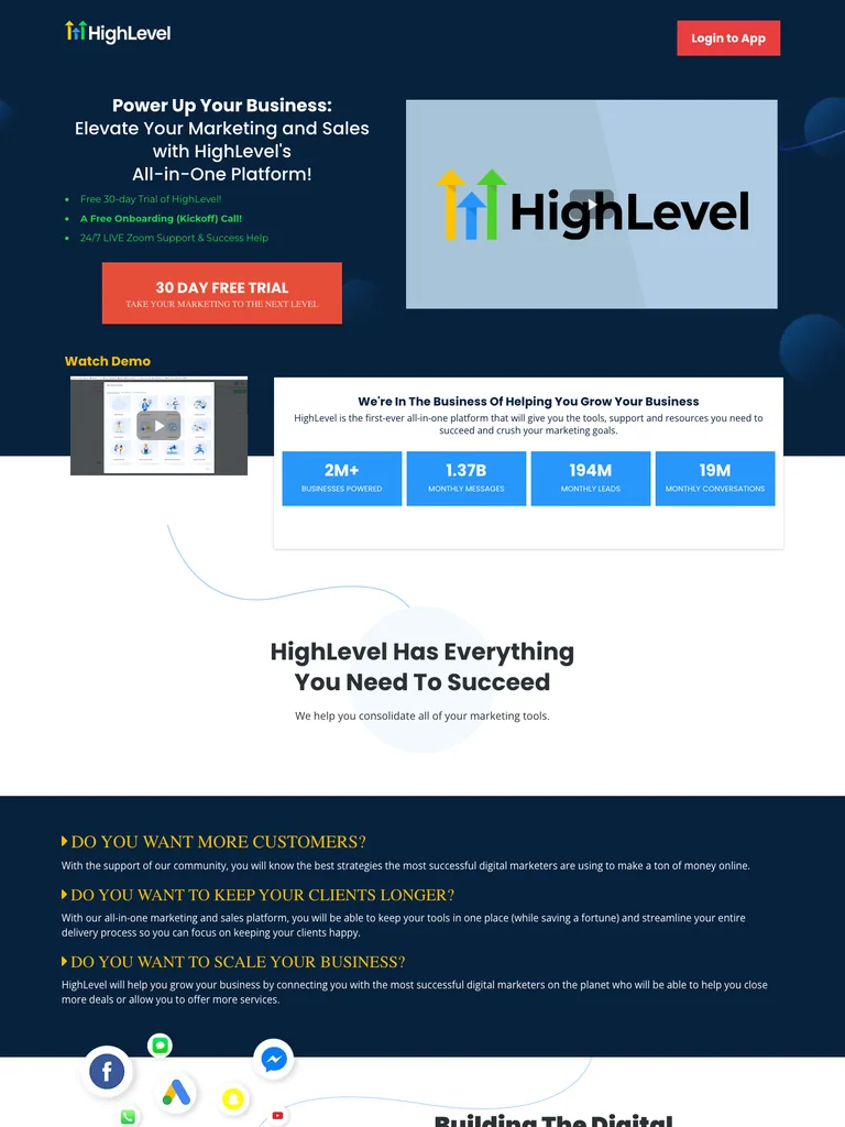
HighLevel’s dedicated trial page walks from a product promise and demo through lead capture, nurturing, booking, white labeling, pricing, and customer videos.
Useful for: Study the complete public landing page and its section order. This is one sales page, not a captured multi-step checkout or verified conversion result.
# Design reference: HighLevel — Free Trial Landing Page
Source: https://www.gohighlevel.com/em-30-day-trial
Swipefile reference: https://swipefile.design/ref/funnel-highlevel-trial/
Captured: 2026-09-07. This is a dated reference, not a claim about the current live product.


## Objective
Adapt the visual principles below to my project. Use my own content and identity. Do not reproduce logos, proprietary copy, or brand assets.

## Reference notes
- mood: Practical, feature-rich, and commercially focused.
- colors: Deep navy, white, bright blue metrics, and orange-red trial buttons.
- typography: Bold rounded sans section headings, compact explanatory paragraphs, and oversized price labels.
- layout: Offer and product video → headline metrics → alternating feature explanations → white-label proposition → support and community → pricing comparison → customer videos → final trial CTA and footer.
- motion: The screenshot records a static state. Preserve readable scrolling and clear CTA feedback; do not infer video playback or hidden form behavior.
- texture: Product screenshots, curved blue connector lines, customer portraits, and pale abstract backgrounds.
- dont: Use your own offer, brand, and assets. Do not invent testimonials, results, scarcity, guarantees, or pricing.

Useful for: Study the complete public landing page and its section order. This is one sales page, not a captured multi-step checkout or verified conversion result.

## Acceptance criteria
- Existing project conventions, design tokens, working functionality, and unrelated changes are preserved.
- Two or three reference principles clearly support the user's task; conflicts are resolved in favor of usability and the existing product.
- Reusable components and semantic HTML express the interface. Available licensed assets are used; important UI text is never rendered as a bitmap.
- Every visible control has a defined behavior. Loading, empty, error, success, disabled, and long-content states are specified where relevant. Demo data is clearly labeled.
- Navigation and content adapt at 375px, 768px, and 1440px without horizontal page overflow. Keyboard use, visible focus, labeled inputs, at least 44px touch targets, readable contrast, and reduced motion are supported.
- Verification distinguishes rendered behavior from proposals and identifies anything still requiring a backend or external service.

## Quality bar
Clear hierarchy, consistent spacing, restrained surfaces, and purposeful motion. Avoid decorative gradients, excessive cards, placeholder buttons, and invented metrics unless the project calls for them. Do not claim a feature is connected or tested without evidence.
 hover to scroll
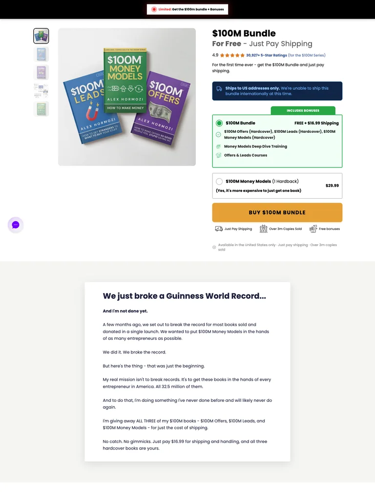
A book-bundle sales page that uses product imagery, an offer breakdown, author context, customer proof, and questions to support a focused purchase decision.
Useful for: Study the complete public landing page and its section order. This is one sales page, not a captured multi-step checkout or verified conversion result.
# Design reference: Acquisition.com — Book Bundle Offer
Source: https://shop.acquisition.com/pages/100m-book-bundle
Swipefile reference: https://swipefile.design/ref/funnel-acquisition-books/
Captured: 2026-09-07. This is a dated reference, not a claim about the current live product.


## Objective
Adapt the visual principles below to my project. Use my own content and identity. Do not reproduce logos, proprietary copy, or brand assets.

## Reference notes
- mood: Direct, product-centered, and authoritative.
- colors: White and near-black surfaces with strong offer accents drawn from the book covers.
- typography: Large bold headlines, distinct section labels, short persuasive paragraphs, and prominent purchase buttons.
- layout: Book offer → bundle contents and supporting explanations → author and proof sections → repeated buying opportunities → questions and footer. Study the visible offer page; checkout and upsells are outside this capture.
- motion: The screenshot records a static state. Preserve readable scrolling and clear CTA feedback; do not infer video playback or hidden form behavior.
- texture: Book mockups, author photography, testimonial treatments, and generous contrasting sections.
- dont: Use your own offer, brand, and assets. Do not invent testimonials, results, scarcity, guarantees, or pricing.

Useful for: Study the complete public landing page and its section order. This is one sales page, not a captured multi-step checkout or verified conversion result.

## Acceptance criteria
- Existing project conventions, design tokens, working functionality, and unrelated changes are preserved.
- Two or three reference principles clearly support the user's task; conflicts are resolved in favor of usability and the existing product.
- Reusable components and semantic HTML express the interface. Available licensed assets are used; important UI text is never rendered as a bitmap.
- Every visible control has a defined behavior. Loading, empty, error, success, disabled, and long-content states are specified where relevant. Demo data is clearly labeled.
- Navigation and content adapt at 375px, 768px, and 1440px without horizontal page overflow. Keyboard use, visible focus, labeled inputs, at least 44px touch targets, readable contrast, and reduced motion are supported.
- Verification distinguishes rendered behavior from proposals and identifies anything still requiring a backend or external service.

## Quality bar
Clear hierarchy, consistent spacing, restrained surfaces, and purposeful motion. Avoid decorative gradients, excessive cards, placeholder buttons, and invented metrics unless the project calls for them. Do not claim a feature is connected or tested without evidence.
 hover to scroll
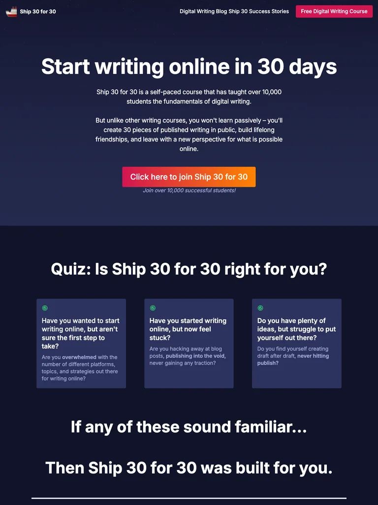
A long course offer that explains the writing program, teaches its method, introduces the instructors, and builds toward enrollment with curriculum and student proof.
Useful for: Study the complete public landing page and its section order. This is one sales page, not a captured multi-step checkout or verified conversion result.
# Design reference: Ship 30 for 30 — Writing Course
Source: https://www.ship30for30.com/
Swipefile reference: https://swipefile.design/ref/funnel-ship30/
Captured: 2026-09-07. This is a dated reference, not a claim about the current live product.


## Objective
Adapt the visual principles below to my project. Use my own content and identity. Do not reproduce logos, proprietary copy, or brand assets.

## Reference notes
- mood: Encouraging, educational, and personal.
- colors: Deep ink-blue backgrounds, white text and content panels, and pink-to-orange enrollment accents.
- typography: Large expressive headings paired with comfortable paragraph widths and scannable benefit lists.
- layout: Course promise and enrollment action → reasons to write online → teaching method and curriculum → student examples and proof → instructor context → offer and closing questions. The reference covers the public sales page only.
- motion: The screenshot records a static state. Preserve readable scrolling and clear CTA feedback; do not infer video playback or hidden form behavior.
- texture: Writing examples, hand-drawn circles, colorful notes, instructor imagery, and student testimonials.
- dont: Use your own offer, brand, and assets. Do not invent testimonials, results, scarcity, guarantees, or pricing.

Useful for: Study the complete public landing page and its section order. This is one sales page, not a captured multi-step checkout or verified conversion result.

## Acceptance criteria
- Existing project conventions, design tokens, working functionality, and unrelated changes are preserved.
- Two or three reference principles clearly support the user's task; conflicts are resolved in favor of usability and the existing product.
- Reusable components and semantic HTML express the interface. Available licensed assets are used; important UI text is never rendered as a bitmap.
- Every visible control has a defined behavior. Loading, empty, error, success, disabled, and long-content states are specified where relevant. Demo data is clearly labeled.
- Navigation and content adapt at 375px, 768px, and 1440px without horizontal page overflow. Keyboard use, visible focus, labeled inputs, at least 44px touch targets, readable contrast, and reduced motion are supported.
- Verification distinguishes rendered behavior from proposals and identifies anything still requiring a backend or external service.

## Quality bar
Clear hierarchy, consistent spacing, restrained surfaces, and purposeful motion. Avoid decorative gradients, excessive cards, placeholder buttons, and invented metrics unless the project calls for them. Do not claim a feature is connected or tested without evidence.
 hover to scroll
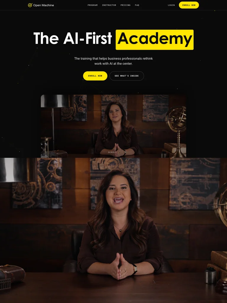
A course launch page pairing a video introduction with a level-based curriculum and repeated enrollment actions.
Useful for: Study the public sales page and its section order, offer presentation, and calls to action. This reference captures one page; checkout steps and conversion results are not verified.
# Design reference: Allie K. Miller — AI-First Academy
Source: https://academy.alliekmiller.com/
Swipefile reference: https://swipefile.design/ref/funnel-allie-k-miller-ai-first-academy/
Captured: 2026-09-07. This is a dated reference, not a claim about the current live product.


## Objective
Adapt the visual principles below to my project. Use my own content and identity. Do not reproduce logos, proprietary copy, or brand assets.

## Reference notes
- mood: Precise and modern
- colors: Black, warm white, and high-contrast yellow highlights.
- typography: Bold sans-serif headlines, compact labels, and scannable benefit lists create a clear hierarchy through the long page.
- layout: Video-led opening and enrollment → audience levels → curriculum accordions → instructor and proof → closing enrollment panel.
- motion: The capture records a static page state. Preserve readable scrolling and clear action feedback; video playback, counters, and hidden form behavior are not demonstrated.
- texture: Photographic or product imagery, contrasting section backgrounds, grouped benefits, and visual proof panels.
- dont: Use your own offer, brand, and assets. Do not invent testimonials, results, scarcity, guarantees, or pricing.

Useful for: Study the public sales page and its section order, offer presentation, and calls to action. This reference captures one page; checkout steps and conversion results are not verified.

## Acceptance criteria
- Existing project conventions, design tokens, working functionality, and unrelated changes are preserved.
- Two or three reference principles clearly support the user's task; conflicts are resolved in favor of usability and the existing product.
- Reusable components and semantic HTML express the interface. Available licensed assets are used; important UI text is never rendered as a bitmap.
- Every visible control has a defined behavior. Loading, empty, error, success, disabled, and long-content states are specified where relevant. Demo data is clearly labeled.
- Navigation and content adapt at 375px, 768px, and 1440px without horizontal page overflow. Keyboard use, visible focus, labeled inputs, at least 44px touch targets, readable contrast, and reduced motion are supported.
- Verification distinguishes rendered behavior from proposals and identifies anything still requiring a backend or external service.

## Quality bar
Clear hierarchy, consistent spacing, restrained surfaces, and purposeful motion. Avoid decorative gradients, excessive cards, placeholder buttons, and invented metrics unless the project calls for them. Do not claim a feature is connected or tested without evidence.
 hover to scroll
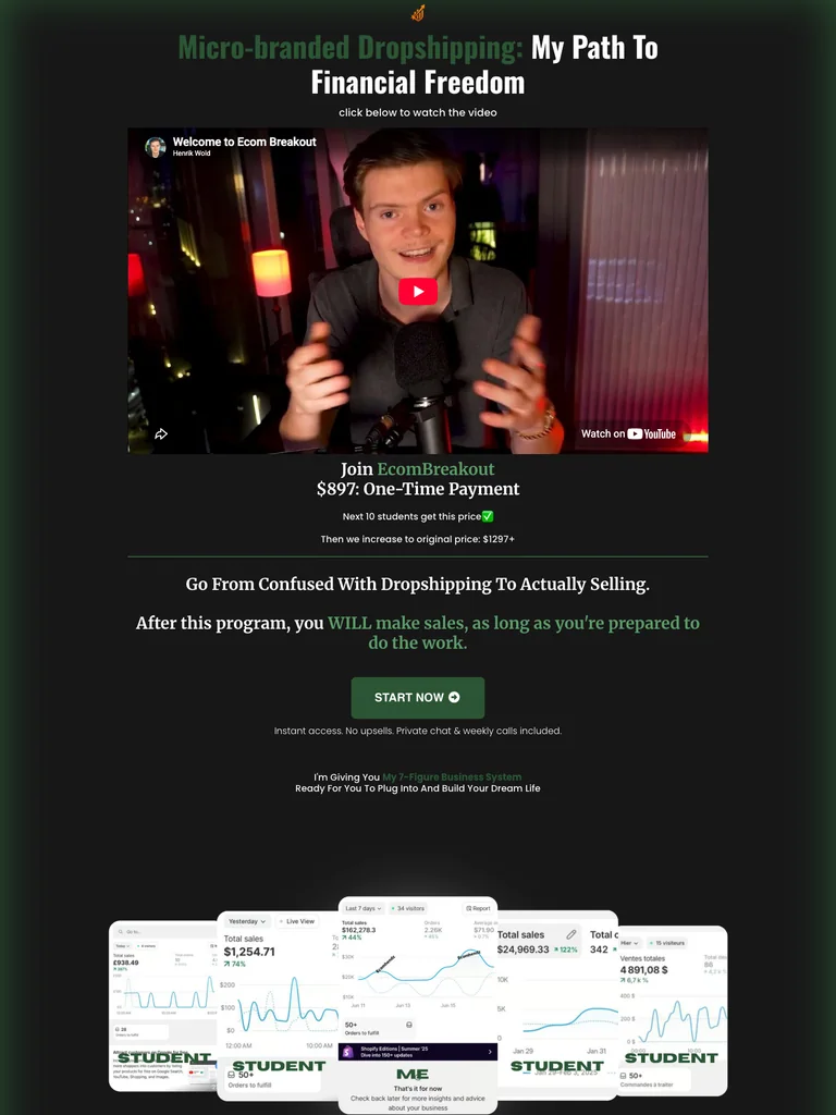
A narrow video sales page with a personal pitch, a simple offer, and a dense student-proof section.
Useful for: Study the public sales page and its section order, offer presentation, and calls to action. This reference captures one page; checkout steps and conversion results are not verified.
# Design reference: Henrik Wold — EcomBreakout
Source: https://breakoutecom.com/start
Swipefile reference: https://swipefile.design/ref/funnel-henrik-wold-ecombreakout/
Captured: 2026-09-07. This is a dated reference, not a claim about the current live product.


## Objective
Adapt the visual principles below to my project. Use my own content and identity. Do not reproduce logos, proprietary copy, or brand assets.

## Reference notes
- mood: Personal and direct
- colors: Near-black canvas, forest-green accents, white copy, and green CTA buttons.
- typography: Bold sans-serif headlines, compact labels, and scannable benefit lists create a clear hierarchy through the long page.
- layout: Personal video → one-time offer → lesson benefits → objection handling → student-message gallery → final start action.
- motion: The capture records a static page state. Preserve readable scrolling and clear action feedback; video playback, counters, and hidden form behavior are not demonstrated.
- texture: Photographic or product imagery, contrasting section backgrounds, grouped benefits, and visual proof panels.
- dont: Use your own offer, brand, and assets. Do not invent testimonials, results, scarcity, guarantees, or pricing.

Useful for: Study the public sales page and its section order, offer presentation, and calls to action. This reference captures one page; checkout steps and conversion results are not verified.

## Acceptance criteria
- Existing project conventions, design tokens, working functionality, and unrelated changes are preserved.
- Two or three reference principles clearly support the user's task; conflicts are resolved in favor of usability and the existing product.
- Reusable components and semantic HTML express the interface. Available licensed assets are used; important UI text is never rendered as a bitmap.
- Every visible control has a defined behavior. Loading, empty, error, success, disabled, and long-content states are specified where relevant. Demo data is clearly labeled.
- Navigation and content adapt at 375px, 768px, and 1440px without horizontal page overflow. Keyboard use, visible focus, labeled inputs, at least 44px touch targets, readable contrast, and reduced motion are supported.
- Verification distinguishes rendered behavior from proposals and identifies anything still requiring a backend or external service.

## Quality bar
Clear hierarchy, consistent spacing, restrained surfaces, and purposeful motion. Avoid decorative gradients, excessive cards, placeholder buttons, and invented metrics unless the project calls for them. Do not claim a feature is connected or tested without evidence.
 hover to scroll
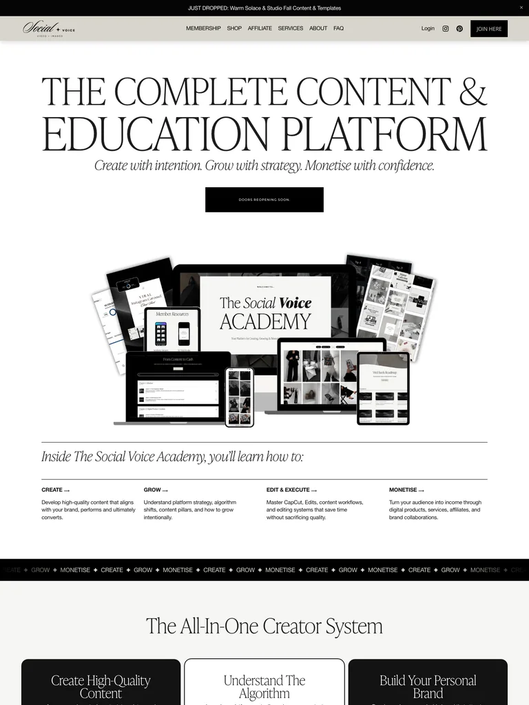
An editorial membership page using course previews, generous spacing, and a long sequence of educational benefits.
Useful for: Study the public sales page and its section order, offer presentation, and calls to action. This reference captures one page; checkout steps and conversion results are not verified.
# Design reference: The Social Voice — Academy
Source: https://thesocialvoiceco.com/academy
Swipefile reference: https://swipefile.design/ref/funnel-caitlin-armstrong-the-social-voice-academy/
Captured: 2026-09-07. This is a dated reference, not a claim about the current live product.


## Objective
Adapt the visual principles below to my project. Use my own content and identity. Do not reproduce logos, proprietary copy, or brand assets.

## Reference notes
- mood: Editorial and restrained
- colors: Ivory, taupe, black, and neutral product imagery.
- typography: Expressive serif display headings mixed with clean supporting text; large typographic shifts separate the offer story from the details.
- layout: Large editorial promise → course-library previews → individual course explanations → membership offer → questions and customer-message proof.
- motion: The capture records a static page state. Preserve readable scrolling and clear action feedback; video playback, counters, and hidden form behavior are not demonstrated.
- texture: Photographic or product imagery, contrasting section backgrounds, grouped benefits, and visual proof panels.
- dont: Use your own offer, brand, and assets. Do not invent testimonials, results, scarcity, guarantees, or pricing.

Useful for: Study the public sales page and its section order, offer presentation, and calls to action. This reference captures one page; checkout steps and conversion results are not verified.

## Acceptance criteria
- Existing project conventions, design tokens, working functionality, and unrelated changes are preserved.
- Two or three reference principles clearly support the user's task; conflicts are resolved in favor of usability and the existing product.
- Reusable components and semantic HTML express the interface. Available licensed assets are used; important UI text is never rendered as a bitmap.
- Every visible control has a defined behavior. Loading, empty, error, success, disabled, and long-content states are specified where relevant. Demo data is clearly labeled.
- Navigation and content adapt at 375px, 768px, and 1440px without horizontal page overflow. Keyboard use, visible focus, labeled inputs, at least 44px touch targets, readable contrast, and reduced motion are supported.
- Verification distinguishes rendered behavior from proposals and identifies anything still requiring a backend or external service.

## Quality bar
Clear hierarchy, consistent spacing, restrained surfaces, and purposeful motion. Avoid decorative gradients, excessive cards, placeholder buttons, and invented metrics unless the project calls for them. Do not claim a feature is connected or tested without evidence.
 hover to scroll
A long creator-course offer with playful portrait collages, large serif headlines, pink sections, and recurring proof.
Useful for: Study the public sales page and its section order, offer presentation, and calls to action. This reference captures one page; checkout steps and conversion results are not verified.
# Design reference: Social Han — Content That Sells
Source: https://socialhan.com/content-that-sells
Swipefile reference: https://swipefile.design/ref/funnel-han-mosby-content-that-sells/
Captured: 2026-09-07. This is a dated reference, not a claim about the current live product.


## Objective
Adapt the visual principles below to my project. Use my own content and identity. Do not reproduce logos, proprietary copy, or brand assets.

## Reference notes
- mood: Expressive and personal
- colors: Hot pink, pale blush, warm cream, and deep burgundy.
- typography: Expressive serif display headings mixed with clean supporting text; large typographic shifts separate the offer story from the details.
- layout: Cutout portrait hero → audience problem and teaching proposition → course breakdown → testimonial panels → repeated purchase actions → creator footer.
- motion: The capture records a static page state. Preserve readable scrolling and clear action feedback; video playback, counters, and hidden form behavior are not demonstrated.
- texture: Photographic or product imagery, contrasting section backgrounds, grouped benefits, and visual proof panels.
- dont: Use your own offer, brand, and assets. Do not invent testimonials, results, scarcity, guarantees, or pricing.

Useful for: Study the public sales page and its section order, offer presentation, and calls to action. This reference captures one page; checkout steps and conversion results are not verified.

## Acceptance criteria
- Existing project conventions, design tokens, working functionality, and unrelated changes are preserved.
- Two or three reference principles clearly support the user's task; conflicts are resolved in favor of usability and the existing product.
- Reusable components and semantic HTML express the interface. Available licensed assets are used; important UI text is never rendered as a bitmap.
- Every visible control has a defined behavior. Loading, empty, error, success, disabled, and long-content states are specified where relevant. Demo data is clearly labeled.
- Navigation and content adapt at 375px, 768px, and 1440px without horizontal page overflow. Keyboard use, visible focus, labeled inputs, at least 44px touch targets, readable contrast, and reduced motion are supported.
- Verification distinguishes rendered behavior from proposals and identifies anything still requiring a backend or external service.

## Quality bar
Clear hierarchy, consistent spacing, restrained surfaces, and purposeful motion. Avoid decorative gradients, excessive cards, placeholder buttons, and invented metrics unless the project calls for them. Do not claim a feature is connected or tested without evidence.
 hover to scroll
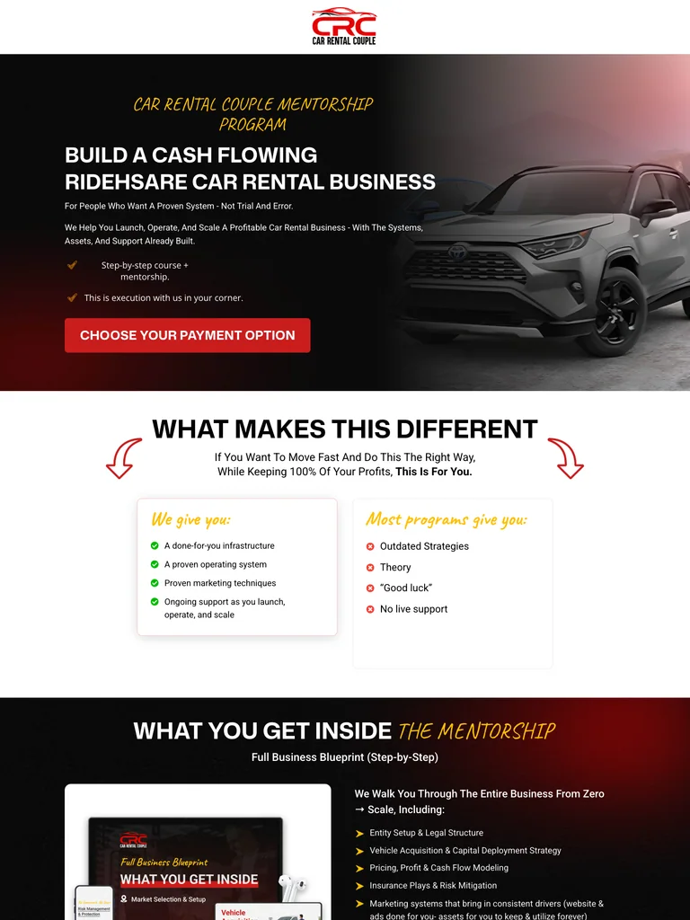
A mentorship sales page that alternates concrete benefits, checklists, and payment-option calls to action.
Useful for: Study the public sales page and its section order, offer presentation, and calls to action. This reference captures one page; checkout steps and conversion results are not verified.
# Design reference: Car Rental Couple — Rideshare Mentorship
Source: https://carrentalcouple.com/mentorship-program
Swipefile reference: https://swipefile.design/ref/funnel-car-rental-couple-rideshare-mentorship-program/
Captured: 2026-09-07. This is a dated reference, not a claim about the current live product.


## Objective
Adapt the visual principles below to my project. Use my own content and identity. Do not reproduce logos, proprietary copy, or brand assets.

## Reference notes
- mood: Practical and emphatic
- colors: Black and white with red purchase buttons and yellow checklist accents.
- typography: Bold sans-serif headlines, compact labels, and scannable benefit lists create a clear hierarchy through the long page.
- layout: Car-led hero and mentorship promise → differentiators → curriculum and services → audience fit → enrollment options → what happens after joining.
- motion: The capture records a static page state. Preserve readable scrolling and clear action feedback; video playback, counters, and hidden form behavior are not demonstrated.
- texture: Photographic or product imagery, contrasting section backgrounds, grouped benefits, and visual proof panels.
- dont: Use your own offer, brand, and assets. Do not invent testimonials, results, scarcity, guarantees, or pricing.

Useful for: Study the public sales page and its section order, offer presentation, and calls to action. This reference captures one page; checkout steps and conversion results are not verified.

## Acceptance criteria
- Existing project conventions, design tokens, working functionality, and unrelated changes are preserved.
- Two or three reference principles clearly support the user's task; conflicts are resolved in favor of usability and the existing product.
- Reusable components and semantic HTML express the interface. Available licensed assets are used; important UI text is never rendered as a bitmap.
- Every visible control has a defined behavior. Loading, empty, error, success, disabled, and long-content states are specified where relevant. Demo data is clearly labeled.
- Navigation and content adapt at 375px, 768px, and 1440px without horizontal page overflow. Keyboard use, visible focus, labeled inputs, at least 44px touch targets, readable contrast, and reduced motion are supported.
- Verification distinguishes rendered behavior from proposals and identifies anything still requiring a backend or external service.

## Quality bar
Clear hierarchy, consistent spacing, restrained surfaces, and purposeful motion. Avoid decorative gradients, excessive cards, placeholder buttons, and invented metrics unless the project calls for them. Do not claim a feature is connected or tested without evidence.
 hover to scroll
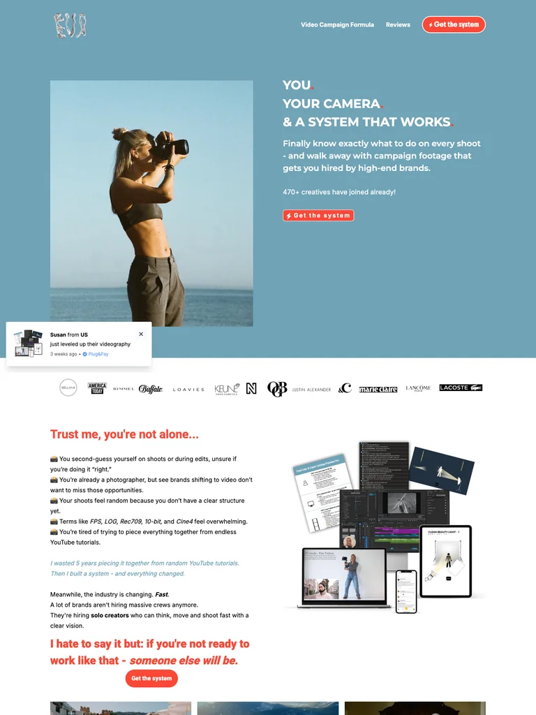
A videography-course page combining blue photographic sections with a coral closing offer and clear lesson benefits.
Useful for: Study the public sales page and its section order, offer presentation, and calls to action. This reference captures one page; checkout steps and conversion results are not verified.
# Design reference: Eva Glasbeek — Video Campaign Formula
Source: https://byevaaluna.plugandpay.nl/video-campaign-formula
Swipefile reference: https://swipefile.design/ref/funnel-eva-glasbeek-video-campaign-formula/
Captured: 2026-09-07. This is a dated reference, not a claim about the current live product.


## Objective
Adapt the visual principles below to my project. Use my own content and identity. Do not reproduce logos, proprietary copy, or brand assets.

## Reference notes
- mood: Confident and approachable
- colors: Muted sky blue, coral-orange offer panels, white, and dark body text.
- typography: Bold sans-serif headlines, compact labels, and scannable benefit lists create a clear hierarchy through the long page.
- layout: Photographic video-course opening → example work and reviews → lesson and coaching benefits → instructor introduction → course bundle → final price panel.
- motion: The capture records a static page state. Preserve readable scrolling and clear action feedback; video playback, counters, and hidden form behavior are not demonstrated.
- texture: Photographic or product imagery, contrasting section backgrounds, grouped benefits, and visual proof panels.
- dont: Use your own offer, brand, and assets. Do not invent testimonials, results, scarcity, guarantees, or pricing.

Useful for: Study the public sales page and its section order, offer presentation, and calls to action. This reference captures one page; checkout steps and conversion results are not verified.

## Acceptance criteria
- Existing project conventions, design tokens, working functionality, and unrelated changes are preserved.
- Two or three reference principles clearly support the user's task; conflicts are resolved in favor of usability and the existing product.
- Reusable components and semantic HTML express the interface. Available licensed assets are used; important UI text is never rendered as a bitmap.
- Every visible control has a defined behavior. Loading, empty, error, success, disabled, and long-content states are specified where relevant. Demo data is clearly labeled.
- Navigation and content adapt at 375px, 768px, and 1440px without horizontal page overflow. Keyboard use, visible focus, labeled inputs, at least 44px touch targets, readable contrast, and reduced motion are supported.
- Verification distinguishes rendered behavior from proposals and identifies anything still requiring a backend or external service.

## Quality bar
Clear hierarchy, consistent spacing, restrained surfaces, and purposeful motion. Avoid decorative gradients, excessive cards, placeholder buttons, and invented metrics unless the project calls for them. Do not claim a feature is connected or tested without evidence.
 hover to scroll
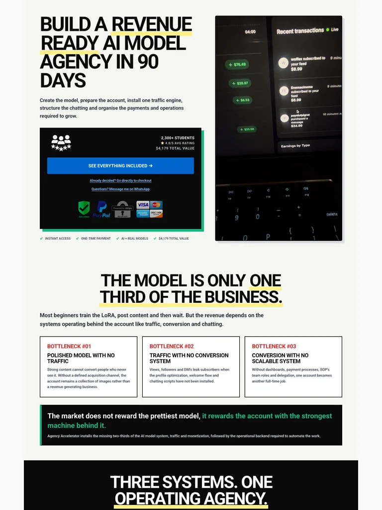
A compact agency-training funnel with an immediate offer, bold headings, and dense dashboard and message screenshots.
Useful for: Study the public sales page and its section order, offer presentation, and calls to action. This reference captures one page; checkout steps and conversion results are not verified.
# Design reference: Bjorn Olsen — Agency Accelerator
Source: https://bjornolsen.com.au/pages/agency-accelerator-trinity
Swipefile reference: https://swipefile.design/ref/funnel-bjorn-olsen-agency-accelerator/
Captured: 2026-09-07. This is a dated reference, not a claim about the current live product.


## Objective
Adapt the visual principles below to my project. Use my own content and identity. Do not reproduce logos, proprietary copy, or brand assets.

## Reference notes
- mood: Bold and compact
- colors: Off-white, black, blue enrollment accents, and selective yellow headline highlights.
- typography: Bold sans-serif headlines, compact labels, and scannable benefit lists create a clear hierarchy through the long page.
- layout: Compressed headline and purchase panel → process explanation → dashboard and message proof → course contents → repeated enrollment offer.
- motion: The capture records a static page state. Preserve readable scrolling and clear action feedback; video playback, counters, and hidden form behavior are not demonstrated.
- texture: Photographic or product imagery, contrasting section backgrounds, grouped benefits, and visual proof panels.
- dont: Use your own offer, brand, and assets. Do not invent testimonials, results, scarcity, guarantees, or pricing.

Useful for: Study the public sales page and its section order, offer presentation, and calls to action. This reference captures one page; checkout steps and conversion results are not verified.

## Acceptance criteria
- Existing project conventions, design tokens, working functionality, and unrelated changes are preserved.
- Two or three reference principles clearly support the user's task; conflicts are resolved in favor of usability and the existing product.
- Reusable components and semantic HTML express the interface. Available licensed assets are used; important UI text is never rendered as a bitmap.
- Every visible control has a defined behavior. Loading, empty, error, success, disabled, and long-content states are specified where relevant. Demo data is clearly labeled.
- Navigation and content adapt at 375px, 768px, and 1440px without horizontal page overflow. Keyboard use, visible focus, labeled inputs, at least 44px touch targets, readable contrast, and reduced motion are supported.
- Verification distinguishes rendered behavior from proposals and identifies anything still requiring a backend or external service.

## Quality bar
Clear hierarchy, consistent spacing, restrained surfaces, and purposeful motion. Avoid decorative gradients, excessive cards, placeholder buttons, and invented metrics unless the project calls for them. Do not claim a feature is connected or tested without evidence.
 hover to scroll
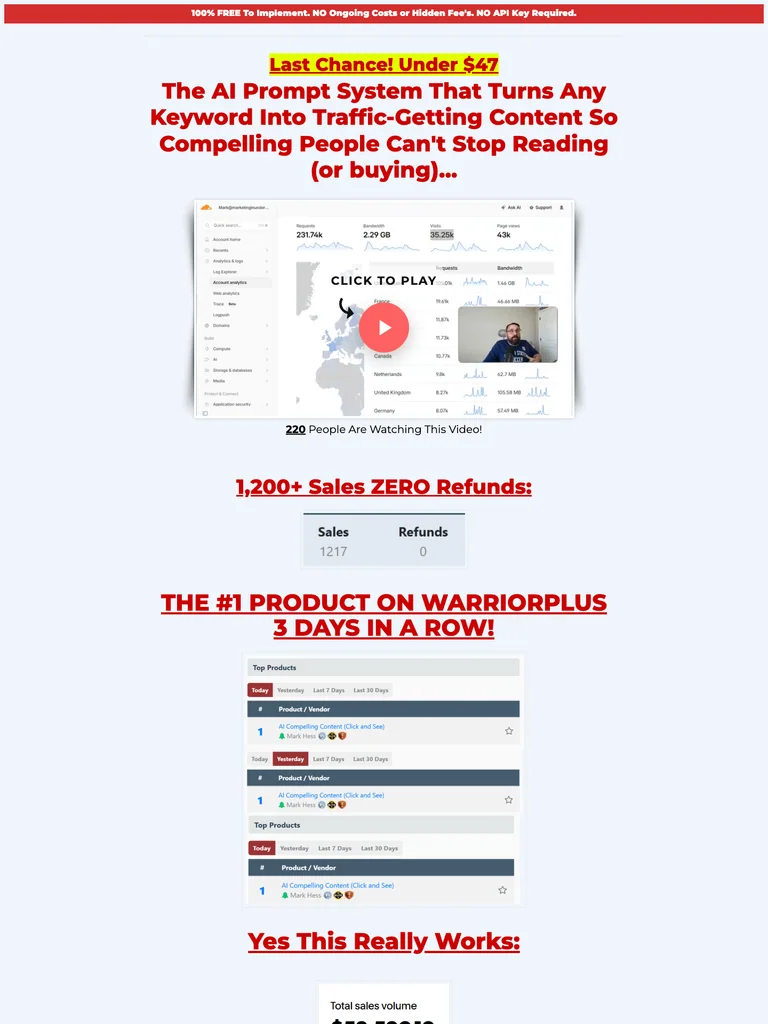
A classic sales letter with highlighted claims, a demo-led opening, and a long single-column product explanation.
Useful for: Study the public sales page and its section order, offer presentation, and calls to action. This reference captures one page; checkout steps and conversion results are not verified.
# Design reference: Mark Hess — Compelling Content
Source: https://actionactivated.com/compelling-content
Swipefile reference: https://swipefile.design/ref/funnel-mark-hess-compelling-content-fe-oto-custom-gpt-compelling-keywords/
Captured: 2026-09-07. This is a dated reference, not a claim about the current live product.


## Objective
Adapt the visual principles below to my project. Use my own content and identity. Do not reproduce logos, proprietary copy, or brand assets.

## Reference notes
- mood: Classic direct response
- colors: Pale blue page, black copy, red headlines, and yellow text highlights.
- typography: Readable single-column body copy, bold section headlines, and selective inline emphasis sustain a long written pitch.
- layout: Offer headline and demo → product explanation → long written argument → highlighted mechanism sections → purchase opportunities → closing offer notes.
- motion: The capture records a static page state. Preserve readable scrolling and clear action feedback; video playback, counters, and hidden form behavior are not demonstrated.
- texture: Narrow reading columns, inset illustrations and examples, highlighted phrases, and repeated offer sections.
- dont: Use your own offer, brand, and assets. Do not invent testimonials, results, scarcity, guarantees, or pricing.

Useful for: Study the public sales page and its section order, offer presentation, and calls to action. This reference captures one page; checkout steps and conversion results are not verified.

## Acceptance criteria
- Existing project conventions, design tokens, working functionality, and unrelated changes are preserved.
- Two or three reference principles clearly support the user's task; conflicts are resolved in favor of usability and the existing product.
- Reusable components and semantic HTML express the interface. Available licensed assets are used; important UI text is never rendered as a bitmap.
- Every visible control has a defined behavior. Loading, empty, error, success, disabled, and long-content states are specified where relevant. Demo data is clearly labeled.
- Navigation and content adapt at 375px, 768px, and 1440px without horizontal page overflow. Keyboard use, visible focus, labeled inputs, at least 44px touch targets, readable contrast, and reduced motion are supported.
- Verification distinguishes rendered behavior from proposals and identifies anything still requiring a backend or external service.

## Quality bar
Clear hierarchy, consistent spacing, restrained surfaces, and purposeful motion. Avoid decorative gradients, excessive cards, placeholder buttons, and invented metrics unless the project calls for them. Do not claim a feature is connected or tested without evidence.
 hover to scroll
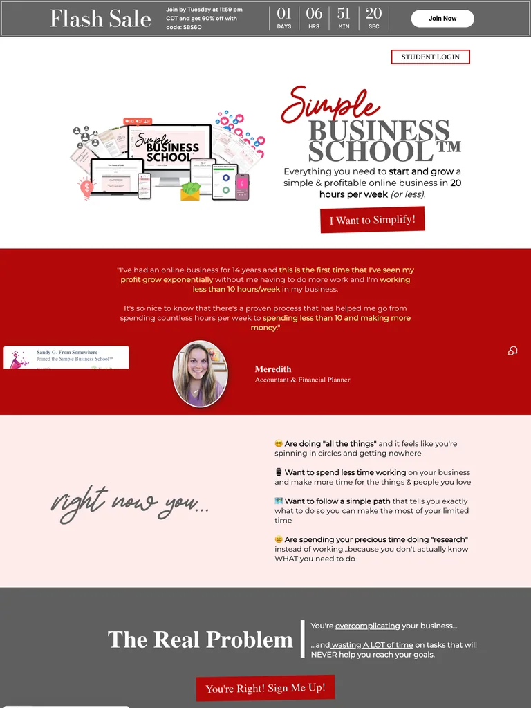
A membership offer built from product mockups, student stories, audience-fit sections, and a closing FAQ.
Useful for: Study the public sales page and its section order, offer presentation, and calls to action. This reference captures one page; checkout steps and conversion results are not verified.
# Design reference: Steph Blake — Simple Business School
Source: https://scalewithsteph.com/sbs
Swipefile reference: https://swipefile.design/ref/funnel-steph-blake-simple-business-school/
Captured: 2026-09-07. This is a dated reference, not a claim about the current live product.


## Objective
Adapt the visual principles below to my project. Use my own content and identity. Do not reproduce logos, proprietary copy, or brand assets.

## Reference notes
- mood: Warm and persuasive
- colors: White, deep red, pale pink, gray offer bands, and black type.
- typography: Bold sans-serif headlines, compact labels, and scannable benefit lists create a clear hierarchy through the long page.
- layout: Product bundle hero → founder and student stories → audience categories → membership benefits → offer details → FAQ and final join button.
- motion: The capture records a static page state. Preserve readable scrolling and clear action feedback; video playback, counters, and hidden form behavior are not demonstrated.
- texture: Photographic or product imagery, contrasting section backgrounds, grouped benefits, and visual proof panels.
- dont: Use your own offer, brand, and assets. Do not invent testimonials, results, scarcity, guarantees, or pricing.

Useful for: Study the public sales page and its section order, offer presentation, and calls to action. This reference captures one page; checkout steps and conversion results are not verified.

## Acceptance criteria
- Existing project conventions, design tokens, working functionality, and unrelated changes are preserved.
- Two or three reference principles clearly support the user's task; conflicts are resolved in favor of usability and the existing product.
- Reusable components and semantic HTML express the interface. Available licensed assets are used; important UI text is never rendered as a bitmap.
- Every visible control has a defined behavior. Loading, empty, error, success, disabled, and long-content states are specified where relevant. Demo data is clearly labeled.
- Navigation and content adapt at 375px, 768px, and 1440px without horizontal page overflow. Keyboard use, visible focus, labeled inputs, at least 44px touch targets, readable contrast, and reduced motion are supported.
- Verification distinguishes rendered behavior from proposals and identifies anything still requiring a backend or external service.

## Quality bar
Clear hierarchy, consistent spacing, restrained surfaces, and purposeful motion. Avoid decorative gradients, excessive cards, placeholder buttons, and invented metrics unless the project calls for them. Do not claim a feature is connected or tested without evidence.
 hover to scroll
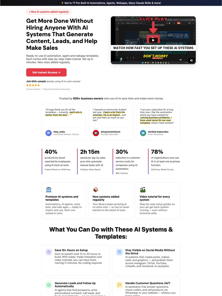
An automation-library sales page with expandable categories, product demonstrations, proof cards, and repeated access buttons.
Useful for: Study the public sales page and its section order, offer presentation, and calls to action. This reference captures one page; checkout steps and conversion results are not verified.
# Design reference: Fabian Markl — AI Systems Library
Source: https://fabimarkl.com/library
Swipefile reference: https://swipefile.design/ref/funnel-fabian-markl-ai-automations-agents-webapps/
Captured: 2026-09-07. This is a dated reference, not a claim about the current live product.


## Objective
Adapt the visual principles below to my project. Use my own content and identity. Do not reproduce logos, proprietary copy, or brand assets.

## Reference notes
- mood: Clear and product-focused
- colors: White and light gray panels with near-black text and coral-red buttons.
- typography: Bold sans-serif headlines, compact labels, and scannable benefit lists create a clear hierarchy through the long page.
- layout: Outcome-focused hero and demo → customer-message proof → benefit metrics → categorized template library → offer and objections → closing access action.
- motion: The capture records a static page state. Preserve readable scrolling and clear action feedback; video playback, counters, and hidden form behavior are not demonstrated.
- texture: Photographic or product imagery, contrasting section backgrounds, grouped benefits, and visual proof panels.
- dont: Use your own offer, brand, and assets. Do not invent testimonials, results, scarcity, guarantees, or pricing.

Useful for: Study the public sales page and its section order, offer presentation, and calls to action. This reference captures one page; checkout steps and conversion results are not verified.

## Acceptance criteria
- Existing project conventions, design tokens, working functionality, and unrelated changes are preserved.
- Two or three reference principles clearly support the user's task; conflicts are resolved in favor of usability and the existing product.
- Reusable components and semantic HTML express the interface. Available licensed assets are used; important UI text is never rendered as a bitmap.
- Every visible control has a defined behavior. Loading, empty, error, success, disabled, and long-content states are specified where relevant. Demo data is clearly labeled.
- Navigation and content adapt at 375px, 768px, and 1440px without horizontal page overflow. Keyboard use, visible focus, labeled inputs, at least 44px touch targets, readable contrast, and reduced motion are supported.
- Verification distinguishes rendered behavior from proposals and identifies anything still requiring a backend or external service.

## Quality bar
Clear hierarchy, consistent spacing, restrained surfaces, and purposeful motion. Avoid decorative gradients, excessive cards, placeholder buttons, and invented metrics unless the project calls for them. Do not claim a feature is connected or tested without evidence.
 hover to scroll
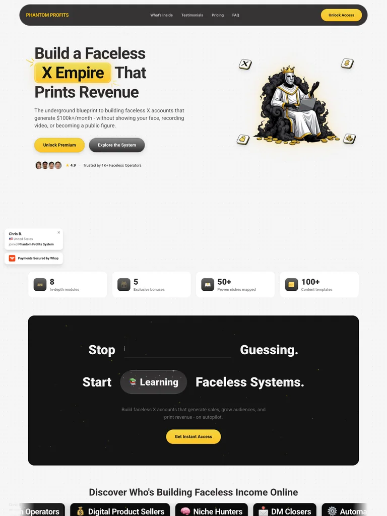
A creator-system funnel that combines a character illustration, modular benefits, a roadmap, and an embedded purchase section.
Useful for: Study the public sales page and its section order, offer presentation, and calls to action. This reference captures one page; checkout steps and conversion results are not verified.
# Design reference: Phantom Profits — X Creator System
Source: https://phantomprofitssystem.com/
Swipefile reference: https://swipefile.design/ref/funnel-x-empire-phantom-profits/
Captured: 2026-09-07. This is a dated reference, not a claim about the current live product.


## Objective
Adapt the visual principles below to my project. Use my own content and identity. Do not reproduce logos, proprietary copy, or brand assets.

## Reference notes
- mood: Playful and focused
- colors: Soft gray, near-black, yellow emphasis, and warm gold borders.
- typography: Bold sans-serif headlines, compact labels, and scannable benefit lists create a clear hierarchy through the long page.
- layout: Illustrated hero → creator proof → included tools and community → purchase invitation → roadmap → embedded offer and checkout section.
- motion: The capture records a static page state. Preserve readable scrolling and clear action feedback; video playback, counters, and hidden form behavior are not demonstrated.
- texture: Photographic or product imagery, contrasting section backgrounds, grouped benefits, and visual proof panels.
- dont: Use your own offer, brand, and assets. Do not invent testimonials, results, scarcity, guarantees, or pricing.

Useful for: Study the public sales page and its section order, offer presentation, and calls to action. This reference captures one page; checkout steps and conversion results are not verified.

## Acceptance criteria
- Existing project conventions, design tokens, working functionality, and unrelated changes are preserved.
- Two or three reference principles clearly support the user's task; conflicts are resolved in favor of usability and the existing product.
- Reusable components and semantic HTML express the interface. Available licensed assets are used; important UI text is never rendered as a bitmap.
- Every visible control has a defined behavior. Loading, empty, error, success, disabled, and long-content states are specified where relevant. Demo data is clearly labeled.
- Navigation and content adapt at 375px, 768px, and 1440px without horizontal page overflow. Keyboard use, visible focus, labeled inputs, at least 44px touch targets, readable contrast, and reduced motion are supported.
- Verification distinguishes rendered behavior from proposals and identifies anything still requiring a backend or external service.

## Quality bar
Clear hierarchy, consistent spacing, restrained surfaces, and purposeful motion. Avoid decorative gradients, excessive cards, placeholder buttons, and invented metrics unless the project calls for them. Do not claim a feature is connected or tested without evidence.
 hover to scroll
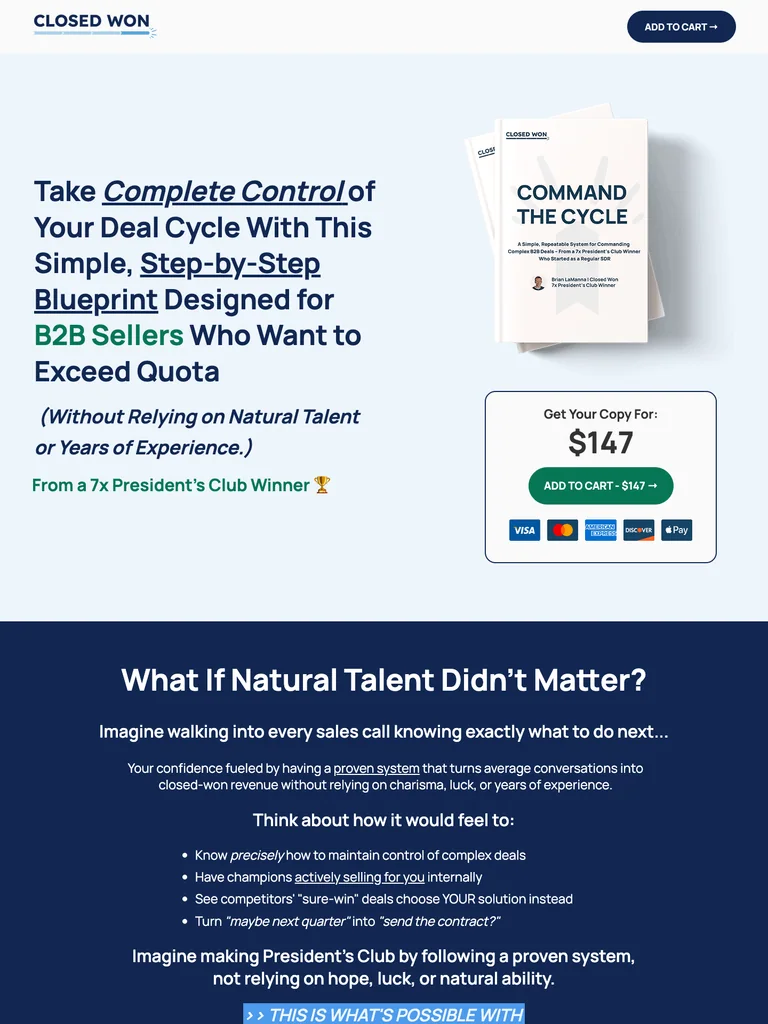
A guide offer with a prominent product mockup, clear pricing, an author introduction, and repeated buying opportunities.
Useful for: Study the public sales page and its section order, offer presentation, and calls to action. This reference captures one page; checkout steps and conversion results are not verified.
# Design reference: Brian LaManna — Command The Cycle
Source: https://closedwon.xyz/command-the-cycle
Swipefile reference: https://swipefile.design/ref/funnel-brian-lamanna-command-the-cycle/
Captured: 2026-09-07. This is a dated reference, not a claim about the current live product.


## Objective
Adapt the visual principles below to my project. Use my own content and identity. Do not reproduce logos, proprietary copy, or brand assets.

## Reference notes
- mood: Structured and professional
- colors: Light blue, navy, white, and green CTA accents.
- typography: Bold sans-serif headlines, compact labels, and scannable benefit lists create a clear hierarchy through the long page.
- layout: Guide mockup and price → reader challenges → practical benefits → author introduction → contents and proof → final purchase action.
- motion: The capture records a static page state. Preserve readable scrolling and clear action feedback; video playback, counters, and hidden form behavior are not demonstrated.
- texture: Photographic or product imagery, contrasting section backgrounds, grouped benefits, and visual proof panels.
- dont: Use your own offer, brand, and assets. Do not invent testimonials, results, scarcity, guarantees, or pricing.

Useful for: Study the public sales page and its section order, offer presentation, and calls to action. This reference captures one page; checkout steps and conversion results are not verified.

## Acceptance criteria
- Existing project conventions, design tokens, working functionality, and unrelated changes are preserved.
- Two or three reference principles clearly support the user's task; conflicts are resolved in favor of usability and the existing product.
- Reusable components and semantic HTML express the interface. Available licensed assets are used; important UI text is never rendered as a bitmap.
- Every visible control has a defined behavior. Loading, empty, error, success, disabled, and long-content states are specified where relevant. Demo data is clearly labeled.
- Navigation and content adapt at 375px, 768px, and 1440px without horizontal page overflow. Keyboard use, visible focus, labeled inputs, at least 44px touch targets, readable contrast, and reduced motion are supported.
- Verification distinguishes rendered behavior from proposals and identifies anything still requiring a backend or external service.

## Quality bar
Clear hierarchy, consistent spacing, restrained surfaces, and purposeful motion. Avoid decorative gradients, excessive cards, placeholder buttons, and invented metrics unless the project calls for them. Do not claim a feature is connected or tested without evidence.
 hover to scroll
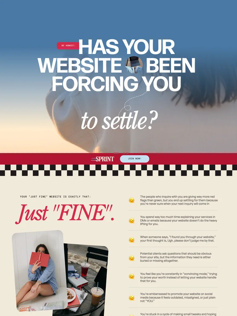
An exceptionally long website-copy course page using expressive typography, alternating sections, and a sustained sales narrative.
Useful for: Study the public sales page and its section order, offer presentation, and calls to action. This reference captures one page; checkout steps and conversion results are not verified.
# Design reference: Sara Noel — Site Series Sprint
Source: https://betweenthelinescopy.com/site-series-sprint
Swipefile reference: https://swipefile.design/ref/funnel-sara-noel-site-series-sprint/
Captured: 2026-09-07. This is a dated reference, not a claim about the current live product.


## Objective
Adapt the visual principles below to my project. Use my own content and identity. Do not reproduce logos, proprietary copy, or brand assets.

## Reference notes
- mood: Bold and conversational
- colors: Sky blue, red, cream, and oversized white headings.
- typography: Expressive serif display headings mixed with clean supporting text; large typographic shifts separate the offer story from the details.
- layout: Large scenic headline → website-copy problem → teaching approach and examples → course details → proof and instructor context → offer and questions.
- motion: The capture records a static page state. Preserve readable scrolling and clear action feedback; video playback, counters, and hidden form behavior are not demonstrated.
- texture: Photographic or product imagery, contrasting section backgrounds, grouped benefits, and visual proof panels.
- dont: Use your own offer, brand, and assets. Do not invent testimonials, results, scarcity, guarantees, or pricing.

Useful for: Study the public sales page and its section order, offer presentation, and calls to action. This reference captures one page; checkout steps and conversion results are not verified.

## Acceptance criteria
- Existing project conventions, design tokens, working functionality, and unrelated changes are preserved.
- Two or three reference principles clearly support the user's task; conflicts are resolved in favor of usability and the existing product.
- Reusable components and semantic HTML express the interface. Available licensed assets are used; important UI text is never rendered as a bitmap.
- Every visible control has a defined behavior. Loading, empty, error, success, disabled, and long-content states are specified where relevant. Demo data is clearly labeled.
- Navigation and content adapt at 375px, 768px, and 1440px without horizontal page overflow. Keyboard use, visible focus, labeled inputs, at least 44px touch targets, readable contrast, and reduced motion are supported.
- Verification distinguishes rendered behavior from proposals and identifies anything still requiring a backend or external service.

## Quality bar
Clear hierarchy, consistent spacing, restrained surfaces, and purposeful motion. Avoid decorative gradients, excessive cards, placeholder buttons, and invented metrics unless the project calls for them. Do not claim a feature is connected or tested without evidence.
 hover to scroll
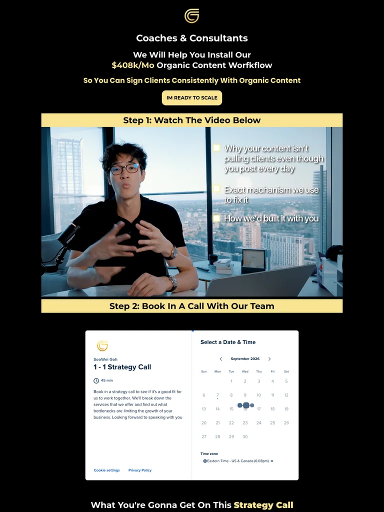
A video-led consulting funnel with a short opening pitch, a dense proof gallery, and repeated consultation actions.
Useful for: Study the public sales page and its section order, offer presentation, and calls to action. This reference captures one page; checkout steps and conversion results are not verified.
# Design reference: Goh Consulting — Training Funnel
Source: https://gohconsulting.com/training
Swipefile reference: https://swipefile.design/ref/funnel-soowei-goh-consulting-mastery-2-0-all-his-courses/
Captured: 2026-09-07. This is a dated reference, not a claim about the current live product.


## Objective
Adapt the visual principles below to my project. Use my own content and identity. Do not reproduce logos, proprietary copy, or brand assets.

## Reference notes
- mood: Focused and proof-heavy
- colors: Black canvas, warm yellow accents, white text, and gold outlines.
- typography: Bold sans-serif headlines, compact labels, and scannable benefit lists create a clear hierarchy through the long page.
- layout: Audience-specific promise → training video → client-name proof → video case studies → final consultation CTA.
- motion: The capture records a static page state. Preserve readable scrolling and clear action feedback; video playback, counters, and hidden form behavior are not demonstrated.
- texture: Photographic or product imagery, contrasting section backgrounds, grouped benefits, and visual proof panels.
- dont: Use your own offer, brand, and assets. Do not invent testimonials, results, scarcity, guarantees, or pricing.

Useful for: Study the public sales page and its section order, offer presentation, and calls to action. This reference captures one page; checkout steps and conversion results are not verified.

## Acceptance criteria
- Existing project conventions, design tokens, working functionality, and unrelated changes are preserved.
- Two or three reference principles clearly support the user's task; conflicts are resolved in favor of usability and the existing product.
- Reusable components and semantic HTML express the interface. Available licensed assets are used; important UI text is never rendered as a bitmap.
- Every visible control has a defined behavior. Loading, empty, error, success, disabled, and long-content states are specified where relevant. Demo data is clearly labeled.
- Navigation and content adapt at 375px, 768px, and 1440px without horizontal page overflow. Keyboard use, visible focus, labeled inputs, at least 44px touch targets, readable contrast, and reduced motion are supported.
- Verification distinguishes rendered behavior from proposals and identifies anything still requiring a backend or external service.

## Quality bar
Clear hierarchy, consistent spacing, restrained surfaces, and purposeful motion. Avoid decorative gradients, excessive cards, placeholder buttons, and invented metrics unless the project calls for them. Do not claim a feature is connected or tested without evidence.
 hover to scroll
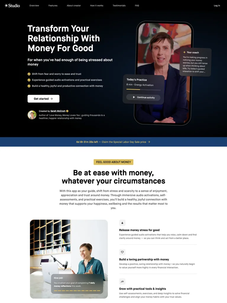
A membership landing page that uses a mobile product preview and a clear practice-based story to explain the offer.
Useful for: Study the public sales page and its section order, offer presentation, and calls to action. This reference captures one page; checkout steps and conversion results are not verified.
# Design reference: Sarah McCrum — Love Money Studio
Source: https://studio.com/apps/sarah-mccrum/moneylove?code=a&ref=sarah-mccrum
Swipefile reference: https://swipefile.design/ref/funnel-sarah-mccrum-love-money/
Captured: 2026-09-07. This is a dated reference, not a claim about the current live product.


## Objective
Adapt the visual principles below to my project. Use my own content and identity. Do not reproduce logos, proprietary copy, or brand assets.

## Reference notes
- mood: Calm and supportive
- colors: Black, white, medium blue, and small yellow labels.
- typography: Bold sans-serif headlines, compact labels, and scannable benefit lists create a clear hierarchy through the long page.
- layout: Practice-led hero with interface preview → benefits and routine → product features → four-step explanation → membership invitation and final action.
- motion: The capture records a static page state. Preserve readable scrolling and clear action feedback; video playback, counters, and hidden form behavior are not demonstrated.
- texture: Photographic or product imagery, contrasting section backgrounds, grouped benefits, and visual proof panels.
- dont: Use your own offer, brand, and assets. Do not invent testimonials, results, scarcity, guarantees, or pricing.

Useful for: Study the public sales page and its section order, offer presentation, and calls to action. This reference captures one page; checkout steps and conversion results are not verified.

## Acceptance criteria
- Existing project conventions, design tokens, working functionality, and unrelated changes are preserved.
- Two or three reference principles clearly support the user's task; conflicts are resolved in favor of usability and the existing product.
- Reusable components and semantic HTML express the interface. Available licensed assets are used; important UI text is never rendered as a bitmap.
- Every visible control has a defined behavior. Loading, empty, error, success, disabled, and long-content states are specified where relevant. Demo data is clearly labeled.
- Navigation and content adapt at 375px, 768px, and 1440px without horizontal page overflow. Keyboard use, visible focus, labeled inputs, at least 44px touch targets, readable contrast, and reduced motion are supported.
- Verification distinguishes rendered behavior from proposals and identifies anything still requiring a backend or external service.

## Quality bar
Clear hierarchy, consistent spacing, restrained surfaces, and purposeful motion. Avoid decorative gradients, excessive cards, placeholder buttons, and invented metrics unless the project calls for them. Do not claim a feature is connected or tested without evidence.
 hover to scroll
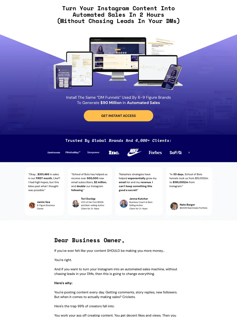
A course funnel organized around a large digital bundle, a clear method, and prominent access buttons.
Useful for: Study the public sales page and its section order, offer presentation, and calls to action. This reference captures one page; checkout steps and conversion results are not verified.
# Design reference: School of Bots — Content to Cashflow
Source: https://learn.schoolofbots.co/ctc-level1-organic-yt
Swipefile reference: https://swipefile.design/ref/funnel-natasha-willis-the-content-to-cashflow-system/
Captured: 2026-09-07. This is a dated reference, not a claim about the current live product.


## Objective
Adapt the visual principles below to my project. Use my own content and identity. Do not reproduce logos, proprietary copy, or brand assets.

## Reference notes
- mood: Product-led and emphatic
- colors: White, deep indigo, violet gradients, and gold access buttons.
- typography: Bold sans-serif headlines, compact labels, and scannable benefit lists create a clear hierarchy through the long page.
- layout: Course bundle and outcome headline → brand proof → method and included resources → instructor and student proof → repeated access offer.
- motion: The capture records a static page state. Preserve readable scrolling and clear action feedback; video playback, counters, and hidden form behavior are not demonstrated.
- texture: Photographic or product imagery, contrasting section backgrounds, grouped benefits, and visual proof panels.
- dont: Use your own offer, brand, and assets. Do not invent testimonials, results, scarcity, guarantees, or pricing.

Useful for: Study the public sales page and its section order, offer presentation, and calls to action. This reference captures one page; checkout steps and conversion results are not verified.

## Acceptance criteria
- Existing project conventions, design tokens, working functionality, and unrelated changes are preserved.
- Two or three reference principles clearly support the user's task; conflicts are resolved in favor of usability and the existing product.
- Reusable components and semantic HTML express the interface. Available licensed assets are used; important UI text is never rendered as a bitmap.
- Every visible control has a defined behavior. Loading, empty, error, success, disabled, and long-content states are specified where relevant. Demo data is clearly labeled.
- Navigation and content adapt at 375px, 768px, and 1440px without horizontal page overflow. Keyboard use, visible focus, labeled inputs, at least 44px touch targets, readable contrast, and reduced motion are supported.
- Verification distinguishes rendered behavior from proposals and identifies anything still requiring a backend or external service.

## Quality bar
Clear hierarchy, consistent spacing, restrained surfaces, and purposeful motion. Avoid decorative gradients, excessive cards, placeholder buttons, and invented metrics unless the project calls for them. Do not claim a feature is connected or tested without evidence.
 hover to scroll
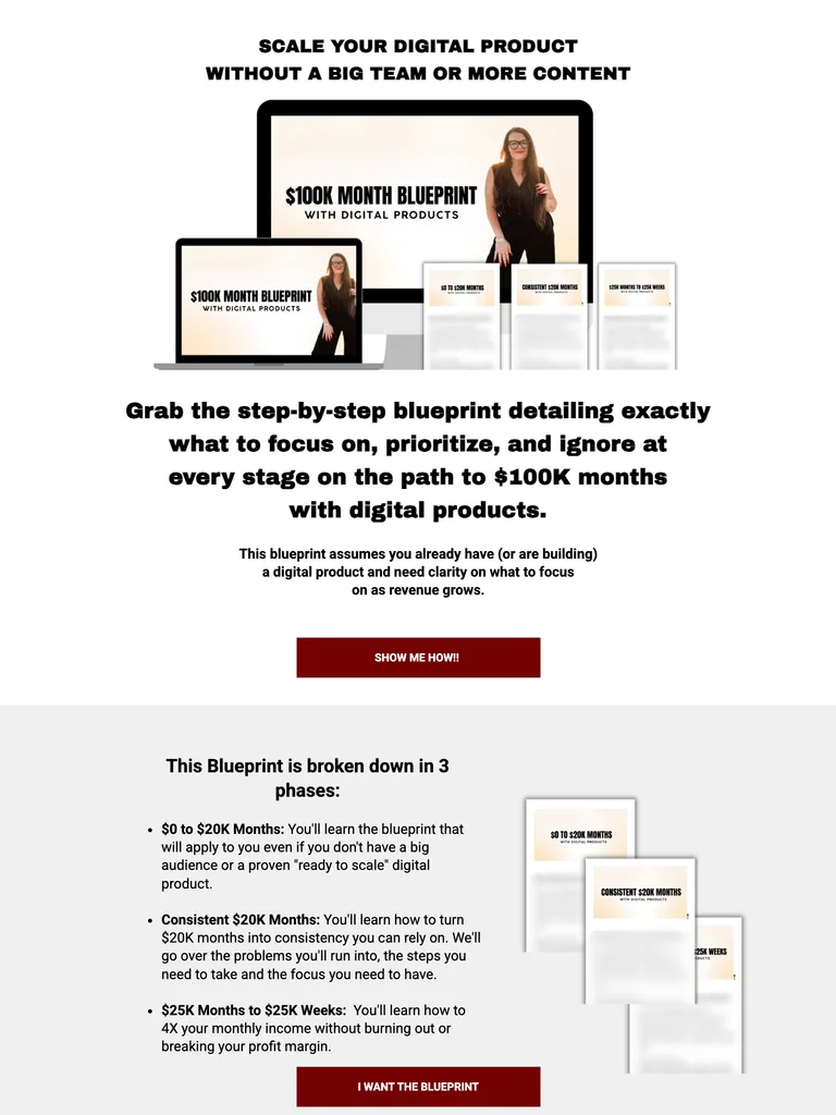
A narrow digital-product offer with bold copy, device mockups, a straightforward price section, and student quotes.
Useful for: Study the public sales page and its section order, offer presentation, and calls to action. This reference captures one page; checkout steps and conversion results are not verified.
# Design reference: Katie and Floyd — Digital Product Blueprint
Source: https://katiejcoaching.com/usd100k-month-blueprint-with-digital-products
Swipefile reference: https://swipefile.design/ref/funnel-katie-and-floyd-100k-month-blueprint-with-digital-products/
Captured: 2026-09-07. This is a dated reference, not a claim about the current live product.


## Objective
Adapt the visual principles below to my project. Use my own content and identity. Do not reproduce logos, proprietary copy, or brand assets.

## Reference notes
- mood: Simple and direct
- colors: White canvas, black text, deep red offer buttons, and green price highlights.
- typography: Bold sans-serif headlines, compact labels, and scannable benefit lists create a clear hierarchy through the long page.
- layout: Product mockups and promise → intended audience → course contents → price and offer → student testimonials → repeated closing bundle.
- motion: The capture records a static page state. Preserve readable scrolling and clear action feedback; video playback, counters, and hidden form behavior are not demonstrated.
- texture: Photographic or product imagery, contrasting section backgrounds, grouped benefits, and visual proof panels.
- dont: Use your own offer, brand, and assets. Do not invent testimonials, results, scarcity, guarantees, or pricing.

Useful for: Study the public sales page and its section order, offer presentation, and calls to action. This reference captures one page; checkout steps and conversion results are not verified.

## Acceptance criteria
- Existing project conventions, design tokens, working functionality, and unrelated changes are preserved.
- Two or three reference principles clearly support the user's task; conflicts are resolved in favor of usability and the existing product.
- Reusable components and semantic HTML express the interface. Available licensed assets are used; important UI text is never rendered as a bitmap.
- Every visible control has a defined behavior. Loading, empty, error, success, disabled, and long-content states are specified where relevant. Demo data is clearly labeled.
- Navigation and content adapt at 375px, 768px, and 1440px without horizontal page overflow. Keyboard use, visible focus, labeled inputs, at least 44px touch targets, readable contrast, and reduced motion are supported.
- Verification distinguishes rendered behavior from proposals and identifies anything still requiring a backend or external service.

## Quality bar
Clear hierarchy, consistent spacing, restrained surfaces, and purposeful motion. Avoid decorative gradients, excessive cards, placeholder buttons, and invented metrics unless the project calls for them. Do not claim a feature is connected or tested without evidence.
 hover to scroll
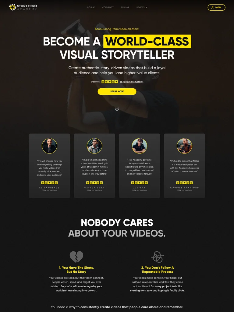
A filmmaking-course page using cinematic imagery, dark sections, and yellow emphasis to carry a long enrollment story.
Useful for: Study the public sales page and its section order, offer presentation, and calls to action. This reference captures one page; checkout steps and conversion results are not verified.
# Design reference: Nicklas Christl — Story Hero Academy
Source: https://story-hero.com/
Swipefile reference: https://swipefile.design/ref/funnel-nicklas-christl-story-hero-academy/
Captured: 2026-09-07. This is a dated reference, not a claim about the current live product.


## Objective
Adapt the visual principles below to my project. Use my own content and identity. Do not reproduce logos, proprietary copy, or brand assets.

## Reference notes
- mood: Cinematic and purposeful
- colors: Near-black, dark olive, yellow highlights, and warm photographic tones.
- typography: Bold sans-serif headlines, compact labels, and scannable benefit lists create a clear hierarchy through the long page.
- layout: Video-led course introduction → filmmaking problems and examples → curriculum → creator guidance and community → student proof → enrollment and questions.
- motion: The capture records a static page state. Preserve readable scrolling and clear action feedback; video playback, counters, and hidden form behavior are not demonstrated.
- texture: Photographic or product imagery, contrasting section backgrounds, grouped benefits, and visual proof panels.
- dont: Use your own offer, brand, and assets. Do not invent testimonials, results, scarcity, guarantees, or pricing.

Useful for: Study the public sales page and its section order, offer presentation, and calls to action. This reference captures one page; checkout steps and conversion results are not verified.

## Acceptance criteria
- Existing project conventions, design tokens, working functionality, and unrelated changes are preserved.
- Two or three reference principles clearly support the user's task; conflicts are resolved in favor of usability and the existing product.
- Reusable components and semantic HTML express the interface. Available licensed assets are used; important UI text is never rendered as a bitmap.
- Every visible control has a defined behavior. Loading, empty, error, success, disabled, and long-content states are specified where relevant. Demo data is clearly labeled.
- Navigation and content adapt at 375px, 768px, and 1440px without horizontal page overflow. Keyboard use, visible focus, labeled inputs, at least 44px touch targets, readable contrast, and reduced motion are supported.
- Verification distinguishes rendered behavior from proposals and identifies anything still requiring a backend or external service.

## Quality bar
Clear hierarchy, consistent spacing, restrained surfaces, and purposeful motion. Avoid decorative gradients, excessive cards, placeholder buttons, and invented metrics unless the project calls for them. Do not claim a feature is connected or tested without evidence.
 hover to scroll
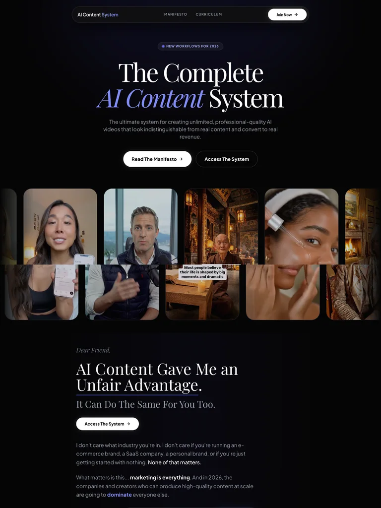
An AI-content course page pairing editorial type with a visual gallery and a structured explanation of the system.
Useful for: Study the public sales page and its section order, offer presentation, and calls to action. This reference captures one page; checkout steps and conversion results are not verified.
# Design reference: MikoAI — AI Content System
Source: https://contentsystem.ai/
Swipefile reference: https://swipefile.design/ref/funnel-mikoai-ai-content-system/
Captured: 2026-09-07. This is a dated reference, not a claim about the current live product.


## Objective
Adapt the visual principles below to my project. Use my own content and identity. Do not reproduce logos, proprietary copy, or brand assets.

## Reference notes
- mood: Editorial and polished
- colors: Near-black, white, and restrained lavender accents.
- typography: Expressive serif display headings mixed with clean supporting text; large typographic shifts separate the offer story from the details.
- layout: Editorial hero and creator-image strip → method overview → tools and resources → system contents → access invitation and closing details.
- motion: The capture records a static page state. Preserve readable scrolling and clear action feedback; video playback, counters, and hidden form behavior are not demonstrated.
- texture: Photographic or product imagery, contrasting section backgrounds, grouped benefits, and visual proof panels.
- dont: Use your own offer, brand, and assets. Do not invent testimonials, results, scarcity, guarantees, or pricing.

Useful for: Study the public sales page and its section order, offer presentation, and calls to action. This reference captures one page; checkout steps and conversion results are not verified.

## Acceptance criteria
- Existing project conventions, design tokens, working functionality, and unrelated changes are preserved.
- Two or three reference principles clearly support the user's task; conflicts are resolved in favor of usability and the existing product.
- Reusable components and semantic HTML express the interface. Available licensed assets are used; important UI text is never rendered as a bitmap.
- Every visible control has a defined behavior. Loading, empty, error, success, disabled, and long-content states are specified where relevant. Demo data is clearly labeled.
- Navigation and content adapt at 375px, 768px, and 1440px without horizontal page overflow. Keyboard use, visible focus, labeled inputs, at least 44px touch targets, readable contrast, and reduced motion are supported.
- Verification distinguishes rendered behavior from proposals and identifies anything still requiring a backend or external service.

## Quality bar
Clear hierarchy, consistent spacing, restrained surfaces, and purposeful motion. Avoid decorative gradients, excessive cards, placeholder buttons, and invented metrics unless the project calls for them. Do not claim a feature is connected or tested without evidence.
 hover to scroll
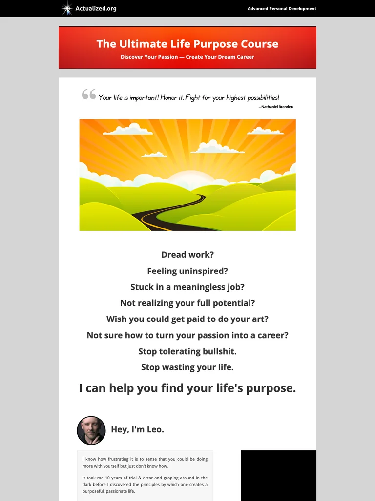
A traditional course sales letter with narrow reading columns, illustrative imagery, and detailed written explanations.
Useful for: Study the public sales page and its section order, offer presentation, and calls to action. This reference captures one page; checkout steps and conversion results are not verified.
# Design reference: Actualized.org — Life Purpose Course
Source: https://actualized.org/life-purpose-course
Swipefile reference: https://swipefile.design/ref/funnel-leo-gura-the-ultimate-life-purpose-course/
Captured: 2026-09-07. This is a dated reference, not a claim about the current live product.


## Objective
Adapt the visual principles below to my project. Use my own content and identity. Do not reproduce logos, proprietary copy, or brand assets.

## Reference notes
- mood: Traditional and explanatory
- colors: Light gray and white with black text, red headings, and warm illustrated imagery.
- typography: Readable single-column body copy, bold section headlines, and selective inline emphasis sustain a long written pitch.
- layout: Course title and introductory illustration → reader problem → long explanatory narrative → lesson contents and instructor context → purchase invitation and questions.
- motion: The capture records a static page state. Preserve readable scrolling and clear action feedback; video playback, counters, and hidden form behavior are not demonstrated.
- texture: Narrow reading columns, inset illustrations and examples, highlighted phrases, and repeated offer sections.
- dont: Use your own offer, brand, and assets. Do not invent testimonials, results, scarcity, guarantees, or pricing.

Useful for: Study the public sales page and its section order, offer presentation, and calls to action. This reference captures one page; checkout steps and conversion results are not verified.

## Acceptance criteria
- Existing project conventions, design tokens, working functionality, and unrelated changes are preserved.
- Two or three reference principles clearly support the user's task; conflicts are resolved in favor of usability and the existing product.
- Reusable components and semantic HTML express the interface. Available licensed assets are used; important UI text is never rendered as a bitmap.
- Every visible control has a defined behavior. Loading, empty, error, success, disabled, and long-content states are specified where relevant. Demo data is clearly labeled.
- Navigation and content adapt at 375px, 768px, and 1440px without horizontal page overflow. Keyboard use, visible focus, labeled inputs, at least 44px touch targets, readable contrast, and reduced motion are supported.
- Verification distinguishes rendered behavior from proposals and identifies anything still requiring a backend or external service.

## Quality bar
Clear hierarchy, consistent spacing, restrained surfaces, and purposeful motion. Avoid decorative gradients, excessive cards, placeholder buttons, and invented metrics unless the project calls for them. Do not claim a feature is connected or tested without evidence.
 hover to scroll
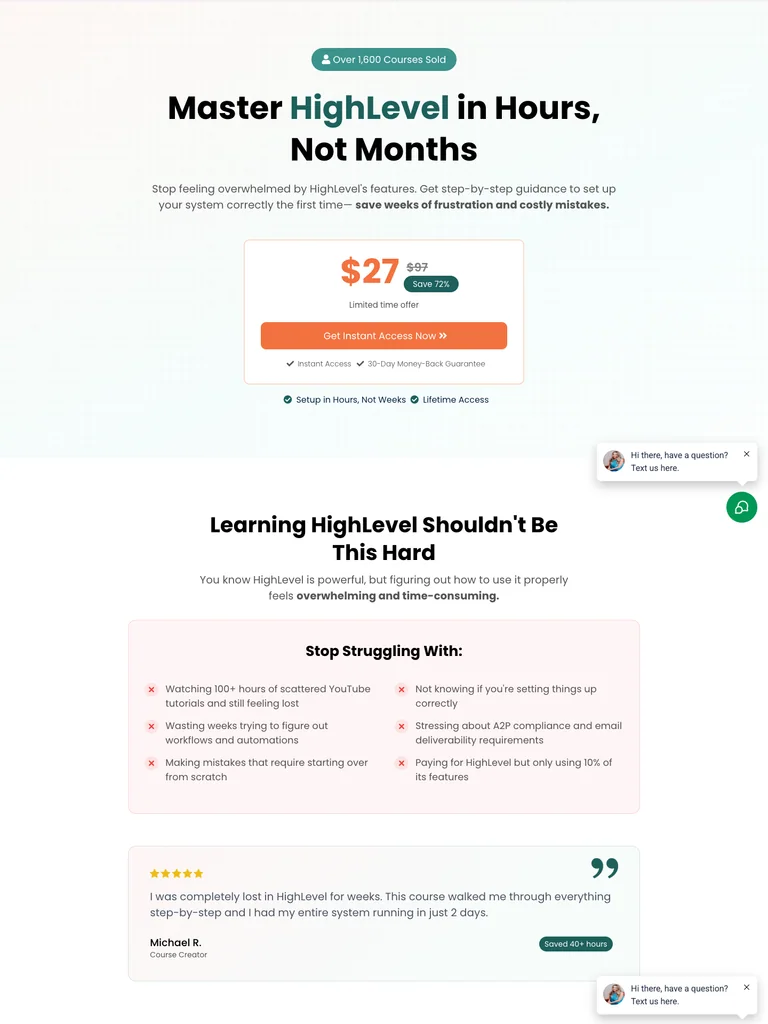
A HighLevel training funnel with an immediate price panel, a focused learning promise, and a clear curriculum sequence.
Useful for: Study the public sales page and its section order, offer presentation, and calls to action. This reference captures one page; checkout steps and conversion results are not verified.
# Design reference: Good Tree Agency — HighLevel Simplified
Source: https://goodtreeagency.com/course-ghl-2
Swipefile reference: https://swipefile.design/ref/funnel-good-tree-agency-team-highlevel-simplified-master-highlevel-in-hours-not-months/
Captured: 2026-09-07. This is a dated reference, not a claim about the current live product.


## Objective
Adapt the visual principles below to my project. Use my own content and identity. Do not reproduce logos, proprietary copy, or brand assets.

## Reference notes
- mood: Simple and instructional
- colors: White, pale mint, teal emphasis, and orange access buttons.
- typography: Bold sans-serif headlines, compact labels, and scannable benefit lists create a clear hierarchy through the long page.
- layout: Specific learning promise and price → common software-learning problems → curriculum and benefits → proof → questions and final access action.
- motion: The capture records a static page state. Preserve readable scrolling and clear action feedback; video playback, counters, and hidden form behavior are not demonstrated.
- texture: Photographic or product imagery, contrasting section backgrounds, grouped benefits, and visual proof panels.
- dont: Use your own offer, brand, and assets. Do not invent testimonials, results, scarcity, guarantees, or pricing.

Useful for: Study the public sales page and its section order, offer presentation, and calls to action. This reference captures one page; checkout steps and conversion results are not verified.

## Acceptance criteria
- Existing project conventions, design tokens, working functionality, and unrelated changes are preserved.
- Two or three reference principles clearly support the user's task; conflicts are resolved in favor of usability and the existing product.
- Reusable components and semantic HTML express the interface. Available licensed assets are used; important UI text is never rendered as a bitmap.
- Every visible control has a defined behavior. Loading, empty, error, success, disabled, and long-content states are specified where relevant. Demo data is clearly labeled.
- Navigation and content adapt at 375px, 768px, and 1440px without horizontal page overflow. Keyboard use, visible focus, labeled inputs, at least 44px touch targets, readable contrast, and reduced motion are supported.
- Verification distinguishes rendered behavior from proposals and identifies anything still requiring a backend or external service.

## Quality bar
Clear hierarchy, consistent spacing, restrained surfaces, and purposeful motion. Avoid decorative gradients, excessive cards, placeholder buttons, and invented metrics unless the project calls for them. Do not claim a feature is connected or tested without evidence.
 hover to scroll
A long options-program sales letter using personal narrative, large contrast shifts, and detailed offer explanations.
Useful for: Study the public sales page and its section order, offer presentation, and calls to action. This reference captures one page; checkout steps and conversion results are not verified.
# Design reference: Low Stress Trading — Options Program
Source: https://lowstresstrading.com/options
Swipefile reference: https://swipefile.design/ref/funnel-troy-broussard-low-stress-options/
Captured: 2026-09-07. This is a dated reference, not a claim about the current live product.


## Objective
Adapt the visual principles below to my project. Use my own content and identity. Do not reproduce logos, proprietary copy, or brand assets.

## Reference notes
- mood: Personal and story-driven
- colors: Dark navy, white, mint headings, and pink announcement accents.
- typography: Readable single-column body copy, bold section headlines, and selective inline emphasis sustain a long written pitch.
- layout: Personal promise → founder story → detailed method explanation → examples and objections → program contents → offer and closing action.
- motion: The capture records a static page state. Preserve readable scrolling and clear action feedback; video playback, counters, and hidden form behavior are not demonstrated.
- texture: Narrow reading columns, inset illustrations and examples, highlighted phrases, and repeated offer sections.
- dont: Use your own offer, brand, and assets. Do not invent testimonials, results, scarcity, guarantees, or pricing.

Useful for: Study the public sales page and its section order, offer presentation, and calls to action. This reference captures one page; checkout steps and conversion results are not verified.

## Acceptance criteria
- Existing project conventions, design tokens, working functionality, and unrelated changes are preserved.
- Two or three reference principles clearly support the user's task; conflicts are resolved in favor of usability and the existing product.
- Reusable components and semantic HTML express the interface. Available licensed assets are used; important UI text is never rendered as a bitmap.
- Every visible control has a defined behavior. Loading, empty, error, success, disabled, and long-content states are specified where relevant. Demo data is clearly labeled.
- Navigation and content adapt at 375px, 768px, and 1440px without horizontal page overflow. Keyboard use, visible focus, labeled inputs, at least 44px touch targets, readable contrast, and reduced motion are supported.
- Verification distinguishes rendered behavior from proposals and identifies anything still requiring a backend or external service.

## Quality bar
Clear hierarchy, consistent spacing, restrained surfaces, and purposeful motion. Avoid decorative gradients, excessive cards, placeholder buttons, and invented metrics unless the project calls for them. Do not claim a feature is connected or tested without evidence.
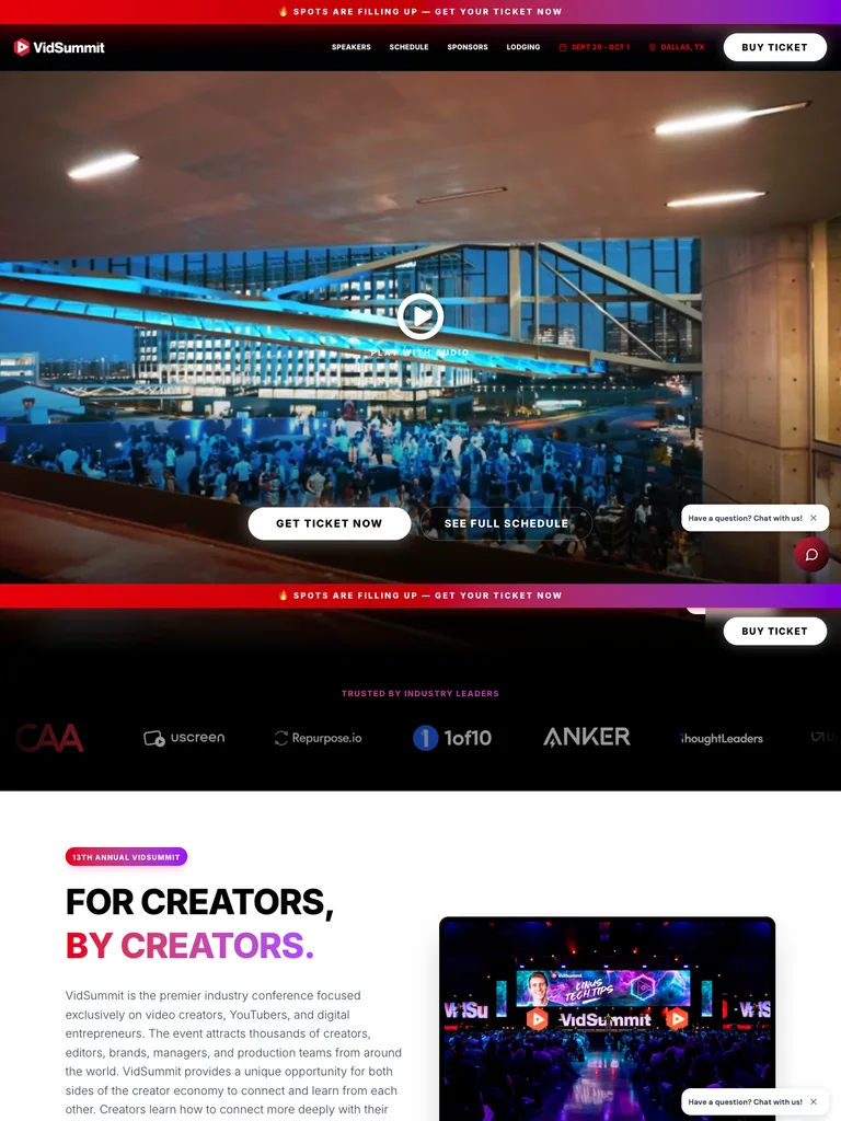 hover to scroll
A creator-event landing page with a large opening visual, speaker and session sections, and repeated ticket calls to action.
Useful for: Study the public sales page and its section order, offer presentation, and calls to action. This reference captures one page; checkout steps and conversion results are not verified.
# Design reference: VidSummit — Creator Event
Source: https://vidsummit.com/
Swipefile reference: https://swipefile.design/ref/funnel-vidsummit-2024/
Captured: 2026-09-07. This is a dated reference, not a claim about the current live product.


## Objective
Adapt the visual principles below to my project. Use my own content and identity. Do not reproduce logos, proprietary copy, or brand assets.

## Reference notes
- mood: Cinematic and event-led
- colors: Near-black backgrounds, white type, and red-to-violet accents.
- typography: Bold sans-serif headlines, compact labels, and scannable benefit lists create a clear hierarchy through the long page.
- layout: Event hero → event benefits → speakers and sessions → attendee proof → ticket options → questions and closing ticket action.
- motion: The capture records a static page state. Preserve readable scrolling and clear action feedback; video playback, counters, and hidden form behavior are not demonstrated.
- texture: Photographic or product imagery, contrasting section backgrounds, grouped benefits, and visual proof panels.
- dont: Use your own offer, brand, and assets. Do not invent testimonials, results, scarcity, guarantees, or pricing.

Useful for: Study the public sales page and its section order, offer presentation, and calls to action. This reference captures one page; checkout steps and conversion results are not verified.

## Acceptance criteria
- Existing project conventions, design tokens, working functionality, and unrelated changes are preserved.
- Two or three reference principles clearly support the user's task; conflicts are resolved in favor of usability and the existing product.
- Reusable components and semantic HTML express the interface. Available licensed assets are used; important UI text is never rendered as a bitmap.
- Every visible control has a defined behavior. Loading, empty, error, success, disabled, and long-content states are specified where relevant. Demo data is clearly labeled.
- Navigation and content adapt at 375px, 768px, and 1440px without horizontal page overflow. Keyboard use, visible focus, labeled inputs, at least 44px touch targets, readable contrast, and reduced motion are supported.
- Verification distinguishes rendered behavior from proposals and identifies anything still requiring a backend or external service.

## Quality bar
Clear hierarchy, consistent spacing, restrained surfaces, and purposeful motion. Avoid decorative gradients, excessive cards, placeholder buttons, and invented metrics unless the project calls for them. Do not claim a feature is connected or tested without evidence.
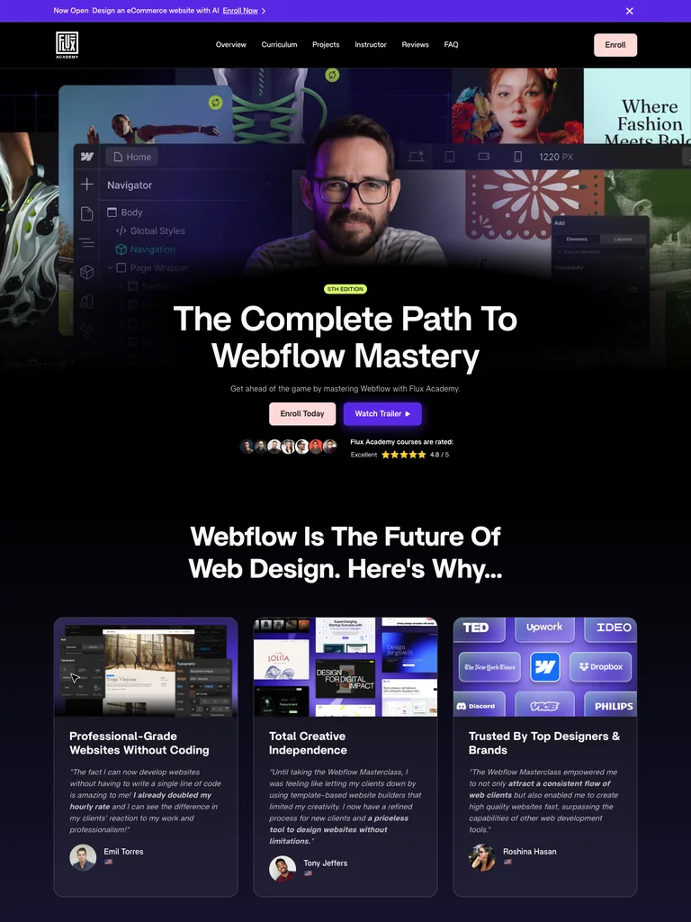 hover to scroll
A detailed course funnel combining an instructor-led hero, project examples, curriculum, and community benefits.
Useful for: Study the public sales page and its section order, offer presentation, and calls to action. This reference captures one page; checkout steps and conversion results are not verified.
# Design reference: Flux Academy — Webflow Masterclass
Source: https://flux-academy.com/courses/the-webflow-masterclass
Swipefile reference: https://swipefile.design/ref/funnel-ran-segall-webflow-masterclass-5-1-pro/
Captured: 2026-09-07. This is a dated reference, not a claim about the current live product.


## Objective
Adapt the visual principles below to my project. Use my own content and identity. Do not reproduce logos, proprietary copy, or brand assets.

## Reference notes
- mood: Cinematic and structured
- colors: Deep navy, violet, white, and soft pink enrollment buttons.
- typography: Bold sans-serif headlines, compact labels, and scannable benefit lists create a clear hierarchy through the long page.
- layout: Instructor and project montage → course overview → curriculum and student work → community and opportunities → enrollment offer → questions and footer.
- motion: The capture records a static page state. Preserve readable scrolling and clear action feedback; video playback, counters, and hidden form behavior are not demonstrated.
- texture: Photographic or product imagery, contrasting section backgrounds, grouped benefits, and visual proof panels.
- dont: Use your own offer, brand, and assets. Do not invent testimonials, results, scarcity, guarantees, or pricing.

Useful for: Study the public sales page and its section order, offer presentation, and calls to action. This reference captures one page; checkout steps and conversion results are not verified.

## Acceptance criteria
- Existing project conventions, design tokens, working functionality, and unrelated changes are preserved.
- Two or three reference principles clearly support the user's task; conflicts are resolved in favor of usability and the existing product.
- Reusable components and semantic HTML express the interface. Available licensed assets are used; important UI text is never rendered as a bitmap.
- Every visible control has a defined behavior. Loading, empty, error, success, disabled, and long-content states are specified where relevant. Demo data is clearly labeled.
- Navigation and content adapt at 375px, 768px, and 1440px without horizontal page overflow. Keyboard use, visible focus, labeled inputs, at least 44px touch targets, readable contrast, and reduced motion are supported.
- Verification distinguishes rendered behavior from proposals and identifies anything still requiring a backend or external service.

## Quality bar
Clear hierarchy, consistent spacing, restrained surfaces, and purposeful motion. Avoid decorative gradients, excessive cards, placeholder buttons, and invented metrics unless the project calls for them. Do not claim a feature is connected or tested without evidence.
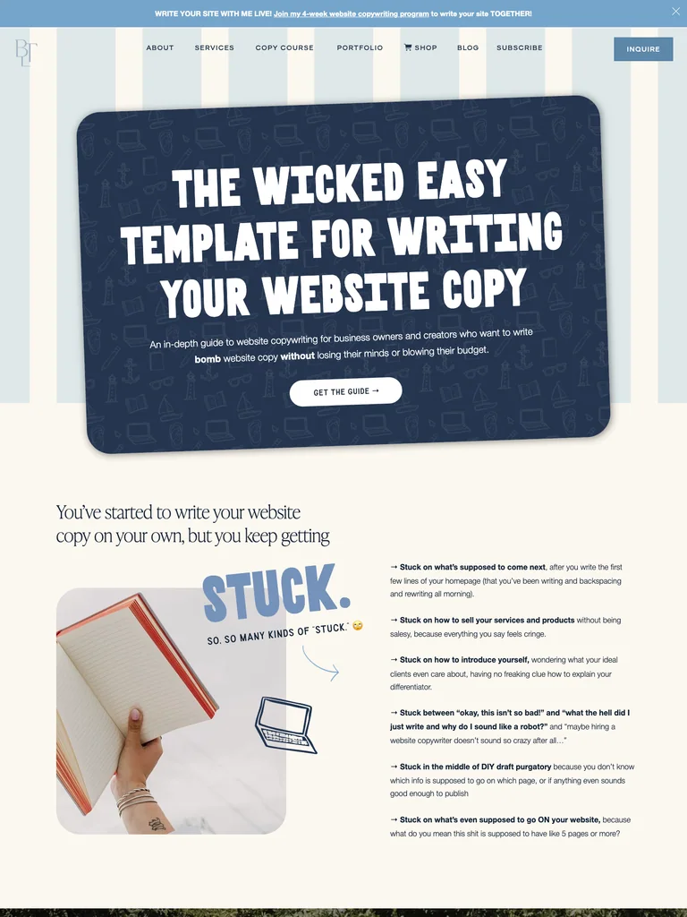 hover to scroll
A website-copy guide offer with conversational headings, product previews, and a long sequence of reader objections and benefits.
Useful for: Study the public sales page and its section order, offer presentation, and calls to action. This reference captures one page; checkout steps and conversion results are not verified.
# Design reference: Sara Noel — Wicked Easy Web Copy Guide
Source: https://betweenthelinescopy.com/web-copy-guide
Swipefile reference: https://swipefile.design/ref/funnel-sara-noel-wicked-easy-web-copy-guide/
Captured: 2026-09-07. This is a dated reference, not a claim about the current live product.


## Objective
Adapt the visual principles below to my project. Use my own content and identity. Do not reproduce logos, proprietary copy, or brand assets.

## Reference notes
- mood: Playful and editorial
- colors: Cream, navy, muted sky blue, and white display lettering.
- typography: Bold sans-serif headlines, compact labels, and scannable benefit lists create a clear hierarchy through the long page.
- layout: Large copywriting promise → reader frustrations → guide previews and benefits → instructor context → customer proof → offer and closing questions.
- motion: The capture records a static page state. Preserve readable scrolling and clear action feedback; video playback, counters, and hidden form behavior are not demonstrated.
- texture: Photographic or product imagery, contrasting section backgrounds, grouped benefits, and visual proof panels.
- dont: Use your own offer, brand, and assets. Do not invent testimonials, results, scarcity, guarantees, or pricing.

Useful for: Study the public sales page and its section order, offer presentation, and calls to action. This reference captures one page; checkout steps and conversion results are not verified.

## Acceptance criteria
- Existing project conventions, design tokens, working functionality, and unrelated changes are preserved.
- Two or three reference principles clearly support the user's task; conflicts are resolved in favor of usability and the existing product.
- Reusable components and semantic HTML express the interface. Available licensed assets are used; important UI text is never rendered as a bitmap.
- Every visible control has a defined behavior. Loading, empty, error, success, disabled, and long-content states are specified where relevant. Demo data is clearly labeled.
- Navigation and content adapt at 375px, 768px, and 1440px without horizontal page overflow. Keyboard use, visible focus, labeled inputs, at least 44px touch targets, readable contrast, and reduced motion are supported.
- Verification distinguishes rendered behavior from proposals and identifies anything still requiring a backend or external service.

## Quality bar
Clear hierarchy, consistent spacing, restrained surfaces, and purposeful motion. Avoid decorative gradients, excessive cards, placeholder buttons, and invented metrics unless the project calls for them. Do not claim a feature is connected or tested without evidence.
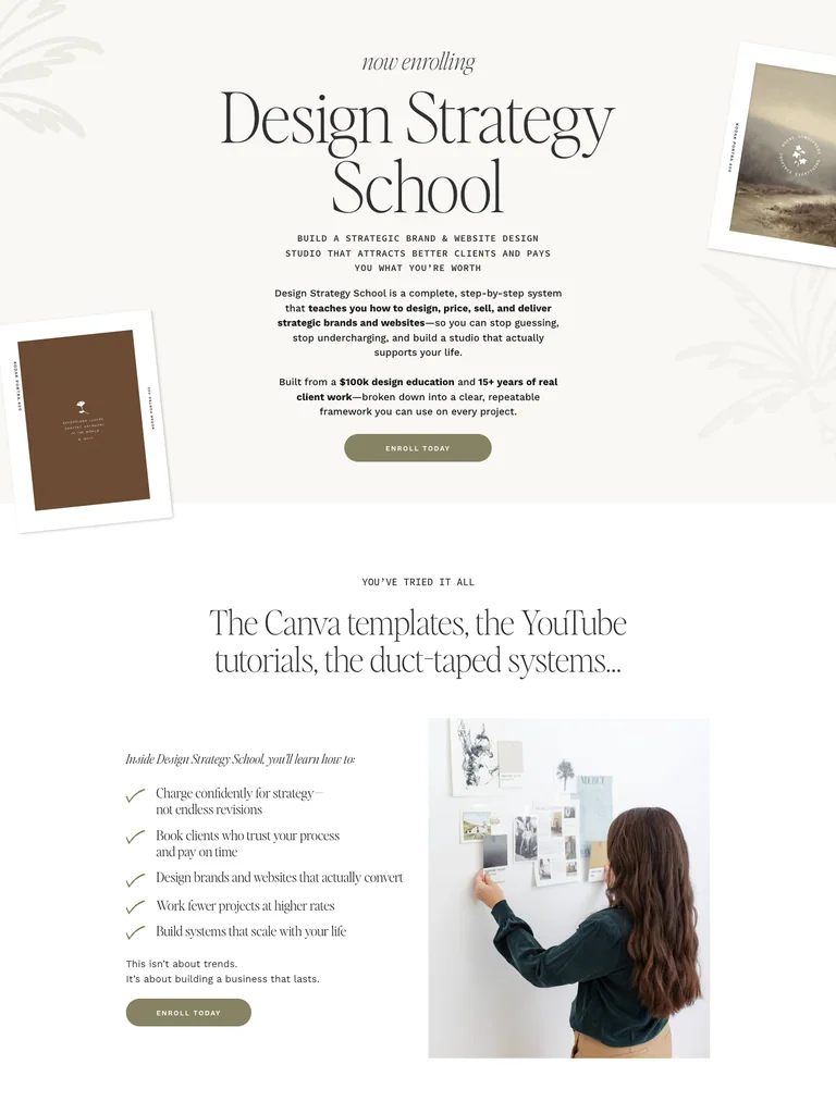 hover to scroll
An editorial design-business course page with large photography, a detailed teaching framework, and student proof.
Useful for: Study the public sales page and its section order, offer presentation, and calls to action. This reference captures one page; checkout steps and conversion results are not verified.
# Design reference: Davey & Krista — Design Strategy School
Source: https://daveyandkrista.com/design-school
Swipefile reference: https://swipefile.design/ref/funnel-davey-and-krista-design-strategy-school/
Captured: 2026-09-07. This is a dated reference, not a claim about the current live product.


## Objective
Adapt the visual principles below to my project. Use my own content and identity. Do not reproduce logos, proprietary copy, or brand assets.

## Reference notes
- mood: Warm and editorial
- colors: Soft ivory, olive-gray buttons, black serif type, and warm neutral photography.
- typography: Expressive serif display headings mixed with clean supporting text; large typographic shifts separate the offer story from the details.
- layout: Editorial course promise → designer problems and possibilities → teaching framework → curriculum and resources → instructor and student proof → enrollment details.
- motion: The capture records a static page state. Preserve readable scrolling and clear action feedback; video playback, counters, and hidden form behavior are not demonstrated.
- texture: Photographic or product imagery, contrasting section backgrounds, grouped benefits, and visual proof panels.
- dont: Use your own offer, brand, and assets. Do not invent testimonials, results, scarcity, guarantees, or pricing.

Useful for: Study the public sales page and its section order, offer presentation, and calls to action. This reference captures one page; checkout steps and conversion results are not verified.

## Acceptance criteria
- Existing project conventions, design tokens, working functionality, and unrelated changes are preserved.
- Two or three reference principles clearly support the user's task; conflicts are resolved in favor of usability and the existing product.
- Reusable components and semantic HTML express the interface. Available licensed assets are used; important UI text is never rendered as a bitmap.
- Every visible control has a defined behavior. Loading, empty, error, success, disabled, and long-content states are specified where relevant. Demo data is clearly labeled.
- Navigation and content adapt at 375px, 768px, and 1440px without horizontal page overflow. Keyboard use, visible focus, labeled inputs, at least 44px touch targets, readable contrast, and reduced motion are supported.
- Verification distinguishes rendered behavior from proposals and identifies anything still requiring a backend or external service.

## Quality bar
Clear hierarchy, consistent spacing, restrained surfaces, and purposeful motion. Avoid decorative gradients, excessive cards, placeholder buttons, and invented metrics unless the project calls for them. Do not claim a feature is connected or tested without evidence.
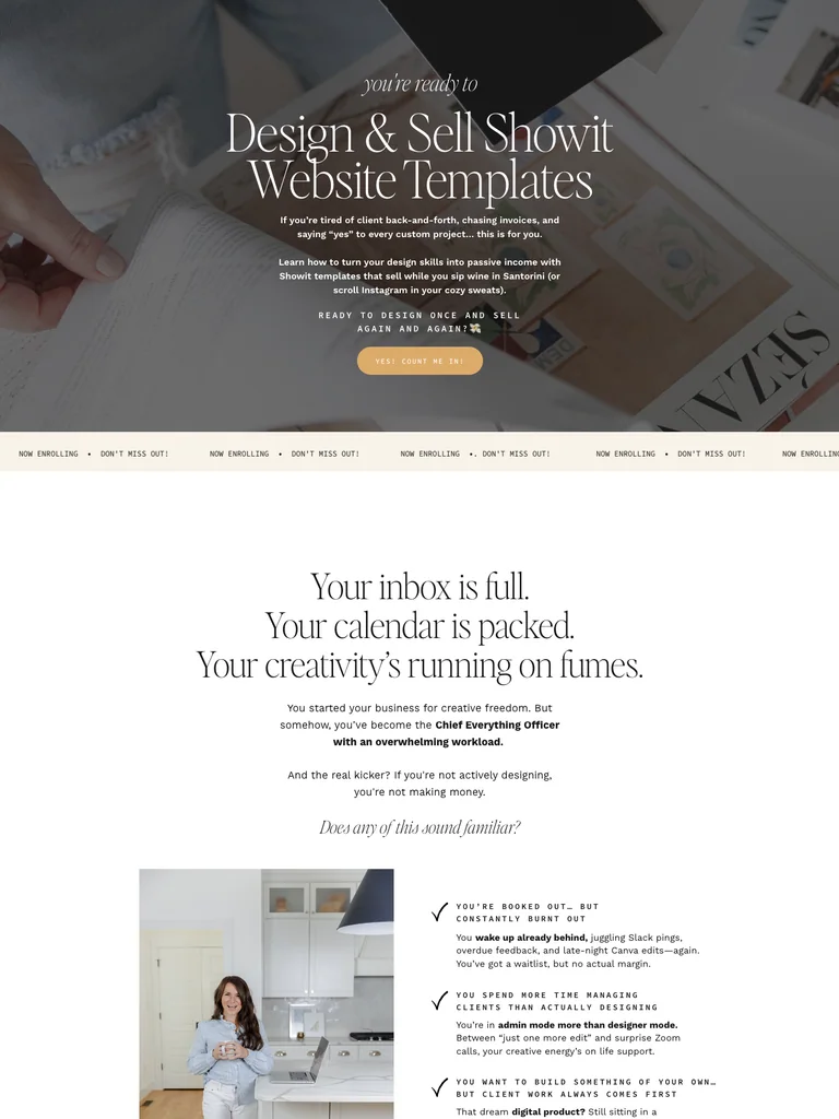 hover to scroll
A template-business course funnel with a long visual narrative, example website designs, curriculum, and enrollment sections.
Useful for: Study the public sales page and its section order, offer presentation, and calls to action. This reference captures one page; checkout steps and conversion results are not verified.
# Design reference: Davey & Krista — Design & Sell Showit Templates
Source: https://selltemplates.daveyandkrista.com/
Swipefile reference: https://swipefile.design/ref/funnel-davey-and-krista-design-sell-showit-website-templates/
Captured: 2026-09-07. This is a dated reference, not a claim about the current live product.


## Objective
Adapt the visual principles below to my project. Use my own content and identity. Do not reproduce logos, proprietary copy, or brand assets.

## Reference notes
- mood: Elegant and instructional
- colors: White, warm cream, olive-gray bands, gold buttons, and dark serif type.
- typography: Expressive serif display headings mixed with clean supporting text; large typographic shifts separate the offer story from the details.
- layout: Template-business promise → example designs → course approach → lesson and resource breakdown → instructor context and student proof → offer and questions.
- motion: The capture records a static page state. Preserve readable scrolling and clear action feedback; video playback, counters, and hidden form behavior are not demonstrated.
- texture: Photographic or product imagery, contrasting section backgrounds, grouped benefits, and visual proof panels.
- dont: Use your own offer, brand, and assets. Do not invent testimonials, results, scarcity, guarantees, or pricing.

Useful for: Study the public sales page and its section order, offer presentation, and calls to action. This reference captures one page; checkout steps and conversion results are not verified.

## Acceptance criteria
- Existing project conventions, design tokens, working functionality, and unrelated changes are preserved.
- Two or three reference principles clearly support the user's task; conflicts are resolved in favor of usability and the existing product.
- Reusable components and semantic HTML express the interface. Available licensed assets are used; important UI text is never rendered as a bitmap.
- Every visible control has a defined behavior. Loading, empty, error, success, disabled, and long-content states are specified where relevant. Demo data is clearly labeled.
- Navigation and content adapt at 375px, 768px, and 1440px without horizontal page overflow. Keyboard use, visible focus, labeled inputs, at least 44px touch targets, readable contrast, and reduced motion are supported.
- Verification distinguishes rendered behavior from proposals and identifies anything still requiring a backend or external service.

## Quality bar
Clear hierarchy, consistent spacing, restrained surfaces, and purposeful motion. Avoid decorative gradients, excessive cards, placeholder buttons, and invented metrics unless the project calls for them. Do not claim a feature is connected or tested without evidence.
 hover to scroll
A long editorial sales page that builds its case through charts, examples, a detailed curriculum, and a community offer.
Useful for: Study the public sales page and its section order, offer presentation, and calls to action. This reference captures one page; checkout steps and conversion results are not verified.
# Design reference: Grow and Convert — Course & Community
Source: https://growandconvert.com/course-and-community-sales-page
Swipefile reference: https://swipefile.design/ref/funnel-benji-hyam-grow-convert-course/
Captured: 2026-09-07. This is a dated reference, not a claim about the current live product.


## Objective
Adapt the visual principles below to my project. Use my own content and identity. Do not reproduce logos, proprietary copy, or brand assets.

## Reference notes
- mood: Evidence-led and editorial
- colors: Black hero, white reading surfaces, dark body type, and restrained blue links.
- typography: Readable single-column body copy, bold section headlines, and selective inline emphasis sustain a long written pitch.
- layout: Content-marketing problem → founder story → charts and client examples → course method → curriculum and community → offer and questions.
- motion: The capture records a static page state. Preserve readable scrolling and clear action feedback; video playback, counters, and hidden form behavior are not demonstrated.
- texture: Narrow reading columns, inset illustrations and examples, highlighted phrases, and repeated offer sections.
- dont: Use your own offer, brand, and assets. Do not invent testimonials, results, scarcity, guarantees, or pricing.

Useful for: Study the public sales page and its section order, offer presentation, and calls to action. This reference captures one page; checkout steps and conversion results are not verified.

## Acceptance criteria
- Existing project conventions, design tokens, working functionality, and unrelated changes are preserved.
- Two or three reference principles clearly support the user's task; conflicts are resolved in favor of usability and the existing product.
- Reusable components and semantic HTML express the interface. Available licensed assets are used; important UI text is never rendered as a bitmap.
- Every visible control has a defined behavior. Loading, empty, error, success, disabled, and long-content states are specified where relevant. Demo data is clearly labeled.
- Navigation and content adapt at 375px, 768px, and 1440px without horizontal page overflow. Keyboard use, visible focus, labeled inputs, at least 44px touch targets, readable contrast, and reduced motion are supported.
- Verification distinguishes rendered behavior from proposals and identifies anything still requiring a backend or external service.

## Quality bar
Clear hierarchy, consistent spacing, restrained surfaces, and purposeful motion. Avoid decorative gradients, excessive cards, placeholder buttons, and invented metrics unless the project calls for them. Do not claim a feature is connected or tested without evidence.
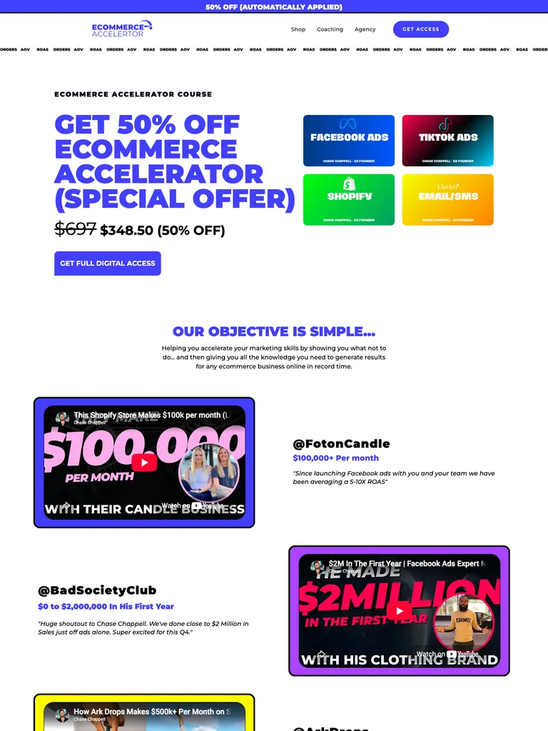 hover to scroll
An ecommerce-course funnel organized around student videos, marketing topics, a broad curriculum, and a closing offer.
Useful for: Study the public sales page and its section order, offer presentation, and calls to action. This reference captures one page; checkout steps and conversion results are not verified.
# Design reference: Chase Chappell — Ecommerce Accelerator
Source: https://chasechappell.com/ecommerce-accelerator-course
Swipefile reference: https://swipefile.design/ref/funnel-chase-chappell-ecommerce-accelerator-course/
Captured: 2026-09-07. This is a dated reference, not a claim about the current live product.


## Objective
Adapt the visual principles below to my project. Use my own content and identity. Do not reproduce logos, proprietary copy, or brand assets.

## Reference notes
- mood: Energetic and practical
- colors: White with vivid violet headings, blue buttons, and green, cyan, and orange curriculum panels.
- typography: Bold sans-serif headlines, compact labels, and scannable benefit lists create a clear hierarchy through the long page.
- layout: Course proposition → student video examples → marketing disciplines → curriculum and bonuses → price and enrollment → FAQ.
- motion: The capture records a static page state. Preserve readable scrolling and clear action feedback; video playback, counters, and hidden form behavior are not demonstrated.
- texture: Photographic or product imagery, contrasting section backgrounds, grouped benefits, and visual proof panels.
- dont: Use your own offer, brand, and assets. Do not invent testimonials, results, scarcity, guarantees, or pricing.

Useful for: Study the public sales page and its section order, offer presentation, and calls to action. This reference captures one page; checkout steps and conversion results are not verified.

## Acceptance criteria
- Existing project conventions, design tokens, working functionality, and unrelated changes are preserved.
- Two or three reference principles clearly support the user's task; conflicts are resolved in favor of usability and the existing product.
- Reusable components and semantic HTML express the interface. Available licensed assets are used; important UI text is never rendered as a bitmap.
- Every visible control has a defined behavior. Loading, empty, error, success, disabled, and long-content states are specified where relevant. Demo data is clearly labeled.
- Navigation and content adapt at 375px, 768px, and 1440px without horizontal page overflow. Keyboard use, visible focus, labeled inputs, at least 44px touch targets, readable contrast, and reduced motion are supported.
- Verification distinguishes rendered behavior from proposals and identifies anything still requiring a backend or external service.

## Quality bar
Clear hierarchy, consistent spacing, restrained surfaces, and purposeful motion. Avoid decorative gradients, excessive cards, placeholder buttons, and invented metrics unless the project calls for them. Do not claim a feature is connected or tested without evidence.
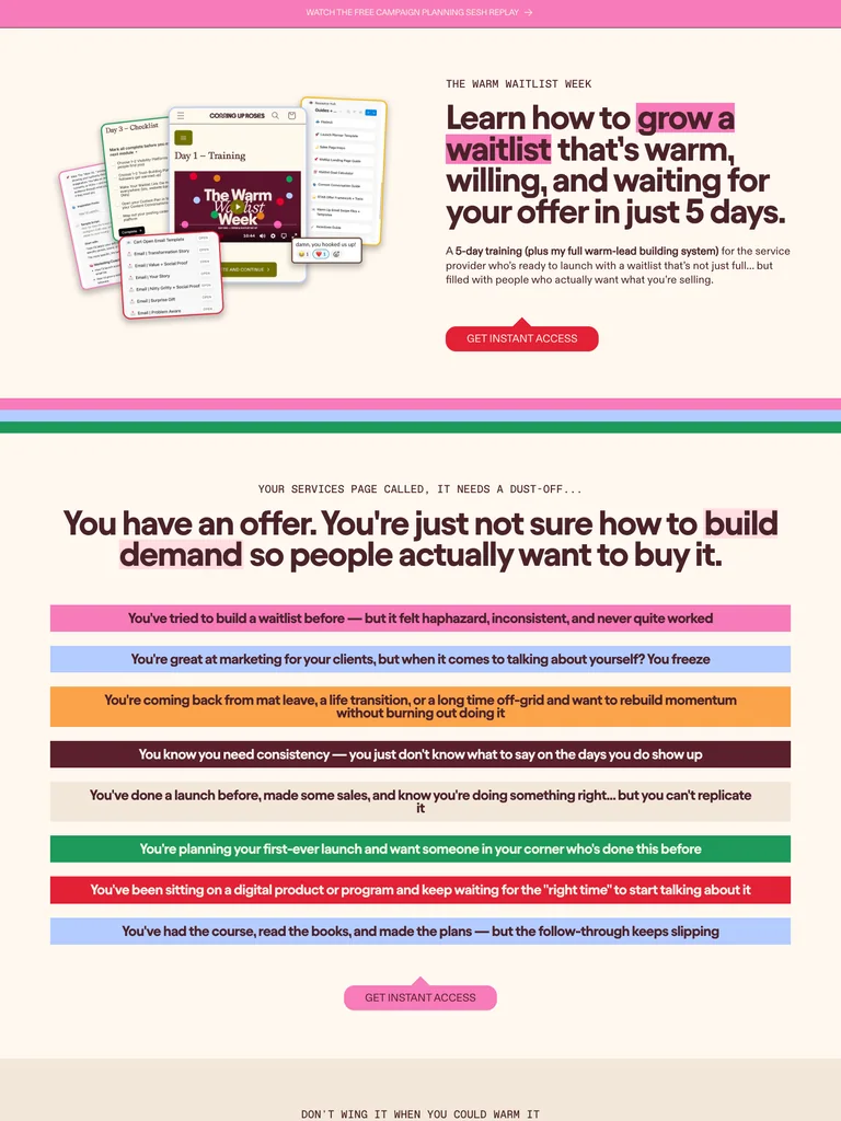 hover to scroll
A launch-training offer that explains a short learning sequence with expressive typography and clearly grouped resources.
Useful for: Study the public sales page and its section order, offer presentation, and calls to action. This reference captures one page; checkout steps and conversion results are not verified.
# Design reference: Coming Up Roses — Warm Waitlist Week
Source: https://cominguproses.co/products/www
Swipefile reference: https://swipefile.design/ref/funnel-kelsey-mccormick-the-warm-waitlist-week/
Captured: 2026-09-07. This is a dated reference, not a claim about the current live product.


## Objective
Adapt the visual principles below to my project. Use my own content and identity. Do not reproduce logos, proprietary copy, or brand assets.

## Reference notes
- mood: Expressive and approachable
- colors: Warm cream, burgundy, pink highlights, and green, blue, and orange course panels.
- typography: Bold sans-serif headlines, compact labels, and scannable benefit lists create a clear hierarchy through the long page.
- layout: Waitlist-training offer → launch problem → five-day method → included resources → instructor and proof → purchase section.
- motion: The capture records a static page state. Preserve readable scrolling and clear action feedback; video playback, counters, and hidden form behavior are not demonstrated.
- texture: Photographic or product imagery, contrasting section backgrounds, grouped benefits, and visual proof panels.
- dont: Use your own offer, brand, and assets. Do not invent testimonials, results, scarcity, guarantees, or pricing.

Useful for: Study the public sales page and its section order, offer presentation, and calls to action. This reference captures one page; checkout steps and conversion results are not verified.

## Acceptance criteria
- Existing project conventions, design tokens, working functionality, and unrelated changes are preserved.
- Two or three reference principles clearly support the user's task; conflicts are resolved in favor of usability and the existing product.
- Reusable components and semantic HTML express the interface. Available licensed assets are used; important UI text is never rendered as a bitmap.
- Every visible control has a defined behavior. Loading, empty, error, success, disabled, and long-content states are specified where relevant. Demo data is clearly labeled.
- Navigation and content adapt at 375px, 768px, and 1440px without horizontal page overflow. Keyboard use, visible focus, labeled inputs, at least 44px touch targets, readable contrast, and reduced motion are supported.
- Verification distinguishes rendered behavior from proposals and identifies anything still requiring a backend or external service.

## Quality bar
Clear hierarchy, consistent spacing, restrained surfaces, and purposeful motion. Avoid decorative gradients, excessive cards, placeholder buttons, and invented metrics unless the project calls for them. Do not claim a feature is connected or tested without evidence.
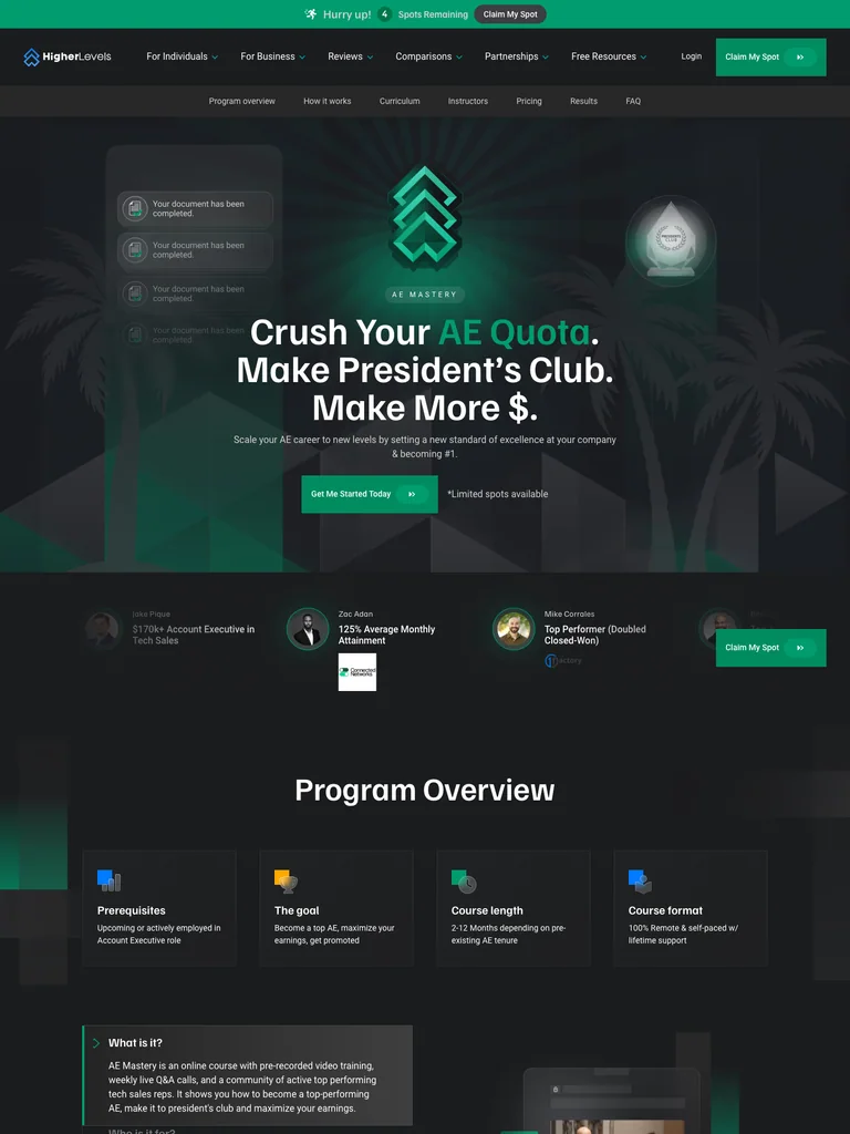 hover to scroll
A sales-training course page with a concise program overview, detailed curriculum, proof, and enrollment actions.
Useful for: Study the public sales page and its section order, offer presentation, and calls to action. This reference captures one page; checkout steps and conversion results are not verified.
# Design reference: Higher Levels — AE Mastery
Source: https://higherlevels.com/ae-mastery
Swipefile reference: https://swipefile.design/ref/funnel-higher-levels-ae-mastery/
Captured: 2026-09-07. This is a dated reference, not a claim about the current live product.


## Objective
Adapt the visual principles below to my project. Use my own content and identity. Do not reproduce logos, proprietary copy, or brand assets.

## Reference notes
- mood: Clear and professional
- colors: Charcoal backgrounds, white headings, and emerald-green accents and instructor frames.
- typography: Bold sans-serif headlines, compact labels, and scannable benefit lists create a clear hierarchy through the long page.
- layout: Career-focused promise → course overview facts → learning format → curriculum → instructor and student proof → enrollment and questions.
- motion: The capture records a static page state. Preserve readable scrolling and clear action feedback; video playback, counters, and hidden form behavior are not demonstrated.
- texture: Photographic or product imagery, contrasting section backgrounds, grouped benefits, and visual proof panels.
- dont: Use your own offer, brand, and assets. Do not invent testimonials, results, scarcity, guarantees, or pricing.

Useful for: Study the public sales page and its section order, offer presentation, and calls to action. This reference captures one page; checkout steps and conversion results are not verified.

## Acceptance criteria
- Existing project conventions, design tokens, working functionality, and unrelated changes are preserved.
- Two or three reference principles clearly support the user's task; conflicts are resolved in favor of usability and the existing product.
- Reusable components and semantic HTML express the interface. Available licensed assets are used; important UI text is never rendered as a bitmap.
- Every visible control has a defined behavior. Loading, empty, error, success, disabled, and long-content states are specified where relevant. Demo data is clearly labeled.
- Navigation and content adapt at 375px, 768px, and 1440px without horizontal page overflow. Keyboard use, visible focus, labeled inputs, at least 44px touch targets, readable contrast, and reduced motion are supported.
- Verification distinguishes rendered behavior from proposals and identifies anything still requiring a backend or external service.

## Quality bar
Clear hierarchy, consistent spacing, restrained surfaces, and purposeful motion. Avoid decorative gradients, excessive cards, placeholder buttons, and invented metrics unless the project calls for them. Do not claim a feature is connected or tested without evidence.
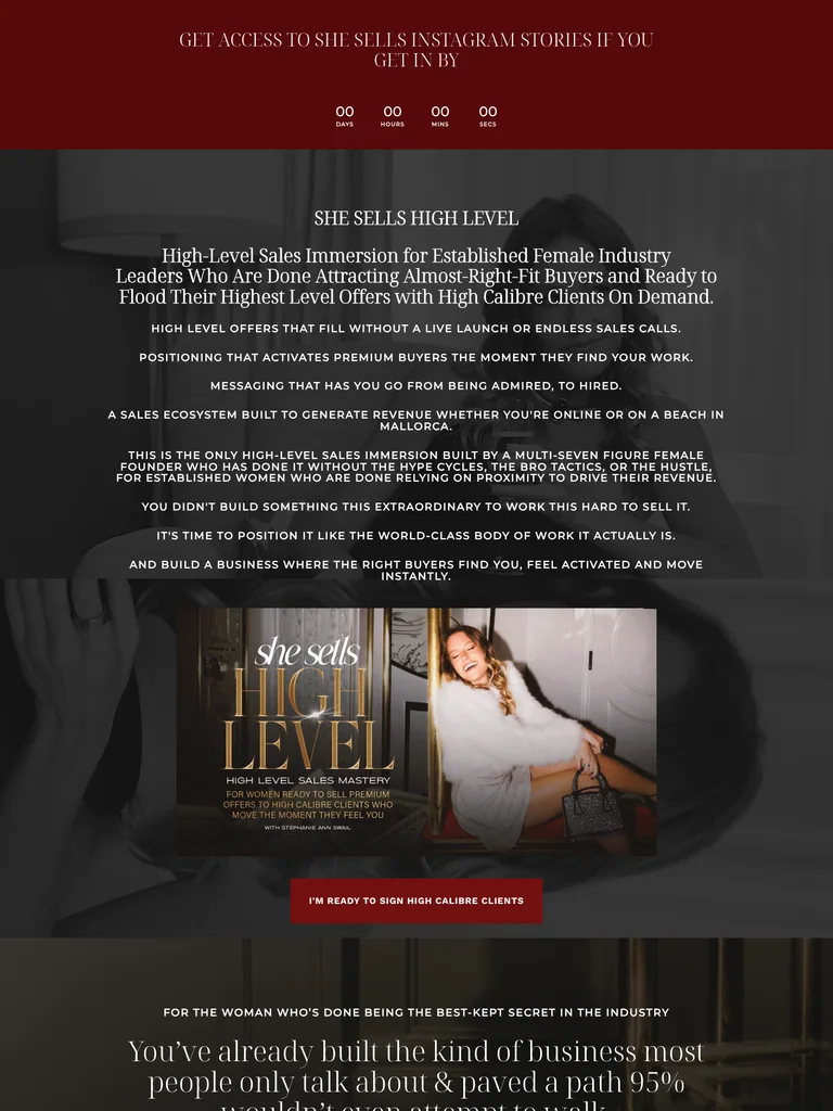 hover to scroll
A long coaching-program offer built around audience positioning, a founder story, training details, and repeated enrollment invitations.
Useful for: Study the public sales page and its section order, offer presentation, and calls to action. This reference captures one page; checkout steps and conversion results are not verified.
# Design reference: Stephanie Ann Swail — She Sells High Level
Source: https://stephanieannswail.com/shesellshighlevel
Swipefile reference: https://swipefile.design/ref/funnel-stephanie-ann-swail-she-sells-high-level/
Captured: 2026-09-07. This is a dated reference, not a claim about the current live product.


## Objective
Adapt the visual principles below to my project. Use my own content and identity. Do not reproduce logos, proprietary copy, or brand assets.

## Reference notes
- mood: Personal and editorial
- colors: Deep burgundy, black photographic overlays, white serif headings, and pale FAQ panels.
- typography: Expressive serif display headings mixed with clean supporting text; large typographic shifts separate the offer story from the details.
- layout: Program positioning → reader challenges → audience fit → founder story → training contents and bonuses → enrollment and closing details.
- motion: The capture records a static page state. Preserve readable scrolling and clear action feedback; video playback, counters, and hidden form behavior are not demonstrated.
- texture: Photographic or product imagery, contrasting section backgrounds, grouped benefits, and visual proof panels.
- dont: Use your own offer, brand, and assets. Do not invent testimonials, results, scarcity, guarantees, or pricing.

Useful for: Study the public sales page and its section order, offer presentation, and calls to action. This reference captures one page; checkout steps and conversion results are not verified.

## Acceptance criteria
- Existing project conventions, design tokens, working functionality, and unrelated changes are preserved.
- Two or three reference principles clearly support the user's task; conflicts are resolved in favor of usability and the existing product.
- Reusable components and semantic HTML express the interface. Available licensed assets are used; important UI text is never rendered as a bitmap.
- Every visible control has a defined behavior. Loading, empty, error, success, disabled, and long-content states are specified where relevant. Demo data is clearly labeled.
- Navigation and content adapt at 375px, 768px, and 1440px without horizontal page overflow. Keyboard use, visible focus, labeled inputs, at least 44px touch targets, readable contrast, and reduced motion are supported.
- Verification distinguishes rendered behavior from proposals and identifies anything still requiring a backend or external service.

## Quality bar
Clear hierarchy, consistent spacing, restrained surfaces, and purposeful motion. Avoid decorative gradients, excessive cards, placeholder buttons, and invented metrics unless the project calls for them. Do not claim a feature is connected or tested without evidence.
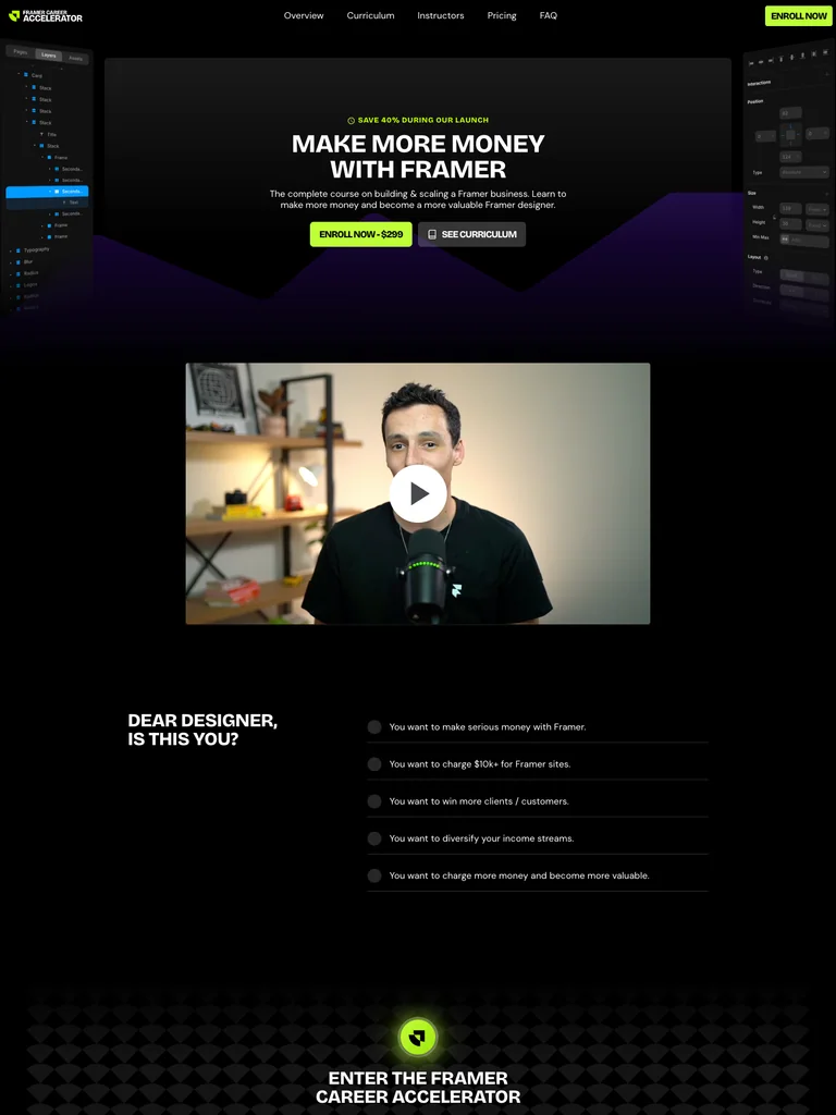 hover to scroll
A Framer business-course funnel with a dark opening, clear curriculum blocks, instructor portraits, and bright enrollment actions.
Useful for: Study the complete public offer page, its section order, and calls to action. Checkout steps, current enrollment availability, and conversion results are not verified.
# Design reference: Ryan Hayward — Framer Career Accelerator
Source: https://framercareercourse.com/
Swipefile reference: https://swipefile.design/ref/funnel-ryan-hayward-ultimate-framer-career-accelerator-course/
Captured: 2026-09-07. This is a dated reference, not a claim about the current live product.


## Objective
Adapt the visual principles below to my project. Use my own content and identity. Do not reproduce logos, proprietary copy, or brand assets.

## Reference notes
- mood: Focused and technical
- colors: Black, deep violet, white headings, and acid-green enrollment buttons.
- typography: Bold sans-serif headings, compact labels, short benefit lists, and clearly separated curriculum sections make the long offer scannable.
- layout: Business-focused promise and video → designer problems → course introduction → six skill areas → instructor portraits → enrollment and FAQ.
- motion: The screenshot records a static page state. Preserve readable scrolling and clear action feedback; do not infer video playback, counters, or hidden form behavior.
- texture: Product or instructor imagery, contrasting section backgrounds, grouped curriculum details, and customer-story panels.
- dont: Use your own offer, brand, and assets. Do not invent testimonials, results, scarcity, guarantees, or pricing.

Useful for: Study the complete public offer page, its section order, and calls to action. Checkout steps, current enrollment availability, and conversion results are not verified.

## Acceptance criteria
- Existing project conventions, design tokens, working functionality, and unrelated changes are preserved.
- Two or three reference principles clearly support the user's task; conflicts are resolved in favor of usability and the existing product.
- Reusable components and semantic HTML express the interface. Available licensed assets are used; important UI text is never rendered as a bitmap.
- Every visible control has a defined behavior. Loading, empty, error, success, disabled, and long-content states are specified where relevant. Demo data is clearly labeled.
- Navigation and content adapt at 375px, 768px, and 1440px without horizontal page overflow. Keyboard use, visible focus, labeled inputs, at least 44px touch targets, readable contrast, and reduced motion are supported.
- Verification distinguishes rendered behavior from proposals and identifies anything still requiring a backend or external service.

## Quality bar
Clear hierarchy, consistent spacing, restrained surfaces, and purposeful motion. Avoid decorative gradients, excessive cards, placeholder buttons, and invented metrics unless the project calls for them. Do not claim a feature is connected or tested without evidence.
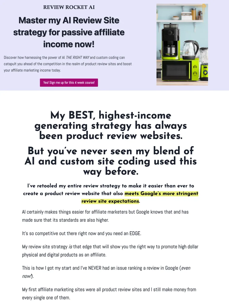 hover to scroll
A long course sales letter combining detailed written explanations, example products, and a clear breakdown of included tools and support.
Useful for: Study the complete public offer page, its section order, and calls to action. Checkout steps, current enrollment availability, and conversion results are not verified.
# Design reference: Erica Stone — Review Rocket AI
Source: https://extremereviewer.com/review-rocket-ai
Swipefile reference: https://swipefile.design/ref/funnel-erica-stone-review-rocket-ai/
Captured: 2026-09-07. This is a dated reference, not a claim about the current live product.


## Objective
Adapt the visual principles below to my project. Use my own content and identity. Do not reproduce logos, proprietary copy, or brand assets.

## Reference notes
- mood: Detailed and instructional
- colors: White, pale lavender, dark navy type, and purple offer buttons and icons.
- typography: Long readable text columns, emphatic section headings, detailed bullet lists, and selective highlights carry the sales argument.
- layout: Course promise and example product imagery → detailed review-site argument → lesson breakdown → tools and support → instructor story → offer and closing proof.
- motion: The screenshot records a static page state. Preserve readable scrolling and clear action feedback; do not infer video playback, counters, or hidden form behavior.
- texture: Extended reading sections, inset examples and portraits, selective text emphasis, and recurring offer details.
- dont: Use your own offer, brand, and assets. Do not invent testimonials, results, scarcity, guarantees, or pricing.

Useful for: Study the complete public offer page, its section order, and calls to action. Checkout steps, current enrollment availability, and conversion results are not verified.

## Acceptance criteria
- Existing project conventions, design tokens, working functionality, and unrelated changes are preserved.
- Two or three reference principles clearly support the user's task; conflicts are resolved in favor of usability and the existing product.
- Reusable components and semantic HTML express the interface. Available licensed assets are used; important UI text is never rendered as a bitmap.
- Every visible control has a defined behavior. Loading, empty, error, success, disabled, and long-content states are specified where relevant. Demo data is clearly labeled.
- Navigation and content adapt at 375px, 768px, and 1440px without horizontal page overflow. Keyboard use, visible focus, labeled inputs, at least 44px touch targets, readable contrast, and reduced motion are supported.
- Verification distinguishes rendered behavior from proposals and identifies anything still requiring a backend or external service.

## Quality bar
Clear hierarchy, consistent spacing, restrained surfaces, and purposeful motion. Avoid decorative gradients, excessive cards, placeholder buttons, and invented metrics unless the project calls for them. Do not claim a feature is connected or tested without evidence.
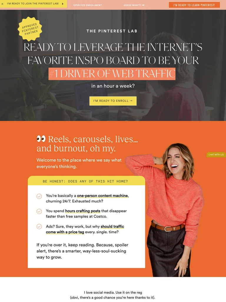 hover to scroll
A long Pinterest-course offer with expressive serif typography, warm color changes, detailed modules, and a three-option enrollment section.
Useful for: Study the complete public offer page, its section order, and calls to action. Checkout steps, current enrollment availability, and conversion results are not verified.
# Design reference: Jenna Kutcher — The Pinterest Lab
Source: https://thepinterestlab.jennakutcher.com/
Swipefile reference: https://swipefile.design/ref/funnel-jenna-kutcher-the-pinterest-lab/
Captured: 2026-09-07. This is a dated reference, not a claim about the current live product.


## Objective
Adapt the visual principles below to my project. Use my own content and identity. Do not reproduce logos, proprietary copy, or brand assets.

## Reference notes
- mood: Warm and expressive
- colors: Charcoal, vivid orange, peach, cream, and yellow enrollment accents.
- typography: Editorial serif headings, small uppercase labels, and readable supporting text. Broad type-size changes mark each stage of the offer.
- layout: Large editorial promise → audience frustrations → Pinterest teaching approach → curriculum → student stories and instructor context → three payment options.
- motion: The screenshot records a static page state. Preserve readable scrolling and clear action feedback; do not infer video playback, counters, or hidden form behavior.
- texture: Product or instructor imagery, contrasting section backgrounds, grouped curriculum details, and customer-story panels.
- dont: Use your own offer, brand, and assets. Do not invent testimonials, results, scarcity, guarantees, or pricing.

Useful for: Study the complete public offer page, its section order, and calls to action. Checkout steps, current enrollment availability, and conversion results are not verified.

## Acceptance criteria
- Existing project conventions, design tokens, working functionality, and unrelated changes are preserved.
- Two or three reference principles clearly support the user's task; conflicts are resolved in favor of usability and the existing product.
- Reusable components and semantic HTML express the interface. Available licensed assets are used; important UI text is never rendered as a bitmap.
- Every visible control has a defined behavior. Loading, empty, error, success, disabled, and long-content states are specified where relevant. Demo data is clearly labeled.
- Navigation and content adapt at 375px, 768px, and 1440px without horizontal page overflow. Keyboard use, visible focus, labeled inputs, at least 44px touch targets, readable contrast, and reduced motion are supported.
- Verification distinguishes rendered behavior from proposals and identifies anything still requiring a backend or external service.

## Quality bar
Clear hierarchy, consistent spacing, restrained surfaces, and purposeful motion. Avoid decorative gradients, excessive cards, placeholder buttons, and invented metrics unless the project calls for them. Do not claim a feature is connected or tested without evidence.
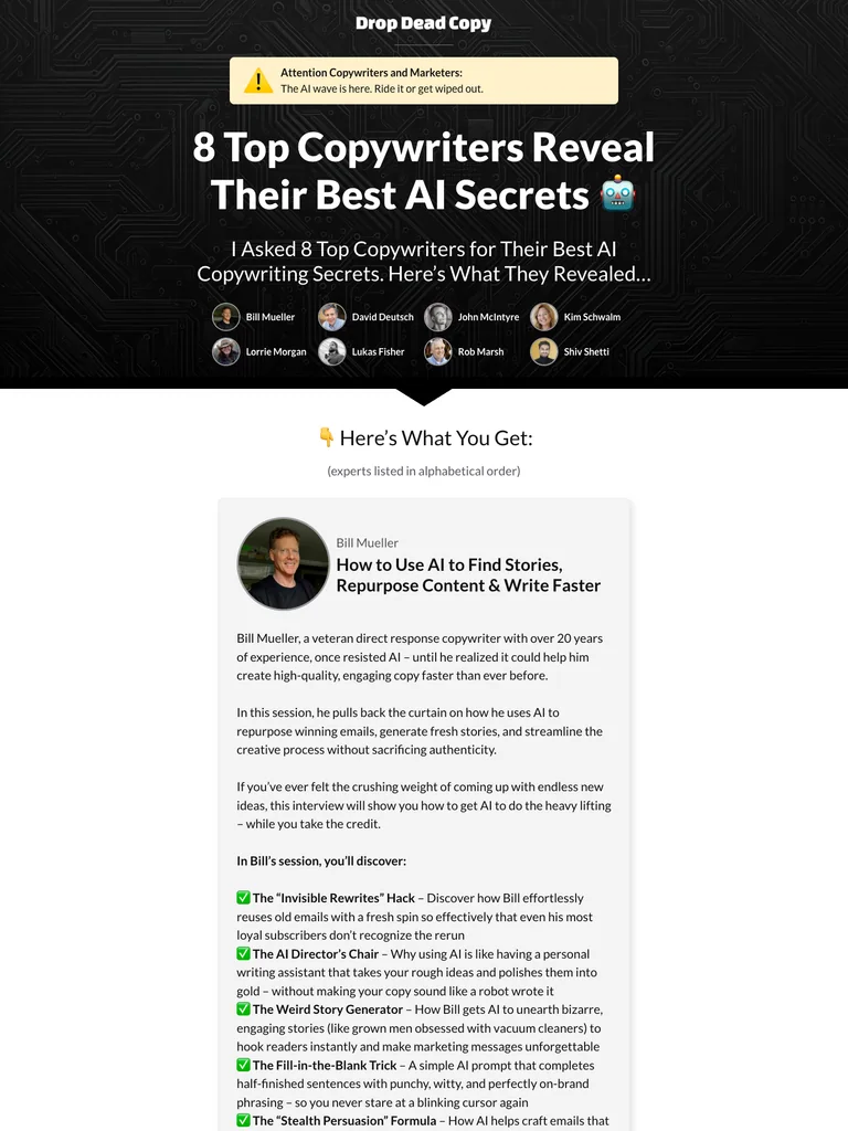 hover to scroll
An expert-interview bundle page that devotes most of its length to the contents of each session before presenting the offer.
Useful for: Study the complete public offer page, its section order, and calls to action. Checkout steps, current enrollment availability, and conversion results are not verified.
# Design reference: Drop Dead Copy — AI Copywriting Secrets
Source: https://dropdeadcopy.com/ai-march-2025
Swipefile reference: https://swipefile.design/ref/funnel-drop-dead-copy-ai-copywriting-secrets-volume-1/
Captured: 2026-09-07. This is a dated reference, not a claim about the current live product.


## Objective
Adapt the visual principles below to my project. Use my own content and identity. Do not reproduce logos, proprietary copy, or brand assets.

## Reference notes
- mood: Direct and bundle-focused
- colors: Black circuit-pattern opening, white and gray reading panels, yellow accents, and red signup buttons.
- typography: Long readable text columns, emphatic section headings, detailed bullet lists, and selective highlights carry the sales argument.
- layout: Expert bundle introduction → individual speaker portraits → detailed session descriptions → offer stack → signup invitation → FAQ.
- motion: The screenshot records a static page state. Preserve readable scrolling and clear action feedback; do not infer video playback, counters, or hidden form behavior.
- texture: Extended reading sections, inset examples and portraits, selective text emphasis, and recurring offer details.
- dont: Use your own offer, brand, and assets. Do not invent testimonials, results, scarcity, guarantees, or pricing.

Useful for: Study the complete public offer page, its section order, and calls to action. Checkout steps, current enrollment availability, and conversion results are not verified.

## Acceptance criteria
- Existing project conventions, design tokens, working functionality, and unrelated changes are preserved.
- Two or three reference principles clearly support the user's task; conflicts are resolved in favor of usability and the existing product.
- Reusable components and semantic HTML express the interface. Available licensed assets are used; important UI text is never rendered as a bitmap.
- Every visible control has a defined behavior. Loading, empty, error, success, disabled, and long-content states are specified where relevant. Demo data is clearly labeled.
- Navigation and content adapt at 375px, 768px, and 1440px without horizontal page overflow. Keyboard use, visible focus, labeled inputs, at least 44px touch targets, readable contrast, and reduced motion are supported.
- Verification distinguishes rendered behavior from proposals and identifies anything still requiring a backend or external service.

## Quality bar
Clear hierarchy, consistent spacing, restrained surfaces, and purposeful motion. Avoid decorative gradients, excessive cards, placeholder buttons, and invented metrics unless the project calls for them. Do not claim a feature is connected or tested without evidence.
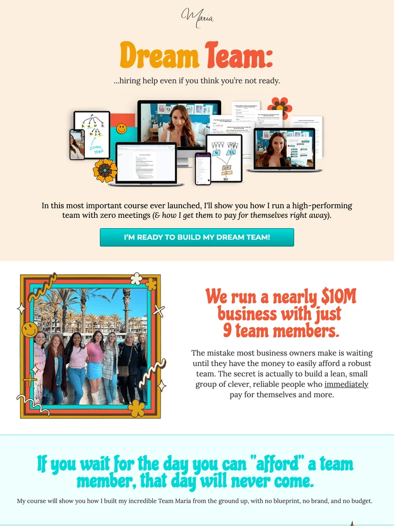 hover to scroll
A hiring-course funnel with retro lettering, product mockups, colorful checklists, and a personal team-video close.
Useful for: Study the complete public offer page, its section order, and calls to action. Checkout steps, current enrollment availability, and conversion results are not verified.
# Design reference: Maria Wendt — Dream Team
Source: https://mariawendt.com/dream-team
Swipefile reference: https://swipefile.design/ref/funnel-maria-wendt-dream-team/
Captured: 2026-09-07. This is a dated reference, not a claim about the current live product.


## Objective
Adapt the visual principles below to my project. Use my own content and identity. Do not reproduce logos, proprietary copy, or brand assets.

## Reference notes
- mood: Playful and personal
- colors: Warm cream, orange display lettering, pale turquoise panels, and teal buttons.
- typography: Bold sans-serif headings, compact labels, short benefit lists, and clearly separated curriculum sections make the long offer scannable.
- layout: Product bundle hero → hiring objections and benefits → course contents → audience-fit checklist → enrollment → team video and final CTA.
- motion: The screenshot records a static page state. Preserve readable scrolling and clear action feedback; do not infer video playback, counters, or hidden form behavior.
- texture: Product or instructor imagery, contrasting section backgrounds, grouped curriculum details, and customer-story panels.
- dont: Use your own offer, brand, and assets. Do not invent testimonials, results, scarcity, guarantees, or pricing.

Useful for: Study the complete public offer page, its section order, and calls to action. Checkout steps, current enrollment availability, and conversion results are not verified.

## Acceptance criteria
- Existing project conventions, design tokens, working functionality, and unrelated changes are preserved.
- Two or three reference principles clearly support the user's task; conflicts are resolved in favor of usability and the existing product.
- Reusable components and semantic HTML express the interface. Available licensed assets are used; important UI text is never rendered as a bitmap.
- Every visible control has a defined behavior. Loading, empty, error, success, disabled, and long-content states are specified where relevant. Demo data is clearly labeled.
- Navigation and content adapt at 375px, 768px, and 1440px without horizontal page overflow. Keyboard use, visible focus, labeled inputs, at least 44px touch targets, readable contrast, and reduced motion are supported.
- Verification distinguishes rendered behavior from proposals and identifies anything still requiring a backend or external service.

## Quality bar
Clear hierarchy, consistent spacing, restrained surfaces, and purposeful motion. Avoid decorative gradients, excessive cards, placeholder buttons, and invented metrics unless the project calls for them. Do not claim a feature is connected or tested without evidence.
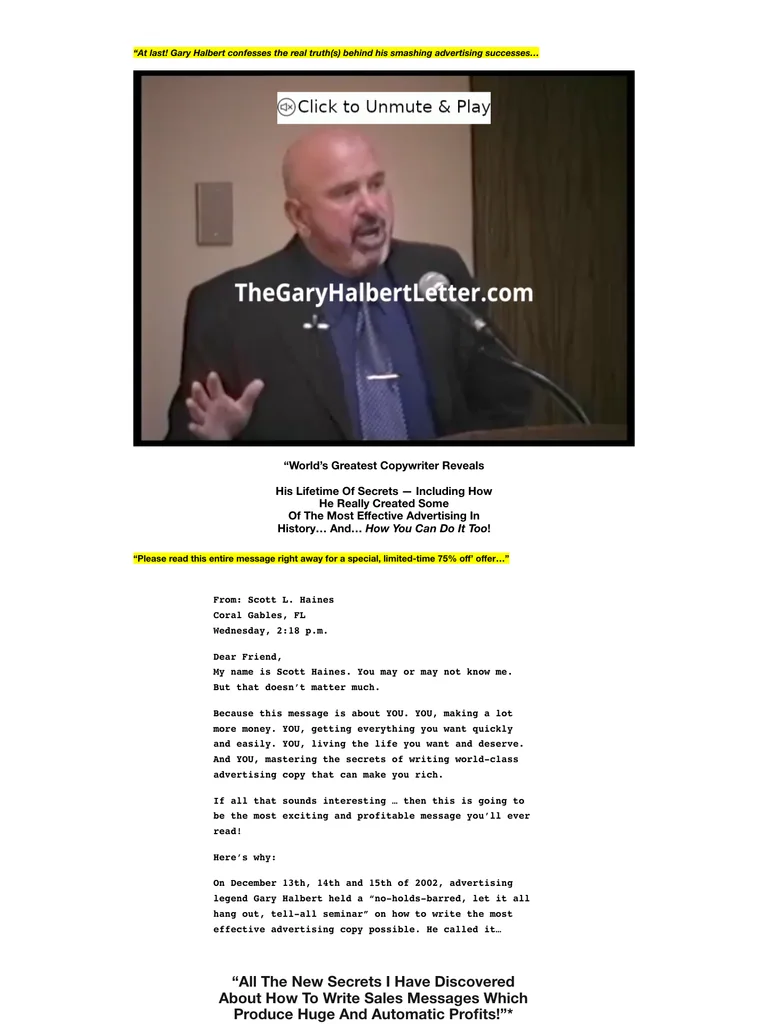 hover to scroll
A traditional seminar sales letter with a narrow reading column, video opening, long bullet lists, and bright yellow offer graphics.
Useful for: Study the complete public offer page, its section order, and calls to action. Checkout steps, current enrollment availability, and conversion results are not verified.
# Design reference: Gary Halbert — Last Seminar
Source: https://thegaryhalbertletter.com/gary-halberts-last-seminar
Swipefile reference: https://swipefile.design/ref/funnel-gary-halbert-last-seminar/
Captured: 2026-09-07. This is a dated reference, not a claim about the current live product.


## Objective
Adapt the visual principles below to my project. Use my own content and identity. Do not reproduce logos, proprietary copy, or brand assets.

## Reference notes
- mood: Classic direct response
- colors: White, black text, yellow emphasis, and hand-marked offer graphics.
- typography: Long readable text columns, emphatic section headings, detailed bullet lists, and selective highlights carry the sales argument.
- layout: Seminar video → extended copywriting argument → lesson and expert details → value explanation → written objections → final access action.
- motion: The screenshot records a static page state. Preserve readable scrolling and clear action feedback; do not infer video playback, counters, or hidden form behavior.
- texture: Extended reading sections, inset examples and portraits, selective text emphasis, and recurring offer details.
- dont: Use your own offer, brand, and assets. Do not invent testimonials, results, scarcity, guarantees, or pricing.

Useful for: Study the complete public offer page, its section order, and calls to action. Checkout steps, current enrollment availability, and conversion results are not verified.

## Acceptance criteria
- Existing project conventions, design tokens, working functionality, and unrelated changes are preserved.
- Two or three reference principles clearly support the user's task; conflicts are resolved in favor of usability and the existing product.
- Reusable components and semantic HTML express the interface. Available licensed assets are used; important UI text is never rendered as a bitmap.
- Every visible control has a defined behavior. Loading, empty, error, success, disabled, and long-content states are specified where relevant. Demo data is clearly labeled.
- Navigation and content adapt at 375px, 768px, and 1440px without horizontal page overflow. Keyboard use, visible focus, labeled inputs, at least 44px touch targets, readable contrast, and reduced motion are supported.
- Verification distinguishes rendered behavior from proposals and identifies anything still requiring a backend or external service.

## Quality bar
Clear hierarchy, consistent spacing, restrained surfaces, and purposeful motion. Avoid decorative gradients, excessive cards, placeholder buttons, and invented metrics unless the project calls for them. Do not claim a feature is connected or tested without evidence.
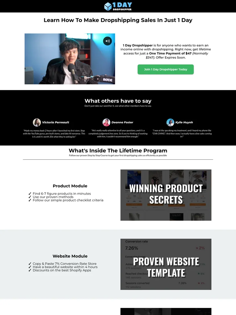 hover to scroll
A compact video-led course funnel that alternates black proof sections with a white curriculum and offer explanation.
Useful for: Study the complete public offer page, its section order, and calls to action. Checkout steps, current enrollment availability, and conversion results are not verified.
# Design reference: Kevin Dang — 1 Day Dropshipper
Source: https://smarternomad.com/1daydropshipper
Swipefile reference: https://swipefile.design/ref/funnel-kevin-dang-1-day-dropshipper/
Captured: 2026-09-07. This is a dated reference, not a claim about the current live product.


## Objective
Adapt the visual principles below to my project. Use my own content and identity. Do not reproduce logos, proprietary copy, or brand assets.

## Reference notes
- mood: Simple and practical
- colors: Black and white sections with green enrollment buttons and small gold guarantee details.
- typography: Bold sans-serif headings, compact labels, short benefit lists, and clearly separated curriculum sections make the long offer scannable.
- layout: Video and one-time offer → student proof → curriculum modules → resource previews → member video → mentorship bonus → closing guarantee and CTA.
- motion: The screenshot records a static page state. Preserve readable scrolling and clear action feedback; do not infer video playback, counters, or hidden form behavior.
- texture: Product or instructor imagery, contrasting section backgrounds, grouped curriculum details, and customer-story panels.
- dont: Use your own offer, brand, and assets. Do not invent testimonials, results, scarcity, guarantees, or pricing.

Useful for: Study the complete public offer page, its section order, and calls to action. Checkout steps, current enrollment availability, and conversion results are not verified.

## Acceptance criteria
- Existing project conventions, design tokens, working functionality, and unrelated changes are preserved.
- Two or three reference principles clearly support the user's task; conflicts are resolved in favor of usability and the existing product.
- Reusable components and semantic HTML express the interface. Available licensed assets are used; important UI text is never rendered as a bitmap.
- Every visible control has a defined behavior. Loading, empty, error, success, disabled, and long-content states are specified where relevant. Demo data is clearly labeled.
- Navigation and content adapt at 375px, 768px, and 1440px without horizontal page overflow. Keyboard use, visible focus, labeled inputs, at least 44px touch targets, readable contrast, and reduced motion are supported.
- Verification distinguishes rendered behavior from proposals and identifies anything still requiring a backend or external service.

## Quality bar
Clear hierarchy, consistent spacing, restrained surfaces, and purposeful motion. Avoid decorative gradients, excessive cards, placeholder buttons, and invented metrics unless the project calls for them. Do not claim a feature is connected or tested without evidence.
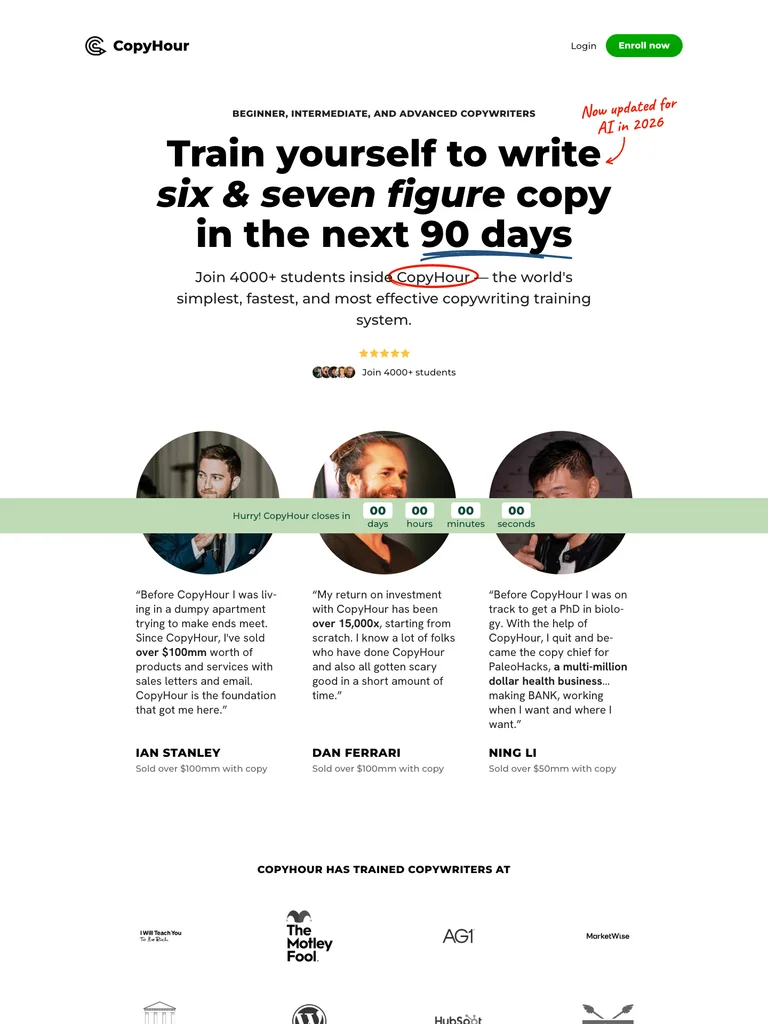 hover to scroll
A copywriting-course page with a clear daily-practice explanation, five curriculum modules, handwritten accents, and student proof.
Useful for: Study the complete public offer page, its section order, and calls to action. Checkout steps, current enrollment availability, and conversion results are not verified.
# Design reference: CopyHour — Copywriting Course
Source: https://copyhour.com/
Swipefile reference: https://swipefile.design/ref/funnel-derek-johanson-copyhour/
Captured: 2026-09-07. This is a dated reference, not a claim about the current live product.


## Objective
Adapt the visual principles below to my project. Use my own content and identity. Do not reproduce logos, proprietary copy, or brand assets.

## Reference notes
- mood: Confident and readable
- colors: White, black, green enrollment buttons, pale green panels, and small red handwritten annotations.
- typography: Bold sans-serif headings, compact labels, short benefit lists, and clearly separated curriculum sections make the long offer scannable.
- layout: Large course promise → brand and student proof → reader problem → daily practice method → five curriculum modules → offer → instructor story and close.
- motion: The screenshot records a static page state. Preserve readable scrolling and clear action feedback; do not infer video playback, counters, or hidden form behavior.
- texture: Product or instructor imagery, contrasting section backgrounds, grouped curriculum details, and customer-story panels.
- dont: Use your own offer, brand, and assets. Do not invent testimonials, results, scarcity, guarantees, or pricing.

Useful for: Study the complete public offer page, its section order, and calls to action. Checkout steps, current enrollment availability, and conversion results are not verified.

## Acceptance criteria
- Existing project conventions, design tokens, working functionality, and unrelated changes are preserved.
- Two or three reference principles clearly support the user's task; conflicts are resolved in favor of usability and the existing product.
- Reusable components and semantic HTML express the interface. Available licensed assets are used; important UI text is never rendered as a bitmap.
- Every visible control has a defined behavior. Loading, empty, error, success, disabled, and long-content states are specified where relevant. Demo data is clearly labeled.
- Navigation and content adapt at 375px, 768px, and 1440px without horizontal page overflow. Keyboard use, visible focus, labeled inputs, at least 44px touch targets, readable contrast, and reduced motion are supported.
- Verification distinguishes rendered behavior from proposals and identifies anything still requiring a backend or external service.

## Quality bar
Clear hierarchy, consistent spacing, restrained surfaces, and purposeful motion. Avoid decorative gradients, excessive cards, placeholder buttons, and invented metrics unless the project calls for them. Do not claim a feature is connected or tested without evidence.
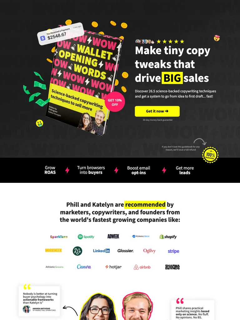 hover to scroll
A buyer-psychology course funnel with bold product illustrations, bright emphasis, teaching examples, and repeated purchase actions.
Useful for: Study the complete public offer page, its section order, and calls to action. Checkout steps, current enrollment availability, and conversion results are not verified.
# Design reference: Wallet-Opening Words — Copywriting Course
Source: https://walletopeningwords.com/katelyn
Swipefile reference: https://swipefile.design/ref/funnel-katelyn-bourgoin-wallet-opening-words/
Captured: 2026-09-07. This is a dated reference, not a claim about the current live product.


## Objective
Adapt the visual principles below to my project. Use my own content and identity. Do not reproduce logos, proprietary copy, or brand assets.

## Reference notes
- mood: Playful and emphatic
- colors: Black, bright yellow, hot pink, white, and vivid green illustration accents.
- typography: Bold sans-serif headings, compact labels, short benefit lists, and clearly separated curriculum sections make the long offer scannable.
- layout: Illustrated product hero → brand proof → copywriting frustrations → teaching method and creators → lessons and examples → offer → FAQ and closing purchase action.
- motion: The screenshot records a static page state. Preserve readable scrolling and clear action feedback; do not infer video playback, counters, or hidden form behavior.
- texture: Product or instructor imagery, contrasting section backgrounds, grouped curriculum details, and customer-story panels.
- dont: Use your own offer, brand, and assets. Do not invent testimonials, results, scarcity, guarantees, or pricing.

Useful for: Study the complete public offer page, its section order, and calls to action. Checkout steps, current enrollment availability, and conversion results are not verified.

## Acceptance criteria
- Existing project conventions, design tokens, working functionality, and unrelated changes are preserved.
- Two or three reference principles clearly support the user's task; conflicts are resolved in favor of usability and the existing product.
- Reusable components and semantic HTML express the interface. Available licensed assets are used; important UI text is never rendered as a bitmap.
- Every visible control has a defined behavior. Loading, empty, error, success, disabled, and long-content states are specified where relevant. Demo data is clearly labeled.
- Navigation and content adapt at 375px, 768px, and 1440px without horizontal page overflow. Keyboard use, visible focus, labeled inputs, at least 44px touch targets, readable contrast, and reduced motion are supported.
- Verification distinguishes rendered behavior from proposals and identifies anything still requiring a backend or external service.

## Quality bar
Clear hierarchy, consistent spacing, restrained surfaces, and purposeful motion. Avoid decorative gradients, excessive cards, placeholder buttons, and invented metrics unless the project calls for them. Do not claim a feature is connected or tested without evidence.
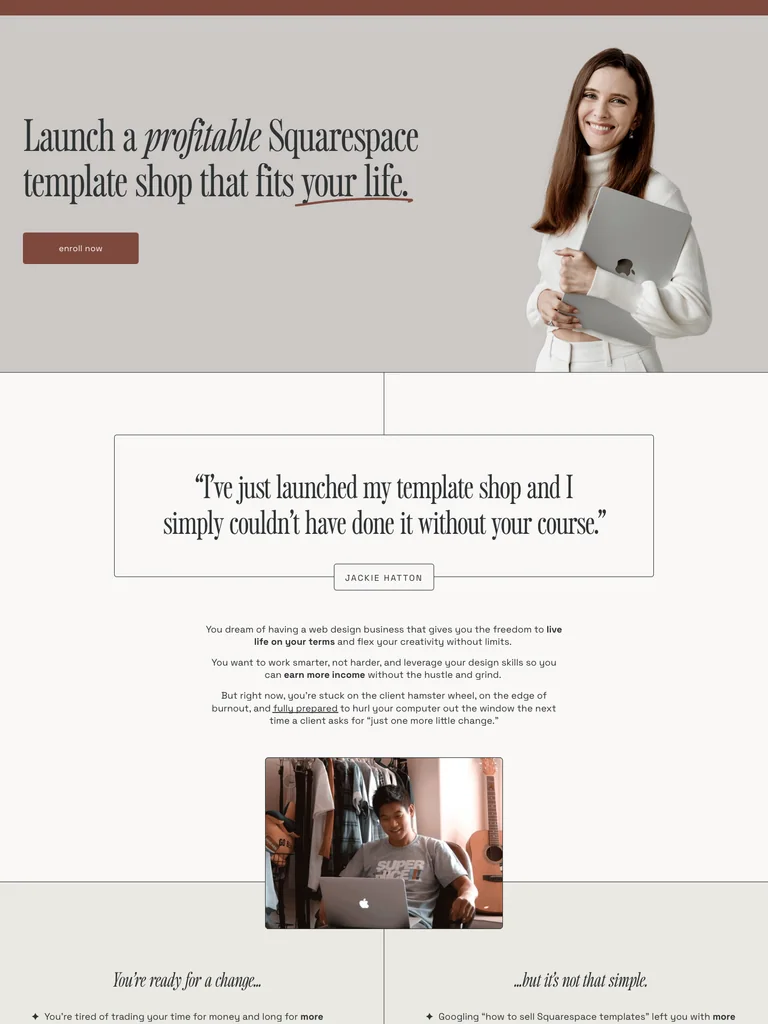 hover to scroll
An editorial template-business course page with restrained serif headings, a personal story, curriculum details, and generous spacing.
Useful for: Study the complete public offer page, its section order, and calls to action. Checkout steps, current enrollment availability, and conversion results are not verified.
# Design reference: Kate Scott — Scale with Templates
Source: https://katescott.co/scale-with-templates
Swipefile reference: https://swipefile.design/ref/funnel-kate-scott-scale-with-templates-2-0/
Captured: 2026-09-07. This is a dated reference, not a claim about the current live product.


## Objective
Adapt the visual principles below to my project. Use my own content and identity. Do not reproduce logos, proprietary copy, or brand assets.

## Reference notes
- mood: Calm and editorial
- colors: Warm white, muted brown, dusty rose, black type, and neutral photography.
- typography: Editorial serif headings, small uppercase labels, and readable supporting text. Broad type-size changes mark each stage of the offer.
- layout: Portrait and template-shop promise → reader objections → instructor story → student proof → five-stage curriculum → enrollment choices → FAQ and final action.
- motion: The screenshot records a static page state. Preserve readable scrolling and clear action feedback; do not infer video playback, counters, or hidden form behavior.
- texture: Product or instructor imagery, contrasting section backgrounds, grouped curriculum details, and customer-story panels.
- dont: Use your own offer, brand, and assets. Do not invent testimonials, results, scarcity, guarantees, or pricing.

Useful for: Study the complete public offer page, its section order, and calls to action. Checkout steps, current enrollment availability, and conversion results are not verified.

## Acceptance criteria
- Existing project conventions, design tokens, working functionality, and unrelated changes are preserved.
- Two or three reference principles clearly support the user's task; conflicts are resolved in favor of usability and the existing product.
- Reusable components and semantic HTML express the interface. Available licensed assets are used; important UI text is never rendered as a bitmap.
- Every visible control has a defined behavior. Loading, empty, error, success, disabled, and long-content states are specified where relevant. Demo data is clearly labeled.
- Navigation and content adapt at 375px, 768px, and 1440px without horizontal page overflow. Keyboard use, visible focus, labeled inputs, at least 44px touch targets, readable contrast, and reduced motion are supported.
- Verification distinguishes rendered behavior from proposals and identifies anything still requiring a backend or external service.

## Quality bar
Clear hierarchy, consistent spacing, restrained surfaces, and purposeful motion. Avoid decorative gradients, excessive cards, placeholder buttons, and invented metrics unless the project calls for them. Do not claim a feature is connected or tested without evidence.
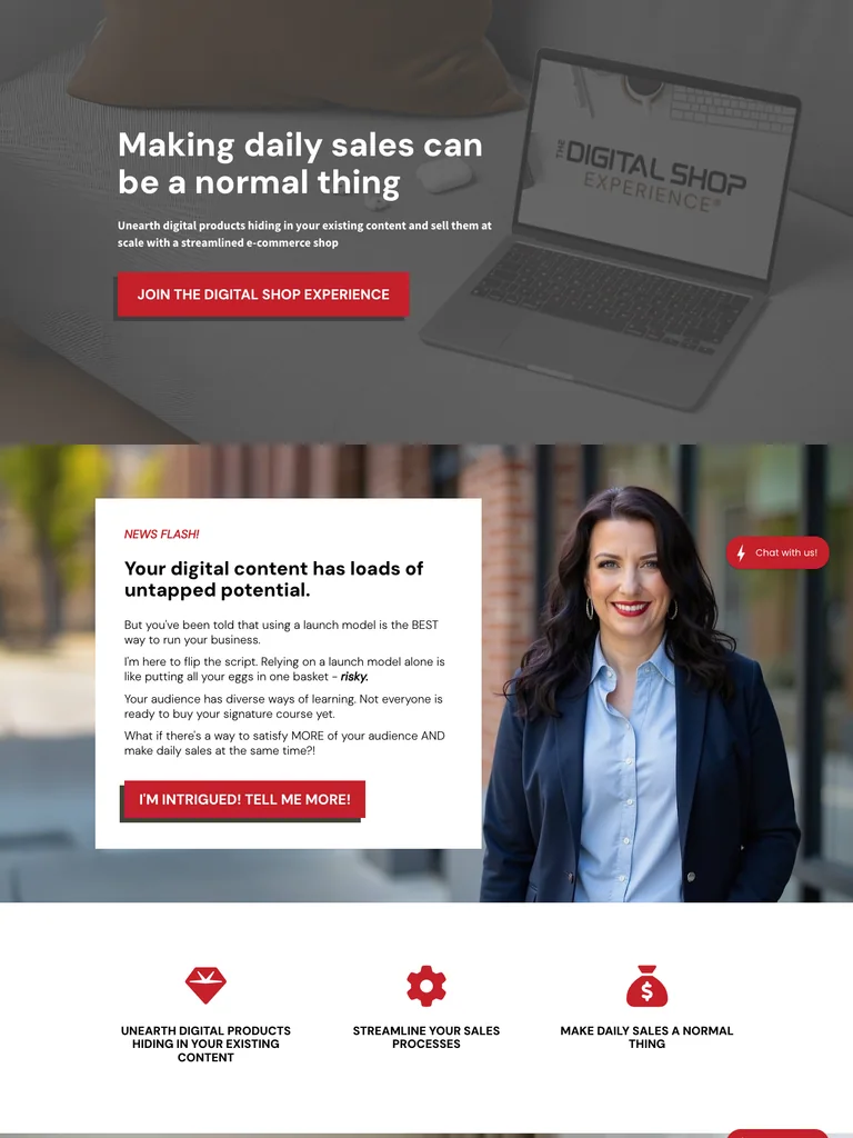 hover to scroll
A digital-shop course offer that turns a content problem into a phased teaching framework, then presents resources, proof, and enrollment options.
Useful for: Study the complete public offer page, its section order, and calls to action. Checkout steps, current enrollment availability, and conversion results are not verified.
# Design reference: Monica Froese — Digital Shop Experience
Source: https://digitalshopexperience.com/
Swipefile reference: https://swipefile.design/ref/funnel-monica-froese-the-digital-shop-experience/
Captured: 2026-09-07. This is a dated reference, not a claim about the current live product.


## Objective
Adapt the visual principles below to my project. Use my own content and identity. Do not reproduce logos, proprietary copy, or brand assets.

## Reference notes
- mood: Practical and encouraging
- colors: White and pale gray, cherry-red buttons and accents, dark text, and photographic sections.
- typography: Bold sans-serif headings, compact labels, short benefit lists, and clearly separated curriculum sections make the long offer scannable.
- layout: Shop-building promise → unused-content problem → sales examples → three-phase teaching framework → bonuses and templates → student proof → price and guarantee.
- motion: The screenshot records a static page state. Preserve readable scrolling and clear action feedback; do not infer video playback, counters, or hidden form behavior.
- texture: Product or instructor imagery, contrasting section backgrounds, grouped curriculum details, and customer-story panels.
- dont: Use your own offer, brand, and assets. Do not invent testimonials, results, scarcity, guarantees, or pricing.

Useful for: Study the complete public offer page, its section order, and calls to action. Checkout steps, current enrollment availability, and conversion results are not verified.

## Acceptance criteria
- Existing project conventions, design tokens, working functionality, and unrelated changes are preserved.
- Two or three reference principles clearly support the user's task; conflicts are resolved in favor of usability and the existing product.
- Reusable components and semantic HTML express the interface. Available licensed assets are used; important UI text is never rendered as a bitmap.
- Every visible control has a defined behavior. Loading, empty, error, success, disabled, and long-content states are specified where relevant. Demo data is clearly labeled.
- Navigation and content adapt at 375px, 768px, and 1440px without horizontal page overflow. Keyboard use, visible focus, labeled inputs, at least 44px touch targets, readable contrast, and reduced motion are supported.
- Verification distinguishes rendered behavior from proposals and identifies anything still requiring a backend or external service.

## Quality bar
Clear hierarchy, consistent spacing, restrained surfaces, and purposeful motion. Avoid decorative gradients, excessive cards, placeholder buttons, and invented metrics unless the project calls for them. Do not claim a feature is connected or tested without evidence.
 hover to scroll
A Framer training page with a clean video opening, extensive student proof, project previews, and a structured enrollment section.
Useful for: Study the complete public offer page, its section order, and calls to action. Checkout steps, current enrollment availability, and conversion results are not verified.
# Design reference: Ryan Hayward — Ultimate Framer Masterclass
Source: https://ultimateframercourse.com/
Swipefile reference: https://swipefile.design/ref/funnel-ryan-hayward-ultimate-framer-masterclass-3-0/
Captured: 2026-09-07. This is a dated reference, not a claim about the current live product.


## Objective
Adapt the visual principles below to my project. Use my own content and identity. Do not reproduce logos, proprietary copy, or brand assets.

## Reference notes
- mood: Clear and structured
- colors: Off-white, black headings, violet buttons, and soft lavender accents.
- typography: Bold sans-serif headings, compact labels, short benefit lists, and clearly separated curriculum sections make the long offer scannable.
- layout: Course promise and instructor video → designer testimonials → course features → project and lesson previews → instructor context → plans and questions.
- motion: The screenshot records a static page state. Preserve readable scrolling and clear action feedback; do not infer video playback, counters, or hidden form behavior.
- texture: Product or instructor imagery, contrasting section backgrounds, grouped curriculum details, and customer-story panels.
- dont: Use your own offer, brand, and assets. Do not invent testimonials, results, scarcity, guarantees, or pricing.

Useful for: Study the complete public offer page, its section order, and calls to action. Checkout steps, current enrollment availability, and conversion results are not verified.

## Acceptance criteria
- Existing project conventions, design tokens, working functionality, and unrelated changes are preserved.
- Two or three reference principles clearly support the user's task; conflicts are resolved in favor of usability and the existing product.
- Reusable components and semantic HTML express the interface. Available licensed assets are used; important UI text is never rendered as a bitmap.
- Every visible control has a defined behavior. Loading, empty, error, success, disabled, and long-content states are specified where relevant. Demo data is clearly labeled.
- Navigation and content adapt at 375px, 768px, and 1440px without horizontal page overflow. Keyboard use, visible focus, labeled inputs, at least 44px touch targets, readable contrast, and reduced motion are supported.
- Verification distinguishes rendered behavior from proposals and identifies anything still requiring a backend or external service.

## Quality bar
Clear hierarchy, consistent spacing, restrained surfaces, and purposeful motion. Avoid decorative gradients, excessive cards, placeholder buttons, and invented metrics unless the project calls for them. Do not claim a feature is connected or tested without evidence.
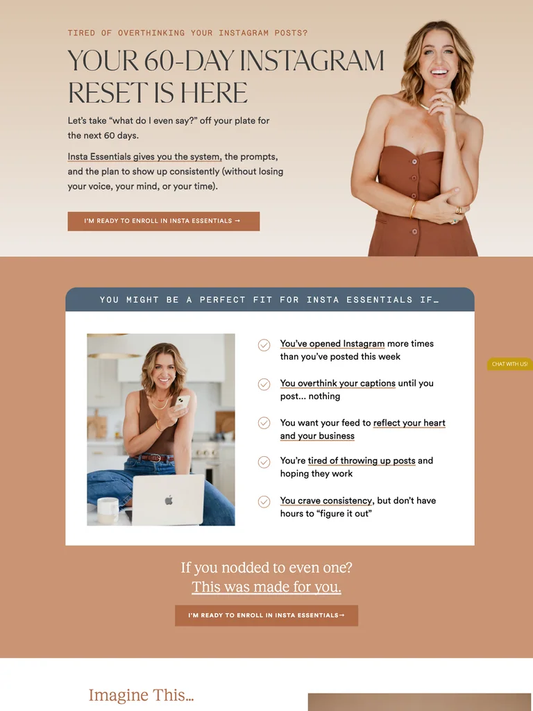 hover to scroll
An Instagram-resource offer combining warm portrait photography, editorial headings, grouped resources, and an approachable implementation plan.
Useful for: Study the complete public offer page, its section order, and calls to action. Checkout steps, current enrollment availability, and conversion results are not verified.
# Design reference: Jenna Kutcher — Insta Essentials
Source: https://thelab.jennakutcher.com/
Swipefile reference: https://swipefile.design/ref/funnel-jenna-kutcher-instagram-lab/
Captured: 2026-09-07. This is a dated reference, not a claim about the current live product.


## Objective
Adapt the visual principles below to my project. Use my own content and identity. Do not reproduce logos, proprietary copy, or brand assets.

## Reference notes
- mood: Warm and reassuring
- colors: Cream, caramel, peach, muted blue, and dark serif typography.
- typography: Editorial serif headings, small uppercase labels, and readable supporting text. Broad type-size changes mark each stage of the offer.
- layout: Portrait-led Instagram reset offer → audience situations → included playbook and resources → short implementation plan → instructor and student proof → purchase invitation.
- motion: The screenshot records a static page state. Preserve readable scrolling and clear action feedback; do not infer video playback, counters, or hidden form behavior.
- texture: Product or instructor imagery, contrasting section backgrounds, grouped curriculum details, and customer-story panels.
- dont: Use your own offer, brand, and assets. Do not invent testimonials, results, scarcity, guarantees, or pricing.

Useful for: Study the complete public offer page, its section order, and calls to action. Checkout steps, current enrollment availability, and conversion results are not verified.

## Acceptance criteria
- Existing project conventions, design tokens, working functionality, and unrelated changes are preserved.
- Two or three reference principles clearly support the user's task; conflicts are resolved in favor of usability and the existing product.
- Reusable components and semantic HTML express the interface. Available licensed assets are used; important UI text is never rendered as a bitmap.
- Every visible control has a defined behavior. Loading, empty, error, success, disabled, and long-content states are specified where relevant. Demo data is clearly labeled.
- Navigation and content adapt at 375px, 768px, and 1440px without horizontal page overflow. Keyboard use, visible focus, labeled inputs, at least 44px touch targets, readable contrast, and reduced motion are supported.
- Verification distinguishes rendered behavior from proposals and identifies anything still requiring a backend or external service.

## Quality bar
Clear hierarchy, consistent spacing, restrained surfaces, and purposeful motion. Avoid decorative gradients, excessive cards, placeholder buttons, and invented metrics unless the project calls for them. Do not claim a feature is connected or tested without evidence.
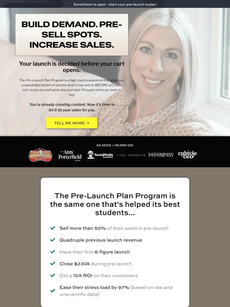 hover to scroll
An exceptionally long coaching-program sales page built around a pre-launch method, detailed client stories, program resources, and repeated enrollment invitations.
Useful for: Study the complete public offer page, its section order, and calls to action. Checkout steps, current enrollment availability, and conversion results are not verified.
# Design reference: Brenna McGowan — Pre-Launch Plan Program
Source: https://brennamcgowan.co/ppp
Swipefile reference: https://swipefile.design/ref/funnel-brenna-mcgowan-pre-launch-plan-program/
Captured: 2026-09-07. This is a dated reference, not a claim about the current live product.


## Objective
Adapt the visual principles below to my project. Use my own content and identity. Do not reproduce logos, proprietary copy, or brand assets.

## Reference notes
- mood: Personal and persuasive
- colors: White, charcoal, pale pink, and vivid yellow action buttons.
- typography: Long readable text columns, emphatic section headings, detailed bullet lists, and selective highlights carry the sales argument.
- layout: Portrait and pre-launch promise → client stories → detailed anticipation-marketing argument → program process → coaching and resources → enrollment → objections and final offer.
- motion: The screenshot records a static page state. Preserve readable scrolling and clear action feedback; do not infer video playback, counters, or hidden form behavior.
- texture: Extended reading sections, inset examples and portraits, selective text emphasis, and recurring offer details.
- dont: Use your own offer, brand, and assets. Do not invent testimonials, results, scarcity, guarantees, or pricing.

Useful for: Study the complete public offer page, its section order, and calls to action. Checkout steps, current enrollment availability, and conversion results are not verified.

## Acceptance criteria
- Existing project conventions, design tokens, working functionality, and unrelated changes are preserved.
- Two or three reference principles clearly support the user's task; conflicts are resolved in favor of usability and the existing product.
- Reusable components and semantic HTML express the interface. Available licensed assets are used; important UI text is never rendered as a bitmap.
- Every visible control has a defined behavior. Loading, empty, error, success, disabled, and long-content states are specified where relevant. Demo data is clearly labeled.
- Navigation and content adapt at 375px, 768px, and 1440px without horizontal page overflow. Keyboard use, visible focus, labeled inputs, at least 44px touch targets, readable contrast, and reduced motion are supported.
- Verification distinguishes rendered behavior from proposals and identifies anything still requiring a backend or external service.

## Quality bar
Clear hierarchy, consistent spacing, restrained surfaces, and purposeful motion. Avoid decorative gradients, excessive cards, placeholder buttons, and invented metrics unless the project calls for them. Do not claim a feature is connected or tested without evidence.
 hover to scroll
An SEO-course page for service providers with a soft editorial palette, a clear four-module curriculum, and practical resource previews.
Useful for: Study the complete public offer page, its section order, and calls to action. Checkout steps, current enrollment availability, and conversion results are not verified.
# Design reference: Sara Dunn — Rank for Revenue
Source: https://saradoesseo.com/rank-for-revenue
Swipefile reference: https://swipefile.design/ref/funnel-sara-dunn-rank-for-revenue/
Captured: 2026-09-07. This is a dated reference, not a claim about the current live product.


## Objective
Adapt the visual principles below to my project. Use my own content and identity. Do not reproduce logos, proprietary copy, or brand assets.

## Reference notes
- mood: Supportive and editorial
- colors: Warm white, pale green, dusty rose, dark blue text, and restrained green buttons.
- typography: Editorial serif headings, small uppercase labels, and readable supporting text. Broad type-size changes mark each stage of the offer.
- layout: SEO-service promise → audience problem → course introduction → four core modules → practical resources → instructor and student proof → enrollment and questions.
- motion: The screenshot records a static page state. Preserve readable scrolling and clear action feedback; do not infer video playback, counters, or hidden form behavior.
- texture: Product or instructor imagery, contrasting section backgrounds, grouped curriculum details, and customer-story panels.
- dont: Use your own offer, brand, and assets. Do not invent testimonials, results, scarcity, guarantees, or pricing.

Useful for: Study the complete public offer page, its section order, and calls to action. Checkout steps, current enrollment availability, and conversion results are not verified.

## Acceptance criteria
- Existing project conventions, design tokens, working functionality, and unrelated changes are preserved.
- Two or three reference principles clearly support the user's task; conflicts are resolved in favor of usability and the existing product.
- Reusable components and semantic HTML express the interface. Available licensed assets are used; important UI text is never rendered as a bitmap.
- Every visible control has a defined behavior. Loading, empty, error, success, disabled, and long-content states are specified where relevant. Demo data is clearly labeled.
- Navigation and content adapt at 375px, 768px, and 1440px without horizontal page overflow. Keyboard use, visible focus, labeled inputs, at least 44px touch targets, readable contrast, and reduced motion are supported.
- Verification distinguishes rendered behavior from proposals and identifies anything still requiring a backend or external service.

## Quality bar
Clear hierarchy, consistent spacing, restrained surfaces, and purposeful motion. Avoid decorative gradients, excessive cards, placeholder buttons, and invented metrics unless the project calls for them. Do not claim a feature is connected or tested without evidence.
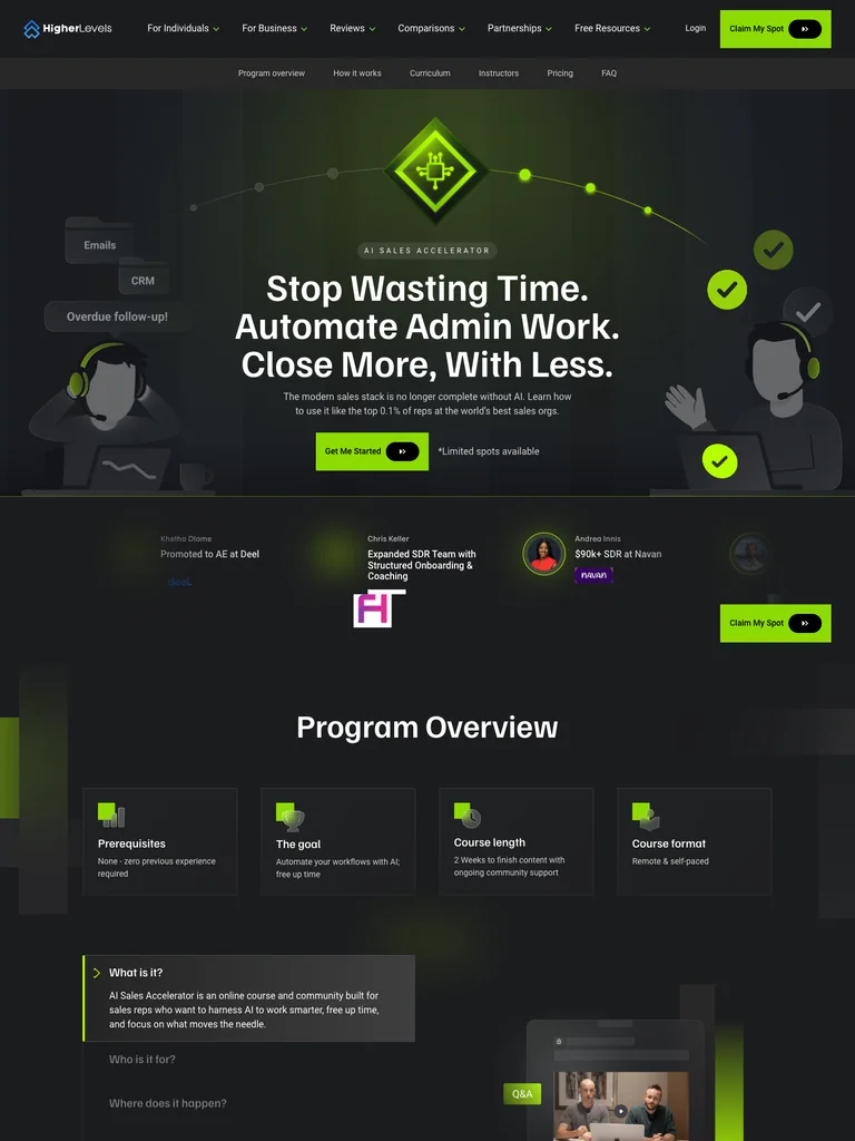 hover to scroll
An AI sales-training page with a concise program overview, structured teaching pillars, instructor cards, and bright enrollment accents.
Useful for: Study the complete public offer page, its section order, and calls to action. Checkout steps, current enrollment availability, and conversion results are not verified.
# Design reference: Higher Levels — AI Sales Accelerator
Source: https://higherlevels.com/ai-sales-accelerator
Swipefile reference: https://swipefile.design/ref/funnel-higher-levels-ai-sales-accelerator/
Captured: 2026-09-07. This is a dated reference, not a claim about the current live product.


## Objective
Adapt the visual principles below to my project. Use my own content and identity. Do not reproduce logos, proprietary copy, or brand assets.

## Reference notes
- mood: Technical and purposeful
- colors: Charcoal, white, acid-green accents, and dark illustrated panels.
- typography: Bold sans-serif headings, compact labels, short benefit lists, and clearly separated curriculum sections make the long offer scannable.
- layout: Automation promise → program overview → three teaching pillars → curriculum → instructors → pricing → FAQ and final enrollment panel.
- motion: The screenshot records a static page state. Preserve readable scrolling and clear action feedback; do not infer video playback, counters, or hidden form behavior.
- texture: Product or instructor imagery, contrasting section backgrounds, grouped curriculum details, and customer-story panels.
- dont: Use your own offer, brand, and assets. Do not invent testimonials, results, scarcity, guarantees, or pricing.

Useful for: Study the complete public offer page, its section order, and calls to action. Checkout steps, current enrollment availability, and conversion results are not verified.

## Acceptance criteria
- Existing project conventions, design tokens, working functionality, and unrelated changes are preserved.
- Two or three reference principles clearly support the user's task; conflicts are resolved in favor of usability and the existing product.
- Reusable components and semantic HTML express the interface. Available licensed assets are used; important UI text is never rendered as a bitmap.
- Every visible control has a defined behavior. Loading, empty, error, success, disabled, and long-content states are specified where relevant. Demo data is clearly labeled.
- Navigation and content adapt at 375px, 768px, and 1440px without horizontal page overflow. Keyboard use, visible focus, labeled inputs, at least 44px touch targets, readable contrast, and reduced motion are supported.
- Verification distinguishes rendered behavior from proposals and identifies anything still requiring a backend or external service.

## Quality bar
Clear hierarchy, consistent spacing, restrained surfaces, and purposeful motion. Avoid decorative gradients, excessive cards, placeholder buttons, and invented metrics unless the project calls for them. Do not claim a feature is connected or tested without evidence.
 hover to scroll
A YouTube-course offer that explains a complete marketing system through customer stories, resource previews, and approachable teaching sections.
Useful for: Study the complete public offer page, its section order, and calls to action. Checkout steps, current enrollment availability, and conversion results are not verified.
# Design reference: Stephanie Kase — YouTube for Business
Source: https://stephaniekase.com/youtubeforbusiness
Swipefile reference: https://swipefile.design/ref/funnel-stephanie-kase-youtube-for-business/
Captured: 2026-09-07. This is a dated reference, not a claim about the current live product.


## Objective
Adapt the visual principles below to my project. Use my own content and identity. Do not reproduce logos, proprietary copy, or brand assets.

## Reference notes
- mood: Friendly and practical
- colors: Warm white, peach, pale yellow, charcoal type, and small playful floral shapes.
- typography: Bold sans-serif headings, compact labels, short benefit lists, and clearly separated curriculum sections make the long offer scannable.
- layout: Portrait and marketing promise → three audience situations → customer stories → course system and resources → instructor context → enrollment → FAQ and final invitation.
- motion: The screenshot records a static page state. Preserve readable scrolling and clear action feedback; do not infer video playback, counters, or hidden form behavior.
- texture: Product or instructor imagery, contrasting section backgrounds, grouped curriculum details, and customer-story panels.
- dont: Use your own offer, brand, and assets. Do not invent testimonials, results, scarcity, guarantees, or pricing.

Useful for: Study the complete public offer page, its section order, and calls to action. Checkout steps, current enrollment availability, and conversion results are not verified.

## Acceptance criteria
- Existing project conventions, design tokens, working functionality, and unrelated changes are preserved.
- Two or three reference principles clearly support the user's task; conflicts are resolved in favor of usability and the existing product.
- Reusable components and semantic HTML express the interface. Available licensed assets are used; important UI text is never rendered as a bitmap.
- Every visible control has a defined behavior. Loading, empty, error, success, disabled, and long-content states are specified where relevant. Demo data is clearly labeled.
- Navigation and content adapt at 375px, 768px, and 1440px without horizontal page overflow. Keyboard use, visible focus, labeled inputs, at least 44px touch targets, readable contrast, and reduced motion are supported.
- Verification distinguishes rendered behavior from proposals and identifies anything still requiring a backend or external service.

## Quality bar
Clear hierarchy, consistent spacing, restrained surfaces, and purposeful motion. Avoid decorative gradients, excessive cards, placeholder buttons, and invented metrics unless the project calls for them. Do not claim a feature is connected or tested without evidence.
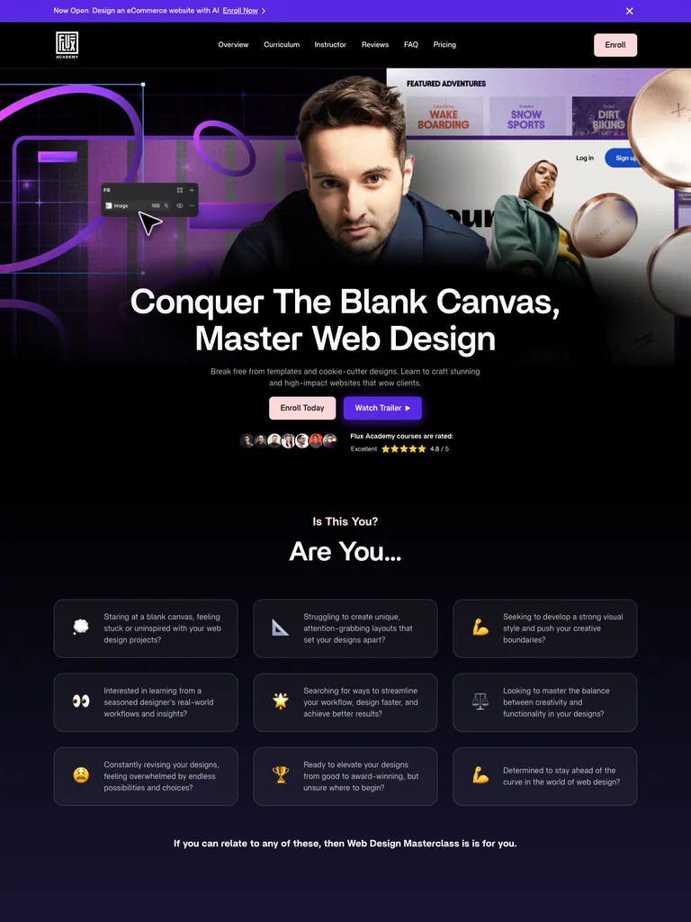 hover to scroll
A web-design course funnel that uses a cinematic opening, three visual project examples, detailed curriculum, and mentor support to explain the offer.
Useful for: Study the complete public offer page, its section order, and calls to action. Checkout steps, current enrollment availability, and conversion results are not verified.
# Design reference: Flux Academy — Web Design Masterclass
Source: https://flux-academy.com/courses/web-design-masterclass
Swipefile reference: https://swipefile.design/ref/funnel-matt-jumper-flux-academy-web-design-masterclass/
Captured: 2026-09-07. This is a dated reference, not a claim about the current live product.


## Objective
Adapt the visual principles below to my project. Use my own content and identity. Do not reproduce logos, proprietary copy, or brand assets.

## Reference notes
- mood: Cinematic and structured
- colors: Black, deep violet, white, and soft pink enrollment buttons.
- typography: Bold sans-serif headings, compact labels, short benefit lists, and clearly separated curriculum sections make the long offer scannable.
- layout: Instructor and project montage → designer problems → course features → three example projects → curriculum → mentor support and community → enrollment and FAQ.
- motion: The screenshot records a static page state. Preserve readable scrolling and clear action feedback; do not infer video playback, counters, or hidden form behavior.
- texture: Product or instructor imagery, contrasting section backgrounds, grouped curriculum details, and customer-story panels.
- dont: Use your own offer, brand, and assets. Do not invent testimonials, results, scarcity, guarantees, or pricing.

Useful for: Study the complete public offer page, its section order, and calls to action. Checkout steps, current enrollment availability, and conversion results are not verified.

## Acceptance criteria
- Existing project conventions, design tokens, working functionality, and unrelated changes are preserved.
- Two or three reference principles clearly support the user's task; conflicts are resolved in favor of usability and the existing product.
- Reusable components and semantic HTML express the interface. Available licensed assets are used; important UI text is never rendered as a bitmap.
- Every visible control has a defined behavior. Loading, empty, error, success, disabled, and long-content states are specified where relevant. Demo data is clearly labeled.
- Navigation and content adapt at 375px, 768px, and 1440px without horizontal page overflow. Keyboard use, visible focus, labeled inputs, at least 44px touch targets, readable contrast, and reduced motion are supported.
- Verification distinguishes rendered behavior from proposals and identifies anything still requiring a backend or external service.

## Quality bar
Clear hierarchy, consistent spacing, restrained surfaces, and purposeful motion. Avoid decorative gradients, excessive cards, placeholder buttons, and invented metrics unless the project calls for them. Do not claim a feature is connected or tested without evidence.
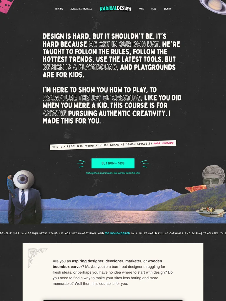 hover to scroll
An expressive design-course sales page with a manifesto opening, collage imagery, playful copy, an extensive lesson preview, and two offer tiers.
Useful for: Study the complete public offer page, its section order, and calls to action. Checkout steps, current enrollment availability, and conversion results are not verified.
# Design reference: Jack McDade — Radical Design
Source: https://radicaldesigncourse.com/
Swipefile reference: https://swipefile.design/ref/funnel-jack-mcdade-radical-design/
Captured: 2026-09-07. This is a dated reference, not a claim about the current live product.


## Objective
Adapt the visual principles below to my project. Use my own content and identity. Do not reproduce logos, proprietary copy, or brand assets.

## Reference notes
- mood: Irreverent and expressive
- colors: Charcoal, white, vivid pink and turquoise accents, and colorful collage imagery.
- typography: Condensed display lettering, hand-marked labels, playful inline emphasis, and a distinct visual hierarchy through the long lesson lists.
- layout: Manifesto-style introduction → instructor story → what you will and will not learn → course preview → detailed lesson lists → two offer tiers → FAQ and personal close.
- motion: The screenshot records a static page state. Preserve readable scrolling and clear action feedback; do not infer video playback, counters, or hidden form behavior.
- texture: Product or instructor imagery, contrasting section backgrounds, grouped curriculum details, and customer-story panels.
- dont: Use your own offer, brand, and assets. Do not invent testimonials, results, scarcity, guarantees, or pricing.

Useful for: Study the complete public offer page, its section order, and calls to action. Checkout steps, current enrollment availability, and conversion results are not verified.

## Acceptance criteria
- Existing project conventions, design tokens, working functionality, and unrelated changes are preserved.
- Two or three reference principles clearly support the user's task; conflicts are resolved in favor of usability and the existing product.
- Reusable components and semantic HTML express the interface. Available licensed assets are used; important UI text is never rendered as a bitmap.
- Every visible control has a defined behavior. Loading, empty, error, success, disabled, and long-content states are specified where relevant. Demo data is clearly labeled.
- Navigation and content adapt at 375px, 768px, and 1440px without horizontal page overflow. Keyboard use, visible focus, labeled inputs, at least 44px touch targets, readable contrast, and reduced motion are supported.
- Verification distinguishes rendered behavior from proposals and identifies anything still requiring a backend or external service.

## Quality bar
Clear hierarchy, consistent spacing, restrained surfaces, and purposeful motion. Avoid decorative gradients, excessive cards, placeholder buttons, and invented metrics unless the project calls for them. Do not claim a feature is connected or tested without evidence.
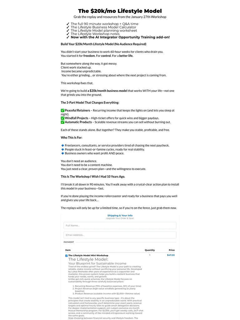 hover to scroll
A compact workshop sales letter with inline checkout and a substantial postscript.
Useful for: Study the complete public offer page, its section order, and calls to action. Checkout steps, current enrollment availability, and conversion results are not verified.
# Design reference: Lukas Resheske — The Lifestyle Model
Source: https://lukasresheske.com/
Swipefile reference: https://swipefile.design/ref/funnel-the-20k-mo-lifestyle-model-build-your-20k-month-lifestyle-model-no-audience-required/
Captured: 2026-09-07. This is a dated reference, not a claim about the current live product.


## Objective
Adapt the visual principles below to my project. Use my own content and identity. Do not reproduce logos, proprietary copy, or brand assets.

## Reference notes
- mood: Plainspoken, compact, and workshop-focused.
- colors: White background, black copy, muted gray headings, and small colored checklist marks.
- typography: Long readable text columns, emphatic section headings, detailed bullet lists, and selective highlights carry the sales argument.
- layout: Narrow sales-letter introduction leads through workshop resources, a three-part model, audience-fit bullets, an embedded order section, and an extended postscript.
- motion: The screenshot records a static page state. Preserve readable scrolling and clear action feedback; do not infer video playback, counters, or hidden form behavior.
- texture: Extended reading sections, inset examples and portraits, selective text emphasis, and recurring offer details.
- dont: Use your own offer, brand, and assets. Do not invent testimonials, results, scarcity, guarantees, or pricing.

Useful for: Study the complete public offer page, its section order, and calls to action. Checkout steps, current enrollment availability, and conversion results are not verified.

## Acceptance criteria
- Existing project conventions, design tokens, working functionality, and unrelated changes are preserved.
- Two or three reference principles clearly support the user's task; conflicts are resolved in favor of usability and the existing product.
- Reusable components and semantic HTML express the interface. Available licensed assets are used; important UI text is never rendered as a bitmap.
- Every visible control has a defined behavior. Loading, empty, error, success, disabled, and long-content states are specified where relevant. Demo data is clearly labeled.
- Navigation and content adapt at 375px, 768px, and 1440px without horizontal page overflow. Keyboard use, visible focus, labeled inputs, at least 44px touch targets, readable contrast, and reduced motion are supported.
- Verification distinguishes rendered behavior from proposals and identifies anything still requiring a backend or external service.

## Quality bar
Clear hierarchy, consistent spacing, restrained surfaces, and purposeful motion. Avoid decorative gradients, excessive cards, placeholder buttons, and invented metrics unless the project calls for them. Do not claim a feature is connected or tested without evidence.
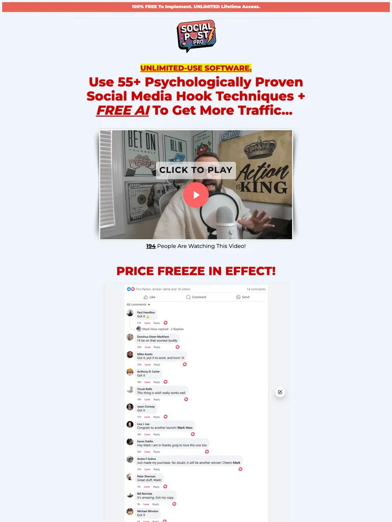 hover to scroll
An extended software sales letter built around examples, highlighted copy, and repeated offer sections.
Useful for: Study the complete public offer page, its section order, and calls to action. Checkout steps, current enrollment availability, and conversion results are not verified.
# Design reference: Mark Hess — Social Post Pro
Source: https://actionactivated.com/social-post-pro
Swipefile reference: https://swipefile.design/ref/funnel-mark-hess-social-post-pro-create-unlimited-traffic-getting-social-media-posts-in-seconds/
Captured: 2026-09-07. This is a dated reference, not a claim about the current live product.


## Objective
Adapt the visual principles below to my project. Use my own content and identity. Do not reproduce logos, proprietary copy, or brand assets.

## Reference notes
- mood: Direct, emphatic, and demonstration-heavy.
- colors: White and pale blue sections, red headlines, yellow highlights, and black body copy.
- typography: Long readable text columns, emphatic section headings, detailed bullet lists, and selective highlights carry the sales argument.
- layout: Video introduction flows into repeated problem-and-solution sections, sample social posts, product demonstrations, detailed benefit lists, recurring offer panels, and closing disclosures.
- motion: The screenshot records a static page state. Preserve readable scrolling and clear action feedback; do not infer video playback, counters, or hidden form behavior.
- texture: Extended reading sections, inset examples and portraits, selective text emphasis, and recurring offer details.
- dont: Use your own offer, brand, and assets. Do not invent testimonials, results, scarcity, guarantees, or pricing.

Useful for: Study the complete public offer page, its section order, and calls to action. Checkout steps, current enrollment availability, and conversion results are not verified.

## Acceptance criteria
- Existing project conventions, design tokens, working functionality, and unrelated changes are preserved.
- Two or three reference principles clearly support the user's task; conflicts are resolved in favor of usability and the existing product.
- Reusable components and semantic HTML express the interface. Available licensed assets are used; important UI text is never rendered as a bitmap.
- Every visible control has a defined behavior. Loading, empty, error, success, disabled, and long-content states are specified where relevant. Demo data is clearly labeled.
- Navigation and content adapt at 375px, 768px, and 1440px without horizontal page overflow. Keyboard use, visible focus, labeled inputs, at least 44px touch targets, readable contrast, and reduced motion are supported.
- Verification distinguishes rendered behavior from proposals and identifies anything still requiring a backend or external service.

## Quality bar
Clear hierarchy, consistent spacing, restrained surfaces, and purposeful motion. Avoid decorative gradients, excessive cards, placeholder buttons, and invented metrics unless the project calls for them. Do not claim a feature is connected or tested without evidence.
 hover to scroll
A publishing course page combining concrete creative examples with a straightforward course offer.
Useful for: Study the complete public offer page, its section order, and calls to action. Checkout steps, current enrollment availability, and conversion results are not verified.
# Design reference: Quick Start Publishing — Bold & Easy Patterns
Source: https://quickstartpublishing.com/bold-easy-patterns
Swipefile reference: https://swipefile.design/ref/funnel-quick-start-coloring-bold-and-easy-patterns-collages/
Captured: 2026-09-07. This is a dated reference, not a claim about the current live product.


## Objective
Adapt the visual principles below to my project. Use my own content and identity. Do not reproduce logos, proprietary copy, or brand assets.

## Reference notes
- mood: Practical, colorful, and approachable.
- colors: White, black, teal section bands, red buttons, and colorful book examples.
- typography: Bold sans-serif headings, compact labels, short benefit lists, and clearly separated curriculum sections make the long offer scannable.
- layout: Course introduction moves through coloring-book examples, instructor context, lesson details, product imagery, and a closing enrollment offer.
- motion: The screenshot records a static page state. Preserve readable scrolling and clear action feedback; do not infer video playback, counters, or hidden form behavior.
- texture: Product or instructor imagery, contrasting section backgrounds, grouped curriculum details, and customer-story panels.
- dont: Use your own offer, brand, and assets. Do not invent testimonials, results, scarcity, guarantees, or pricing.

Useful for: Study the complete public offer page, its section order, and calls to action. Checkout steps, current enrollment availability, and conversion results are not verified.

## Acceptance criteria
- Existing project conventions, design tokens, working functionality, and unrelated changes are preserved.
- Two or three reference principles clearly support the user's task; conflicts are resolved in favor of usability and the existing product.
- Reusable components and semantic HTML express the interface. Available licensed assets are used; important UI text is never rendered as a bitmap.
- Every visible control has a defined behavior. Loading, empty, error, success, disabled, and long-content states are specified where relevant. Demo data is clearly labeled.
- Navigation and content adapt at 375px, 768px, and 1440px without horizontal page overflow. Keyboard use, visible focus, labeled inputs, at least 44px touch targets, readable contrast, and reduced motion are supported.
- Verification distinguishes rendered behavior from proposals and identifies anything still requiring a backend or external service.

## Quality bar
Clear hierarchy, consistent spacing, restrained surfaces, and purposeful motion. Avoid decorative gradients, excessive cards, placeholder buttons, and invented metrics unless the project calls for them. Do not claim a feature is connected or tested without evidence.
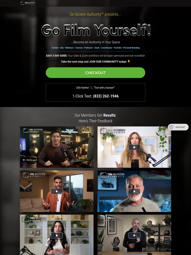 hover to scroll
A dark filming-course funnel built around video examples, studio setups, and a bright enrollment action.
Useful for: Study the complete public offer page, its section order, and calls to action. Checkout steps, current enrollment availability, and conversion results are not verified.
# Design reference: On-Screen Authority — Go Film Yourself
Source: https://onscreenauthority.com/join-gfy
Swipefile reference: https://swipefile.design/ref/funnel-on-screen-authority-go-film-yourself/
Captured: 2026-09-07. This is a dated reference, not a claim about the current live product.


## Objective
Adapt the visual principles below to my project. Use my own content and identity. Do not reproduce logos, proprietary copy, or brand assets.

## Reference notes
- mood: Confident, visual, and studio-focused.
- colors: Charcoal photographic backgrounds, white text, lime green buttons, and muted gray panels.
- typography: Bold sans-serif headings, compact labels, short benefit lists, and clearly separated curriculum sections make the long offer scannable.
- layout: Video-oriented opening introduces the filming program, compares on-camera examples, presents studio setups and included resources, then repeats the enrollment offer before the footer.
- motion: The screenshot records a static page state. Preserve readable scrolling and clear action feedback; do not infer video playback, counters, or hidden form behavior.
- texture: Product or instructor imagery, contrasting section backgrounds, grouped curriculum details, and customer-story panels.
- dont: Use your own offer, brand, and assets. Do not invent testimonials, results, scarcity, guarantees, or pricing.

Useful for: Study the complete public offer page, its section order, and calls to action. Checkout steps, current enrollment availability, and conversion results are not verified.

## Acceptance criteria
- Existing project conventions, design tokens, working functionality, and unrelated changes are preserved.
- Two or three reference principles clearly support the user's task; conflicts are resolved in favor of usability and the existing product.
- Reusable components and semantic HTML express the interface. Available licensed assets are used; important UI text is never rendered as a bitmap.
- Every visible control has a defined behavior. Loading, empty, error, success, disabled, and long-content states are specified where relevant. Demo data is clearly labeled.
- Navigation and content adapt at 375px, 768px, and 1440px without horizontal page overflow. Keyboard use, visible focus, labeled inputs, at least 44px touch targets, readable contrast, and reduced motion are supported.
- Verification distinguishes rendered behavior from proposals and identifies anything still requiring a backend or external service.

## Quality bar
Clear hierarchy, consistent spacing, restrained surfaces, and purposeful motion. Avoid decorative gradients, excessive cards, placeholder buttons, and invented metrics unless the project calls for them. Do not claim a feature is connected or tested without evidence.
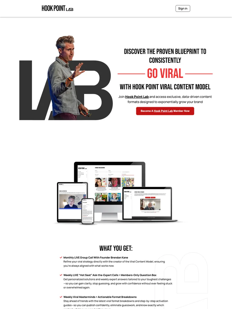 hover to scroll
A creator membership page with oversized type, a portrait-led opening, and a strong red closing offer.
Useful for: Study the complete public offer page, its section order, and calls to action. Checkout steps, current enrollment availability, and conversion results are not verified.
# Design reference: Brendan Kane — Hook Point Lab
Source: https://goviral.hookpoint.com/
Swipefile reference: https://swipefile.design/ref/funnel-viral-trends-brendan-kane-1-expert-on-virality-in-the-world/
Captured: 2026-09-07. This is a dated reference, not a claim about the current live product.


## Objective
Adapt the visual principles below to my project. Use my own content and identity. Do not reproduce logos, proprietary copy, or brand assets.

## Reference notes
- mood: Bold, energetic, and community-focused.
- colors: Black and white, vivid red action panels, and restrained gray dividers.
- typography: Bold sans-serif headings, compact labels, short benefit lists, and clearly separated curriculum sections make the long offer scannable.
- layout: Large portrait and membership introduction lead into benefits, live learning opportunities, member examples, supporting proof, and a prominent closing membership panel.
- motion: The screenshot records a static page state. Preserve readable scrolling and clear action feedback; do not infer video playback, counters, or hidden form behavior.
- texture: Product or instructor imagery, contrasting section backgrounds, grouped curriculum details, and customer-story panels.
- dont: Use your own offer, brand, and assets. Do not invent testimonials, results, scarcity, guarantees, or pricing.

Useful for: Study the complete public offer page, its section order, and calls to action. Checkout steps, current enrollment availability, and conversion results are not verified.

## Acceptance criteria
- Existing project conventions, design tokens, working functionality, and unrelated changes are preserved.
- Two or three reference principles clearly support the user's task; conflicts are resolved in favor of usability and the existing product.
- Reusable components and semantic HTML express the interface. Available licensed assets are used; important UI text is never rendered as a bitmap.
- Every visible control has a defined behavior. Loading, empty, error, success, disabled, and long-content states are specified where relevant. Demo data is clearly labeled.
- Navigation and content adapt at 375px, 768px, and 1440px without horizontal page overflow. Keyboard use, visible focus, labeled inputs, at least 44px touch targets, readable contrast, and reduced motion are supported.
- Verification distinguishes rendered behavior from proposals and identifies anything still requiring a backend or external service.

## Quality bar
Clear hierarchy, consistent spacing, restrained surfaces, and purposeful motion. Avoid decorative gradients, excessive cards, placeholder buttons, and invented metrics unless the project calls for them. Do not claim a feature is connected or tested without evidence.
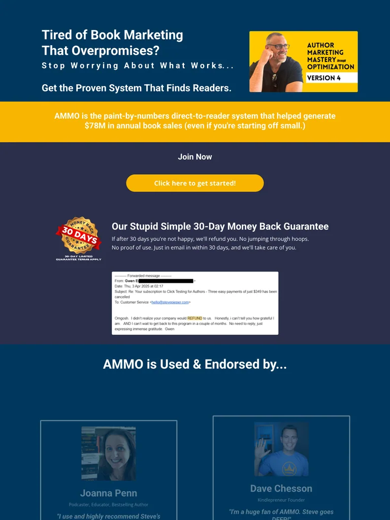 hover to scroll
An exceptionally long author-training funnel with a large video-proof library and detailed program explanations.
Useful for: Study the complete public offer page, its section order, and calls to action. Checkout steps, current enrollment availability, and conversion results are not verified.
# Design reference: Steve Pieper — Author Marketing Mastery
Source: https://app.stevepieper.com/ammo-v4-post-sale
Swipefile reference: https://swipefile.design/ref/funnel-steven-pieper-author-marketing-mastery-through-optimization-4/
Captured: 2026-09-07. This is a dated reference, not a claim about the current live product.


## Objective
Adapt the visual principles below to my project. Use my own content and identity. Do not reproduce logos, proprietary copy, or brand assets.

## Reference notes
- mood: Intensive, instructional, and proof-heavy.
- colors: Navy and teal blue, pale lavender-gray sections, white text, and yellow offer bands.
- typography: Long readable text columns, emphatic section headings, detailed bullet lists, and selective highlights carry the sales argument.
- layout: Book-marketing program introduction expands into a large author-video proof library, teaching methods, detailed curriculum, extended objections, and a portrait-led closing call to action.
- motion: The screenshot records a static page state. Preserve readable scrolling and clear action feedback; do not infer video playback, counters, or hidden form behavior.
- texture: Extended reading sections, inset examples and portraits, selective text emphasis, and recurring offer details.
- dont: Use your own offer, brand, and assets. Do not invent testimonials, results, scarcity, guarantees, or pricing.

Useful for: Study the complete public offer page, its section order, and calls to action. Checkout steps, current enrollment availability, and conversion results are not verified.

## Acceptance criteria
- Existing project conventions, design tokens, working functionality, and unrelated changes are preserved.
- Two or three reference principles clearly support the user's task; conflicts are resolved in favor of usability and the existing product.
- Reusable components and semantic HTML express the interface. Available licensed assets are used; important UI text is never rendered as a bitmap.
- Every visible control has a defined behavior. Loading, empty, error, success, disabled, and long-content states are specified where relevant. Demo data is clearly labeled.
- Navigation and content adapt at 375px, 768px, and 1440px without horizontal page overflow. Keyboard use, visible focus, labeled inputs, at least 44px touch targets, readable contrast, and reduced motion are supported.
- Verification distinguishes rendered behavior from proposals and identifies anything still requiring a backend or external service.

## Quality bar
Clear hierarchy, consistent spacing, restrained surfaces, and purposeful motion. Avoid decorative gradients, excessive cards, placeholder buttons, and invented metrics unless the project calls for them. Do not claim a feature is connected or tested without evidence.
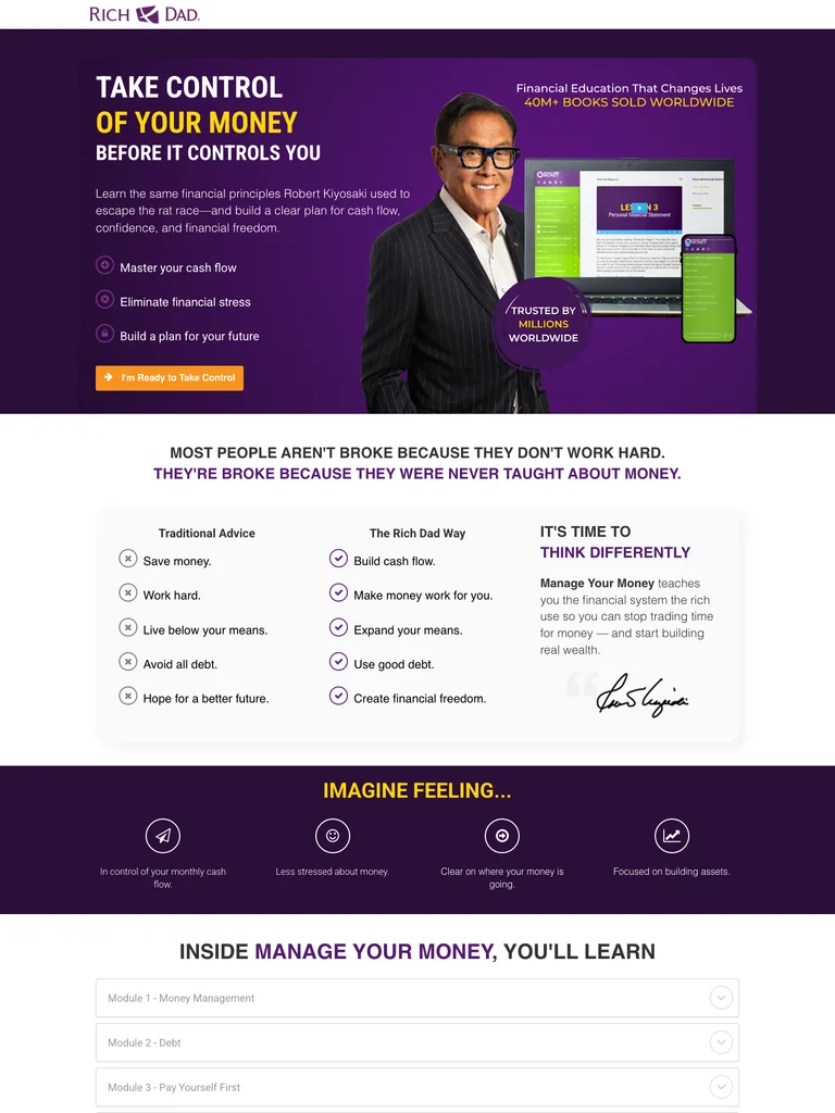 hover to scroll
A purple-and-yellow course offer that pairs a recognizable instructor with book mockups and clear benefit lists.
Useful for: Study the complete public offer page, its section order, and calls to action. Checkout steps, current enrollment availability, and conversion results are not verified.
# Design reference: Rich Dad — Manage Your Money
Source: https://study.richdad.com/mym-lander
Swipefile reference: https://swipefile.design/ref/funnel-robert-kiyosaki-manage-your-money/
Captured: 2026-09-07. This is a dated reference, not a claim about the current live product.


## Objective
Adapt the visual principles below to my project. Use my own content and identity. Do not reproduce logos, proprietary copy, or brand assets.

## Reference notes
- mood: Direct, branded, and offer-focused.
- colors: Deep purple, bright yellow, white, and dark gray body text.
- typography: Bold sans-serif headings, compact labels, short benefit lists, and clearly separated curriculum sections make the long offer scannable.
- layout: Book mockups and an instructor portrait introduce the offer, followed by problem framing, checklist benefits, media references, a personal introduction, and repeated action buttons.
- motion: The screenshot records a static page state. Preserve readable scrolling and clear action feedback; do not infer video playback, counters, or hidden form behavior.
- texture: Product or instructor imagery, contrasting section backgrounds, grouped curriculum details, and customer-story panels.
- dont: Use your own offer, brand, and assets. Do not invent testimonials, results, scarcity, guarantees, or pricing.

Useful for: Study the complete public offer page, its section order, and calls to action. Checkout steps, current enrollment availability, and conversion results are not verified.

## Acceptance criteria
- Existing project conventions, design tokens, working functionality, and unrelated changes are preserved.
- Two or three reference principles clearly support the user's task; conflicts are resolved in favor of usability and the existing product.
- Reusable components and semantic HTML express the interface. Available licensed assets are used; important UI text is never rendered as a bitmap.
- Every visible control has a defined behavior. Loading, empty, error, success, disabled, and long-content states are specified where relevant. Demo data is clearly labeled.
- Navigation and content adapt at 375px, 768px, and 1440px without horizontal page overflow. Keyboard use, visible focus, labeled inputs, at least 44px touch targets, readable contrast, and reduced motion are supported.
- Verification distinguishes rendered behavior from proposals and identifies anything still requiring a backend or external service.

## Quality bar
Clear hierarchy, consistent spacing, restrained surfaces, and purposeful motion. Avoid decorative gradients, excessive cards, placeholder buttons, and invented metrics unless the project calls for them. Do not claim a feature is connected or tested without evidence.
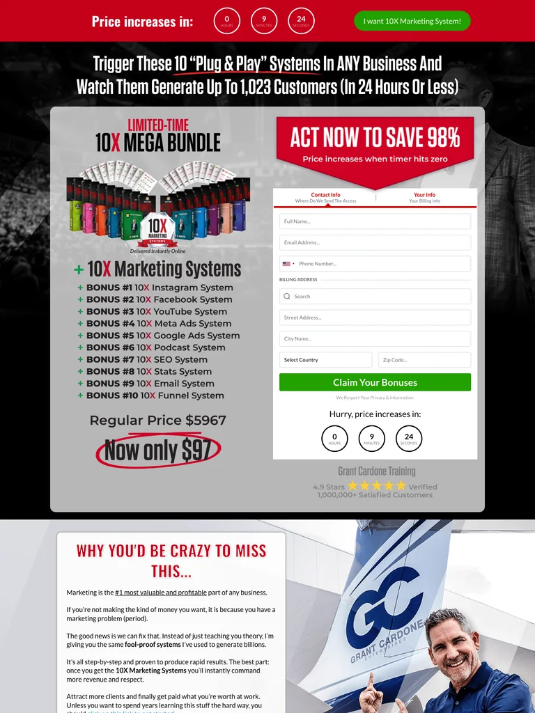 hover to scroll
A traditional marketing bundle funnel with an opening form, extensive module stack, and repeated offers.
Useful for: Study the complete public offer page, its section order, and calls to action. Checkout steps, current enrollment availability, and conversion results are not verified.
# Design reference: Grant Cardone — 10X Marketing Systems
Source: https://10xcertified.com/marketing-systems-97-4
Swipefile reference: https://swipefile.design/ref/funnel-grant-cardone-10x-marketing-mega-bundle/
Captured: 2026-09-07. This is a dated reference, not a claim about the current live product.


## Objective
Adapt the visual principles below to my project. Use my own content and identity. Do not reproduce logos, proprietary copy, or brand assets.

## Reference notes
- mood: Loud, urgent, and bundle-focused.
- colors: Black and white, vivid red sections, yellow emphasis, and green action buttons.
- typography: Bold sans-serif headings, compact labels, short benefit lists, and clearly separated curriculum sections make the long offer scannable.
- layout: Initial bundle artwork and order form lead into program modules, dashboard mockups, value-stack sections, repeated purchase prompts, and a final bundle recap.
- motion: The screenshot records a static page state. Preserve readable scrolling and clear action feedback; do not infer video playback, counters, or hidden form behavior.
- texture: Product or instructor imagery, contrasting section backgrounds, grouped curriculum details, and customer-story panels.
- dont: Use your own offer, brand, and assets. Do not invent testimonials, results, scarcity, guarantees, or pricing.

Useful for: Study the complete public offer page, its section order, and calls to action. Checkout steps, current enrollment availability, and conversion results are not verified.

## Acceptance criteria
- Existing project conventions, design tokens, working functionality, and unrelated changes are preserved.
- Two or three reference principles clearly support the user's task; conflicts are resolved in favor of usability and the existing product.
- Reusable components and semantic HTML express the interface. Available licensed assets are used; important UI text is never rendered as a bitmap.
- Every visible control has a defined behavior. Loading, empty, error, success, disabled, and long-content states are specified where relevant. Demo data is clearly labeled.
- Navigation and content adapt at 375px, 768px, and 1440px without horizontal page overflow. Keyboard use, visible focus, labeled inputs, at least 44px touch targets, readable contrast, and reduced motion are supported.
- Verification distinguishes rendered behavior from proposals and identifies anything still requiring a backend or external service.

## Quality bar
Clear hierarchy, consistent spacing, restrained surfaces, and purposeful motion. Avoid decorative gradients, excessive cards, placeholder buttons, and invented metrics unless the project calls for them. Do not claim a feature is connected or tested without evidence.
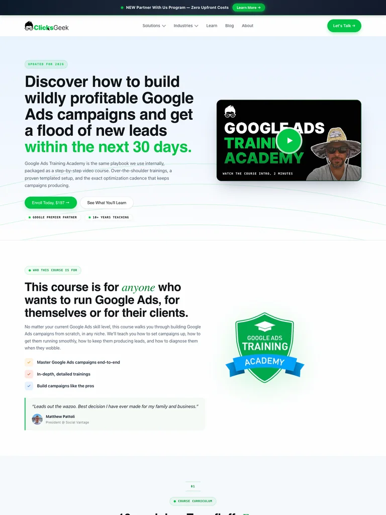 hover to scroll
A polished training page with a split hero, extensive curriculum, instructor section, and green calls to action.
Useful for: Study the complete public offer page, its section order, and calls to action. Checkout steps, current enrollment availability, and conversion results are not verified.
# Design reference: Clicks Geek — Google Ads Training Academy
Source: https://clicksgeek.com/google-ads-ppc-course
Swipefile reference: https://swipefile.design/ref/funnel-rob-andolina-google-ads-training-academy/
Captured: 2026-09-08. This is a dated reference, not a claim about the current live product.


## Objective
Adapt the visual principles below to my project. Use my own content and identity. Do not reproduce logos, proprietary copy, or brand assets.

## Reference notes
- mood: Clean, practical, and agency-led.
- colors: White and pale ice blue, near-black headings, bright green actions, and yellow portrait accents.
- typography: Bold sans-serif headings, compact labels, short benefit lists, and clearly separated curriculum sections make the long offer scannable.
- layout: Split course hero and video thumbnail lead through benefits, a detailed module curriculum, instructor credentials, enrollment details, and a dark closing call to action.
- motion: The screenshot records a static page state. Preserve readable scrolling and clear action feedback; do not infer video playback, counters, or hidden form behavior.
- texture: Product or instructor imagery, contrasting section backgrounds, grouped curriculum details, and customer-story panels.
- dont: Use your own offer, brand, and assets. Do not invent testimonials, results, scarcity, guarantees, or pricing.

Useful for: Study the complete public offer page, its section order, and calls to action. Checkout steps, current enrollment availability, and conversion results are not verified.

## Acceptance criteria
- Existing project conventions, design tokens, working functionality, and unrelated changes are preserved.
- Two or three reference principles clearly support the user's task; conflicts are resolved in favor of usability and the existing product.
- Reusable components and semantic HTML express the interface. Available licensed assets are used; important UI text is never rendered as a bitmap.
- Every visible control has a defined behavior. Loading, empty, error, success, disabled, and long-content states are specified where relevant. Demo data is clearly labeled.
- Navigation and content adapt at 375px, 768px, and 1440px without horizontal page overflow. Keyboard use, visible focus, labeled inputs, at least 44px touch targets, readable contrast, and reduced motion are supported.
- Verification distinguishes rendered behavior from proposals and identifies anything still requiring a backend or external service.

## Quality bar
Clear hierarchy, consistent spacing, restrained surfaces, and purposeful motion. Avoid decorative gradients, excessive cards, placeholder buttons, and invented metrics unless the project calls for them. Do not claim a feature is connected or tested without evidence.
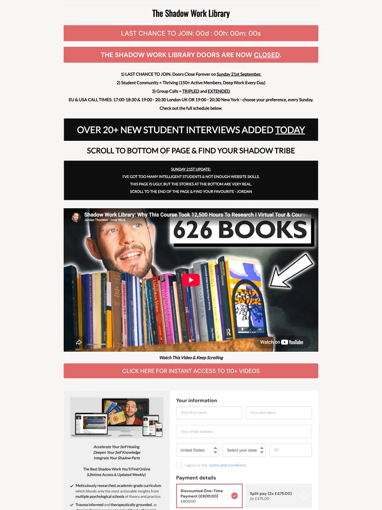 hover to scroll
A narrow library sales letter whose lower page becomes an extensive interview archive; the captured page shows enrollment closed.
Useful for: Study the complete public offer page, its section order, and calls to action. Checkout steps, current enrollment availability, and conversion results are not verified.
# Design reference: Jordan Thornton — Shadow Work Library
Source: https://courses.jordanthornton.com/shadow-work-library
Swipefile reference: https://swipefile.design/ref/funnel-jordan-thornton-shadow-work-library/
Captured: 2026-09-07. This is a dated reference, not a claim about the current live product.


## Objective
Adapt the visual principles below to my project. Use my own content and identity. Do not reproduce logos, proprietary copy, or brand assets.

## Reference notes
- mood: Minimal, text-dense, and interview-led.
- colors: White and warm gray, black section bands, and coral enrollment-status notices.
- typography: Long readable text columns, emphatic section headings, detailed bullet lists, and selective highlights carry the sales argument.
- layout: Narrow introduction with enrollment-status notices leads into a video, library explanation, offer details, and a very long sequence of written student interviews.
- motion: The screenshot records a static page state. Preserve readable scrolling and clear action feedback; do not infer video playback, counters, or hidden form behavior.
- texture: Extended reading sections, inset examples and portraits, selective text emphasis, and recurring offer details.
- dont: Use your own offer, brand, and assets. Do not invent testimonials, results, scarcity, guarantees, or pricing.

Useful for: Study the complete public offer page, its section order, and calls to action. Checkout steps, current enrollment availability, and conversion results are not verified.

## Acceptance criteria
- Existing project conventions, design tokens, working functionality, and unrelated changes are preserved.
- Two or three reference principles clearly support the user's task; conflicts are resolved in favor of usability and the existing product.
- Reusable components and semantic HTML express the interface. Available licensed assets are used; important UI text is never rendered as a bitmap.
- Every visible control has a defined behavior. Loading, empty, error, success, disabled, and long-content states are specified where relevant. Demo data is clearly labeled.
- Navigation and content adapt at 375px, 768px, and 1440px without horizontal page overflow. Keyboard use, visible focus, labeled inputs, at least 44px touch targets, readable contrast, and reduced motion are supported.
- Verification distinguishes rendered behavior from proposals and identifies anything still requiring a backend or external service.

## Quality bar
Clear hierarchy, consistent spacing, restrained surfaces, and purposeful motion. Avoid decorative gradients, excessive cards, placeholder buttons, and invented metrics unless the project calls for them. Do not claim a feature is connected or tested without evidence.
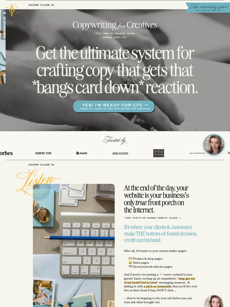 hover to scroll
A long editorial course funnel with refined typography, template previews, and an extensive closing offer.
Useful for: Study the complete public offer page, its section order, and calls to action. Checkout steps, current enrollment availability, and conversion results are not verified.
# Design reference: Ashlyn Writes — Copywriting for Creatives
Source: https://copywritingforcreatives.ashlynwrites.com/open
Swipefile reference: https://swipefile.design/ref/funnel-ashlyn-writes-copywriting-for-creatives-2024/
Captured: 2026-09-08. This is a dated reference, not a claim about the current live product.


## Objective
Adapt the visual principles below to my project. Use my own content and identity. Do not reproduce logos, proprietary copy, or brand assets.

## Reference notes
- mood: Editorial, layered, and personable.
- colors: Warm cream, dark brown, muted sky blue, golden yellow buttons, and grayscale imagery.
- typography: Editorial serif headings, small uppercase labels, readable supporting copy, and occasional script accents establish a layered hierarchy.
- layout: Large editorial hero opens a long narrative of audience fit, instructor context, student stories, course modules, template previews, bonuses, and closing payment-plan comparisons.
- motion: The screenshot records a static page state. Preserve readable scrolling and clear action feedback; do not infer video playback, counters, or hidden form behavior.
- texture: Product or instructor imagery, contrasting section backgrounds, grouped curriculum details, and customer-story panels.
- dont: Use your own offer, brand, and assets. Do not invent testimonials, results, scarcity, guarantees, or pricing.

Useful for: Study the complete public offer page, its section order, and calls to action. Checkout steps, current enrollment availability, and conversion results are not verified.

## Acceptance criteria
- Existing project conventions, design tokens, working functionality, and unrelated changes are preserved.
- Two or three reference principles clearly support the user's task; conflicts are resolved in favor of usability and the existing product.
- Reusable components and semantic HTML express the interface. Available licensed assets are used; important UI text is never rendered as a bitmap.
- Every visible control has a defined behavior. Loading, empty, error, success, disabled, and long-content states are specified where relevant. Demo data is clearly labeled.
- Navigation and content adapt at 375px, 768px, and 1440px without horizontal page overflow. Keyboard use, visible focus, labeled inputs, at least 44px touch targets, readable contrast, and reduced motion are supported.
- Verification distinguishes rendered behavior from proposals and identifies anything still requiring a backend or external service.

## Quality bar
Clear hierarchy, consistent spacing, restrained surfaces, and purposeful motion. Avoid decorative gradients, excessive cards, placeholder buttons, and invented metrics unless the project calls for them. Do not claim a feature is connected or tested without evidence.
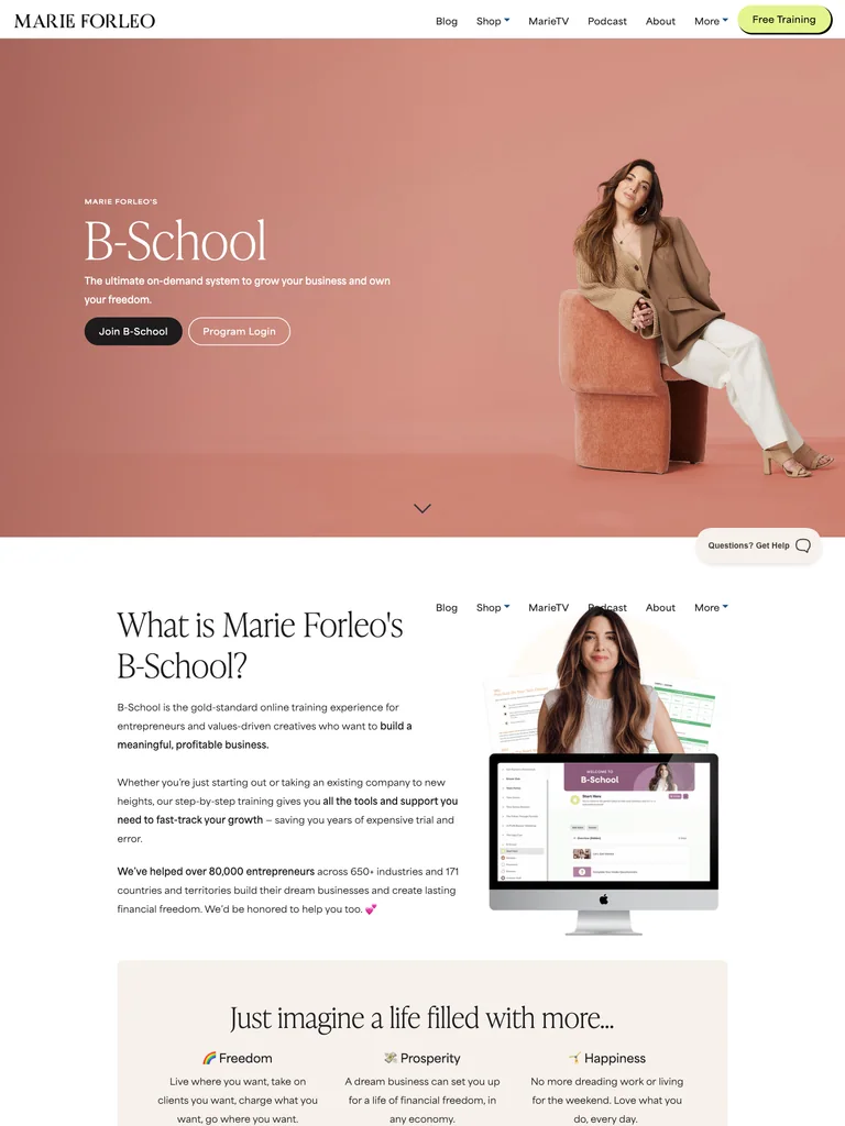 hover to scroll
A warm business-course page using large photography, an editorial rhythm, and a restrained closing offer.
Useful for: Study the complete public offer page, its section order, and calls to action. Checkout steps, current enrollment availability, and conversion results are not verified.
# Design reference: Marie Forleo — B-School
Source: https://marieforleo.com/bschool
Swipefile reference: https://swipefile.design/ref/funnel-marie-forleo-b-school-2023-summer/
Captured: 2026-09-07. This is a dated reference, not a claim about the current live product.


## Objective
Adapt the visual principles below to my project. Use my own content and identity. Do not reproduce logos, proprietary copy, or brand assets.

## Reference notes
- mood: Warm, editorial, and established.
- colors: Peach and dusty pink, cream, black, and pale lime action accents.
- typography: Editorial serif headings, small uppercase labels, readable supporting copy, and occasional script accents establish a layered hierarchy.
- layout: Portrait-led course opening transitions into business categories illustrated with large photographs, program context, video stories, and a simple closing course offer above the dark footer.
- motion: The screenshot records a static page state. Preserve readable scrolling and clear action feedback; do not infer video playback, counters, or hidden form behavior.
- texture: Product or instructor imagery, contrasting section backgrounds, grouped curriculum details, and customer-story panels.
- dont: Use your own offer, brand, and assets. Do not invent testimonials, results, scarcity, guarantees, or pricing.

Useful for: Study the complete public offer page, its section order, and calls to action. Checkout steps, current enrollment availability, and conversion results are not verified.

## Acceptance criteria
- Existing project conventions, design tokens, working functionality, and unrelated changes are preserved.
- Two or three reference principles clearly support the user's task; conflicts are resolved in favor of usability and the existing product.
- Reusable components and semantic HTML express the interface. Available licensed assets are used; important UI text is never rendered as a bitmap.
- Every visible control has a defined behavior. Loading, empty, error, success, disabled, and long-content states are specified where relevant. Demo data is clearly labeled.
- Navigation and content adapt at 375px, 768px, and 1440px without horizontal page overflow. Keyboard use, visible focus, labeled inputs, at least 44px touch targets, readable contrast, and reduced motion are supported.
- Verification distinguishes rendered behavior from proposals and identifies anything still requiring a backend or external service.

## Quality bar
Clear hierarchy, consistent spacing, restrained surfaces, and purposeful motion. Avoid decorative gradients, excessive cards, placeholder buttons, and invented metrics unless the project calls for them. Do not claim a feature is connected or tested without evidence.
 hover to scroll
A detailed copywriting-course funnel with a yellow-chair visual motif and a long sequence of program resources.
Useful for: Study the complete public offer page, its section order, and calls to action. Checkout steps, current enrollment availability, and conversion results are not verified.
# Design reference: Dani Paige — Sales Page Prep School
Source: https://salespageprepschool.com/
Swipefile reference: https://swipefile.design/ref/funnel-dani-paige-sales-page-prep-school/
Captured: 2026-09-08. This is a dated reference, not a claim about the current live product.


## Objective
Adapt the visual principles below to my project. Use my own content and identity. Do not reproduce logos, proprietary copy, or brand assets.

## Reference notes
- mood: Personable, detailed, and coaching-oriented.
- colors: Warm white, charcoal, muted purple-gray sections, and mustard yellow accents.
- typography: Bold sans-serif headings, compact labels, short benefit lists, and clearly separated curriculum sections make the long offer scannable.
- layout: Instructor portrait and video introduce the course before an extended sales narrative, curriculum, community and coaching resources, template previews, student stories, and a personal closing letter.
- motion: The screenshot records a static page state. Preserve readable scrolling and clear action feedback; do not infer video playback, counters, or hidden form behavior.
- texture: Product or instructor imagery, contrasting section backgrounds, grouped curriculum details, and customer-story panels.
- dont: Use your own offer, brand, and assets. Do not invent testimonials, results, scarcity, guarantees, or pricing.

Useful for: Study the complete public offer page, its section order, and calls to action. Checkout steps, current enrollment availability, and conversion results are not verified.

## Acceptance criteria
- Existing project conventions, design tokens, working functionality, and unrelated changes are preserved.
- Two or three reference principles clearly support the user's task; conflicts are resolved in favor of usability and the existing product.
- Reusable components and semantic HTML express the interface. Available licensed assets are used; important UI text is never rendered as a bitmap.
- Every visible control has a defined behavior. Loading, empty, error, success, disabled, and long-content states are specified where relevant. Demo data is clearly labeled.
- Navigation and content adapt at 375px, 768px, and 1440px without horizontal page overflow. Keyboard use, visible focus, labeled inputs, at least 44px touch targets, readable contrast, and reduced motion are supported.
- Verification distinguishes rendered behavior from proposals and identifies anything still requiring a backend or external service.

## Quality bar
Clear hierarchy, consistent spacing, restrained surfaces, and purposeful motion. Avoid decorative gradients, excessive cards, placeholder buttons, and invented metrics unless the project calls for them. Do not claim a feature is connected or tested without evidence.
 hover to scroll
A web-design membership funnel organizing courses, community, and coaching around a consistent green action.
Useful for: Study the complete public offer page, its section order, and calls to action. Checkout steps, current enrollment availability, and conversion results are not verified.
# Design reference: Josh Hall — Web Designer Pro
Source: https://webdesignerpro.com/
Swipefile reference: https://swipefile.design/ref/funnel-josh-hall-web-designer-pro-all-access-pass/
Captured: 2026-09-07. This is a dated reference, not a claim about the current live product.


## Objective
Adapt the visual principles below to my project. Use my own content and identity. Do not reproduce logos, proprietary copy, or brand assets.

## Reference notes
- mood: Friendly, clear, and community-led.
- colors: White, charcoal, bright lime green, and soft gray panels.
- typography: Bold sans-serif headings, compact labels, short benefit lists, and clearly separated curriculum sections make the long offer scannable.
- layout: Centered membership introduction and student-video row lead into courses, community, coaching, audience profiles, highlighted member stories, and an instructor-led final invitation.
- motion: The screenshot records a static page state. Preserve readable scrolling and clear action feedback; do not infer video playback, counters, or hidden form behavior.
- texture: Product or instructor imagery, contrasting section backgrounds, grouped curriculum details, and customer-story panels.
- dont: Use your own offer, brand, and assets. Do not invent testimonials, results, scarcity, guarantees, or pricing.

Useful for: Study the complete public offer page, its section order, and calls to action. Checkout steps, current enrollment availability, and conversion results are not verified.

## Acceptance criteria
- Existing project conventions, design tokens, working functionality, and unrelated changes are preserved.
- Two or three reference principles clearly support the user's task; conflicts are resolved in favor of usability and the existing product.
- Reusable components and semantic HTML express the interface. Available licensed assets are used; important UI text is never rendered as a bitmap.
- Every visible control has a defined behavior. Loading, empty, error, success, disabled, and long-content states are specified where relevant. Demo data is clearly labeled.
- Navigation and content adapt at 375px, 768px, and 1440px without horizontal page overflow. Keyboard use, visible focus, labeled inputs, at least 44px touch targets, readable contrast, and reduced motion are supported.
- Verification distinguishes rendered behavior from proposals and identifies anything still requiring a backend or external service.

## Quality bar
Clear hierarchy, consistent spacing, restrained surfaces, and purposeful motion. Avoid decorative gradients, excessive cards, placeholder buttons, and invented metrics unless the project calls for them. Do not claim a feature is connected or tested without evidence.
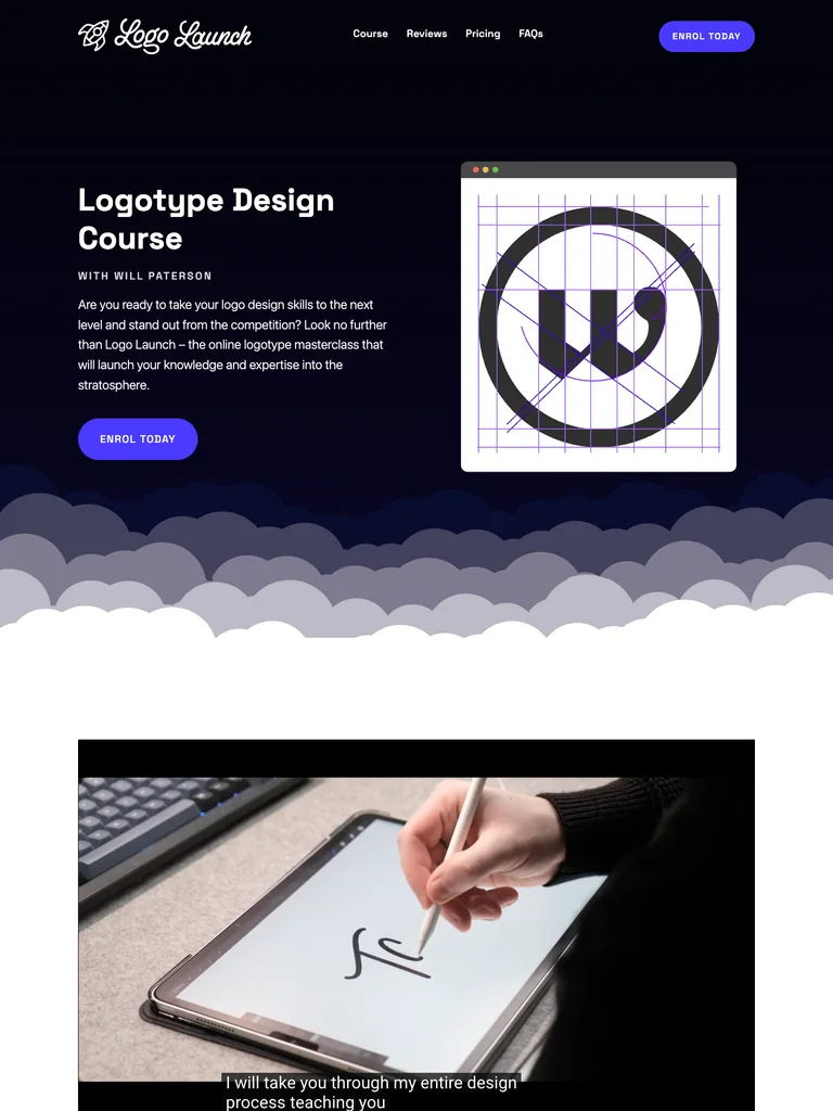 hover to scroll
A logo-design course funnel with geometric artwork, a dark opening, and structured curriculum and FAQ sections.
Useful for: Study the complete public offer page, its section order, and calls to action. Checkout steps, current enrollment availability, and conversion results are not verified.
# Design reference: Will Paterson — Logo Launch
Source: https://logo-launch.com/
Swipefile reference: https://swipefile.design/ref/funnel-will-patterson-logo-launch/
Captured: 2026-09-08. This is a dated reference, not a claim about the current live product.


## Objective
Adapt the visual principles below to my project. Use my own content and identity. Do not reproduce logos, proprietary copy, or brand assets.

## Reference notes
- mood: Graphic, precise, and playful.
- colors: Near-black navy, white, electric violet buttons, and pale lavender outlines.
- typography: Bold sans-serif headings, compact labels, short benefit lists, and clearly separated curriculum sections make the long offer scannable.
- layout: Dark split hero pairs course copy with a geometric logo drawing, then transitions through cloud-shaped dividers into course details, expandable module lists, pricing, and a two-column FAQ.
- motion: The screenshot records a static page state. Preserve readable scrolling and clear action feedback; do not infer video playback, counters, or hidden form behavior.
- texture: Product or instructor imagery, contrasting section backgrounds, grouped curriculum details, and customer-story panels.
- dont: Use your own offer, brand, and assets. Do not invent testimonials, results, scarcity, guarantees, or pricing.

Useful for: Study the complete public offer page, its section order, and calls to action. Checkout steps, current enrollment availability, and conversion results are not verified.

## Acceptance criteria
- Existing project conventions, design tokens, working functionality, and unrelated changes are preserved.
- Two or three reference principles clearly support the user's task; conflicts are resolved in favor of usability and the existing product.
- Reusable components and semantic HTML express the interface. Available licensed assets are used; important UI text is never rendered as a bitmap.
- Every visible control has a defined behavior. Loading, empty, error, success, disabled, and long-content states are specified where relevant. Demo data is clearly labeled.
- Navigation and content adapt at 375px, 768px, and 1440px without horizontal page overflow. Keyboard use, visible focus, labeled inputs, at least 44px touch targets, readable contrast, and reduced motion are supported.
- Verification distinguishes rendered behavior from proposals and identifies anything still requiring a backend or external service.

## Quality bar
Clear hierarchy, consistent spacing, restrained surfaces, and purposeful motion. Avoid decorative gradients, excessive cards, placeholder buttons, and invented metrics unless the project calls for them. Do not claim a feature is connected or tested without evidence.
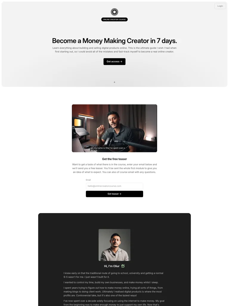 hover to scroll
A restrained creator-course page that uses generous whitespace and a concise sequence of learning resources.
Useful for: Study the complete public offer page, its section order, and calls to action. Checkout steps, current enrollment availability, and conversion results are not verified.
# Design reference: Oliur — Online Creator Course
Source: https://onlinecreatorcourse.com/
Swipefile reference: https://swipefile.design/ref/funnel-oliur-online-creator-course/
Captured: 2026-09-08. This is a dated reference, not a claim about the current live product.


## Objective
Adapt the visual principles below to my project. Use my own content and identity. Do not reproduce logos, proprietary copy, or brand assets.

## Reference notes
- mood: Minimal, focused, and quietly confident.
- colors: White and light gray, black pill buttons, and small green emphasis details.
- typography: Bold sans-serif headings, compact labels, short benefit lists, and clearly separated curriculum sections make the long offer scannable.
- layout: Compact centered course hero leads to a presenter video, audience-fit lists, an author story, a seven-day curriculum, additional resources, and a compact accordion FAQ.
- motion: The screenshot records a static page state. Preserve readable scrolling and clear action feedback; do not infer video playback, counters, or hidden form behavior.
- texture: Product or instructor imagery, contrasting section backgrounds, grouped curriculum details, and customer-story panels.
- dont: Use your own offer, brand, and assets. Do not invent testimonials, results, scarcity, guarantees, or pricing.

Useful for: Study the complete public offer page, its section order, and calls to action. Checkout steps, current enrollment availability, and conversion results are not verified.

## Acceptance criteria
- Existing project conventions, design tokens, working functionality, and unrelated changes are preserved.
- Two or three reference principles clearly support the user's task; conflicts are resolved in favor of usability and the existing product.
- Reusable components and semantic HTML express the interface. Available licensed assets are used; important UI text is never rendered as a bitmap.
- Every visible control has a defined behavior. Loading, empty, error, success, disabled, and long-content states are specified where relevant. Demo data is clearly labeled.
- Navigation and content adapt at 375px, 768px, and 1440px without horizontal page overflow. Keyboard use, visible focus, labeled inputs, at least 44px touch targets, readable contrast, and reduced motion are supported.
- Verification distinguishes rendered behavior from proposals and identifies anything still requiring a backend or external service.

## Quality bar
Clear hierarchy, consistent spacing, restrained surfaces, and purposeful motion. Avoid decorative gradients, excessive cards, placeholder buttons, and invented metrics unless the project calls for them. Do not claim a feature is connected or tested without evidence.
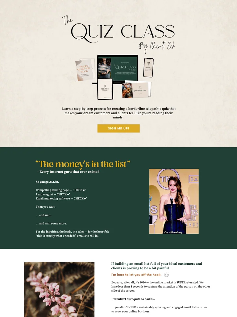 hover to scroll
A textured quiz-course funnel with serif-and-script typography, forest-green curriculum sections, and gold actions.
Useful for: Study the complete public offer page, its section order, and calls to action. Checkout steps, current enrollment availability, and conversion results are not verified.
# Design reference: Chanti Zak — The Quiz Class
Source: https://chantizak.com/the-quiz-class
Swipefile reference: https://swipefile.design/ref/funnel-chanti-zak-quiz-creation-course-bundle/
Captured: 2026-09-08. This is a dated reference, not a claim about the current live product.


## Objective
Adapt the visual principles below to my project. Use my own content and identity. Do not reproduce logos, proprietary copy, or brand assets.

## Reference notes
- mood: Warm, textured, and expressive.
- colors: Paper cream, deep forest green, mustard gold, and soft orange labels.
- typography: Editorial serif headings, small uppercase labels, readable supporting copy, and occasional script accents establish a layered hierarchy.
- layout: Product-bundle hero opens into a long course narrative, instructor context, examples, a dark green lesson sequence, student stories, and a portrait-led final invitation.
- motion: The screenshot records a static page state. Preserve readable scrolling and clear action feedback; do not infer video playback, counters, or hidden form behavior.
- texture: Product or instructor imagery, contrasting section backgrounds, grouped curriculum details, and customer-story panels.
- dont: Use your own offer, brand, and assets. Do not invent testimonials, results, scarcity, guarantees, or pricing.

Useful for: Study the complete public offer page, its section order, and calls to action. Checkout steps, current enrollment availability, and conversion results are not verified.

## Acceptance criteria
- Existing project conventions, design tokens, working functionality, and unrelated changes are preserved.
- Two or three reference principles clearly support the user's task; conflicts are resolved in favor of usability and the existing product.
- Reusable components and semantic HTML express the interface. Available licensed assets are used; important UI text is never rendered as a bitmap.
- Every visible control has a defined behavior. Loading, empty, error, success, disabled, and long-content states are specified where relevant. Demo data is clearly labeled.
- Navigation and content adapt at 375px, 768px, and 1440px without horizontal page overflow. Keyboard use, visible focus, labeled inputs, at least 44px touch targets, readable contrast, and reduced motion are supported.
- Verification distinguishes rendered behavior from proposals and identifies anything still requiring a backend or external service.

## Quality bar
Clear hierarchy, consistent spacing, restrained surfaces, and purposeful motion. Avoid decorative gradients, excessive cards, placeholder buttons, and invented metrics unless the project calls for them. Do not claim a feature is connected or tested without evidence.
 hover to scroll
A full coaching-course funnel with wave-shaped sections, extensive program detail, and repeated payment-plan comparisons.
Useful for: Study the complete public offer page, its section order, and calls to action. Checkout steps, current enrollment availability, and conversion results are not verified.
# Design reference: Denise Duffield-Thomas — Money Bootcamp
Source: https://denisedt.com/bootcamp
Swipefile reference: https://swipefile.design/ref/funnel-denise-duffield-thomas-money-bootcamp/
Captured: 2026-09-08. This is a dated reference, not a claim about the current live product.


## Objective
Adapt the visual principles below to my project. Use my own content and identity. Do not reproduce logos, proprietary copy, or brand assets.

## Reference notes
- mood: Supportive, expansive, and coaching-led.
- colors: Sky blue, deep indigo, white, and orange call-to-action buttons.
- typography: Bold sans-serif headings, compact labels, short benefit lists, and clearly separated curriculum sections make the long offer scannable.
- layout: Video-and-copy introduction leads through audience concerns, instructor context, member stories, six training modules, coaching resources, learner-stage panels, bonuses, repeated three-plan pricing, and extensive FAQs.
- motion: The screenshot records a static page state. Preserve readable scrolling and clear action feedback; do not infer video playback, counters, or hidden form behavior.
- texture: Product or instructor imagery, contrasting section backgrounds, grouped curriculum details, and customer-story panels.
- dont: Use your own offer, brand, and assets. Do not invent testimonials, results, scarcity, guarantees, or pricing.

Useful for: Study the complete public offer page, its section order, and calls to action. Checkout steps, current enrollment availability, and conversion results are not verified.

## Acceptance criteria
- Existing project conventions, design tokens, working functionality, and unrelated changes are preserved.
- Two or three reference principles clearly support the user's task; conflicts are resolved in favor of usability and the existing product.
- Reusable components and semantic HTML express the interface. Available licensed assets are used; important UI text is never rendered as a bitmap.
- Every visible control has a defined behavior. Loading, empty, error, success, disabled, and long-content states are specified where relevant. Demo data is clearly labeled.
- Navigation and content adapt at 375px, 768px, and 1440px without horizontal page overflow. Keyboard use, visible focus, labeled inputs, at least 44px touch targets, readable contrast, and reduced motion are supported.
- Verification distinguishes rendered behavior from proposals and identifies anything still requiring a backend or external service.

## Quality bar
Clear hierarchy, consistent spacing, restrained surfaces, and purposeful motion. Avoid decorative gradients, excessive cards, placeholder buttons, and invented metrics unless the project calls for them. Do not claim a feature is connected or tested without evidence.
 hover to scroll
A compact training funnel with navy section bands, readable checklists, and a closing FAQ.
Useful for: Study the complete public offer page, its section order, and calls to action. Checkout steps, current enrollment availability, and conversion results are not verified.
# Design reference: Price Action Traders Institute — Command Your Trading
Source: https://priceactiontradersinstitute.com/independence
Swipefile reference: https://swipefile.design/ref/funnel-price-action-traders-institute-command-your-trading/
Captured: 2026-09-08. This is a dated reference, not a claim about the current live product.


## Objective
Adapt the visual principles below to my project. Use my own content and identity. Do not reproduce logos, proprietary copy, or brand assets.

## Reference notes
- mood: Straightforward, restrained, and instructional.
- colors: White and light gray, deep navy and purple, and red offer buttons.
- typography: Editorial serif headings, small uppercase labels, readable supporting copy, and occasional script accents establish a layered hierarchy.
- layout: Compact course introduction leads through problem checklists, course benefits, a membership bonus, student comments, an enrollment-status section, and an accordion FAQ.
- motion: The screenshot records a static page state. Preserve readable scrolling and clear action feedback; do not infer video playback, counters, or hidden form behavior.
- texture: Product or instructor imagery, contrasting section backgrounds, grouped curriculum details, and customer-story panels.
- dont: Use your own offer, brand, and assets. Do not invent testimonials, results, scarcity, guarantees, or pricing.

Useful for: Study the complete public offer page, its section order, and calls to action. Checkout steps, current enrollment availability, and conversion results are not verified.

## Acceptance criteria
- Existing project conventions, design tokens, working functionality, and unrelated changes are preserved.
- Two or three reference principles clearly support the user's task; conflicts are resolved in favor of usability and the existing product.
- Reusable components and semantic HTML express the interface. Available licensed assets are used; important UI text is never rendered as a bitmap.
- Every visible control has a defined behavior. Loading, empty, error, success, disabled, and long-content states are specified where relevant. Demo data is clearly labeled.
- Navigation and content adapt at 375px, 768px, and 1440px without horizontal page overflow. Keyboard use, visible focus, labeled inputs, at least 44px touch targets, readable contrast, and reduced motion are supported.
- Verification distinguishes rendered behavior from proposals and identifies anything still requiring a backend or external service.

## Quality bar
Clear hierarchy, consistent spacing, restrained surfaces, and purposeful motion. Avoid decorative gradients, excessive cards, placeholder buttons, and invented metrics unless the project calls for them. Do not claim a feature is connected or tested without evidence.
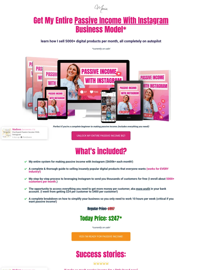 hover to scroll
A pink-and-white product funnel that combines a long sales page and an inline checkout.
Useful for: Study the complete public offer page, its section order, and calls to action. Checkout steps, current enrollment availability, and conversion results are not verified.
# Design reference: Maria Wendt — Passive Income With Instagram
Source: https://mariawendt.samcart.com/products/passive-income-business-for-instagram
Swipefile reference: https://swipefile.design/ref/funnel-maria-wendt-passive-income-business-with-instagram-bundle/
Captured: 2026-09-08. This is a dated reference, not a claim about the current live product.


## Objective
Adapt the visual principles below to my project. Use my own content and identity. Do not reproduce logos, proprietary copy, or brand assets.

## Reference notes
- mood: Bright, direct, and product-focused.
- colors: White, hot pink, dark navy copy, pale gray panels, and blue checkout controls.
- typography: Long readable text columns, emphatic section headings, detailed bullet lists, and selective highlights carry the sales argument.
- layout: Product-bundle hero flows through included resources, student examples, social-video comparisons, FAQs, a personal sales narrative, and an embedded checkout with optional order additions.
- motion: The screenshot records a static page state. Preserve readable scrolling and clear action feedback; do not infer video playback, counters, or hidden form behavior.
- texture: Extended reading sections, inset examples and portraits, selective text emphasis, and recurring offer details.
- dont: Use your own offer, brand, and assets. Do not invent testimonials, results, scarcity, guarantees, or pricing.

Useful for: Study the complete public offer page, its section order, and calls to action. Checkout steps, current enrollment availability, and conversion results are not verified.

## Acceptance criteria
- Existing project conventions, design tokens, working functionality, and unrelated changes are preserved.
- Two or three reference principles clearly support the user's task; conflicts are resolved in favor of usability and the existing product.
- Reusable components and semantic HTML express the interface. Available licensed assets are used; important UI text is never rendered as a bitmap.
- Every visible control has a defined behavior. Loading, empty, error, success, disabled, and long-content states are specified where relevant. Demo data is clearly labeled.
- Navigation and content adapt at 375px, 768px, and 1440px without horizontal page overflow. Keyboard use, visible focus, labeled inputs, at least 44px touch targets, readable contrast, and reduced motion are supported.
- Verification distinguishes rendered behavior from proposals and identifies anything still requiring a backend or external service.

## Quality bar
Clear hierarchy, consistent spacing, restrained surfaces, and purposeful motion. Avoid decorative gradients, excessive cards, placeholder buttons, and invented metrics unless the project calls for them. Do not claim a feature is connected or tested without evidence.
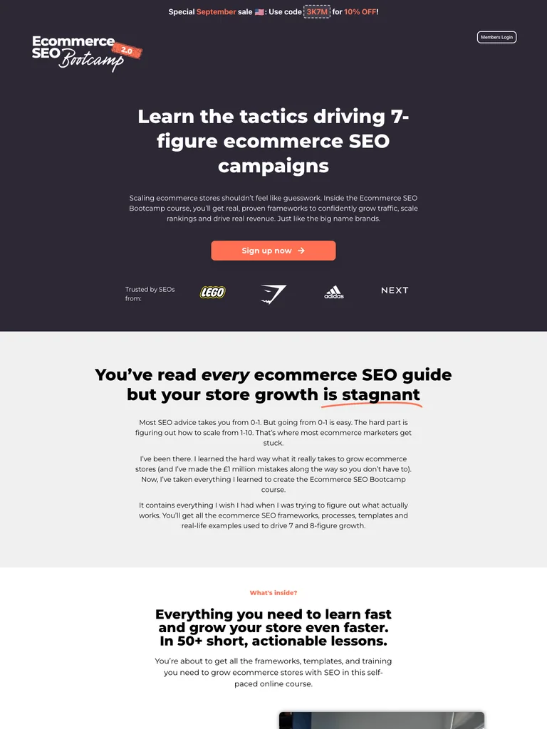 hover to scroll
An extensive SEO course funnel with a clear module sequence, a dense review grid, and a coral closing offer.
Useful for: Study the complete public offer page, its section order, and calls to action. Checkout steps, current enrollment availability, and conversion results are not verified.
# Design reference: Freddie Chatt — Ecommerce SEO Bootcamp
Source: https://ecommerceseobootcamp.com/
Swipefile reference: https://swipefile.design/ref/funnel-ecommerce-seo-bootcamp-course-go-from-zero-to-10000-per-month-with-seo/
Captured: 2026-09-08. This is a dated reference, not a claim about the current live product.


## Objective
Adapt the visual principles below to my project. Use my own content and identity. Do not reproduce logos, proprietary copy, or brand assets.

## Reference notes
- mood: Practical, detailed, and evidence-led.
- colors: Dark plum, white, coral-orange action sections, and light gray backgrounds.
- typography: Bold sans-serif headings, compact labels, short benefit lists, and clearly separated curriculum sections make the long offer scannable.
- layout: Focused course hero leads into audience problems, a detailed module sequence, a large student-review grid, example results, instructor context, pricing, and a contrasting closing offer.
- motion: The screenshot records a static page state. Preserve readable scrolling and clear action feedback; do not infer video playback, counters, or hidden form behavior.
- texture: Product or instructor imagery, contrasting section backgrounds, grouped curriculum details, and customer-story panels.
- dont: Use your own offer, brand, and assets. Do not invent testimonials, results, scarcity, guarantees, or pricing.

Useful for: Study the complete public offer page, its section order, and calls to action. Checkout steps, current enrollment availability, and conversion results are not verified.

## Acceptance criteria
- Existing project conventions, design tokens, working functionality, and unrelated changes are preserved.
- Two or three reference principles clearly support the user's task; conflicts are resolved in favor of usability and the existing product.
- Reusable components and semantic HTML express the interface. Available licensed assets are used; important UI text is never rendered as a bitmap.
- Every visible control has a defined behavior. Loading, empty, error, success, disabled, and long-content states are specified where relevant. Demo data is clearly labeled.
- Navigation and content adapt at 375px, 768px, and 1440px without horizontal page overflow. Keyboard use, visible focus, labeled inputs, at least 44px touch targets, readable contrast, and reduced motion are supported.
- Verification distinguishes rendered behavior from proposals and identifies anything still requiring a backend or external service.

## Quality bar
Clear hierarchy, consistent spacing, restrained surfaces, and purposeful motion. Avoid decorative gradients, excessive cards, placeholder buttons, and invented metrics unless the project calls for them. Do not claim a feature is connected or tested without evidence.
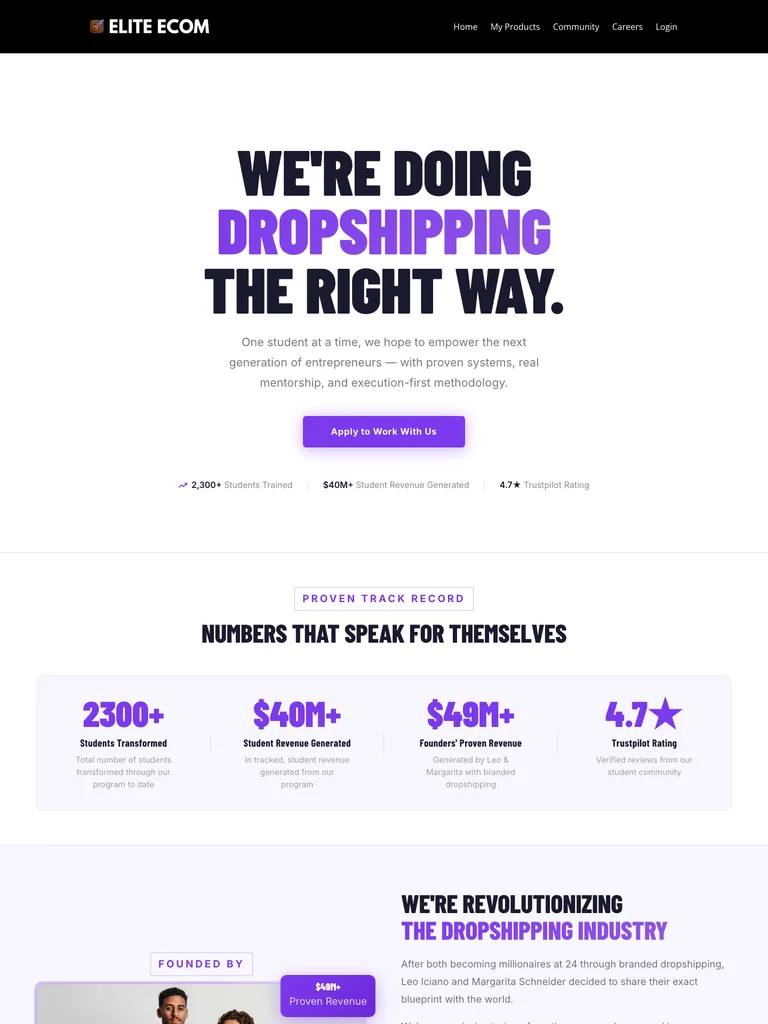 hover to scroll
A coaching funnel with condensed display type, violet accents, and repeated application prompts.
Useful for: Study the complete public offer page, its section order, and calls to action. Checkout steps, current enrollment availability, and conversion results are not verified.
# Design reference: Elite Ecom — Coaching Program
Source: https://joineliteecom.com/
Swipefile reference: https://swipefile.design/ref/funnel-elite-ecom-academy-facebook-unlocked-blueprint/
Captured: 2026-09-08. This is a dated reference, not a claim about the current live product.


## Objective
Adapt the visual principles below to my project. Use my own content and identity. Do not reproduce logos, proprietary copy, or brand assets.

## Reference notes
- mood: Bold, focused, and application-led.
- colors: White, near-black navy, vivid violet actions, and pale lavender panels.
- typography: Bold sans-serif headings, compact labels, short benefit lists, and clearly separated curriculum sections make the long offer scannable.
- layout: Oversized condensed headline and application action lead into program context, coaching and community benefits, member reviews, and a final side-by-side program recap and invitation.
- motion: The screenshot records a static page state. Preserve readable scrolling and clear action feedback; do not infer video playback, counters, or hidden form behavior.
- texture: Product or instructor imagery, contrasting section backgrounds, grouped curriculum details, and customer-story panels.
- dont: Use your own offer, brand, and assets. Do not invent testimonials, results, scarcity, guarantees, or pricing.

Useful for: Study the complete public offer page, its section order, and calls to action. Checkout steps, current enrollment availability, and conversion results are not verified.

## Acceptance criteria
- Existing project conventions, design tokens, working functionality, and unrelated changes are preserved.
- Two or three reference principles clearly support the user's task; conflicts are resolved in favor of usability and the existing product.
- Reusable components and semantic HTML express the interface. Available licensed assets are used; important UI text is never rendered as a bitmap.
- Every visible control has a defined behavior. Loading, empty, error, success, disabled, and long-content states are specified where relevant. Demo data is clearly labeled.
- Navigation and content adapt at 375px, 768px, and 1440px without horizontal page overflow. Keyboard use, visible focus, labeled inputs, at least 44px touch targets, readable contrast, and reduced motion are supported.
- Verification distinguishes rendered behavior from proposals and identifies anything still requiring a backend or external service.

## Quality bar
Clear hierarchy, consistent spacing, restrained surfaces, and purposeful motion. Avoid decorative gradients, excessive cards, placeholder buttons, and invented metrics unless the project calls for them. Do not claim a feature is connected or tested without evidence.
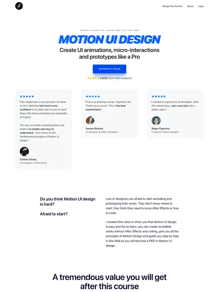 hover to scroll
A motion-design course funnel using generous whitespace, blue actions, and structured lesson and package sections.
Useful for: Study the complete public offer page, its section order, and calls to action. Checkout steps, current enrollment availability, and conversion results are not verified.
# Design reference: Alexunder Hess — Motion UI Design
Source: https://alexunderhess.design/motion-ui
Swipefile reference: https://swipefile.design/ref/funnel-alexunder-hess-motion-ui-design-gold/
Captured: 2026-09-08. This is a dated reference, not a claim about the current live product.


## Objective
Adapt the visual principles below to my project. Use my own content and identity. Do not reproduce logos, proprietary copy, or brand assets.

## Reference notes
- mood: Clean, technical, and approachable.
- colors: White and cool gray, electric blue, dark navy copy, and small violet illustrations.
- typography: Bold sans-serif headings, compact labels, short benefit lists, and clearly separated curriculum sections make the long offer scannable.
- layout: Centered course opening and review cards introduce audience fit, design benefits, detailed lesson modules, more student stories, package comparisons, tool references, and closing illustrations.
- motion: The screenshot records a static page state. Preserve readable scrolling and clear action feedback; do not infer video playback, counters, or hidden form behavior.
- texture: Product or instructor imagery, contrasting section backgrounds, grouped curriculum details, and customer-story panels.
- dont: Use your own offer, brand, and assets. Do not invent testimonials, results, scarcity, guarantees, or pricing.

Useful for: Study the complete public offer page, its section order, and calls to action. Checkout steps, current enrollment availability, and conversion results are not verified.

## Acceptance criteria
- Existing project conventions, design tokens, working functionality, and unrelated changes are preserved.
- Two or three reference principles clearly support the user's task; conflicts are resolved in favor of usability and the existing product.
- Reusable components and semantic HTML express the interface. Available licensed assets are used; important UI text is never rendered as a bitmap.
- Every visible control has a defined behavior. Loading, empty, error, success, disabled, and long-content states are specified where relevant. Demo data is clearly labeled.
- Navigation and content adapt at 375px, 768px, and 1440px without horizontal page overflow. Keyboard use, visible focus, labeled inputs, at least 44px touch targets, readable contrast, and reduced motion are supported.
- Verification distinguishes rendered behavior from proposals and identifies anything still requiring a backend or external service.

## Quality bar
Clear hierarchy, consistent spacing, restrained surfaces, and purposeful motion. Avoid decorative gradients, excessive cards, placeholder buttons, and invented metrics unless the project calls for them. Do not claim a feature is connected or tested without evidence.
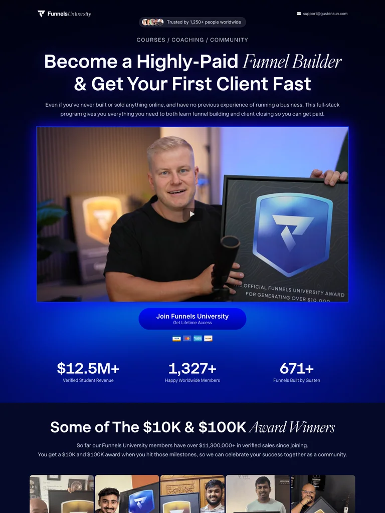 hover to scroll
A dark funnel-building program page combining courses, coaching, community, and a long bundle offer.
Useful for: Study the complete public offer page, its section order, and calls to action. Checkout steps, current enrollment availability, and conversion results are not verified.
# Design reference: Gusten Sun — Funnels University
Source: https://funnelsuniversity.com/
Swipefile reference: https://swipefile.design/ref/funnel-gusten-sun-funnel-university/
Captured: 2026-09-08. This is a dated reference, not a claim about the current live product.


## Objective
Adapt the visual principles below to my project. Use my own content and identity. Do not reproduce logos, proprietary copy, or brand assets.

## Reference notes
- mood: High-energy, immersive, and instructor-led.
- colors: Near-black navy, white, electric blue and violet, with bright offer accents.
- typography: Bold sans-serif headings, compact labels, short benefit lists, and clearly separated curriculum sections make the long offer scannable.
- layout: Video-led opening progresses through instructor credentials, member examples, guest experts, courses and community resources, an extended bundle stack, pricing, and repeated enrollment invitations.
- motion: The screenshot records a static page state. Preserve readable scrolling and clear action feedback; do not infer video playback, counters, or hidden form behavior.
- texture: Product or instructor imagery, contrasting section backgrounds, grouped curriculum details, and customer-story panels.
- dont: Use your own offer, brand, and assets. Do not invent testimonials, results, scarcity, guarantees, or pricing.

Useful for: Study the complete public offer page, its section order, and calls to action. Checkout steps, current enrollment availability, and conversion results are not verified.

## Acceptance criteria
- Existing project conventions, design tokens, working functionality, and unrelated changes are preserved.
- Two or three reference principles clearly support the user's task; conflicts are resolved in favor of usability and the existing product.
- Reusable components and semantic HTML express the interface. Available licensed assets are used; important UI text is never rendered as a bitmap.
- Every visible control has a defined behavior. Loading, empty, error, success, disabled, and long-content states are specified where relevant. Demo data is clearly labeled.
- Navigation and content adapt at 375px, 768px, and 1440px without horizontal page overflow. Keyboard use, visible focus, labeled inputs, at least 44px touch targets, readable contrast, and reduced motion are supported.
- Verification distinguishes rendered behavior from proposals and identifies anything still requiring a backend or external service.

## Quality bar
Clear hierarchy, consistent spacing, restrained surfaces, and purposeful motion. Avoid decorative gradients, excessive cards, placeholder buttons, and invented metrics unless the project calls for them. Do not claim a feature is connected or tested without evidence.
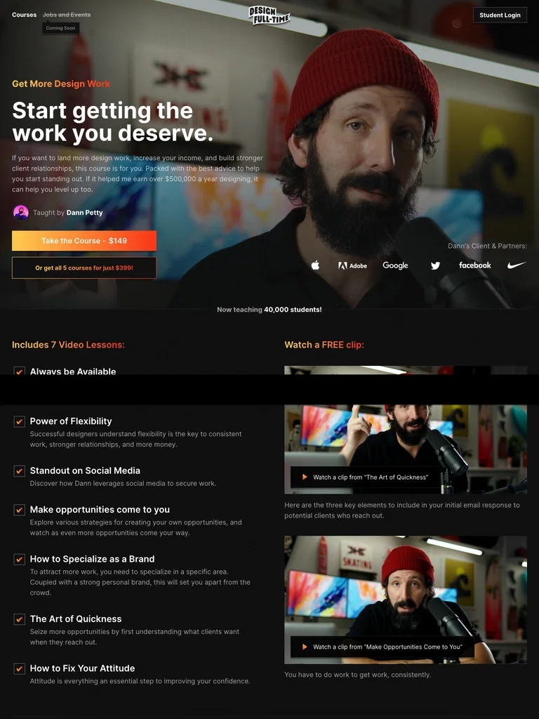 hover to scroll
A compact design-course funnel with a cinematic instructor opening and a clear lesson outline.
Useful for: Study the complete public offer page, its section order, and calls to action. Checkout steps, current enrollment availability, and conversion results are not verified.
# Design reference: Dann Petty — Get More Design Work
Source: https://designfulltime.com/course/getmoredesignwork
Swipefile reference: https://swipefile.design/ref/funnel-dan-petty-design-full-time-bundle/
Captured: 2026-09-08. This is a dated reference, not a claim about the current live product.


## Objective
Adapt the visual principles below to my project. Use my own content and identity. Do not reproduce logos, proprietary copy, or brand assets.

## Reference notes
- mood: Cinematic, personal, and concise.
- colors: Black and charcoal, white text, warm orange and yellow actions, and photographic backgrounds.
- typography: Bold sans-serif headings, compact labels, short benefit lists, and clearly separated curriculum sections make the long offer scannable.
- layout: Full-width instructor-video hero leads into a seven-lesson outline, a sample clip, instructor experience, student comments, related course cards, and repeated course or bundle actions.
- motion: The screenshot records a static page state. Preserve readable scrolling and clear action feedback; do not infer video playback, counters, or hidden form behavior.
- texture: Product or instructor imagery, contrasting section backgrounds, grouped curriculum details, and customer-story panels.
- dont: Use your own offer, brand, and assets. Do not invent testimonials, results, scarcity, guarantees, or pricing.

Useful for: Study the complete public offer page, its section order, and calls to action. Checkout steps, current enrollment availability, and conversion results are not verified.

## Acceptance criteria
- Existing project conventions, design tokens, working functionality, and unrelated changes are preserved.
- Two or three reference principles clearly support the user's task; conflicts are resolved in favor of usability and the existing product.
- Reusable components and semantic HTML express the interface. Available licensed assets are used; important UI text is never rendered as a bitmap.
- Every visible control has a defined behavior. Loading, empty, error, success, disabled, and long-content states are specified where relevant. Demo data is clearly labeled.
- Navigation and content adapt at 375px, 768px, and 1440px without horizontal page overflow. Keyboard use, visible focus, labeled inputs, at least 44px touch targets, readable contrast, and reduced motion are supported.
- Verification distinguishes rendered behavior from proposals and identifies anything still requiring a backend or external service.

## Quality bar
Clear hierarchy, consistent spacing, restrained surfaces, and purposeful motion. Avoid decorative gradients, excessive cards, placeholder buttons, and invented metrics unless the project calls for them. Do not claim a feature is connected or tested without evidence.
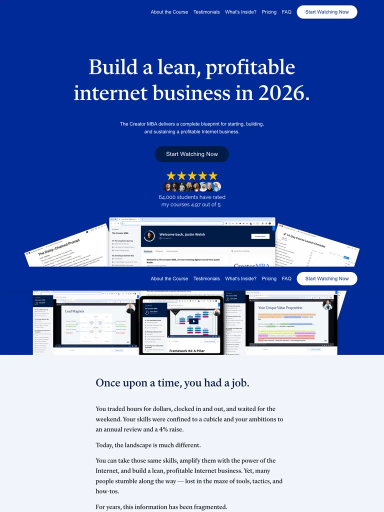 hover to scroll
A long blue-and-white business-course page with editorial headings and a detailed curriculum-to-offer sequence.
Useful for: Study the complete public offer page, its section order, and calls to action. Checkout steps, current enrollment availability, and conversion results are not verified.
# Design reference: Justin Welsh — The Creator MBA
Source: https://learn.justinwelsh.me/creator
Swipefile reference: https://swipefile.design/ref/funnel-justin-welsh-the-creator-mba/
Captured: 2026-09-08. This is a dated reference, not a claim about the current live product.


## Objective
Adapt the visual principles below to my project. Use my own content and identity. Do not reproduce logos, proprietary copy, or brand assets.

## Reference notes
- mood: Editorial, confident, and structured.
- colors: Royal blue, deep navy, white, and restrained pale neutral panels.
- typography: Editorial serif headings, small uppercase labels, readable supporting copy, and occasional script accents establish a layered hierarchy.
- layout: Large serif course hero and layered resource previews lead into a narrative introduction, curriculum chapters, tool and bonus previews, audience-fit lists, student stories, pricing, instructor background, and FAQs.
- motion: The screenshot records a static page state. Preserve readable scrolling and clear action feedback; do not infer video playback, counters, or hidden form behavior.
- texture: Product or instructor imagery, contrasting section backgrounds, grouped curriculum details, and customer-story panels.
- dont: Use your own offer, brand, and assets. Do not invent testimonials, results, scarcity, guarantees, or pricing.

Useful for: Study the complete public offer page, its section order, and calls to action. Checkout steps, current enrollment availability, and conversion results are not verified.

## Acceptance criteria
- Existing project conventions, design tokens, working functionality, and unrelated changes are preserved.
- Two or three reference principles clearly support the user's task; conflicts are resolved in favor of usability and the existing product.
- Reusable components and semantic HTML express the interface. Available licensed assets are used; important UI text is never rendered as a bitmap.
- Every visible control has a defined behavior. Loading, empty, error, success, disabled, and long-content states are specified where relevant. Demo data is clearly labeled.
- Navigation and content adapt at 375px, 768px, and 1440px without horizontal page overflow. Keyboard use, visible focus, labeled inputs, at least 44px touch targets, readable contrast, and reduced motion are supported.
- Verification distinguishes rendered behavior from proposals and identifies anything still requiring a backend or external service.

## Quality bar
Clear hierarchy, consistent spacing, restrained surfaces, and purposeful motion. Avoid decorative gradients, excessive cards, placeholder buttons, and invented metrics unless the project calls for them. Do not claim a feature is connected or tested without evidence.
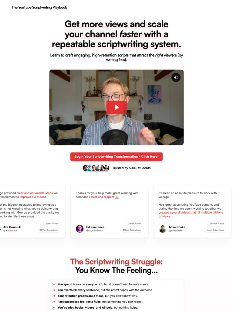 hover to scroll
A scriptwriting funnel built around a video introduction, concrete learning resources, and recurring red actions.
Useful for: Study the complete public offer page, its section order, and calls to action. Checkout steps, current enrollment availability, and conversion results are not verified.
# Design reference: George Blackman — The YouTube Scriptwriting Playbook
Source: https://ytsp.co/
Swipefile reference: https://swipefile.design/ref/funnel-george-blackman-the-youtube-scriptwriter-s-playbook/
Captured: 2026-09-08. This is a dated reference, not a claim about the current live product.


## Objective
Adapt the visual principles below to my project. Use my own content and identity. Do not reproduce logos, proprietary copy, or brand assets.

## Reference notes
- mood: Clear, approachable, and demonstration-led.
- colors: White, black, blush-pink sections, and bright red action buttons.
- typography: Bold sans-serif headings, compact labels, short benefit lists, and clearly separated curriculum sections make the long offer scannable.
- layout: Centered video opening moves through writing frustrations, the course method, resource previews, module details, community support, student stories, offer comparisons, and closing questions.
- motion: The screenshot records a static page state. Preserve readable scrolling and clear action feedback; do not infer video playback, counters, or hidden form behavior.
- texture: Product or instructor imagery, contrasting section backgrounds, grouped curriculum details, and customer-story panels.
- dont: Use your own offer, brand, and assets. Do not invent testimonials, results, scarcity, guarantees, or pricing.

Useful for: Study the complete public offer page, its section order, and calls to action. Checkout steps, current enrollment availability, and conversion results are not verified.

## Acceptance criteria
- Existing project conventions, design tokens, working functionality, and unrelated changes are preserved.
- Two or three reference principles clearly support the user's task; conflicts are resolved in favor of usability and the existing product.
- Reusable components and semantic HTML express the interface. Available licensed assets are used; important UI text is never rendered as a bitmap.
- Every visible control has a defined behavior. Loading, empty, error, success, disabled, and long-content states are specified where relevant. Demo data is clearly labeled.
- Navigation and content adapt at 375px, 768px, and 1440px without horizontal page overflow. Keyboard use, visible focus, labeled inputs, at least 44px touch targets, readable contrast, and reduced motion are supported.
- Verification distinguishes rendered behavior from proposals and identifies anything still requiring a backend or external service.

## Quality bar
Clear hierarchy, consistent spacing, restrained surfaces, and purposeful motion. Avoid decorative gradients, excessive cards, placeholder buttons, and invented metrics unless the project calls for them. Do not claim a feature is connected or tested without evidence.
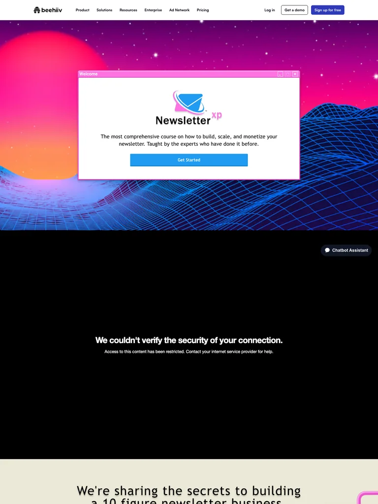 hover to scroll
A newsletter-course funnel with a retro computer-window hero, neon landscapes, and a prominent speaker lineup.
Useful for: Study the complete public offer page, its section order, and calls to action. Checkout steps, current enrollment availability, and conversion results are not verified.
# Design reference: beehiiv — Newsletter XP
Source: https://beehiiv.com/courses/newsletter-xp
Swipefile reference: https://swipefile.design/ref/funnel-tyler-denk-beehiiv-newsletterxp/
Captured: 2026-09-08. This is a dated reference, not a claim about the current live product.


## Objective
Adapt the visual principles below to my project. Use my own content and identity. Do not reproduce logos, proprietary copy, or brand assets.

## Reference notes
- mood: Playful, retro, and speaker-led.
- colors: Neon pink and purple, electric blue grids, black sections, white panels, and pale cream backgrounds.
- typography: Bold sans-serif headings, compact labels, short benefit lists, and clearly separated curriculum sections make the long offer scannable.
- layout: Retro desktop-window hero introduces the course, followed by co-host and speaker profiles, curriculum details, supporting resources, enrollment information, and FAQs.
- motion: The screenshot records a static page state. Preserve readable scrolling and clear action feedback; do not infer video playback, counters, or hidden form behavior.
- texture: Product or instructor imagery, contrasting section backgrounds, grouped curriculum details, and customer-story panels.
- dont: Use your own offer, brand, and assets. Do not invent testimonials, results, scarcity, guarantees, or pricing.

Useful for: Study the complete public offer page, its section order, and calls to action. Checkout steps, current enrollment availability, and conversion results are not verified.

## Acceptance criteria
- Existing project conventions, design tokens, working functionality, and unrelated changes are preserved.
- Two or three reference principles clearly support the user's task; conflicts are resolved in favor of usability and the existing product.
- Reusable components and semantic HTML express the interface. Available licensed assets are used; important UI text is never rendered as a bitmap.
- Every visible control has a defined behavior. Loading, empty, error, success, disabled, and long-content states are specified where relevant. Demo data is clearly labeled.
- Navigation and content adapt at 375px, 768px, and 1440px without horizontal page overflow. Keyboard use, visible focus, labeled inputs, at least 44px touch targets, readable contrast, and reduced motion are supported.
- Verification distinguishes rendered behavior from proposals and identifies anything still requiring a backend or external service.

## Quality bar
Clear hierarchy, consistent spacing, restrained surfaces, and purposeful motion. Avoid decorative gradients, excessive cards, placeholder buttons, and invented metrics unless the project calls for them. Do not claim a feature is connected or tested without evidence.
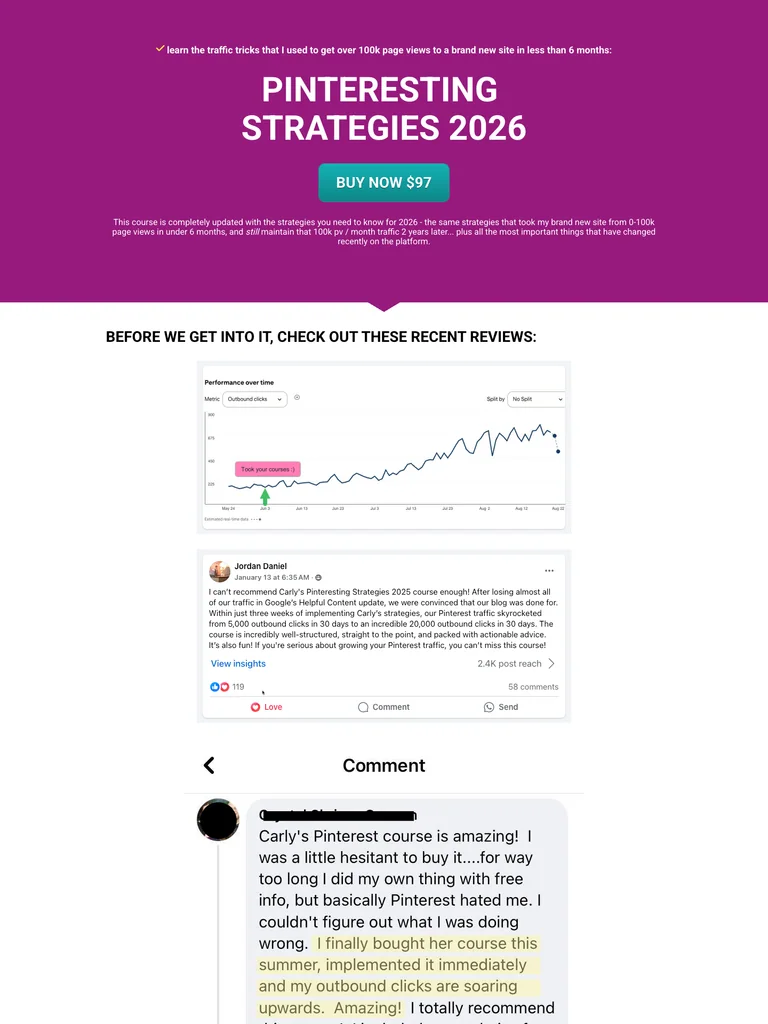 hover to scroll
A long Pinterest training sales letter organized around charts, learning outcomes, and student examples.
Useful for: Study the complete public offer page, its section order, and calls to action. Checkout steps, current enrollment availability, and conversion results are not verified.
# Design reference: Carly Campbell — Pinteresting Strategies
Source: https://blogginglikeyoumeanit.lpages.co/pinteresting-strategies
Swipefile reference: https://swipefile.design/ref/funnel-carly-campbell-pinterest-strategies-2-0/
Captured: 2026-09-08. This is a dated reference, not a claim about the current live product.


## Objective
Adapt the visual principles below to my project. Use my own content and identity. Do not reproduce logos, proprietary copy, or brand assets.

## Reference notes
- mood: Direct, detailed, and evidence-heavy.
- colors: Magenta-purple, white, teal action buttons, and black body copy.
- typography: Long readable text columns, emphatic section headings, detailed bullet lists, and selective highlights carry the sales argument.
- layout: Simple course offer opens into chart-based examples, instructor narrative, topic-by-topic learning outcomes, templates, extensive student comments, objections, and recurring purchase buttons.
- motion: The screenshot records a static page state. Preserve readable scrolling and clear action feedback; do not infer video playback, counters, or hidden form behavior.
- texture: Extended reading sections, inset examples and portraits, selective text emphasis, and recurring offer details.
- dont: Use your own offer, brand, and assets. Do not invent testimonials, results, scarcity, guarantees, or pricing.

Useful for: Study the complete public offer page, its section order, and calls to action. Checkout steps, current enrollment availability, and conversion results are not verified.

## Acceptance criteria
- Existing project conventions, design tokens, working functionality, and unrelated changes are preserved.
- Two or three reference principles clearly support the user's task; conflicts are resolved in favor of usability and the existing product.
- Reusable components and semantic HTML express the interface. Available licensed assets are used; important UI text is never rendered as a bitmap.
- Every visible control has a defined behavior. Loading, empty, error, success, disabled, and long-content states are specified where relevant. Demo data is clearly labeled.
- Navigation and content adapt at 375px, 768px, and 1440px without horizontal page overflow. Keyboard use, visible focus, labeled inputs, at least 44px touch targets, readable contrast, and reduced motion are supported.
- Verification distinguishes rendered behavior from proposals and identifies anything still requiring a backend or external service.

## Quality bar
Clear hierarchy, consistent spacing, restrained surfaces, and purposeful motion. Avoid decorative gradients, excessive cards, placeholder buttons, and invented metrics unless the project calls for them. Do not claim a feature is connected or tested without evidence.
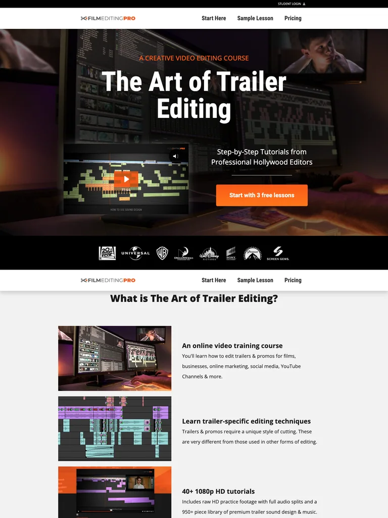 hover to scroll
A cinematic editing-course funnel that uses free lessons as the entry point to a longer training offer.
Useful for: Study the complete public offer page, its section order, and calls to action. Checkout steps, current enrollment availability, and conversion results are not verified.
# Design reference: Film Editing Pro — The Art of Trailer Editing
Source: https://theartoftrailerediting.com/
Swipefile reference: https://swipefile.design/ref/funnel-film-editing-pro-the-art-of-trailer-editing-pro-ultimate/
Captured: 2026-09-08. This is a dated reference, not a claim about the current live product.


## Objective
Adapt the visual principles below to my project. Use my own content and identity. Do not reproduce logos, proprietary copy, or brand assets.

## Reference notes
- mood: Cinematic, practical, and professional.
- colors: Black and charcoal, white, warm orange buttons, and editing-workstation photography.
- typography: Bold sans-serif headings, compact labels, short benefit lists, and clearly separated curriculum sections make the long offer scannable.
- layout: Editing-workstation hero introduces the course and free lessons, followed by course format, a sample lesson, pricing context, a detailed lesson list, studio references, trainer profiles, and a closing free-lesson invitation.
- motion: The screenshot records a static page state. Preserve readable scrolling and clear action feedback; do not infer video playback, counters, or hidden form behavior.
- texture: Product or instructor imagery, contrasting section backgrounds, grouped curriculum details, and customer-story panels.
- dont: Use your own offer, brand, and assets. Do not invent testimonials, results, scarcity, guarantees, or pricing.

Useful for: Study the complete public offer page, its section order, and calls to action. Checkout steps, current enrollment availability, and conversion results are not verified.

## Acceptance criteria
- Existing project conventions, design tokens, working functionality, and unrelated changes are preserved.
- Two or three reference principles clearly support the user's task; conflicts are resolved in favor of usability and the existing product.
- Reusable components and semantic HTML express the interface. Available licensed assets are used; important UI text is never rendered as a bitmap.
- Every visible control has a defined behavior. Loading, empty, error, success, disabled, and long-content states are specified where relevant. Demo data is clearly labeled.
- Navigation and content adapt at 375px, 768px, and 1440px without horizontal page overflow. Keyboard use, visible focus, labeled inputs, at least 44px touch targets, readable contrast, and reduced motion are supported.
- Verification distinguishes rendered behavior from proposals and identifies anything still requiring a backend or external service.

## Quality bar
Clear hierarchy, consistent spacing, restrained surfaces, and purposeful motion. Avoid decorative gradients, excessive cards, placeholder buttons, and invented metrics unless the project calls for them. Do not claim a feature is connected or tested without evidence.
Allow basic usage counts to help us understand what is useful. Your board contents stay out of analytics. Details
Your browser’s privacy preference keeps analytics off.