Analytics Dashboard
CURATED COLLECTION · 4 REFERENCES
A dashboard should help someone notice a change and decide what to do. This collection contrasts metric summaries, issue lists, task tables, and rankings so you can choose a structure around the actual job.
Copy the reference notes below and paste them into Claude, ChatGPT, or your coding assistant. Add what you want to build.
Includes design notes, original sources, and preview links. An assistant that supports browsing can also read the public board link.
Selected for a legible information hierarchy in public or demo captures. These examples document visible screens, not a full accessibility audit or evidence that one layout outperforms another.
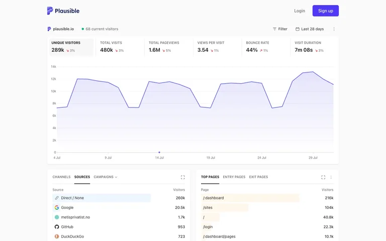
Compare the relationship between headline metrics, the chart, and ranked lists. Keep units, time ranges, and comparisons explicit in your own version.
Study a query and compact filters above a readable issue list. Preserve the title hierarchy when labels and metadata grow.
Use the text-first table as a density reference. Status and priority remain scannable without turning every row into a separate card.
Sketch the task before the dashboard: monitor, compare, investigate, or act. Then choose the smallest set of summaries that supports it. Use consistent date ranges and meaningful empty states. A board, table, or calendar may serve the user better than a page of charts.
The stat row IS the chart legend — click a tile and the line chart replots to that metric — and every ranked list underneath fakes a bar chart by tinting a proportion of each row's own background.
Useful for: Steal the in-row proportional bar: Sources and Top Pages are plain two-column lists, but each row has a translucent fill scaled to that row's share of the total sitting behind the text, so you get a bar chart's read without ever drawing an axis. Also take the six-tile stat strip where every tile is a button that reassigns what the chart above is plotting, with the active metric getting a soft grey selection card — one row of numbers replaces a metric-picker dropdown.
# Design reference: Plausible — Analytics dashboard
Source: https://plausible.io/plausible.io
Swipefile reference: https://swipefile.design/ref/plausible-dashboard/
Captured: 2026-08-01. This is a dated reference, not a claim about the current live product.
Capture scope: a page excerpt. Do not infer unseen sections or interactions.

## Objective
Adapt the interaction and layout patterns below to my project. Use my own content and identity. Do not reproduce logos, proprietary copy, or brand assets.

## Reference notes
- surface: Public/shared analytics dashboard for a single site (plausible.io), logged-out marketing chrome above it
- nav: Effectively one tier: a site-identity row (favicon, domain, live-visitor dot) stands in for navigation, plus `Filter` and a date-range control on the right. No sidebar, no settings rail — this is the shared/embed view, not the logged-in app shell.
- layout: Single centered column on a faint grey-blue page tint. The stat strip is one fixed-height row of six equal tiles; the chart is a single flexible block beneath it; two list panels close the page side by side, each roughly half width with a gap between.
- density: Airy. Stat tiles carry real padding around one big number; list rows run about 40px with only two columns (name, count) so nothing competes with the figures.
- color: White cards on a faint grey page tint. One accent (indigo) is reused for the logo, the `Sign up` button, the chart line and fill, and the active tab underline. Red marks negative deltas beside the big numbers. The row-tint bars in the two list panels use a low-opacity wash, never full saturation.
- typography: One sans throughout. Stat labels are tiny uppercase grey tracked-out text; the numbers beneath them are the largest bold type on the page. List rows are regular weight with the count right-aligned and slightly heavier.
- pattern: A proportional background tint hiding inside a plain two-column list row — it turns Sources and Top Pages into bar charts for free, with nothing more than a width-scaled wash behind the text.
- states: The top source row (Direct/None) carries a highlighted background, reading as either a hover or a pinned top-rank state. A single marker dot sits on the chart at one date, like a frozen tooltip anchor.
- dont: Don't let the row-tint bars gain a border or full opacity. The moment they look like a deliberate progress bar instead of a background wash, the list stops reading as a plain table and starts competing with the real chart above it.

Useful for: Steal the in-row proportional bar: Sources and Top Pages are plain two-column lists, but each row has a translucent fill scaled to that row's share of the total sitting behind the text, so you get a bar chart's read without ever drawing an axis. Also take the six-tile stat strip where every tile is a button that reassigns what the chart above is plotting, with the active metric getting a soft grey selection card — one row of numbers replaces a metric-picker dropdown.

## Acceptance criteria
- Existing project conventions, design tokens, working functionality, and unrelated changes are preserved.
- Two or three reference principles clearly support the user's task; conflicts are resolved in favor of usability and the existing product.
- Reusable components and semantic HTML express the interface. Available licensed assets are used; important UI text is never rendered as a bitmap.
- Every visible control has a defined behavior. Loading, empty, error, success, disabled, and long-content states are specified where relevant. Demo data is clearly labeled.
- Navigation and content adapt at 375px, 768px, and 1440px without horizontal page overflow. Keyboard use, visible focus, labeled inputs, at least 44px touch targets, readable contrast, and reduced motion are supported.
- Verification distinguishes rendered behavior from proposals and identifies anything still requiring a backend or external service.

## Quality bar
Clear hierarchy, consistent spacing, restrained surfaces, and purposeful motion. Avoid decorative gradients, excessive cards, placeholder buttons, and invented metrics unless the project calls for them. Do not claim a feature is connected or tested without evidence.
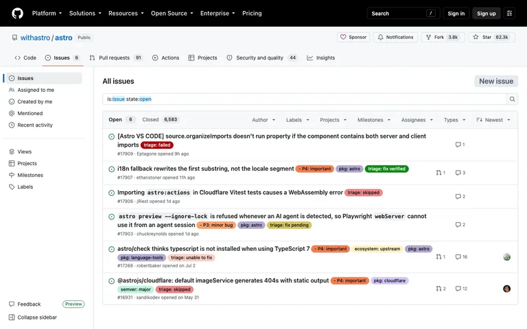
A searchable issue list combines a readable query, compact filters, and inline labels without losing the hierarchy of each issue title.
Useful for: Keep the query visible as editable text, with task-specific filters directly above the results. Pair status icons with labels and reserve the strongest weight for the issue title.
# Design reference: GitHub — Issue list
Source: https://github.com/withastro/astro/issues
Swipefile reference: https://swipefile.design/ref/github-issues/
Captured: 2026-09-04. This is a dated reference, not a claim about the current live product.
Capture scope: a page excerpt. Do not infer unseen sections or interactions.

## Objective
Adapt the interaction and layout patterns below to my project. Use my own content and identity. Do not reproduce logos, proprietary copy, or brand assets.

## Reference notes
- surface: Open issues in a public GitHub repository
- nav: Global GitHub navigation, repository tabs, and a left sidebar for issue views.
- layout: A narrow left navigation rail and a wide results list, preceded by a query field and a filter toolbar.
- density: Compact metadata below each title; rows expand naturally for long titles and labels.
- color: Neutral white and gray structure with semantic issue icons and colored labels. Status remains legible from text and icons.
- typography: Bold issue titles; smaller muted author, time, and issue-number metadata. Query syntax remains readable in the search field.
- pattern: Combine an editable structured query with familiar filters instead of forcing users into one search method.
- states: Populated open-issues view. Counts and issue contents are a dated public snapshot, not current operational data.
- dont: Do not communicate state solely through label color. Preserve the current query and filter state when navigating back.

Useful for: Keep the query visible as editable text, with task-specific filters directly above the results. Pair status icons with labels and reserve the strongest weight for the issue title.

## Acceptance criteria
- Existing project conventions, design tokens, working functionality, and unrelated changes are preserved.
- Two or three reference principles clearly support the user's task; conflicts are resolved in favor of usability and the existing product.
- Reusable components and semantic HTML express the interface. Available licensed assets are used; important UI text is never rendered as a bitmap.
- Every visible control has a defined behavior. Loading, empty, error, success, disabled, and long-content states are specified where relevant. Demo data is clearly labeled.
- Navigation and content adapt at 375px, 768px, and 1440px without horizontal page overflow. Keyboard use, visible focus, labeled inputs, at least 44px touch targets, readable contrast, and reduced motion are supported.
- Verification distinguishes rendered behavior from proposals and identifies anything still requiring a backend or external service.

## Quality bar
Clear hierarchy, consistent spacing, restrained surfaces, and purposeful motion. Avoid decorative gradients, excessive cards, placeholder buttons, and invented metrics unless the project calls for them. Do not claim a feature is connected or tested without evidence.
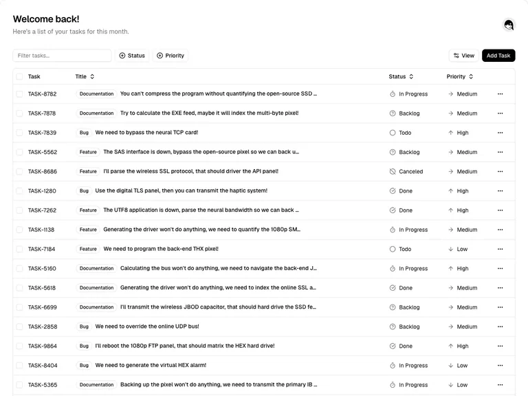
A text-first task table makes status, priority, and row actions scannable without wrapping every task in a card.
Useful for: Use inline filters above the table, stable column widths, and a compact overflow menu for secondary row actions.
# Design reference: shadcn/ui — Task table
Source: https://ui.shadcn.com/examples/tasks
Swipefile reference: https://swipefile.design/ref/shadcn-tasks/
Captured: 2026-09-04. This is a dated reference, not a claim about the current live product.
Capture scope: a page excerpt. Do not infer unseen sections or interactions.

## Objective
Adapt the interaction and layout patterns below to my project. Use my own content and identity. Do not reproduce logos, proprietary copy, or brand assets.

## Reference notes
- surface: Task list with search and status filters
- nav: One page header; controls belong directly above the table they affect.
- layout: Wide table with selection, ID, title, status, priority, and a trailing overflow menu.
- density: Dense rows with enough vertical padding for scanning. Long titles truncate while the status columns remain aligned.
- color: Neutral surfaces and fine separators. Status uses an icon and label rather than relying on color.
- typography: Small sans-serif table text, bold task title, subdued IDs and header labels.
- pattern: Keep comparison attributes in fixed columns and preserve row alignment during filtering.
- states: Populated public demo with fictional task text; selected count and pagination are below the captured area.
- dont: Do not hide essential row actions behind hover or let long titles push status off screen.

Useful for: Use inline filters above the table, stable column widths, and a compact overflow menu for secondary row actions.

## Acceptance criteria
- Existing project conventions, design tokens, working functionality, and unrelated changes are preserved.
- Two or three reference principles clearly support the user's task; conflicts are resolved in favor of usability and the existing product.
- Reusable components and semantic HTML express the interface. Available licensed assets are used; important UI text is never rendered as a bitmap.
- Every visible control has a defined behavior. Loading, empty, error, success, disabled, and long-content states are specified where relevant. Demo data is clearly labeled.
- Navigation and content adapt at 375px, 768px, and 1440px without horizontal page overflow. Keyboard use, visible focus, labeled inputs, at least 44px touch targets, readable contrast, and reduced motion are supported.
- Verification distinguishes rendered behavior from proposals and identifies anything still requiring a backend or external service.

## Quality bar
Clear hierarchy, consistent spacing, restrained surfaces, and purposeful motion. Avoid decorative gradients, excessive cards, placeholder buttons, and invented metrics unless the project calls for them. Do not claim a feature is connected or tested without evidence.
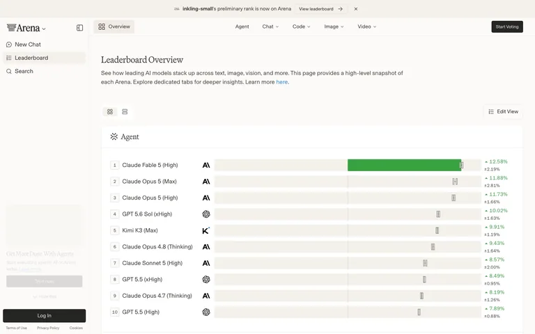
A leaderboard that refuses to look like SaaS — cream paper background, a serif display face on every heading, and the confidence bar isn't a chart beside the ranking, it's drawn inside each row.
Useful for: The in-row confidence bar: a light-grey track spans the full width of every ranking row, filled solid green to the leader's score with a thin vertical bracket marking the confidence-interval edge — a chart built into the row instead of bolted beside it as a separate column. Pair it with the cream-and-serif treatment (warm paper backdrop, serif display headings against a plain sans for data) and a dense AI-benchmark table reads like a printed report instead of another blue SaaS dashboard.
# Design reference: LMArena — Leaderboard
Source: https://lmarena.ai/leaderboard
Swipefile reference: https://swipefile.design/ref/lmarena-leaderboard/
Captured: 2026-08-01. This is a dated reference, not a claim about the current live product.
Capture scope: a page excerpt. Do not infer unseen sections or interactions.

## Objective
Adapt the interaction and layout patterns below to my project. Use my own content and identity. Do not reproduce logos, proprietary copy, or brand assets.

## Reference notes
- surface: LMArena Leaderboard, Overview tab, Agent category
- nav: Two tiers. A left sidebar (logo with a collapse toggle, New Chat, Leaderboard as the active item, Search, then a promo card and Log In pinned to the bottom) and a top tab strip inside the content area (Overview as an active boxed icon tab, then Agent/Chat/Code/Image/Video category tabs with dropdown chevrons) plus a black 'Start Voting' button on the far right. A dismissible cream announcement banner sits above everything.
- layout: Fixed sidebar, fluid content. The ranking table is a single column filling the remaining width; each row is full-bleed with no card borders between rows, just a hairline divider.
- density: Comfortable. Rows run roughly 56-60px tall with room for a secondary confidence line under the percentage figure — built for scanning ten rows at a glance, not hundreds.
- color: Cream/paper background throughout, including the announcement bar — not white. The only saturated colour is the green fill of the leading confidence bar and the green up-arrow percentage figures; every rank badge, logo glyph and divider stays black, grey, or the paper tone.
- typography: A serif display face for page titles and section labels ('Leaderboard Overview', the italic-leaning 'Agent' section header) paired with a plain sans for body copy, table content and the percentage figures — serif signals editorial authority, sans carries the data.
- pattern: The in-row confidence bar: a full-width light-grey track sits inside every ranking row, filled solid green up to the leader's score with a thin vertical bracket marking the statistical interval edge; lower rows show the same track with only the bracket mark, no fill, so the eye reads relative standing without a separate chart.
- states: Rank #1 is the only row with a filled bar — every other row shows an empty track with just its interval bracket, which reads as 'not yet statistically separated from the leader' rather than an empty or loading state. The announcement banner is dismissible via a top-right X.
- dont: Don't render the confidence bar as a separate sparkline column bolted onto the right of the table. It has to share the row's left-to-right axis with the rank and name, or the 'chart built into the row' effect is lost and it just becomes another numeric column.

Useful for: The in-row confidence bar: a light-grey track spans the full width of every ranking row, filled solid green to the leader's score with a thin vertical bracket marking the confidence-interval edge — a chart built into the row instead of bolted beside it as a separate column. Pair it with the cream-and-serif treatment (warm paper backdrop, serif display headings against a plain sans for data) and a dense AI-benchmark table reads like a printed report instead of another blue SaaS dashboard.

## Acceptance criteria
- Existing project conventions, design tokens, working functionality, and unrelated changes are preserved.
- Two or three reference principles clearly support the user's task; conflicts are resolved in favor of usability and the existing product.
- Reusable components and semantic HTML express the interface. Available licensed assets are used; important UI text is never rendered as a bitmap.
- Every visible control has a defined behavior. Loading, empty, error, success, disabled, and long-content states are specified where relevant. Demo data is clearly labeled.
- Navigation and content adapt at 375px, 768px, and 1440px without horizontal page overflow. Keyboard use, visible focus, labeled inputs, at least 44px touch targets, readable contrast, and reduced motion are supported.
- Verification distinguishes rendered behavior from proposals and identifies anything still requiring a backend or external service.

## Quality bar
Clear hierarchy, consistent spacing, restrained surfaces, and purposeful motion. Avoid decorative gradients, excessive cards, placeholder buttons, and invented metrics unless the project calls for them. Do not claim a feature is connected or tested without evidence.Allow basic usage counts to help us understand what is useful. Your board contents stay out of analytics. Details
Your browser’s privacy preference keeps analytics off.