3 Input-First Landing Pages That Make the First Step Clear
An input field can make a landing page feel immediately useful, but only when a visitor knows what to enter and what will happen next. These three captures show different ways to frame that first step: choosing an output, monitoring a domain, and starting from an existing website.
Key takeaways
- Match the field to a task a new visitor can understand.
- Explain the expected input and the result of submitting it.
- Treat examples, validation, and the next state as part of the opening.
Editorial observations of dated captures, not measured performance rankings. Original sites may have changed. Our approach.
1. Sivi: give a prompt some output context
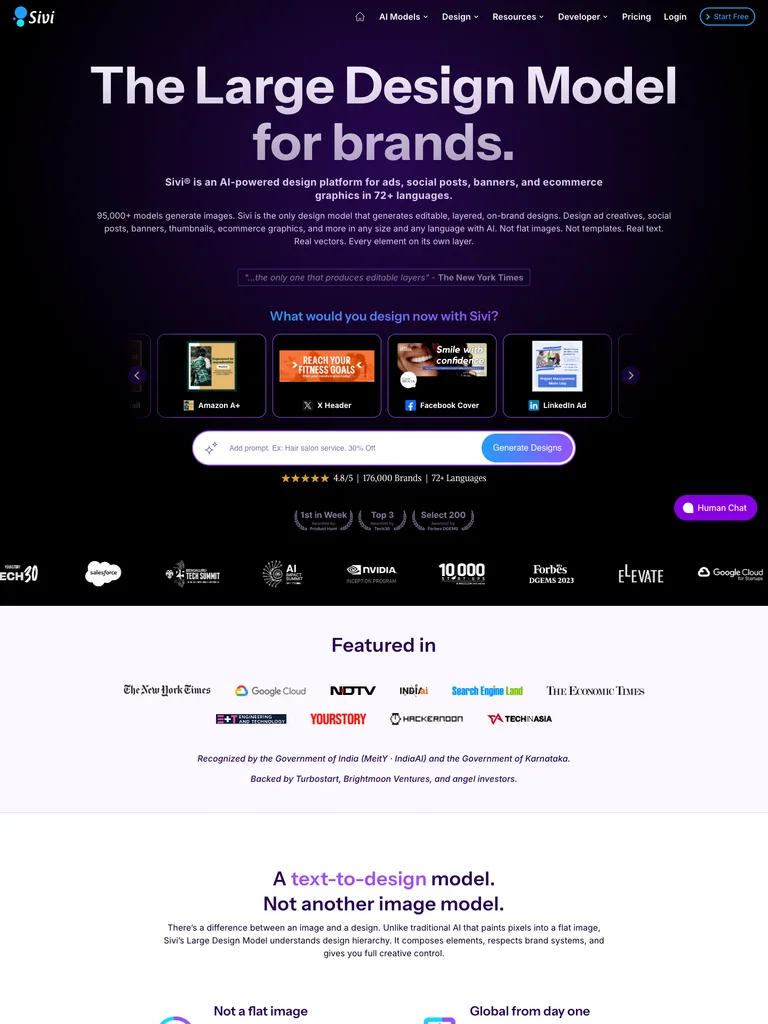
The dark opening combines a large product statement with design-format examples and a bright prompt area. The visible formats make the blank field less abstract by suggesting the kinds of work the product is about.
Adapt it: Place a small set of representative outputs near an open-ended prompt. Make examples specific enough to guide a first attempt without suggesting that every output is guaranteed.
Watch for: Do not create a visual menu of formats your product cannot produce. A beautiful but unsupported choice leaves the visitor with the wrong expectation.
2. Notify.domains: narrow the task to one object
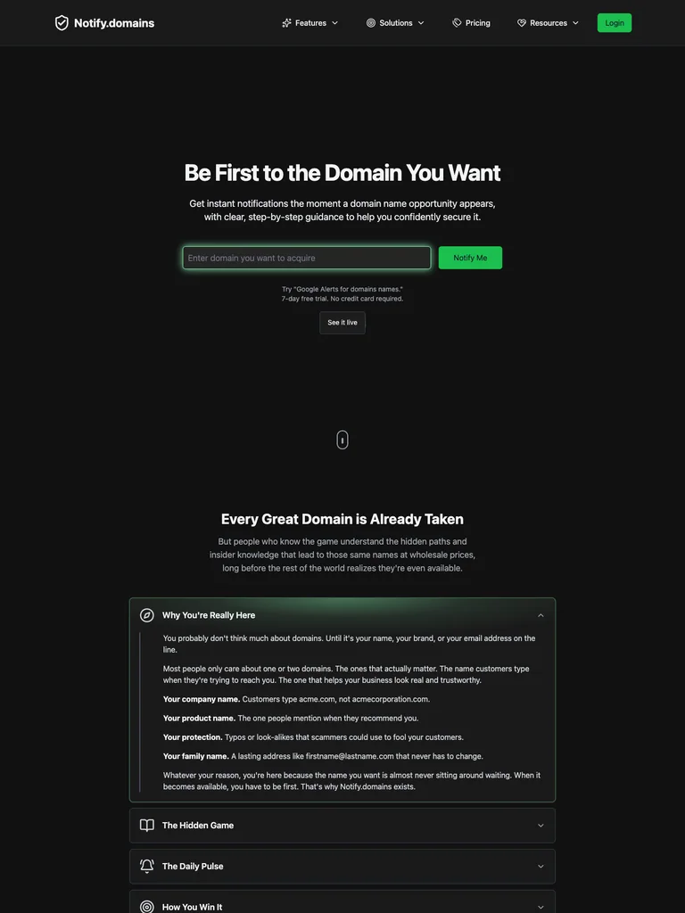
The nearly black opening keeps a domain field and green action close to a compact statement. With little surrounding decoration, the input becomes the clear center of the task.
Adapt it: Use a focused field when the first step revolves around one recognizable object. Explain the required format and use a button label that names the action rather than simply saying “Go.”
Watch for: A minimal form still needs feedback. Decide how invalid input, unavailable results, and a delayed request will be explained.
3. Repaint: connect an input with a visible comparison
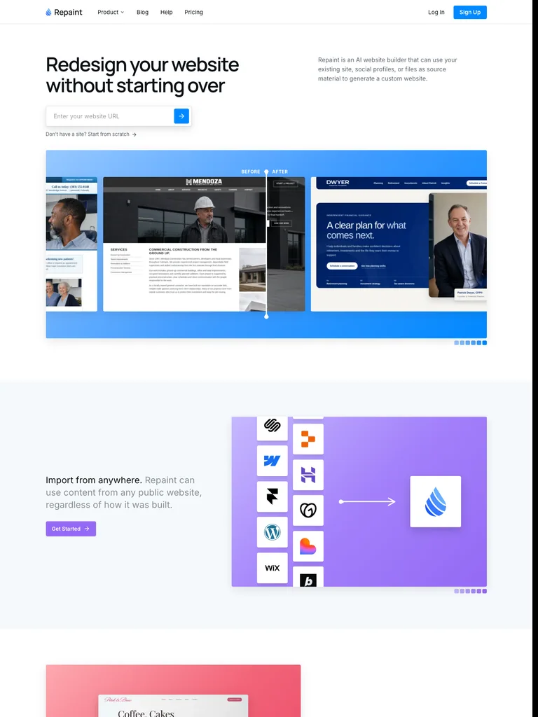
A URL input sits near the short introduction, followed by a wide blue panel containing website comparisons. The page gives the input an object and the proposed transformation a visual frame.
Adapt it: When a tool starts with something the visitor already has, name that object and show an honest example of the kind of change being offered.
Watch for: A comparison needs context. Label examples accurately, and do not imply that a staged concept represents an automatically achieved result.
Decide whether the field belongs in the hero
Use an opening input when someone can make a useful first move without reading a manual. A domain, a URL, or a short creative request can be understandable starting material. A field that requires internal account identifiers or a complex configuration may belong later in the flow.
The hero should explain the task around the field. If users need to inspect the entire page to discover what is accepted, the input is arriving before the explanation. A short example can help, but it should complement a visible label and instructions.
Separate trying the product from starting a commitment
Submitting a field might show a preview, create an account, request access, or begin a paid process. Those are not interchangeable next steps. Name the one your product actually supports, and explain any required sign-in before the visitor assumes a result will appear immediately.
Avoid fake progress that ends at an unexpected sales form. If the public interaction is only a demonstration, say so. A landing page can still show useful product evidence without pretending to perform work it does not perform.
Design the unsuccessful attempt
Write a message for an invalid format, an unsupported input, and a temporary failure. These conditions call for different responses. A malformed URL needs a correction; a temporary failure may need a retry; an unsupported source may need an explanation of the product’s scope.
Keep the entered value when it is safe and useful to do so. A user should not have to reconstruct a long prompt because a request failed. Consider whether the form can show the previous input beside a clear retry action.
Make examples instructional
Choose example prompts or outputs that expose the product’s boundaries. Three examples that vary in task are often more instructive than a row of nearly identical polished results. Explain which part the visitor can change and which parts come from the product.
For a broader visual opening, compare the SaaS preview examples. To specify the behavior after submission, use the empty and error-state guide. The field is the beginning of the experience, not a substitute for designing what follows.
Common questions
Should the main landing-page action always be an input field?
No. Use a field when the first task is simple and its result can be explained clearly. Products that need substantial context may work better with a demo, an example, or a clearly described sign-up action.