Authentication
CURATED COLLECTION · 4 REFERENCES
Account creation, forms, and useful defaults.
Copy the reference notes below and paste them into Claude, ChatGPT, or your coding assistant. Add what you want to build.
Includes design notes, original sources, and preview links. An assistant that supports browsing can also read the public board link.
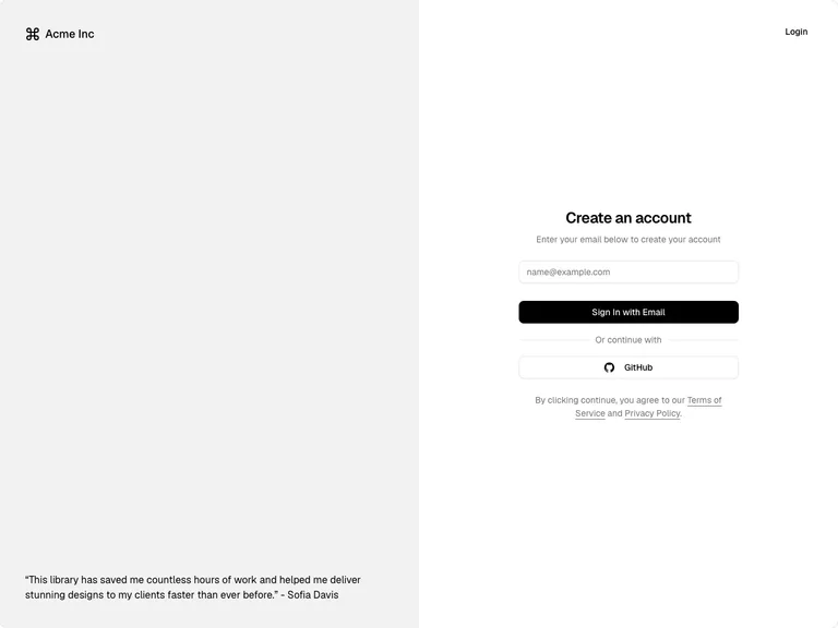
A split account-creation screen gives the form one clear primary action and a quieter alternative sign-in method.
Useful for: Use a short centered form, an explicit alternative identity method, and readable terms close to the submit action.
# Design reference: shadcn/ui — Create an account
Source: https://ui.shadcn.com/examples/authentication
Swipefile reference: https://swipefile.design/ref/shadcn-authentication/
Captured: 2026-09-04. This is a dated reference, not a claim about the current live product.
Capture scope: a page excerpt. Do not infer unseen sections or interactions.

## Objective
Adapt the interaction and layout patterns below to my project. Use my own content and identity. Do not reproduce logos, proprietary copy, or brand assets.

## Reference notes
- surface: Create-account form in a public component demo
- nav: A compact Login link allows existing users to switch intent.
- layout: Two equal columns: identity and testimonial on the left, a narrow centered form on the right.
- density: Sparse; only the fields and choices needed to enter the product.
- color: Gray supporting panel, white form surface, a black primary button and outlined alternative.
- typography: Sans-serif throughout, clear form heading and subdued explanatory copy.
- pattern: One obvious primary path, with the alternative separated by a small text divider.
- states: Empty email field; no submitted, loading, or error state is represented in this capture.
- dont: Do not use placeholders as the only field label or treat this visual example as working authentication.

Useful for: Use a short centered form, an explicit alternative identity method, and readable terms close to the submit action.

## Acceptance criteria
- Existing project conventions, design tokens, working functionality, and unrelated changes are preserved.
- Two or three reference principles clearly support the user's task; conflicts are resolved in favor of usability and the existing product.
- Reusable components and semantic HTML express the interface. Available licensed assets are used; important UI text is never rendered as a bitmap.
- Every visible control has a defined behavior. Loading, empty, error, success, disabled, and long-content states are specified where relevant. Demo data is clearly labeled.
- Navigation and content adapt at 375px, 768px, and 1440px without horizontal page overflow. Keyboard use, visible focus, labeled inputs, at least 44px touch targets, readable contrast, and reduced motion are supported.
- Verification distinguishes rendered behavior from proposals and identifies anything still requiring a backend or external service.

## Quality bar
Clear hierarchy, consistent spacing, restrained surfaces, and purposeful motion. Avoid decorative gradients, excessive cards, placeholder buttons, and invented metrics unless the project calls for them. Do not claim a feature is connected or tested without evidence.
 hover to scroll
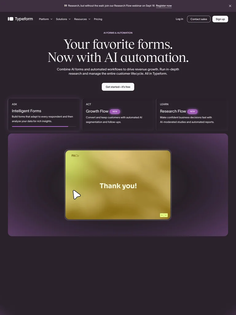
One-question-at-a-time conversational form: elegant serif prompts, full-screen steps, and a calm dark-plum canvas that makes surveys feel like a chat.
# Design reference: Typeform — Conversational Form
Source: https://www.typeform.com
Swipefile reference: https://swipefile.design/ref/typeform/
Captured: 2026-09-05. This is a dated reference, not a claim about the current live product.
Capture scope: a page excerpt. Do not infer unseen sections or interactions.

## Objective
Adapt the visual principles below to my project. Use my own content and identity. Do not reproduce logos, proprietary copy, or brand assets.

## Reference notes
- mood: Human, calm, and premium. A form that behaves like a friendly one-on-one conversation instead of a wall of fields. Reduces friction by only ever showing one thing to answer.
- colors: Deep plum / near-black canvas, warm off-white type, a single confident accent (coral or the brand hue) on buttons and choice-cards. High contrast, very few colors.
- typography: Large elegant serif for the question prompt (the hero of every screen), clean sans for helper text, choice labels, and letter keys. One big question fills the viewport.
- layout: FLOW-FIRST. One question per full screen, advanced by Enter or click. Thin progress bar pinned top. Each step: big serif question, optional helper line, then the input (short text, or A/B/C multiple-choice cards with keyboard letters, or rating, or email). Persistent OK ✓ + press-Enter cue. Ends on a submit/thank-you screen. Marketing homepage stacks the hero claim over three labelled product cards (Ask / Act / Learn).
- motion: Vertical slide-and-fade between questions (old scrolls up, next rises in), gentle focus states, a progress bar that fills as you advance, subtle button-press feedback.
- texture: Flat premium darkness — soft plum gradient, rounded choice-cards with hairline borders, generous whitespace, no clutter, no imagery competing with the question.
- dont: No multi-field forms crammed on one screen, no tiny labels, no busy backgrounds, no more than one accent color, no progress hidden from the user. Never show two questions at once.

## Acceptance criteria
- Existing project conventions, design tokens, working functionality, and unrelated changes are preserved.
- Two or three reference principles clearly support the user's task; conflicts are resolved in favor of usability and the existing product.
- Reusable components and semantic HTML express the interface. Available licensed assets are used; important UI text is never rendered as a bitmap.
- Every visible control has a defined behavior. Loading, empty, error, success, disabled, and long-content states are specified where relevant. Demo data is clearly labeled.
- Navigation and content adapt at 375px, 768px, and 1440px without horizontal page overflow. Keyboard use, visible focus, labeled inputs, at least 44px touch targets, readable contrast, and reduced motion are supported.
- Verification distinguishes rendered behavior from proposals and identifies anything still requiring a backend or external service.

## Quality bar
Clear hierarchy, consistent spacing, restrained surfaces, and purposeful motion. Avoid decorative gradients, excessive cards, placeholder buttons, and invented metrics unless the project calls for them. Do not claim a feature is connected or tested without evidence.
 hover to scroll
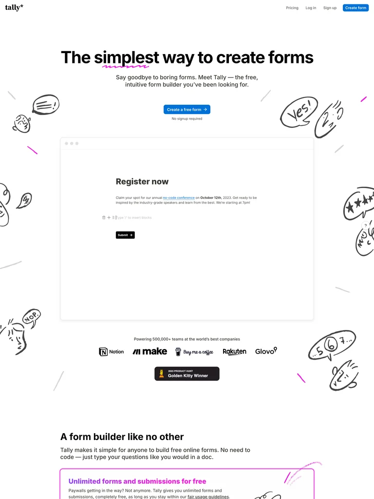
Notion-clean form building: pure black type on white, a single blue CTA, and hand-drawn doodles that keep an otherwise stark page warm.
# Design reference: Tally — Minimal Doc Form
Source: https://tally.so
Swipefile reference: https://swipefile.design/ref/tally-forms/
Captured: 2026-09-05. This is a dated reference, not a claim about the current live product.
Capture scope: a page excerpt. Do not infer unseen sections or interactions.

## Objective
Adapt the visual principles below to my project. Use my own content and identity. Do not reproduce logos, proprietary copy, or brand assets.

## Reference notes
- mood: Effortless, honest, indie-friendly. Forms as plain documents you just start typing into. Minimal chrome, zero intimidation, a touch of hand-drawn play.
- colors: White background, near-black text, one saturated blue for the primary button and inline accents. Doodles in black with occasional pink/yellow/purple pops. Otherwise monochrome.
- typography: Bold heavy sans display headline ('The simplest way to create forms'), regular sans body, document-like question styling. Tight, confident, no serifs.
- layout: FLOW-FIRST. Document-style form: each question is a typed line with a minimal underline/box input, stacked vertically like a Notion doc, one blue submit at the end — no visual step-gating, you scroll the page. Marketing homepage centers a doodle cluster over a giant headline, subhead, single blue CTA, and 'No signup required' reassurance. Slim top nav, floating help bubble.
- motion: Minimal — hover states on the button, doodles static or with a tiny wiggle, smooth scroll. Restraint is the point.
- texture: Flat white paper, hand-drawn marker doodles as the only ornament, thin dividers, lots of air.
- dont: No gradients, no stacked drop shadows, no heavy illustration, no more than one accent color, no dark mode. Keep it paper-plain with doodle warmth.

## Acceptance criteria
- Existing project conventions, design tokens, working functionality, and unrelated changes are preserved.
- Two or three reference principles clearly support the user's task; conflicts are resolved in favor of usability and the existing product.
- Reusable components and semantic HTML express the interface. Available licensed assets are used; important UI text is never rendered as a bitmap.
- Every visible control has a defined behavior. Loading, empty, error, success, disabled, and long-content states are specified where relevant. Demo data is clearly labeled.
- Navigation and content adapt at 375px, 768px, and 1440px without horizontal page overflow. Keyboard use, visible focus, labeled inputs, at least 44px touch targets, readable contrast, and reduced motion are supported.
- Verification distinguishes rendered behavior from proposals and identifies anything still requiring a backend or external service.

## Quality bar
Clear hierarchy, consistent spacing, restrained surfaces, and purposeful motion. Avoid decorative gradients, excessive cards, placeholder buttons, and invented metrics unless the project calls for them. Do not claim a feature is connected or tested without evidence.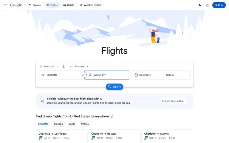
A six-field search form is the entire product, so it gets an illustrated sky behind it, floats over the fold, and every other decision on the page defers to it.
Useful for: The compound search card: a single white card holding a row of three ghost dropdown selectors (trip type, passengers, cabin) on top and four bordered fields below (origin, a circular swap button straddling the seam, destination, then a split departure/return date field), with the submit button hanging off the card's bottom edge, half in and half out. That overhang is the whole trick — it pins your eye to the action and tells you the card is one object rather than a form-shaped stack. Also take the price-tease row underneath: destination chips that reload three cheap-route cards, giving a first-time visitor something to look at before they've typed anything.
# Design reference: Google Flights — Search
Source: https://www.google.com/travel/flights
Swipefile reference: https://swipefile.design/ref/google-flights/
Captured: 2026-08-01. This is a dated reference, not a claim about the current live product.
Capture scope: a page excerpt. Do not infer unseen sections or interactions.

## Objective
Adapt the interaction and layout patterns below to my project. Use my own content and identity. Do not reproduce logos, proprietary copy, or brand assets.

## Reference notes
- surface: Google Flights search entry screen, logged out, no query yet
- nav: One tier only. A hamburger, the wordmark, then four pill tabs for sibling products (Explore, Flights, Hotels, Vacation rentals) where the active pill is filled light blue with a blue icon and label. Everything else on the bar is chrome — theme toggle, app grid, Sign in.
- layout: Centred single column, ~990px wide, on an unbounded white page. The illustrated header banner is full-bleed and about 230px tall; the search card overlaps its bottom edge.
- density: Loose at the top, tighter as you go down. The search card breathes; the result cards below it are compact three-line rows. Density increases with your depth into the task.
- color: Almost entirely white and grey. Blue appears three times only: the active nav pill, the focused field's border, and the Explore button. The illustration is a pale desaturated blue so it never competes with the form on top of it.
- typography: One neutral sans, small. The word 'Flights' at ~52px regular weight is the only display type on the page, and it is not bold — the size does the work alone. Everything else sits at 13-15px.
- pattern: The submit button straddling the card's bottom border, half inside and half outside. It binds the whole compound form into one object and puts the action exactly where the eye finishes reading.
- states: This is the zero-query state, and it never shows an empty region. The origin is pre-filled from location, the destination is focused and waiting, and below the fold a set of destination chips populates three real route cards so there is always something priced on screen.
- dont: Don't scale the header illustration up to compete with the card. It works because it is pale, low-contrast and cropped — the moment it reads as a hero image the form stops being the subject and the page becomes a marketing page.

Useful for: The compound search card: a single white card holding a row of three ghost dropdown selectors (trip type, passengers, cabin) on top and four bordered fields below (origin, a circular swap button straddling the seam, destination, then a split departure/return date field), with the submit button hanging off the card's bottom edge, half in and half out. That overhang is the whole trick — it pins your eye to the action and tells you the card is one object rather than a form-shaped stack. Also take the price-tease row underneath: destination chips that reload three cheap-route cards, giving a first-time visitor something to look at before they've typed anything.

## Acceptance criteria
- Existing project conventions, design tokens, working functionality, and unrelated changes are preserved.
- Two or three reference principles clearly support the user's task; conflicts are resolved in favor of usability and the existing product.
- Reusable components and semantic HTML express the interface. Available licensed assets are used; important UI text is never rendered as a bitmap.
- Every visible control has a defined behavior. Loading, empty, error, success, disabled, and long-content states are specified where relevant. Demo data is clearly labeled.
- Navigation and content adapt at 375px, 768px, and 1440px without horizontal page overflow. Keyboard use, visible focus, labeled inputs, at least 44px touch targets, readable contrast, and reduced motion are supported.
- Verification distinguishes rendered behavior from proposals and identifies anything still requiring a backend or external service.

## Quality bar
Clear hierarchy, consistent spacing, restrained surfaces, and purposeful motion. Avoid decorative gradients, excessive cards, placeholder buttons, and invented metrics unless the project calls for them. Do not claim a feature is connected or tested without evidence.
Allow basic usage counts to help us understand what is useful. Your board contents stay out of analytics. Details
Your browser’s privacy preference keeps analytics off.