Creative Tools
CURATED COLLECTION · 4 REFERENCES
Color, shape, and code tools that keep their output in view.
Copy the reference notes below and paste them into Claude, ChatGPT, or your coding assistant. Add what you want to build.
Includes design notes, original sources, and preview links. An assistant that supports browsing can also read the public board link.
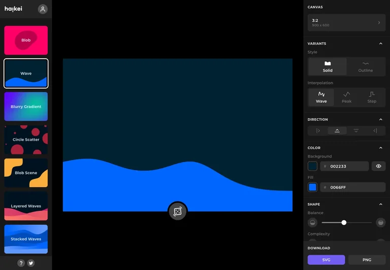
A shape generator separates generator choice, artwork preview, and styling controls into three clear zones.
Useful for: Separate choosing a tool from adjusting its output and keep the preview central.
# Design reference: Haikei — Shape generator
Source: https://app.haikei.app/
Swipefile reference: https://swipefile.design/ref/haikei-editor/
Captured: 2026-09-04. This is a dated reference, not a claim about the current live product.
Capture scope: one viewport. Do not infer unseen page sections or a complete user flow.

## Objective
Adapt the interaction and layout patterns below to my project. Use my own content and identity. Do not reproduce logos, proprietary copy, or brand assets.

## Reference notes
- surface: Shape generator
- nav: Generator families stay on the left while parameters stay with the active canvas on the right.
- layout: A colorful preset rail sits left of a large canvas, with shape and export options in a right sidebar.
- density: The working preview takes most of the space, with compact controls grouped around it.
- color: Black chrome, vivid preset thumbnails, and a saturated blue wave preview.
- typography: Use compact settings rows beside a generous artwork preview.
- pattern: Separate choosing a tool from adjusting its output and keep the preview central.
- states: Public wave-generator workspace using its supplied initial artwork; no export was created.
- dont: Adapt the interaction pattern to your own product. Do not copy brand assets, sample identities, proprietary text, or assume unseen states. Specify keyboard behavior, loading, empty, error, and narrow-screen layouts for your implementation.

Useful for: Separate choosing a tool from adjusting its output and keep the preview central.

## Acceptance criteria
- Existing project conventions, design tokens, working functionality, and unrelated changes are preserved.
- Two or three reference principles clearly support the user's task; conflicts are resolved in favor of usability and the existing product.
- Reusable components and semantic HTML express the interface. Available licensed assets are used; important UI text is never rendered as a bitmap.
- Every visible control has a defined behavior. Loading, empty, error, success, disabled, and long-content states are specified where relevant. Demo data is clearly labeled.
- Navigation and content adapt at 375px, 768px, and 1440px without horizontal page overflow. Keyboard use, visible focus, labeled inputs, at least 44px touch targets, readable contrast, and reduced motion are supported.
- Verification distinguishes rendered behavior from proposals and identifies anything still requiring a backend or external service.

## Quality bar
Clear hierarchy, consistent spacing, restrained surfaces, and purposeful motion. Avoid decorative gradients, excessive cards, placeholder buttons, and invented metrics unless the project calls for them. Do not claim a feature is connected or tested without evidence.
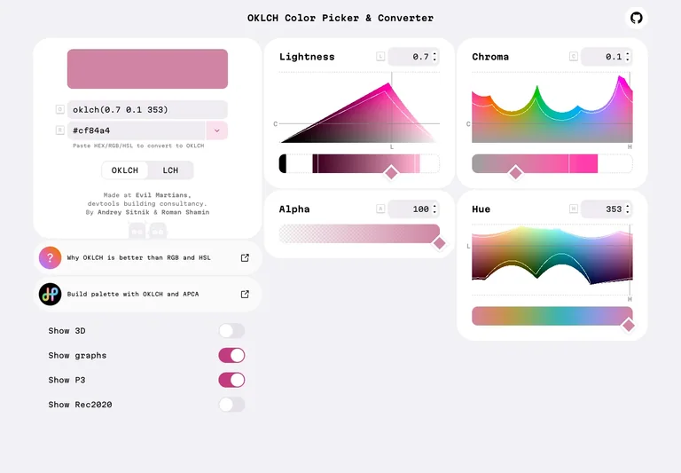
A color tool turns a technical color space into a coordinated set of visual controls.
Useful for: Pair numeric values with visual representations so users can move between precision and exploration.
# Design reference: OKLCH — Color picker
Source: https://oklch.com/#0.7,0.1,353,100
Swipefile reference: https://swipefile.design/ref/oklch-picker/
Captured: 2026-09-04. This is a dated reference, not a claim about the current live product.
Capture scope: one viewport. Do not infer unseen page sections or a complete user flow.

## Objective
Adapt the interaction and layout patterns below to my project. Use my own content and identity. Do not reproduce logos, proprietary copy, or brand assets.

## Reference notes
- surface: Color picker
- nav: Supporting display toggles sit beneath the color value rather than competing with the main controls.
- layout: A color sample and value fields sit alongside separate lightness, chroma, alpha, and hue panels.
- density: The working preview takes most of the space, with compact controls grouped around it.
- color: Pale panels surround vivid color spectra and a large selected-color sample.
- typography: Give each color dimension its own labeled control and keep the current value easy to find.
- pattern: Pair numeric values with visual representations so users can move between precision and exploration.
- states: Public color picker in its initial visible state; no palette was exported.
- dont: Adapt the interaction pattern to your own product. Do not copy brand assets, sample identities, proprietary text, or assume unseen states. Specify keyboard behavior, loading, empty, error, and narrow-screen layouts for your implementation.

Useful for: Pair numeric values with visual representations so users can move between precision and exploration.

## Acceptance criteria
- Existing project conventions, design tokens, working functionality, and unrelated changes are preserved.
- Two or three reference principles clearly support the user's task; conflicts are resolved in favor of usability and the existing product.
- Reusable components and semantic HTML express the interface. Available licensed assets are used; important UI text is never rendered as a bitmap.
- Every visible control has a defined behavior. Loading, empty, error, success, disabled, and long-content states are specified where relevant. Demo data is clearly labeled.
- Navigation and content adapt at 375px, 768px, and 1440px without horizontal page overflow. Keyboard use, visible focus, labeled inputs, at least 44px touch targets, readable contrast, and reduced motion are supported.
- Verification distinguishes rendered behavior from proposals and identifies anything still requiring a backend or external service.

## Quality bar
Clear hierarchy, consistent spacing, restrained surfaces, and purposeful motion. Avoid decorative gradients, excessive cards, placeholder buttons, and invented metrics unless the project calls for them. Do not claim a feature is connected or tested without evidence.
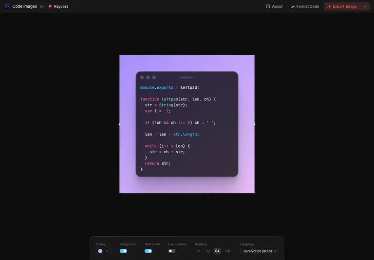
A code-image tool gives its preview generous space and moves presentation controls into a compact bottom panel.
Useful for: Keep the composition visible as a whole while grouping appearance settings in one predictable place.
# Design reference: Ray.so — Code image editor
Source: https://ray.so/
Swipefile reference: https://swipefile.design/ref/rayso-code/
Captured: 2026-09-04. This is a dated reference, not a claim about the current live product.
Capture scope: one viewport. Do not infer unseen page sections or a complete user flow.

## Objective
Adapt the interaction and layout patterns below to my project. Use my own content and identity. Do not reproduce logos, proprietary copy, or brand assets.

## Reference notes
- surface: Code image editor
- nav: Export stays in the top bar while theme, background, padding, and language live near the preview.
- layout: A centered code card floats on a color field with a horizontal settings panel beneath it.
- density: Primary content has the most space; repeated rows and secondary navigation use a compact, consistent rhythm.
- color: A near-black workspace surrounds a violet gradient and syntax-colored code.
- typography: Use a restrained toolbar and a large preview to keep composition choices easy to compare.
- pattern: Keep the composition visible as a whole while grouping appearance settings in one predictable place.
- states: The public tool's supplied sample code; no image was exported.
- dont: Adapt the interaction pattern to your own product. Do not copy brand assets, sample identities, proprietary text, or assume unseen states. Specify keyboard behavior, loading, empty, error, and narrow-screen layouts for your implementation.

Useful for: Keep the composition visible as a whole while grouping appearance settings in one predictable place.

## Acceptance criteria
- Existing project conventions, design tokens, working functionality, and unrelated changes are preserved.
- Two or three reference principles clearly support the user's task; conflicts are resolved in favor of usability and the existing product.
- Reusable components and semantic HTML express the interface. Available licensed assets are used; important UI text is never rendered as a bitmap.
- Every visible control has a defined behavior. Loading, empty, error, success, disabled, and long-content states are specified where relevant. Demo data is clearly labeled.
- Navigation and content adapt at 375px, 768px, and 1440px without horizontal page overflow. Keyboard use, visible focus, labeled inputs, at least 44px touch targets, readable contrast, and reduced motion are supported.
- Verification distinguishes rendered behavior from proposals and identifies anything still requiring a backend or external service.

## Quality bar
Clear hierarchy, consistent spacing, restrained surfaces, and purposeful motion. Avoid decorative gradients, excessive cards, placeholder buttons, and invented metrics unless the project calls for them. Do not claim a feature is connected or tested without evidence.
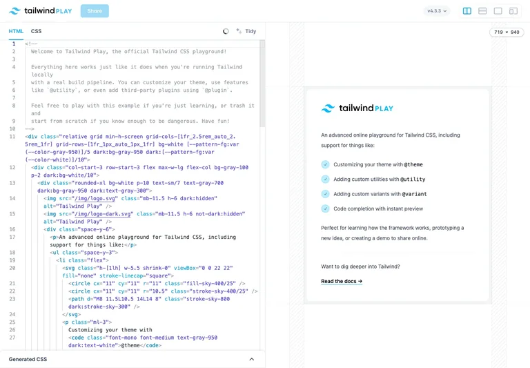
A live coding workspace pairs editable markup with the rendered interface in a split view.
Useful for: Keep the result visible next to the code and make preview dimensions easy to change.
# Design reference: Tailwind Play — Live editor
Source: https://play.tailwindcss.com/
Swipefile reference: https://swipefile.design/ref/tailwind-play/
Captured: 2026-09-04. This is a dated reference, not a claim about the current live product.
Capture scope: one viewport. Do not infer unseen page sections or a complete user flow.

## Objective
Adapt the interaction and layout patterns below to my project. Use my own content and identity. Do not reproduce logos, proprietary copy, or brand assets.

## Reference notes
- surface: Live editor
- nav: Language tabs sit above the source; preview-size controls and sharing sit in the top bar.
- layout: The source editor fills the left half and a preview of the built-in example fills the right.
- density: Primary content has the most space; repeated rows and secondary navigation use a compact, consistent rhythm.
- color: White panes with syntax colors and a clear cyan product accent.
- typography: Reserve almost all of the screen for editing and previewing rather than surrounding chrome.
- pattern: Keep the result visible next to the code and make preview dimensions easy to change.
- states: The supplied example is loaded in the public playground; no code was published.
- dont: Adapt the interaction pattern to your own product. Do not copy brand assets, sample identities, proprietary text, or assume unseen states. Specify keyboard behavior, loading, empty, error, and narrow-screen layouts for your implementation.

Useful for: Keep the result visible next to the code and make preview dimensions easy to change.

## Acceptance criteria
- Existing project conventions, design tokens, working functionality, and unrelated changes are preserved.
- Two or three reference principles clearly support the user's task; conflicts are resolved in favor of usability and the existing product.
- Reusable components and semantic HTML express the interface. Available licensed assets are used; important UI text is never rendered as a bitmap.
- Every visible control has a defined behavior. Loading, empty, error, success, disabled, and long-content states are specified where relevant. Demo data is clearly labeled.
- Navigation and content adapt at 375px, 768px, and 1440px without horizontal page overflow. Keyboard use, visible focus, labeled inputs, at least 44px touch targets, readable contrast, and reduced motion are supported.
- Verification distinguishes rendered behavior from proposals and identifies anything still requiring a backend or external service.

## Quality bar
Clear hierarchy, consistent spacing, restrained surfaces, and purposeful motion. Avoid decorative gradients, excessive cards, placeholder buttons, and invented metrics unless the project calls for them. Do not claim a feature is connected or tested without evidence.
Allow basic usage counts to help us understand what is useful. Your board contents stay out of analytics. Details
Your browser’s privacy preference keeps analytics off.