Creative Tools
CURATED COLLECTION · 50 REFERENCES
Chat, creative tools, translation, research, model discovery and onboarding. Includes eight clearly labeled browser demos and six onboarding or sign-in screens.
Copy the reference notes below and paste them into Claude, ChatGPT, or your coding assistant. Add what you want to build.
Includes design notes, original sources, and preview links. An assistant that supports browsing can also read the public board link.
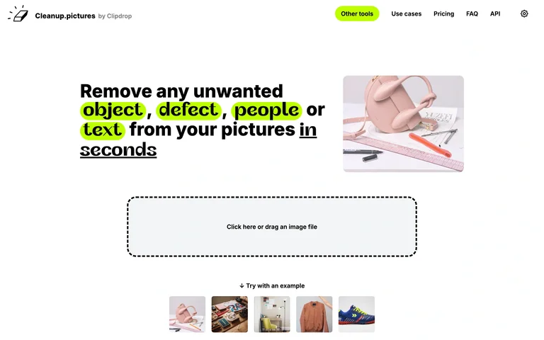
A neon-highlighted title leads to a dashed image drop zone and a row of sample pictures.
Useful for: Pair an empty upload state with visible examples.
# Design reference: Cleanup.pictures — Image cleanup
Source: https://cleanup.pictures/
Swipefile reference: https://swipefile.design/ref/ai-cleanup-pictures/
Captured: 2026-09-06. This is a dated reference, not a claim about the current live product.
Capture scope: one viewport. Do not infer unseen page sections or a complete user flow.

## Objective
Adapt the interaction and layout patterns below to my project. Use my own content and identity. Do not reproduce logos, proprietary copy, or brand assets.

## Reference notes
- surface: A neon-highlighted title leads to a dashed image drop zone and a row of sample pictures.
- nav: Compact top links
- layout: Title and illustration above a wide drop zone
- density: Comfortable spacing with focused controls.
- color: White, black and lime
- typography: Readable sans-serif controls and clear heading hierarchy.
- pattern: Pair an empty upload state with visible examples.
- states: Public initial state; no user content submitted.
- dont: Adapt the layout to your own product and supported capabilities; write your own examples and keep important actions clearly labeled.

Useful for: Pair an empty upload state with visible examples.

## Acceptance criteria
- Existing project conventions, design tokens, working functionality, and unrelated changes are preserved.
- Two or three reference principles clearly support the user's task; conflicts are resolved in favor of usability and the existing product.
- Reusable components and semantic HTML express the interface. Available licensed assets are used; important UI text is never rendered as a bitmap.
- Every visible control has a defined behavior. Loading, empty, error, success, disabled, and long-content states are specified where relevant. Demo data is clearly labeled.
- Navigation and content adapt at 375px, 768px, and 1440px without horizontal page overflow. Keyboard use, visible focus, labeled inputs, at least 44px touch targets, readable contrast, and reduced motion are supported.
- Verification distinguishes rendered behavior from proposals and identifies anything still requiring a backend or external service.

## Quality bar
Clear hierarchy, consistent spacing, restrained surfaces, and purposeful motion. Avoid decorative gradients, excessive cards, placeholder buttons, and invented metrics unless the project calls for them. Do not claim a feature is connected or tested without evidence.
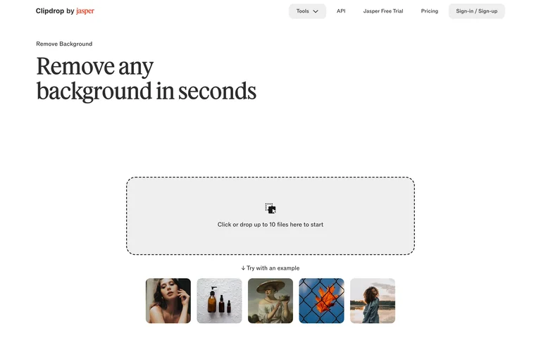
A serif tool title leads into a large file drop zone and example thumbnails.
Useful for: Make image input the primary action and offer sample images.
# Design reference: Clipdrop — Remove background
Source: https://clipdrop.co/remove-background
Swipefile reference: https://swipefile.design/ref/ai-clipdrop-background/
Captured: 2026-09-06. This is a dated reference, not a claim about the current live product.
Capture scope: one viewport. Do not infer unseen page sections or a complete user flow.

## Objective
Adapt the interaction and layout patterns below to my project. Use my own content and identity. Do not reproduce logos, proprietary copy, or brand assets.

## Reference notes
- surface: A serif tool title leads into a large file drop zone and example thumbnails.
- nav: Compact product header
- layout: Wide upload panel with sample strip below
- density: Comfortable spacing with focused controls.
- color: White, black and light gray
- typography: Readable sans-serif controls and clear heading hierarchy.
- pattern: Make image input the primary action and offer sample images.
- states: Public initial state; no user content submitted.
- dont: Adapt the layout to your own product and supported capabilities; write your own examples and keep important actions clearly labeled.

Useful for: Make image input the primary action and offer sample images.

## Acceptance criteria
- Existing project conventions, design tokens, working functionality, and unrelated changes are preserved.
- Two or three reference principles clearly support the user's task; conflicts are resolved in favor of usability and the existing product.
- Reusable components and semantic HTML express the interface. Available licensed assets are used; important UI text is never rendered as a bitmap.
- Every visible control has a defined behavior. Loading, empty, error, success, disabled, and long-content states are specified where relevant. Demo data is clearly labeled.
- Navigation and content adapt at 375px, 768px, and 1440px without horizontal page overflow. Keyboard use, visible focus, labeled inputs, at least 44px touch targets, readable contrast, and reduced motion are supported.
- Verification distinguishes rendered behavior from proposals and identifies anything still requiring a backend or external service.

## Quality bar
Clear hierarchy, consistent spacing, restrained surfaces, and purposeful motion. Avoid decorative gradients, excessive cards, placeholder buttons, and invented metrics unless the project calls for them. Do not claim a feature is connected or tested without evidence.
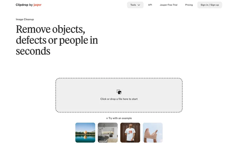
An object-removal entry presents a large dashed image-input area beneath a serif heading.
Useful for: Explain the task before asking for an image.
# Design reference: Clipdrop — Cleanup
Source: https://clipdrop.co/cleanup
Swipefile reference: https://swipefile.design/ref/ai-clipdrop-cleanup/
Captured: 2026-09-06. This is a dated reference, not a claim about the current live product.
Capture scope: one viewport. Do not infer unseen page sections or a complete user flow.

## Objective
Adapt the interaction and layout patterns below to my project. Use my own content and identity. Do not reproduce logos, proprietary copy, or brand assets.

## Reference notes
- surface: An object-removal entry presents a large dashed image-input area beneath a serif heading.
- nav: Compact product header
- layout: Large centered drop zone and sample strip
- density: Comfortable spacing with focused controls.
- color: White, black and light gray
- typography: Readable sans-serif controls and clear heading hierarchy.
- pattern: Explain the task before asking for an image.
- states: Public initial state; no user content submitted.
- dont: Adapt the layout to your own product and supported capabilities; write your own examples and keep important actions clearly labeled.

Useful for: Explain the task before asking for an image.

## Acceptance criteria
- Existing project conventions, design tokens, working functionality, and unrelated changes are preserved.
- Two or three reference principles clearly support the user's task; conflicts are resolved in favor of usability and the existing product.
- Reusable components and semantic HTML express the interface. Available licensed assets are used; important UI text is never rendered as a bitmap.
- Every visible control has a defined behavior. Loading, empty, error, success, disabled, and long-content states are specified where relevant. Demo data is clearly labeled.
- Navigation and content adapt at 375px, 768px, and 1440px without horizontal page overflow. Keyboard use, visible focus, labeled inputs, at least 44px touch targets, readable contrast, and reduced motion are supported.
- Verification distinguishes rendered behavior from proposals and identifies anything still requiring a backend or external service.

## Quality bar
Clear hierarchy, consistent spacing, restrained surfaces, and purposeful motion. Avoid decorative gradients, excessive cards, placeholder buttons, and invented metrics unless the project calls for them. Do not claim a feature is connected or tested without evidence.
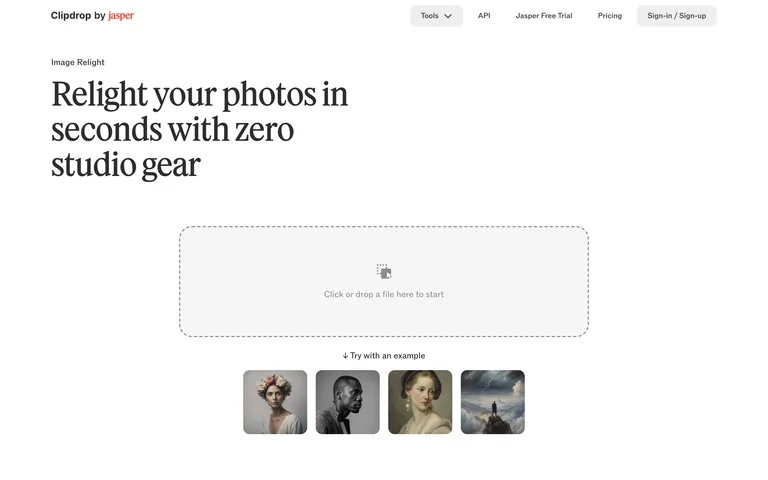
A portrait-relighting entry pairs its serif introduction with an image drop zone and portrait examples.
Useful for: Use relevant portrait examples beside an empty editing state.
# Design reference: Clipdrop — Relight
Source: https://clipdrop.co/relight
Swipefile reference: https://swipefile.design/ref/ai-clipdrop-relight/
Captured: 2026-09-06. This is a dated reference, not a claim about the current live product.
Capture scope: one viewport. Do not infer unseen page sections or a complete user flow.

## Objective
Adapt the interaction and layout patterns below to my project. Use my own content and identity. Do not reproduce logos, proprietary copy, or brand assets.

## Reference notes
- surface: A portrait-relighting entry pairs its serif introduction with an image drop zone and portrait examples.
- nav: Compact product header
- layout: Title above a centered input region
- density: Comfortable spacing with focused controls.
- color: White, black and light gray
- typography: Readable sans-serif controls and clear heading hierarchy.
- pattern: Use relevant portrait examples beside an empty editing state.
- states: Public initial state; no user content submitted.
- dont: Adapt the layout to your own product and supported capabilities; write your own examples and keep important actions clearly labeled.

Useful for: Use relevant portrait examples beside an empty editing state.

## Acceptance criteria
- Existing project conventions, design tokens, working functionality, and unrelated changes are preserved.
- Two or three reference principles clearly support the user's task; conflicts are resolved in favor of usability and the existing product.
- Reusable components and semantic HTML express the interface. Available licensed assets are used; important UI text is never rendered as a bitmap.
- Every visible control has a defined behavior. Loading, empty, error, success, disabled, and long-content states are specified where relevant. Demo data is clearly labeled.
- Navigation and content adapt at 375px, 768px, and 1440px without horizontal page overflow. Keyboard use, visible focus, labeled inputs, at least 44px touch targets, readable contrast, and reduced motion are supported.
- Verification distinguishes rendered behavior from proposals and identifies anything still requiring a backend or external service.

## Quality bar
Clear hierarchy, consistent spacing, restrained surfaces, and purposeful motion. Avoid decorative gradients, excessive cards, placeholder buttons, and invented metrics unless the project calls for them. Do not claim a feature is connected or tested without evidence.
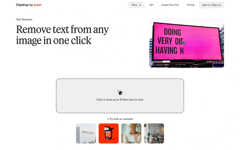
A text-removal tool pairs a signboard example with a file-input zone and selectable samples.
Useful for: Show a concrete example of what the tool removes.
# Design reference: Clipdrop — Text remover
Source: https://clipdrop.co/text-remover
Swipefile reference: https://swipefile.design/ref/ai-clipdrop-text-remover/
Captured: 2026-09-06. This is a dated reference, not a claim about the current live product.
Capture scope: one viewport. Do not infer unseen page sections or a complete user flow.

## Objective
Adapt the interaction and layout patterns below to my project. Use my own content and identity. Do not reproduce logos, proprietary copy, or brand assets.

## Reference notes
- surface: A text-removal tool pairs a signboard example with a file-input zone and selectable samples.
- nav: Compact product header
- layout: Split introduction above a drop zone
- density: Comfortable spacing with focused controls.
- color: White, black and bright pink imagery
- typography: Readable sans-serif controls and clear heading hierarchy.
- pattern: Show a concrete example of what the tool removes.
- states: Public initial state; no user content submitted.
- dont: Adapt the layout to your own product and supported capabilities; write your own examples and keep important actions clearly labeled.

Useful for: Show a concrete example of what the tool removes.

## Acceptance criteria
- Existing project conventions, design tokens, working functionality, and unrelated changes are preserved.
- Two or three reference principles clearly support the user's task; conflicts are resolved in favor of usability and the existing product.
- Reusable components and semantic HTML express the interface. Available licensed assets are used; important UI text is never rendered as a bitmap.
- Every visible control has a defined behavior. Loading, empty, error, success, disabled, and long-content states are specified where relevant. Demo data is clearly labeled.
- Navigation and content adapt at 375px, 768px, and 1440px without horizontal page overflow. Keyboard use, visible focus, labeled inputs, at least 44px touch targets, readable contrast, and reduced motion are supported.
- Verification distinguishes rendered behavior from proposals and identifies anything still requiring a backend or external service.

## Quality bar
Clear hierarchy, consistent spacing, restrained surfaces, and purposeful motion. Avoid decorative gradients, excessive cards, placeholder buttons, and invented metrics unless the project calls for them. Do not claim a feature is connected or tested without evidence.
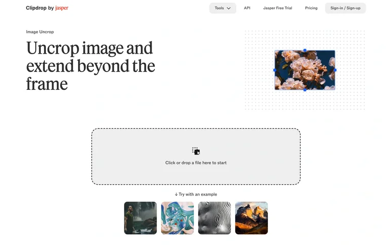
An image-extension entry shows a small framed example, a large drop zone and landscape samples.
Useful for: Explain an unfamiliar editing operation with a visual example.
# Design reference: Clipdrop — Uncrop
Source: https://clipdrop.co/uncrop
Swipefile reference: https://swipefile.design/ref/ai-clipdrop-uncrop/
Captured: 2026-09-06. This is a dated reference, not a claim about the current live product.
Capture scope: one viewport. Do not infer unseen page sections or a complete user flow.

## Objective
Adapt the interaction and layout patterns below to my project. Use my own content and identity. Do not reproduce logos, proprietary copy, or brand assets.

## Reference notes
- surface: An image-extension entry shows a small framed example, a large drop zone and landscape samples.
- nav: Compact product header
- layout: Title and example above image input
- density: Comfortable spacing with focused controls.
- color: White, black and muted gray
- typography: Readable sans-serif controls and clear heading hierarchy.
- pattern: Explain an unfamiliar editing operation with a visual example.
- states: Public initial state; no user content submitted.
- dont: Adapt the layout to your own product and supported capabilities; write your own examples and keep important actions clearly labeled.

Useful for: Explain an unfamiliar editing operation with a visual example.

## Acceptance criteria
- Existing project conventions, design tokens, working functionality, and unrelated changes are preserved.
- Two or three reference principles clearly support the user's task; conflicts are resolved in favor of usability and the existing product.
- Reusable components and semantic HTML express the interface. Available licensed assets are used; important UI text is never rendered as a bitmap.
- Every visible control has a defined behavior. Loading, empty, error, success, disabled, and long-content states are specified where relevant. Demo data is clearly labeled.
- Navigation and content adapt at 375px, 768px, and 1440px without horizontal page overflow. Keyboard use, visible focus, labeled inputs, at least 44px touch targets, readable contrast, and reduced motion are supported.
- Verification distinguishes rendered behavior from proposals and identifies anything still requiring a backend or external service.

## Quality bar
Clear hierarchy, consistent spacing, restrained surfaces, and purposeful motion. Avoid decorative gradients, excessive cards, placeholder buttons, and invented metrics unless the project calls for them. Do not claim a feature is connected or tested without evidence.
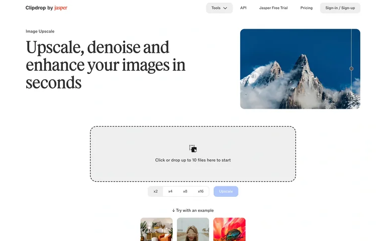
An upscaling entry pairs a mountain comparison with image input, mode controls and samples.
Useful for: Keep quality and speed choices close to the image input.
# Design reference: Clipdrop — Image upscaler
Source: https://clipdrop.co/image-upscaler
Swipefile reference: https://swipefile.design/ref/ai-clipdrop-upscale/
Captured: 2026-09-06. This is a dated reference, not a claim about the current live product.
Capture scope: one viewport. Do not infer unseen page sections or a complete user flow.

## Objective
Adapt the interaction and layout patterns below to my project. Use my own content and identity. Do not reproduce logos, proprietary copy, or brand assets.

## Reference notes
- surface: An upscaling entry pairs a mountain comparison with image input, mode controls and samples.
- nav: Compact product header
- layout: Split introduction above image input and controls
- density: Comfortable spacing with focused controls.
- color: White, black and pale blue
- typography: Readable sans-serif controls and clear heading hierarchy.
- pattern: Keep quality and speed choices close to the image input.
- states: Public initial state; no user content submitted.
- dont: Adapt the layout to your own product and supported capabilities; write your own examples and keep important actions clearly labeled.

Useful for: Keep quality and speed choices close to the image input.

## Acceptance criteria
- Existing project conventions, design tokens, working functionality, and unrelated changes are preserved.
- Two or three reference principles clearly support the user's task; conflicts are resolved in favor of usability and the existing product.
- Reusable components and semantic HTML express the interface. Available licensed assets are used; important UI text is never rendered as a bitmap.
- Every visible control has a defined behavior. Loading, empty, error, success, disabled, and long-content states are specified where relevant. Demo data is clearly labeled.
- Navigation and content adapt at 375px, 768px, and 1440px without horizontal page overflow. Keyboard use, visible focus, labeled inputs, at least 44px touch targets, readable contrast, and reduced motion are supported.
- Verification distinguishes rendered behavior from proposals and identifies anything still requiring a backend or external service.

## Quality bar
Clear hierarchy, consistent spacing, restrained surfaces, and purposeful motion. Avoid decorative gradients, excessive cards, placeholder buttons, and invented metrics unless the project calls for them. Do not claim a feature is connected or tested without evidence.
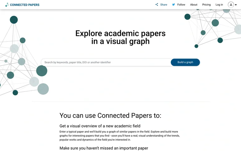
A paper-search entry places a query field and graph-building action between decorative citation networks.
Useful for: Introduce graph-based discovery with a familiar search input.
# Design reference: Connected Papers — Research search
Source: https://www.connectedpapers.com/
Swipefile reference: https://swipefile.design/ref/ai-connected-papers/
Captured: 2026-09-06. This is a dated reference, not a claim about the current live product.
Capture scope: one viewport. Do not infer unseen page sections or a complete user flow.

## Objective
Adapt the interaction and layout patterns below to my project. Use my own content and identity. Do not reproduce logos, proprietary copy, or brand assets.

## Reference notes
- surface: A paper-search entry places a query field and graph-building action between decorative citation networks.
- nav: Small top navigation
- layout: Centered search field with explanatory content below
- density: Comfortable spacing with focused controls.
- color: White, teal and pale gray
- typography: Readable sans-serif controls and clear heading hierarchy.
- pattern: Introduce graph-based discovery with a familiar search input.
- states: Public initial state; no user content submitted.
- dont: Adapt the layout to your own product and supported capabilities; write your own examples and keep important actions clearly labeled.

Useful for: Introduce graph-based discovery with a familiar search input.

## Acceptance criteria
- Existing project conventions, design tokens, working functionality, and unrelated changes are preserved.
- Two or three reference principles clearly support the user's task; conflicts are resolved in favor of usability and the existing product.
- Reusable components and semantic HTML express the interface. Available licensed assets are used; important UI text is never rendered as a bitmap.
- Every visible control has a defined behavior. Loading, empty, error, success, disabled, and long-content states are specified where relevant. Demo data is clearly labeled.
- Navigation and content adapt at 375px, 768px, and 1440px without horizontal page overflow. Keyboard use, visible focus, labeled inputs, at least 44px touch targets, readable contrast, and reduced motion are supported.
- Verification distinguishes rendered behavior from proposals and identifies anything still requiring a backend or external service.

## Quality bar
Clear hierarchy, consistent spacing, restrained surfaces, and purposeful motion. Avoid decorative gradients, excessive cards, placeholder buttons, and invented metrics unless the project calls for them. Do not claim a feature is connected or tested without evidence.
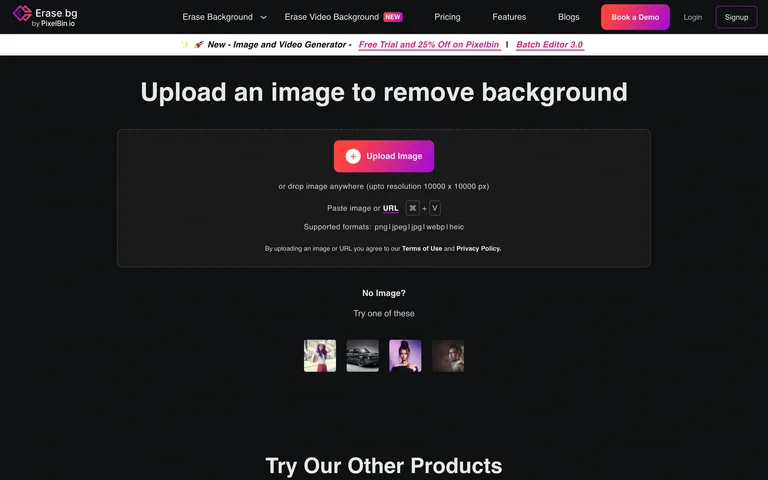
A dark background-removal entry centers a magenta upload action and a compact row of sample portraits.
Useful for: Make upload and sample routes easy to distinguish.
# Design reference: Erase.bg — Background removal
Source: https://www.erase.bg/upload
Swipefile reference: https://swipefile.design/ref/ai-erase-bg/
Captured: 2026-09-06. This is a dated reference, not a claim about the current live product.
Capture scope: one viewport. Do not infer unseen page sections or a complete user flow.

## Objective
Adapt the interaction and layout patterns below to my project. Use my own content and identity. Do not reproduce logos, proprietary copy, or brand assets.

## Reference notes
- surface: A dark background-removal entry centers a magenta upload action and a compact row of sample portraits.
- nav: Horizontal product navigation
- layout: Centered image-input panel above samples
- density: Comfortable spacing with focused controls.
- color: Near-black, white and magenta
- typography: Readable sans-serif controls and clear heading hierarchy.
- pattern: Make upload and sample routes easy to distinguish.
- states: Public initial state; no user content submitted.
- dont: Adapt the layout to your own product and supported capabilities; write your own examples and keep important actions clearly labeled.

Useful for: Make upload and sample routes easy to distinguish.

## Acceptance criteria
- Existing project conventions, design tokens, working functionality, and unrelated changes are preserved.
- Two or three reference principles clearly support the user's task; conflicts are resolved in favor of usability and the existing product.
- Reusable components and semantic HTML express the interface. Available licensed assets are used; important UI text is never rendered as a bitmap.
- Every visible control has a defined behavior. Loading, empty, error, success, disabled, and long-content states are specified where relevant. Demo data is clearly labeled.
- Navigation and content adapt at 375px, 768px, and 1440px without horizontal page overflow. Keyboard use, visible focus, labeled inputs, at least 44px touch targets, readable contrast, and reduced motion are supported.
- Verification distinguishes rendered behavior from proposals and identifies anything still requiring a backend or external service.

## Quality bar
Clear hierarchy, consistent spacing, restrained surfaces, and purposeful motion. Avoid decorative gradients, excessive cards, placeholder buttons, and invented metrics unless the project calls for them. Do not claim a feature is connected or tested without evidence.
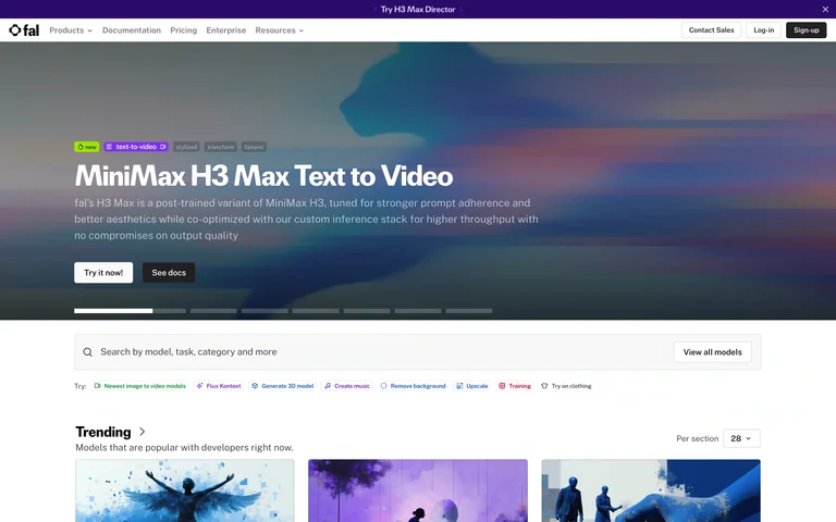
A featured model banner leads to model search, modality filters and a grid of visual model cards.
Useful for: Combine curated model discovery with task-based filtering.
# Design reference: fal — Model explorer
Source: https://fal.ai/explore
Swipefile reference: https://swipefile.design/ref/ai-fal-explore/
Captured: 2026-09-06. This is a dated reference, not a claim about the current live product.
Capture scope: one viewport. Do not infer unseen page sections or a complete user flow.

## Objective
Adapt the interaction and layout patterns below to my project. Use my own content and identity. Do not reproduce logos, proprietary copy, or brand assets.

## Reference notes
- surface: A featured model banner leads to model search, modality filters and a grid of visual model cards.
- nav: Global product navigation
- layout: Feature banner above search, filters and cards
- density: Comfortable spacing with focused controls.
- color: White, charcoal and violet
- typography: Readable sans-serif controls and clear heading hierarchy.
- pattern: Combine curated model discovery with task-based filtering.
- states: Public initial state; no user content submitted.
- dont: Adapt the layout to your own product and supported capabilities; write your own examples and keep important actions clearly labeled.

Useful for: Combine curated model discovery with task-based filtering.

## Acceptance criteria
- Existing project conventions, design tokens, working functionality, and unrelated changes are preserved.
- Two or three reference principles clearly support the user's task; conflicts are resolved in favor of usability and the existing product.
- Reusable components and semantic HTML express the interface. Available licensed assets are used; important UI text is never rendered as a bitmap.
- Every visible control has a defined behavior. Loading, empty, error, success, disabled, and long-content states are specified where relevant. Demo data is clearly labeled.
- Navigation and content adapt at 375px, 768px, and 1440px without horizontal page overflow. Keyboard use, visible focus, labeled inputs, at least 44px touch targets, readable contrast, and reduced motion are supported.
- Verification distinguishes rendered behavior from proposals and identifies anything still requiring a backend or external service.

## Quality bar
Clear hierarchy, consistent spacing, restrained surfaces, and purposeful motion. Avoid decorative gradients, excessive cards, placeholder buttons, and invented metrics unless the project calls for them. Do not claim a feature is connected or tested without evidence.
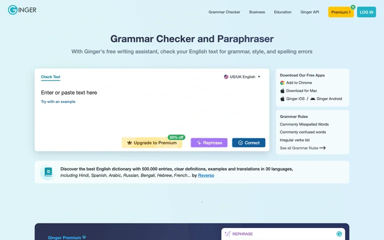
A pale-blue grammar interface pairs a large text area with writing actions and keyboard-command guidance.
Useful for: Keep corrective actions near the text and expose keyboard guidance.
# Design reference: Ginger — Grammar checker
Source: https://www.gingersoftware.com/grammarcheck
Swipefile reference: https://swipefile.design/ref/ai-ginger-writer/
Captured: 2026-09-06. This is a dated reference, not a claim about the current live product.
Capture scope: one viewport. Do not infer unseen page sections or a complete user flow.

## Objective
Adapt the interaction and layout patterns below to my project. Use my own content and identity. Do not reproduce logos, proprietary copy, or brand assets.

## Reference notes
- surface: A pale-blue grammar interface pairs a large text area with writing actions and keyboard-command guidance.
- nav: Compact top navigation
- layout: Editor left with shortcuts and guidance on the right
- density: Comfortable spacing with focused controls.
- color: Pale blue, white and teal
- typography: Readable sans-serif controls and clear heading hierarchy.
- pattern: Keep corrective actions near the text and expose keyboard guidance.
- states: Public initial state; no user content submitted.
- dont: Adapt the layout to your own product and supported capabilities; write your own examples and keep important actions clearly labeled.

Useful for: Keep corrective actions near the text and expose keyboard guidance.

## Acceptance criteria
- Existing project conventions, design tokens, working functionality, and unrelated changes are preserved.
- Two or three reference principles clearly support the user's task; conflicts are resolved in favor of usability and the existing product.
- Reusable components and semantic HTML express the interface. Available licensed assets are used; important UI text is never rendered as a bitmap.
- Every visible control has a defined behavior. Loading, empty, error, success, disabled, and long-content states are specified where relevant. Demo data is clearly labeled.
- Navigation and content adapt at 375px, 768px, and 1440px without horizontal page overflow. Keyboard use, visible focus, labeled inputs, at least 44px touch targets, readable contrast, and reduced motion are supported.
- Verification distinguishes rendered behavior from proposals and identifies anything still requiring a backend or external service.

## Quality bar
Clear hierarchy, consistent spacing, restrained surfaces, and purposeful motion. Avoid decorative gradients, excessive cards, placeholder buttons, and invented metrics unless the project calls for them. Do not claim a feature is connected or tested without evidence.
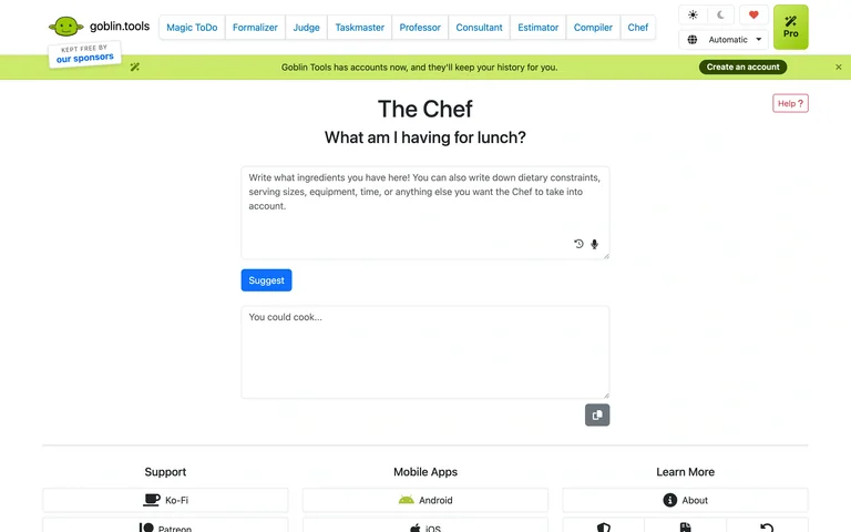
An ingredient-and-preference text area sits above a suggestion action and an empty recipe output.
Useful for: Turn an open-ended request into a single focused form.
# Design reference: Goblin Tools — The Chef
Source: https://goblin.tools/Chef
Swipefile reference: https://swipefile.design/ref/ai-goblin-chef/
Captured: 2026-09-06. This is a dated reference, not a claim about the current live product.
Capture scope: one viewport. Do not infer unseen page sections or a complete user flow.

## Objective
Adapt the interaction and layout patterns below to my project. Use my own content and identity. Do not reproduce logos, proprietary copy, or brand assets.

## Reference notes
- surface: An ingredient-and-preference text area sits above a suggestion action and an empty recipe output.
- nav: Shared horizontal tool navigation
- layout: Narrow stacked input and output fields
- density: Comfortable spacing with focused controls.
- color: White, blue and lime
- typography: Readable sans-serif controls and clear heading hierarchy.
- pattern: Turn an open-ended request into a single focused form.
- states: Public initial state; no user content submitted.
- dont: Adapt the layout to your own product and supported capabilities; write your own examples and keep important actions clearly labeled.

Useful for: Turn an open-ended request into a single focused form.

## Acceptance criteria
- Existing project conventions, design tokens, working functionality, and unrelated changes are preserved.
- Two or three reference principles clearly support the user's task; conflicts are resolved in favor of usability and the existing product.
- Reusable components and semantic HTML express the interface. Available licensed assets are used; important UI text is never rendered as a bitmap.
- Every visible control has a defined behavior. Loading, empty, error, success, disabled, and long-content states are specified where relevant. Demo data is clearly labeled.
- Navigation and content adapt at 375px, 768px, and 1440px without horizontal page overflow. Keyboard use, visible focus, labeled inputs, at least 44px touch targets, readable contrast, and reduced motion are supported.
- Verification distinguishes rendered behavior from proposals and identifies anything still requiring a backend or external service.

## Quality bar
Clear hierarchy, consistent spacing, restrained surfaces, and purposeful motion. Avoid decorative gradients, excessive cards, placeholder buttons, and invented metrics unless the project calls for them. Do not claim a feature is connected or tested without evidence.
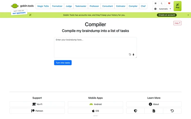
A brain-dump input and task-conversion action provide a sparse entry into task organization.
Useful for: Let people begin with unstructured thoughts before organizing tasks.
# Design reference: Goblin Tools — Compiler
Source: https://goblin.tools/Compiler
Swipefile reference: https://swipefile.design/ref/ai-goblin-compiler/
Captured: 2026-09-06. This is a dated reference, not a claim about the current live product.
Capture scope: one viewport. Do not infer unseen page sections or a complete user flow.

## Objective
Adapt the interaction and layout patterns below to my project. Use my own content and identity. Do not reproduce logos, proprietary copy, or brand assets.

## Reference notes
- surface: A brain-dump input and task-conversion action provide a sparse entry into task organization.
- nav: Shared horizontal tool navigation
- layout: Single centered input and conversion action
- density: Comfortable spacing with focused controls.
- color: White, blue and lime
- typography: Readable sans-serif controls and clear heading hierarchy.
- pattern: Let people begin with unstructured thoughts before organizing tasks.
- states: Public initial state; no user content submitted.
- dont: Adapt the layout to your own product and supported capabilities; write your own examples and keep important actions clearly labeled.

Useful for: Let people begin with unstructured thoughts before organizing tasks.

## Acceptance criteria
- Existing project conventions, design tokens, working functionality, and unrelated changes are preserved.
- Two or three reference principles clearly support the user's task; conflicts are resolved in favor of usability and the existing product.
- Reusable components and semantic HTML express the interface. Available licensed assets are used; important UI text is never rendered as a bitmap.
- Every visible control has a defined behavior. Loading, empty, error, success, disabled, and long-content states are specified where relevant. Demo data is clearly labeled.
- Navigation and content adapt at 375px, 768px, and 1440px without horizontal page overflow. Keyboard use, visible focus, labeled inputs, at least 44px touch targets, readable contrast, and reduced motion are supported.
- Verification distinguishes rendered behavior from proposals and identifies anything still requiring a backend or external service.

## Quality bar
Clear hierarchy, consistent spacing, restrained surfaces, and purposeful motion. Avoid decorative gradients, excessive cards, placeholder buttons, and invented metrics unless the project calls for them. Do not claim a feature is connected or tested without evidence.
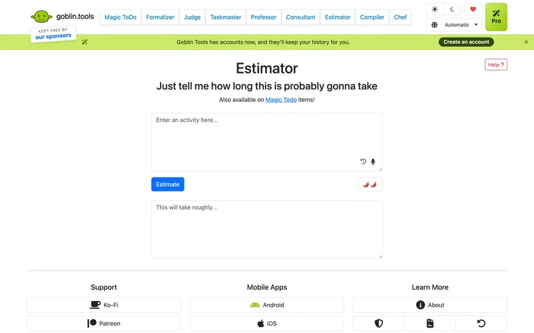
An activity input sits above an estimate action, intensity controls and an empty duration output.
Useful for: Place adjustment controls next to the operation they affect.
# Design reference: Goblin Tools — Estimator
Source: https://goblin.tools/Estimator
Swipefile reference: https://swipefile.design/ref/ai-goblin-estimator/
Captured: 2026-09-06. This is a dated reference, not a claim about the current live product.
Capture scope: one viewport. Do not infer unseen page sections or a complete user flow.

## Objective
Adapt the interaction and layout patterns below to my project. Use my own content and identity. Do not reproduce logos, proprietary copy, or brand assets.

## Reference notes
- surface: An activity input sits above an estimate action, intensity controls and an empty duration output.
- nav: Shared horizontal tool navigation
- layout: Stacked form with controls between input and output
- density: Comfortable spacing with focused controls.
- color: White, blue and lime
- typography: Readable sans-serif controls and clear heading hierarchy.
- pattern: Place adjustment controls next to the operation they affect.
- states: Public initial state; no user content submitted.
- dont: Adapt the layout to your own product and supported capabilities; write your own examples and keep important actions clearly labeled.

Useful for: Place adjustment controls next to the operation they affect.

## Acceptance criteria
- Existing project conventions, design tokens, working functionality, and unrelated changes are preserved.
- Two or three reference principles clearly support the user's task; conflicts are resolved in favor of usability and the existing product.
- Reusable components and semantic HTML express the interface. Available licensed assets are used; important UI text is never rendered as a bitmap.
- Every visible control has a defined behavior. Loading, empty, error, success, disabled, and long-content states are specified where relevant. Demo data is clearly labeled.
- Navigation and content adapt at 375px, 768px, and 1440px without horizontal page overflow. Keyboard use, visible focus, labeled inputs, at least 44px touch targets, readable contrast, and reduced motion are supported.
- Verification distinguishes rendered behavior from proposals and identifies anything still requiring a backend or external service.

## Quality bar
Clear hierarchy, consistent spacing, restrained surfaces, and purposeful motion. Avoid decorative gradients, excessive cards, placeholder buttons, and invented metrics unless the project calls for them. Do not claim a feature is connected or tested without evidence.
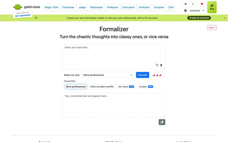
A text editor, tone selector and conversion action lead into a separate rewritten-text panel.
Useful for: Make tone selection explicit before rewriting text.
# Design reference: Goblin Tools — Formalizer
Source: https://goblin.tools/Formalizer
Swipefile reference: https://swipefile.design/ref/ai-goblin-formalizer/
Captured: 2026-09-06. This is a dated reference, not a claim about the current live product.
Capture scope: one viewport. Do not infer unseen page sections or a complete user flow.

## Objective
Adapt the interaction and layout patterns below to my project. Use my own content and identity. Do not reproduce logos, proprietary copy, or brand assets.

## Reference notes
- surface: A text editor, tone selector and conversion action lead into a separate rewritten-text panel.
- nav: Shared horizontal tool navigation
- layout: Input above tone controls and output
- density: Comfortable spacing with focused controls.
- color: White, blue and lime
- typography: Readable sans-serif controls and clear heading hierarchy.
- pattern: Make tone selection explicit before rewriting text.
- states: Public initial state; no user content submitted.
- dont: Adapt the layout to your own product and supported capabilities; write your own examples and keep important actions clearly labeled.

Useful for: Make tone selection explicit before rewriting text.

## Acceptance criteria
- Existing project conventions, design tokens, working functionality, and unrelated changes are preserved.
- Two or three reference principles clearly support the user's task; conflicts are resolved in favor of usability and the existing product.
- Reusable components and semantic HTML express the interface. Available licensed assets are used; important UI text is never rendered as a bitmap.
- Every visible control has a defined behavior. Loading, empty, error, success, disabled, and long-content states are specified where relevant. Demo data is clearly labeled.
- Navigation and content adapt at 375px, 768px, and 1440px without horizontal page overflow. Keyboard use, visible focus, labeled inputs, at least 44px touch targets, readable contrast, and reduced motion are supported.
- Verification distinguishes rendered behavior from proposals and identifies anything still requiring a backend or external service.

## Quality bar
Clear hierarchy, consistent spacing, restrained surfaces, and purposeful motion. Avoid decorative gradients, excessive cards, placeholder buttons, and invented metrics unless the project calls for them. Do not claim a feature is connected or tested without evidence.
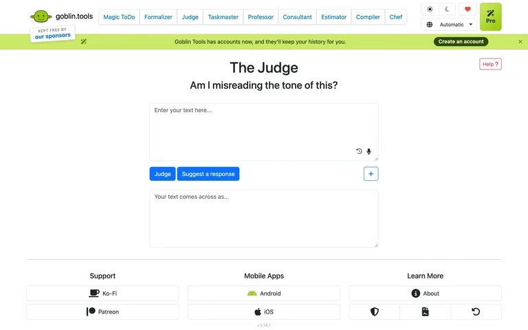
A message-analysis form separates the original text, analysis actions and an empty interpretation area.
Useful for: Differentiate interpreting a message from suggesting a response.
# Design reference: Goblin Tools — The Judge
Source: https://goblin.tools/Judge
Swipefile reference: https://swipefile.design/ref/ai-goblin-judge/
Captured: 2026-09-06. This is a dated reference, not a claim about the current live product.
Capture scope: one viewport. Do not infer unseen page sections or a complete user flow.

## Objective
Adapt the interaction and layout patterns below to my project. Use my own content and identity. Do not reproduce logos, proprietary copy, or brand assets.

## Reference notes
- surface: A message-analysis form separates the original text, analysis actions and an empty interpretation area.
- nav: Shared horizontal tool navigation
- layout: Single-column text analysis form
- density: Comfortable spacing with focused controls.
- color: White, blue and lime
- typography: Readable sans-serif controls and clear heading hierarchy.
- pattern: Differentiate interpreting a message from suggesting a response.
- states: Public initial state; no user content submitted.
- dont: Adapt the layout to your own product and supported capabilities; write your own examples and keep important actions clearly labeled.

Useful for: Differentiate interpreting a message from suggesting a response.

## Acceptance criteria
- Existing project conventions, design tokens, working functionality, and unrelated changes are preserved.
- Two or three reference principles clearly support the user's task; conflicts are resolved in favor of usability and the existing product.
- Reusable components and semantic HTML express the interface. Available licensed assets are used; important UI text is never rendered as a bitmap.
- Every visible control has a defined behavior. Loading, empty, error, success, disabled, and long-content states are specified where relevant. Demo data is clearly labeled.
- Navigation and content adapt at 375px, 768px, and 1440px without horizontal page overflow. Keyboard use, visible focus, labeled inputs, at least 44px touch targets, readable contrast, and reduced motion are supported.
- Verification distinguishes rendered behavior from proposals and identifies anything still requiring a backend or external service.

## Quality bar
Clear hierarchy, consistent spacing, restrained surfaces, and purposeful motion. Avoid decorative gradients, excessive cards, placeholder buttons, and invented metrics unless the project calls for them. Do not claim a feature is connected or tested without evidence.
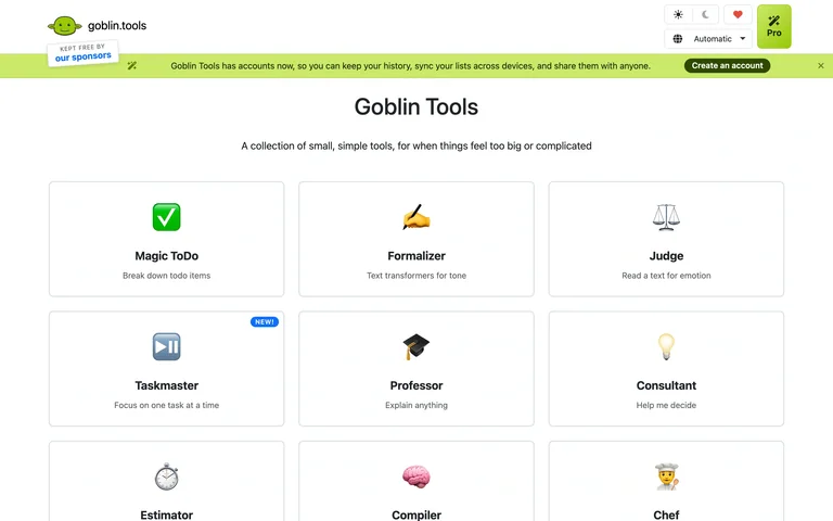
A three-column directory uses small icons and short descriptions to introduce everyday AI tools.
Useful for: Organize focused utilities by recognizable everyday tasks.
# Design reference: Goblin Tools — Tool directory
Source: https://goblin.tools/
Swipefile reference: https://swipefile.design/ref/ai-goblin-tools/
Captured: 2026-09-06. This is a dated reference, not a claim about the current live product.
Capture scope: one viewport. Do not infer unseen page sections or a complete user flow.

## Objective
Adapt the interaction and layout patterns below to my project. Use my own content and identity. Do not reproduce logos, proprietary copy, or brand assets.

## Reference notes
- surface: A three-column directory uses small icons and short descriptions to introduce everyday AI tools.
- nav: Shared tool navigation
- layout: Compact three-column tool-card grid
- density: Comfortable spacing with focused controls.
- color: White, blue and lime
- typography: Readable sans-serif controls and clear heading hierarchy.
- pattern: Organize focused utilities by recognizable everyday tasks.
- states: Public initial state; no user content submitted.
- dont: Adapt the layout to your own product and supported capabilities; write your own examples and keep important actions clearly labeled.

Useful for: Organize focused utilities by recognizable everyday tasks.

## Acceptance criteria
- Existing project conventions, design tokens, working functionality, and unrelated changes are preserved.
- Two or three reference principles clearly support the user's task; conflicts are resolved in favor of usability and the existing product.
- Reusable components and semantic HTML express the interface. Available licensed assets are used; important UI text is never rendered as a bitmap.
- Every visible control has a defined behavior. Loading, empty, error, success, disabled, and long-content states are specified where relevant. Demo data is clearly labeled.
- Navigation and content adapt at 375px, 768px, and 1440px without horizontal page overflow. Keyboard use, visible focus, labeled inputs, at least 44px touch targets, readable contrast, and reduced motion are supported.
- Verification distinguishes rendered behavior from proposals and identifies anything still requiring a backend or external service.

## Quality bar
Clear hierarchy, consistent spacing, restrained surfaces, and purposeful motion. Avoid decorative gradients, excessive cards, placeholder buttons, and invented metrics unless the project calls for them. Do not claim a feature is connected or tested without evidence.
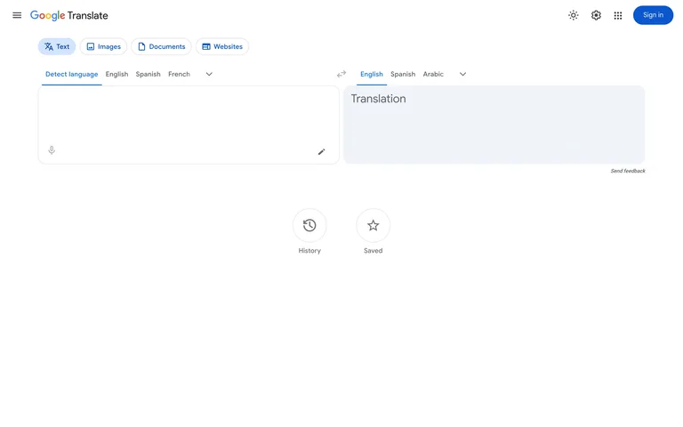
A two-panel translation workspace keeps source and target language selectors above text input and output.
Useful for: Align source and output while keeping language switching nearby.
# Design reference: Google Translate — Translation workspace
Source: https://translate.google.com/?sl=auto&tl=en&op=translate
Swipefile reference: https://swipefile.design/ref/ai-google-translate/
Captured: 2026-09-06. This is a dated reference, not a claim about the current live product.
Capture scope: one viewport. Do not infer unseen page sections or a complete user flow.

## Objective
Adapt the interaction and layout patterns below to my project. Use my own content and identity. Do not reproduce logos, proprietary copy, or brand assets.

## Reference notes
- surface: A two-panel translation workspace keeps source and target language selectors above text input and output.
- nav: Header with content-mode tabs
- layout: Side-by-side input and translation panels
- density: Comfortable spacing with focused controls.
- color: White, light gray and blue
- typography: Readable sans-serif controls and clear heading hierarchy.
- pattern: Align source and output while keeping language switching nearby.
- states: Public initial state; no user content submitted.
- dont: Adapt the layout to your own product and supported capabilities; write your own examples and keep important actions clearly labeled.

Useful for: Align source and output while keeping language switching nearby.

## Acceptance criteria
- Existing project conventions, design tokens, working functionality, and unrelated changes are preserved.
- Two or three reference principles clearly support the user's task; conflicts are resolved in favor of usability and the existing product.
- Reusable components and semantic HTML express the interface. Available licensed assets are used; important UI text is never rendered as a bitmap.
- Every visible control has a defined behavior. Loading, empty, error, success, disabled, and long-content states are specified where relevant. Demo data is clearly labeled.
- Navigation and content adapt at 375px, 768px, and 1440px without horizontal page overflow. Keyboard use, visible focus, labeled inputs, at least 44px touch targets, readable contrast, and reduced motion are supported.
- Verification distinguishes rendered behavior from proposals and identifies anything still requiring a backend or external service.

## Quality bar
Clear hierarchy, consistent spacing, restrained surfaces, and purposeful motion. Avoid decorative gradients, excessive cards, placeholder buttons, and invented metrics unless the project calls for them. Do not claim a feature is connected or tested without evidence.
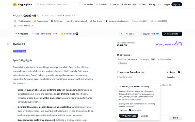
A model detail combines repository tabs, technical documentation, activity metrics and an inference sidebar.
Useful for: Keep technical documentation and model-use controls in one detail view.
# Design reference: Hugging Face — Qwen model card
Source: https://huggingface.co/Qwen/Qwen3-8B
Swipefile reference: https://swipefile.design/ref/ai-huggingface-model-card/
Captured: 2026-09-06. This is a dated reference, not a claim about the current live product.
Capture scope: one viewport. Do not infer unseen page sections or a complete user flow.

## Objective
Adapt the interaction and layout patterns below to my project. Use my own content and identity. Do not reproduce logos, proprietary copy, or brand assets.

## Reference notes
- surface: A model detail combines repository tabs, technical documentation, activity metrics and an inference sidebar.
- nav: Global search plus repository tabs
- layout: Documentation column with model metadata and inference sidebar
- density: Comfortable spacing with focused controls.
- color: White, gray and blue
- typography: Readable sans-serif controls and clear heading hierarchy.
- pattern: Keep technical documentation and model-use controls in one detail view.
- states: Public initial state; no user content submitted.
- dont: Adapt the layout to your own product and supported capabilities; write your own examples and keep important actions clearly labeled.

Useful for: Keep technical documentation and model-use controls in one detail view.

## Acceptance criteria
- Existing project conventions, design tokens, working functionality, and unrelated changes are preserved.
- Two or three reference principles clearly support the user's task; conflicts are resolved in favor of usability and the existing product.
- Reusable components and semantic HTML express the interface. Available licensed assets are used; important UI text is never rendered as a bitmap.
- Every visible control has a defined behavior. Loading, empty, error, success, disabled, and long-content states are specified where relevant. Demo data is clearly labeled.
- Navigation and content adapt at 375px, 768px, and 1440px without horizontal page overflow. Keyboard use, visible focus, labeled inputs, at least 44px touch targets, readable contrast, and reduced motion are supported.
- Verification distinguishes rendered behavior from proposals and identifies anything still requiring a backend or external service.

## Quality bar
Clear hierarchy, consistent spacing, restrained surfaces, and purposeful motion. Avoid decorative gradients, excessive cards, placeholder buttons, and invented metrics unless the project calls for them. Do not claim a feature is connected or tested without evidence.
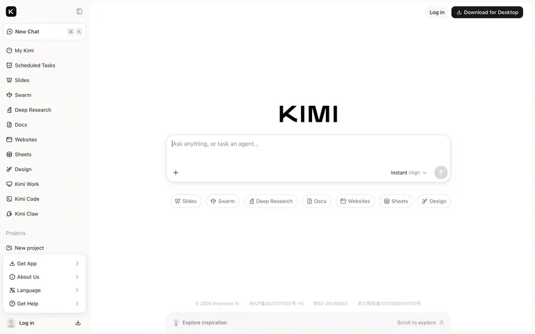
A centered composer and task shortcuts sit inside a broad workspace with a persistent project-and-tools sidebar.
Useful for: Offer task-specific starts without hiding the main chat composer.
# Design reference: Kimi — Chat workspace
Source: https://www.kimi.com/
Swipefile reference: https://swipefile.design/ref/ai-kimi-chat/
Captured: 2026-09-05. This is a dated reference, not a claim about the current live product.
Capture scope: one viewport. Do not infer unseen page sections or a complete user flow.

## Objective
Adapt the interaction and layout patterns below to my project. Use my own content and identity. Do not reproduce logos, proprietary copy, or brand assets.

## Reference notes
- surface: A centered composer and task shortcuts sit inside a broad workspace with a persistent project-and-tools sidebar.
- nav: Full-height left sidebar
- layout: Wide central composer with task shortcuts below
- density: Comfortable spacing with focused controls.
- color: White, black and light gray
- typography: Readable sans-serif controls and clear heading hierarchy.
- pattern: Offer task-specific starts without hiding the main chat composer.
- states: Public initial state; no user content submitted.
- dont: Adapt the layout to your own product and supported capabilities; write your own examples and keep important actions clearly labeled.

Useful for: Offer task-specific starts without hiding the main chat composer.

## Acceptance criteria
- Existing project conventions, design tokens, working functionality, and unrelated changes are preserved.
- Two or three reference principles clearly support the user's task; conflicts are resolved in favor of usability and the existing product.
- Reusable components and semantic HTML express the interface. Available licensed assets are used; important UI text is never rendered as a bitmap.
- Every visible control has a defined behavior. Loading, empty, error, success, disabled, and long-content states are specified where relevant. Demo data is clearly labeled.
- Navigation and content adapt at 375px, 768px, and 1440px without horizontal page overflow. Keyboard use, visible focus, labeled inputs, at least 44px touch targets, readable contrast, and reduced motion are supported.
- Verification distinguishes rendered behavior from proposals and identifies anything still requiring a backend or external service.

## Quality bar
Clear hierarchy, consistent spacing, restrained surfaces, and purposeful motion. Avoid decorative gradients, excessive cards, placeholder buttons, and invented metrics unless the project calls for them. Do not claim a feature is connected or tested without evidence.
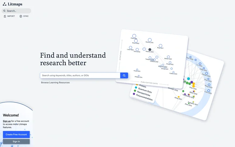
A paper-search entry pairs a narrow sidebar with overlapping citation-map previews and an account invitation.
Useful for: Explain a research graph through a visual preview before search.
# Design reference: Litmaps — Research discovery
Source: https://app.litmaps.com/
Swipefile reference: https://swipefile.design/ref/ai-litmaps/
Captured: 2026-09-06. This is a dated reference, not a claim about the current live product.
Capture scope: one viewport. Do not infer unseen page sections or a complete user flow.

## Objective
Adapt the interaction and layout patterns below to my project. Use my own content and identity. Do not reproduce logos, proprietary copy, or brand assets.

## Reference notes
- surface: A paper-search entry pairs a narrow sidebar with overlapping citation-map previews and an account invitation.
- nav: Slim left sidebar
- layout: Search-led introduction with map previews
- density: Comfortable spacing with focused controls.
- color: Pale gray, white and blue
- typography: Readable sans-serif controls and clear heading hierarchy.
- pattern: Explain a research graph through a visual preview before search.
- states: Public initial state; no user content submitted.
- dont: Adapt the layout to your own product and supported capabilities; write your own examples and keep important actions clearly labeled.

Useful for: Explain a research graph through a visual preview before search.

## Acceptance criteria
- Existing project conventions, design tokens, working functionality, and unrelated changes are preserved.
- Two or three reference principles clearly support the user's task; conflicts are resolved in favor of usability and the existing product.
- Reusable components and semantic HTML express the interface. Available licensed assets are used; important UI text is never rendered as a bitmap.
- Every visible control has a defined behavior. Loading, empty, error, success, disabled, and long-content states are specified where relevant. Demo data is clearly labeled.
- Navigation and content adapt at 375px, 768px, and 1440px without horizontal page overflow. Keyboard use, visible focus, labeled inputs, at least 44px touch targets, readable contrast, and reduced motion are supported.
- Verification distinguishes rendered behavior from proposals and identifies anything still requiring a backend or external service.

## Quality bar
Clear hierarchy, consistent spacing, restrained surfaces, and purposeful motion. Avoid decorative gradients, excessive cards, placeholder buttons, and invented metrics unless the project calls for them. Do not claim a feature is connected or tested without evidence.
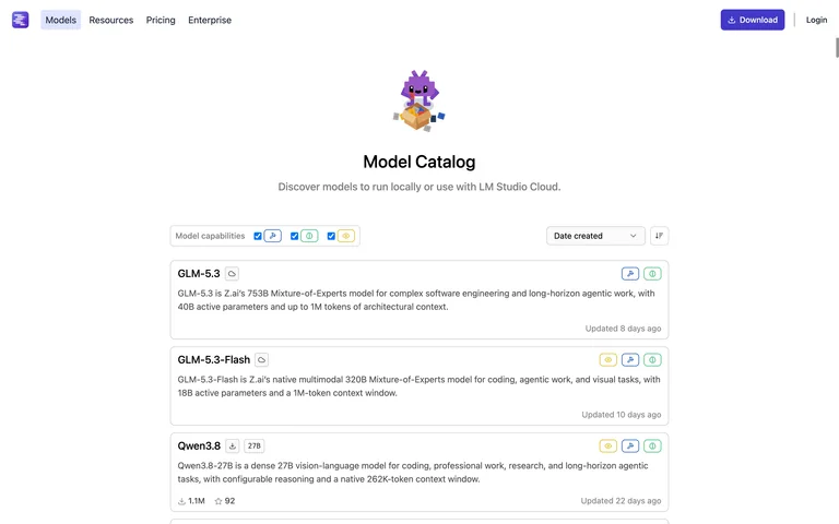
A model catalog puts capability filters and a sort menu above compact model summaries.
Useful for: Expose model capabilities in scannable list rows.
# Design reference: LM Studio — Model catalog
Source: https://lmstudio.ai/models
Swipefile reference: https://swipefile.design/ref/ai-lmstudio-models/
Captured: 2026-09-06. This is a dated reference, not a claim about the current live product.
Capture scope: one viewport. Do not infer unseen page sections or a complete user flow.

## Objective
Adapt the interaction and layout patterns below to my project. Use my own content and identity. Do not reproduce logos, proprietary copy, or brand assets.

## Reference notes
- surface: A model catalog puts capability filters and a sort menu above compact model summaries.
- nav: Compact header navigation
- layout: Narrow centered list with filters and sorting
- density: Comfortable spacing with focused controls.
- color: White, gray and violet
- typography: Readable sans-serif controls and clear heading hierarchy.
- pattern: Expose model capabilities in scannable list rows.
- states: Public initial state; no user content submitted.
- dont: Adapt the layout to your own product and supported capabilities; write your own examples and keep important actions clearly labeled.

Useful for: Expose model capabilities in scannable list rows.

## Acceptance criteria
- Existing project conventions, design tokens, working functionality, and unrelated changes are preserved.
- Two or three reference principles clearly support the user's task; conflicts are resolved in favor of usability and the existing product.
- Reusable components and semantic HTML express the interface. Available licensed assets are used; important UI text is never rendered as a bitmap.
- Every visible control has a defined behavior. Loading, empty, error, success, disabled, and long-content states are specified where relevant. Demo data is clearly labeled.
- Navigation and content adapt at 375px, 768px, and 1440px without horizontal page overflow. Keyboard use, visible focus, labeled inputs, at least 44px touch targets, readable contrast, and reduced motion are supported.
- Verification distinguishes rendered behavior from proposals and identifies anything still requiring a backend or external service.

## Quality bar
Clear hierarchy, consistent spacing, restrained surfaces, and purposeful motion. Avoid decorative gradients, excessive cards, placeholder buttons, and invented metrics unless the project calls for them. Do not claim a feature is connected or tested without evidence.
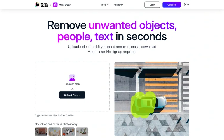
A file-input area sits beside a before-and-after image example with selectable sample thumbnails below.
Useful for: Use a visible comparison to explain the editing action.
# Design reference: Magic Studio — Magic Eraser
Source: https://magicstudio.com/magiceraser/
Swipefile reference: https://swipefile.design/ref/ai-magic-eraser/
Captured: 2026-09-06. This is a dated reference, not a claim about the current live product.
Capture scope: one viewport. Do not infer unseen page sections or a complete user flow.

## Objective
Adapt the interaction and layout patterns below to my project. Use my own content and identity. Do not reproduce logos, proprietary copy, or brand assets.

## Reference notes
- surface: A file-input area sits beside a before-and-after image example with selectable sample thumbnails below.
- nav: Minimal top navigation
- layout: Image input left and editing demonstration right
- density: Comfortable spacing with focused controls.
- color: White, charcoal and magenta
- typography: Readable sans-serif controls and clear heading hierarchy.
- pattern: Use a visible comparison to explain the editing action.
- states: Public initial state; no user content submitted.
- dont: Adapt the layout to your own product and supported capabilities; write your own examples and keep important actions clearly labeled.

Useful for: Use a visible comparison to explain the editing action.

## Acceptance criteria
- Existing project conventions, design tokens, working functionality, and unrelated changes are preserved.
- Two or three reference principles clearly support the user's task; conflicts are resolved in favor of usability and the existing product.
- Reusable components and semantic HTML express the interface. Available licensed assets are used; important UI text is never rendered as a bitmap.
- Every visible control has a defined behavior. Loading, empty, error, success, disabled, and long-content states are specified where relevant. Demo data is clearly labeled.
- Navigation and content adapt at 375px, 768px, and 1440px without horizontal page overflow. Keyboard use, visible focus, labeled inputs, at least 44px touch targets, readable contrast, and reduced motion are supported.
- Verification distinguishes rendered behavior from proposals and identifies anything still requiring a backend or external service.

## Quality bar
Clear hierarchy, consistent spacing, restrained surfaces, and purposeful motion. Avoid decorative gradients, excessive cards, placeholder buttons, and invented metrics unless the project calls for them. Do not claim a feature is connected or tested without evidence.
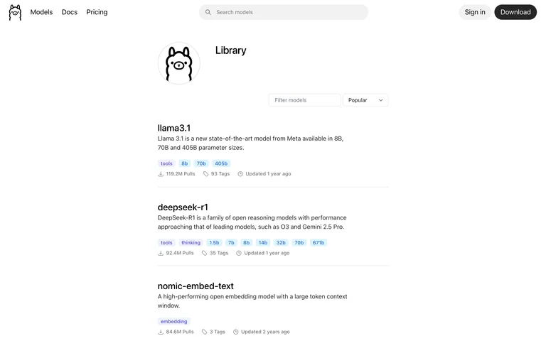
A searchable model library uses capability tags, short descriptions and usage metadata in spacious rows.
Useful for: Put compatibility and model size information directly in list rows.
# Design reference: Ollama — Model library
Source: https://ollama.com/library
Swipefile reference: https://swipefile.design/ref/ai-ollama-library/
Captured: 2026-09-06. This is a dated reference, not a claim about the current live product.
Capture scope: one viewport. Do not infer unseen page sections or a complete user flow.

## Objective
Adapt the interaction and layout patterns below to my project. Use my own content and identity. Do not reproduce logos, proprietary copy, or brand assets.

## Reference notes
- surface: A searchable model library uses capability tags, short descriptions and usage metadata in spacious rows.
- nav: Compact header with search
- layout: Centered filter bar and model list
- density: Comfortable spacing with focused controls.
- color: White, black and muted blue
- typography: Readable sans-serif controls and clear heading hierarchy.
- pattern: Put compatibility and model size information directly in list rows.
- states: Public initial state; no user content submitted.
- dont: Adapt the layout to your own product and supported capabilities; write your own examples and keep important actions clearly labeled.

Useful for: Put compatibility and model size information directly in list rows.

## Acceptance criteria
- Existing project conventions, design tokens, working functionality, and unrelated changes are preserved.
- Two or three reference principles clearly support the user's task; conflicts are resolved in favor of usability and the existing product.
- Reusable components and semantic HTML express the interface. Available licensed assets are used; important UI text is never rendered as a bitmap.
- Every visible control has a defined behavior. Loading, empty, error, success, disabled, and long-content states are specified where relevant. Demo data is clearly labeled.
- Navigation and content adapt at 375px, 768px, and 1440px without horizontal page overflow. Keyboard use, visible focus, labeled inputs, at least 44px touch targets, readable contrast, and reduced motion are supported.
- Verification distinguishes rendered behavior from proposals and identifies anything still requiring a backend or external service.

## Quality bar
Clear hierarchy, consistent spacing, restrained surfaces, and purposeful motion. Avoid decorative gradients, excessive cards, placeholder buttons, and invented metrics unless the project calls for them. Do not claim a feature is connected or tested without evidence.
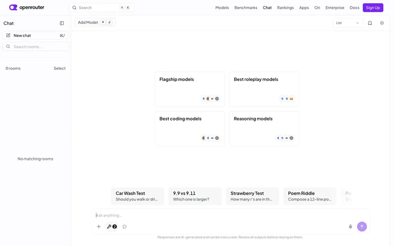
A comparison-ready chat workspace exposes model selection, a conversation sidebar and a broad prompt composer.
Useful for: Keep model selection visible when comparing chat experiences.
# Design reference: OpenRouter — Chat playground
Source: https://openrouter.ai/chat
Swipefile reference: https://swipefile.design/ref/ai-openrouter-chat/
Captured: 2026-09-06. This is a dated reference, not a claim about the current live product.
Capture scope: one viewport. Do not infer unseen page sections or a complete user flow.

## Objective
Adapt the interaction and layout patterns below to my project. Use my own content and identity. Do not reproduce logos, proprietary copy, or brand assets.

## Reference notes
- surface: A comparison-ready chat workspace exposes model selection, a conversation sidebar and a broad prompt composer.
- nav: Left conversation sidebar and top model controls
- layout: Large empty conversation canvas with composer below
- density: Comfortable spacing with focused controls.
- color: White, light gray and violet
- typography: Readable sans-serif controls and clear heading hierarchy.
- pattern: Keep model selection visible when comparing chat experiences.
- states: Public initial state; no user content submitted.
- dont: Adapt the layout to your own product and supported capabilities; write your own examples and keep important actions clearly labeled.

Useful for: Keep model selection visible when comparing chat experiences.

## Acceptance criteria
- Existing project conventions, design tokens, working functionality, and unrelated changes are preserved.
- Two or three reference principles clearly support the user's task; conflicts are resolved in favor of usability and the existing product.
- Reusable components and semantic HTML express the interface. Available licensed assets are used; important UI text is never rendered as a bitmap.
- Every visible control has a defined behavior. Loading, empty, error, success, disabled, and long-content states are specified where relevant. Demo data is clearly labeled.
- Navigation and content adapt at 375px, 768px, and 1440px without horizontal page overflow. Keyboard use, visible focus, labeled inputs, at least 44px touch targets, readable contrast, and reduced motion are supported.
- Verification distinguishes rendered behavior from proposals and identifies anything still requiring a backend or external service.

## Quality bar
Clear hierarchy, consistent spacing, restrained surfaces, and purposeful motion. Avoid decorative gradients, excessive cards, placeholder buttons, and invented metrics unless the project calls for them. Do not claim a feature is connected or tested without evidence.
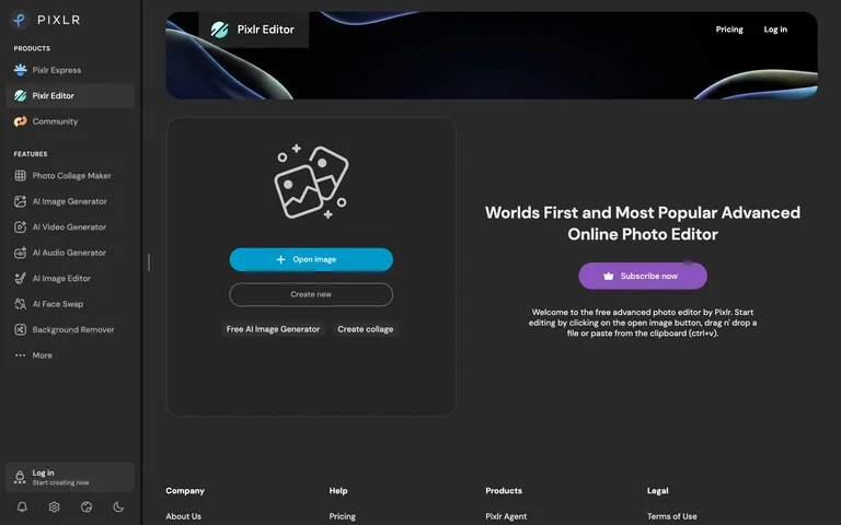
A dark editor start screen places image opening and canvas creation beside an introduction, with tools listed in a sidebar.
Useful for: Distinguish opening an image from creating a blank canvas.
# Design reference: Pixlr Editor — Start screen
Source: https://pixlr.com/editor/
Swipefile reference: https://swipefile.design/ref/ai-pixlr-editor/
Captured: 2026-09-06. This is a dated reference, not a claim about the current live product.
Capture scope: one viewport. Do not infer unseen page sections or a complete user flow.

## Objective
Adapt the interaction and layout patterns below to my project. Use my own content and identity. Do not reproduce logos, proprietary copy, or brand assets.

## Reference notes
- surface: A dark editor start screen places image opening and canvas creation beside an introduction, with tools listed in a sidebar.
- nav: Persistent left product and feature sidebar
- layout: Large input panel next to introductory copy
- density: Comfortable spacing with focused controls.
- color: Charcoal, cyan and violet
- typography: Readable sans-serif controls and clear heading hierarchy.
- pattern: Distinguish opening an image from creating a blank canvas.
- states: Public initial state; no user content submitted.
- dont: Adapt the layout to your own product and supported capabilities; write your own examples and keep important actions clearly labeled.

Useful for: Distinguish opening an image from creating a blank canvas.

## Acceptance criteria
- Existing project conventions, design tokens, working functionality, and unrelated changes are preserved.
- Two or three reference principles clearly support the user's task; conflicts are resolved in favor of usability and the existing product.
- Reusable components and semantic HTML express the interface. Available licensed assets are used; important UI text is never rendered as a bitmap.
- Every visible control has a defined behavior. Loading, empty, error, success, disabled, and long-content states are specified where relevant. Demo data is clearly labeled.
- Navigation and content adapt at 375px, 768px, and 1440px without horizontal page overflow. Keyboard use, visible focus, labeled inputs, at least 44px touch targets, readable contrast, and reduced motion are supported.
- Verification distinguishes rendered behavior from proposals and identifies anything still requiring a backend or external service.

## Quality bar
Clear hierarchy, consistent spacing, restrained surfaces, and purposeful motion. Avoid decorative gradients, excessive cards, placeholder buttons, and invented metrics unless the project calls for them. Do not claim a feature is connected or tested without evidence.
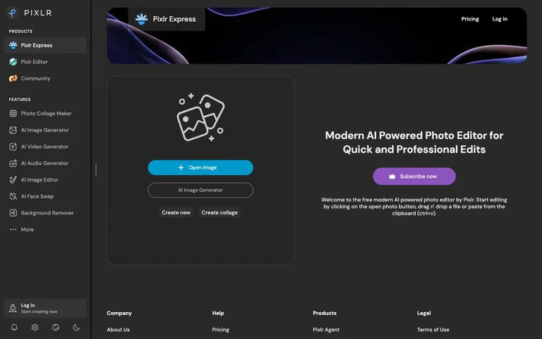
An AI photo-editor start screen combines an image-opening panel, generation entry and a full tool sidebar.
Useful for: Show common editing starts before users provide an image.
# Design reference: Pixlr Express — Start screen
Source: https://pixlr.com/express/
Swipefile reference: https://swipefile.design/ref/ai-pixlr-express/
Captured: 2026-09-06. This is a dated reference, not a claim about the current live product.
Capture scope: one viewport. Do not infer unseen page sections or a complete user flow.

## Objective
Adapt the interaction and layout patterns below to my project. Use my own content and identity. Do not reproduce logos, proprietary copy, or brand assets.

## Reference notes
- surface: An AI photo-editor start screen combines an image-opening panel, generation entry and a full tool sidebar.
- nav: Persistent left product and feature sidebar
- layout: Input panel left and introduction right
- density: Comfortable spacing with focused controls.
- color: Charcoal, cyan and violet
- typography: Readable sans-serif controls and clear heading hierarchy.
- pattern: Show common editing starts before users provide an image.
- states: Public initial state; no user content submitted.
- dont: Adapt the layout to your own product and supported capabilities; write your own examples and keep important actions clearly labeled.

Useful for: Show common editing starts before users provide an image.

## Acceptance criteria
- Existing project conventions, design tokens, working functionality, and unrelated changes are preserved.
- Two or three reference principles clearly support the user's task; conflicts are resolved in favor of usability and the existing product.
- Reusable components and semantic HTML express the interface. Available licensed assets are used; important UI text is never rendered as a bitmap.
- Every visible control has a defined behavior. Loading, empty, error, success, disabled, and long-content states are specified where relevant. Demo data is clearly labeled.
- Navigation and content adapt at 375px, 768px, and 1440px without horizontal page overflow. Keyboard use, visible focus, labeled inputs, at least 44px touch targets, readable contrast, and reduced motion are supported.
- Verification distinguishes rendered behavior from proposals and identifies anything still requiring a backend or external service.

## Quality bar
Clear hierarchy, consistent spacing, restrained surfaces, and purposeful motion. Avoid decorative gradients, excessive cards, placeholder buttons, and invented metrics unless the project calls for them. Do not claim a feature is connected or tested without evidence.
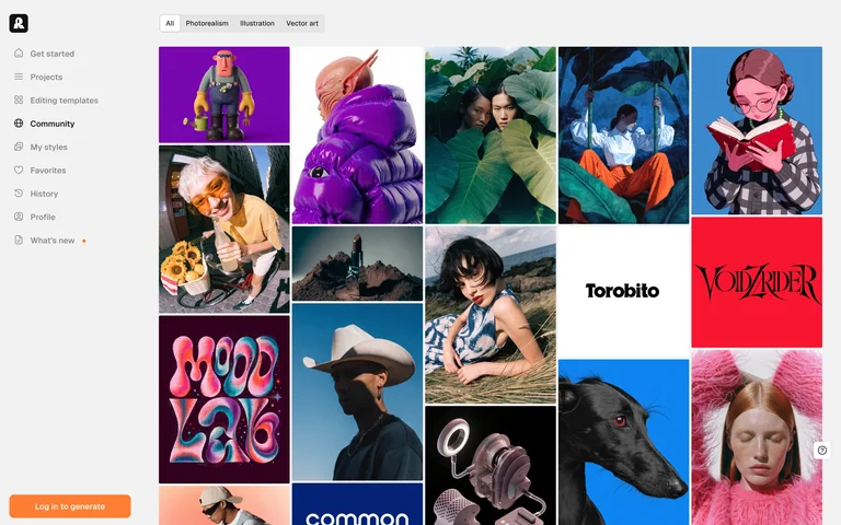
A dense masonry gallery pairs image-type filters with a persistent project-and-community sidebar.
Useful for: Let imagery lead while keeping type filters and navigation stable.
# Design reference: Recraft — Community gallery
Source: https://www.recraft.ai/community
Swipefile reference: https://swipefile.design/ref/ai-recraft-community/
Captured: 2026-09-06. This is a dated reference, not a claim about the current live product.
Capture scope: one viewport. Do not infer unseen page sections or a complete user flow.

## Objective
Adapt the interaction and layout patterns below to my project. Use my own content and identity. Do not reproduce logos, proprietary copy, or brand assets.

## Reference notes
- surface: A dense masonry gallery pairs image-type filters with a persistent project-and-community sidebar.
- nav: Full-height left sidebar
- layout: Multi-column masonry gallery below filter tabs
- density: Comfortable spacing with focused controls.
- color: Pale gray and black around colorful artwork
- typography: Readable sans-serif controls and clear heading hierarchy.
- pattern: Let imagery lead while keeping type filters and navigation stable.
- states: Public initial state; no user content submitted.
- dont: Adapt the layout to your own product and supported capabilities; write your own examples and keep important actions clearly labeled.

Useful for: Let imagery lead while keeping type filters and navigation stable.

## Acceptance criteria
- Existing project conventions, design tokens, working functionality, and unrelated changes are preserved.
- Two or three reference principles clearly support the user's task; conflicts are resolved in favor of usability and the existing product.
- Reusable components and semantic HTML express the interface. Available licensed assets are used; important UI text is never rendered as a bitmap.
- Every visible control has a defined behavior. Loading, empty, error, success, disabled, and long-content states are specified where relevant. Demo data is clearly labeled.
- Navigation and content adapt at 375px, 768px, and 1440px without horizontal page overflow. Keyboard use, visible focus, labeled inputs, at least 44px touch targets, readable contrast, and reduced motion are supported.
- Verification distinguishes rendered behavior from proposals and identifies anything still requiring a backend or external service.

## Quality bar
Clear hierarchy, consistent spacing, restrained surfaces, and purposeful motion. Avoid decorative gradients, excessive cards, placeholder buttons, and invented metrics unless the project calls for them. Do not claim a feature is connected or tested without evidence.

A deep-blue research-search entry centers a broad search field, yellow action and sample topics.
Useful for: Use sample topics to make a broad research search approachable.
# Design reference: Semantic Scholar — Paper search
Source: https://www.semanticscholar.org/
Swipefile reference: https://swipefile.design/ref/ai-semantic-scholar/
Captured: 2026-09-06. This is a dated reference, not a claim about the current live product.
Capture scope: one viewport. Do not infer unseen page sections or a complete user flow.

## Objective
Adapt the interaction and layout patterns below to my project. Use my own content and identity. Do not reproduce logos, proprietary copy, or brand assets.

## Reference notes
- surface: A deep-blue research-search entry centers a broad search field, yellow action and sample topics.
- nav: Small account actions at top
- layout: Large search field beneath identity and description
- density: Comfortable spacing with focused controls.
- color: Navy, yellow and white
- typography: Readable sans-serif controls and clear heading hierarchy.
- pattern: Use sample topics to make a broad research search approachable.
- states: Public initial state; no user content submitted.
- dont: Adapt the layout to your own product and supported capabilities; write your own examples and keep important actions clearly labeled.

Useful for: Use sample topics to make a broad research search approachable.

## Acceptance criteria
- Existing project conventions, design tokens, working functionality, and unrelated changes are preserved.
- Two or three reference principles clearly support the user's task; conflicts are resolved in favor of usability and the existing product.
- Reusable components and semantic HTML express the interface. Available licensed assets are used; important UI text is never rendered as a bitmap.
- Every visible control has a defined behavior. Loading, empty, error, success, disabled, and long-content states are specified where relevant. Demo data is clearly labeled.
- Navigation and content adapt at 375px, 768px, and 1440px without horizontal page overflow. Keyboard use, visible focus, labeled inputs, at least 44px touch targets, readable contrast, and reduced motion are supported.
- Verification distinguishes rendered behavior from proposals and identifies anything still requiring a backend or external service.

## Quality bar
Clear hierarchy, consistent spacing, restrained surfaces, and purposeful motion. Avoid decorative gradients, excessive cards, placeholder buttons, and invented metrics unless the project calls for them. Do not claim a feature is connected or tested without evidence.
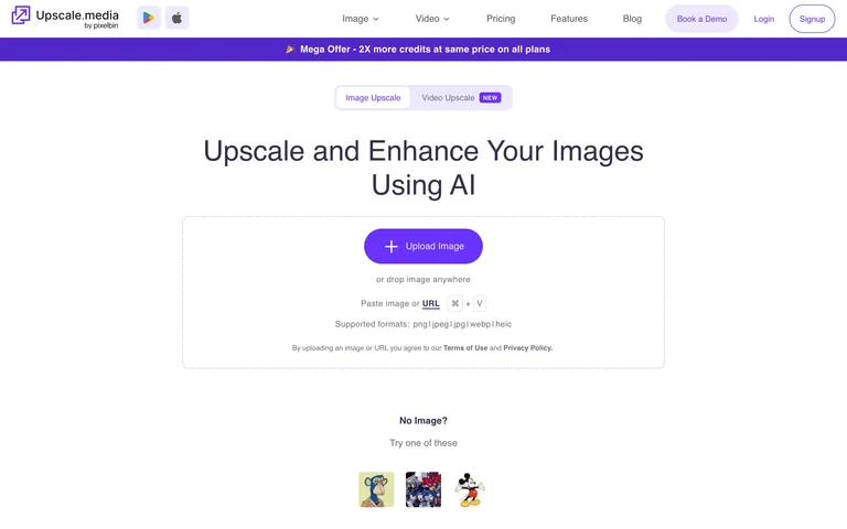
An upscaling entry presents image/video mode tabs, a single purple upload action and example images.
Useful for: Keep supported media modes visible before upload.
# Design reference: Upscale.media — Upload workspace
Source: https://www.upscale.media/upload
Swipefile reference: https://swipefile.design/ref/ai-upscale-media/
Captured: 2026-09-06. This is a dated reference, not a claim about the current live product.
Capture scope: one viewport. Do not infer unseen page sections or a complete user flow.

## Objective
Adapt the interaction and layout patterns below to my project. Use my own content and identity. Do not reproduce logos, proprietary copy, or brand assets.

## Reference notes
- surface: An upscaling entry presents image/video mode tabs, a single purple upload action and example images.
- nav: Horizontal product navigation
- layout: Centered input panel with mode tabs and examples
- density: Comfortable spacing with focused controls.
- color: White, gray and violet
- typography: Readable sans-serif controls and clear heading hierarchy.
- pattern: Keep supported media modes visible before upload.
- states: Public initial state; no user content submitted.
- dont: Adapt the layout to your own product and supported capabilities; write your own examples and keep important actions clearly labeled.

Useful for: Keep supported media modes visible before upload.

## Acceptance criteria
- Existing project conventions, design tokens, working functionality, and unrelated changes are preserved.
- Two or three reference principles clearly support the user's task; conflicts are resolved in favor of usability and the existing product.
- Reusable components and semantic HTML express the interface. Available licensed assets are used; important UI text is never rendered as a bitmap.
- Every visible control has a defined behavior. Loading, empty, error, success, disabled, and long-content states are specified where relevant. Demo data is clearly labeled.
- Navigation and content adapt at 375px, 768px, and 1440px without horizontal page overflow. Keyboard use, visible focus, labeled inputs, at least 44px touch targets, readable contrast, and reduced motion are supported.
- Verification distinguishes rendered behavior from proposals and identifies anything still requiring a backend or external service.

## Quality bar
Clear hierarchy, consistent spacing, restrained surfaces, and purposeful motion. Avoid decorative gradients, excessive cards, placeholder buttons, and invented metrics unless the project calls for them. Do not claim a feature is connected or tested without evidence.
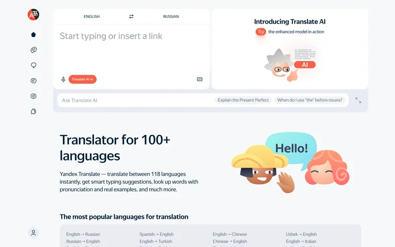
A translation input and paired output region sit beside a slim navigation rail, with an AI prompt bar beneath.
Useful for: Separate translation input from optional follow-up questions.
# Design reference: Yandex Translate — Translation workspace
Source: https://translate.yandex.com/
Swipefile reference: https://swipefile.design/ref/ai-yandex-translate/
Captured: 2026-09-06. This is a dated reference, not a claim about the current live product.
Capture scope: one viewport. Do not infer unseen page sections or a complete user flow.

## Objective
Adapt the interaction and layout patterns below to my project. Use my own content and identity. Do not reproduce logos, proprietary copy, or brand assets.

## Reference notes
- surface: A translation input and paired output region sit beside a slim navigation rail, with an AI prompt bar beneath.
- nav: Vertical icon rail
- layout: Two-column translation area above a prompt bar
- density: Comfortable spacing with focused controls.
- color: Light gray, white and coral
- typography: Readable sans-serif controls and clear heading hierarchy.
- pattern: Separate translation input from optional follow-up questions.
- states: Public initial state; no user content submitted.
- dont: Adapt the layout to your own product and supported capabilities; write your own examples and keep important actions clearly labeled.

Useful for: Separate translation input from optional follow-up questions.

## Acceptance criteria
- Existing project conventions, design tokens, working functionality, and unrelated changes are preserved.
- Two or three reference principles clearly support the user's task; conflicts are resolved in favor of usability and the existing product.
- Reusable components and semantic HTML express the interface. Available licensed assets are used; important UI text is never rendered as a bitmap.
- Every visible control has a defined behavior. Loading, empty, error, success, disabled, and long-content states are specified where relevant. Demo data is clearly labeled.
- Navigation and content adapt at 375px, 768px, and 1440px without horizontal page overflow. Keyboard use, visible focus, labeled inputs, at least 44px touch targets, readable contrast, and reduced motion are supported.
- Verification distinguishes rendered behavior from proposals and identifies anything still requiring a backend or external service.

## Quality bar
Clear hierarchy, consistent spacing, restrained surfaces, and purposeful motion. Avoid decorative gradients, excessive cards, placeholder buttons, and invented metrics unless the project calls for them. Do not claim a feature is connected or tested without evidence.
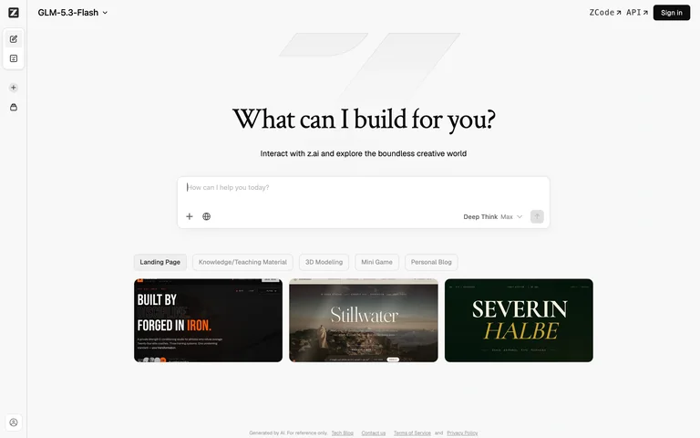
A serif creation prompt sits above a composer and a small gallery of example sites inside a narrow-rail workspace.
Useful for: Use visual examples to make a broad creation prompt concrete.
# Design reference: Z.ai — Creation chat
Source: https://chat.z.ai/
Swipefile reference: https://swipefile.design/ref/ai-z-ai-chat/
Captured: 2026-09-05. This is a dated reference, not a claim about the current live product.
Capture scope: one viewport. Do not infer unseen page sections or a complete user flow.

## Objective
Adapt the interaction and layout patterns below to my project. Use my own content and identity. Do not reproduce logos, proprietary copy, or brand assets.

## Reference notes
- surface: A serif creation prompt sits above a composer and a small gallery of example sites inside a narrow-rail workspace.
- nav: Slim left icon rail
- layout: Centered composer above visual example cards
- density: Comfortable spacing with focused controls.
- color: White, charcoal and light gray
- typography: Readable sans-serif controls and clear heading hierarchy.
- pattern: Use visual examples to make a broad creation prompt concrete.
- states: Public initial state; no user content submitted.
- dont: Adapt the layout to your own product and supported capabilities; write your own examples and keep important actions clearly labeled.

Useful for: Use visual examples to make a broad creation prompt concrete.

## Acceptance criteria
- Existing project conventions, design tokens, working functionality, and unrelated changes are preserved.
- Two or three reference principles clearly support the user's task; conflicts are resolved in favor of usability and the existing product.
- Reusable components and semantic HTML express the interface. Available licensed assets are used; important UI text is never rendered as a bitmap.
- Every visible control has a defined behavior. Loading, empty, error, success, disabled, and long-content states are specified where relevant. Demo data is clearly labeled.
- Navigation and content adapt at 375px, 768px, and 1440px without horizontal page overflow. Keyboard use, visible focus, labeled inputs, at least 44px touch targets, readable contrast, and reduced motion are supported.
- Verification distinguishes rendered behavior from proposals and identifies anything still requiring a backend or external service.

## Quality bar
Clear hierarchy, consistent spacing, restrained surfaces, and purposeful motion. Avoid decorative gradients, excessive cards, placeholder buttons, and invented metrics unless the project calls for them. Do not claim a feature is connected or tested without evidence.
A minimal chat entry keeps the model selector at the top and a sparse composer in the center.
Useful for: Keep a first conversation focused on one input.
# Design reference: Qwen Studio — Chat entry
Source: https://chat.qwen.ai/
Swipefile reference: https://swipefile.design/ref/ai-qwen-chat/
Captured: 2026-09-05. This is a dated reference, not a claim about the current live product.
Capture scope: one viewport. Do not infer unseen page sections or a complete user flow.

## Objective
Adapt the interaction and layout patterns below to my project. Use my own content and identity. Do not reproduce logos, proprietary copy, or brand assets.

## Reference notes
- surface: A minimal chat entry keeps the model selector at the top and a sparse composer in the center.
- nav: Minimal top model and account controls
- layout: Open canvas with centered text composer
- density: Comfortable spacing with focused controls.
- color: White, black and light gray
- typography: Readable sans-serif controls and clear heading hierarchy.
- pattern: Keep a first conversation focused on one input.
- states: Public initial state; no user content submitted.
- dont: Adapt the layout to your own product and supported capabilities; write your own examples and keep important actions clearly labeled.

Useful for: Keep a first conversation focused on one input.

## Acceptance criteria
- Existing project conventions, design tokens, working functionality, and unrelated changes are preserved.
- Two or three reference principles clearly support the user's task; conflicts are resolved in favor of usability and the existing product.
- Reusable components and semantic HTML express the interface. Available licensed assets are used; important UI text is never rendered as a bitmap.
- Every visible control has a defined behavior. Loading, empty, error, success, disabled, and long-content states are specified where relevant. Demo data is clearly labeled.
- Navigation and content adapt at 375px, 768px, and 1440px without horizontal page overflow. Keyboard use, visible focus, labeled inputs, at least 44px touch targets, readable contrast, and reduced motion are supported.
- Verification distinguishes rendered behavior from proposals and identifies anything still requiring a backend or external service.

## Quality bar
Clear hierarchy, consistent spacing, restrained surfaces, and purposeful motion. Avoid decorative gradients, excessive cards, placeholder buttons, and invented metrics unless the project calls for them. Do not claim a feature is connected or tested without evidence.
A speech-recognition demo presents three clearly labeled input routes: URL, file and recording.
Useful for: Expose supported input routes before loading a transcription workflow.
# Design reference: Whisper Web — Audio input demo
Source: https://xenova-whisper-web.static.hf.space/index.html
Swipefile reference: https://swipefile.design/ref/ai-demo-whisper-web/
Captured: 2026-09-06. This is a dated reference, not a claim about the current live product.
Capture scope: one viewport. Do not infer unseen page sections or a complete user flow.

## Objective
Adapt the interaction and layout patterns below to my project. Use my own content and identity. Do not reproduce logos, proprietary copy, or brand assets.

## Reference notes
- surface: A speech-recognition demo presents three clearly labeled input routes: URL, file and recording.
- nav: A single segmented input selector
- layout: Large centered heading above three input buttons
- density: Focused controls with comfortable spacing.
- color: White, navy and gray
- typography: Clear heading hierarchy and readable form labels.
- pattern: Expose supported input routes before loading a transcription workflow.
- states: Demo entry; no audio supplied or microphone activated.
- dont: Adapt the layout to your own product and supported capabilities; write your own examples and keep important actions clearly labeled.

Useful for: Expose supported input routes before loading a transcription workflow.

## Acceptance criteria
- Existing project conventions, design tokens, working functionality, and unrelated changes are preserved.
- Two or three reference principles clearly support the user's task; conflicts are resolved in favor of usability and the existing product.
- Reusable components and semantic HTML express the interface. Available licensed assets are used; important UI text is never rendered as a bitmap.
- Every visible control has a defined behavior. Loading, empty, error, success, disabled, and long-content states are specified where relevant. Demo data is clearly labeled.
- Navigation and content adapt at 375px, 768px, and 1440px without horizontal page overflow. Keyboard use, visible focus, labeled inputs, at least 44px touch targets, readable contrast, and reduced motion are supported.
- Verification distinguishes rendered behavior from proposals and identifies anything still requiring a backend or external service.

## Quality bar
Clear hierarchy, consistent spacing, restrained surfaces, and purposeful motion. Avoid decorative gradients, excessive cards, placeholder buttons, and invented metrics unless the project calls for them. Do not claim a feature is connected or tested without evidence.
A tokenizer selector sits above a text editor, token and character counters, and a separate output panel.
Useful for: Make model-dependent text processing visible through paired input and output.
# Design reference: Tokenizer Playground — Empty editor demo
Source: https://xenova-the-tokenizer-playground.static.hf.space/index.html
Swipefile reference: https://swipefile.design/ref/ai-demo-the-tokenizer-playground/
Captured: 2026-09-06. This is a dated reference, not a claim about the current live product.
Capture scope: one viewport. Do not infer unseen page sections or a complete user flow.

## Objective
Adapt the interaction and layout patterns below to my project. Use my own content and identity. Do not reproduce logos, proprietary copy, or brand assets.

## Reference notes
- surface: A tokenizer selector sits above a text editor, token and character counters, and a separate output panel.
- nav: Tokenizer selector and output display options
- layout: Stacked editor, counters and output
- density: Focused controls with comfortable spacing.
- color: White, slate and light gray
- typography: Clear heading hierarchy and readable form labels.
- pattern: Make model-dependent text processing visible through paired input and output.
- states: Demo initial state with zero tokens and characters.
- dont: Adapt the layout to your own product and supported capabilities; write your own examples and keep important actions clearly labeled.

Useful for: Make model-dependent text processing visible through paired input and output.

## Acceptance criteria
- Existing project conventions, design tokens, working functionality, and unrelated changes are preserved.
- Two or three reference principles clearly support the user's task; conflicts are resolved in favor of usability and the existing product.
- Reusable components and semantic HTML express the interface. Available licensed assets are used; important UI text is never rendered as a bitmap.
- Every visible control has a defined behavior. Loading, empty, error, success, disabled, and long-content states are specified where relevant. Demo data is clearly labeled.
- Navigation and content adapt at 375px, 768px, and 1440px without horizontal page overflow. Keyboard use, visible focus, labeled inputs, at least 44px touch targets, readable contrast, and reduced motion are supported.
- Verification distinguishes rendered behavior from proposals and identifies anything still requiring a backend or external service.

## Quality bar
Clear hierarchy, consistent spacing, restrained surfaces, and purposeful motion. Avoid decorative gradients, excessive cards, placeholder buttons, and invented metrics unless the project calls for them. Do not claim a feature is connected or tested without evidence.
A speech composer contains built-in sample text, word counts, a voice selector, speed slider and disabled audio download.
Useful for: Keep voice and speed controls between the text and generation action.
# Design reference: Kokoro Web — Speech composer demo
Source: https://xenova-kokoro-web.static.hf.space/index.html
Swipefile reference: https://swipefile.design/ref/ai-demo-kokoro-web/
Captured: 2026-09-06. This is a dated reference, not a claim about the current live product.
Capture scope: one viewport. Do not infer unseen page sections or a complete user flow.

## Objective
Adapt the interaction and layout patterns below to my project. Use my own content and identity. Do not reproduce logos, proprietary copy, or brand assets.

## Reference notes
- surface: A speech composer contains built-in sample text, word counts, a voice selector, speed slider and disabled audio download.
- nav: Inline voice and speed controls
- layout: Framed text composer with controls and output action below
- density: Focused controls with comfortable spacing.
- color: White, charcoal and blue
- typography: Clear heading hierarchy and readable form labels.
- pattern: Keep voice and speed controls between the text and generation action.
- states: Built-in example text; no speech generated.
- dont: Adapt the layout to your own product and supported capabilities; write your own examples and keep important actions clearly labeled.

Useful for: Keep voice and speed controls between the text and generation action.

## Acceptance criteria
- Existing project conventions, design tokens, working functionality, and unrelated changes are preserved.
- Two or three reference principles clearly support the user's task; conflicts are resolved in favor of usability and the existing product.
- Reusable components and semantic HTML express the interface. Available licensed assets are used; important UI text is never rendered as a bitmap.
- Every visible control has a defined behavior. Loading, empty, error, success, disabled, and long-content states are specified where relevant. Demo data is clearly labeled.
- Navigation and content adapt at 375px, 768px, and 1440px without horizontal page overflow. Keyboard use, visible focus, labeled inputs, at least 44px touch targets, readable contrast, and reduced motion are supported.
- Verification distinguishes rendered behavior from proposals and identifies anything still requiring a backend or external service.

## Quality bar
Clear hierarchy, consistent spacing, restrained surfaces, and purposeful motion. Avoid decorative gradients, excessive cards, placeholder buttons, and invented metrics unless the project calls for them. Do not claim a feature is connected or tested without evidence.
A large image-input area is followed by reset, point-clear and mask controls, with a short interaction hint.
Useful for: Explain point-based selection alongside the image canvas.
# Design reference: Segment Anything — Image input demo
Source: https://xenova-segment-anything-web.static.hf.space/index.html
Swipefile reference: https://swipefile.design/ref/ai-demo-segment-anything-web/
Captured: 2026-09-06. This is a dated reference, not a claim about the current live product.
Capture scope: one viewport. Do not infer unseen page sections or a complete user flow.

## Objective
Adapt the interaction and layout patterns below to my project. Use my own content and identity. Do not reproduce logos, proprietary copy, or brand assets.

## Reference notes
- surface: A large image-input area is followed by reset, point-clear and mask controls, with a short interaction hint.
- nav: Local image and mask controls
- layout: Centered image region with action row below
- density: Focused controls with comfortable spacing.
- color: White, black and blue
- typography: Clear heading hierarchy and readable form labels.
- pattern: Explain point-based selection alongside the image canvas.
- states: Public demo initial state; no image supplied.
- dont: Adapt the layout to your own product and supported capabilities; write your own examples and keep important actions clearly labeled.

Useful for: Explain point-based selection alongside the image canvas.

## Acceptance criteria
- Existing project conventions, design tokens, working functionality, and unrelated changes are preserved.
- Two or three reference principles clearly support the user's task; conflicts are resolved in favor of usability and the existing product.
- Reusable components and semantic HTML express the interface. Available licensed assets are used; important UI text is never rendered as a bitmap.
- Every visible control has a defined behavior. Loading, empty, error, success, disabled, and long-content states are specified where relevant. Demo data is clearly labeled.
- Navigation and content adapt at 375px, 768px, and 1440px without horizontal page overflow. Keyboard use, visible focus, labeled inputs, at least 44px touch targets, readable contrast, and reduced motion are supported.
- Verification distinguishes rendered behavior from proposals and identifies anything still requiring a backend or external service.

## Quality bar
Clear hierarchy, consistent spacing, restrained surfaces, and purposeful motion. Avoid decorative gradients, excessive cards, placeholder buttons, and invented metrics unless the project calls for them. Do not claim a feature is connected or tested without evidence.
A minimal depth-estimation demo offers a large dashed upload region, an example route and a ready indicator.
Useful for: Keep an upload-driven tool focused on input and readiness.
# Design reference: Depth Anything — Image input demo
Source: https://xenova-depth-anything-web.static.hf.space/index.html
Swipefile reference: https://swipefile.design/ref/ai-demo-depth-anything-web/
Captured: 2026-09-06. This is a dated reference, not a claim about the current live product.
Capture scope: one viewport. Do not infer unseen page sections or a complete user flow.

## Objective
Adapt the interaction and layout patterns below to my project. Use my own content and identity. Do not reproduce logos, proprietary copy, or brand assets.

## Reference notes
- surface: A minimal depth-estimation demo offers a large dashed upload region, an example route and a ready indicator.
- nav: Single image-input region
- layout: Centered title, large input region and status line
- density: Focused controls with comfortable spacing.
- color: White, black and gray
- typography: Clear heading hierarchy and readable form labels.
- pattern: Keep an upload-driven tool focused on input and readiness.
- states: Public demo ready state; no image supplied.
- dont: Adapt the layout to your own product and supported capabilities; write your own examples and keep important actions clearly labeled.

Useful for: Keep an upload-driven tool focused on input and readiness.

## Acceptance criteria
- Existing project conventions, design tokens, working functionality, and unrelated changes are preserved.
- Two or three reference principles clearly support the user's task; conflicts are resolved in favor of usability and the existing product.
- Reusable components and semantic HTML express the interface. Available licensed assets are used; important UI text is never rendered as a bitmap.
- Every visible control has a defined behavior. Loading, empty, error, success, disabled, and long-content states are specified where relevant. Demo data is clearly labeled.
- Navigation and content adapt at 375px, 768px, and 1440px without horizontal page overflow. Keyboard use, visible focus, labeled inputs, at least 44px touch targets, readable contrast, and reduced motion are supported.
- Verification distinguishes rendered behavior from proposals and identifies anything still requiring a backend or external service.

## Quality bar
Clear hierarchy, consistent spacing, restrained surfaces, and purposeful motion. Avoid decorative gradients, excessive cards, placeholder buttons, and invented metrics unless the project calls for them. Do not claim a feature is connected or tested without evidence.
A model-linked introduction sits above a large dashed input panel and a simple ready status.
Useful for: Explain local processing close to the image input.
# Design reference: Background Removal — Browser demo
Source: https://xenova-remove-background-web.static.hf.space/index.html
Swipefile reference: https://swipefile.design/ref/ai-demo-remove-background-web/
Captured: 2026-09-06. This is a dated reference, not a claim about the current live product.
Capture scope: one viewport. Do not infer unseen page sections or a complete user flow.

## Objective
Adapt the interaction and layout patterns below to my project. Use my own content and identity. Do not reproduce logos, proprietary copy, or brand assets.

## Reference notes
- surface: A model-linked introduction sits above a large dashed input panel and a simple ready status.
- nav: Single image-input region
- layout: Centered title and large image-input panel
- density: Focused controls with comfortable spacing.
- color: White, black and blue
- typography: Clear heading hierarchy and readable form labels.
- pattern: Explain local processing close to the image input.
- states: Public demo ready state; no image supplied.
- dont: Adapt the layout to your own product and supported capabilities; write your own examples and keep important actions clearly labeled.

Useful for: Explain local processing close to the image input.

## Acceptance criteria
- Existing project conventions, design tokens, working functionality, and unrelated changes are preserved.
- Two or three reference principles clearly support the user's task; conflicts are resolved in favor of usability and the existing product.
- Reusable components and semantic HTML express the interface. Available licensed assets are used; important UI text is never rendered as a bitmap.
- Every visible control has a defined behavior. Loading, empty, error, success, disabled, and long-content states are specified where relevant. Demo data is clearly labeled.
- Navigation and content adapt at 375px, 768px, and 1440px without horizontal page overflow. Keyboard use, visible focus, labeled inputs, at least 44px touch targets, readable contrast, and reduced motion are supported.
- Verification distinguishes rendered behavior from proposals and identifies anything still requiring a backend or external service.

## Quality bar
Clear hierarchy, consistent spacing, restrained surfaces, and purposeful motion. Avoid decorative gradients, excessive cards, placeholder buttons, and invented metrics unless the project calls for them. Do not claim a feature is connected or tested without evidence.
A vision demo explains its model download before a task selector and side-by-side input and output regions.
Useful for: Expose the download step before starting a browser model.
# Design reference: Florence-2 — Vision task demo
Source: https://xenova-florence2-webgpu.static.hf.space/index.html
Swipefile reference: https://swipefile.design/ref/ai-demo-florence2-webgpu/
Captured: 2026-09-06. This is a dated reference, not a claim about the current live product.
Capture scope: one viewport. Do not infer unseen page sections or a complete user flow.

## Objective
Adapt the interaction and layout patterns below to my project. Use my own content and identity. Do not reproduce logos, proprietary copy, or brand assets.

## Reference notes
- surface: A vision demo explains its model download before a task selector and side-by-side input and output regions.
- nav: Task selector and model-loading action
- layout: Introduction above paired input and output panels
- density: Focused controls with comfortable spacing.
- color: White, slate and blue
- typography: Clear heading hierarchy and readable form labels.
- pattern: Expose the download step before starting a browser model.
- states: Demo before loading the model; no image supplied.
- dont: Adapt the layout to your own product and supported capabilities; write your own examples and keep important actions clearly labeled.

Useful for: Expose the download step before starting a browser model.

## Acceptance criteria
- Existing project conventions, design tokens, working functionality, and unrelated changes are preserved.
- Two or three reference principles clearly support the user's task; conflicts are resolved in favor of usability and the existing product.
- Reusable components and semantic HTML express the interface. Available licensed assets are used; important UI text is never rendered as a bitmap.
- Every visible control has a defined behavior. Loading, empty, error, success, disabled, and long-content states are specified where relevant. Demo data is clearly labeled.
- Navigation and content adapt at 375px, 768px, and 1440px without horizontal page overflow. Keyboard use, visible focus, labeled inputs, at least 44px touch targets, readable contrast, and reduced motion are supported.
- Verification distinguishes rendered behavior from proposals and identifies anything still requiring a backend or external service.

## Quality bar
Clear hierarchy, consistent spacing, restrained surfaces, and purposeful motion. Avoid decorative gradients, excessive cards, placeholder buttons, and invented metrics unless the project calls for them. Do not claim a feature is connected or tested without evidence.
A small centered speech form combines built-in sample text, a speaker selector and one blue generation action.
Useful for: Use a compact form for one clearly defined text-to-audio task.
# Design reference: Transformers.js — Speech demo
Source: https://xenova-text-to-speech-client.static.hf.space/index.html
Swipefile reference: https://swipefile.design/ref/ai-demo-text-to-speech-client/
Captured: 2026-09-06. This is a dated reference, not a claim about the current live product.
Capture scope: one viewport. Do not infer unseen page sections or a complete user flow.

## Objective
Adapt the interaction and layout patterns below to my project. Use my own content and identity. Do not reproduce logos, proprietary copy, or brand assets.

## Reference notes
- surface: A small centered speech form combines built-in sample text, a speaker selector and one blue generation action.
- nav: Speaker selector within the form
- layout: Single elevated card on a pale background
- density: Focused controls with comfortable spacing.
- color: Light gray, white and blue
- typography: Clear heading hierarchy and readable form labels.
- pattern: Use a compact form for one clearly defined text-to-audio task.
- states: Built-in example text; no speech generated.
- dont: Adapt the layout to your own product and supported capabilities; write your own examples and keep important actions clearly labeled.

Useful for: Use a compact form for one clearly defined text-to-audio task.

## Acceptance criteria
- Existing project conventions, design tokens, working functionality, and unrelated changes are preserved.
- Two or three reference principles clearly support the user's task; conflicts are resolved in favor of usability and the existing product.
- Reusable components and semantic HTML express the interface. Available licensed assets are used; important UI text is never rendered as a bitmap.
- Every visible control has a defined behavior. Loading, empty, error, success, disabled, and long-content states are specified where relevant. Demo data is clearly labeled.
- Navigation and content adapt at 375px, 768px, and 1440px without horizontal page overflow. Keyboard use, visible focus, labeled inputs, at least 44px touch targets, readable contrast, and reduced motion are supported.
- Verification distinguishes rendered behavior from proposals and identifies anything still requiring a backend or external service.

## Quality bar
Clear hierarchy, consistent spacing, restrained surfaces, and purposeful motion. Avoid decorative gradients, excessive cards, placeholder buttons, and invented metrics unless the project calls for them. Do not claim a feature is connected or tested without evidence.
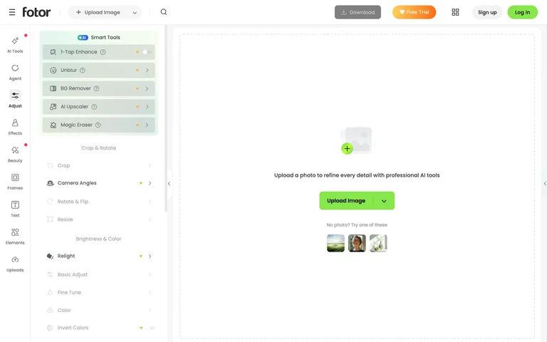
An empty editing canvas sits beside a tool rail and detailed adjustment panel, with image upload and sample thumbnails.
Useful for: Keep tools visible but inactive until an image is supplied.
# Design reference: Fotor — Photo editor workspace
Source: https://www.fotor.com/photo-editor-app/editor/basic
Swipefile reference: https://swipefile.design/ref/ai-fotor-editor/
Captured: 2026-09-06. This is a dated reference, not a claim about the current live product.
Capture scope: one viewport. Do not infer unseen page sections or a complete user flow.

## Objective
Adapt the interaction and layout patterns below to my project. Use my own content and identity. Do not reproduce logos, proprietary copy, or brand assets.

## Reference notes
- surface: An empty editing canvas sits beside a tool rail and detailed adjustment panel, with image upload and sample thumbnails.
- nav: Icon rail plus secondary adjustment sidebar
- layout: Two levels of tools beside a large image canvas
- density: Focused controls with comfortable spacing.
- color: White, gray and lime
- typography: Clear heading hierarchy and readable form labels.
- pattern: Keep tools visible but inactive until an image is supplied.
- states: Empty editor; no image uploaded or edits generated.
- dont: Adapt the layout to your own product and supported capabilities; write your own examples and keep important actions clearly labeled.

Useful for: Keep tools visible but inactive until an image is supplied.

## Acceptance criteria
- Existing project conventions, design tokens, working functionality, and unrelated changes are preserved.
- Two or three reference principles clearly support the user's task; conflicts are resolved in favor of usability and the existing product.
- Reusable components and semantic HTML express the interface. Available licensed assets are used; important UI text is never rendered as a bitmap.
- Every visible control has a defined behavior. Loading, empty, error, success, disabled, and long-content states are specified where relevant. Demo data is clearly labeled.
- Navigation and content adapt at 375px, 768px, and 1440px without horizontal page overflow. Keyboard use, visible focus, labeled inputs, at least 44px touch targets, readable contrast, and reduced motion are supported.
- Verification distinguishes rendered behavior from proposals and identifies anything still requiring a backend or external service.

## Quality bar
Clear hierarchy, consistent spacing, restrained surfaces, and purposeful motion. Avoid decorative gradients, excessive cards, placeholder buttons, and invented metrics unless the project calls for them. Do not claim a feature is connected or tested without evidence.
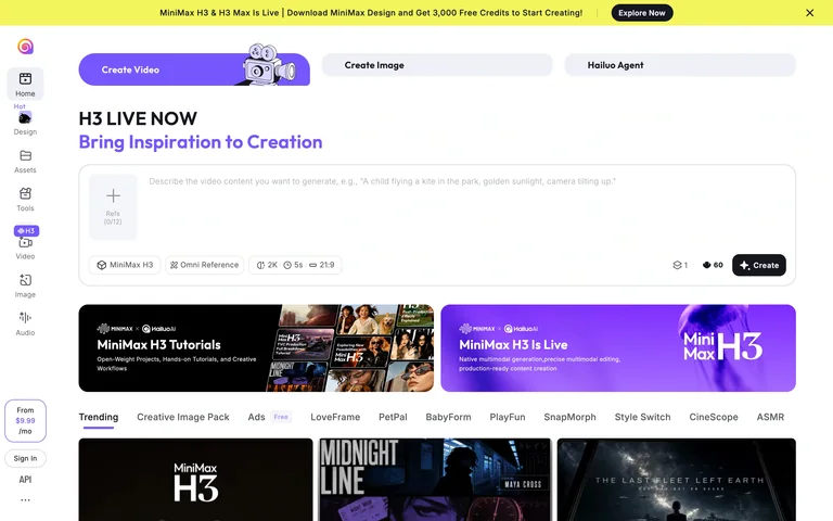
A large video composer exposes reference input, model, resolution and duration controls above tutorials and discovery cards.
Useful for: Place generation settings in the composer rather than a separate settings page.
# Design reference: Hailuo — Video creation workspace
Source: https://hailuoai.video/
Swipefile reference: https://swipefile.design/ref/ai-hailuo-video/
Captured: 2026-09-06. This is a dated reference, not a claim about the current live product.
Capture scope: one viewport. Do not infer unseen page sections or a complete user flow.

## Objective
Adapt the interaction and layout patterns below to my project. Use my own content and identity. Do not reproduce logos, proprietary copy, or brand assets.

## Reference notes
- surface: A large video composer exposes reference input, model, resolution and duration controls above tutorials and discovery cards.
- nav: Vertical tool rail plus media-mode tabs
- layout: Wide composer above tutorials and a visual feed
- density: Focused controls with comfortable spacing.
- color: White, violet, yellow and black
- typography: Clear heading hierarchy and readable form labels.
- pattern: Place generation settings in the composer rather than a separate settings page.
- states: Signed-out public composer; no prompt submitted or generation started.
- dont: Adapt the layout to your own product and supported capabilities; write your own examples and keep important actions clearly labeled.

Useful for: Place generation settings in the composer rather than a separate settings page.

## Acceptance criteria
- Existing project conventions, design tokens, working functionality, and unrelated changes are preserved.
- Two or three reference principles clearly support the user's task; conflicts are resolved in favor of usability and the existing product.
- Reusable components and semantic HTML express the interface. Available licensed assets are used; important UI text is never rendered as a bitmap.
- Every visible control has a defined behavior. Loading, empty, error, success, disabled, and long-content states are specified where relevant. Demo data is clearly labeled.
- Navigation and content adapt at 375px, 768px, and 1440px without horizontal page overflow. Keyboard use, visible focus, labeled inputs, at least 44px touch targets, readable contrast, and reduced motion are supported.
- Verification distinguishes rendered behavior from proposals and identifies anything still requiring a backend or external service.

## Quality bar
Clear hierarchy, consistent spacing, restrained surfaces, and purposeful motion. Avoid decorative gradients, excessive cards, placeholder buttons, and invented metrics unless the project calls for them. Do not claim a feature is connected or tested without evidence.
A spacious sign-in form is balanced by a pastel testimonial panel, rating mark and compact social-login choices.
Useful for: Pair a straightforward sign-in form with concise product reassurance.
# Design reference: Uizard — Sign-in screen
Source: https://app.uizard.io/login
Swipefile reference: https://swipefile.design/ref/ai-uizard-app/
Captured: 2026-09-06. This is a dated reference, not a claim about the current live product.
Capture scope: one viewport. Do not infer unseen page sections or a complete user flow.

## Objective
Adapt the interaction and layout patterns below to my project. Use my own content and identity. Do not reproduce logos, proprietary copy, or brand assets.

## Reference notes
- surface: A spacious sign-in form is balanced by a pastel testimonial panel, rating mark and compact social-login choices.
- nav: Minimal brand header and account-switch link
- layout: Two equal columns for authentication and reassurance
- density: Focused controls with comfortable spacing.
- color: White, blue, yellow and peach
- typography: Clear heading hierarchy and readable form labels.
- pattern: Pair a straightforward sign-in form with concise product reassurance.
- states: Public sign-in screen; authenticated editor not captured.
- dont: Adapt the layout to your own product and supported capabilities; write your own examples and keep important actions clearly labeled.

Useful for: Pair a straightforward sign-in form with concise product reassurance.

## Acceptance criteria
- Existing project conventions, design tokens, working functionality, and unrelated changes are preserved.
- Two or three reference principles clearly support the user's task; conflicts are resolved in favor of usability and the existing product.
- Reusable components and semantic HTML express the interface. Available licensed assets are used; important UI text is never rendered as a bitmap.
- Every visible control has a defined behavior. Loading, empty, error, success, disabled, and long-content states are specified where relevant. Demo data is clearly labeled.
- Navigation and content adapt at 375px, 768px, and 1440px without horizontal page overflow. Keyboard use, visible focus, labeled inputs, at least 44px touch targets, readable contrast, and reduced motion are supported.
- Verification distinguishes rendered behavior from proposals and identifies anything still requiring a backend or external service.

## Quality bar
Clear hierarchy, consistent spacing, restrained surfaces, and purposeful motion. Avoid decorative gradients, excessive cards, placeholder buttons, and invented metrics unless the project calls for them. Do not claim a feature is connected or tested without evidence.
A centered sign-in card offers social login, email and password, with visible magic-link and recovery routes.
Useful for: Make alternative sign-in and recovery paths easy to find.
# Design reference: Visily — Sign-in screen
Source: https://app.visily.ai/login
Swipefile reference: https://swipefile.design/ref/ai-visily-app/
Captured: 2026-09-06. This is a dated reference, not a claim about the current live product.
Capture scope: one viewport. Do not infer unseen page sections or a complete user flow.

## Objective
Adapt the interaction and layout patterns below to my project. Use my own content and identity. Do not reproduce logos, proprietary copy, or brand assets.

## Reference notes
- surface: A centered sign-in card offers social login, email and password, with visible magic-link and recovery routes.
- nav: Account options within one centered card
- layout: Compact form over a pale illustrated backdrop
- density: Focused controls with comfortable spacing.
- color: White, lavender and dark navy
- typography: Clear heading hierarchy and readable form labels.
- pattern: Make alternative sign-in and recovery paths easy to find.
- states: Public sign-in screen; authenticated editor not captured.
- dont: Adapt the layout to your own product and supported capabilities; write your own examples and keep important actions clearly labeled.

Useful for: Make alternative sign-in and recovery paths easy to find.

## Acceptance criteria
- Existing project conventions, design tokens, working functionality, and unrelated changes are preserved.
- Two or three reference principles clearly support the user's task; conflicts are resolved in favor of usability and the existing product.
- Reusable components and semantic HTML express the interface. Available licensed assets are used; important UI text is never rendered as a bitmap.
- Every visible control has a defined behavior. Loading, empty, error, success, disabled, and long-content states are specified where relevant. Demo data is clearly labeled.
- Navigation and content adapt at 375px, 768px, and 1440px without horizontal page overflow. Keyboard use, visible focus, labeled inputs, at least 44px touch targets, readable contrast, and reduced motion are supported.
- Verification distinguishes rendered behavior from proposals and identifies anything still requiring a backend or external service.

## Quality bar
Clear hierarchy, consistent spacing, restrained surfaces, and purposeful motion. Avoid decorative gradients, excessive cards, placeholder buttons, and invented metrics unless the project calls for them. Do not claim a feature is connected or tested without evidence.
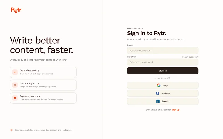
A two-column writing-app sign-in places example tasks beside a form with several identity-provider options.
Useful for: Explain the product while preserving a clear authentication path.
# Design reference: Rytr — Sign-in screen
Source: https://app.rytr.me/login?returnTo=%2F
Swipefile reference: https://swipefile.design/ref/ai-rytr-editor/
Captured: 2026-09-06. This is a dated reference, not a claim about the current live product.
Capture scope: one viewport. Do not infer unseen page sections or a complete user flow.

## Objective
Adapt the interaction and layout patterns below to my project. Use my own content and identity. Do not reproduce logos, proprietary copy, or brand assets.

## Reference notes
- surface: A two-column writing-app sign-in places example tasks beside a form with several identity-provider options.
- nav: Minimal header with primary form navigation
- layout: Writing benefits left and authentication form right
- density: Focused controls with comfortable spacing.
- color: Cream, brown and orange accents
- typography: Clear heading hierarchy and readable form labels.
- pattern: Explain the product while preserving a clear authentication path.
- states: Public sign-in screen; authenticated writing workspace not captured.
- dont: Adapt the layout to your own product and supported capabilities; write your own examples and keep important actions clearly labeled.

Useful for: Explain the product while preserving a clear authentication path.

## Acceptance criteria
- Existing project conventions, design tokens, working functionality, and unrelated changes are preserved.
- Two or three reference principles clearly support the user's task; conflicts are resolved in favor of usability and the existing product.
- Reusable components and semantic HTML express the interface. Available licensed assets are used; important UI text is never rendered as a bitmap.
- Every visible control has a defined behavior. Loading, empty, error, success, disabled, and long-content states are specified where relevant. Demo data is clearly labeled.
- Navigation and content adapt at 375px, 768px, and 1440px without horizontal page overflow. Keyboard use, visible focus, labeled inputs, at least 44px touch targets, readable contrast, and reduced motion are supported.
- Verification distinguishes rendered behavior from proposals and identifies anything still requiring a backend or external service.

## Quality bar
Clear hierarchy, consistent spacing, restrained surfaces, and purposeful motion. Avoid decorative gradients, excessive cards, placeholder buttons, and invented metrics unless the project calls for them. Do not claim a feature is connected or tested without evidence.
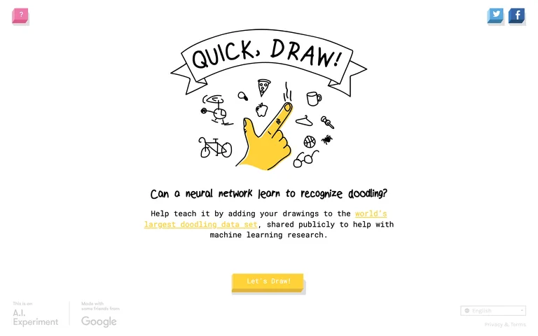
A hand-drawn game introduction explains the drawing-recognition activity with a yellow action, language selector and playful illustrations.
Useful for: Explain an AI activity in plain language before starting.
# Design reference: Quick, Draw! — Game introduction
Source: https://quickdraw.withgoogle.com/
Swipefile reference: https://swipefile.design/ref/ai-quickdraw/
Captured: 2026-09-06. This is a dated reference, not a claim about the current live product.
Capture scope: one viewport. Do not infer unseen page sections or a complete user flow.

## Objective
Adapt the interaction and layout patterns below to my project. Use my own content and identity. Do not reproduce logos, proprietary copy, or brand assets.

## Reference notes
- surface: A hand-drawn game introduction explains the drawing-recognition activity with a yellow action, language selector and playful illustrations.
- nav: Minimal corner links and language selector
- layout: Centered illustrated introduction with one primary action
- density: Open and playful.
- color: White, black and yellow
- typography: Handwritten headings paired with monospaced supporting text.
- pattern: Explain an AI activity in plain language before starting.
- states: Public game introduction; no drawings submitted.
- dont: Adapt the layout to your own product and supported capabilities; write your own examples and keep important actions clearly labeled.

Useful for: Explain an AI activity in plain language before starting.

## Acceptance criteria
- Existing project conventions, design tokens, working functionality, and unrelated changes are preserved.
- Two or three reference principles clearly support the user's task; conflicts are resolved in favor of usability and the existing product.
- Reusable components and semantic HTML express the interface. Available licensed assets are used; important UI text is never rendered as a bitmap.
- Every visible control has a defined behavior. Loading, empty, error, success, disabled, and long-content states are specified where relevant. Demo data is clearly labeled.
- Navigation and content adapt at 375px, 768px, and 1440px without horizontal page overflow. Keyboard use, visible focus, labeled inputs, at least 44px touch targets, readable contrast, and reduced motion are supported.
- Verification distinguishes rendered behavior from proposals and identifies anything still requiring a backend or external service.

## Quality bar
Clear hierarchy, consistent spacing, restrained surfaces, and purposeful motion. Avoid decorative gradients, excessive cards, placeholder buttons, and invented metrics unless the project calls for them. Do not claim a feature is connected or tested without evidence.
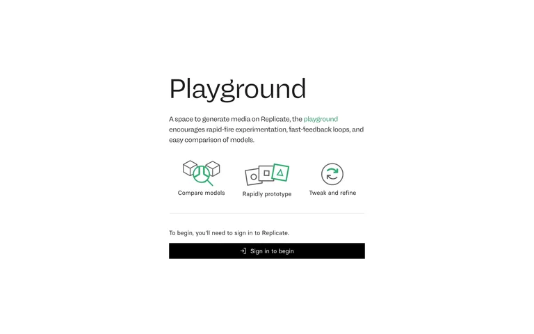
A spare playground introduction pairs three illustrated benefits with one GitHub sign-in action.
Useful for: Describe what a developer playground supports before authentication.
# Design reference: Replicate — Playground introduction
Source: https://replicate.com/playground
Swipefile reference: https://swipefile.design/ref/ai-replicate-playground/
Captured: 2026-09-06. This is a dated reference, not a claim about the current live product.
Capture scope: one viewport. Do not infer unseen page sections or a complete user flow.

## Objective
Adapt the interaction and layout patterns below to my project. Use my own content and identity. Do not reproduce logos, proprietary copy, or brand assets.

## Reference notes
- surface: A spare playground introduction pairs three illustrated benefits with one GitHub sign-in action.
- nav: Single sign-in action
- layout: Narrow centered introduction and icon row
- density: Sparse.
- color: White, black and green accents
- typography: Simple sans-serif labels with a large title.
- pattern: Describe what a developer playground supports before authentication.
- states: Public introductory state; authenticated playground not captured.
- dont: Adapt the layout to your own product and supported capabilities; write your own examples and keep important actions clearly labeled.

Useful for: Describe what a developer playground supports before authentication.

## Acceptance criteria
- Existing project conventions, design tokens, working functionality, and unrelated changes are preserved.
- Two or three reference principles clearly support the user's task; conflicts are resolved in favor of usability and the existing product.
- Reusable components and semantic HTML express the interface. Available licensed assets are used; important UI text is never rendered as a bitmap.
- Every visible control has a defined behavior. Loading, empty, error, success, disabled, and long-content states are specified where relevant. Demo data is clearly labeled.
- Navigation and content adapt at 375px, 768px, and 1440px without horizontal page overflow. Keyboard use, visible focus, labeled inputs, at least 44px touch targets, readable contrast, and reduced motion are supported.
- Verification distinguishes rendered behavior from proposals and identifies anything still requiring a backend or external service.

## Quality bar
Clear hierarchy, consistent spacing, restrained surfaces, and purposeful motion. Avoid decorative gradients, excessive cards, placeholder buttons, and invented metrics unless the project calls for them. Do not claim a feature is connected or tested without evidence.
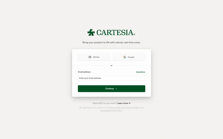
A small voice-playground sign-in card combines email entry with GitHub and Google options on a warm neutral canvas.
Useful for: Keep provider and email entry together in a focused form.
# Design reference: Cartesia — Playground sign-in
Source: https://play.cartesia.ai/sign-in?redirect_url=https%3A%2F%2Fplay.cartesia.ai%2Fdashboard
Swipefile reference: https://swipefile.design/ref/ai-cartesia-playground/
Captured: 2026-09-06. This is a dated reference, not a claim about the current live product.
Capture scope: one viewport. Do not infer unseen page sections or a complete user flow.

## Objective
Adapt the interaction and layout patterns below to my project. Use my own content and identity. Do not reproduce logos, proprietary copy, or brand assets.

## Reference notes
- surface: A small voice-playground sign-in card combines email entry with GitHub and Google options on a warm neutral canvas.
- nav: Provider choices within the card
- layout: Small centered card below brand and purpose
- density: Compact.
- color: Warm white, forest green and gray
- typography: Serif brand identity with plain form labels.
- pattern: Keep provider and email entry together in a focused form.
- states: Public sign-in state; authenticated voice playground not captured.
- dont: Adapt the layout to your own product and supported capabilities; write your own examples and keep important actions clearly labeled.

Useful for: Keep provider and email entry together in a focused form.

## Acceptance criteria
- Existing project conventions, design tokens, working functionality, and unrelated changes are preserved.
- Two or three reference principles clearly support the user's task; conflicts are resolved in favor of usability and the existing product.
- Reusable components and semantic HTML express the interface. Available licensed assets are used; important UI text is never rendered as a bitmap.
- Every visible control has a defined behavior. Loading, empty, error, success, disabled, and long-content states are specified where relevant. Demo data is clearly labeled.
- Navigation and content adapt at 375px, 768px, and 1440px without horizontal page overflow. Keyboard use, visible focus, labeled inputs, at least 44px touch targets, readable contrast, and reduced motion are supported.
- Verification distinguishes rendered behavior from proposals and identifies anything still requiring a backend or external service.

## Quality bar
Clear hierarchy, consistent spacing, restrained surfaces, and purposeful motion. Avoid decorative gradients, excessive cards, placeholder buttons, and invented metrics unless the project calls for them. Do not claim a feature is connected or tested without evidence.
A large blank drawing canvas sits within a gray workspace, with a vertical tool strip and a minimal header.
Useful for: Give the drawing surface most of the screen and keep tools at the edge.
# Design reference: AutoDraw — Drawing canvas
Source: https://www.autodraw.com/
Swipefile reference: https://swipefile.design/ref/ai-autodraw/
Captured: 2026-09-06. This is a dated reference, not a claim about the current live product.
Capture scope: one viewport. Do not infer unseen page sections or a complete user flow.

## Objective
Adapt the interaction and layout patterns below to my project. Use my own content and identity. Do not reproduce logos, proprietary copy, or brand assets.

## Reference notes
- surface: A large blank drawing canvas sits within a gray workspace, with a vertical tool strip and a minimal header.
- nav: Vertical drawing toolbar and compact menu
- layout: Full-size white canvas surrounded by gray workspace
- density: Sparse chrome with generous canvas area.
- color: White, gray and blue
- typography: Small plain labels with recognizable tool icons.
- pattern: Give the drawing surface most of the screen and keep tools at the edge.
- states: Empty drawing workspace; no drawing submitted.
- dont: Adapt the layout to your own product and supported capabilities; write your own examples and keep important actions clearly labeled.

Useful for: Give the drawing surface most of the screen and keep tools at the edge.

## Acceptance criteria
- Existing project conventions, design tokens, working functionality, and unrelated changes are preserved.
- Two or three reference principles clearly support the user's task; conflicts are resolved in favor of usability and the existing product.
- Reusable components and semantic HTML express the interface. Available licensed assets are used; important UI text is never rendered as a bitmap.
- Every visible control has a defined behavior. Loading, empty, error, success, disabled, and long-content states are specified where relevant. Demo data is clearly labeled.
- Navigation and content adapt at 375px, 768px, and 1440px without horizontal page overflow. Keyboard use, visible focus, labeled inputs, at least 44px touch targets, readable contrast, and reduced motion are supported.
- Verification distinguishes rendered behavior from proposals and identifies anything still requiring a backend or external service.

## Quality bar
Clear hierarchy, consistent spacing, restrained surfaces, and purposeful motion. Avoid decorative gradients, excessive cards, placeholder buttons, and invented metrics unless the project calls for them. Do not claim a feature is connected or tested without evidence.
Allow basic usage counts to help us understand what is useful. Your board contents stay out of analytics. Details
Your browser’s privacy preference keeps analytics off.