 hover to scroll
Course Sales Page
CURATED COLLECTION · 29 REFERENCES
Long course offers for writing, design, filmmaking, and content creation.
Copy the reference notes below and paste them into Claude, ChatGPT, or your coding assistant. Add what you want to build.
Includes design notes, original sources, and preview links. An assistant that supports browsing can also read the public board link.
hover to scrollA long creator-course offer with playful portrait collages, large serif headlines, pink sections, and recurring proof.
Useful for: Study the public sales page and its section order, offer presentation, and calls to action. This reference captures one page; checkout steps and conversion results are not verified.
# Design reference: Social Han — Content That Sells
Source: https://socialhan.com/content-that-sells
Swipefile reference: https://swipefile.design/ref/funnel-han-mosby-content-that-sells/
Captured: 2026-09-07. This is a dated reference, not a claim about the current live product.


## Objective
Adapt the visual principles below to my project. Use my own content and identity. Do not reproduce logos, proprietary copy, or brand assets.

## Reference notes
- mood: Expressive and personal
- colors: Hot pink, pale blush, warm cream, and deep burgundy.
- typography: Expressive serif display headings mixed with clean supporting text; large typographic shifts separate the offer story from the details.
- layout: Cutout portrait hero → audience problem and teaching proposition → course breakdown → testimonial panels → repeated purchase actions → creator footer.
- motion: The capture records a static page state. Preserve readable scrolling and clear action feedback; video playback, counters, and hidden form behavior are not demonstrated.
- texture: Photographic or product imagery, contrasting section backgrounds, grouped benefits, and visual proof panels.
- dont: Use your own offer, brand, and assets. Do not invent testimonials, results, scarcity, guarantees, or pricing.

Useful for: Study the public sales page and its section order, offer presentation, and calls to action. This reference captures one page; checkout steps and conversion results are not verified.

## Acceptance criteria
- Existing project conventions, design tokens, working functionality, and unrelated changes are preserved.
- Two or three reference principles clearly support the user's task; conflicts are resolved in favor of usability and the existing product.
- Reusable components and semantic HTML express the interface. Available licensed assets are used; important UI text is never rendered as a bitmap.
- Every visible control has a defined behavior. Loading, empty, error, success, disabled, and long-content states are specified where relevant. Demo data is clearly labeled.
- Navigation and content adapt at 375px, 768px, and 1440px without horizontal page overflow. Keyboard use, visible focus, labeled inputs, at least 44px touch targets, readable contrast, and reduced motion are supported.
- Verification distinguishes rendered behavior from proposals and identifies anything still requiring a backend or external service.

## Quality bar
Clear hierarchy, consistent spacing, restrained surfaces, and purposeful motion. Avoid decorative gradients, excessive cards, placeholder buttons, and invented metrics unless the project calls for them. Do not claim a feature is connected or tested without evidence.
 hover to scroll
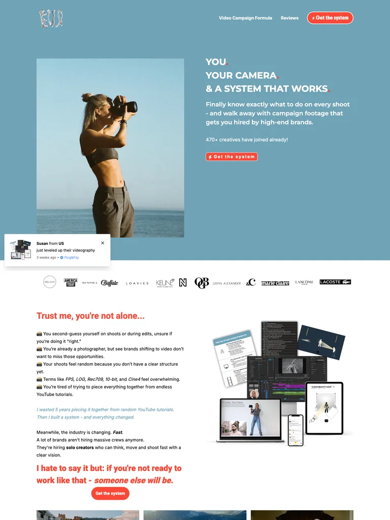
A videography-course page combining blue photographic sections with a coral closing offer and clear lesson benefits.
Useful for: Study the public sales page and its section order, offer presentation, and calls to action. This reference captures one page; checkout steps and conversion results are not verified.
# Design reference: Eva Glasbeek — Video Campaign Formula
Source: https://byevaaluna.plugandpay.nl/video-campaign-formula
Swipefile reference: https://swipefile.design/ref/funnel-eva-glasbeek-video-campaign-formula/
Captured: 2026-09-07. This is a dated reference, not a claim about the current live product.


## Objective
Adapt the visual principles below to my project. Use my own content and identity. Do not reproduce logos, proprietary copy, or brand assets.

## Reference notes
- mood: Confident and approachable
- colors: Muted sky blue, coral-orange offer panels, white, and dark body text.
- typography: Bold sans-serif headlines, compact labels, and scannable benefit lists create a clear hierarchy through the long page.
- layout: Photographic video-course opening → example work and reviews → lesson and coaching benefits → instructor introduction → course bundle → final price panel.
- motion: The capture records a static page state. Preserve readable scrolling and clear action feedback; video playback, counters, and hidden form behavior are not demonstrated.
- texture: Photographic or product imagery, contrasting section backgrounds, grouped benefits, and visual proof panels.
- dont: Use your own offer, brand, and assets. Do not invent testimonials, results, scarcity, guarantees, or pricing.

Useful for: Study the public sales page and its section order, offer presentation, and calls to action. This reference captures one page; checkout steps and conversion results are not verified.

## Acceptance criteria
- Existing project conventions, design tokens, working functionality, and unrelated changes are preserved.
- Two or three reference principles clearly support the user's task; conflicts are resolved in favor of usability and the existing product.
- Reusable components and semantic HTML express the interface. Available licensed assets are used; important UI text is never rendered as a bitmap.
- Every visible control has a defined behavior. Loading, empty, error, success, disabled, and long-content states are specified where relevant. Demo data is clearly labeled.
- Navigation and content adapt at 375px, 768px, and 1440px without horizontal page overflow. Keyboard use, visible focus, labeled inputs, at least 44px touch targets, readable contrast, and reduced motion are supported.
- Verification distinguishes rendered behavior from proposals and identifies anything still requiring a backend or external service.

## Quality bar
Clear hierarchy, consistent spacing, restrained surfaces, and purposeful motion. Avoid decorative gradients, excessive cards, placeholder buttons, and invented metrics unless the project calls for them. Do not claim a feature is connected or tested without evidence.
 hover to scroll
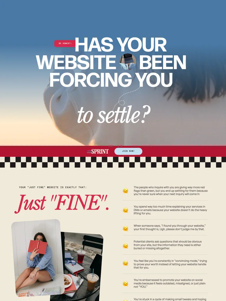
An exceptionally long website-copy course page using expressive typography, alternating sections, and a sustained sales narrative.
Useful for: Study the public sales page and its section order, offer presentation, and calls to action. This reference captures one page; checkout steps and conversion results are not verified.
# Design reference: Sara Noel — Site Series Sprint
Source: https://betweenthelinescopy.com/site-series-sprint
Swipefile reference: https://swipefile.design/ref/funnel-sara-noel-site-series-sprint/
Captured: 2026-09-07. This is a dated reference, not a claim about the current live product.


## Objective
Adapt the visual principles below to my project. Use my own content and identity. Do not reproduce logos, proprietary copy, or brand assets.

## Reference notes
- mood: Bold and conversational
- colors: Sky blue, red, cream, and oversized white headings.
- typography: Expressive serif display headings mixed with clean supporting text; large typographic shifts separate the offer story from the details.
- layout: Large scenic headline → website-copy problem → teaching approach and examples → course details → proof and instructor context → offer and questions.
- motion: The capture records a static page state. Preserve readable scrolling and clear action feedback; video playback, counters, and hidden form behavior are not demonstrated.
- texture: Photographic or product imagery, contrasting section backgrounds, grouped benefits, and visual proof panels.
- dont: Use your own offer, brand, and assets. Do not invent testimonials, results, scarcity, guarantees, or pricing.

Useful for: Study the public sales page and its section order, offer presentation, and calls to action. This reference captures one page; checkout steps and conversion results are not verified.

## Acceptance criteria
- Existing project conventions, design tokens, working functionality, and unrelated changes are preserved.
- Two or three reference principles clearly support the user's task; conflicts are resolved in favor of usability and the existing product.
- Reusable components and semantic HTML express the interface. Available licensed assets are used; important UI text is never rendered as a bitmap.
- Every visible control has a defined behavior. Loading, empty, error, success, disabled, and long-content states are specified where relevant. Demo data is clearly labeled.
- Navigation and content adapt at 375px, 768px, and 1440px without horizontal page overflow. Keyboard use, visible focus, labeled inputs, at least 44px touch targets, readable contrast, and reduced motion are supported.
- Verification distinguishes rendered behavior from proposals and identifies anything still requiring a backend or external service.

## Quality bar
Clear hierarchy, consistent spacing, restrained surfaces, and purposeful motion. Avoid decorative gradients, excessive cards, placeholder buttons, and invented metrics unless the project calls for them. Do not claim a feature is connected or tested without evidence.
 hover to scroll
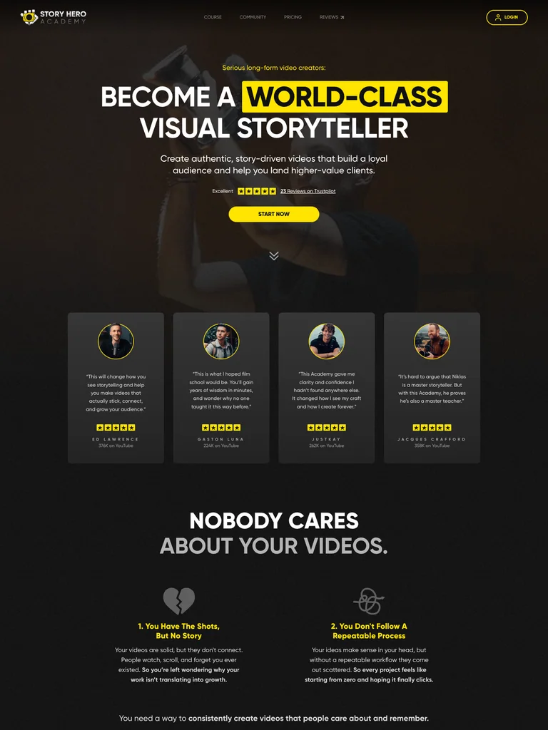
A filmmaking-course page using cinematic imagery, dark sections, and yellow emphasis to carry a long enrollment story.
Useful for: Study the public sales page and its section order, offer presentation, and calls to action. This reference captures one page; checkout steps and conversion results are not verified.
# Design reference: Nicklas Christl — Story Hero Academy
Source: https://story-hero.com/
Swipefile reference: https://swipefile.design/ref/funnel-nicklas-christl-story-hero-academy/
Captured: 2026-09-07. This is a dated reference, not a claim about the current live product.


## Objective
Adapt the visual principles below to my project. Use my own content and identity. Do not reproduce logos, proprietary copy, or brand assets.

## Reference notes
- mood: Cinematic and purposeful
- colors: Near-black, dark olive, yellow highlights, and warm photographic tones.
- typography: Bold sans-serif headlines, compact labels, and scannable benefit lists create a clear hierarchy through the long page.
- layout: Video-led course introduction → filmmaking problems and examples → curriculum → creator guidance and community → student proof → enrollment and questions.
- motion: The capture records a static page state. Preserve readable scrolling and clear action feedback; video playback, counters, and hidden form behavior are not demonstrated.
- texture: Photographic or product imagery, contrasting section backgrounds, grouped benefits, and visual proof panels.
- dont: Use your own offer, brand, and assets. Do not invent testimonials, results, scarcity, guarantees, or pricing.

Useful for: Study the public sales page and its section order, offer presentation, and calls to action. This reference captures one page; checkout steps and conversion results are not verified.

## Acceptance criteria
- Existing project conventions, design tokens, working functionality, and unrelated changes are preserved.
- Two or three reference principles clearly support the user's task; conflicts are resolved in favor of usability and the existing product.
- Reusable components and semantic HTML express the interface. Available licensed assets are used; important UI text is never rendered as a bitmap.
- Every visible control has a defined behavior. Loading, empty, error, success, disabled, and long-content states are specified where relevant. Demo data is clearly labeled.
- Navigation and content adapt at 375px, 768px, and 1440px without horizontal page overflow. Keyboard use, visible focus, labeled inputs, at least 44px touch targets, readable contrast, and reduced motion are supported.
- Verification distinguishes rendered behavior from proposals and identifies anything still requiring a backend or external service.

## Quality bar
Clear hierarchy, consistent spacing, restrained surfaces, and purposeful motion. Avoid decorative gradients, excessive cards, placeholder buttons, and invented metrics unless the project calls for them. Do not claim a feature is connected or tested without evidence.
 hover to scroll
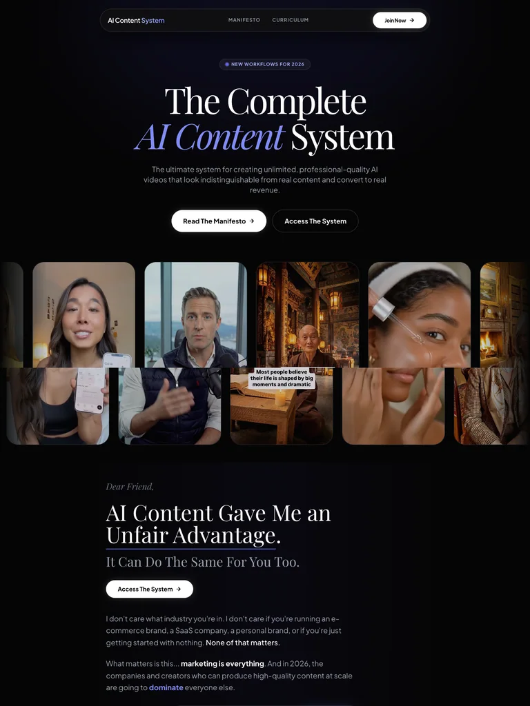
An AI-content course page pairing editorial type with a visual gallery and a structured explanation of the system.
Useful for: Study the public sales page and its section order, offer presentation, and calls to action. This reference captures one page; checkout steps and conversion results are not verified.
# Design reference: MikoAI — AI Content System
Source: https://contentsystem.ai/
Swipefile reference: https://swipefile.design/ref/funnel-mikoai-ai-content-system/
Captured: 2026-09-07. This is a dated reference, not a claim about the current live product.


## Objective
Adapt the visual principles below to my project. Use my own content and identity. Do not reproduce logos, proprietary copy, or brand assets.

## Reference notes
- mood: Editorial and polished
- colors: Near-black, white, and restrained lavender accents.
- typography: Expressive serif display headings mixed with clean supporting text; large typographic shifts separate the offer story from the details.
- layout: Editorial hero and creator-image strip → method overview → tools and resources → system contents → access invitation and closing details.
- motion: The capture records a static page state. Preserve readable scrolling and clear action feedback; video playback, counters, and hidden form behavior are not demonstrated.
- texture: Photographic or product imagery, contrasting section backgrounds, grouped benefits, and visual proof panels.
- dont: Use your own offer, brand, and assets. Do not invent testimonials, results, scarcity, guarantees, or pricing.

Useful for: Study the public sales page and its section order, offer presentation, and calls to action. This reference captures one page; checkout steps and conversion results are not verified.

## Acceptance criteria
- Existing project conventions, design tokens, working functionality, and unrelated changes are preserved.
- Two or three reference principles clearly support the user's task; conflicts are resolved in favor of usability and the existing product.
- Reusable components and semantic HTML express the interface. Available licensed assets are used; important UI text is never rendered as a bitmap.
- Every visible control has a defined behavior. Loading, empty, error, success, disabled, and long-content states are specified where relevant. Demo data is clearly labeled.
- Navigation and content adapt at 375px, 768px, and 1440px without horizontal page overflow. Keyboard use, visible focus, labeled inputs, at least 44px touch targets, readable contrast, and reduced motion are supported.
- Verification distinguishes rendered behavior from proposals and identifies anything still requiring a backend or external service.

## Quality bar
Clear hierarchy, consistent spacing, restrained surfaces, and purposeful motion. Avoid decorative gradients, excessive cards, placeholder buttons, and invented metrics unless the project calls for them. Do not claim a feature is connected or tested without evidence.
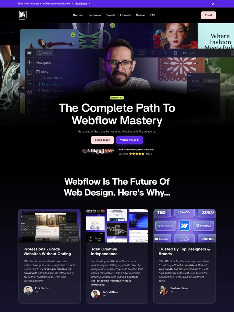 hover to scroll
A detailed course funnel combining an instructor-led hero, project examples, curriculum, and community benefits.
Useful for: Study the public sales page and its section order, offer presentation, and calls to action. This reference captures one page; checkout steps and conversion results are not verified.
# Design reference: Flux Academy — Webflow Masterclass
Source: https://flux-academy.com/courses/the-webflow-masterclass
Swipefile reference: https://swipefile.design/ref/funnel-ran-segall-webflow-masterclass-5-1-pro/
Captured: 2026-09-07. This is a dated reference, not a claim about the current live product.


## Objective
Adapt the visual principles below to my project. Use my own content and identity. Do not reproduce logos, proprietary copy, or brand assets.

## Reference notes
- mood: Cinematic and structured
- colors: Deep navy, violet, white, and soft pink enrollment buttons.
- typography: Bold sans-serif headlines, compact labels, and scannable benefit lists create a clear hierarchy through the long page.
- layout: Instructor and project montage → course overview → curriculum and student work → community and opportunities → enrollment offer → questions and footer.
- motion: The capture records a static page state. Preserve readable scrolling and clear action feedback; video playback, counters, and hidden form behavior are not demonstrated.
- texture: Photographic or product imagery, contrasting section backgrounds, grouped benefits, and visual proof panels.
- dont: Use your own offer, brand, and assets. Do not invent testimonials, results, scarcity, guarantees, or pricing.

Useful for: Study the public sales page and its section order, offer presentation, and calls to action. This reference captures one page; checkout steps and conversion results are not verified.

## Acceptance criteria
- Existing project conventions, design tokens, working functionality, and unrelated changes are preserved.
- Two or three reference principles clearly support the user's task; conflicts are resolved in favor of usability and the existing product.
- Reusable components and semantic HTML express the interface. Available licensed assets are used; important UI text is never rendered as a bitmap.
- Every visible control has a defined behavior. Loading, empty, error, success, disabled, and long-content states are specified where relevant. Demo data is clearly labeled.
- Navigation and content adapt at 375px, 768px, and 1440px without horizontal page overflow. Keyboard use, visible focus, labeled inputs, at least 44px touch targets, readable contrast, and reduced motion are supported.
- Verification distinguishes rendered behavior from proposals and identifies anything still requiring a backend or external service.

## Quality bar
Clear hierarchy, consistent spacing, restrained surfaces, and purposeful motion. Avoid decorative gradients, excessive cards, placeholder buttons, and invented metrics unless the project calls for them. Do not claim a feature is connected or tested without evidence.
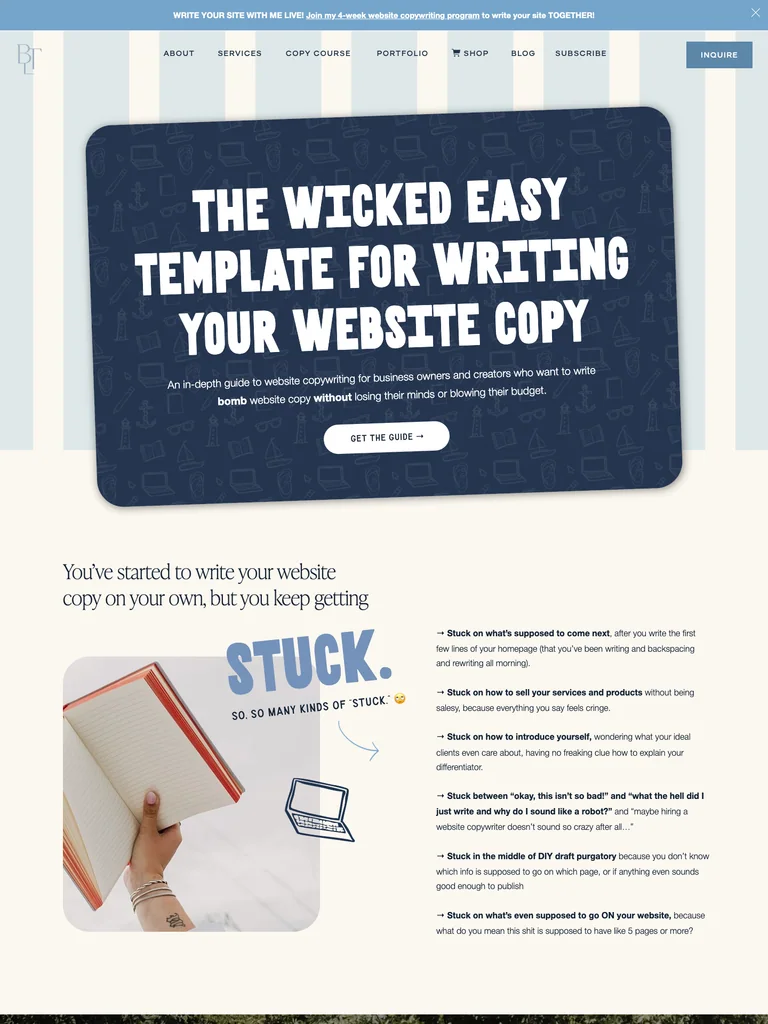 hover to scroll
A website-copy guide offer with conversational headings, product previews, and a long sequence of reader objections and benefits.
Useful for: Study the public sales page and its section order, offer presentation, and calls to action. This reference captures one page; checkout steps and conversion results are not verified.
# Design reference: Sara Noel — Wicked Easy Web Copy Guide
Source: https://betweenthelinescopy.com/web-copy-guide
Swipefile reference: https://swipefile.design/ref/funnel-sara-noel-wicked-easy-web-copy-guide/
Captured: 2026-09-07. This is a dated reference, not a claim about the current live product.


## Objective
Adapt the visual principles below to my project. Use my own content and identity. Do not reproduce logos, proprietary copy, or brand assets.

## Reference notes
- mood: Playful and editorial
- colors: Cream, navy, muted sky blue, and white display lettering.
- typography: Bold sans-serif headlines, compact labels, and scannable benefit lists create a clear hierarchy through the long page.
- layout: Large copywriting promise → reader frustrations → guide previews and benefits → instructor context → customer proof → offer and closing questions.
- motion: The capture records a static page state. Preserve readable scrolling and clear action feedback; video playback, counters, and hidden form behavior are not demonstrated.
- texture: Photographic or product imagery, contrasting section backgrounds, grouped benefits, and visual proof panels.
- dont: Use your own offer, brand, and assets. Do not invent testimonials, results, scarcity, guarantees, or pricing.

Useful for: Study the public sales page and its section order, offer presentation, and calls to action. This reference captures one page; checkout steps and conversion results are not verified.

## Acceptance criteria
- Existing project conventions, design tokens, working functionality, and unrelated changes are preserved.
- Two or three reference principles clearly support the user's task; conflicts are resolved in favor of usability and the existing product.
- Reusable components and semantic HTML express the interface. Available licensed assets are used; important UI text is never rendered as a bitmap.
- Every visible control has a defined behavior. Loading, empty, error, success, disabled, and long-content states are specified where relevant. Demo data is clearly labeled.
- Navigation and content adapt at 375px, 768px, and 1440px without horizontal page overflow. Keyboard use, visible focus, labeled inputs, at least 44px touch targets, readable contrast, and reduced motion are supported.
- Verification distinguishes rendered behavior from proposals and identifies anything still requiring a backend or external service.

## Quality bar
Clear hierarchy, consistent spacing, restrained surfaces, and purposeful motion. Avoid decorative gradients, excessive cards, placeholder buttons, and invented metrics unless the project calls for them. Do not claim a feature is connected or tested without evidence.
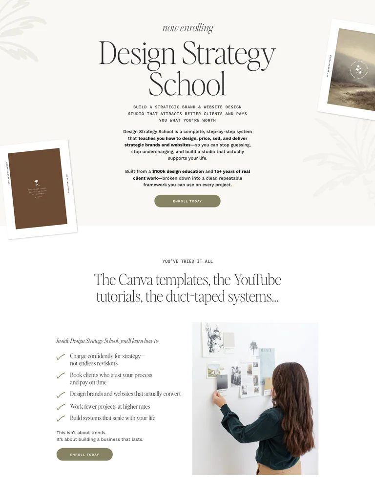 hover to scroll
An editorial design-business course page with large photography, a detailed teaching framework, and student proof.
Useful for: Study the public sales page and its section order, offer presentation, and calls to action. This reference captures one page; checkout steps and conversion results are not verified.
# Design reference: Davey & Krista — Design Strategy School
Source: https://daveyandkrista.com/design-school
Swipefile reference: https://swipefile.design/ref/funnel-davey-and-krista-design-strategy-school/
Captured: 2026-09-07. This is a dated reference, not a claim about the current live product.


## Objective
Adapt the visual principles below to my project. Use my own content and identity. Do not reproduce logos, proprietary copy, or brand assets.

## Reference notes
- mood: Warm and editorial
- colors: Soft ivory, olive-gray buttons, black serif type, and warm neutral photography.
- typography: Expressive serif display headings mixed with clean supporting text; large typographic shifts separate the offer story from the details.
- layout: Editorial course promise → designer problems and possibilities → teaching framework → curriculum and resources → instructor and student proof → enrollment details.
- motion: The capture records a static page state. Preserve readable scrolling and clear action feedback; video playback, counters, and hidden form behavior are not demonstrated.
- texture: Photographic or product imagery, contrasting section backgrounds, grouped benefits, and visual proof panels.
- dont: Use your own offer, brand, and assets. Do not invent testimonials, results, scarcity, guarantees, or pricing.

Useful for: Study the public sales page and its section order, offer presentation, and calls to action. This reference captures one page; checkout steps and conversion results are not verified.

## Acceptance criteria
- Existing project conventions, design tokens, working functionality, and unrelated changes are preserved.
- Two or three reference principles clearly support the user's task; conflicts are resolved in favor of usability and the existing product.
- Reusable components and semantic HTML express the interface. Available licensed assets are used; important UI text is never rendered as a bitmap.
- Every visible control has a defined behavior. Loading, empty, error, success, disabled, and long-content states are specified where relevant. Demo data is clearly labeled.
- Navigation and content adapt at 375px, 768px, and 1440px without horizontal page overflow. Keyboard use, visible focus, labeled inputs, at least 44px touch targets, readable contrast, and reduced motion are supported.
- Verification distinguishes rendered behavior from proposals and identifies anything still requiring a backend or external service.

## Quality bar
Clear hierarchy, consistent spacing, restrained surfaces, and purposeful motion. Avoid decorative gradients, excessive cards, placeholder buttons, and invented metrics unless the project calls for them. Do not claim a feature is connected or tested without evidence.
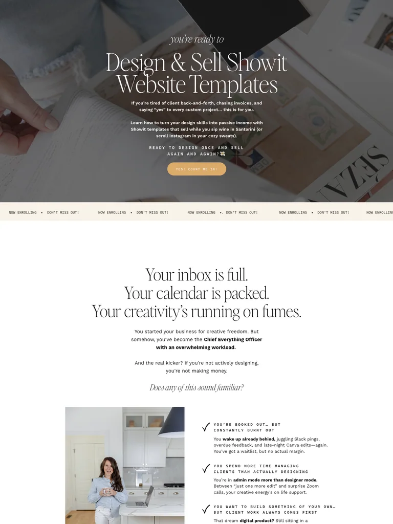 hover to scroll
A template-business course funnel with a long visual narrative, example website designs, curriculum, and enrollment sections.
Useful for: Study the public sales page and its section order, offer presentation, and calls to action. This reference captures one page; checkout steps and conversion results are not verified.
# Design reference: Davey & Krista — Design & Sell Showit Templates
Source: https://selltemplates.daveyandkrista.com/
Swipefile reference: https://swipefile.design/ref/funnel-davey-and-krista-design-sell-showit-website-templates/
Captured: 2026-09-07. This is a dated reference, not a claim about the current live product.


## Objective
Adapt the visual principles below to my project. Use my own content and identity. Do not reproduce logos, proprietary copy, or brand assets.

## Reference notes
- mood: Elegant and instructional
- colors: White, warm cream, olive-gray bands, gold buttons, and dark serif type.
- typography: Expressive serif display headings mixed with clean supporting text; large typographic shifts separate the offer story from the details.
- layout: Template-business promise → example designs → course approach → lesson and resource breakdown → instructor context and student proof → offer and questions.
- motion: The capture records a static page state. Preserve readable scrolling and clear action feedback; video playback, counters, and hidden form behavior are not demonstrated.
- texture: Photographic or product imagery, contrasting section backgrounds, grouped benefits, and visual proof panels.
- dont: Use your own offer, brand, and assets. Do not invent testimonials, results, scarcity, guarantees, or pricing.

Useful for: Study the public sales page and its section order, offer presentation, and calls to action. This reference captures one page; checkout steps and conversion results are not verified.

## Acceptance criteria
- Existing project conventions, design tokens, working functionality, and unrelated changes are preserved.
- Two or three reference principles clearly support the user's task; conflicts are resolved in favor of usability and the existing product.
- Reusable components and semantic HTML express the interface. Available licensed assets are used; important UI text is never rendered as a bitmap.
- Every visible control has a defined behavior. Loading, empty, error, success, disabled, and long-content states are specified where relevant. Demo data is clearly labeled.
- Navigation and content adapt at 375px, 768px, and 1440px without horizontal page overflow. Keyboard use, visible focus, labeled inputs, at least 44px touch targets, readable contrast, and reduced motion are supported.
- Verification distinguishes rendered behavior from proposals and identifies anything still requiring a backend or external service.

## Quality bar
Clear hierarchy, consistent spacing, restrained surfaces, and purposeful motion. Avoid decorative gradients, excessive cards, placeholder buttons, and invented metrics unless the project calls for them. Do not claim a feature is connected or tested without evidence.
 hover to scroll
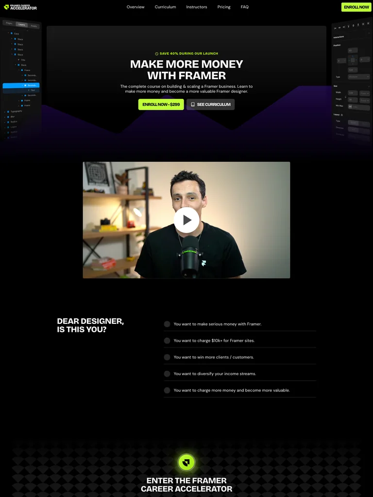
A Framer business-course funnel with a dark opening, clear curriculum blocks, instructor portraits, and bright enrollment actions.
Useful for: Study the complete public offer page, its section order, and calls to action. Checkout steps, current enrollment availability, and conversion results are not verified.
# Design reference: Ryan Hayward — Framer Career Accelerator
Source: https://framercareercourse.com/
Swipefile reference: https://swipefile.design/ref/funnel-ryan-hayward-ultimate-framer-career-accelerator-course/
Captured: 2026-09-07. This is a dated reference, not a claim about the current live product.


## Objective
Adapt the visual principles below to my project. Use my own content and identity. Do not reproduce logos, proprietary copy, or brand assets.

## Reference notes
- mood: Focused and technical
- colors: Black, deep violet, white headings, and acid-green enrollment buttons.
- typography: Bold sans-serif headings, compact labels, short benefit lists, and clearly separated curriculum sections make the long offer scannable.
- layout: Business-focused promise and video → designer problems → course introduction → six skill areas → instructor portraits → enrollment and FAQ.
- motion: The screenshot records a static page state. Preserve readable scrolling and clear action feedback; do not infer video playback, counters, or hidden form behavior.
- texture: Product or instructor imagery, contrasting section backgrounds, grouped curriculum details, and customer-story panels.
- dont: Use your own offer, brand, and assets. Do not invent testimonials, results, scarcity, guarantees, or pricing.

Useful for: Study the complete public offer page, its section order, and calls to action. Checkout steps, current enrollment availability, and conversion results are not verified.

## Acceptance criteria
- Existing project conventions, design tokens, working functionality, and unrelated changes are preserved.
- Two or three reference principles clearly support the user's task; conflicts are resolved in favor of usability and the existing product.
- Reusable components and semantic HTML express the interface. Available licensed assets are used; important UI text is never rendered as a bitmap.
- Every visible control has a defined behavior. Loading, empty, error, success, disabled, and long-content states are specified where relevant. Demo data is clearly labeled.
- Navigation and content adapt at 375px, 768px, and 1440px without horizontal page overflow. Keyboard use, visible focus, labeled inputs, at least 44px touch targets, readable contrast, and reduced motion are supported.
- Verification distinguishes rendered behavior from proposals and identifies anything still requiring a backend or external service.

## Quality bar
Clear hierarchy, consistent spacing, restrained surfaces, and purposeful motion. Avoid decorative gradients, excessive cards, placeholder buttons, and invented metrics unless the project calls for them. Do not claim a feature is connected or tested without evidence.
 hover to scroll
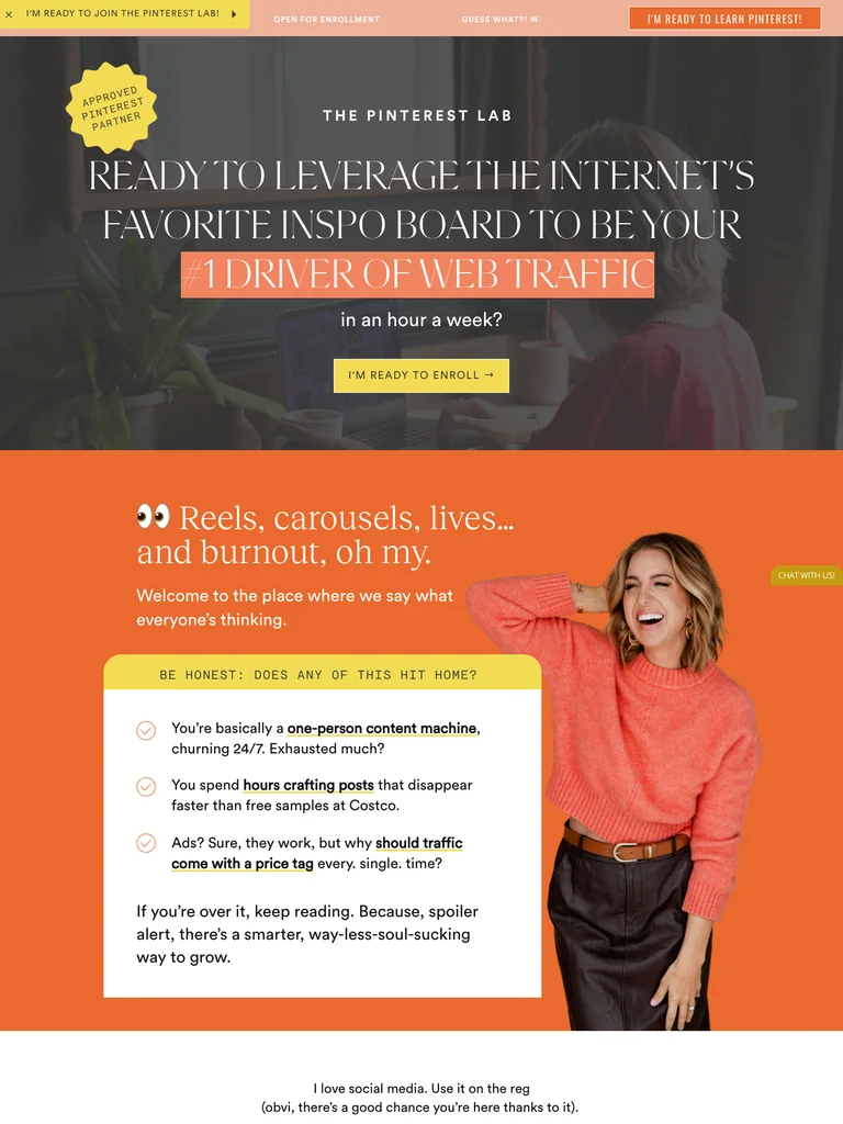
A long Pinterest-course offer with expressive serif typography, warm color changes, detailed modules, and a three-option enrollment section.
Useful for: Study the complete public offer page, its section order, and calls to action. Checkout steps, current enrollment availability, and conversion results are not verified.
# Design reference: Jenna Kutcher — The Pinterest Lab
Source: https://thepinterestlab.jennakutcher.com/
Swipefile reference: https://swipefile.design/ref/funnel-jenna-kutcher-the-pinterest-lab/
Captured: 2026-09-07. This is a dated reference, not a claim about the current live product.


## Objective
Adapt the visual principles below to my project. Use my own content and identity. Do not reproduce logos, proprietary copy, or brand assets.

## Reference notes
- mood: Warm and expressive
- colors: Charcoal, vivid orange, peach, cream, and yellow enrollment accents.
- typography: Editorial serif headings, small uppercase labels, and readable supporting text. Broad type-size changes mark each stage of the offer.
- layout: Large editorial promise → audience frustrations → Pinterest teaching approach → curriculum → student stories and instructor context → three payment options.
- motion: The screenshot records a static page state. Preserve readable scrolling and clear action feedback; do not infer video playback, counters, or hidden form behavior.
- texture: Product or instructor imagery, contrasting section backgrounds, grouped curriculum details, and customer-story panels.
- dont: Use your own offer, brand, and assets. Do not invent testimonials, results, scarcity, guarantees, or pricing.

Useful for: Study the complete public offer page, its section order, and calls to action. Checkout steps, current enrollment availability, and conversion results are not verified.

## Acceptance criteria
- Existing project conventions, design tokens, working functionality, and unrelated changes are preserved.
- Two or three reference principles clearly support the user's task; conflicts are resolved in favor of usability and the existing product.
- Reusable components and semantic HTML express the interface. Available licensed assets are used; important UI text is never rendered as a bitmap.
- Every visible control has a defined behavior. Loading, empty, error, success, disabled, and long-content states are specified where relevant. Demo data is clearly labeled.
- Navigation and content adapt at 375px, 768px, and 1440px without horizontal page overflow. Keyboard use, visible focus, labeled inputs, at least 44px touch targets, readable contrast, and reduced motion are supported.
- Verification distinguishes rendered behavior from proposals and identifies anything still requiring a backend or external service.

## Quality bar
Clear hierarchy, consistent spacing, restrained surfaces, and purposeful motion. Avoid decorative gradients, excessive cards, placeholder buttons, and invented metrics unless the project calls for them. Do not claim a feature is connected or tested without evidence.
 hover to scroll
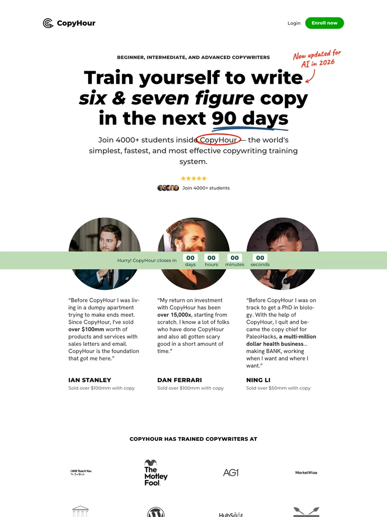
A copywriting-course page with a clear daily-practice explanation, five curriculum modules, handwritten accents, and student proof.
Useful for: Study the complete public offer page, its section order, and calls to action. Checkout steps, current enrollment availability, and conversion results are not verified.
# Design reference: CopyHour — Copywriting Course
Source: https://copyhour.com/
Swipefile reference: https://swipefile.design/ref/funnel-derek-johanson-copyhour/
Captured: 2026-09-07. This is a dated reference, not a claim about the current live product.


## Objective
Adapt the visual principles below to my project. Use my own content and identity. Do not reproduce logos, proprietary copy, or brand assets.

## Reference notes
- mood: Confident and readable
- colors: White, black, green enrollment buttons, pale green panels, and small red handwritten annotations.
- typography: Bold sans-serif headings, compact labels, short benefit lists, and clearly separated curriculum sections make the long offer scannable.
- layout: Large course promise → brand and student proof → reader problem → daily practice method → five curriculum modules → offer → instructor story and close.
- motion: The screenshot records a static page state. Preserve readable scrolling and clear action feedback; do not infer video playback, counters, or hidden form behavior.
- texture: Product or instructor imagery, contrasting section backgrounds, grouped curriculum details, and customer-story panels.
- dont: Use your own offer, brand, and assets. Do not invent testimonials, results, scarcity, guarantees, or pricing.

Useful for: Study the complete public offer page, its section order, and calls to action. Checkout steps, current enrollment availability, and conversion results are not verified.

## Acceptance criteria
- Existing project conventions, design tokens, working functionality, and unrelated changes are preserved.
- Two or three reference principles clearly support the user's task; conflicts are resolved in favor of usability and the existing product.
- Reusable components and semantic HTML express the interface. Available licensed assets are used; important UI text is never rendered as a bitmap.
- Every visible control has a defined behavior. Loading, empty, error, success, disabled, and long-content states are specified where relevant. Demo data is clearly labeled.
- Navigation and content adapt at 375px, 768px, and 1440px without horizontal page overflow. Keyboard use, visible focus, labeled inputs, at least 44px touch targets, readable contrast, and reduced motion are supported.
- Verification distinguishes rendered behavior from proposals and identifies anything still requiring a backend or external service.

## Quality bar
Clear hierarchy, consistent spacing, restrained surfaces, and purposeful motion. Avoid decorative gradients, excessive cards, placeholder buttons, and invented metrics unless the project calls for them. Do not claim a feature is connected or tested without evidence.
 hover to scroll
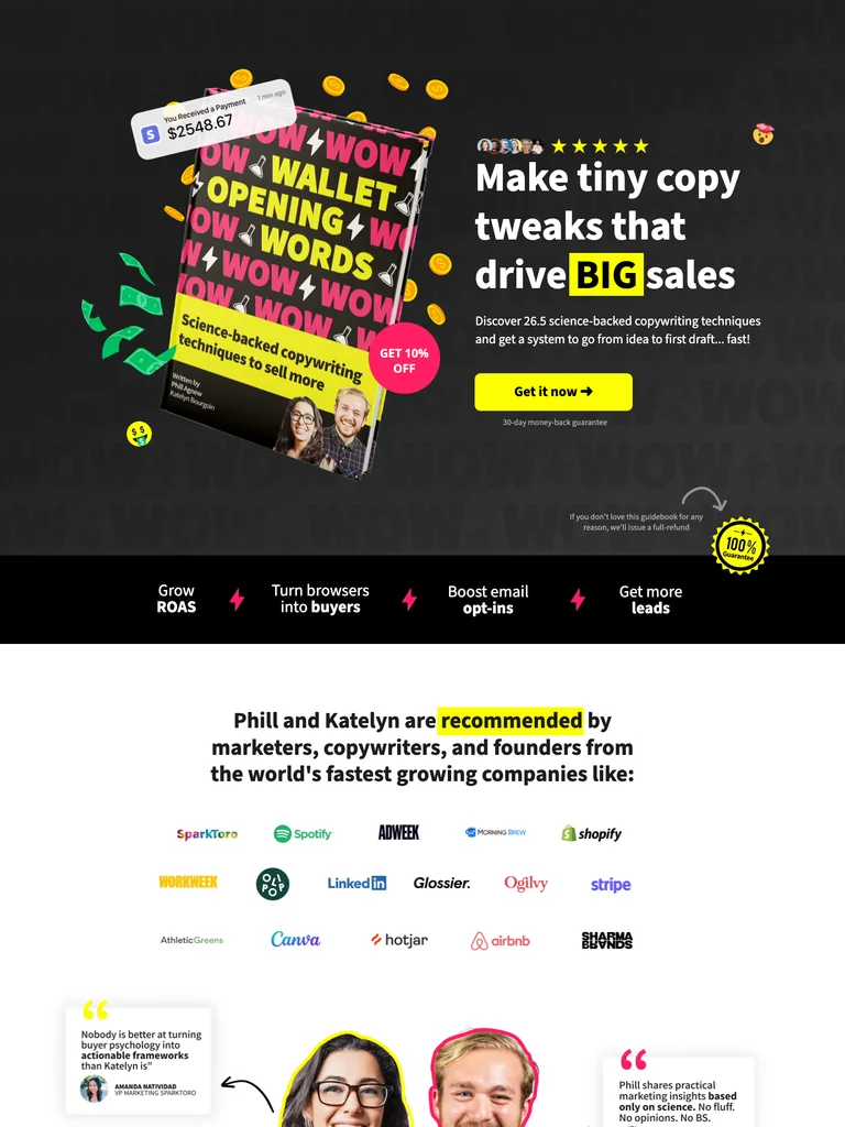
A buyer-psychology course funnel with bold product illustrations, bright emphasis, teaching examples, and repeated purchase actions.
Useful for: Study the complete public offer page, its section order, and calls to action. Checkout steps, current enrollment availability, and conversion results are not verified.
# Design reference: Wallet-Opening Words — Copywriting Course
Source: https://walletopeningwords.com/katelyn
Swipefile reference: https://swipefile.design/ref/funnel-katelyn-bourgoin-wallet-opening-words/
Captured: 2026-09-07. This is a dated reference, not a claim about the current live product.


## Objective
Adapt the visual principles below to my project. Use my own content and identity. Do not reproduce logos, proprietary copy, or brand assets.

## Reference notes
- mood: Playful and emphatic
- colors: Black, bright yellow, hot pink, white, and vivid green illustration accents.
- typography: Bold sans-serif headings, compact labels, short benefit lists, and clearly separated curriculum sections make the long offer scannable.
- layout: Illustrated product hero → brand proof → copywriting frustrations → teaching method and creators → lessons and examples → offer → FAQ and closing purchase action.
- motion: The screenshot records a static page state. Preserve readable scrolling and clear action feedback; do not infer video playback, counters, or hidden form behavior.
- texture: Product or instructor imagery, contrasting section backgrounds, grouped curriculum details, and customer-story panels.
- dont: Use your own offer, brand, and assets. Do not invent testimonials, results, scarcity, guarantees, or pricing.

Useful for: Study the complete public offer page, its section order, and calls to action. Checkout steps, current enrollment availability, and conversion results are not verified.

## Acceptance criteria
- Existing project conventions, design tokens, working functionality, and unrelated changes are preserved.
- Two or three reference principles clearly support the user's task; conflicts are resolved in favor of usability and the existing product.
- Reusable components and semantic HTML express the interface. Available licensed assets are used; important UI text is never rendered as a bitmap.
- Every visible control has a defined behavior. Loading, empty, error, success, disabled, and long-content states are specified where relevant. Demo data is clearly labeled.
- Navigation and content adapt at 375px, 768px, and 1440px without horizontal page overflow. Keyboard use, visible focus, labeled inputs, at least 44px touch targets, readable contrast, and reduced motion are supported.
- Verification distinguishes rendered behavior from proposals and identifies anything still requiring a backend or external service.

## Quality bar
Clear hierarchy, consistent spacing, restrained surfaces, and purposeful motion. Avoid decorative gradients, excessive cards, placeholder buttons, and invented metrics unless the project calls for them. Do not claim a feature is connected or tested without evidence.
 hover to scroll
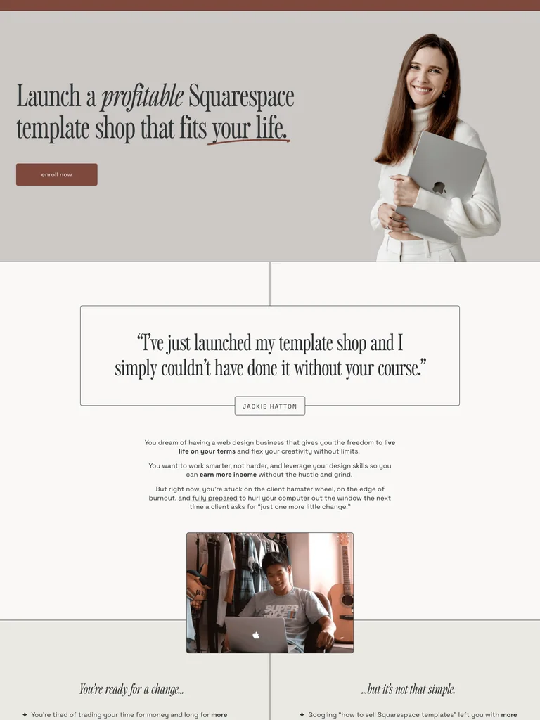
An editorial template-business course page with restrained serif headings, a personal story, curriculum details, and generous spacing.
Useful for: Study the complete public offer page, its section order, and calls to action. Checkout steps, current enrollment availability, and conversion results are not verified.
# Design reference: Kate Scott — Scale with Templates
Source: https://katescott.co/scale-with-templates
Swipefile reference: https://swipefile.design/ref/funnel-kate-scott-scale-with-templates-2-0/
Captured: 2026-09-07. This is a dated reference, not a claim about the current live product.


## Objective
Adapt the visual principles below to my project. Use my own content and identity. Do not reproduce logos, proprietary copy, or brand assets.

## Reference notes
- mood: Calm and editorial
- colors: Warm white, muted brown, dusty rose, black type, and neutral photography.
- typography: Editorial serif headings, small uppercase labels, and readable supporting text. Broad type-size changes mark each stage of the offer.
- layout: Portrait and template-shop promise → reader objections → instructor story → student proof → five-stage curriculum → enrollment choices → FAQ and final action.
- motion: The screenshot records a static page state. Preserve readable scrolling and clear action feedback; do not infer video playback, counters, or hidden form behavior.
- texture: Product or instructor imagery, contrasting section backgrounds, grouped curriculum details, and customer-story panels.
- dont: Use your own offer, brand, and assets. Do not invent testimonials, results, scarcity, guarantees, or pricing.

Useful for: Study the complete public offer page, its section order, and calls to action. Checkout steps, current enrollment availability, and conversion results are not verified.

## Acceptance criteria
- Existing project conventions, design tokens, working functionality, and unrelated changes are preserved.
- Two or three reference principles clearly support the user's task; conflicts are resolved in favor of usability and the existing product.
- Reusable components and semantic HTML express the interface. Available licensed assets are used; important UI text is never rendered as a bitmap.
- Every visible control has a defined behavior. Loading, empty, error, success, disabled, and long-content states are specified where relevant. Demo data is clearly labeled.
- Navigation and content adapt at 375px, 768px, and 1440px without horizontal page overflow. Keyboard use, visible focus, labeled inputs, at least 44px touch targets, readable contrast, and reduced motion are supported.
- Verification distinguishes rendered behavior from proposals and identifies anything still requiring a backend or external service.

## Quality bar
Clear hierarchy, consistent spacing, restrained surfaces, and purposeful motion. Avoid decorative gradients, excessive cards, placeholder buttons, and invented metrics unless the project calls for them. Do not claim a feature is connected or tested without evidence.
 hover to scroll
A Framer training page with a clean video opening, extensive student proof, project previews, and a structured enrollment section.
Useful for: Study the complete public offer page, its section order, and calls to action. Checkout steps, current enrollment availability, and conversion results are not verified.
# Design reference: Ryan Hayward — Ultimate Framer Masterclass
Source: https://ultimateframercourse.com/
Swipefile reference: https://swipefile.design/ref/funnel-ryan-hayward-ultimate-framer-masterclass-3-0/
Captured: 2026-09-07. This is a dated reference, not a claim about the current live product.


## Objective
Adapt the visual principles below to my project. Use my own content and identity. Do not reproduce logos, proprietary copy, or brand assets.

## Reference notes
- mood: Clear and structured
- colors: Off-white, black headings, violet buttons, and soft lavender accents.
- typography: Bold sans-serif headings, compact labels, short benefit lists, and clearly separated curriculum sections make the long offer scannable.
- layout: Course promise and instructor video → designer testimonials → course features → project and lesson previews → instructor context → plans and questions.
- motion: The screenshot records a static page state. Preserve readable scrolling and clear action feedback; do not infer video playback, counters, or hidden form behavior.
- texture: Product or instructor imagery, contrasting section backgrounds, grouped curriculum details, and customer-story panels.
- dont: Use your own offer, brand, and assets. Do not invent testimonials, results, scarcity, guarantees, or pricing.

Useful for: Study the complete public offer page, its section order, and calls to action. Checkout steps, current enrollment availability, and conversion results are not verified.

## Acceptance criteria
- Existing project conventions, design tokens, working functionality, and unrelated changes are preserved.
- Two or three reference principles clearly support the user's task; conflicts are resolved in favor of usability and the existing product.
- Reusable components and semantic HTML express the interface. Available licensed assets are used; important UI text is never rendered as a bitmap.
- Every visible control has a defined behavior. Loading, empty, error, success, disabled, and long-content states are specified where relevant. Demo data is clearly labeled.
- Navigation and content adapt at 375px, 768px, and 1440px without horizontal page overflow. Keyboard use, visible focus, labeled inputs, at least 44px touch targets, readable contrast, and reduced motion are supported.
- Verification distinguishes rendered behavior from proposals and identifies anything still requiring a backend or external service.

## Quality bar
Clear hierarchy, consistent spacing, restrained surfaces, and purposeful motion. Avoid decorative gradients, excessive cards, placeholder buttons, and invented metrics unless the project calls for them. Do not claim a feature is connected or tested without evidence.
 hover to scroll
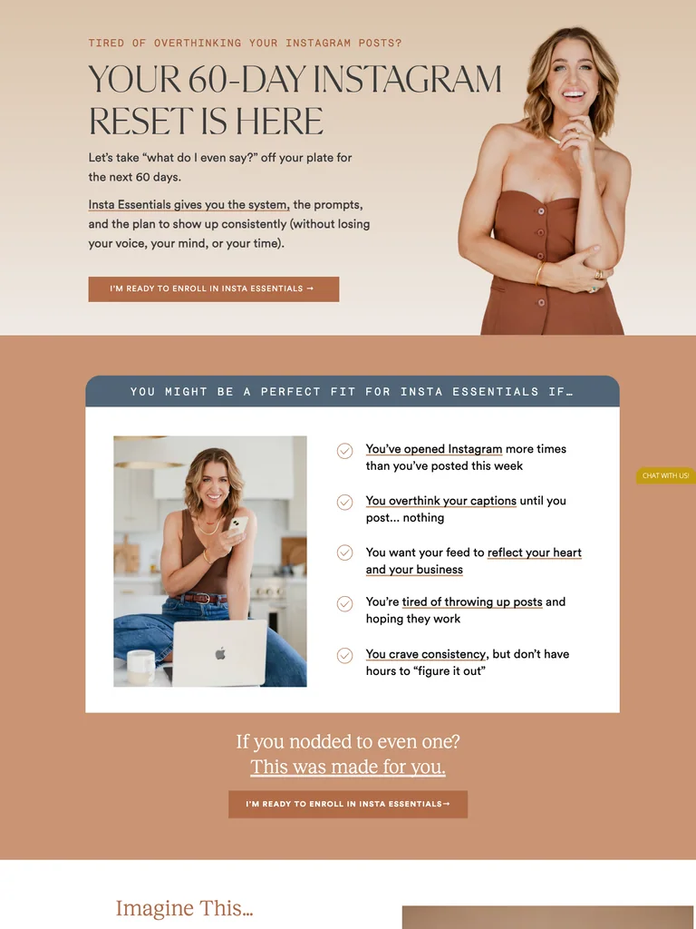
An Instagram-resource offer combining warm portrait photography, editorial headings, grouped resources, and an approachable implementation plan.
Useful for: Study the complete public offer page, its section order, and calls to action. Checkout steps, current enrollment availability, and conversion results are not verified.
# Design reference: Jenna Kutcher — Insta Essentials
Source: https://thelab.jennakutcher.com/
Swipefile reference: https://swipefile.design/ref/funnel-jenna-kutcher-instagram-lab/
Captured: 2026-09-07. This is a dated reference, not a claim about the current live product.


## Objective
Adapt the visual principles below to my project. Use my own content and identity. Do not reproduce logos, proprietary copy, or brand assets.

## Reference notes
- mood: Warm and reassuring
- colors: Cream, caramel, peach, muted blue, and dark serif typography.
- typography: Editorial serif headings, small uppercase labels, and readable supporting text. Broad type-size changes mark each stage of the offer.
- layout: Portrait-led Instagram reset offer → audience situations → included playbook and resources → short implementation plan → instructor and student proof → purchase invitation.
- motion: The screenshot records a static page state. Preserve readable scrolling and clear action feedback; do not infer video playback, counters, or hidden form behavior.
- texture: Product or instructor imagery, contrasting section backgrounds, grouped curriculum details, and customer-story panels.
- dont: Use your own offer, brand, and assets. Do not invent testimonials, results, scarcity, guarantees, or pricing.

Useful for: Study the complete public offer page, its section order, and calls to action. Checkout steps, current enrollment availability, and conversion results are not verified.

## Acceptance criteria
- Existing project conventions, design tokens, working functionality, and unrelated changes are preserved.
- Two or three reference principles clearly support the user's task; conflicts are resolved in favor of usability and the existing product.
- Reusable components and semantic HTML express the interface. Available licensed assets are used; important UI text is never rendered as a bitmap.
- Every visible control has a defined behavior. Loading, empty, error, success, disabled, and long-content states are specified where relevant. Demo data is clearly labeled.
- Navigation and content adapt at 375px, 768px, and 1440px without horizontal page overflow. Keyboard use, visible focus, labeled inputs, at least 44px touch targets, readable contrast, and reduced motion are supported.
- Verification distinguishes rendered behavior from proposals and identifies anything still requiring a backend or external service.

## Quality bar
Clear hierarchy, consistent spacing, restrained surfaces, and purposeful motion. Avoid decorative gradients, excessive cards, placeholder buttons, and invented metrics unless the project calls for them. Do not claim a feature is connected or tested without evidence.
 hover to scroll
A YouTube-course offer that explains a complete marketing system through customer stories, resource previews, and approachable teaching sections.
Useful for: Study the complete public offer page, its section order, and calls to action. Checkout steps, current enrollment availability, and conversion results are not verified.
# Design reference: Stephanie Kase — YouTube for Business
Source: https://stephaniekase.com/youtubeforbusiness
Swipefile reference: https://swipefile.design/ref/funnel-stephanie-kase-youtube-for-business/
Captured: 2026-09-07. This is a dated reference, not a claim about the current live product.


## Objective
Adapt the visual principles below to my project. Use my own content and identity. Do not reproduce logos, proprietary copy, or brand assets.

## Reference notes
- mood: Friendly and practical
- colors: Warm white, peach, pale yellow, charcoal type, and small playful floral shapes.
- typography: Bold sans-serif headings, compact labels, short benefit lists, and clearly separated curriculum sections make the long offer scannable.
- layout: Portrait and marketing promise → three audience situations → customer stories → course system and resources → instructor context → enrollment → FAQ and final invitation.
- motion: The screenshot records a static page state. Preserve readable scrolling and clear action feedback; do not infer video playback, counters, or hidden form behavior.
- texture: Product or instructor imagery, contrasting section backgrounds, grouped curriculum details, and customer-story panels.
- dont: Use your own offer, brand, and assets. Do not invent testimonials, results, scarcity, guarantees, or pricing.

Useful for: Study the complete public offer page, its section order, and calls to action. Checkout steps, current enrollment availability, and conversion results are not verified.

## Acceptance criteria
- Existing project conventions, design tokens, working functionality, and unrelated changes are preserved.
- Two or three reference principles clearly support the user's task; conflicts are resolved in favor of usability and the existing product.
- Reusable components and semantic HTML express the interface. Available licensed assets are used; important UI text is never rendered as a bitmap.
- Every visible control has a defined behavior. Loading, empty, error, success, disabled, and long-content states are specified where relevant. Demo data is clearly labeled.
- Navigation and content adapt at 375px, 768px, and 1440px without horizontal page overflow. Keyboard use, visible focus, labeled inputs, at least 44px touch targets, readable contrast, and reduced motion are supported.
- Verification distinguishes rendered behavior from proposals and identifies anything still requiring a backend or external service.

## Quality bar
Clear hierarchy, consistent spacing, restrained surfaces, and purposeful motion. Avoid decorative gradients, excessive cards, placeholder buttons, and invented metrics unless the project calls for them. Do not claim a feature is connected or tested without evidence.
 hover to scroll
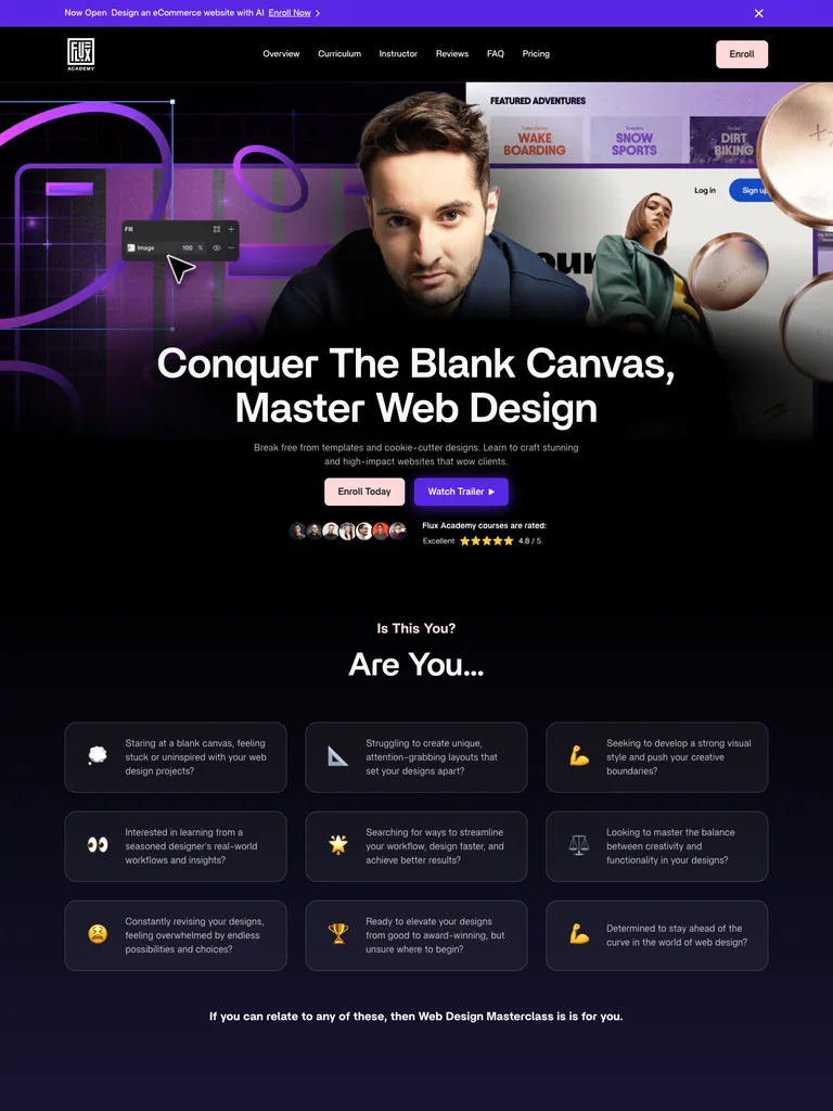
A web-design course funnel that uses a cinematic opening, three visual project examples, detailed curriculum, and mentor support to explain the offer.
Useful for: Study the complete public offer page, its section order, and calls to action. Checkout steps, current enrollment availability, and conversion results are not verified.
# Design reference: Flux Academy — Web Design Masterclass
Source: https://flux-academy.com/courses/web-design-masterclass
Swipefile reference: https://swipefile.design/ref/funnel-matt-jumper-flux-academy-web-design-masterclass/
Captured: 2026-09-07. This is a dated reference, not a claim about the current live product.


## Objective
Adapt the visual principles below to my project. Use my own content and identity. Do not reproduce logos, proprietary copy, or brand assets.

## Reference notes
- mood: Cinematic and structured
- colors: Black, deep violet, white, and soft pink enrollment buttons.
- typography: Bold sans-serif headings, compact labels, short benefit lists, and clearly separated curriculum sections make the long offer scannable.
- layout: Instructor and project montage → designer problems → course features → three example projects → curriculum → mentor support and community → enrollment and FAQ.
- motion: The screenshot records a static page state. Preserve readable scrolling and clear action feedback; do not infer video playback, counters, or hidden form behavior.
- texture: Product or instructor imagery, contrasting section backgrounds, grouped curriculum details, and customer-story panels.
- dont: Use your own offer, brand, and assets. Do not invent testimonials, results, scarcity, guarantees, or pricing.

Useful for: Study the complete public offer page, its section order, and calls to action. Checkout steps, current enrollment availability, and conversion results are not verified.

## Acceptance criteria
- Existing project conventions, design tokens, working functionality, and unrelated changes are preserved.
- Two or three reference principles clearly support the user's task; conflicts are resolved in favor of usability and the existing product.
- Reusable components and semantic HTML express the interface. Available licensed assets are used; important UI text is never rendered as a bitmap.
- Every visible control has a defined behavior. Loading, empty, error, success, disabled, and long-content states are specified where relevant. Demo data is clearly labeled.
- Navigation and content adapt at 375px, 768px, and 1440px without horizontal page overflow. Keyboard use, visible focus, labeled inputs, at least 44px touch targets, readable contrast, and reduced motion are supported.
- Verification distinguishes rendered behavior from proposals and identifies anything still requiring a backend or external service.

## Quality bar
Clear hierarchy, consistent spacing, restrained surfaces, and purposeful motion. Avoid decorative gradients, excessive cards, placeholder buttons, and invented metrics unless the project calls for them. Do not claim a feature is connected or tested without evidence.
 hover to scroll
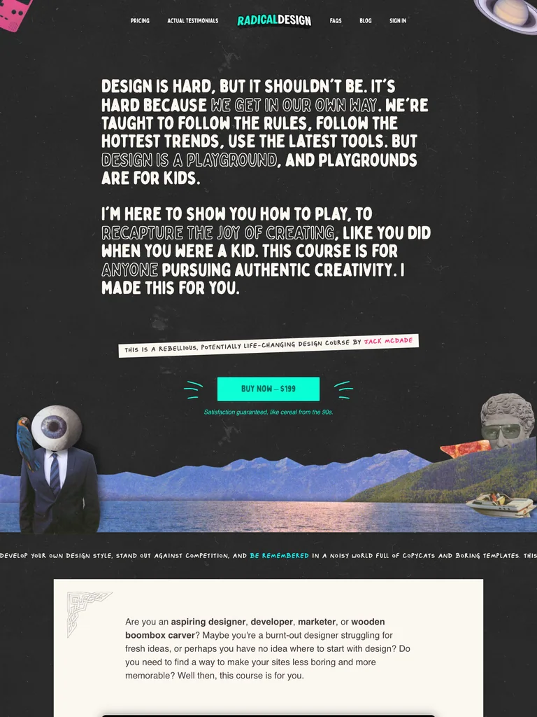
An expressive design-course sales page with a manifesto opening, collage imagery, playful copy, an extensive lesson preview, and two offer tiers.
Useful for: Study the complete public offer page, its section order, and calls to action. Checkout steps, current enrollment availability, and conversion results are not verified.
# Design reference: Jack McDade — Radical Design
Source: https://radicaldesigncourse.com/
Swipefile reference: https://swipefile.design/ref/funnel-jack-mcdade-radical-design/
Captured: 2026-09-07. This is a dated reference, not a claim about the current live product.


## Objective
Adapt the visual principles below to my project. Use my own content and identity. Do not reproduce logos, proprietary copy, or brand assets.

## Reference notes
- mood: Irreverent and expressive
- colors: Charcoal, white, vivid pink and turquoise accents, and colorful collage imagery.
- typography: Condensed display lettering, hand-marked labels, playful inline emphasis, and a distinct visual hierarchy through the long lesson lists.
- layout: Manifesto-style introduction → instructor story → what you will and will not learn → course preview → detailed lesson lists → two offer tiers → FAQ and personal close.
- motion: The screenshot records a static page state. Preserve readable scrolling and clear action feedback; do not infer video playback, counters, or hidden form behavior.
- texture: Product or instructor imagery, contrasting section backgrounds, grouped curriculum details, and customer-story panels.
- dont: Use your own offer, brand, and assets. Do not invent testimonials, results, scarcity, guarantees, or pricing.

Useful for: Study the complete public offer page, its section order, and calls to action. Checkout steps, current enrollment availability, and conversion results are not verified.

## Acceptance criteria
- Existing project conventions, design tokens, working functionality, and unrelated changes are preserved.
- Two or three reference principles clearly support the user's task; conflicts are resolved in favor of usability and the existing product.
- Reusable components and semantic HTML express the interface. Available licensed assets are used; important UI text is never rendered as a bitmap.
- Every visible control has a defined behavior. Loading, empty, error, success, disabled, and long-content states are specified where relevant. Demo data is clearly labeled.
- Navigation and content adapt at 375px, 768px, and 1440px without horizontal page overflow. Keyboard use, visible focus, labeled inputs, at least 44px touch targets, readable contrast, and reduced motion are supported.
- Verification distinguishes rendered behavior from proposals and identifies anything still requiring a backend or external service.

## Quality bar
Clear hierarchy, consistent spacing, restrained surfaces, and purposeful motion. Avoid decorative gradients, excessive cards, placeholder buttons, and invented metrics unless the project calls for them. Do not claim a feature is connected or tested without evidence.
 hover to scroll
A publishing course page combining concrete creative examples with a straightforward course offer.
Useful for: Study the complete public offer page, its section order, and calls to action. Checkout steps, current enrollment availability, and conversion results are not verified.
# Design reference: Quick Start Publishing — Bold & Easy Patterns
Source: https://quickstartpublishing.com/bold-easy-patterns
Swipefile reference: https://swipefile.design/ref/funnel-quick-start-coloring-bold-and-easy-patterns-collages/
Captured: 2026-09-07. This is a dated reference, not a claim about the current live product.


## Objective
Adapt the visual principles below to my project. Use my own content and identity. Do not reproduce logos, proprietary copy, or brand assets.

## Reference notes
- mood: Practical, colorful, and approachable.
- colors: White, black, teal section bands, red buttons, and colorful book examples.
- typography: Bold sans-serif headings, compact labels, short benefit lists, and clearly separated curriculum sections make the long offer scannable.
- layout: Course introduction moves through coloring-book examples, instructor context, lesson details, product imagery, and a closing enrollment offer.
- motion: The screenshot records a static page state. Preserve readable scrolling and clear action feedback; do not infer video playback, counters, or hidden form behavior.
- texture: Product or instructor imagery, contrasting section backgrounds, grouped curriculum details, and customer-story panels.
- dont: Use your own offer, brand, and assets. Do not invent testimonials, results, scarcity, guarantees, or pricing.

Useful for: Study the complete public offer page, its section order, and calls to action. Checkout steps, current enrollment availability, and conversion results are not verified.

## Acceptance criteria
- Existing project conventions, design tokens, working functionality, and unrelated changes are preserved.
- Two or three reference principles clearly support the user's task; conflicts are resolved in favor of usability and the existing product.
- Reusable components and semantic HTML express the interface. Available licensed assets are used; important UI text is never rendered as a bitmap.
- Every visible control has a defined behavior. Loading, empty, error, success, disabled, and long-content states are specified where relevant. Demo data is clearly labeled.
- Navigation and content adapt at 375px, 768px, and 1440px without horizontal page overflow. Keyboard use, visible focus, labeled inputs, at least 44px touch targets, readable contrast, and reduced motion are supported.
- Verification distinguishes rendered behavior from proposals and identifies anything still requiring a backend or external service.

## Quality bar
Clear hierarchy, consistent spacing, restrained surfaces, and purposeful motion. Avoid decorative gradients, excessive cards, placeholder buttons, and invented metrics unless the project calls for them. Do not claim a feature is connected or tested without evidence.
 hover to scroll
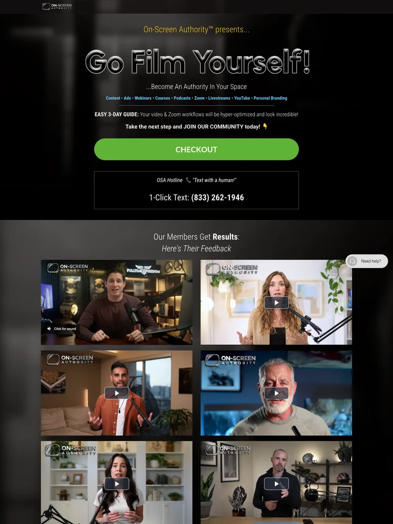
A dark filming-course funnel built around video examples, studio setups, and a bright enrollment action.
Useful for: Study the complete public offer page, its section order, and calls to action. Checkout steps, current enrollment availability, and conversion results are not verified.
# Design reference: On-Screen Authority — Go Film Yourself
Source: https://onscreenauthority.com/join-gfy
Swipefile reference: https://swipefile.design/ref/funnel-on-screen-authority-go-film-yourself/
Captured: 2026-09-07. This is a dated reference, not a claim about the current live product.


## Objective
Adapt the visual principles below to my project. Use my own content and identity. Do not reproduce logos, proprietary copy, or brand assets.

## Reference notes
- mood: Confident, visual, and studio-focused.
- colors: Charcoal photographic backgrounds, white text, lime green buttons, and muted gray panels.
- typography: Bold sans-serif headings, compact labels, short benefit lists, and clearly separated curriculum sections make the long offer scannable.
- layout: Video-oriented opening introduces the filming program, compares on-camera examples, presents studio setups and included resources, then repeats the enrollment offer before the footer.
- motion: The screenshot records a static page state. Preserve readable scrolling and clear action feedback; do not infer video playback, counters, or hidden form behavior.
- texture: Product or instructor imagery, contrasting section backgrounds, grouped curriculum details, and customer-story panels.
- dont: Use your own offer, brand, and assets. Do not invent testimonials, results, scarcity, guarantees, or pricing.

Useful for: Study the complete public offer page, its section order, and calls to action. Checkout steps, current enrollment availability, and conversion results are not verified.

## Acceptance criteria
- Existing project conventions, design tokens, working functionality, and unrelated changes are preserved.
- Two or three reference principles clearly support the user's task; conflicts are resolved in favor of usability and the existing product.
- Reusable components and semantic HTML express the interface. Available licensed assets are used; important UI text is never rendered as a bitmap.
- Every visible control has a defined behavior. Loading, empty, error, success, disabled, and long-content states are specified where relevant. Demo data is clearly labeled.
- Navigation and content adapt at 375px, 768px, and 1440px without horizontal page overflow. Keyboard use, visible focus, labeled inputs, at least 44px touch targets, readable contrast, and reduced motion are supported.
- Verification distinguishes rendered behavior from proposals and identifies anything still requiring a backend or external service.

## Quality bar
Clear hierarchy, consistent spacing, restrained surfaces, and purposeful motion. Avoid decorative gradients, excessive cards, placeholder buttons, and invented metrics unless the project calls for them. Do not claim a feature is connected or tested without evidence.
 hover to scroll
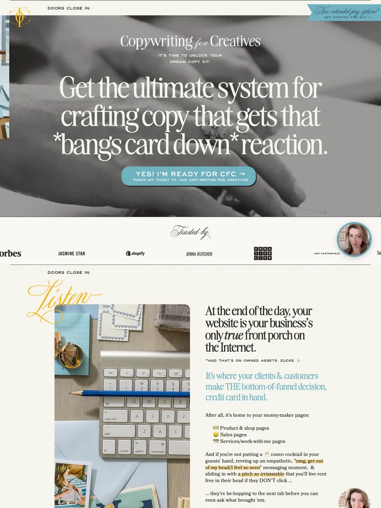
A long editorial course funnel with refined typography, template previews, and an extensive closing offer.
Useful for: Study the complete public offer page, its section order, and calls to action. Checkout steps, current enrollment availability, and conversion results are not verified.
# Design reference: Ashlyn Writes — Copywriting for Creatives
Source: https://copywritingforcreatives.ashlynwrites.com/open
Swipefile reference: https://swipefile.design/ref/funnel-ashlyn-writes-copywriting-for-creatives-2024/
Captured: 2026-09-08. This is a dated reference, not a claim about the current live product.


## Objective
Adapt the visual principles below to my project. Use my own content and identity. Do not reproduce logos, proprietary copy, or brand assets.

## Reference notes
- mood: Editorial, layered, and personable.
- colors: Warm cream, dark brown, muted sky blue, golden yellow buttons, and grayscale imagery.
- typography: Editorial serif headings, small uppercase labels, readable supporting copy, and occasional script accents establish a layered hierarchy.
- layout: Large editorial hero opens a long narrative of audience fit, instructor context, student stories, course modules, template previews, bonuses, and closing payment-plan comparisons.
- motion: The screenshot records a static page state. Preserve readable scrolling and clear action feedback; do not infer video playback, counters, or hidden form behavior.
- texture: Product or instructor imagery, contrasting section backgrounds, grouped curriculum details, and customer-story panels.
- dont: Use your own offer, brand, and assets. Do not invent testimonials, results, scarcity, guarantees, or pricing.

Useful for: Study the complete public offer page, its section order, and calls to action. Checkout steps, current enrollment availability, and conversion results are not verified.

## Acceptance criteria
- Existing project conventions, design tokens, working functionality, and unrelated changes are preserved.
- Two or three reference principles clearly support the user's task; conflicts are resolved in favor of usability and the existing product.
- Reusable components and semantic HTML express the interface. Available licensed assets are used; important UI text is never rendered as a bitmap.
- Every visible control has a defined behavior. Loading, empty, error, success, disabled, and long-content states are specified where relevant. Demo data is clearly labeled.
- Navigation and content adapt at 375px, 768px, and 1440px without horizontal page overflow. Keyboard use, visible focus, labeled inputs, at least 44px touch targets, readable contrast, and reduced motion are supported.
- Verification distinguishes rendered behavior from proposals and identifies anything still requiring a backend or external service.

## Quality bar
Clear hierarchy, consistent spacing, restrained surfaces, and purposeful motion. Avoid decorative gradients, excessive cards, placeholder buttons, and invented metrics unless the project calls for them. Do not claim a feature is connected or tested without evidence.
 hover to scroll
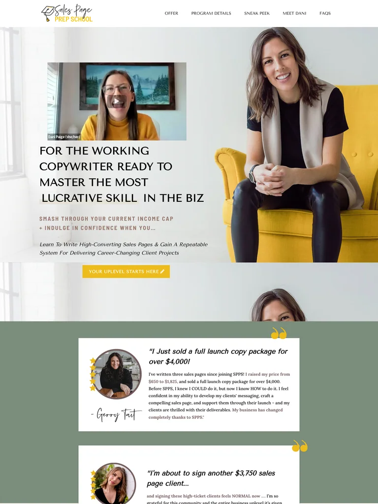
A detailed copywriting-course funnel with a yellow-chair visual motif and a long sequence of program resources.
Useful for: Study the complete public offer page, its section order, and calls to action. Checkout steps, current enrollment availability, and conversion results are not verified.
# Design reference: Dani Paige — Sales Page Prep School
Source: https://salespageprepschool.com/
Swipefile reference: https://swipefile.design/ref/funnel-dani-paige-sales-page-prep-school/
Captured: 2026-09-08. This is a dated reference, not a claim about the current live product.


## Objective
Adapt the visual principles below to my project. Use my own content and identity. Do not reproduce logos, proprietary copy, or brand assets.

## Reference notes
- mood: Personable, detailed, and coaching-oriented.
- colors: Warm white, charcoal, muted purple-gray sections, and mustard yellow accents.
- typography: Bold sans-serif headings, compact labels, short benefit lists, and clearly separated curriculum sections make the long offer scannable.
- layout: Instructor portrait and video introduce the course before an extended sales narrative, curriculum, community and coaching resources, template previews, student stories, and a personal closing letter.
- motion: The screenshot records a static page state. Preserve readable scrolling and clear action feedback; do not infer video playback, counters, or hidden form behavior.
- texture: Product or instructor imagery, contrasting section backgrounds, grouped curriculum details, and customer-story panels.
- dont: Use your own offer, brand, and assets. Do not invent testimonials, results, scarcity, guarantees, or pricing.

Useful for: Study the complete public offer page, its section order, and calls to action. Checkout steps, current enrollment availability, and conversion results are not verified.

## Acceptance criteria
- Existing project conventions, design tokens, working functionality, and unrelated changes are preserved.
- Two or three reference principles clearly support the user's task; conflicts are resolved in favor of usability and the existing product.
- Reusable components and semantic HTML express the interface. Available licensed assets are used; important UI text is never rendered as a bitmap.
- Every visible control has a defined behavior. Loading, empty, error, success, disabled, and long-content states are specified where relevant. Demo data is clearly labeled.
- Navigation and content adapt at 375px, 768px, and 1440px without horizontal page overflow. Keyboard use, visible focus, labeled inputs, at least 44px touch targets, readable contrast, and reduced motion are supported.
- Verification distinguishes rendered behavior from proposals and identifies anything still requiring a backend or external service.

## Quality bar
Clear hierarchy, consistent spacing, restrained surfaces, and purposeful motion. Avoid decorative gradients, excessive cards, placeholder buttons, and invented metrics unless the project calls for them. Do not claim a feature is connected or tested without evidence.
 hover to scroll
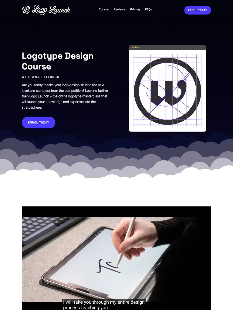
A logo-design course funnel with geometric artwork, a dark opening, and structured curriculum and FAQ sections.
Useful for: Study the complete public offer page, its section order, and calls to action. Checkout steps, current enrollment availability, and conversion results are not verified.
# Design reference: Will Paterson — Logo Launch
Source: https://logo-launch.com/
Swipefile reference: https://swipefile.design/ref/funnel-will-patterson-logo-launch/
Captured: 2026-09-08. This is a dated reference, not a claim about the current live product.


## Objective
Adapt the visual principles below to my project. Use my own content and identity. Do not reproduce logos, proprietary copy, or brand assets.

## Reference notes
- mood: Graphic, precise, and playful.
- colors: Near-black navy, white, electric violet buttons, and pale lavender outlines.
- typography: Bold sans-serif headings, compact labels, short benefit lists, and clearly separated curriculum sections make the long offer scannable.
- layout: Dark split hero pairs course copy with a geometric logo drawing, then transitions through cloud-shaped dividers into course details, expandable module lists, pricing, and a two-column FAQ.
- motion: The screenshot records a static page state. Preserve readable scrolling and clear action feedback; do not infer video playback, counters, or hidden form behavior.
- texture: Product or instructor imagery, contrasting section backgrounds, grouped curriculum details, and customer-story panels.
- dont: Use your own offer, brand, and assets. Do not invent testimonials, results, scarcity, guarantees, or pricing.

Useful for: Study the complete public offer page, its section order, and calls to action. Checkout steps, current enrollment availability, and conversion results are not verified.

## Acceptance criteria
- Existing project conventions, design tokens, working functionality, and unrelated changes are preserved.
- Two or three reference principles clearly support the user's task; conflicts are resolved in favor of usability and the existing product.
- Reusable components and semantic HTML express the interface. Available licensed assets are used; important UI text is never rendered as a bitmap.
- Every visible control has a defined behavior. Loading, empty, error, success, disabled, and long-content states are specified where relevant. Demo data is clearly labeled.
- Navigation and content adapt at 375px, 768px, and 1440px without horizontal page overflow. Keyboard use, visible focus, labeled inputs, at least 44px touch targets, readable contrast, and reduced motion are supported.
- Verification distinguishes rendered behavior from proposals and identifies anything still requiring a backend or external service.

## Quality bar
Clear hierarchy, consistent spacing, restrained surfaces, and purposeful motion. Avoid decorative gradients, excessive cards, placeholder buttons, and invented metrics unless the project calls for them. Do not claim a feature is connected or tested without evidence.
 hover to scroll
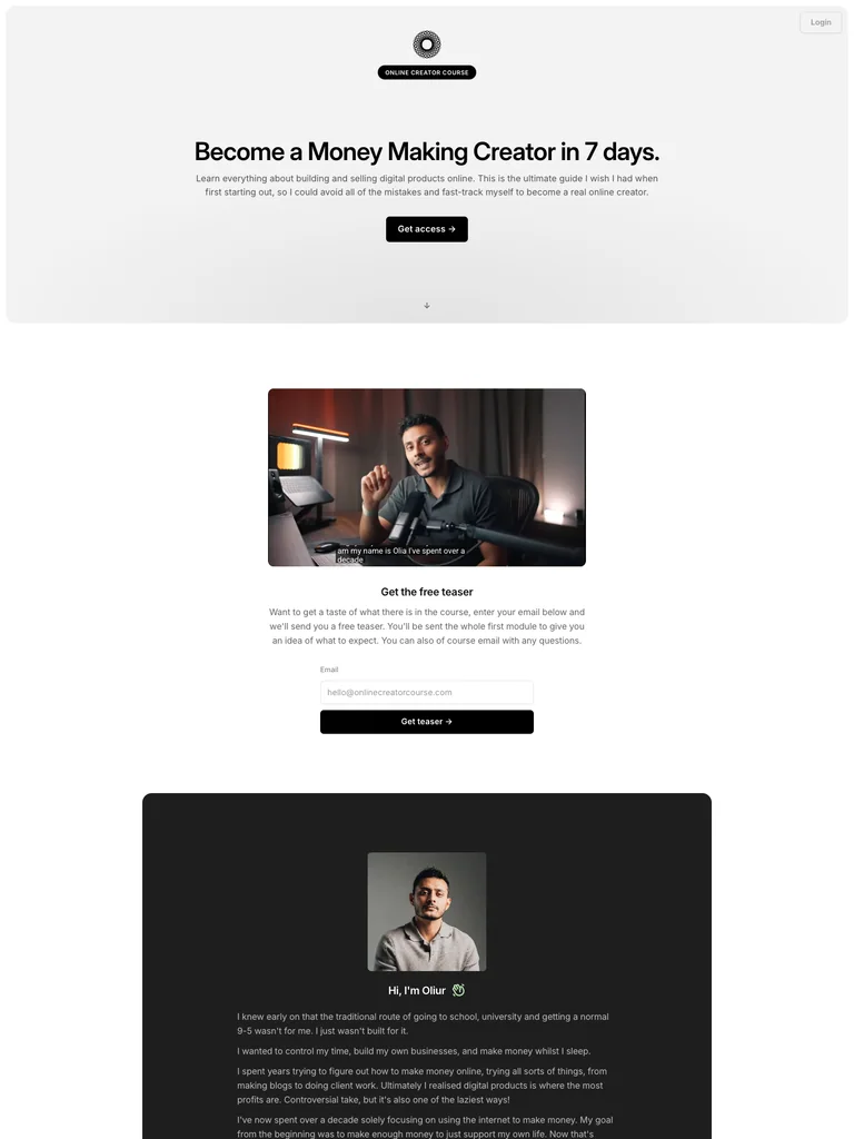
A restrained creator-course page that uses generous whitespace and a concise sequence of learning resources.
Useful for: Study the complete public offer page, its section order, and calls to action. Checkout steps, current enrollment availability, and conversion results are not verified.
# Design reference: Oliur — Online Creator Course
Source: https://onlinecreatorcourse.com/
Swipefile reference: https://swipefile.design/ref/funnel-oliur-online-creator-course/
Captured: 2026-09-08. This is a dated reference, not a claim about the current live product.


## Objective
Adapt the visual principles below to my project. Use my own content and identity. Do not reproduce logos, proprietary copy, or brand assets.

## Reference notes
- mood: Minimal, focused, and quietly confident.
- colors: White and light gray, black pill buttons, and small green emphasis details.
- typography: Bold sans-serif headings, compact labels, short benefit lists, and clearly separated curriculum sections make the long offer scannable.
- layout: Compact centered course hero leads to a presenter video, audience-fit lists, an author story, a seven-day curriculum, additional resources, and a compact accordion FAQ.
- motion: The screenshot records a static page state. Preserve readable scrolling and clear action feedback; do not infer video playback, counters, or hidden form behavior.
- texture: Product or instructor imagery, contrasting section backgrounds, grouped curriculum details, and customer-story panels.
- dont: Use your own offer, brand, and assets. Do not invent testimonials, results, scarcity, guarantees, or pricing.

Useful for: Study the complete public offer page, its section order, and calls to action. Checkout steps, current enrollment availability, and conversion results are not verified.

## Acceptance criteria
- Existing project conventions, design tokens, working functionality, and unrelated changes are preserved.
- Two or three reference principles clearly support the user's task; conflicts are resolved in favor of usability and the existing product.
- Reusable components and semantic HTML express the interface. Available licensed assets are used; important UI text is never rendered as a bitmap.
- Every visible control has a defined behavior. Loading, empty, error, success, disabled, and long-content states are specified where relevant. Demo data is clearly labeled.
- Navigation and content adapt at 375px, 768px, and 1440px without horizontal page overflow. Keyboard use, visible focus, labeled inputs, at least 44px touch targets, readable contrast, and reduced motion are supported.
- Verification distinguishes rendered behavior from proposals and identifies anything still requiring a backend or external service.

## Quality bar
Clear hierarchy, consistent spacing, restrained surfaces, and purposeful motion. Avoid decorative gradients, excessive cards, placeholder buttons, and invented metrics unless the project calls for them. Do not claim a feature is connected or tested without evidence.
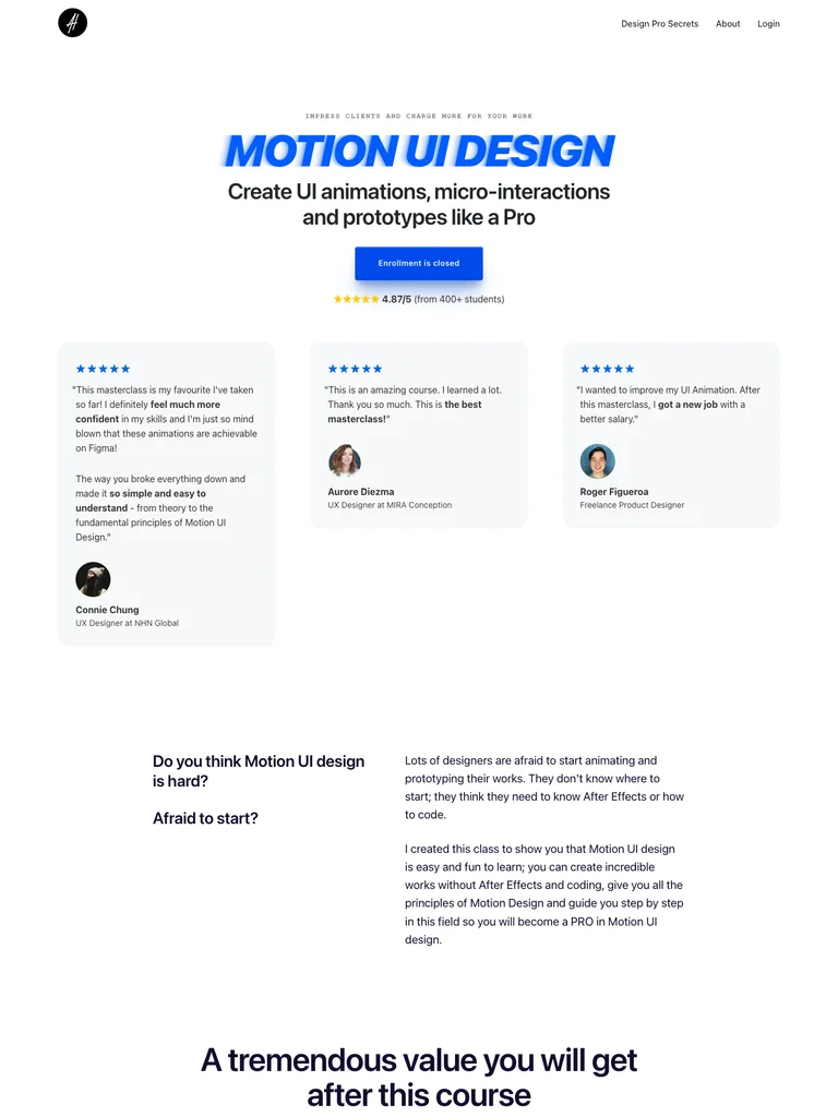 hover to scroll
A motion-design course funnel using generous whitespace, blue actions, and structured lesson and package sections.
Useful for: Study the complete public offer page, its section order, and calls to action. Checkout steps, current enrollment availability, and conversion results are not verified.
# Design reference: Alexunder Hess — Motion UI Design
Source: https://alexunderhess.design/motion-ui
Swipefile reference: https://swipefile.design/ref/funnel-alexunder-hess-motion-ui-design-gold/
Captured: 2026-09-08. This is a dated reference, not a claim about the current live product.


## Objective
Adapt the visual principles below to my project. Use my own content and identity. Do not reproduce logos, proprietary copy, or brand assets.

## Reference notes
- mood: Clean, technical, and approachable.
- colors: White and cool gray, electric blue, dark navy copy, and small violet illustrations.
- typography: Bold sans-serif headings, compact labels, short benefit lists, and clearly separated curriculum sections make the long offer scannable.
- layout: Centered course opening and review cards introduce audience fit, design benefits, detailed lesson modules, more student stories, package comparisons, tool references, and closing illustrations.
- motion: The screenshot records a static page state. Preserve readable scrolling and clear action feedback; do not infer video playback, counters, or hidden form behavior.
- texture: Product or instructor imagery, contrasting section backgrounds, grouped curriculum details, and customer-story panels.
- dont: Use your own offer, brand, and assets. Do not invent testimonials, results, scarcity, guarantees, or pricing.

Useful for: Study the complete public offer page, its section order, and calls to action. Checkout steps, current enrollment availability, and conversion results are not verified.

## Acceptance criteria
- Existing project conventions, design tokens, working functionality, and unrelated changes are preserved.
- Two or three reference principles clearly support the user's task; conflicts are resolved in favor of usability and the existing product.
- Reusable components and semantic HTML express the interface. Available licensed assets are used; important UI text is never rendered as a bitmap.
- Every visible control has a defined behavior. Loading, empty, error, success, disabled, and long-content states are specified where relevant. Demo data is clearly labeled.
- Navigation and content adapt at 375px, 768px, and 1440px without horizontal page overflow. Keyboard use, visible focus, labeled inputs, at least 44px touch targets, readable contrast, and reduced motion are supported.
- Verification distinguishes rendered behavior from proposals and identifies anything still requiring a backend or external service.

## Quality bar
Clear hierarchy, consistent spacing, restrained surfaces, and purposeful motion. Avoid decorative gradients, excessive cards, placeholder buttons, and invented metrics unless the project calls for them. Do not claim a feature is connected or tested without evidence.
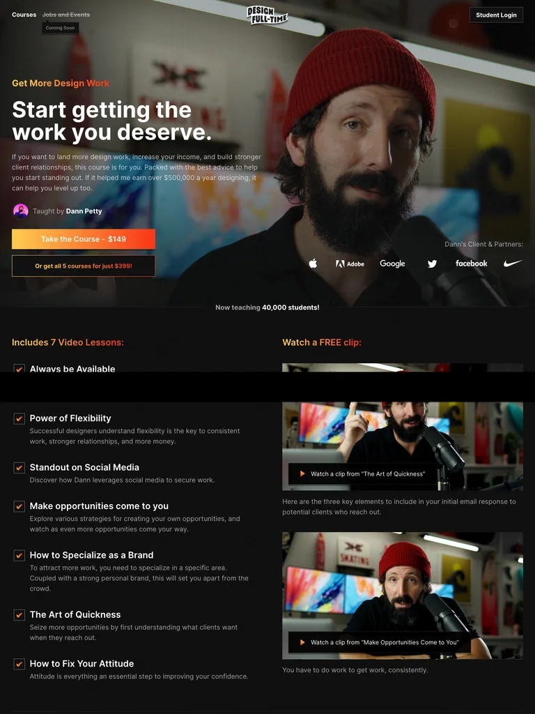 hover to scroll
A compact design-course funnel with a cinematic instructor opening and a clear lesson outline.
Useful for: Study the complete public offer page, its section order, and calls to action. Checkout steps, current enrollment availability, and conversion results are not verified.
# Design reference: Dann Petty — Get More Design Work
Source: https://designfulltime.com/course/getmoredesignwork
Swipefile reference: https://swipefile.design/ref/funnel-dan-petty-design-full-time-bundle/
Captured: 2026-09-08. This is a dated reference, not a claim about the current live product.


## Objective
Adapt the visual principles below to my project. Use my own content and identity. Do not reproduce logos, proprietary copy, or brand assets.

## Reference notes
- mood: Cinematic, personal, and concise.
- colors: Black and charcoal, white text, warm orange and yellow actions, and photographic backgrounds.
- typography: Bold sans-serif headings, compact labels, short benefit lists, and clearly separated curriculum sections make the long offer scannable.
- layout: Full-width instructor-video hero leads into a seven-lesson outline, a sample clip, instructor experience, student comments, related course cards, and repeated course or bundle actions.
- motion: The screenshot records a static page state. Preserve readable scrolling and clear action feedback; do not infer video playback, counters, or hidden form behavior.
- texture: Product or instructor imagery, contrasting section backgrounds, grouped curriculum details, and customer-story panels.
- dont: Use your own offer, brand, and assets. Do not invent testimonials, results, scarcity, guarantees, or pricing.

Useful for: Study the complete public offer page, its section order, and calls to action. Checkout steps, current enrollment availability, and conversion results are not verified.

## Acceptance criteria
- Existing project conventions, design tokens, working functionality, and unrelated changes are preserved.
- Two or three reference principles clearly support the user's task; conflicts are resolved in favor of usability and the existing product.
- Reusable components and semantic HTML express the interface. Available licensed assets are used; important UI text is never rendered as a bitmap.
- Every visible control has a defined behavior. Loading, empty, error, success, disabled, and long-content states are specified where relevant. Demo data is clearly labeled.
- Navigation and content adapt at 375px, 768px, and 1440px without horizontal page overflow. Keyboard use, visible focus, labeled inputs, at least 44px touch targets, readable contrast, and reduced motion are supported.
- Verification distinguishes rendered behavior from proposals and identifies anything still requiring a backend or external service.

## Quality bar
Clear hierarchy, consistent spacing, restrained surfaces, and purposeful motion. Avoid decorative gradients, excessive cards, placeholder buttons, and invented metrics unless the project calls for them. Do not claim a feature is connected or tested without evidence.
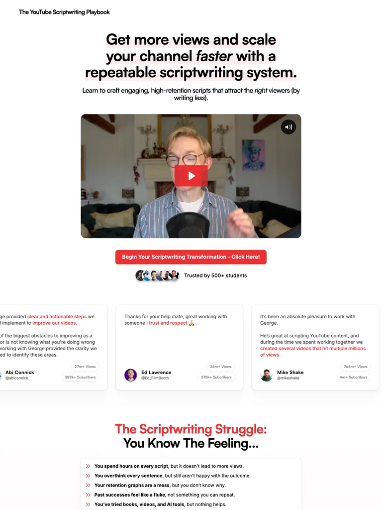 hover to scroll
A scriptwriting funnel built around a video introduction, concrete learning resources, and recurring red actions.
Useful for: Study the complete public offer page, its section order, and calls to action. Checkout steps, current enrollment availability, and conversion results are not verified.
# Design reference: George Blackman — The YouTube Scriptwriting Playbook
Source: https://ytsp.co/
Swipefile reference: https://swipefile.design/ref/funnel-george-blackman-the-youtube-scriptwriter-s-playbook/
Captured: 2026-09-08. This is a dated reference, not a claim about the current live product.


## Objective
Adapt the visual principles below to my project. Use my own content and identity. Do not reproduce logos, proprietary copy, or brand assets.

## Reference notes
- mood: Clear, approachable, and demonstration-led.
- colors: White, black, blush-pink sections, and bright red action buttons.
- typography: Bold sans-serif headings, compact labels, short benefit lists, and clearly separated curriculum sections make the long offer scannable.
- layout: Centered video opening moves through writing frustrations, the course method, resource previews, module details, community support, student stories, offer comparisons, and closing questions.
- motion: The screenshot records a static page state. Preserve readable scrolling and clear action feedback; do not infer video playback, counters, or hidden form behavior.
- texture: Product or instructor imagery, contrasting section backgrounds, grouped curriculum details, and customer-story panels.
- dont: Use your own offer, brand, and assets. Do not invent testimonials, results, scarcity, guarantees, or pricing.

Useful for: Study the complete public offer page, its section order, and calls to action. Checkout steps, current enrollment availability, and conversion results are not verified.

## Acceptance criteria
- Existing project conventions, design tokens, working functionality, and unrelated changes are preserved.
- Two or three reference principles clearly support the user's task; conflicts are resolved in favor of usability and the existing product.
- Reusable components and semantic HTML express the interface. Available licensed assets are used; important UI text is never rendered as a bitmap.
- Every visible control has a defined behavior. Loading, empty, error, success, disabled, and long-content states are specified where relevant. Demo data is clearly labeled.
- Navigation and content adapt at 375px, 768px, and 1440px without horizontal page overflow. Keyboard use, visible focus, labeled inputs, at least 44px touch targets, readable contrast, and reduced motion are supported.
- Verification distinguishes rendered behavior from proposals and identifies anything still requiring a backend or external service.

## Quality bar
Clear hierarchy, consistent spacing, restrained surfaces, and purposeful motion. Avoid decorative gradients, excessive cards, placeholder buttons, and invented metrics unless the project calls for them. Do not claim a feature is connected or tested without evidence.
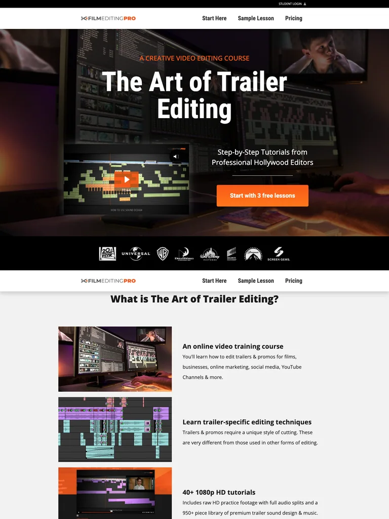 hover to scroll
A cinematic editing-course funnel that uses free lessons as the entry point to a longer training offer.
Useful for: Study the complete public offer page, its section order, and calls to action. Checkout steps, current enrollment availability, and conversion results are not verified.
# Design reference: Film Editing Pro — The Art of Trailer Editing
Source: https://theartoftrailerediting.com/
Swipefile reference: https://swipefile.design/ref/funnel-film-editing-pro-the-art-of-trailer-editing-pro-ultimate/
Captured: 2026-09-08. This is a dated reference, not a claim about the current live product.


## Objective
Adapt the visual principles below to my project. Use my own content and identity. Do not reproduce logos, proprietary copy, or brand assets.

## Reference notes
- mood: Cinematic, practical, and professional.
- colors: Black and charcoal, white, warm orange buttons, and editing-workstation photography.
- typography: Bold sans-serif headings, compact labels, short benefit lists, and clearly separated curriculum sections make the long offer scannable.
- layout: Editing-workstation hero introduces the course and free lessons, followed by course format, a sample lesson, pricing context, a detailed lesson list, studio references, trainer profiles, and a closing free-lesson invitation.
- motion: The screenshot records a static page state. Preserve readable scrolling and clear action feedback; do not infer video playback, counters, or hidden form behavior.
- texture: Product or instructor imagery, contrasting section backgrounds, grouped curriculum details, and customer-story panels.
- dont: Use your own offer, brand, and assets. Do not invent testimonials, results, scarcity, guarantees, or pricing.

Useful for: Study the complete public offer page, its section order, and calls to action. Checkout steps, current enrollment availability, and conversion results are not verified.

## Acceptance criteria
- Existing project conventions, design tokens, working functionality, and unrelated changes are preserved.
- Two or three reference principles clearly support the user's task; conflicts are resolved in favor of usability and the existing product.
- Reusable components and semantic HTML express the interface. Available licensed assets are used; important UI text is never rendered as a bitmap.
- Every visible control has a defined behavior. Loading, empty, error, success, disabled, and long-content states are specified where relevant. Demo data is clearly labeled.
- Navigation and content adapt at 375px, 768px, and 1440px without horizontal page overflow. Keyboard use, visible focus, labeled inputs, at least 44px touch targets, readable contrast, and reduced motion are supported.
- Verification distinguishes rendered behavior from proposals and identifies anything still requiring a backend or external service.

## Quality bar
Clear hierarchy, consistent spacing, restrained surfaces, and purposeful motion. Avoid decorative gradients, excessive cards, placeholder buttons, and invented metrics unless the project calls for them. Do not claim a feature is connected or tested without evidence.
Allow basic usage counts to help us understand what is useful. Your board contents stay out of analytics. Details
Your browser’s privacy preference keeps analytics off.