Forms & Onboarding
CURATED COLLECTION · 4 REFERENCES
Settings, invoices, calendars, and service status.
Copy the reference notes below and paste them into Claude, ChatGPT, or your coding assistant. Add what you want to build.
Includes design notes, original sources, and preview links. An assistant that supports browsing can also read the public board link.
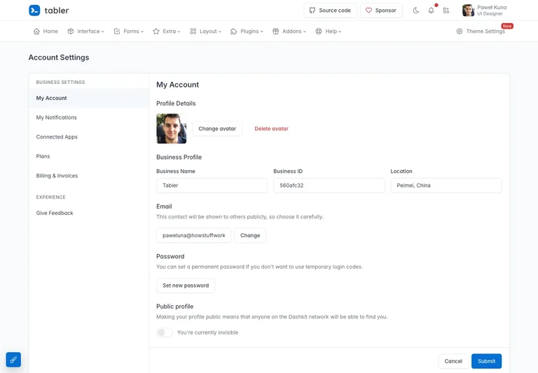
A settings demo groups profile and account controls beside local section navigation.
Useful for: Keep settings sections stable and make the save action clear.
# Design reference: Tabler — Account settings demo
Source: https://preview.tabler.io/settings.html
Swipefile reference: https://swipefile.design/ref/tabler-settings/
Captured: 2026-09-04. This is a dated reference, not a claim about the current live product.
Capture scope: a page excerpt. Do not infer unseen sections or interactions.

## Objective
Adapt the interaction and layout patterns below to my project. Use my own content and identity. Do not reproduce logos, proprietary copy, or brand assets.

## Reference notes
- surface: Account settings demo
- nav: Local settings navigation remains separate from the global product menu.
- layout: A settings section list sits beside a single-column account form.
- density: Use consistent spacing within repeated information so headings, values, and secondary details remain easy to compare.
- color: Pale gray page, white form surface, and a blue submit action.
- typography: Use a clear type hierarchy for the page title, primary content, and supporting labels.
- pattern: Keep settings sections stable and make the save action clear.
- states: Public template demo with fictional profile and business details.
- dont: Do not copy brand assets or sample records. Preserve keyboard access and design empty, loading, and error states for the actual task.

Useful for: Keep settings sections stable and make the save action clear.

## Acceptance criteria
- Existing project conventions, design tokens, working functionality, and unrelated changes are preserved.
- Two or three reference principles clearly support the user's task; conflicts are resolved in favor of usability and the existing product.
- Reusable components and semantic HTML express the interface. Available licensed assets are used; important UI text is never rendered as a bitmap.
- Every visible control has a defined behavior. Loading, empty, error, success, disabled, and long-content states are specified where relevant. Demo data is clearly labeled.
- Navigation and content adapt at 375px, 768px, and 1440px without horizontal page overflow. Keyboard use, visible focus, labeled inputs, at least 44px touch targets, readable contrast, and reduced motion are supported.
- Verification distinguishes rendered behavior from proposals and identifies anything still requiring a backend or external service.

## Quality bar
Clear hierarchy, consistent spacing, restrained surfaces, and purposeful motion. Avoid decorative gradients, excessive cards, placeholder buttons, and invented metrics unless the project calls for them. Do not claim a feature is connected or tested without evidence.
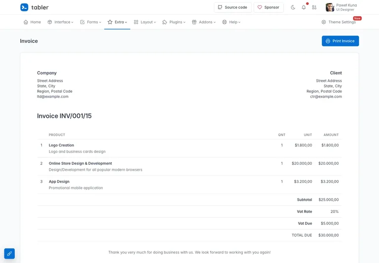
An invoice demo gives document identity, participants, and line items distinct regions.
Useful for: Align monetary values and separate document actions from invoice content.
# Design reference: Tabler — Invoice demo
Source: https://preview.tabler.io/invoice.html
Swipefile reference: https://swipefile.design/ref/tabler-invoice/
Captured: 2026-09-04. This is a dated reference, not a claim about the current live product.
Capture scope: a page excerpt. Do not infer unseen sections or interactions.

## Objective
Adapt the interaction and layout patterns below to my project. Use my own content and identity. Do not reproduce logos, proprietary copy, or brand assets.

## Reference notes
- surface: Invoice demo
- nav: A compact page heading and print action sit outside the invoice content.
- layout: Document identity, sender/recipient details, and line items form a printable invoice layout.
- density: Use consistent spacing within repeated information so headings, values, and secondary details remain easy to compare.
- color: White document surface with fine row separators and dark numeric values.
- typography: Use a clear type hierarchy for the page title, primary content, and supporting labels.
- pattern: Align monetary values and separate document actions from invoice content.
- states: Public invoice template containing example companies and amounts.
- dont: Do not copy brand assets or sample records. Preserve keyboard access and design empty, loading, and error states for the actual task.

Useful for: Align monetary values and separate document actions from invoice content.

## Acceptance criteria
- Existing project conventions, design tokens, working functionality, and unrelated changes are preserved.
- Two or three reference principles clearly support the user's task; conflicts are resolved in favor of usability and the existing product.
- Reusable components and semantic HTML express the interface. Available licensed assets are used; important UI text is never rendered as a bitmap.
- Every visible control has a defined behavior. Loading, empty, error, success, disabled, and long-content states are specified where relevant. Demo data is clearly labeled.
- Navigation and content adapt at 375px, 768px, and 1440px without horizontal page overflow. Keyboard use, visible focus, labeled inputs, at least 44px touch targets, readable contrast, and reduced motion are supported.
- Verification distinguishes rendered behavior from proposals and identifies anything still requiring a backend or external service.

## Quality bar
Clear hierarchy, consistent spacing, restrained surfaces, and purposeful motion. Avoid decorative gradients, excessive cards, placeholder buttons, and invented metrics unless the project calls for them. Do not claim a feature is connected or tested without evidence.
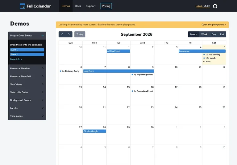
An interactive calendar demo offers dated events and multiple calendar views.
Useful for: Keep the active period and view selector close to the event grid.
# Design reference: FullCalendar — Interactive calendar demo
Source: https://fullcalendar.io/demos
Swipefile reference: https://swipefile.design/ref/fullcalendar-demo/
Captured: 2026-09-04. This is a dated reference, not a claim about the current live product.
Capture scope: a page excerpt. Do not infer unseen sections or interactions.

## Objective
Adapt the interaction and layout patterns below to my project. Use my own content and identity. Do not reproduce logos, proprietary copy, or brand assets.

## Reference notes
- surface: Interactive calendar demo
- nav: Previous, next, today, and view choices sit above the calendar.
- layout: A dated event grid sits beside the available demo controls.
- density: Use consistent spacing within repeated information so headings, values, and secondary details remain easy to compare.
- color: White calendar cells with blue event labels and dark toolbar controls.
- typography: Use a clear type hierarchy for the page title, primary content, and supporting labels.
- pattern: Keep the active period and view selector close to the event grid.
- states: Public calendar demo with sample events and a month view.
- dont: Do not copy brand assets or sample records. Preserve keyboard access and design empty, loading, and error states for the actual task.

Useful for: Keep the active period and view selector close to the event grid.

## Acceptance criteria
- Existing project conventions, design tokens, working functionality, and unrelated changes are preserved.
- Two or three reference principles clearly support the user's task; conflicts are resolved in favor of usability and the existing product.
- Reusable components and semantic HTML express the interface. Available licensed assets are used; important UI text is never rendered as a bitmap.
- Every visible control has a defined behavior. Loading, empty, error, success, disabled, and long-content states are specified where relevant. Demo data is clearly labeled.
- Navigation and content adapt at 375px, 768px, and 1440px without horizontal page overflow. Keyboard use, visible focus, labeled inputs, at least 44px touch targets, readable contrast, and reduced motion are supported.
- Verification distinguishes rendered behavior from proposals and identifies anything still requiring a backend or external service.

## Quality bar
Clear hierarchy, consistent spacing, restrained surfaces, and purposeful motion. Avoid decorative gradients, excessive cards, placeholder buttons, and invented metrics unless the project calls for them. Do not claim a feature is connected or tested without evidence.
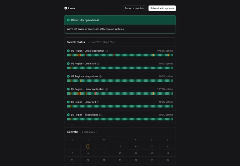
A public status page pairs current service health with recent incident history.
Useful for: Keep the current state prominent and make historical updates easy to scan.
# Design reference: Linear — Service status
Source: https://status.linear.app/
Swipefile reference: https://swipefile.design/ref/linear-status/
Captured: 2026-09-04. This is a dated reference, not a claim about the current live product.
Capture scope: a page excerpt. Do not infer unseen sections or interactions.

## Objective
Adapt the interaction and layout patterns below to my project. Use my own content and identity. Do not reproduce logos, proprietary copy, or brand assets.

## Reference notes
- surface: Service status
- nav: History and status sections support scanning from current state to prior updates.
- layout: A service-health overview precedes dated operational and incident information.
- density: Use consistent spacing within repeated information so headings, values, and secondary details remain easy to compare.
- color: A restrained status page with clear text hierarchy and semantic health indicators.
- typography: Use a clear type hierarchy for the page title, primary content, and supporting labels.
- pattern: Keep the current state prominent and make historical updates easy to scan.
- states: Public service-status snapshot at capture time; current availability may differ.
- dont: Do not copy brand assets or sample records. Preserve keyboard access and design empty, loading, and error states for the actual task.

Useful for: Keep the current state prominent and make historical updates easy to scan.

## Acceptance criteria
- Existing project conventions, design tokens, working functionality, and unrelated changes are preserved.
- Two or three reference principles clearly support the user's task; conflicts are resolved in favor of usability and the existing product.
- Reusable components and semantic HTML express the interface. Available licensed assets are used; important UI text is never rendered as a bitmap.
- Every visible control has a defined behavior. Loading, empty, error, success, disabled, and long-content states are specified where relevant. Demo data is clearly labeled.
- Navigation and content adapt at 375px, 768px, and 1440px without horizontal page overflow. Keyboard use, visible focus, labeled inputs, at least 44px touch targets, readable contrast, and reduced motion are supported.
- Verification distinguishes rendered behavior from proposals and identifies anything still requiring a backend or external service.

## Quality bar
Clear hierarchy, consistent spacing, restrained surfaces, and purposeful motion. Avoid decorative gradients, excessive cards, placeholder buttons, and invented metrics unless the project calls for them. Do not claim a feature is connected or tested without evidence.
Allow basic usage counts to help us understand what is useful. Your board contents stay out of analytics. Details
Your browser’s privacy preference keeps analytics off.