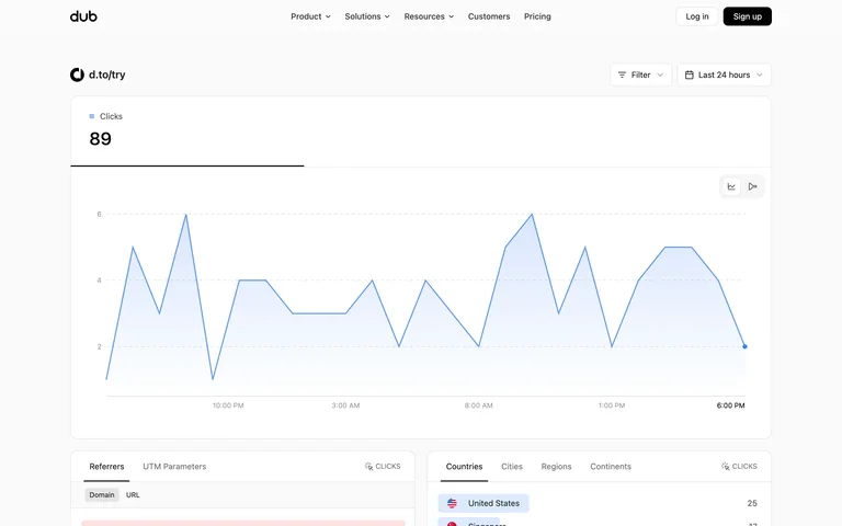
Analytics Dashboard
CURATED COLLECTION · 5 REFERENCES
Real form editing, analytics, discovery, time comparison, and canvas interfaces, with the captured state explained.
Copy the reference notes below and paste them into Claude, ChatGPT, or your coding assistant. Add what you want to build.
Includes design notes, original sources, and preview links. An assistant that supports browsing can also read the public board link.
A public link analytics view pairs a single headline metric and trend chart with tabbed breakdowns for referrers, geography, and devices.
Useful for: Public shared analytics for d.to/try, linked from Dub’s live demo.
# Design reference: Dub — Shared link analytics
Source: https://app.dub.co/share/dash_6NSA6vNm017MZwfzt8SubNSZ
Swipefile reference: https://swipefile.design/ref/dub-link-analytics/
Captured: 2026-09-05. This is a dated reference, not a claim about the current live product.
Capture scope: one viewport. Do not infer unseen page sections or a complete user flow.

## Objective
Adapt the interaction and layout patterns below to my project. Use my own content and identity. Do not reproduce logos, proprietary copy, or brand assets.

## Reference notes
- surface: Public shared analytics for d.to/try, linked from Dub’s live demo.
- nav: Top-level site navigation remains above a compact filter and time-range toolbar.
- layout: Headline clicks metric, broad trend chart, then two-column breakdown panels.
- density: Moderate; a clear overview precedes denser breakdown rows.
- color: White and pale gray, dark text, restrained blue chart fill.
- typography: Compact sans labels and a larger metric.
- pattern: Keep time range and filters adjacent to the chart they affect.
- states: This is a public shared view; data changes over time. Signed-in management and empty/error states were not captured.
- dont: Do not confuse a public report with the authenticated analytics workspace.

Useful for: Public shared analytics for d.to/try, linked from Dub’s live demo.

## Acceptance criteria
- Existing project conventions, design tokens, working functionality, and unrelated changes are preserved.
- Two or three reference principles clearly support the user's task; conflicts are resolved in favor of usability and the existing product.
- Reusable components and semantic HTML express the interface. Available licensed assets are used; important UI text is never rendered as a bitmap.
- Every visible control has a defined behavior. Loading, empty, error, success, disabled, and long-content states are specified where relevant. Demo data is clearly labeled.
- Navigation and content adapt at 375px, 768px, and 1440px without horizontal page overflow. Keyboard use, visible focus, labeled inputs, at least 44px touch targets, readable contrast, and reduced motion are supported.
- Verification distinguishes rendered behavior from proposals and identifies anything still requiring a backend or external service.

## Quality bar
Clear hierarchy, consistent spacing, restrained surfaces, and purposeful motion. Avoid decorative gradients, excessive cards, placeholder buttons, and invented metrics unless the project calls for them. Do not claim a feature is connected or tested without evidence.
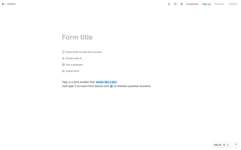
A form begins as a blank document with a title and inline starting choices, keeping editor chrome lighter than the content area.
Useful for: Unsigned initial form editor.
# Design reference: Tally — Document-style form builder
Source: https://tally.so/create
Swipefile reference: https://swipefile.design/ref/tally-form-editor/
Captured: 2026-09-05. This is a dated reference, not a claim about the current live product.
Capture scope: one viewport. Do not infer unseen page sections or a complete user flow.

## Objective
Adapt the interaction and layout patterns below to my project. Use my own content and identity. Do not reproduce logos, proprietary copy, or brand assets.

## Reference notes
- surface: Unsigned initial form editor.
- nav: A slim top bar groups Customize, Preview, Publish, and account access.
- layout: Wide document canvas with inline start, template, and import choices.
- density: Low; most space is reserved for the document.
- color: White, muted gray, blue action accents.
- typography: Document-like sans text with a larger form title.
- pattern: Make the empty state the first step of editing: type directly or choose a starting route.
- states: Actual blank form state. No form was published or submitted.
- dont: Do not hide the starting options behind a separate onboarding wizard.

Useful for: Unsigned initial form editor.

## Acceptance criteria
- Existing project conventions, design tokens, working functionality, and unrelated changes are preserved.
- Two or three reference principles clearly support the user's task; conflicts are resolved in favor of usability and the existing product.
- Reusable components and semantic HTML express the interface. Available licensed assets are used; important UI text is never rendered as a bitmap.
- Every visible control has a defined behavior. Loading, empty, error, success, disabled, and long-content states are specified where relevant. Demo data is clearly labeled.
- Navigation and content adapt at 375px, 768px, and 1440px without horizontal page overflow. Keyboard use, visible focus, labeled inputs, at least 44px touch targets, readable contrast, and reduced motion are supported.
- Verification distinguishes rendered behavior from proposals and identifies anything still requiring a backend or external service.

## Quality bar
Clear hierarchy, consistent spacing, restrained surfaces, and purposeful motion. Avoid decorative gradients, excessive cards, placeholder buttons, and invented metrics unless the project calls for them. Do not claim a feature is connected or tested without evidence.
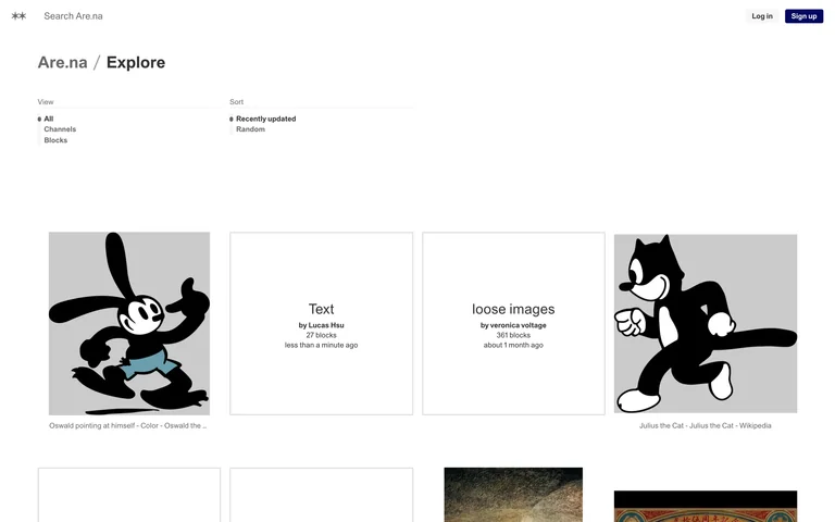
A restrained discovery grid lets channels and individual blocks share a visual browsing surface, with simple type and sort controls above it.
Useful for: Public Explore feed of channels and blocks.
# Design reference: Are.na — Explore channels and blocks
Source: https://www.are.na/explore
Swipefile reference: https://swipefile.design/ref/arena-explore/
Captured: 2026-09-05. This is a dated reference, not a claim about the current live product.
Capture scope: one viewport. Do not infer unseen page sections or a complete user flow.

## Objective
Adapt the interaction and layout patterns below to my project. Use my own content and identity. Do not reproduce logos, proprietary copy, or brand assets.

## Reference notes
- surface: Public Explore feed of channels and blocks.
- nav: Search and account actions above View and Sort controls.
- layout: Open filter area followed by a multi-column grid of image, text, and channel cards.
- density: Moderate; imagery carries more weight than interface chrome.
- color: White, light gray dividers, black text; color comes from saved blocks.
- typography: Small neutral sans interface labels.
- pattern: Keep mixed content types recognizable while allowing them to coexist in one browsing grid.
- states: Public feed as captured; content and ordering change. Private channels were not accessed.
- dont: Do not make every metadata field compete with the content preview.

Useful for: Public Explore feed of channels and blocks.

## Acceptance criteria
- Existing project conventions, design tokens, working functionality, and unrelated changes are preserved.
- Two or three reference principles clearly support the user's task; conflicts are resolved in favor of usability and the existing product.
- Reusable components and semantic HTML express the interface. Available licensed assets are used; important UI text is never rendered as a bitmap.
- Every visible control has a defined behavior. Loading, empty, error, success, disabled, and long-content states are specified where relevant. Demo data is clearly labeled.
- Navigation and content adapt at 375px, 768px, and 1440px without horizontal page overflow. Keyboard use, visible focus, labeled inputs, at least 44px touch targets, readable contrast, and reduced motion are supported.
- Verification distinguishes rendered behavior from proposals and identifies anything still requiring a backend or external service.

## Quality bar
Clear hierarchy, consistent spacing, restrained surfaces, and purposeful motion. Avoid decorative gradients, excessive cards, placeholder buttons, and invented metrics unless the project calls for them. Do not claim a feature is connected or tested without evidence.
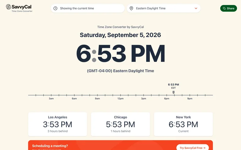
A large local time anchors a horizontal hour rail and comparison cards, making a time difference visible before users need to read a city list.
Useful for: Public time zone converter.
# Design reference: SavvyCal — Time zone comparison
Source: https://time.savvycal.com/
Swipefile reference: https://swipefile.design/ref/savvycal-time-zones/
Captured: 2026-09-05. This is a dated reference, not a claim about the current live product.
Capture scope: one viewport. Do not infer unseen page sections or a complete user flow.

## Objective
Adapt the interaction and layout patterns below to my project. Use my own content and identity. Do not reproduce logos, proprietary copy, or brand assets.

## Reference notes
- surface: Public time zone converter.
- nav: Time and zone selectors across the top, plus a Share action.
- layout: Large date and time, horizontal timeline, then city comparison cards.
- density: Low around the current time, denser further down the city list.
- color: Warm cream, dark navy, white cards, green primary utility action.
- typography: Large tabular-looking time numerals with compact sans labels.
- pattern: Establish one reference time and show the offset beside every comparison.
- states: Live current-time state; this capture does not book or share a meeting.
- dont: Do not rely on zone abbreviations alone when a city and relative offset can clarify them.

Useful for: Public time zone converter.

## Acceptance criteria
- Existing project conventions, design tokens, working functionality, and unrelated changes are preserved.
- Two or three reference principles clearly support the user's task; conflicts are resolved in favor of usability and the existing product.
- Reusable components and semantic HTML express the interface. Available licensed assets are used; important UI text is never rendered as a bitmap.
- Every visible control has a defined behavior. Loading, empty, error, success, disabled, and long-content states are specified where relevant. Demo data is clearly labeled.
- Navigation and content adapt at 375px, 768px, and 1440px without horizontal page overflow. Keyboard use, visible focus, labeled inputs, at least 44px touch targets, readable contrast, and reduced motion are supported.
- Verification distinguishes rendered behavior from proposals and identifies anything still requiring a backend or external service.

## Quality bar
Clear hierarchy, consistent spacing, restrained surfaces, and purposeful motion. Avoid decorative gradients, excessive cards, placeholder buttons, and invented metrics unless the project calls for them. Do not claim a feature is connected or tested without evidence.
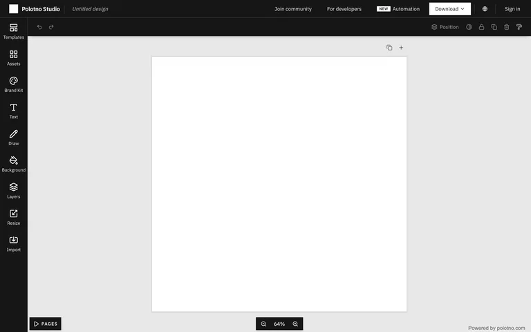
A narrow asset rail and compact toolbar surround a large empty canvas, with page and zoom controls anchored at the bottom.
Useful for: Public design editor, new untitled canvas.
# Design reference: Polotno — Canvas and asset editor
Source: https://polotno.com/studio
Swipefile reference: https://swipefile.design/ref/polotno-design-editor/
Captured: 2026-09-05. This is a dated reference, not a claim about the current live product.
Capture scope: one viewport. Do not infer unseen page sections or a complete user flow.

## Objective
Adapt the interaction and layout patterns below to my project. Use my own content and identity. Do not reproduce logos, proprietary copy, or brand assets.

## Reference notes
- surface: Public design editor, new untitled canvas.
- nav: Left tool rail for assets, text, drawing, layers, and import; top actions for download and account access.
- layout: Dark editor shell surrounding a light workspace and centered white canvas.
- density: Low on the canvas, compact around the edges.
- color: Dark charcoal chrome, gray workspace, white page.
- typography: Small sans tool labels.
- pattern: Keep tools at the edges and the artifact in the center; anchor zoom and page navigation consistently.
- states: Actual empty canvas. No design was uploaded or exported.
- dont: Do not mistake the empty canvas for a loading screen or fill it with invented customer work.

Useful for: Public design editor, new untitled canvas.

## Acceptance criteria
- Existing project conventions, design tokens, working functionality, and unrelated changes are preserved.
- Two or three reference principles clearly support the user's task; conflicts are resolved in favor of usability and the existing product.
- Reusable components and semantic HTML express the interface. Available licensed assets are used; important UI text is never rendered as a bitmap.
- Every visible control has a defined behavior. Loading, empty, error, success, disabled, and long-content states are specified where relevant. Demo data is clearly labeled.
- Navigation and content adapt at 375px, 768px, and 1440px without horizontal page overflow. Keyboard use, visible focus, labeled inputs, at least 44px touch targets, readable contrast, and reduced motion are supported.
- Verification distinguishes rendered behavior from proposals and identifies anything still requiring a backend or external service.

## Quality bar
Clear hierarchy, consistent spacing, restrained surfaces, and purposeful motion. Avoid decorative gradients, excessive cards, placeholder buttons, and invented metrics unless the project calls for them. Do not claim a feature is connected or tested without evidence.
Allow basic usage counts to help us understand what is useful. Your board contents stay out of analytics. Details
Your browser’s privacy preference keeps analytics off.